

The right data analysis can result in immense business growth, help you figure out gray areas in your business, and scale your business to the next level.
Every organization collects tons of data, usually in an unstructured way. It is not easy to understand this data, even for technical people who handle it and work with it daily.
To understand the data better, it must be presented in a structured, graphical format. Charts are often the best option as they allow anyone to extensively analyze the data in detail or at a high level, and charts make it easy to compare different data over time.
Syncfusion offers a great library of charts that can be used to represent data in many ways.
Charts are the easy part of data analysis. The complex part is their placement on the screen. Providing flexibility in terms of chart placement, arrangement, and size is challenging.
By providing users with a flexible dashboard, they can rearrange, resize, and replace charts as needed to address the different data analyses they need to perform.
Let’s see how to create a flexible web dashboard for data analysis of code test coverage using Syncfusion Charts and Dashboard Layout components for React.
Setup
Install the necessary dependencies using the following command.
npm i -save @syncfusion/ej2 @syncfusion/ej2-base @syncfusion/ej2-react-layouts
Once the dependencies are installed, set up the dashboard layout in the React application.
import * as React from "react";

import {
 DashboardLayoutComponent,
 PanelsDirective,
 PanelDirective,
} from "@syncfusion/ej2-react-layouts";

import "/node_modules/@syncfusion/ej2/material.css";
Dashboard Layout component
Dashboard Layout is a wrapper component that creates an environment for panels to be rearranged by dragging, resizing, and floating.
It handles all the panel configurations and listens to different events like load, created, resize, etc.
For our use case, I have defined a six-column layout and enabled the option to resize and drag the panels. I have set the cell spacing as [5, 5], the first value is for the top-bottom spacing and the second value is for the left-right spacing. Refer to the following code example.
Const WebDashboard = () => {
  const onCreate = () => {
    // logic goes here
  };

  const onPanelResize = () => {
    // logic goes here
  };

  return (
    <DashboardLayoutComponent
      created={onCreate}
      columns={6}
      id=”predefine_dashboard”
      cellSpacing={[5, 5]}
      resizeStop={onPanelResize}
      allowResizing={true}
      allowDragging={true}
    ></DashboardLayoutComponent>
  );
};
When the user resizes a panel, we need to adjust the contents inside it, and so we are listening to the resizeStop event. We will add the logic to it once we have all the panels ready with the content.
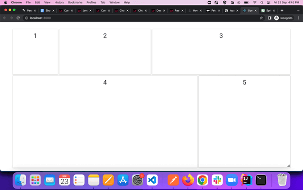
With this wrapper ready, we can now place our panels inside it.
<PanelsDirective>
  <PanelDirective header="" content="<div class=’text-content’> 1 </div>" sizeX={1} sizeY={1} row={0} col={0}></PanelDirective>
  <PanelDirective header="" content="<div class=’text-content’> 2 </div>" sizeX={2} sizeY={1} row={0} col={1}></PanelDirective>
  <PanelDirective header="" content="<div class=’text-content’> 3 </div>" sizeX={3} sizeY={1} row={0} col={3}></PanelDirective>
  <PanelDirective header="" content="<div class=’text-content’> 4 </div>" sizeX={4} sizeY={2} row={2} col={0}></PanelDirective>
  <PanelDirective header="" content="<div class=’text-content’> 5 </div>" sizeX={2} sizeY={2} row={2} col={4}></PanelDirective>
</PanelsDirective>
Each panel is composed of six essential items:
- Header: A string or HTML content in string format.
- Content: A function or string or HTML content in string format.
- sizeX(): Width of the panel corresponding to the number of columns defined. For example, we have defined six columns in the DashboardLayoutComponent. So, providing sizeX(6) will consume 100% of the width of DashboardLayoutComponent. Likewise, providing sizeX(3) will consume 50% of the width.
- sizeY(): Height of the panel corresponding to the total height. For example, providing sizeY(6) will be 100% of the height of the DashboardLayoutComponent and providing sizeY(3) will consume 50% of the height.
- row(): OffsetX of the panel corresponding to the width, just like sizeX().
- column(): OffsetY of the panel corresponding to the height, just like sizeY().
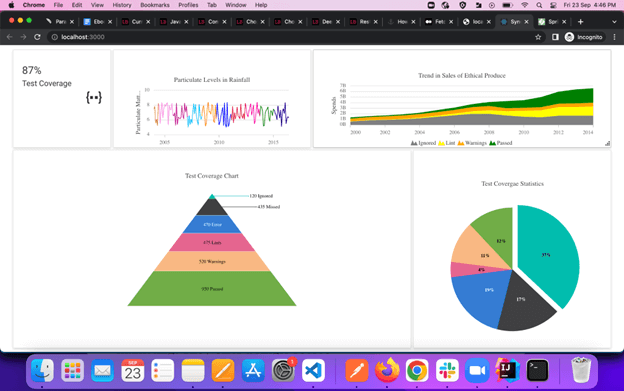
Our simple web dashboard is ready. Now let’s add content to it. For that, we will create the following four different graphs and inject them into the panels as content. Refer to the following code examples to create different charts.
Multicolor Line Chart
import * as React from "react";

import {
  ChartComponent,
  SeriesCollectionDirective,
  SeriesDirective,
  Inject,
  Tooltip,
  DateTime,
  MultiColoredLineSeries,
} from "@syncfusion/ej2-react-charts";

const rainFallData = [
  6.279319488350383, 6.44063341316797, 6.2369215935932125, 5.502712120699334, 8.36727387645628,
  6.8763936909119145, 7.539107641248687, 7.168106790298325, 5.088973211088473, 7.3611443626521975,
  6.262482500009694, 7.066946128264099, 7.919136663279815, 6.048770230229623, 6.635693738128687,
  6.914314060997675, 7.3558393638632245, 7.446799394011705, 6.573065012367965, 7.199248800046284,
  7.2478392502172255, 5.841749916549048, 6.2875032915742555, 7.780344597533645, 7.476252964940152,
  7.31130789349302, 6.9795490749342735, 5.25771395445122, 5.209178065323029, 7.253001207479784,
  7.735630771065614, 7.867579691619466, 6.498505124379967, 7.520182796274494, 6.8849552121955355,
  8.409548532300903, 7.280962677695648, 5.90472258083289, 5.493050947663577, 8.049930030095826,
  7.312239096474201, 6.648881892334176, 8.20778156490454, 7.760450642162979, 7.16896788902378,
  6.464002823190773, 6.744274412468741, 7.608063016119123, 8.28437415597541, 6.0686292110951,
  6.903464462707268, 6.21583898264024, 6.593313193313992, 8.173631463364867, 6.2071625059658535,
  6.418795393716696, 6.564866596674945, 7.762970761208759, 6.69332473846462, 6.1351463701281865,
  7.022493415476658, 5.6249468419041895, 7.874458629000931, 5.990122152134347, 6.813180297026457,
  6.193695064120531, 5.296018389402549, 5.17260081829393, 8.408367813193978, 5.021357760833318,
  5.459118447495531, 8.323738731410392, 5.260751854138992, 7.7013503613788545, 7.161869425083509,
  6.4418768926289145, 5.7231475724513015, 5.364349621131238, 6.773111815759874, 8.306374671332607,
  6.165757722561587, 8.011545688002819, 5.701686949133615, 5.811580507651204, 7.948649630117358,
  8.048489436166571, 6.786435040503838, 7.1266629301054945, 7.091275551544603, 8.413378363384973,
  7.589335230735911, 5.5681611987571165, 5.176557932530318, 6.890754293090578, 7.924184435766012,
  7.671728565183779, 6.534081554237517, 6.078696508169291, 6.722649936820086, 8.13565939847763,
  5.322671901142255, 5.876995219513782, 6.5405777428501555, 8.127136324134698, 6.843787638022269,
  8.214383813349539, 7.091099148563872, 5.573444163129094, 6.1157593307379905, 5.363258884106331,
  6.637800048423518, 5.027116944840255, 6.431401722513312, 7.926967677322131, 7.065957313808207,
  8.301185233917279, 6.143757399153787, 6.607680399250383, 7.938494833444157, 6.365288215185968,
  6.184127061001217, 6.260665337126789, 6.372079016740581, 5.376093226995872, 8.299463466935178,
  5.269678124030882, 6.976824154487483, 6.5820865112357545, 6.724430571963181, 8.26091246496553,
  7.401497200117249, 7.386153557663212, 7.963447373445464, 5.337687146800787, 8.286285086593121,
  8.222978426452293, 7.846639766826911, 8.069351366527062, 7.513260268839259, 6.296995869336903,
  8.3590956573818, 7.34430352413543, 5.527911754495014, 7.770708367719198, 8.266752140439358,
  5.2647621706579635, 6.101003552437883, 5.589774929752683, 7.839799629506524, 7.41897730190976,
];

let dataValues = [];
let colors = [
  "navy",
  "green",
  "#ff0097",
  "crimson",
  "blue",
  "darkorange",
  "deepskyblue",
  "mediumvioletred",
  "violet",
  "peru",
  "gray",
  "deeppink",
  "red",
];
rainFallData.map((value, index) => {
  dataValues.push({
    x: new Date(2017, -index, 1),
    y: value.toFixed(2),
    color: colors[Math.floor(index / 16)],
  });
});

const LineChart = () => {
  return (
    <div className="control-pane" style={{ padding: "10px" }}>
      <div className="control-section">
        <ChartComponent
          id="line-charts"
          style={{ textAlign: "center" }}
          primaryXAxis={{
            valueType: "DateTime",
            labelFormat: "y",
            intervalType: "Years",
            edgeLabelPlacement: "Shift",
            majorGridLines: { width: 0 },
          }}
          primaryYAxis={{
            rangePadding: "None",
            minimum: 4,
            maximum: 10,
            title: "Particulate Matter(PM)",
            lineStyle: { width: 0 },
            majorTickLines: { width: 0 },
            minorTickLines: { width: 0 },
          }}
          tooltip={{ enable: true, shared: true, enableAnimation: false }}
          legendSettings={{ visible: false }}
          chartArea={{ border: { width: 0 } }}
          load={() => {}}
          title="Particulate Levels in Rainfall"
          loaded={() => {}}
          width="100%"
          height="180"
        >
          <Inject services={[MultiColoredLineSeries, DateTime, Tooltip]} />
          <SeriesCollectionDirective>
            <SeriesDirective
              dataSource={dataValues}
              width={1.4}
              xName="x"
              yName="y"
              name="Rainfall"
              type="MultiColoredLine"
              pointColorMapping="color"
            ></SeriesDirective>
          </SeriesCollectionDirective>
        </ChartComponent>
      </div>
    </div>
  );
};

export default LineChart;
Pie Chart
import * as React from "react";
import {
  AccumulationChartComponent,
  AccumulationSeriesCollectionDirective,
  AccumulationSeriesDirective,
  Inject,
  AccumulationLegend,
  PieSeries,
  AccumulationTooltip,
  AccumulationDataLabel,
} from "@syncfusion/ej2-react-charts";

export let data1 = [
  { x: "Passed", y: 37, text: "37%" },
  { x: "Lints", y: 17, text: "17%" },
  { x: "Warning", y: 19, text: "19%" },
  { x: "Ignored", y: 4, text: "4%" },
  { x: "Missed", y: 11, text: "11%" },
  { x: "Error", y: 12, text: "12%" },
];

const Pie = () => {
  const pie = React.useRef();

  return (
    <div className="control-pane">
      <div className="control-section row">
        <div className="col">
          <AccumulationChartComponent
            id="pie-chart"
            ref={pie}
            title="Test Covergae Statistics"
            // load={this.load.bind(this)}
            legendSettings={{ visible: false }}
            enableSmartLabels={true}
            enableAnimation={false}
            center={{ x: "50%", y: "50%" }}
            tooltip={{ enable: true, format: "${point.x} : <b>${point.y}%</b>" }}
            // loaded={this.onChartLoad.bind(this)}
          >
            <Inject
              services={[AccumulationLegend, PieSeries, AccumulationTooltip, AccumulationDataLabel]}
            />
            <AccumulationSeriesCollectionDirective>
              <AccumulationSeriesDirective
                dataSource={data1}
                name="Browser"
                xName="x"
                yName="y"
                explode={true}
                explodeOffset="10%"
                explodeIndex={0}
                dataLabel={{
                  visible: true,
                  position: "Inside",
                  name: "text",
                  font: {
                    fontWeight: "600",
                  },
                }}
                radius="70%"
              ></AccumulationSeriesDirective>
            </AccumulationSeriesCollectionDirective>
          </AccumulationChartComponent>
        </div>
      </div>
    </div>
  );
};

export default Pie;
Pyramid Chart
import * as React from "react";

import {
  AccumulationChartComponent,
  AccumulationSeriesCollectionDirective,
  AccumulationSeriesDirective,
  Inject,
  AccumulationLegend,
  AccumulationDataLabel,
  AccumulationTooltip,
  PyramidSeries,
  AccumulationSelection,
} from "@syncfusion/ej2-react-charts";

export let data1 = [
  { x: "Ignored", y: 120, text: "120 Ignored" },
  { x: "Missed", y: 435, text: "435 Missed" },
  { x: "Error", y: 470, text: "470 Error" },
  { x: "Linting Error", y: 475, text: "475 Lints" },
  { x: "Warning", y: 520, text: "520 Warnings" },
  { x: "Passed", y: 930, text: "930 Passed" },
];

const Pyramid = () => {
  const pyramid = React.useRef();

  return (
    <div className="control-pane">
      <div className="control-section row">
        <div className="col">
          <AccumulationChartComponent
            id="pyramid-chart"
            ref={pyramid}
            title="Test Coverage Chart"
            legendSettings={{
              visible: false,
            }}
            //   load={this.load.bind(this)}
            tooltip={{ enable: true, format: "${point.x} : <b>${point.y} cal</b>" }}
            //   loaded={this.onChartLoad.bind(this)}
            //   resized={this.chartResized.bind(this)}
            width="100%"
            height="80%"
          >
            <Inject
              services={[
                AccumulationDataLabel,
                AccumulationTooltip,
                PyramidSeries,
                AccumulationLegend,
                AccumulationSelection,
              ]}
            />
            <AccumulationSeriesCollectionDirective>
              <AccumulationSeriesDirective
                name="Test"
                dataSource={data1}
                xName="x"
                yName="y"
                type="Pyramid"
                width="45%"
                height="80%"
                neckWidth="15%"
                gapRatio={0.03}
                explode={true}
                emptyPointSettings={{ mode: "Drop", fill: "red" }}
                dataLabel={{
                  visible: true,
                  position: "Inside",
                  name: "text",
                }}
              ></AccumulationSeriesDirective>
            </AccumulationSeriesCollectionDirective>
          </AccumulationChartComponent>
        </div>
      </div>
    </div>
  );
};

export default Pyramid;
Stacked Chart
import * as React from "react";
import {
  ChartComponent,
  SeriesCollectionDirective,
  SeriesDirective,
  Inject,
  DateTime,
  StackingAreaSeries,
  Legend,
} from "@syncfusion/ej2-react-charts";

export let data1 = [
  { x: new Date(2000, 0, 1), y: 0.61 },
  { x: new Date(2001, 0, 1), y: 0.81 },
  { x: new Date(2002, 0, 1), y: 0.91 },
  { x: new Date(2003, 0, 1), y: 1 },
  { x: new Date(2004, 0, 1), y: 1.19 },
  { x: new Date(2005, 0, 1), y: 1.47 },
  { x: new Date(2006, 0, 1), y: 1.74 },
  { x: new Date(2007, 0, 1), y: 1.98 },
  { x: new Date(2008, 0, 1), y: 1.99 },
  { x: new Date(2009, 0, 1), y: 1.7 },
  { x: new Date(2010, 0, 1), y: 1.48 },
  { x: new Date(2011, 0, 1), y: 1.38 },
  { x: new Date(2012, 0, 1), y: 1.66 },
  { x: new Date(2013, 0, 1), y: 1.66 },
  { x: new Date(2014, 0, 1), y: 1.67 },
];
export let data2 = [
  { x: new Date(2000, 0, 1), y: 0.03 },
  { x: new Date(2001, 0, 1), y: 0.05 },
  { x: new Date(2002, 0, 1), y: 0.06 },
  { x: new Date(2003, 0, 1), y: 0.09 },
  { x: new Date(2004, 0, 1), y: 0.14 },
  { x: new Date(2005, 0, 1), y: 0.2 },
  { x: new Date(2006, 0, 1), y: 0.29 },
  { x: new Date(2007, 0, 1), y: 0.46 },
  { x: new Date(2008, 0, 1), y: 0.64 },
  { x: new Date(2009, 0, 1), y: 0.75 },
  { x: new Date(2010, 0, 1), y: 1.06 },
  { x: new Date(2011, 0, 1), y: 1.25 },
  { x: new Date(2012, 0, 1), y: 1.55 },
  { x: new Date(2013, 0, 1), y: 1.55 },
  { x: new Date(2014, 0, 1), y: 1.65 },
];
export let data3 = [
  { x: new Date(2000, 0, 1), y: 0.48 },
  { x: new Date(2001, 0, 1), y: 0.53 },
  { x: new Date(2002, 0, 1), y: 0.57 },
  { x: new Date(2003, 0, 1), y: 0.61 },
  { x: new Date(2004, 0, 1), y: 0.63 },
  { x: new Date(2005, 0, 1), y: 0.64 },
  { x: new Date(2006, 0, 1), y: 0.66 },
  { x: new Date(2007, 0, 1), y: 0.76 },
  { x: new Date(2008, 0, 1), y: 0.77 },
  { x: new Date(2009, 0, 1), y: 0.55 },
  { x: new Date(2010, 0, 1), y: 0.54 },
  { x: new Date(2011, 0, 1), y: 0.57 },
  { x: new Date(2012, 0, 1), y: 0.61 },
  { x: new Date(2013, 0, 1), y: 0.67 },
  { x: new Date(2014, 0, 1), y: 0.67 },
];
export let data4 = [
  { x: new Date(2000, 0, 1), y: 0.23 },
  { x: new Date(2001, 0, 1), y: 0.17 },
  { x: new Date(2002, 0, 1), y: 0.17 },
  { x: new Date(2003, 0, 1), y: 0.2 },
  { x: new Date(2004, 0, 1), y: 0.23 },
  { x: new Date(2005, 0, 1), y: 0.36 },
  { x: new Date(2006, 0, 1), y: 0.43 },
  { x: new Date(2007, 0, 1), y: 0.52 },
  { x: new Date(2008, 0, 1), y: 0.72 },
  { x: new Date(2009, 0, 1), y: 1.29 },
  { x: new Date(2010, 0, 1), y: 1.38 },
  { x: new Date(2011, 0, 1), y: 1.82 },
  { x: new Date(2012, 0, 1), y: 2.16 },
  { x: new Date(2013, 0, 1), y: 2.51 },
  { x: new Date(2014, 0, 1), y: 2.61 },
];

const StackedArea = () => {
  return (
    <div className="control-pane">
      <div className="control-section">
        <ChartComponent
          id="stacked-area-charts"
          style={{ textAlign: "center" }}
          primaryXAxis={{
            valueType: "DateTime",
            intervalType: "Years",
            majorGridLines: { width: 0 },
            labelFormat: "y",
            edgeLabelPlacement: "Shift",
          }}
          //   load={this.load.bind(this)}
          primaryYAxis={{
            title: "Spends",
            minimum: 0,
            maximum: 7,
            interval: 1,
            lineStyle: { width: 0 },
            majorTickLines: { width: 0 },
            minorTickLines: { width: 0 },
            labelFormat: "{value}B",
          }}
          chartArea={{ border: { width: 0 } }}
          //   width={Browser.isDevice ? "100%" : "60%"}
          title="Trend in Sales of Ethical Produce"
          //   loaded={this.onChartLoad.bind(this)}

          height="200px"
        >
          <Inject services={[StackingAreaSeries, Legend, DateTime]} />
          <SeriesCollectionDirective>
            <SeriesDirective
              dataSource={data1}
              xName="x"
              yName="y"
              name="Ignored"
              type="StackingArea"
              fill="gray"
            ></SeriesDirective>
            <SeriesDirective
              dataSource={data2}
              xName="x"
              yName="y"
              name="Lint"
              type="StackingArea"
              fill="yellow"
            ></SeriesDirective>
            <SeriesDirective
              dataSource={data3}
              xName="x"
              yName="y"
              name="Warnings"
              type="StackingArea"
              fill="orange"
            ></SeriesDirective>
            <SeriesDirective
              dataSource={data4}
              xName="x"
              yName="y"
              name="Passed"
              type="StackingArea"
              fill="green"
            ></SeriesDirective>
          </SeriesCollectionDirective>
        </ChartComponent>
      </div>
    </div>
  );
};

export default StackedArea;
Inject charts into the panels
The following code injects the charts into the panels.
import LineChart from "./Charts/LineChart";
import PieChart from "./Charts/PieChart";
import PyramidChart from "./Charts/PyramidChart";
import StackedArea from "./Charts/StackedChart";
import TestCoverage from "./Charts/TestCoverage";

return (
    <DashboardLayoutComponent
      created={onCreate}
      columns={6}
      id="predefine_dashboard"
      cellSpacing={[5, 5]}
      resizeStop={onPanelResize}
      allowResizing={true}
      allowDragging={true}
    >
      <PanelsDirective>
        <PanelDirective
          header=""
          content={TestCoverage}
          sizeX={1}
          sizeY={1}
          row={0}
          col={0}
        ></PanelDirective>
        <PanelDirective
          header=""
          content={LineChart}
          sizeX={2}
          sizeY={1}
          row={0}
          col={1}
        ></PanelDirective>
        <PanelDirective
          header=""
          content={StackedArea}
          sizeX={3}
          sizeY={1}
          row={0}
          col={3}
        ></PanelDirective>
        <PanelDirective
          header=""
          content={PyramidChart}
          sizeX={4}
          sizeY={2}
          row={2}
          col={0}
        ></PanelDirective>
        <PanelDirective
          header=""
          content={PieChart}
          sizeX={2}
          sizeY={2}
          row={2}
          col={4}
        ></PanelDirective>
      </PanelsDirective>
    </DashboardLayoutComponent>
We have kept the headers empty because each chart has its own header.
The final thing to do is resize the charts when the panel is resized. To do that, inside the onPanelResize method, get the closest chart instance, update its width and height, and refresh it. Refer to the following code example.
const onPanelResize = (args) => {
    if (
      args.element &&
      args.element.querySelector(".e-panel-container .e-panel-content div div div")
    ) {
      let chartObj = args.element.querySelector(".e-panel-container .e-panel-content div div div")
        .ej2_instances[0];
      const height = args.element.querySelector(".e-panel-container .e-panel-content").clientHeight;
      chartObj.height = `${height - 20}`;
      chartObj.width = "100%";
      chartObj.refresh();
    }
  };
Resource
For more information, we have committed the entire source code of the project to the Create a Simple Dashboard for Data Analysis in React GitHub repository.
Conclusion
I hope you found this article helpful in designing a dashboard layout for charts in React to make data analysis and decision-making easier.
Thank you for reading.
The Syncfusion Essential Studio® for React suite offers over 70 high-performance, lightweight, modular, and responsive UI components in a single package. It’s the only suite you’ll ever need to construct a complete app.
If you have questions, contact us through our support forum, support portal, or feedback portal. We are always happy to assist you!
 No spam, just valuable updates.
Comments (2)
Do you have such kind of sample using Syncfusion Blazor components ?
Hi Syed, Yes, Please checkout our Blazor Chart overview demo.
https://blazor.syncfusion.com/demos/chart/overview?theme=fluent