
 Jayaleshwari N
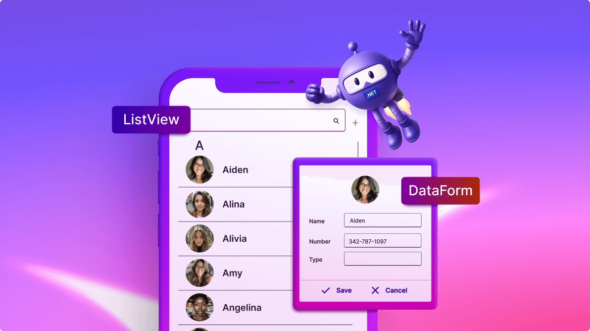
TL;DR: Learn to build a complete contact management app with .NET MAUI using ListView and DataForm components. This guide covers MVVM architecture implementation, data binding, UI design, and essential features like adding, editing, deleting, and filtering contacts with grouping and enhanced user interactions.
Managing contacts efficiently is a common requirement in many applications. In this blog post, we’ll guide you through building a simple yet powerful contact management app using ListView and DataForm. These components make it easy to display, edit, and organize contacts while maintaining an intuitive user experience.
Combine a ListView to display the contact list and a DataForm to add or edit contact details. With proper data binding, updates made in the DataForm will reflect immediately in the ListView, creating a dynamic and responsive app. Here we have the sections to handle:
Displaying contacts with ListView
When building a contact management app, one of the most critical features is presenting contact information in a clean and organized manner. ListView is a versatile control that simplifies displaying and managing lists, making it an ideal choice for showcasing contacts.
Let’s dive into the steps to display contacts in the ListView.
Step 1: Implementing Model and ViewModel
Include the model class to handle the contact info properties and the ViewModel class to populate the binding collection property to show the contacts list in the ListView.
Creating a model
Create a data model to bind it to the control. In a new class file, create a simple data source, as shown in the code example below, and save it as a ContactInfo.cs file.
public class ContactInfo : INotifyPropertyChanged
{
    #region Fields

    private string? contactName = string.Empty;
    private string? image = string.Empty;
    private string? contactNumber = string.Empty;
    private string contactType = string.Empty;

    #endregion

    #region Constructor

    public ContactInfo()
    {

    }

    #endregion

    #region Public Properties

    [Display(Name = "Name")]
    public string? ContactName
    {
        get { return this.contactName; }
        set
        {
            this.contactName = value;
            RaisePropertyChanged("ContactName");
        }
    }

    [Display(AutoGenerateField = false)]
    public string? ContactImage
    {
        get { return this.image; }
        set
        {
            if (value != null)
            {
                this.image = value;
                this.RaisePropertyChanged("ContactImage");
            }
        }
    }

    [Display(Name = "Number")]
    public string? ContactNumber
    {
        get
        {
            return this.contactNumber;
        }
        set
        {
            if (value != null)
            {
                this.contactNumber = value;
                this.RaisePropertyChanged("ContactNumber");
            }
        }
    }

    [Display(Name = "Type")]
    public string ContactType
    {
        get { return contactType; }
        set
        {
            this.contactType = value;
            RaisePropertyChanged("ContactType");
        }
    }

    #endregion

    #region INotifyPropertyChanged implementation

    public event PropertyChangedEventHandler? PropertyChanged;

    private void RaisePropertyChanged(String name)
    {
        if (PropertyChanged != null)
            this.PropertyChanged(this, new PropertyChangedEventArgs(name));
    }

    #endregion
}
Creating a ViewModel
Create a model repository class with the ContactInfo collection property, initialize it with the required number of data objects in a new class file as shown in the code example below, and save it as ViewModel.cs file.
public class ViewModel : INotifyPropertyChanged
{
    #region Fields

    private ObservableCollection<ContactInfo>? contactsInfo;

    #endregion

    #region Constructor

    public ViewModel()
    {
        GenerateSource(100);
    }

    #endregion

    #region Properties

    public ObservableCollection<ContactInfo>? ContactsInfo
    {
        get { return contactsInfo; }
        set
        {
            this.contactsInfo = value;
            OnPropertyChanged(nameof(contactsInfo));
        }
    }

    #endregion

    #region ItemSource

    public void GenerateSource(int count)
    {
        ContactsInfoRepository contactRepository = new();
        contactsInfo = contactRepository.GetContactDetails(count);
    }

    #endregion

    #region Interface Member

    public event PropertyChangedEventHandler PropertyChanged;

    public void OnPropertyChanged(string name)
    {
        if (this.PropertyChanged != null)
            this.PropertyChanged(this, new PropertyChangedEventArgs(name));
    }

    #endregion
}
Step 2: Designing the UI
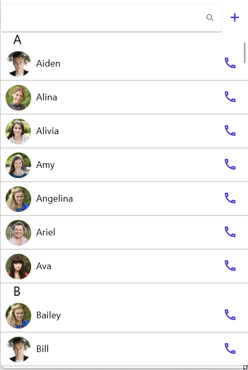
Create the UI to show the contact list using the .NET MAUI ListView. Install the necessary package to use the control in the application.
Note: For more details, refer to the .NET MAUI ListView documentation.
Binding data to the ListView
The BindingContext for the main page is set with a ViewModel to bind properties and commands to the ListView.
<ContentPage xmlns="http://schemas.microsoft.com/dotnet/2021/maui"
             xmlns:x="http://schemas.microsoft.com/winfx/2009/xaml"
             xmlns:syncfusion="clr-namespace:Syncfusion.Maui.ListView;assembly=Syncfusion.Maui.ListView"
             xmlns:local="clr-namespace:ListViewMAUI"
             x:Class="ListViewMAUI.MainPage">

    <ContentPage.BindingContext>
        <local:ViewModel/>
    </ContentPage.BindingContext>

</ContentPage>
To populate the ListView, bind the item collection from the BindingContext to the SfListView.ItemsSource property.
The code example below demonstrates how to bind the previously created collection to the SfListView.ItemsSource property:
<syncfusion:SfListView x:Name="listView"
                       ItemsSource="{Binding ContactsInfo}"/>
Defining the item template
To define the ItemTemplate for a ListView that displays contacts, you can create a custom template that includes controls like labels for displaying contact details and an image to show the contact’s image.
<syncfusion:SfListView x:Name="listView"
ItemsSource="{Binding ContactsInfo}">
<syncfusion:SfListView.ItemTemplate>
<DataTemplate>
<Grid x:Name="grid" RowSpacing="0" HeightRequest="50" BackgroundColor="White">
<Image Grid.Column="0" Source="{Binding ContactImage}"/>
<Label Grid.Column="1" Text="{Binding ContactName}" />
</Grid>
</DataTemplate>
</syncfusion:SfListView.ItemTemplate>
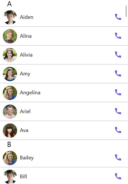
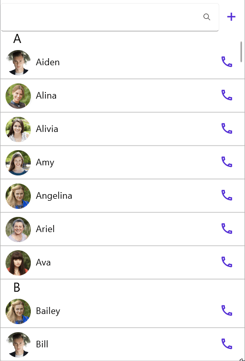
</syncfusion:SfListView>And the contacts will be grouped based on the ContactName property. The group header has been customized to show only the Key, names starting letter, just like the contacts app on mobile phones.
<syncfusion:SfListView.GroupHeaderTemplate>
    <DataTemplate>
        <StackLayout Orientation="Horizontal">
            <Label Text="{Binding Key}"
                   FontSize="20"
                   FontFamily="Roboto-Medium"
                   VerticalOptions="Center"
                   HorizontalOptions="Start"
                   WidthRequest="200"
                   Margin="20,0,0,0" />
        </StackLayout>
    </DataTemplate>
</syncfusion:SfListView.GroupHeaderTemplate>
By default, the key is the value of the property being grouped. For grouping names that start with the same letter, we use KeySelector for grouping.
public class SfListViewGroupingBehavior : Behavior<ContentPage>
{
    #region Fields

    private Syncfusion.Maui.ListView.SfListView ListView;

    #endregion

    #region Overrides
    protected override void OnAttachedTo(ContentPage bindable)
    {
        ListView = ListView = bindable.FindByName<Syncfusion.Maui.ListView.SfListView>("listView");
        ListView.DataSource.GroupDescriptors.Add(new GroupDescriptor()
        {
            PropertyName = "ContactName",
            KeySelector = (obj1) =>
            {
                var item = obj1 as ContactInfo;
                return (item is not null && (item.ContactName.Length > 0 ) ) ? item.ContactName[0].ToString() : "Empty";
            },
        });
        ListView.DataSource.SortDescriptors.Add(new SortDescriptor()
        {
            PropertyName = "ContactName",
        });
        base.OnAttachedTo(bindable);
    }
}
Behavior is added to the content page and accesses the ListView by the FindByName method. You can refer to the following code to assign the behavior class to the content page.
<ContentPage xmlns="http://schemas.microsoft.com/dotnet/2021/maui"
             xmlns:x="http://schemas.microsoft.com/winfx/2009/xaml"
             xmlns:local="clr-namespace:ListViewMAUI"
             x:Class="ListViewMAUI.MainPage">

    <ContentPage.Behaviors>
        <local:SfListViewGroupingBehavior/>
    </ContentPage.Behaviors>

</ContentPage>
You can get the following output when you run the above code snippet.
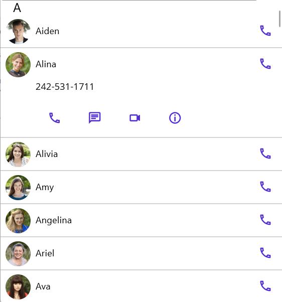
Each contact can be expanded to show contact options like UI with calling, messaging, video calling, and contact information. This is achieved using the tap command in the ViewModel.
public class ViewModel : INotifyPropertyChanged
{
    #region Fields

    private ContactInfo selectContact;
    private bool isReadOnly;

    #endregion

    #region Constructor

    public ViewModel()
    {
+
    }

    #endregion

    #region Properties

    public ContactInfo SelectedItem
    {
        get
        {
            return selectContact;
        }
        set
        {
            selectContact = value;
            OnPropertyChanged(nameof(SelectedItem));
        }
    }

    public bool IsVisible
    {
        get
        {
            return !IsReadOnly;
        }
    }

    public ObservableCollection<ContactOption> ContactOptions { get; set; }

    #endregion

    #region ItemSource

    public void GenerateSource(int count)
    {
        InitializeCommands();
        InitializeContactOptions();
    }

    #endregion

    #region  Commands
    public Command TapCommand { get; set; }

    private void InitializeCommands()
    {
        TapCommand = new Command(OnTapCommand);
    }

    private void InitializeContactOptions()
    {
        ContactOptions = new ObservableCollection<ContactOption>();
        ContactOptions.Add(new ContactOption() { ActionName = "Call", ActionIcon = "\ue763" });
        ContactOptions.Add(new ContactOption() { ActionName = "Message", ActionIcon = "\ue759" });
        ContactOptions.Add(new ContactOption() { ActionName = "Video", ActionIcon = "\ue76b" });
        ContactOptions.Add(new ContactOption() { ActionName = "Info", ActionIcon = "\ue719" });
    }

    private async void OnTapCommand(object eventArgs)
    {
        var tappedEventArgs = eventArgs as Syncfusion.Maui.ListView.ItemTappedEventArgs;
        if (tappedEventArgs != null)
        {
            SelectedItem = tappedEventArgs.DataItem as ContactInfo;
            if (SelectedItem == null)
                return;
            SelectedItem.IsExpanded = !SelectedItem.IsExpanded;

            if (!SelectedItem.IsExpanded)
                return;

            foreach(var contact in this.ContactsInfo)
                if(contact != SelectedItem)
                    contact.IsExpanded = !SelectedItem.IsExpanded;
        }
    }
}
Contact options are defined using the ChipGroup component. And it’s shown when you tap the list item using the IsVisible property. You can find the ChipGroup definition here:
<syncfusion:SfListView x:Name="listView" Grid.Row=" AutoFitMode="DynamicHeight" ItemsSource="{Binding ContactsInfo}">

    <syncfusion:SfListView.ItemTemplate>
        <DataTemplate>
            <Grid x:Name="grid" RowSpacing="0" HeightRequest="50"  BackgroundColor="White">
                <Grid Margin="56,0,0,0" IsVisible="{Binding IsExpanded, Mode=TwoWay}" >
                    <Label Text="{Binding ContactNumber}" FontSize="{OnPlatform Default=16,WinUI=14}" CharacterSpacing="0.5" VerticalOptions="Start"/>
                    <chip:SfChipGroup Grid.Row="1"
                                      ItemHeight="40"
                                      ChipCornerRadius="20"
                                      ChipBackground="Transparent"
                                      ChipStrokeThickness="0"
                                      ChipPadding="10"
                                      ChipClicked="SfChipGroup_ChipClicked"
                                      ItemsSource="{Binding Path=BindingContext.ContactOptions, Source={x:Reference listView}}">
                        <chip:SfChipGroup.ItemTemplate>
                            <DataTemplate>
                                <Label Text="{Binding ActionIcon}" VerticalOptions="Center" VerticalTextAlignment="Center" HorizontalTextAlignment="Center" HorizontalOptions="Center" WidthRequest="40" FontFamily="MauiSampleFontIcon" TextColor="{StaticResource Primary}" FontSize="Medium">
                                </Label>
                            </DataTemplate>
                        </chip:SfChipGroup.ItemTemplate>
                    </chip:SfChipGroup>
                </Grid>
            </Grid>
        </DataTemplate>
    </syncfusion:SfListView.ItemTemplate>
</syncfusion:SfListView>
You can get the following output when you tap the list view item.
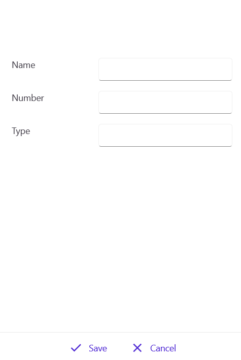
Display contact in DataForm
DataForm displays the contact using the DataObject bound with the ViewModel’s SelectedItem property. SelectedItem will be updated when you tap the contact list.
<dataForm:SfDataForm x:Name="contactForm"
                     DataObject="{Binding SelectedItem}"
                     Grid.Row="1"
                     IsReadOnly="{Binding IsReadOnly}"
                     CommitMode="Manual" />
The IsReadOnly property determines whether we are just showing the contact or trying to edit it. When you tap on the show information chip, DataForm will be in read-only mode.
private void SfChipGroup_ChipClicked(object sender, EventArgs e)
{
    var chip = (sender as SfChip);
    var label = chip.Children[0] as Label;
    var action = (label.BindingContext as ContactOption).ActionName;
    var viewModel = this.BindingContext as ViewModel;
    if (("Info").Equals(action))
    {
        viewModel.SelectedItem = (sender as SfChip).BindingContext as ContactInfo;
        viewModel.OnShowContactCommand();
    }
}
On the show contact command method, DataForm will be loaded with the same bindingcontext.
internal async void OnShowContactCommand()
{
    IsReadOnly = true;
    var editPage = new ContactPage();
    editPage.BindingContext = this;
    await App.Current.MainPage.Navigation.PushAsync(editPage);
}
You will get the following output when you run the above code snippet.
Adding and editing contacts with DataForm
We use the add icon to create a contact using the DataForm with the bound property SelectedItem from the ViewModel. A new contact is created using the CreatedContactCommand.
public class ViewModel : INotifyPropertyChanged
{
    #region Fields
    private ContactInfo selectContact;
    #endregion

    #region Properties

    public ContactInfo SelectedItem
    {
        get
        {
            return selectContact;
        }
        set
        {
            selectContact = value;
            OnPropertyChanged(nameof(SelectedItem));
        }
    }

    #endregion

    #region  Commands
    public Command CreateContactCommand { get; set; }

    private void InitializeCommands()
    {
        CreateContactCommand = new Command(OnCreateContact);
    }

    internal async void OnCreateContact()
    {
        SelectedItem = new ContactInfo();
        IsReadOnly = false;
        var editPage = new ContactPage();
        editPage.BindingContext = this;
        await App.Current.MainPage.Navigation.PushAsync(editPage);
    }
    #endregion
}
Adding contact
The add icon is defined using a label and a font icon. The ViewModel’s CreateContactCommand is assigned to label gestures, creates a new contact, and shows the fields in DataForm to add the values.
<Label Text=""
VerticalOptions="Center"
HorizontalOptions="Center"
FontFamily="MauiSampleFontIcon"
TextColor="{StaticResource Primary}"
Grid.Column="1"
FontSize="Medium" >
<Label.GestureRecognizers>
<TapGestureRecognizer Command="{Binding CreateContactCommand}"/>
</Label.GestureRecognizers>
</Label>You can see the following output when you click on the plus icon in the contact list page.
On this page, you can add the new contact to the list using the save button or discard the contact using the cancel button.
Editing contact
You can edit the contact when you tap its information. When you tap on each contact, you can see the contact options.
You can edit the contact by setting the IsReadOnly property to false. Edited values will be committed only on save since we defined CommitMode as manual for DataForm. The value will be committed using the Commit() method.
contactForm.Commit();Refer to the following image.

Deleting contact
The tapped contact can be deleted using the delete icon in the DataForm page. The contact will be deleted from the list.
These edit, save, cancel, and delete icons are defined using SfChipGroup. You can find the code snippets here:
<chip:SfChipGroup HorizontalOptions="Center"
                  IsVisible="{Binding IsVisible}"
                  ItemHeight="40"
                  ChipCornerRadius="20"
                  ChipBackground="Transparent"
                  ChipStrokeThickness="0"
                  ChipPadding="10"
                  ChipClicked="OnChipClicked"
                  ItemsSource="{Binding CommitOptions}">
    <chip:SfChipGroup.ItemTemplate>
        <DataTemplate>
            <HorizontalStackLayout>
                <Label Text="{Binding ActionIcon}" VerticalTextAlignment="Center" HorizontalTextAlignment="Center" WidthRequest="40" FontFamily="MauiSampleFontIcon" TextColor="{StaticResource Primary}" FontSize="Medium"/>
                <Label Text="{Binding ActionName}" VerticalTextAlignment="Center" HorizontalTextAlignment="Start"  TextColor="{StaticResource Primary}"  FontFamily="Roboto-Regular"   FontSize="{OnPlatform Default=16,WinUI=14}" Margin="0,0,5,0"/>
            </HorizontalStackLayout>
        </DataTemplate>
    </chip:SfChipGroup.ItemTemplate>
</chip:SfChipGroup>
Based on the chip clicked, the associated action will be performed.
private void OnChipClicked(object sender, EventArgs e)
{
    var viewmodel = this.BindingContext as ViewModel;
    var chip = (sender as SfChip);
    var layout = chip.Children[0] as HorizontalStackLayout;
    var action = (layout.BindingContext as ContactOption).ActionName;
    if (string.IsNullOrEmpty(action))
        return;

    switch(action)
    {
        case "Edit":
            viewmodel.OnEditContactCommand();
            break;
        case "Delete":
            viewmodel.OnDeleteContactCommand();
            break;
        case "Save":
            viewmodel.OnSaveContact();
            contactForm.Commit();
            break;
        case "Cancel":
            viewmodel.OnCancelContact();
            break;
    }
}
Add filtering
Creating a contact management app isn’t just about functionality; it’s about delivering a seamless and intuitive experience that makes managing contacts effortless and enjoyable. A well-thought-out user experience can significantly improve user satisfaction and engagement. Here’s how to enhance your contact management app.
Filtering is applied on the TextChanged event of the SearchTextBox.
public class SfListViewGroupingBehavior : Behavior<ContentPage>
{
    #region Fields

    private Syncfusion.Maui.ListView.SfListView ListView;
    private SearchBar searchBar = null;

    #endregion

    #region Overrides
    protected override void OnAttachedTo(ContentPage bindable)
    {
        ListView = ListView = bindable.FindByName<Syncfusion.Maui.ListView.SfListView>("listView");
        searchBar = bindable.FindByName<SearchBar>("searchBar");
        searchBar.TextChanged += SearchBar_TextChanged;

        base.OnAttachedTo(bindable);
    }

    protected override void OnDetachingFrom(ContentPage bindable)
    {
        ListView = null;
        searchBar = null;
        searchBar.TextChanged -= SearchBar_TextChanged;
        base.OnDetachingFrom(bindable);
    }

    private void SearchBar_TextChanged(object sender, TextChangedEventArgs e)
    {
        searchBar = (sender as SearchBar);
        if (ListView.DataSource != null)
        {
            ListView.DataSource.Filter = FilterContacts;
            ListView.DataSource.RefreshFilter();
        }
        ListView.RefreshView();
    }
    private bool FilterContacts(object obj)
    {
        if (searchBar == null || searchBar.Text == null)
            return true;

        var contactInfo = obj as ContactInfo;
        return (contactInfo.ContactName.ToLower().Contains(searchBar.Text.ToLower()) || (contactInfo.ContactNumber.ToString()).ToLower().Contains(searchBar.Text.ToLower()));
    }


    #endregion
}
The behavior class is added to the content page. You can find the code snippet here:
<ContentPage xmlns="http://schemas.microsoft.com/dotnet/2021/maui"
             xmlns:x="http://schemas.microsoft.com/winfx/2009/xaml"
             xmlns:syncfusion="clr-namespace:Syncfusion.Maui.ListView;assembly=Syncfusion.Maui.ListView"
             xmlns:chip="clr-namespace:Syncfusion.Maui.Core;assembly=Syncfusion.Maui.Core"
             xmlns:local="clr-namespace:ListViewMAUI"
             x:Class="ListViewMAUI.MainPage">

    <ContentPage.Behaviors>
        <local:SfListViewGroupingBehavior/>
    </ContentPage.Behaviors>
</ContentPage>
Refer to the following output.
GitHub reference
For more details, refer to the GitHub demo.

FAQs
Q1: How do I implement contact grouping by first letter in the ListView?
Use the KeySelector property in GroupDescriptor to group contacts by their first letter. Create a behavior class that adds a GroupDescriptor with PropertyName = “ContactName” and a KeySelector that returns item.ContactName[0].ToString(). This will automatically group contacts alphabetically, like a typical phone contacts app.
Q2: Can I edit contacts directly in the ListView, or need a separate page?
The app uses a separate page with a DataForm for editing contacts. When you tap a contact, it expands to show action options (Call, Message, Video, Info). Tapping “Info” navigates to a dedicated page with DataForm bound to the SelectedItem property, where you can view, edit, or delete the contact using the IsReadOnly property to control the mode.
Q3: How does the filtering feature work when searching for contacts?
Filtering is implemented using a SearchBar with a TextChanged event handler in a behavior class. The filter method checks if the contact name or phone number contains the search text (case-insensitive). The ListView’s DataSource.Filter property is set to this filter method, and RefreshFilter() is called to update the list and RefreshView() to display in real-time as you type.
Q4: What’s the difference between Manual and Auto commit modes in DataForm?
The app uses CommitMode=”Manual” for DataForm, which means changes aren’t automatically saved to the data source. You must explicitly call contactForm.Commit() when the user taps the Save button. This gives you control over when changes are applied and allows users to cancel edits without affecting the original data, providing a better user experience for contact management.
Conclusion
Building a contact management app using ListView and DataForm in .NET MAUI is efficient and customizable. With features like grouping, searching, editing, and dynamic data binding, you can deliver a seamless user experience. This approach simplifies UI development and ensures scalability and maintainability for real-world applications.
For existing Syncfusion® customers, the newest version of Essential Studio® is available from the license and downloads page. If you are not a customer, try our 30-day free trial to check out these new features.
If you need a new widget for the Flutter framework or new features in our existing widgets, you can contact us through our support forums, support portal, or feedback portal. As always, we are happy to assist you!


 No spam, just valuable updates.