
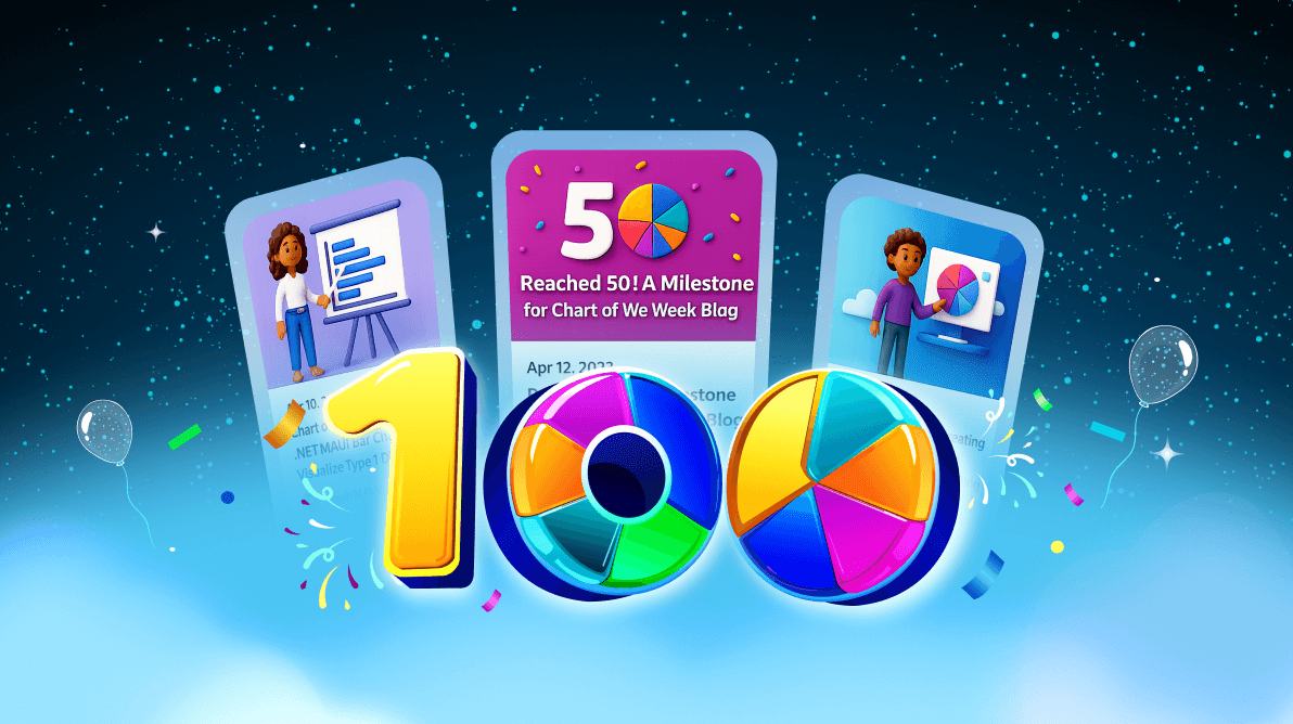
TL;DR: We’re celebrating 100 weeks of transforming complex data into engaging visuals! Our journey spans from .NET MAUI to Flutter, including AI-powered candle charts and real-time bar race animations. Discover how interactive dashboards, natural language chart generation, and captivating UI designs are advancing data visualization. Whether you’re a developer, designer, or data enthusiast, this milestone is for you.
A journey through 100 weeks of chart innovation and impact
What started as a single chart idea has transformed into a weekly source of inspiration for thousands of developers, analysts, and UI designers. As we celebrate the 100th edition of our Chart of the Week, we’re taking a moment to reflect on our mission: turning raw data into stunning, interactive, and intelligent visual experiences.
Over the past two years, we’ve showcased everything from stock trend visualizations powered by AI to cross-platform dashboards built with Flutter and .NET MAUI. Our goal? To empower you with tools that make your data not just readable, but powerful.
Join us as we highlight our top charting breakthroughs, preview the future of data visualization, and thank the community that made this milestone possible.
Milestone journey: 100 weeks of chart innovation
Take a quick scroll through the key highlights that have shaped our charting journey:
- The beginning: We started with a powerful .NET MAUI Column Chart for showing yearly box office data.
- Expanding platforms: We moved to the WPF Platform, enabling rich and immersive desktop experiences.
- Modernization: We introduced WinUI Charts to enhance the performance and appearance of modern Windows applications.
- Chart diversity: We added a variety of chart types, giving users greater flexibility in data representation.
- User-centered design : We focused on developing charts that solve real-world problems and meet evolving customer needs.
- Flutter support: We expanded to the Flutter Platform, offering broader cross-platform charting capabilities.
- Dashboard evolution: We launched interactive dashboard UIs allowing users to monitor, compare, and analyze multiple charts in a unified, real-time view.
- AI innovation: We embraced AI-Powered Charting to push the boundaries of intelligent data visualization.
- 100 Weeks of Innovation: We’re celebrating 100 weeks of turning raw data into engaging visual stories.
Spotlight charts: top 5 picks
Explore the top 5 standout blogs from our Chart of the Week series that have pushed the boundaries of data visualization. These selections showcase innovation, interactivity, and real-world relevance across diverse domains.
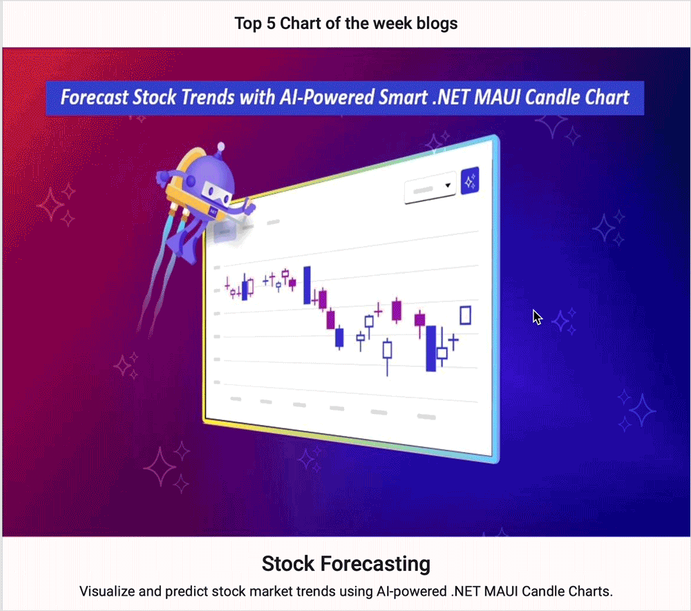
1. AI-powered candle chart
Forecast Stock Trends with AI-Powered Smart .NET MAUI Candle Chart
Ideal for financial analysts seeking to combine historical data with AI-driven predictions.
2. Interactive heat map
Create an Interactive Heat Map Using Flutter Charts
Perfect for visualizing complex datasets like user behavior or regional statistics.
3. 3D Column chart
Create a Flutter 3D Column Chart to Showcase the Top 6 Renewable Energy-Consuming Countries
Enhances comparative analysis with depth and interactivity.
4. Doughnut chart
Creating a Doughnut Chart for the World’s Top Coffee-Producing Countries.
Useful for highlighting proportional data in a visually appealing format.
5. Dynamic bar race chart
Creating a .NET MAUI Dynamic Bar Race Chart for the Top 10 Populations in the World
Engages viewers by illustrating data changes over time dynamically.
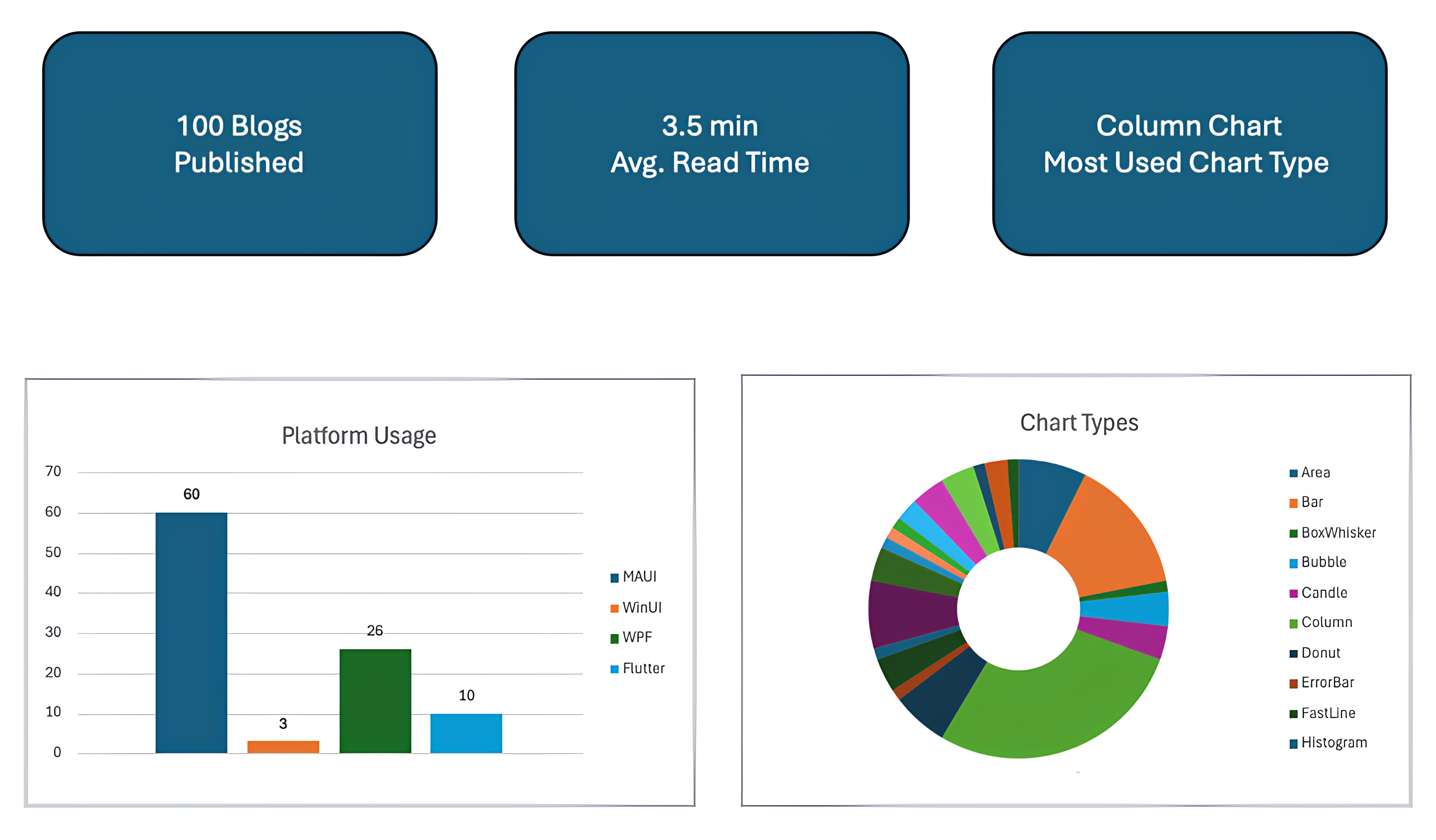
By the numbers, our chart blog analytics
AI-powered chart rendering: A glimpse into the future
As part of our ongoing innovation, we’ve integrated AI to revolutionize how you interact with data. Using natural language processing, our system enables you to generate charts simply by describing what you need. Imagine requesting an “investment portfolio allocation” or a “year-over-year profit margin area chart,” and instantly receiving a precise, interactive visualization.
Key features:
- User-friendly interaction: Describe the chart you need in plain language, and AI takes care of the rest.
- Instant visualization: Receive real-time, accurate charts based on your input.
- Enhanced decision-making: Gain insights quickly with clear, data driven visuals.
This AI integration marks a significant milestone in our journey, laying the groundwork for upcoming blogs that will delve deeply into AI-driven data analytics, empowering more effective and precise decision-making.
What’s next?
Beyond static visuals! The Chart of the Week is evolving into a hub of intelligent, interactive data experiences, unlocking new possibilities in visual analytics.
- AI-Powered Charts: Automatically detect trends, outliers, and predictions with smart charting features.
- Interactive dashboards: Build real-time, cross-platform dashboards that bring your data to life.
- Visually striking designs: Embrace modern aesthetics, from neumorphism to minimalism, to create charts that captivate and communicate effectively.
Stay updated with our chart of the week series
We hope you’ve enjoyed our journey through data visualization and feel inspired by the potential each chart offers. To stay informed about future posts, subscribe to our chart of the week series via our RSS feed. Stay connected and be among the first to discover new insights, techniques, and practical applications in data visualization, dashboards, and AI.
Conclusion
A heartfelt thank you to our amazing developer community, designers, and readers who’ve helped shape the Chart of the Week into what it is today. Your support and feedback have been the driving force behind every chart, dashboard, and innovation we’ve released.
Want to be part of the next 100? Subscribe to our RSS feed, explore samples on GitHub, and follow us for the next wave of charting innovation. Let’s continue transforming data into decisions, one chart at a time.
If you’re already a Syncfusion customer, download the latest Essential Studio® from the license and downloads page and explore these milestones first-hand. If not, start your 30-day free trial and see how we’re revolutionizing data visualization with AI and interactive UIs.
If you need assistance, please don’t hesitate to reach out via our support forum, support portal, or feedback portal. We are always eager to assist you!


 No spam, just valuable updates.