
 Anandh Ganesan
TL;DR: Many .NET MAUI lists falter under real-world demands. This comparison reveals how Syncfusion .NET MAUI ListView confidently manages grouping, gestures, infinite scroll, and large data, delivering smoother scrolling, fewer allocations, and less glue code than CollectionView.
When CollectionView hits its limits, here’s the ListView built for real apps
If you’ve built more than a demo app with .NET MAUI, you’ve probably hit this point:
“The list worked great—until we added more features.”
The .NET MAUI CollectionView is a solid starting point, but it starts to show strain as an app grows.
Add grouped data, sticky headers, swipe actions, drag‑and‑drop, or infinite scrolling, and CollectionView often turns into a web of event handlers, state management, and performance trade‑offs. The result is familiar: more code to maintain, tougher debugging, and a list of experiences that feel sluggish on real devices.
Syncfusion® .NET MAUI ListView takes a different approach.
Instead of making you piece together common list behaviors, it delivers them out of the box using built‑in properties, MVVM‑friendly commands, and a virtualization engine designed for large datasets. The payoff is immediate: cleaner code, smoother scrolling, and significantly lower memory usage.
This post compares both controls using the same real‑world scenario and shows where Syncfusion .NET MAUI ListView saves time, code, and memory.
How Syncfusion .NET MAUI ListView outshines Collection View
When comparing these two controls, the Syncfusion .NET MAUI ListView stands out with built‑in features that reduce extra code and deliver smoother performance:
- Grouping with sticky headers: Pins the current group header at the top while scrolling.
- Swipe actions: Reveals quick actions by swiping left or right on an item.
- Drag-and-drop reorder: Users can reorder items by dragging them.
- Incremental loading: Loads the page on demand for faster, lighter lists.
- Layout choices: Switches between list and grid presentations to fit the content.
- Item sizing and virtualization: Uses fixed or measured row heights to keep scrolling smooth.
Syncfusion .NET MAUI ListView vs .NET MAUI CollectionView: Real feature comparison
To keep this comparison honest, we are going to test both controls using the same MVVM book list, no shortcuts, no artificial demos. Each section answers the kinds of questions developers actually run into when building production apps:
- How much effort does sticky grouping really take?
- How quickly does swipe support get messy?
- What breaks when you add drag‑and‑drop reordering?
- And what happens to memory usage as the list grows?
Along the way, you’ll see where Syncfusion ListView handles these scenarios with built‑in properties and templates, and where Collection View requires extra event wiring, state tracking, and custom logic.
Instead of theory or feature checklists, this walkthrough shows real code, real UI behavior, and real performance numbers, so you can decide which control fits your feature needs and performance goals based on facts rather than assumptions.
1. Grouping with sticky headers
To see the difference clearly, let’s compare how each control handles this feature:
a) Syncfusion .NET MAUI ListView
Sticky headers are a built-in feature in Syncfusion .NET MAUI ListView. As you scroll, the current group title stays pinned at the top, so users always know where they are. A single setting enables it, and grouping by the first letter feels effortless.
Here’s the code you need:
<listView:SfListView x:Name="listView"
                      ItemsSource="{Binding BookInfo}"
                      IsStickyGroupHeader="True">

    <listView:SfListView.GroupHeaderTemplate>
        <DataTemplate>
            <Grid BackgroundColor="#F2F2F2" Padding="8,4">
                <Label Text="{Binding Key}" VerticalTextAlignment="Center" FontAttributes="Bold" />
            </Grid>
        </DataTemplate>
    </listView:SfListView.GroupHeaderTemplate>
</listView:SfListView>// Group items by the first character of BookName (uppercase).
listView.DataSource.GroupDescriptors.Add(new GroupDescriptor()
{
PropertyName = "BookName",
KeySelector = (object obj1) =>
{
var item = (obj1 as BookInfo);
return item.BookName[0].ToString();
}
});b) .NET MAUI CollectionView
You need to manage sticky headers manually. On every scroll, you recalculate which group is visible and update the header. It works but requires extra housekeeping.
Refer to the following code.
<Grid RowDefinitions="Auto,*">
    <Border BackgroundColor="#F2F2F2" Padding="8,4">
        <Label Text="{Binding CurrentGroupName}" FontAttributes="Bold"/>
    </Border>

    <CollectionView x:Name="List"
                    Grid.Row="1"
                    ItemsSource="{Binding BookGroups}"
                    IsGrouped="True"
                    SelectionMode="Multiple"
                    ItemSizingStrategy="MeasureFirstItem"
                    Scrolled="OnCollectionViewScrolled">
        <CollectionView.GroupHeaderTemplate>
            <DataTemplate>
                <Grid BackgroundColor="#f2f2f2" Padding="12">
                    <Label Text="{Binding Name}" FontAttributes="Bold" />
                </Grid>
            </DataTemplate>
        </CollectionView.GroupHeaderTemplate>
    </CollectionView>
</Grid>Loaded += OnLoaded;
private void OnLoaded(object sender, EventArgs e)
{
UpdateCurrentGroupHeader();
}
private void OnCollectionViewScrolled(object sender, ItemsViewScrolledEventArgs e)
{
UpdateCurrentGroupHeader(e.FirstVisibleItemIndex);
}
private void UpdateCurrentGroupHeader(int firstVisibleIndex = 0)
{
if (Vm == null || Vm.BookGroups == null || Vm.BookGroups.Count == 0)
return;
var index = firstVisibleIndex < 0 ? 0 : firstVisibleIndex;
// Map to group by flattening groups until we cover firstVisibleIndex
int cursor = 0;
foreach (var group in Vm.BookGroups)
{
int groupCount = group.Count;
if (index < cursor + groupCount)
{
Vm.CurrentGroupName = group.Name;
return;
}
cursor += groupCount;
}
// Fallback
Vm.CurrentGroupName = Vm.BookGroups[0].Name;
}2. Swipe actions
Both controls support swipe gestures, but the way they implement and simplify quick actions differs significantly:
a) Syncfusion .NET MAUI ListView
Swipe gestures reveal sleek, ready-to-use actions like Favorite and Delete. Templates keep the UI consistent, and commands bind directly to your ViewModel. The experience feels native across platforms.
Refer to the following code example.
<listView:SfListView x:Name="listView"
                      ItemsSource="{Binding BookInfo}"
                      AllowSwiping="True">

    <listView:SfListView.StartSwipeTemplate>
        <DataTemplate>
            <Grid BackgroundColor="#E8F5E9" Padding="12">
                <Button Text="Favourite"
                        FontSize="12"
                        Padding="10"
                        TextColor="White"
                        BackgroundColor="#2E7032"/>
            </Grid>
        </DataTemplate>
    </listView:SfListView.StartSwipeTemplate>

    <listView:SfListView.EndSwipeTemplate>
        <DataTemplate>
            <Grid BackgroundColor="#FFEBEE" Padding="12">
                <Button Text="Delete"
                        TextColor="White"
                        BackgroundColor="#C62828"
                        Command="{Binding BindingContext.DeleteCommand, Source={x:Reference listView}}"
                        CommandParameter="{Binding .}"/>
            </Grid>
        </DataTemplate>
    </listView:SfListView.EndSwipeTemplate>
</listView:SfListView>
b) .NET MAUI CollectionView
You wrap each item in a Swipe View and define left/right actions yourself. Flexible, but repetitive, more template code for the same result.
Here’s how to implement this feature:
<CollectionView ItemsSource="{Binding BookInfo}">
  <CollectionView.ItemTemplate>
    <DataTemplate>
      <SwipeView>
        <SwipeView.LeftItems>
          <SwipeItems Mode="Reveal">
            <SwipeItem Text="Fav" BackgroundColor="#FFE08A"
                       Command="{Binding FavoriteCommand}" CommandParameter="{Binding .}"/>
          </SwipeItems>
        </SwipeView.LeftItems>
        <SwipeView.RightItems>
          <SwipeItems Mode="Reveal">
            <SwipeItem Text="Delete" BackgroundColor="#FFCDD2"
                       Command="{Binding DeleteCommand}" CommandParameter="{Binding .}"/>
          </SwipeItems>
        </SwipeView.RightItems>
        <Grid Padding="12,8"><Label Text="{Binding BookName}"/></Grid>
      </SwipeView>
    </DataTemplate>
  </CollectionView.ItemTemplate>
</CollectionView>
3. Drag-and-drop reordering
This feature shows a clear difference in how each control handles item movement and user interaction:
a) Syncfusion .NET MAUI ListView
Reordering is built in. You can press, drag, and release; items move exactly where expected without juggling gestures or indexes, as shown in the code below.
<listView:SfListView x:Name="listView"
                      ItemsSource="{Binding BookInfo}"
                      DragStartMode="OnHold">
b) .NET MAUI CollectionView
You wire up drag/drop events, manage indices, and refresh grouping after reordering. Powerful, but more moving parts.
Here’s how you can do it in code:
<CollectionView x:Name="List"
                Grid.Row="1"
                ItemsSource="{Binding BookGroups}"
                IsGrouped="True"
                SelectionMode="Multiple"
                ItemSizingStrategy="MeasureFirstItem"
                Scrolled="OnCollectionViewScrolled">

    <CollectionView.ItemTemplate>
        <DataTemplate>
            <SwipeView>
                <Grid Padding="12" RowDefinitions="Auto,Auto" ColumnDefinitions="Auto,*" HeightRequest="70">
                    <Grid.GestureRecognizers>
                        <DropGestureRecognizer AllowDrop="True" DragOver="OnDragOver" Drop="OnDrop" />
                    </Grid.GestureRecognizers>

                    <!-- Drag handle icon -->
                    <Label Grid.RowSpan="2" Grid.Column="0" VerticalOptions="Center" Margin="0,0,8,0" Text="≡≡" FontSize="18" Opacity="0.6">
                        <Label.GestureRecognizers>
                            <DragGestureRecognizer CanDrag="True" DragStarting="OnDragStarting" DropCompleted="OnDropCompleted" />
                        </Label.GestureRecognizers>
                    </Label>

                    <Label Text="{Binding BookName}" Grid.Row="0" Grid.Column="1" FontAttributes="Bold" />
                    <Label Text="{Binding BookDescription}" Grid.Row="1" Grid.Column="1" Opacity="0.7" />
                </Grid>
            </SwipeView>
        </DataTemplate>
    </CollectionView.ItemTemplate>
</CollectionView>private void OnDragStarting(object sender, DragStartingEventArgs e)
{
if (sender is Element element && element.BindingContext is BookInfo item)
{
e.Data.Properties["item"] = item;
}
}
private void OnDrop(object sender, DropEventArgs e)
{
if (Vm == null) return;
if (!e.Data.Properties.TryGetValue("item", out var payload) || payload is not BookInfo source)
return;
if (sender is Element element && element.BindingContext is BookInfo target && !ReferenceEquals(source, target))
{
var list = Vm.BookInfo;
var sourceIndex = list.IndexOf(source);
var targetIndex = list.IndexOf(target);
if (sourceIndex >= 0 && targetIndex >= 0)
{
// Normalize target index when removing earlier item affects index
if (sourceIndex < targetIndex)
targetIndex--;
list.RemoveAt(sourceIndex);
list.Insert(targetIndex, source);
// Update stable order indices and rebuild grouping to reflect new order in the UI
Vm.ReindexOrders();
Vm.RefreshGroups();
}
}
}4. Incremental loading
Handling large datasets highlights how each control approaches infinite scrolling and data fetch efficiency:
a) Syncfusion .NET MAUI ListView
Infinite scrolling is simple. The control fetches more items as you near the end, with a built-in busy indicator. A single command controls when and how much to load.
Refer to the following code examples for feature implementation.
<listView:SfListView x:Name="listView"
                      ItemsSource="{Binding BookInfo}"
                      LoadMoreOption="Manual"
                      LoadMorePosition="End"
                      LoadMoreCommand="{Binding LoadMoreItemsCommand}"
LoadMoreCommandParameter="{Binding Source={x:Reference listView}}">public ICommand LoadMoreItemsCommand { get; }
LoadMoreItemsCommand =
new Command<object>(LoadMoreItems, CanLoadMoreItems);
private bool CanLoadMore() => BookInfo.Count < totalItems;
private bool CanLoadMoreItems(object obj) => CanLoadMore() && !IsLoading;
private async void LoadMoreItems(object obj)
{
if (!CanLoadMore() || IsLoading)
{
return;
}
else
{
listView.IsLazyLoading = true;
await Task.Delay(2000);
listView.IsLazyLoading = false;
}
AddBooks(currentIndex, PageSize);
currentIndex += PageSize;
}b) .NET MAUI CollectionView
You implement a “Load More” footer and spinner, track remaining items, and manage progress state. Clear and explicit, but heavier on logic.
Here’s the code you need for quick implementation:
<CollectionView x:Name="List"
                 ItemsSource="{Binding BookGroups}">

    <!-- Manual Load More footer to mirror List View's LoadMoreOption=Manual at End -->
    <CollectionView.Footer>
        <Grid Padding="12" BackgroundColor="Transparent" HorizontalOptions="Center" RowDefinitions="Auto,Auto" ColumnDefinitions="Auto,Auto">
            <Button Text="Load More"
                    Grid.Row="0" Grid.ColumnSpan="2"
                    HorizontalOptions="Center"
                    IsEnabled="{Binding HasMoreItems}"
                    Command="{Binding LoadMoreItemsCommand}"
                    CommandParameter="{Binding Source={x:Reference List}}" />
            <ActivityIndicator Grid.Row="1" Grid.ColumnSpan="2"
                               IsVisible="{Binding IsLoading}"
                               IsRunning="{Binding IsLoading}" />
        </Grid>
    </CollectionView.Footer>
</CollectionView>public ICommand LoadMoreItemsCommand { get; }
LoadMoreItemsCommand =
new Command<object>(LoadMoreItems, CanLoadMoreItems);
private bool CanLoadMore() => BookInfo.Count < totalItems;
private bool CanLoadMoreItems(object obj) => CanLoadMore() && !IsLoading;
private async void LoadMoreItems(object obj)
{
if (!CanLoadMore() || IsLoading)
{
return;
}
else
{
// CollectionView path uses the footer ActivityIndicator bound to IsLoading
IsLoading = true;
await Task.Delay(2000);
IsLoading = false;
}
AddBooks(currentIndex, PageSize);
currentIndex += PageSize;
RebuildGroups();
}5. Layout choices
Flexibility in presentation is another area where the two controls differ, especially when switching between list and grid views:
a) Syncfusion .NET MAUI ListView
Switch to a two-column grid with one setting, same control, same smooth virtualization.
Here’s the code you need:
<listView:SfListView.ItemsLayout>
    <listView:GridLayout SpanCount="2"/>
</listView:SfListView.ItemsLayout>
b) .NET MAUI CollectionView
Grid layouts are easy too, set the span and tweak spacing. Flexible, but needs more fine-tuning.
See the code snippet to achieve this:
<CollectionView.ItemsLayout>
    <GridItemsLayout Orientation="Vertical" Span="2"/>
</CollectionView.ItemsLayout>
6. Item sizing and virtualization
Efficient scrolling and memory use depend on how each control manages row heights and virtualization:
a) Syncfusion .NET MAUI ListView
Fixed row heights make long lists scroll effortlessly. Virtualization remains fast because sizes are known in advance, making it ideal for uniform feeds.
Code example for quick integration:
<listView:SfListView ItemsSource="{Binding BookInfo}" ItemSize="70">
  <listView:SfListView.ItemTemplate>
    <DataTemplate>
      <Grid HeightRequest="70" Padding="12,0" VerticalOptions="Center">
        <Label Text="{Binding BookName}" VerticalOptions="Center"/>
      </Grid>
    </DataTemplate>
  </listView:SfListView.ItemTemplate>
</listView:SfListView>
b) .NET MAUI CollectionView
Auto-measuring adapts well to mixed sizes but adds layout overhead as lists grow. Best for varied item heights when performance allows.
Here’s the complete code block:
<CollectionView ItemsSource="{Binding BookInfo}" ItemSizingStrategy="MeasureFirstItem">
  <CollectionView.ItemTemplate>
    <DataTemplate>
      <Grid HeightRequest="70" Padding="12,0" VerticalOptions="Center">
        <Label Text="{Binding BookName}" VerticalOptions="Center"/>
      </Grid>
    </DataTemplate>
  </CollectionView.ItemTemplate>
</CollectionView>
Watch these outputs to see how the above-mentioned features work in action:
Memory & performance: The silent differentiator
Features are easy to spot. Memory behavior isn’t, but users feel it.
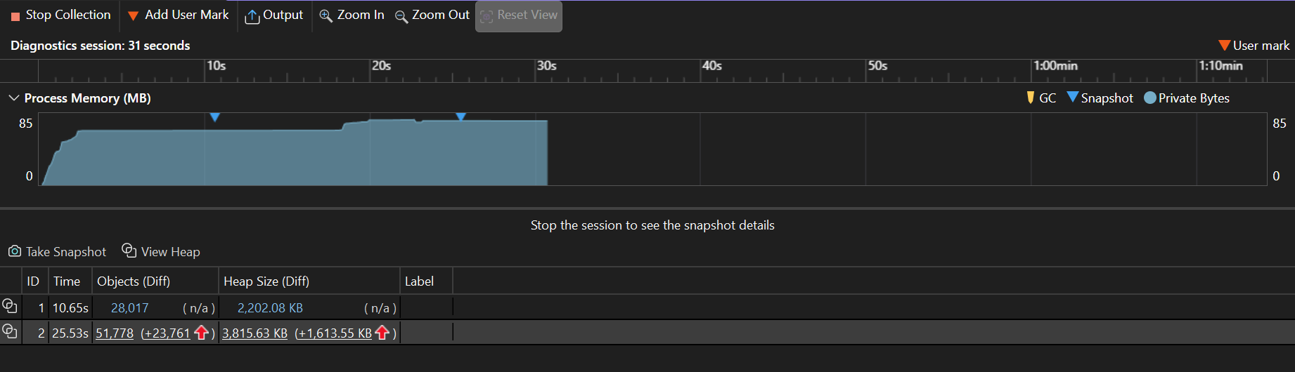
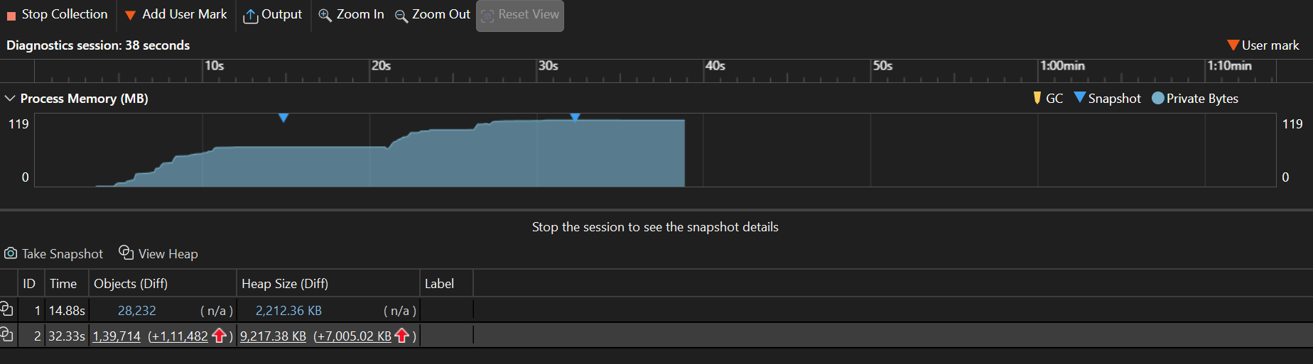
To understand efficiency beyond features, this section compares how each control consumes memory under identical conditions using Visual Studio Diagnostics.
- With 50 identical items and templates, Syncfusion .NET MAUI ListView reports peak process memory usage, allocation churn, and managed heap growth.
| Profiler metric | Syncfusion .NET MAUI ListView | .NET MAUI CollectionView |
| Peak process memory | 85 MB | 119 MB |
| Allocations between snapshots | +23,761 objects | +1,139,714 objects |
| Managed heap growth between snapshots | +1,613 KB | +7,005 KB |
| Initial snapshot heap delta after warm-up | 2,202 KB | 2,212 KB |
Refer to the following images.
Usage summary
- Peak memory: Syncfusion ListView uses ~34 MB less (~28% reduction).
- Allocation churn: Syncfusion ListView allocates ~98% fewer objects (23,761 vs 1,139,714).
- Managed heap growth while scrolling: Syncfusion ListView is ~77% lower (1,613 KB vs 7,005 KB).
- Warm-up retained heap: Similar for both (~2.2 MB).
Syncfusion .NET MAUI List View is significantly more memory-efficient, especially in allocation churn and heap growth.
Note: Values are approximate and may vary by environment. These values are recorded on Windows 11 Enterprise 24H2 (build 26100.7462), .NET 10 SDK (10.0.100), .NET MAUI 10.0.1, Visual Studio 2026; hardware: AMD Ryzen 5 7530U, 16 GB RAM.
For a quick reference, visit:
- Syncfusion .NET MAUI ListView class API.
- Working with ListView in .NET MAUI documentation.
GitHub reference
For more details, refer to how Syncfusion .NET MAUI ListView outshines .NET MAUI CollectionView GitHub demo.
Frequently Asked Questions
How do I implement incremental loading?
Implement incremental loading by using the LoadMoreOption and LoadMoreCommand methods in the Syncfusion .NET MAUI ListView. Display the built-in busy indicator while fetching items.
When should I use a fixed ItemSize?
Set ItemSize to a fixed value to achieve uniform row heights, reduce measurement costs, and improve scrolling performance with large datasets.
Can I switch between list and grid layouts without changing controls?
Yes. Present items in a grid by applying GridLayout with SpanCount in the same Syncfusion .NET MAUI ListView.
Is it hard to migrate from CollectionView to Syncfusion .NET MAUI ListView?
No. Move your ItemTemplate and bindings to the new ListView. Replace custom event wiring, such as swipe, drag, sticky headers, and load more, with the built-in properties and commands of the Syncfusion control. Preserve your MVVM structure.
Does Syncfusion .NET MAUI ListView support multiple selection?
Yes. Set SelectionMode to Multiple. Bind SelectedItems or SelectedItem as required.
How do I show an empty state when there is no data?
Use EmptyView or EmptyViewTemplate to show a placeholder when displaying an empty state.
Can I add headers and footers to the list?
Yes. Define HeaderTemplate and FooterTemplate for static or bound content as needed.

Collection View helps you start. Syncfusion .NET MAUI List View helps you scale.
Thank you for reading! In this post, we’ve compared .NET MAUI CollectionView with Syncfusion .NET MAUI ListView, focusing on how each handles real‑world needs. Through side‑by‑side examples, we’ve seen that CollectionView gets you started while ListView delivers the advanced features with built‑in properties, smooth virtualization, and MVVM‑friendly commands.
If your app depends on lists that are fast, interactive, and maintainable, Syncfusion .NET MAUI ListView helps you ship with confidence, saving time on wiring behaviors and letting you focus on the parts of your app that users notice most.
If you’re a Syncfusion user, you can download the latest setup from the license and downloads page. Otherwise, you can download a free 30-day trial.
You can contact us through our support forum, support portal, or feedback portal for queries. We are always happy to assist you!


 No spam, just valuable updates.