
 Leomaris Reyes
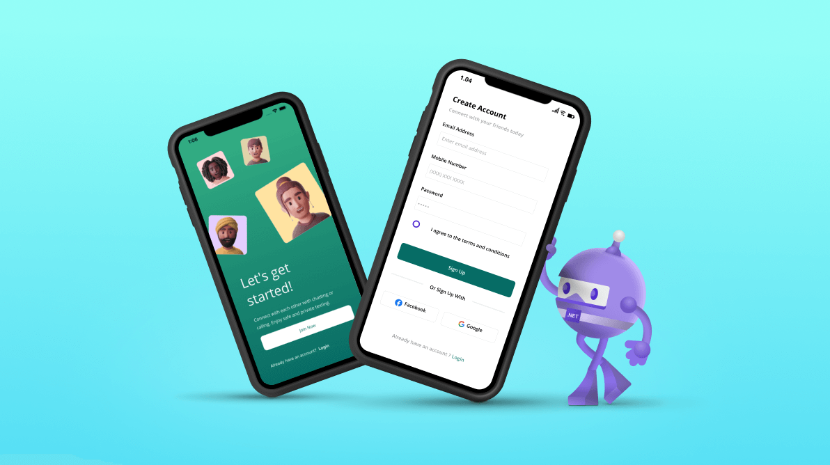
.NET MAUI is a cross-platform framework for building native desktop and mobile apps. One of the advantages it inherited from Xamarin.Forms is the possibility to create user interfaces with XAML. In this article, we will hone this skill by reproducing a sign-up UI based on Dribble.
Start by knowing the structure
To help you better understand XAML, this article is divided into steps, each representing a set of visual elements that make up the UI you need to replicate. By breaking it down this way, you can concentrate on each portion of the code and gain a simpler and faster comprehension of XAML.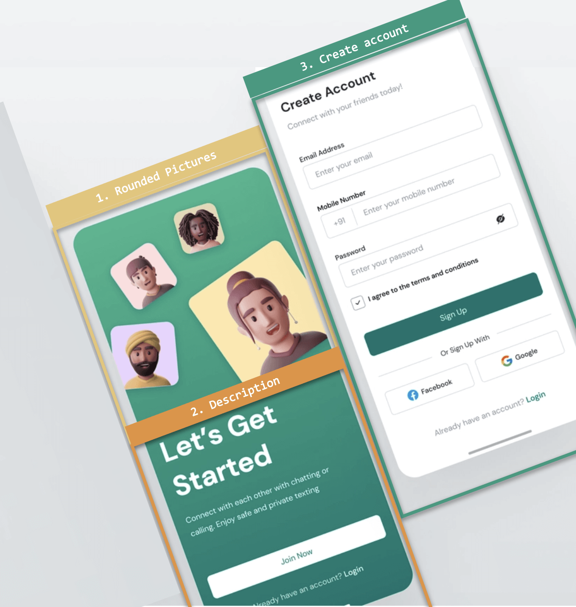
Throughout the development of each block, you will be able to see the results of each step as they are completed.
What specific skills will you be learning in XAML?
In addition to strengthening your XAML skills, you will learn to implement the following .NET MAUI features:
- Syncfusion’s .NET MAUI DataForm: The .NET MAUI DataForm control from Syncfusion can be implemented to display and edit any data object’s properties using a wide range of built-in editors for different data types.
- .NET MAUI’s Gradient: Gradients will be implemented with XAML in a .NET MAUI application to make the UI even more lovely.
- Borders: Add a border to visual elements.
Let’s start!
Create the JoinPage.xaml page. It’s important to start by adding the general implementation to the foundation for steps one and two. The following steps will guide you through this process.
A safe area on iOS
Disable the safe area on iOS, which allows you to extend your layout to the entire screen. You can click here if you want more information about secure areas.
xmlns:ios="clr-namespace:Microsoft.Maui.Controls.PlatformConfiguration.iOSSpecific;assembly=Microsoft.Maui.Controls"
        ios:Page.UseSafeArea="False"
Step 1: Rounded Pictures
Here, we are going to render the following UI elements:
- Main layout
- Predefined boundaries
- Round image edges
- Gradients
Main layout
A grid control will be used to design the main layout. Refer to the following code example for guidance.
<!-- Main layout -->
 <Grid RowDefinitions="Auto,Auto,Auto,*,*,*" Padding="45">
  <!-- Add the elements of steps 1 and 2 here -->
 </Grid>
Gradient
Add a gradient directly after the initial tag of the grid using the code provided below. Before proceeding, refer to the Getting Started with Gradients documentation to become familiar with the control. Then, follow these steps to implement it.
<!-- Adding the gradient-->
<Grid.Background>
 <LinearGradientBrush EndPoint="0,1">
  <GradientStop Color="#38b48d" Offset="0.1" />
  <GradientStop Color="#04766f" Offset="1.0" />
 </LinearGradientBrush>
</Grid.Background>

<!-- Here add all the code explained in the following code block -->
Creating and positioning images
Use the border feature to round the images and add a color background. To position the images, consider that the grid is defined as the main layout (that’s why it’s important to pay attention to how the rows are defined), and use the Rotation property. You will see the implementation of each one of these images below:
<!-- Rounded images-->
 <Border Grid.Row="0"
         BackgroundColor="#ffdddf"
         HorizontalOptions="Start"
         Rotation="-7"
         HeightRequest="100"
         WidthRequest="100"
         StrokeShape="RoundRectangle 10,10,10,10">
         <Image Source="marie"/>
 </Border>

<Border Grid.Row="0"
         BackgroundColor="#e5d8b3"
         HorizontalOptions="End"
         Rotation="10"
         Margin="0,-30,80,0"
         HeightRequest="90"
         WidthRequest="90"
         StrokeShape="RoundRectangle 10,10,10,10">
         <Image Source="peter"/>
 </Border>

 <Border Grid.Row="1"
         BackgroundColor="#e8d4ff"
         HorizontalOptions="Start"
         Rotation="20"
         Margin="-50,50,0,0"
         HeightRequest="130"
         WidthRequest="130"
         StrokeShape="RoundRectangle 10,10,10,10">
         <Image Source="jose"/>
 </Border>

 <Border Grid.Row="1"
         BackgroundColor="#ffe7ab"
         HorizontalOptions="End"
         Rotation="-12"
         Margin="0,40,-40,40"
         HeightRequest="200"
         WidthRequest="200"
         StrokeShape="RoundRectangle 10,10,10,10">
         <Image Source="lana"/>
 </Border>

<!-- Here add all the code explained in the following code block -->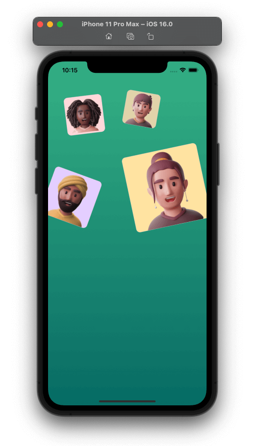
Step 2: Description
This section involves designing the UI to collect the following card information:
- Main title
- Description
- Join button
- Log-in description
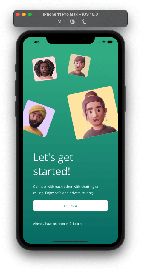
Main title
Refer to the following code example to add the title of the application.
<!-- Main title-->
 <Label Grid.Row="2" Text="Let's get started!"
        TextColor="White"
        FontAttributes="Bold"
        Margin="0,20"
        FontSize="45"/>

<!-- Here add all the code explained in the following code block -->
Description
Refer to the following code example to add the application’s description.
<!-- Description-->
 <Label Grid.Row="3" Text="Connect with each other with chatting or calling. Enjoy safe and private texting. "
        TextColor="White"
        LineHeight="1.3"
        FontSize="15"
        FontAttributes="Bold"/>

<!-- Here add all the code explained in the following code block -->
Join Button
Refer to the following code example to add the Join Button to the Application.
<!-- Join Button -->
 <Button Grid.Row="4" Text="Join Now" VerticalOptions="End" FontSize="14" HeightRequest="50" TextColor="#04766f" BackgroundColor="White" CornerRadius="10" Clicked="Button_Clicked"/>

<!-- Here add all the code explained in the following code block -->
Log-in description
Here, we will use FormatText to save resources and apply different styles to the same Label.
<!-- Login description-->
 <Label Grid.Row="5" TextColor="White" VerticalOptions="End">
  <Label.FormattedText>
   <FormattedString>
    <Span Text="Already have an account?  "/>
    <Span Text="Login" FontAttributes="Bold"/>
   </FormattedString>
  </Label.FormattedText>
 </Label>
We have finished the first page, implementing steps one and two defined in the visual structure. Now, let’s continue creating the last page.
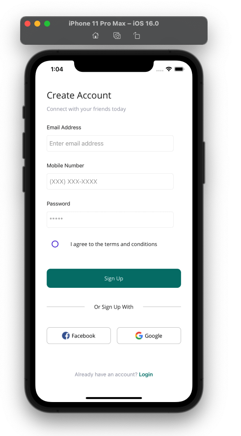
Step 3: Create an account
Let’s design the second page of our UI (i.e. the Create an Account page).
Here, we’ll design the UI with the following elements:
- Title and description
- Personal information form
- Model
- View model
- Sign-up button and text
- Facebook and Google buttons
- Account Registration
 Create the CreateAccount.xaml page. After creating it, add the main layout to use:
<!-- Main layout-->
 <Grid ColumnDefinitions="*,*" RowDefinitions="Auto,Auto,Auto,Auto,Auto,Auto,*,*" RowSpacing="10" Padding="30">
     <!-- Add the elements of step 3. -->
 </Grid>
In this step, we will learn how to use the Syncfusion DataForm control in addition to playing with the positioning of the controls in the Grid; let’s see:
Title and description
<!-- Title & description-->
 <Label Grid.Row="0" Grid.Column="0" Grid.ColumnSpan="2" Text="Create Account" FontSize="24"/>
 <Label Grid.Row="1" Grid.Column="0" Grid.ColumnSpan="2" Text="Connect with your friends today" TextColor="#9799a8"/>

<!-- Here add all the code explained in the following code block -->
Personal information form
As you can see, this personal information form needs different types of labels and entries.
One option is to declare them in the XAML one by one, but today I want to present a more scalable option to achieve this.
Use the Syncfusion DataForm control; this allows you to add all the fields that you will need in your XAML.
To implement this, please follow these steps:
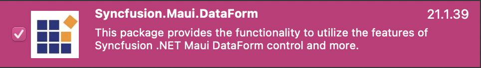
- Add the Syncfusion.Maui.DataForm NuGet package:
- Go to your MauiProgram.cs file and the CreateMauiApp method, and just before the line “.UseMauiApp<App>()”, add the .ConfigureSyncfusionCore() method.
Your class should look like the following:
public static MauiApp CreateMauiApp()
{
    var builder = MauiApp.CreateBuilder();
    builder
        .ConfigureSyncfusionCore()
        .UseMauiApp<App>()
        .ConfigureFonts(fonts =>
	{
	    fonts.AddFont("OpenSans-Regular.ttf", "OpenSansRegular");
	    fonts.AddFont("OpenSans-Semibold.ttf", "OpenSansSemibold");
	});
     #if DEBUG
	builder.Logging.AddDebug();
     #endif
	return builder.Build();
}
- Now, add the Syncfusion.Maui.DataForm namespace in the XAML page.
xmlns:dataForm="clr-namespace:Syncfusion.Maui.DataForm;assembly=Syncfusion.Maui.DataForm"
Create a model
Create a model with the attributes you want to display on the form.
Here, I’ll highlight three important properties that you’ll see in the code:
- Short name: This is the description you want to display in the label of the field in the form.
- Prompt: This is the equivalent of a placeholder of an entry in the form.
- DataType: This is the type of data your field will receive in the form.
public class UserInfo
{
    [Display(ShortName = "Email Address", Prompt ="Enter email address")]
    [DataType(DataType.EmailAddress)]
    public string EmailAddress { get; set; }

    [Display(ShortName = "Mobile Number", Prompt = "(XXX) XXX-XXXX")]
    [DataType(DataType.PhoneNumber)]
    public string MobileNumber { get; set; }

    [Display(ShortName = "Password", Prompt = "*****")]
    [DataType(DataType.Password)]
    public string Password { get; set; }
}
Create a View Model
Create a ViewModel to allow communication between the model and the XAML.
public class DataFormViewModel
{
    public UserInfo UserInfo { get; set; }
    public DataFormViewModel()
    {
        this.UserInfo = new UserInfo();
    }
}
Configuring the XAML page
You have to add XAML code as follows. Here I use LabelPosition with Top as a value to ensure that the label and the entry are displayed on the same line.
<!-- Personal information form-->
 <dataForm:SfDataForm Grid.Row="2" Grid.Column="0" Grid.ColumnSpan="2" Margin="-20,0,0,0" DataObject="{Binding UserInfo}">
  <dataForm:SfDataForm.DefaultLayoutSettings>
   <dataForm:DataFormDefaultLayoutSettings LabelPosition="Top"/>
  </dataForm:SfDataForm.DefaultLayoutSettings>
 </dataForm:SfDataForm>

<!-- Here add all the code explained in the following code block -->
Agreement conditions
<!-- Conditions-->
 <CheckBox Grid.Row="3" Grid.Column="0" HorizontalOptions="Start" HeightRequest="50" />
 <Label Grid.Row="3" Grid.Column="0" Grid.ColumnSpan="2" HorizontalTextAlignment="Center" VerticalTextAlignment="Center" Text="I agree to the terms and conditions"/>

<!-- Here add all the code explained in the following code block -->
Sign-Up button and text
<!—Sign-up button-->
 <Button Grid.Row="4" Grid.Column="0" Grid.ColumnSpan="2" Text="Sign Up" VerticalOptions="End" FontSize="14" HeightRequest="50" Margin="0,30" BackgroundColor="#04766f" TextColor="White" CornerRadius="10"/>
<!-- Separator * sign up text-->
 <BoxView Grid.Row="5" Grid.Column="0" Grid.ColumnSpan="2" HorizontalOptions="FillAndExpand" HeightRequest="1" Color="Silver"/>
 <Label Grid.Row="5" Grid.Column="0" Grid.ColumnSpan="2" BackgroundColor="White" Padding="25,0" HorizontalOptions="Center" Text="Or Sign Up With"/>

<!-- Here add all the code explained in the following code block -->
Facebook and Google buttons
<!-- Facebook and google buttons-->
 <Button Grid.Row="6" Grid.Column="0" HorizontalOptions="Fill" VerticalOptions="End" ImageSource="facebookicon" BackgroundColor="Transparent" Text="Facebook" BorderWidth="1" TextColor="Black" BorderColor="Silver" CornerRadius="8" Margin="0,0,8,0"/>
 <Button Grid.Row="6" Grid.Column="1" HorizontalOptions="Fill" VerticalOptions="End" ImageSource="googleicon" BackgroundColor="Transparent" Text="Google" BorderWidth="1" TextColor="Black" BorderColor="Silver" CornerRadius="8" Margin="8,0,0,0"/>

<!-- Here add all the code explained in the following code block. -->
Account registration
<!-- Account registration-->
 <Label Grid.Row="7" Grid.Column="0" Grid.ColumnSpan="2" VerticalOptions="End" HorizontalTextAlignment="Center">
  <Label.FormattedText>
   <FormattedString>
    <Span Text="Already have an account? " TextColor="#9799a8"/>
    <Span Text="Login" FontAttributes="Bold" TextColor="#04766f"/>
   </FormattedString>
  </Label.FormattedText>
 </Label>

<!-- Here add all the code explained in the following code block. -->
Our user interface is done; let’s see both screens finished.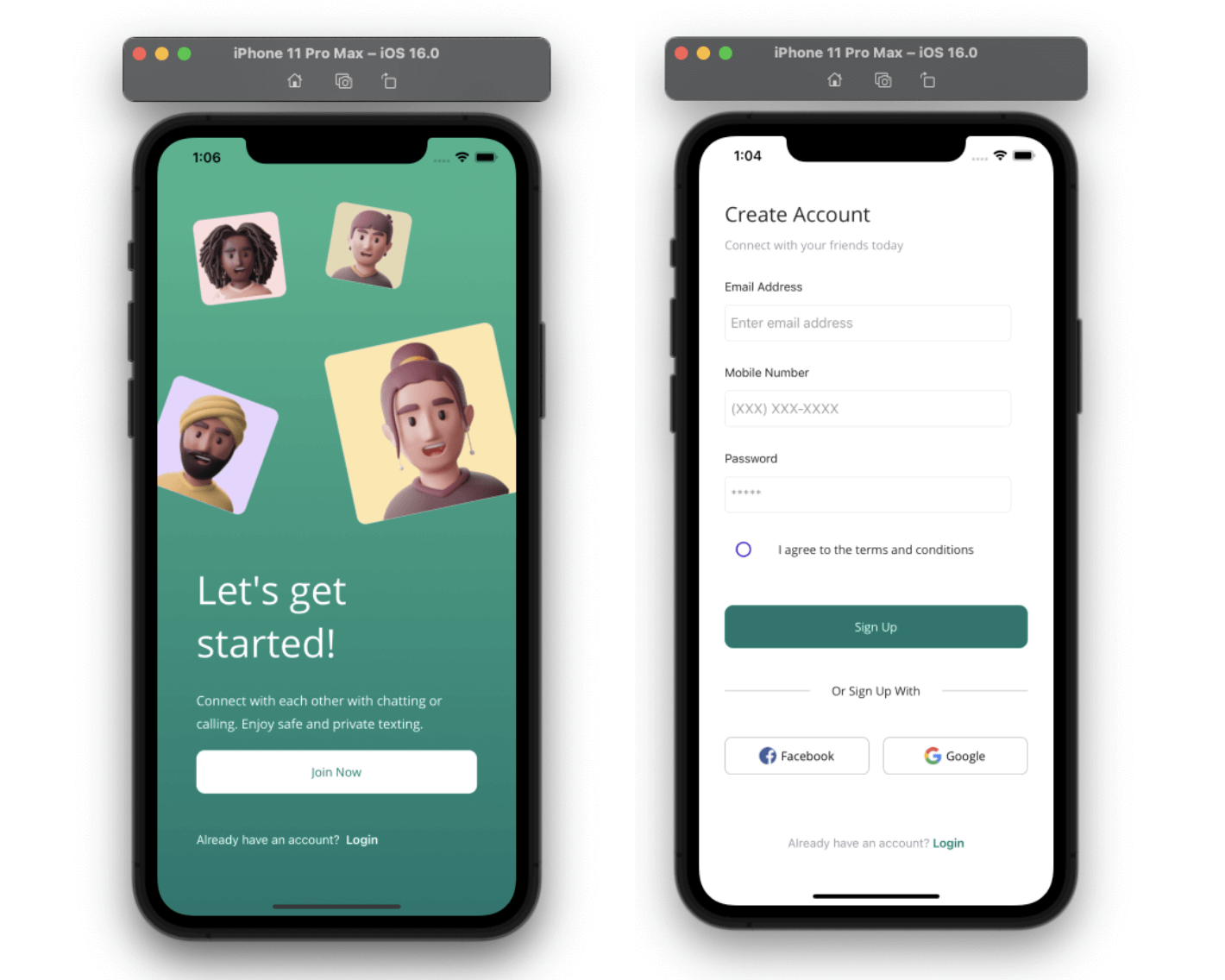
That’s all! We have finished our sign-up UI in .NET MAUI!
GitHub reference
To see the complete code structure of this project, go to our Sign-Up UI in the .NET MAUI demo on GitHub.
Conclusion
Thank you for taking the time to read this blog post! In this article, we expanded our knowledge of XAML by exploring how to recreate a sign-up UI in .NET MAUI with the assistance of Syncfusion .NET MAUI controls. We encourage you to follow the steps outlined in this post and share your feedback in the comments section below.
Syncfusion .NET MAUI controls were developed from the ground up using .NET MAUI, which results in controls that feel like native framework controls. These controls are designed to handle large amounts of data effectively, making them great for developing top-notch cross-platform mobile and desktop applications.
To learn more about the features available in our latest release, Essential Studio® 2023 Volume 1, please refer to our release notes and the What’s New pages. If you have any questions or require assistance, please don’t hesitate to contact us via our support forum, support portal, or feedback portal. We’re always ready to assist you!


 No spam, just valuable updates.