
 Jegan R
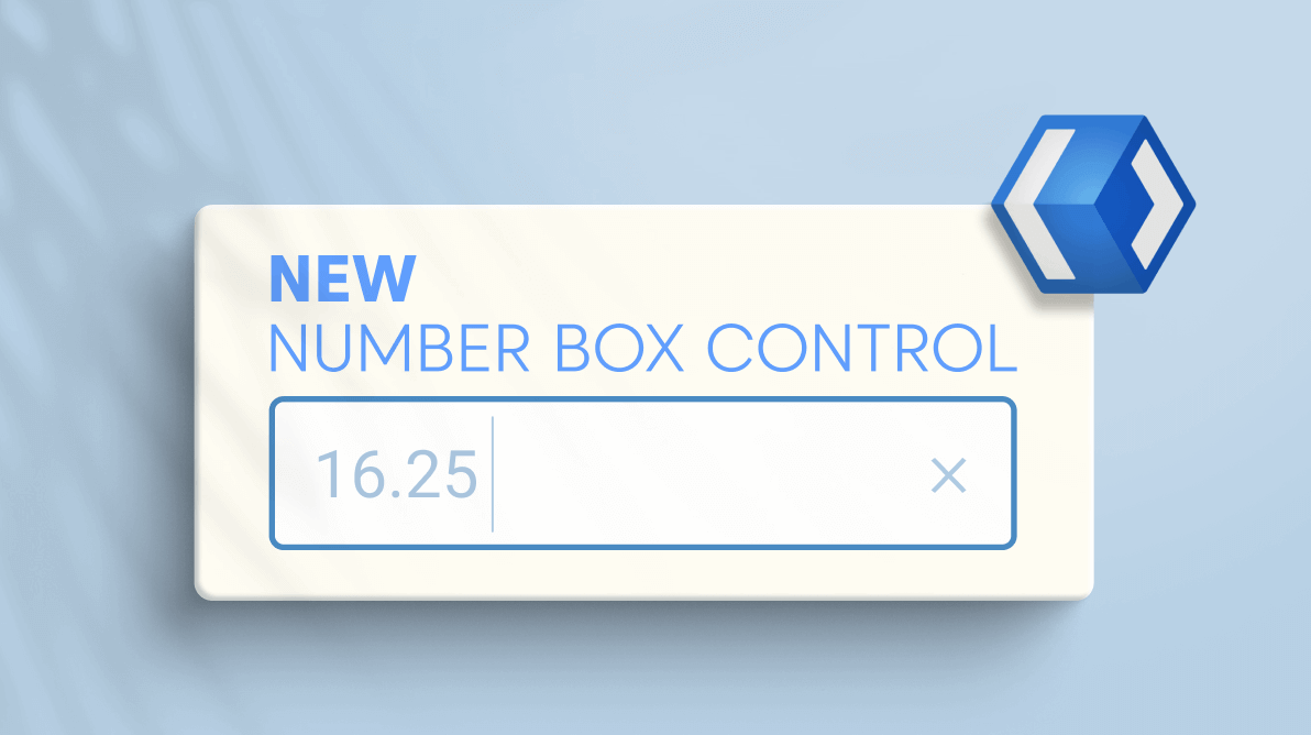
We are glad to roll out the new WinUI NumberBox control in our 2021 Volume 2 release. It allows us to display and edit numbers. It supports input validation, increment stepping, minimum and maximum range validation, themes, formatting, cultures, and much more. Also, you can customize this control to receive currency, percentage, and decimal input.
Let’s see some of its marvelous features with code examples!
Binding a value
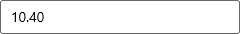
Let’s create a NumberBox and bind it to the properties in the ViewModel.
Follow these steps to add the NumberBox control manually to the XAML page:
- First, create a WinUI 3 desktop app for C# and .NET 5 or a WinUI 3 app in UWP for C#.
- Download and reference the Syncfusion.Editors.WinUI NuGet package in the project.
- Then, import the control’s namespace Syncfusion.UI.Xaml.Editors in the XAML page.
- Now, initialize the WinUI NumberBox control as shown in the following code example.
<Window
    x:Class="ExploringNumberBox.MainWindow"
    xmlns="http://schemas.microsoft.com/winfx/2006/xaml/presentation"
    xmlns:x="http://schemas.microsoft.com/winfx/2006/xaml"
    xmlns:local="using: ExploringNumberBox "
    xmlns:d="http://schemas.microsoft.com/expression/blend/2008"
    xmlns:mc="http://schemas.openxmlformats.org/markup-compatibility/2006"
    xmlns:editors="using:Syncfusion.UI.Xaml.Editors"
    mc:Ignorable="d">
    <Grid>
        <Grid.DataContext>
            <local:NumberBoxViewModel/>
        </Grid.DataContext>
        <editors:SfNumberBox
            Value="{Binding Price}"
            Name="numberBox"/>
    </Grid>
</Window>
//ViewModel.cs public class NumberBoxViewModel : NotificationObject { private double price = 10.4d; public double Price { get { return price;} set { price = value; this.RaisePropertyChanged(nameof(this.Price)); } } }
Editing the value in the NumberBox
By default, the WinUI NumberBox allows you to enter any kind of numerical input, but does not allow other inputs like alphabetic characters. Once the Enter key is pressed or control focus is lost, the value of the NumberBox control is validated and updated based on the format applied.
Note: Formatting will not be applied when the WinUI control is in editing mode.
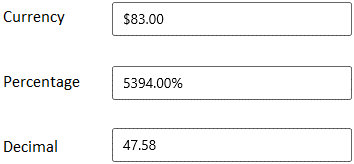
Currency, Percentage, and Decimal Formats
You can format the value in the WinUI NumberBox by using the NumberFormatter or CustomFormat properties. By default, both properties are set as null and the number is formatted as a decimal number based on the current application culture.
The following code example shows how to perform formatting using the NumberFormatter property.
// Format price as currency.
price.NumberFormatter = new CurrencyFormatter(CurrencyIdentifiers.USD);

// Format completion as percentage.
percentageOfCompletion.NumberFormatter = new PercentFormatter();

// Format number of pages as decimal.
numberOfPages.NumberFormatter = new DecimalFormatter();
The following code examples show how to perform formatting using the CustomFormat property.
Note: If you enable both NumberFormatter and CustomFormat, then the CustomFormat takes precedence.
// Format price as currency.
price.CustomFormat = "C";

// Format completion in percentage.
percentageOfCompletion.CustomFormat = "P";

// Format number of pages as decimal.
numberOfPages.CustomFormat = "N";
Note: To learn more about the available formatting in the WinUI NumberBox, please refer to the Currency, Percent, Decimal, Standard, and Custom Format properties.
Formatting integer digits
Let’s configure the WinUI NumberBox to display the minimum number of decimal digits using the NumberFormatter and CustomFormat properties.
Using NumberFormatter
Use the IntegerDigits property to set the minimum number of integer digits (digits that appear to the left of the decimal point).
For example: If you set the IntegerDigits property as 5 and the provided value is less than 5 decimal digits, then the NumberBox will automatically add 0s for the remaining digits in the leftmost position.
//To display the fixed minimum number of decimal digits using the NumberFormatter.

price.NumberFormatter = new CurrencyFormatter(CurrencyIdentifiers.USD) { IntegerDigits = 5 };
percentageOfCompletion.NumberFormatter = new PercentFormatter(){ IntegerDigits = 5 };
numberOfPages.NumberFormatter = new DecimalFormatter() { IntegerDigits = 5 };
Using CustomFormat
Use the 0-format specifier to set the minimum number of decimal digits in the CustomFormat property.
The 0 (Zero placeholders) replaces the zero with the corresponding digit if a digit exists there. Otherwise, a 0 will be appended in the leftmost position of the value.
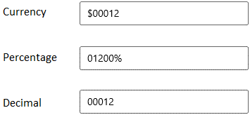
For example: If you set the CustomFormat property values as 00000 and the entered value is less than five decimal digits (eg.,12), then it will automatically add 0s for the remaining digits in the leftmost position.
Refer to the following code example.
//To display the fixed minimum number of decimal digits using CustomFormat.
price.CustomFormat = "$00000";
percentageOfCompletion.CustomFormat = "00000%";
numberOfPages.CustomFormat = "00000";
Example value = 12
Formatting fractional digits
Let’s configure the minimum and the maximum number of fractional digits to be displayed in the WinUI NumberBox control.
Using NumberFormatter
Use the FractionDigits and NumberRounder.Increment properties to set the minimum and the maximum number of fractional digits.
For example: If we set the FractionDigits property value as 2 and the NumberRounder.Increment value as 1/10000, then it will allow a maximum of 4 fractional digits and a minimum of 2 fractional digits.
Refer to the following examples:
- Example value 1.2: If the value’s fractional digits are less than the value in the FractionDigits property (2), then 0 will be inserted to the rightmost position for the remaining digits (output: 1.20).
- Example value 12.345678: If the value’s fractional digits exceed the value in the NumberRounder.Increment property (4), the remaining digits are immediately removed from the rightmost position (output: 12.3456).
Refer to the following code examples.
//To display the minimum and maximum number of fractional digits using the NumberFormatter.
price.NumberFormatter = new CurrencyFormatter(CurrencyIdentifiers.USD)
{
    FractionDigits=2,
    NumberRounder = new IncrementNumberRounder { Increment = 0.0001 }
};
percentageOfCompletion.NumberFormatter = new PercentFormatter()
{
    FractionDigits=2,
    NumberRounder = new IncrementNumberRounder { Increment = 0.0001 }
};
numberOfPages.NumberFormatter = new DecimalFormatter()
{
    FractionDigits=2,
    NumberRounder = new IncrementNumberRounder { Increment = 0.0001 }
};
Using CustomFormat
Use the 0 and # format specifiers to set the minimum and the maximum number of fractional digits in the CustomFormat property.
- 0 (Zero placeholders): Replaces the zero with the corresponding digit if the digits exist. Otherwise, zero appends at the leftmost position of the value.
- # (Digit placeholder): Replaces the # symbol with the corresponding digit if the digits exist. Otherwise, no digit appends the value.
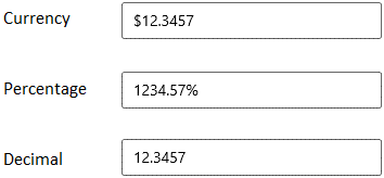
For example: If we set the CustomFormat property as #.00##, it will allow a maximum of 4 fractional digits and a minimum of 2 fractional digits.
Refer to the following examples:
- Example value = 1.2: If the value’s fractional digits are less than the number of 0s (2), then 0 will be inserted to the rightmost position for the remaining digits (output: 1.20).
- Example value = 12.345678: If the value’s fractional digits exceed the number of fractional digits (0s + #s, or 4 in this case), then the remaining digits are immediately removed from the rightmost position (output: 12.3456).
//To display the fixed minimum number of fractional digits using CustomFormat.
price.CustomFormat = "$#.00##";
percentageOfCompletion.CustomFormat = "#.00##%";
numberOfPages.CustomFormat = "#.00##";
Example value = 12.345678
Culture
The WinUI NumberBox automatically formats itself based on the current culture of the application.
Refer to the following code example.
//Applying "en-US" culture to the application.
CultureInfo ci = new CultureInfo("en-US");
Thread.CurrentThread.CurrentCulture = ci;
Thread.CurrentThread.CurrentUICulture = ci;

numberBox.CustomFormat = "C";
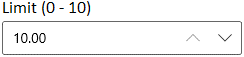
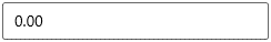
Restrict the value within a particular range
You can restrict user input to values within a minimum and maximum range using the Minimum and Maximum properties, respectively.
numberBox.Minumum = 0;
numberBox.Maximum = 10;
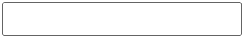
Watermark
You can show hints to help users enter the required value in the WinUI NumberBox by using the PlaceholderText property when the edit value is null or empty.
numberBox.PlaceholderText = "Enter decimal value";

Prevent an empty editor
The WinUI NumberBox control automatically adds zero (0) using the AllowNull property when you try to enter a null value or leave the editor empty. In this scenario, you can’t show the watermark text using the PlaceholderText property.
numberBox.AllowNull = false;
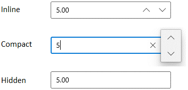
Up and down button
The up and down buttons in the WinUI NumberBox allow you to increase or decrease the value by a specific interval. You can display the up and down buttons using inline, compact, or completely hidden modes through the UpDownPlacementMode property. Use the SmallChange property to specify the increment and decrement intervals.
Refer to the following code example. Here, we have set the interval value as 5.
// The up and down button will be displayed in an expanded, horizontal orientation.
numberBox.UpDownPlacementMode = NumberBoxUpDownPlacementMode.Inline;
numberBox.SmallChange = 5;

// The up and down button will be displayed in a compact, vertical orientation.
numberBox.UpDownPlacementMode = NumberBoxUpDownPlacementMode.Compact;
numberBox.SmallChange = 5;

// The up and down button will be hidden.
numberBox.UpDownPlacementMode = NumberBoxUpDownPlacementMode.Hidden;
numberBox.SmallChange = 5;
Disable editing
You can disable the editing feature in the WinUI NumberBox by setting the IsEditable property as false. However, you can also change the value programmatically, using the up and down arrow keys or the mouse scroll wheel.
numberBox.IsEditable = false;
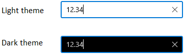
Theme
The WinUI NumberBox supports beautiful light and dark themes. Refer to the following code.
//Applying light theme to the NumberBox.
numberBox.RequestedTheme = Microsoft.UI.Xaml.ElementTheme.Light;

//Applying dark theme to the NumberBox.
numberBox.RequestedTheme = Microsoft.UI.Xaml.ElementTheme.Dark;
Conclusion
In this blog post, we have seen the features of the new WinUI NumberBox control that rolled out in the 2021 Volume 2 release. Details about this control are also available on our Release Notes and What’s New pages. Try this marvelous control and leave your feedback in the comments section of this blog post!
You can learn more about the WinUI NumberBox from its GitHub demos and user guide pages. Also, we encourage you to try our other WinUI samples from this GitHub location. You can download and install WinUI demos from the App Center.
For current Syncfusion customers, the newest version is available for download from the license and downloads page. If you are not yet a customer, you can try our 30-day free trial to check out these new features.
You can also contact us through support forums, feedback portal, or Direct-Trac support system. We are always happy to assist you!
 No spam, just valuable updates.