

TL;DR: Learn how to build a real-time patient health monitoring dashboard using Syncfusion® WinUI Charts to visualize vital signs such as heart rate, blood pressure, and oxygen saturation. Implement dynamic chart updates for continuous tracking, bind live medical data streams, and configure responsive chart types to support timely clinical decisions and enhance patient care outcomes.
Welcome to this week’s edition of the Chart of the Week series!
Introduction
Creating real-time dashboards for healthcare applications isn’t just technically demanding; it’s mission-critical. Developers face challenges in visualizing fast-changing medical data, ensuring UI responsiveness, and maintaining clarity under pressure. In this blog, you’ll learn how to build a real-time patient health monitoring dashboard using Syncfusion® WinUI Charts to track vital signs like heart rate, blood pressure, and oxygen saturation.
Patient health monitoring systems integrate a wide range of physiological data to provide a comprehensive view of a patient’s health status. By combining real-time data with historical trends, these systems support early diagnosis, personalized care, and improved patient engagement, ultimately enhancing the quality and efficiency of healthcare delivery.
Key reasons to use patient health monitoring
- Real-time monitoring: Continuously tracks vital signs like blood pressure, heart rate, oxygen saturation, and glucose levels, enabling immediate response to critical changes.
- Centralized health data: Consolidates patient information from various sources (wearables, EHRs, manual inputs) into a single, easy-to-navigate interface.
- Early detection of health issues: Visual alerts and trend analysis help identify abnormalities early, supporting timely diagnosis and intervention.
- Improved clinical decision-making: Provides healthcare professionals with accurate, up-to-date data to make informed treatment decisions.
Uses of patient health monitoring
- Continuous health surveillance: Tracks vital signs like heart rate, blood pressure, glucose levels, and oxygen saturation in real time, ensuring timely detection of abnormalities.
- Chronic disease management: Supports long-term monitoring of conditions such as diabetes, hypertension, and cardiovascular diseases, helping to adjust treatment plans as needed.
- Post-operative and remote monitoring: Allows healthcare providers to monitor patients after surgery or those in remote locations without requiring frequent hospital visits.
- Emergency alerts and notifications: Automatically generates alerts when critical thresholds are crossed, enabling rapid medical response.
Lets build a Patient Health Monitoring dashboard using Syncfusion® WinUI controls and the WinUI framework to effectively visualize key health metrics. This dashboard will enable healthcare providers to continuously observe, track, and analyze vital signs such as heart rate, blood pressure, oxygen saturation, glucose levels, and more. By integrating real-time data visualization and interactive components, the dashboard supports timely clinical decisions, enhances patient engagement, and promotes proactive health management.
Step 1: Configure the Syncfusion® WinUI controls
Before creating the patient health monitoring dashboard, install the Syncfusion.Chart.WinUI, Syncfusion.Editors.WinUI, Syncfusion.Gauge.WinUI and Syncfusion.Grid.WinUI by following the official WinUI Documentation and setting up the necessary dependencies.
Step 2: Define model
Create a data model to represent patient health information. Here’s a breakdown of its components:
- PatientInfo: Represents the list of patients and their demographic details. It includes properties such as PatientID, Name, Age, Gender, Height, and Weight, and is typically displayed in a data grid for quick reference.
- BloodVitalMetrics: Captures major vital metrics across the days of the week. It is used in line and bar charts to visualize trends in SystolicBP, DiastolicBP, OxygenSaturation, and Glucoselevel, helping monitor cardiovascular and metabolic health.
- MedicationAdherence: Represents medication intake compliance, typically visualized using a pie chart. Each entry includes a Name (e.g., “Taken”, “Missed”) and a Value indicating the percentage or count.
- StepCount: Used to track physical activity over a week. It includes Day, Actual steps taken, and Target steps, and is visualized using a column chart to compare daily performance.
- ECGPoint: Represents individual data points in an ECG waveform. Each point includes Time and Voltage and is used to plot real-time ECG signals for cardiac monitoring.
- HealthConditionInfo: Defines the clinical status of various health metrics. It includes Metrics, ConditionName, a computed Status value (used in gauges), and a GaugeColor that visually indicates the severity or normalcy of the condition (e.g., green for normal, red for critical).
C#
public class PatientInfo
{
    // Represents the Patient Info List
}

public class BloodVitalMetrics
{
    // Represents the Blood Vital Metrics
}

public class MedicationAdherence
{
    // Represents the Medication Adherence
}

public class StepCount
{
    // Represents the Step Count
}

public class ECGPoint
{
    // Represents the ECG Point
}

public class HealthConditionInfo
{
    // Represents the Patient Health Condition Info
}
Step 3: Define ViewModel
ViewModel implements INotifyPropertyChanged to enable dynamic UI updates in a WinUI-based patient health monitoring dashboard. It manages observable collections for ECG data, patient details, vital metrics, medication adherence, and step counts. It also holds individual health parameters like body temperature, cholesterol, heart rate, and respiratory rate. The HealthConditionInfos collection provides clinical status indicators with color-coded severity. Sample patient data is initialized through the GeneratePatientDetails() method for visualization.
XAML
public class ViewModel:INotifyPropertyChanged
{
    public ObservableCollection<ECGPoint> ECGData { get; set; } = new ObservableCollection<ECGPoint>();
    public ObservableCollection<PatientInfo> Patients { get; set; }
    public List<Brush> CustomPalettes { get; set; }
    private ObservableCollection<BloodVitalMetrics> bloodVitalMetrics = new();
    public ObservableCollection<BloodVitalMetrics> BloodVitalMetrics
    {
        get => bloodVitalMetrics;
        set
        {
            bloodVitalMetrics = value;
            OnPropertyChanged(nameof(BloodVitalMetrics));
        }
    }
    private ObservableCollection<MedicationAdherence> medication = new();
    public ObservableCollection<MedicationAdherence> Medications
    {
        get => medication;
        set
        {
            medication = value;
            OnPropertyChanged(nameof(Medications));
        }
     }
     private ObservableCollection<StepCount> stepCounts = new();
     public ObservableCollection<StepCount> StepCounts
    {
        get => stepCounts;
        set
        {
            stepCounts = value;
            OnPropertyChanged(nameof(StepCounts));
        }
    }
    private double bodyTemperature;
    public double BodyTemperature
    {
        get => bodyTemperature;
        set
        {
            bodyTemperature = value;
            OnPropertyChanged(nameof(BodyTemperature));
        }
    }
    private double bloodCholesterol;
    public double BloodCholesterol
    {
        get => bloodCholesterol;
        set
        {
            bloodCholesterol = value;
            OnPropertyChanged(nameof(BloodCholesterol));
        }
    }

    private double heartRate;
    public double HeartRate
    {
        get => heartRate;
        set
        {
            heartRate = value;
            OnPropertyChanged(nameof(HeartRate));
        }
    }
    private double respiratoryRate;
    public double RespiratoryRate
    {
        get => respiratoryRate;
        set
        {
            respiratoryRate = value;
            OnPropertyChanged(nameof(RespiratoryRate));
        }
    }
    private PatientInfo? _selectedPatient;
    public PatientInfo? SelectedPatient
    {
        get => _selectedPatient;
        set
        {
            if(value != null)
            {
                _selectedPatient = value;
                OnPropertyChanged(nameof(SelectedPatient));
                DynamicUpdateData(SelectedPatient!);
                SelectionChangedData(SelectedPatient!);
            }
        }
    }
    private ObservableCollection<HealthConditionInfo> healthConditionInfos = new();
    public ObservableCollection<HealthConditionInfo> HealthConditionInfos
    {
        get => healthConditionInfos;
        set
        {
            healthConditionInfos = value;
            OnPropertyChanged(nameof(HealthConditionInfos));
        }
    }
    …….
    public ViewModel()
    {
        random = new Random();
        Patients = GeneratePatientDetails();
        SelectedPatient = Patients[2];
……
    }
    public event PropertyChangedEventHandler? PropertyChanged;
    protected void OnPropertyChanged([CallerMemberName] string? propertyName = null)
    {
        PropertyChanged?.Invoke(this, new PropertyChangedEventArgs(propertyName));
    }

………

}
Step 4: Define title
This XAML code creates a horizontal header with a patient monitor icon and the title Patient Health Monitoring. The image and text are aligned side by side using a StackPanel. It provides a clean and visually appealing introduction to the dashboard.
XAML
<StackPanel Orientation="Horizontal">
    <Image Source="/Assets/patient_monitor.png" Width="50" Height="50"/>
    <TextBlock Text="Patient Health Monitoring”/>
</StackPanel>
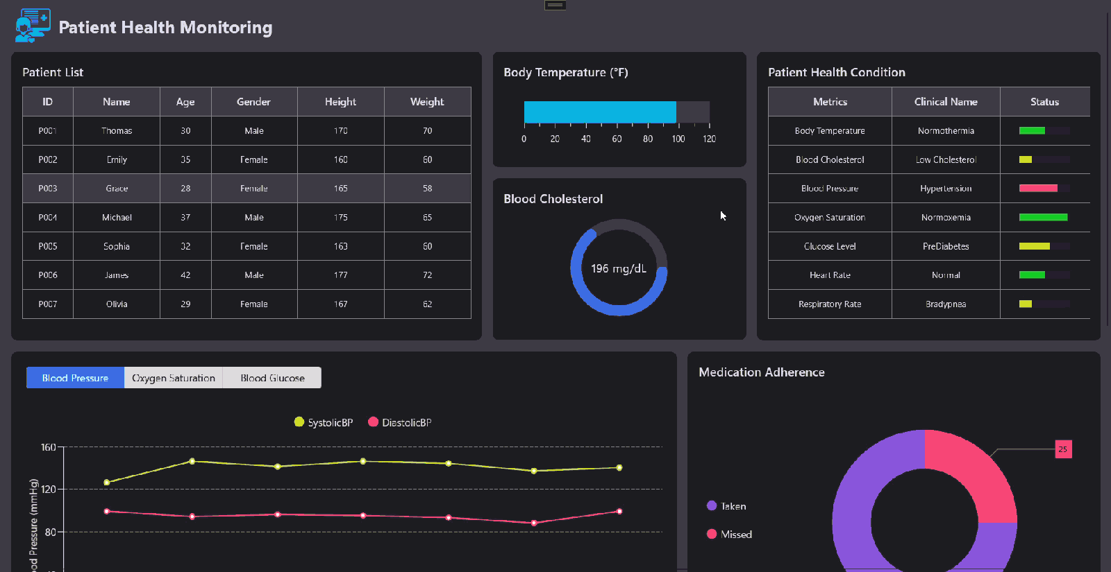
Refer to the following image.

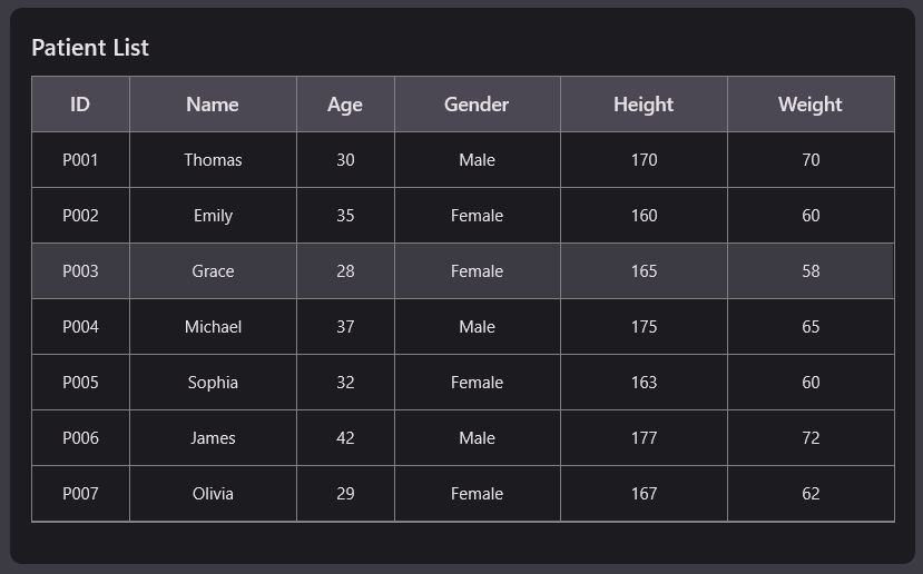
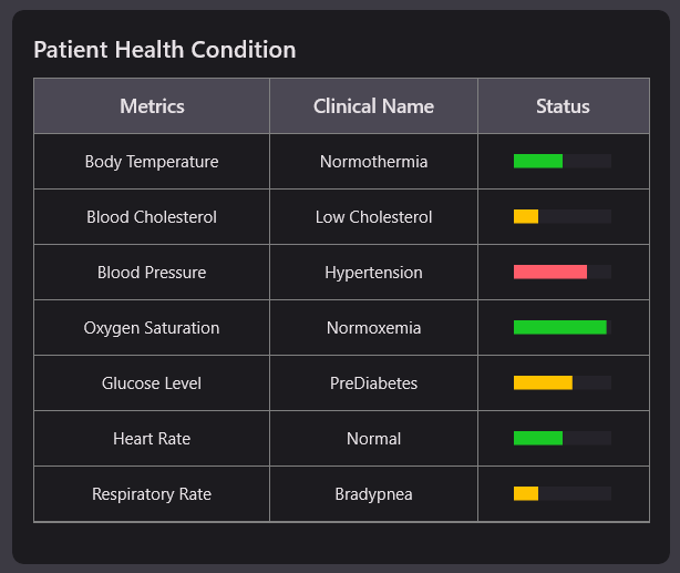
Step 5: Configure the DataGrid
Let’s configure the Syncfusion® WinUI DataGrid control using the provided documentation.
This WinUI XAML code defines two bordered sections for displaying patient data in a health monitoring dashboard. It uses SfDataGrid controls to present structured patient information and health conditions with visual indicators.
- Patient List DataGrid: Displays patient information such as ID, name, age, gender, height, and weight. The grid is styled with custom headers, row spacing, and hover effects for better readability.
- Patient Health Condition DataGrid: Shows health metrics with clinical condition names and visual status indicators. A SfLinearGauge is embedded in a column to represent each condition’s severity using color-coded bars.
XAML
<StackPanel Orientation="Horizontal">
    <Border>
        <StackPanel Orientation="Vertical">
            <TextBlock Text="Patient List"/>
            <dataGrid:SfDataGrid AutoGenerateColumns="False" ItemsSource="{Binding Patients}" SelectedItem="{Binding SelectedPatient, Mode=TwoWay}" AllowSorting="False" AllowRowHoverHighlighting="True">
                <dataGrid:SfDataGrid.Columns>
                    <dataGrid:GridTextColumn MappingName="PatientID" HeaderText="ID" TextAlignment="Center" Width="70"/>
                ………
                </dataGrid:SfDataGrid.Columns>
            </dataGrid:SfDataGrid>
        </StackPanel>
    </Border>
    <Border>
        <StackPanel Orientation="Vertical">
        <TextBlock Text="Patient Health Condition"/>
        <dataGrid:SfDataGrid AutoGenerateColumns="False" ItemsSource="{Binding HealthConditionInfos}" SelectedItem="{Binding SelectedPatient, Mode=TwoWay}" AllowSorting="False">
            <dataGrid:SfDataGrid.Columns>
                <dataGrid:GridTextColumn MappingName="Metrics" HeaderText="Metrics" TextAlignment="Center" Width="170"/>
                ………
            </dataGrid:SfDataGrid.Columns>
        </dataGrid:SfDataGrid>
    </StackPanel>
 </Border>
</StackPanel>
Refer to the following image.
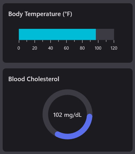
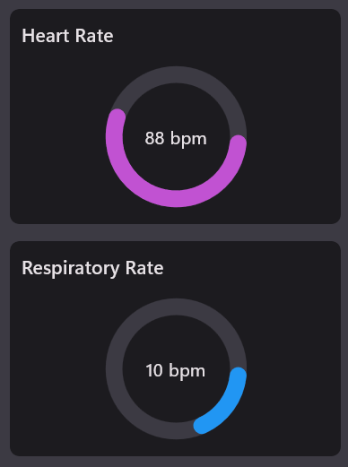
Step 6: Configure the gauges
Let’s configure the Syncfusion® WinUI Gauges control using the provided Linear gauges and Radial gauges documentation.
This XAML layout displays four key patient vitals using Syncfusion gauges in a clean, vertical and horizontal arrangement. Each gauge is data-bound to a ViewModel property for real-time visualization of health metrics.
- Body temperature (Linear Gauge): Displays the patient’s body temperature using a horizontal SfLinearGauge. The gauge has a maximum value of 120°F and uses a BarPointer to indicate the current temperature.
- Blood cholesterol (Radial Gauge): Uses a SfRadialGauge to show cholesterol levels with a maximum of 300 mg/dL. A RangePointer indicates the value, and a GaugeAnnotation displays the exact reading with units.
- Heart rate (Radial Gauge): Visualizes heart rate in bpm using a radial gauge with a 150 bpm maximum. The current value is shown with a RangePointer and annotated text for clarity.
- Respiratory rate (Radial Gauge): Represents respiratory rate with a radial gauge capped at 50 bpm. The gauge includes a pointer and annotation to display the real-time breathing rate.
XAML
<StackPanel Orientation="Horizontal">
     <StackPanel Orientation="Vertical">
         <Border>
             <StackPanel Orientation="Vertical">
                 <TextBlock Text="Body Temperature (°F)"/>
                 <gauge:SfLinearGauge Width="270">
                     <gauge:SfLinearGauge.Axis>
                         <gauge:LinearAxis Maximum="120">
                             <gauge:LinearAxis.BarPointers>
                                 <gauge:BarPointer Value="{Binding BodyTemperature}" PointerSize="30" />
                             </gauge:LinearAxis.BarPointers>
                         </gauge:LinearAxis>
                     </gauge:SfLinearGauge.Axis>
                 </gauge:SfLinearGauge>
             </StackPanel>
         </Border>
         <Border>
             <StackPanel Orientation="Vertical">
                 <TextBlock Text="Blood Cholesterol"/>
                 <gauge:SfRadialGauge >
                             ……………..
                 </gauge:SfRadialGauge>
             </StackPanel>
         </Border>
     </StackPanel>
 </StackPanel>
 <StackPanel Grid.Row="2" Orientation="Horizontal">
    <StackPanel Orientation="Vertical">
        <Border>
            <StackPanel Orientation="Vertical">
                <TextBlock Text="Heart Rate"/>
                <gauge:SfRadialGauge>
                …………………….
                </gauge:SfRadialGauge>
            </StackPanel>
        </Border>
        <Border>
            <StackPanel Orientation="Vertical">
                <TextBlock Text="Respiratory Rate"/>
                <gauge:SfRadialGauge>
                ………………….
                </gauge:SfRadialGauge>
            </StackPanel>
        </Border>
    </StackPanel>
</StackPanel>
Refer to the following image.
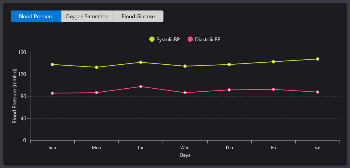
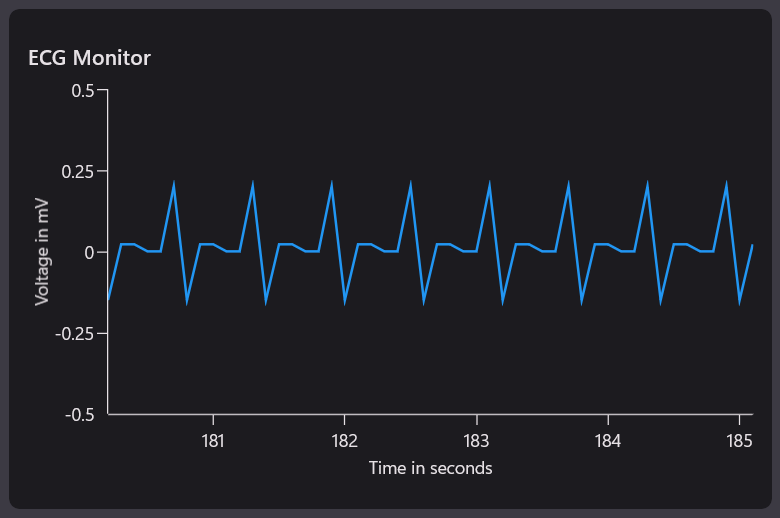
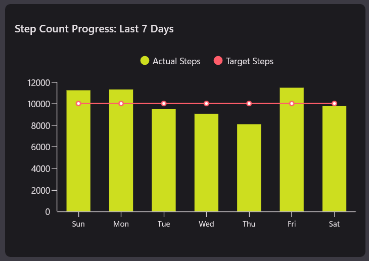
Step 7: Configure the Cartesian Chart
Let’s configure the Syncfusion® WinUI Chart control using the provided documentation.
This XAML layout presents three interactive charts using SfCartesianChart to visualize patient health data. It includes vital metrics, ECG monitoring, and step count tracking, all bound to real-time ViewModel properties.
1. Vital Metrics Chart:
Displays blood pressure, oxygen saturation, and glucose levels across weekdays.
A Syncfusion® SegmentedControl allows switching between metrics, dynamically updating the chart view.
- LineSeries (SystolicBP & DiastolicBP): Plots systolic and diastolic blood pressure trends over the week.
- StepLineSeries (Oxygen Saturation): Displays oxygen saturation levels with step-wise transitions for clarity.
- ColumnSeries (Glucose Level): Shows daily glucose levels using vertical bars for easy comparison.
2. ECG monitor chart:
Plots ECG waveform data using a FastLineSeries for smooth, high-speed rendering.
It visualizes voltage over time to monitor cardiac activity in real time.
3. Step count progress chart:
Compares actual and target steps count over the past 7 days. Uses column and line series with tooltips and legends for clear activity tracking.
XAML
<StackPanel Grid.Row="1" Orientation="Horizontal">
    <Border>
        <StackPanel Orientation="Vertical">
            <editors:SfSegmentedControlSelectedIndex="0" SelectionChanged="segmentedControl_SelectionChanged">
                <x:String>Blood Pressure</x:String>
                <x:String>Oxygen Saturation</x:String>
                <x:String>Blood Glucose</x:String>
            </editors:SfSegmentedControl>
            <! —Represents the Major Vital Metrics chart-- >
            <chart:SfCartesianChart>
                <chart:SfCartesianChart.XAxes>
                    <chart:CategoryAxis Header="Days"/>
                </chart:SfCartesianChart.XAxes>
                <chart:SfCartesianChart.YAxes>
                    <chart:NumericalAxis Header="{Binding AxisTitle}"/>
                </chart:SfCartesianChart.YAxes>
                <chart:SfCartesianChart.Legend>
                    <chart:ChartLegend ItemTemplate="{StaticResource labelTemplate}"/>
                </chart:SfCartesianChart.Legend>
                <chart:SfCartesianChart.TooltipBehavior>
                    <chart:ChartTooltipBehavior/>
                </chart:SfCartesianChart.TooltipBehavior>
                <chart:LineSeries ItemsSource="{Binding BloodVitalMetrics}" XBindingPath="Day" YBindingPath="SystolicBP" EnableTooltip="True"/>
                <chart:LineSeries ItemsSource="{Binding BloodVitalMetrics}" XBindingPath="Day" EnableTooltip="True" YBindingPath="DiastolicBP"/>
                <chart:StepLineSeries ItemsSource="{Binding BloodVitalMetrics}" XBindingPath="Day" YBindingPath="OxygenSaturation" EnableTooltip="True"/>
                <chart:ColumnSeries ItemsSource="{Binding BloodVitalMetrics}" XBindingPath="Day" YBindingPath="Glucoselevel" EnableTooltip="True"/>
            </chart:SfCartesianChart>
        </StackPanel>
    </Border>
</StackPanel>
<StackPanel Grid.Row="2" Orientation="Horizontal">
    <Border>
        <!—Represents the ECG chart-- >
        <chart:SfCartesianChart>
            ………
        </chart:SfCartesianChart>
    </Border>
    <Border>
        <!—Represents the Step Count chart-- >
        <chart:SfCartesianChart>
        ………………..
        </chart:SfCartesianChart>
    </Border>
</StackPanel>
Refer to the following image.
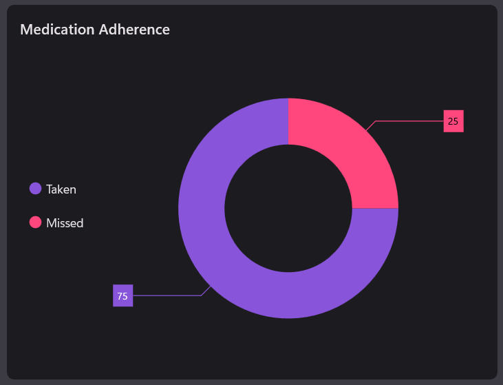
Step 8: Configure the circular chart
Let’s configure the Syncfusion® WinUI Chart control using the provided documentation.
This XAML code creates a circular chart to visualize medication adherence using a doughnut series. It displays categories like Taken and Missed with data labels and a legend for clarity.
The chart includes a header titled Medication Adherence and binds to a data source for dynamic updates. Each segment is labeled and color-coded to represent adherence levels effectively.
XAML
<StackPanel Grid.Row="1" Orientation="Horizontal">
    <Border>
        <chart:SfCircularChart>
            <chart:SfCircularChart.Header>
                <TextBlock Text="Medication Adherence"/>
            </chart:SfCircularChart.Header>
            <chart:SfCircularChart.Legend>
                <chart:ChartLegend temTemplate="{StaticResource labelTemplate}"/>
            </chart:SfCircularChart.Legend>
            <chart:DoughnutSeries ItemsSource="{Binding Medications}"
XBindingPath="Name"  ShowDataLabels="True" YBindingPath="Value"/>
        </chart:SfCircularChart>
    </Border>
</StackPanel>
Refer to the following image.
Step 9: Dynamic data updates
This ViewModel code dynamically updates patient health data in a WinUI dashboard based on the selected patient. It calculates and binds vitals like blood pressure, glucose, heart rate, and respiratory rate to UI components.
It uses methods like SelectionChangedData and DynamicUpdateData to simulate patient-specific values and health conditions. The UpdateHealthCondition method evaluates clinical states and assigns visual indicators for real-time monitoring.
C#
public class ViewModel : INotifyPropertyChanged
{
    private PatientInfo? _selectedPatient;
    public PatientInfo? SelectedPatient
    {
        get => _selectedPatient;
        set
        {
            if (value != null)
            {
                _selectedPatient = value;
                OnPropertyChanged(nameof(SelectedPatient));
                DynamicUpdateData(SelectedPatient!);
                SelectionChangedData(SelectedPatient!);
            }
        }
    }
    public ViewModel()
    {
        // Initialization logic
        ………
    }
    // Select the patient in the patients listed data grid
    private void SelectionChangedData(PatientInfo patient)
    {
        ………
    }
    // Set the Person Details
    private void SetPersonDetails(
        int tempMin, int tempMax,
        int cholMin, int cholMax,
        int sysMin, int sysMax,
        int diaMin, int diaMax,
        int satMin, int satMax,
        int gluMin, int gluMax,
        int medTaken, int medMissed)
    {
        ………..
    }
    // Get the Health Condition Status
    private ObservableCollection<HealthConditionInfo> UpdateHealthCondition()
    {
        ……
    }
    // Get the Step Counts data
    private ObservableCollection UpdateStepCountsData()
    {
        return new ObservableCollection
        {
            ………
        };
    }
    // Get the ECG wave form data
    private double GenerateECGWave(double t)
    {
        ………….
    }
    // Dynamically Update Heart Rate and Respiratory Rate data
    private void DynamicUpdateData(PatientInfo patient)
    {
        ………….
    }
    public event PropertyChangedEventHandler? PropertyChanged;
    protected void OnPropertyChanged([CallerMemberName] string? propertyName = null)
    {
        PropertyChanged?.Invoke(this, new PropertyChangedEventArgs(propertyName));
    }
}
Step 10: Organize the controls in the overall layout
Finally, arrange all controls in the main layout for a seamless, intuitive, and visually balanced user experience.
XAML
<ScrollViewer HorizontalScrollBarVisibility="Visible">
    <StackPanel Orientation="Vertical">
        <!--Title-->
        <StackPanel Orientation="Horizontal">
                  ...
        </StackPanel>

        <Grid Padding="15" RowSpacing="15" Margin="0,-5,0,0">
            <Grid.RowDefinitions>
                <RowDefinition Height="3*"/>
                <RowDefinition Height="4*"/>
                <RowDefinition Height="3*"/>
            </Grid.RowDefinitions>
            <Grid.DataContext>
                <local:ViewModel x:Name="viewModel"/>
            </Grid.DataContext>
            <StackPanel Orientation="Horizontal" Spacing="15">
                <!--Patient List-->
                <Border>
                        ...
                </Border>
                <StackPanel Orientation="Vertical" Spacing="15">
                    <!--Body Temperature-->
                    <Border>
                          ...
                    </Border>
                    <!--Blood Cholesterol-->
                    <Border>
                              ...
                    </Border>
                </StackPanel>
                <!--Patient Health Condition-->
                <Border>
                         ...
                </Border>
            </StackPanel>
            <StackPanel Grid.Row="1" Orientation="Horizontal">
                <!--Major Vital Health Metrics-->
                <Border>
                         ...
                </Border>
                <!--Medical Adherence-->
                <Border>
                          ...
                </Border>
            </StackPanel>
            <StackPanel Grid.Row="2" Orientation="Horizontal" Spacing="15">
                <!--ECG Monitor-->
                <Border>
                        ...
                </Border>
                <StackPanel Orientation="Vertical">
                    <!--Heart Rate-->
                    <Border>
                            ...
                    </Border>

                   <!--Respiratory Rate-->
                    <Border>
                             ...
                    </Border>
                </StackPanel>

                     <!--Steps Count-->
                    <Border>
                              ...
                    </Border>
            </StackPanel>
        </Grid>
    </StackPanel>
</ScrollViewer>
When you execute these examples, the resulting dashboard will resemble the visualization below, featuring a modern and thoughtfully designed layout.
GitHub reference
For more details, refer to the GitHub demo.
Conclusion
Thanks for reading! In this blog, we’ve explored how to build Patient Health Monitoring using Syncfusion® WinUI Controls. By combining Syncfusion® WinUI Charts with real-time data binding, you can create powerful health monitoring dashboards that support clinical decisions and improve patient outcomes. Try it out, explore the GitHub demo, and let us know how Syncfusion® helps you build smarter healthcare solutions in the comments section below.
Explore the new features of Essential Studio® from the license and downloads page or take advantage of our 30-day free trial to transform your data narratives. If you’ve any questions or need support, contact us through our support forum, support portal, or feedback portal. We are always eager to help you! Stay tuned for next week’s featured Chart of the Week.


 No spam, just valuable updates.