
 Jegan R
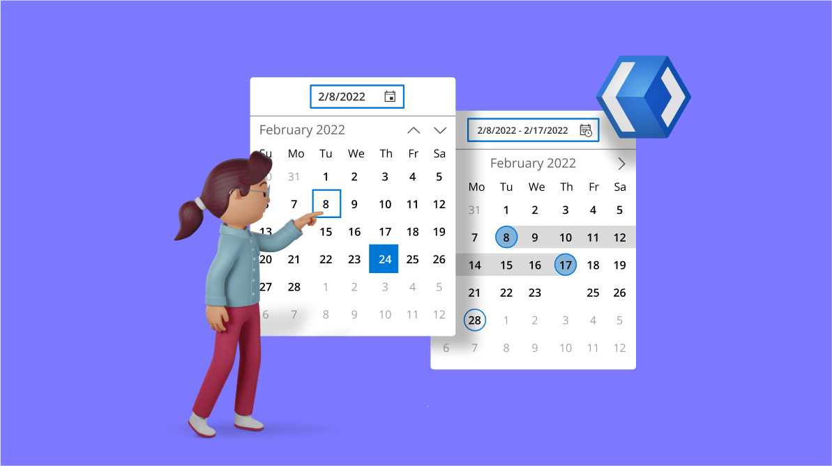
WinUI Calendar Date Picker allows users to select a date from a dropdown calendar or enter a date in an editor and clear the selected date on demand. It supports editing with validation and watermark text display. You can also customize the input format and calendar UI in the dropdown.
WinUI Calendar DateRange Picker allows users to select a range of dates from a dropdown calendar or enter a date range in an editor and clear the selected date range on demand. Also, it supports built-in watermarks and predefined date ranges.
Let’s explore the features of the WinUI Calendar Date Picker and Calendar DateRange Picker controls and the steps to get started with them!
Getting started with the WinUI Calendar Date Picker
Follow these steps to add the Calendar Date Picker to the XAML page of your WinUI application:
- Create a WinUI 3 desktop app for C# and .NET 5.
- Download and install the Syncfusion.Calendar.WinUI NuGet package in the project.
- Import the control namespace Syncfusion.UI.Xaml.Calendar on the XAML page.
- Finally, initialize the WinUI Calendar Date Picker control.Refer to the following code example.
<Window
    x:Class="WinUI_Calendar.MainWindow"
    xmlns="http://schemas.microsoft.com/winfx/2006/xaml/presentation"
    xmlns:x="http://schemas.microsoft.com/winfx/2006/xaml"
    xmlns:local="using:WinUI_Calendar "
    xmlns:d="http://schemas.microsoft.com/expression/blend/2008"
    xmlns:mc="http://schemas.openxmlformats.org/markup-compatibility/2006"
    xmlns:calendar="using:Syncfusion.UI.Xaml.Calendar"
    mc:Ignorable="d">
    <Grid>
        <calendar:SfCalendarDatePicker HorizontalAlignment="Center"
                                      VerticalAlignment="Center"
                                      x:Name="calendarDatePicker"
                                     />
</Grid>
</Window>
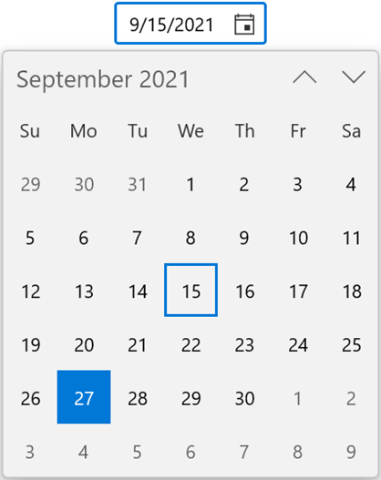
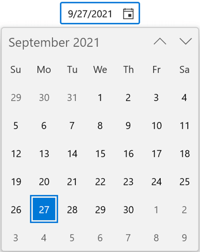
Interactive date selection
The WinUI Calendar Date Picker supports entering a date value in the editor and selecting a date from the dropdown calendar.
Refer to the following GIF image.

Assign empty value
By default, the WinUI Calendar Date Picker allows us to assign an empty value if no date value is selected or entered. You can change it to always show a date value by setting the value of the AllowNull property as false. When the value of the SelectedDate property is null and the value of AllowNull is false, today’s date will be assigned as the value of the SelectedDate property.
Refer to the following code example.
<calendar:SfCalendarDatePicker HorizontalAlignment="Center"
                               VerticalAlignment="Top"
                               x:Name="calendarDatePicker"
                               AllowNull="False"
                               />
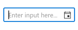
Show watermark
You can display hints using the PlaceHolderText property when no date value is selected or when the value of the SelectedDate property is null.
Refer to the following code example.
<calendar:SfCalendarDatePicker HorizontalAlignment="Center"
                               VerticalAlignment="Top"
                               x:Name="calendarDatePicker"
                               PlaceholderText="Enter input here..."
                               />
Notify on selected date change and cancel the change on demand
You will be notified by the SelectedDateChanged event whenever you select a date in the dropdown calendar or assign a new date value to the SelectedDate property. In addition, if you consider that the currently selected date is invalid, you can cancel updating the value of the SelectedDate property with ease using the SelectedDateChanging event. The SelectedDateChanging event contains the following properties:
- OldDate: Gets a date that is previously selected.
- NewDate: Gets a date that is currently selected.
- Cancel: Gets or sets whether to cancel the selected date value update.
Refer to the following code example.
private void calendarDatePicker_SelectedDateChanging(object sender, DateChangingEventArgs e)
{
    var oldDate = e.OldDate;
    var newDate = e.NewDate;

    if (oldDate > newDate)
    {
        //Cancels the selected date update.
        e.Cancel = true;
    }
}

private void calendarDatePicker_SelectedDateChanged(object sender, SelectedDateChangedEventArgs e)
{
    var oldDate = e.OldDate;
    var newDate = e.NewDate;
}
Selection and restriction
Using the WinUI Calendar Date Picker control, we can easily limit dates, block specific dates, and highlight selected dates. Let’s see how to do them!
Limit available dates
Restrict users to select a date value within a minimum and maximum range by using the MinDate and MaxDate properties. By default, the value of MinDate is 1/1/1921 and the value of MaxDate is 12/31/2121. This feature is useful when you want to allow only users of a specific age range to use your application.
Refer to the following code example.
SfCalendarDatePicker calendarDatePicker = new SfCalendarDatePicker();
calendarDatePicker.HorizontalAlignment = HorizontalAlignment.Center;
calendarDatePicker.VerticalAlignment = VerticalAlignment.Top;
calendarDatePicker.MaxDate = new DateTimeOffset(DateTime.Today.AddMonths(1));
calendarDatePicker.MinDate = new DateTimeOffset(DateTime.Today.AddMonths(-1));

Disable specific dates
Also, we can prevent users from selecting specific dates from the dropdown calendar using the BlackoutDates collection property. The value of the BlackoutDates field is null by default. We can use this feature in an e-procurement app to indicate that there will be no product delivery available on specific dates.
Refer to the following code example.
public sealed partial class MainWindow : Window
{
    public DateTimeOffsetCollection BlackOutDates { get; set; }
    public MainWindow()
    {
        this.InitializeComponent();

        SfCalendarDatePicker calendarDatePicker = new SfCalendarDatePicker();
        calendarDatePicker.HorizontalAlignment = HorizontalAlignment.Center;
        calendarDatePicker.VerticalAlignment = VerticalAlignment.Top;
        calendarDatePicker.BlackoutDates = GetBlackOutDates();
        this.Content = calendarDatePicker;
    }

    private DateTimeOffsetCollection GetBlackOutDates()
    {
        BlackOutDates = new DateTimeOffsetCollection();
        BlackOutDates.Add(new DateTimeOffset(new DateTime(2021, 09, 03)));
        BlackOutDates.Add(new DateTimeOffset(new DateTime(2021, 09, 07)));
        BlackOutDates.Add(new DateTimeOffset(new DateTime(2021, 09, 24)));
        BlackOutDates.Add(new DateTimeOffset(new DateTime(2021, 10, 07)));
        BlackOutDates.Add(new DateTimeOffset(new DateTime(2021, 10, 13)));

        return BlackOutDates;
    }
}
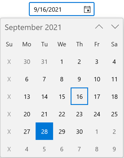
Disable dates dynamically
Using the CalendarItemPrepared event, you can dynamically restrict the set of dates in the dropdown calendar when the calendar is preparing the items. Use this feature in your app for scenarios such as restricting the delivery date of goods to a specific day.
Refer to the following code example.
private void SfCalendarDatePicker_CalendarItemPrepared(object sender, CalendarItemPreparedEventArgs e)
{
    if (e.ItemInfo.Date.DayOfWeek == DayOfWeek.Sunday)
    {
        e.ItemInfo.IsBlackout = true;
        e.ItemInfo.DisplayText = "X";
    }
}
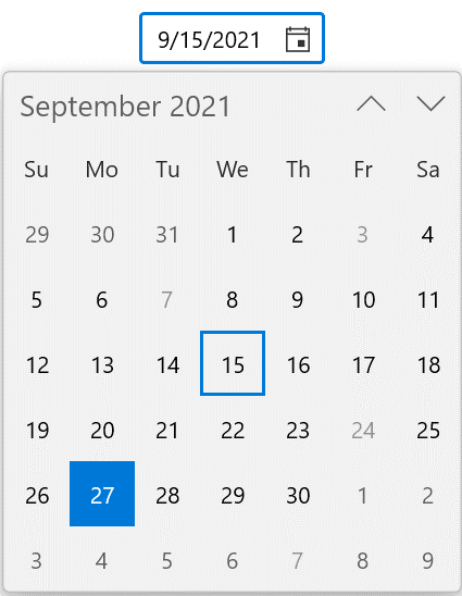
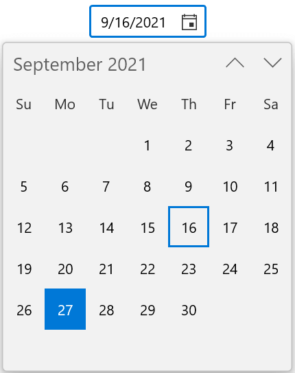
Highlight and change the shape of the selected dates
You can highlight the current date and selected dates using the SelectionHighlightMode property and change their shapes using the SelectionShape property.
Refer to the following code example.
<calendar:SfCalendarDatePicker HorizontalAlignment="Center"
                               VerticalAlignment="Top"
                               x:Name="calendarDatePicker"
                               PlaceholderText="Enter input here..."
                               SelectionHighlightMode="Outline"
                               SelectionShape="Rectangle"
/> | 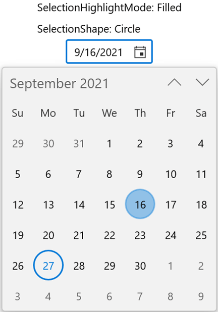 |
Highlighting and Custom Selection Shape Features in the WinUI Calendar Date Picker
Navigation restriction
The Calendar Date Picker control provides support to switch between the month and year views by default. You can also use the MinDisplayMode and MaxDisplayMode properties to limit users from switching between specific views.
The following example allows customers to select only the month and year values to enter the validity period for their credit or debit cards.
<calendar:SfCalendarDatePicker HorizontalAlignment="Center"
                               VerticalAlignment="Top"
                               MinDisplayMode="Year"
                               MaxDisplayMode="Decade" />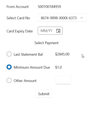
Formatting
We can change the dropdown calendar type and apply various custom formats to the editor and dropdown calendar within the WinUI Calendar Date Picker control.
Different calendar types and languages
The Calendar Date Picker control supports a variety of calendars, including Hebrew, Persian, and others. Use the CalendarIdentifier property to modify the dropdown calendar type and the Language property to change the language. The editor will update the value in it based on the calendar type and the language applied.
Refer to the following code example.
<calendar:SfCalendarDatePicker HorizontalAlignment="Center"
                               VerticalAlignment="Top"
                               x:Name="calendarDatePicker"
                               Language="fr-FR"
                               />
<calendar:SfCalendarDatePicker HorizontalAlignment="Center"
                               VerticalAlignment="Top"
                               x:Name="sfCalendarDatePicker"
                               CalendarIdentifier="PersianCalendar"
/>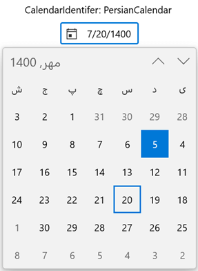 | 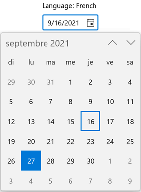 |
Different Calendar Types and Languages Supported in WinUI Calendar Date Picker
Calendar and editor display formats
Apply various custom formats to the dropdown calendar using the DayFormat, MonthFormat, DayOfWeekFormat, and MonthHeaderFormat properties and to the editor using the DisplayDateFormat property. These features are best suited for showing the validity period for credit or debit cards.
Refer to the following code example.
<calendar:SfCalendarDatePicker HorizontalAlignment="Center"
VerticalAlignment="Top"
x:Name="calendarDatePicker"
DisplayDateFormat="M"
/>
<calendar:SfCalendarDatePicker HorizontalAlignment="Center"
VerticalAlignment="Top"
x:Name="SfCalendarDatePicker"
DayFormat="{}{day.integer(2)}"
MonthFormat="{}{month.full}"
DayOfWeekFormat="{}{dayofweek.abbreviated(3)}"
MonthHeaderFormat="{}{month.abbreviated} {year.abbreviated}"
/>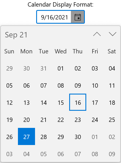 | 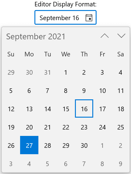 |
Customizing the Editor and Dropdown Calendar Formats in WinUI Calendar Date Picker
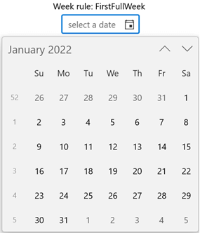
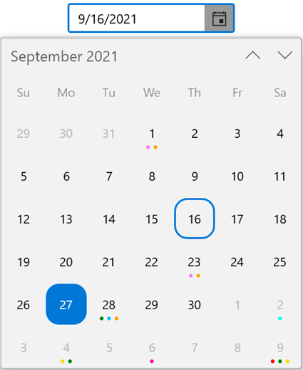
Show week numbers
We can show week numbers in the dropdown calendar using the ShowWeekNumbers property. The week numbers are collapsed in the dropdown calendar by default.
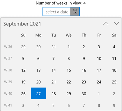
Number of weeks in view
Use the NumberOfWeeksInView property to change the number of weeks shown in the dropdown calendar. Use the WeekNumberRule property to change the rule for determining the first week of the year.
Refer to the following code example.
<calendar:SfCalendarDatePicker HorizontalAlignment="Center"
                               VerticalAlignment="Top"
                               x:Name="calendarDatePicker"
                               ShowWeekNumbers="True"
                               WeekNumberRule="FirstFullWeek"
                               />
<calendar:SfCalendarDatePicker HorizontalAlignment="Center"
                               VerticalAlignment="Top"
                               x:Name="SfCalendarDatePicker"
                               NumberOfWeeksInView="4"
/> |  |
Week Number and Week Rule Features in WinUI Calendar Date Picker
Customize week number and day names
Customize the week number format shown in the dropdown calendar using the WeekNumberFormat property.
Refer to the following code example.
<calendar:SfCalendarDatePicker HorizontalAlignment="Center"
                               VerticalAlignment="Top"
                               x:Name="calendarDatePicker"
                               ShowWeekNumbers="True"
                               WeekNumberFormat="W #"
                               />
Also, we can further customize the template of the week numbers and day names of a week in the dropdown calendar. To do so, use the WeekNumberTemplate and WeekNameTemplate properties, respectively.
Customize calendar UI
We can easily customize the dropdown calendar UI as needed using the DropDownPlacement and DropDownHeight properties.
Refer to the following code example.
<calendar:SfCalendarDatePicker HorizontalAlignment="Center"
                               VerticalAlignment="Top"
                               x:Name="calendarDatePicker"
                               DropDownPlacement="RightEdgeAlignedBottom"
                               DropDownHeight="270"
                               />
Hide days that are out of scope
By default, the Calendar Date Picker displays days that are out of scope in the dropdown calendar, i.e. the days of the previous and next month in the current month view. Use the OutOfScopeVisibility property to hide those days in the current view.
Refer to the following code example.
<calendar:SfCalendarDatePicker HorizontalAlignment="Center"
                               VerticalAlignment="Top"
                               x:Name="calendarDatePicker"
                               OutOfScopeVisibility="Hidden"
                               />
Calendar item customization
Customize the appearance of the date cells in the dropdown calendar based on your requirements using the FlyoutBase.AttachedFlyout property and DropdownFlyout control.
Note: For more details, refer to the WinUI Calendar Date Picker documentation and our GitHub demos.
Getting started with the WinUI Calendar DateRange Picker
Now, let’s see the steps to add the WinUI Calendar DateRange Picker in the XAML page of your app:
- Create a WinUI 3 desktop app for C# and .NET 5.
- Download and install Syncfusion.Calendar.WinUI NuGet package in the project.
- Import the control namespace Syncfusion.UI.Xaml.Calendar on the XAML page.
- Finally, initialize the WinUI Calendar DateRange Picker control.
Refer to the following code example.
<Window
    x:Class="WinUI_Calendar.MainWindow"
    xmlns="http://schemas.microsoft.com/winfx/2006/xaml/presentation"
    xmlns:x="http://schemas.microsoft.com/winfx/2006/xaml"
    xmlns:local="using:WinUI_Calendar "
    xmlns:d="http://schemas.microsoft.com/expression/blend/2008"
    xmlns:mc="http://schemas.openxmlformats.org/markup-compatibility/2006"
    xmlns:calendar="using:Syncfusion.UI.Xaml.Calendar"
    mc:Ignorable="d">
    <Grid>
      <calendar:SfCalendarDateRangePicker HorizontalAlignment="Center"
                                          VerticalAlignment="Center"
                                          x:Name="calendarDateRangePicker"
                                          />
    </Grid>
</Window>
Select a date range
The WinUI Calendar Date Picker control allows you to select multiple dates when they are not consecutive, but on the other hand, the WinUI Calendar DateRange Picker lets us pick consecutive dates that can be specified using the SelectedRange property.
Refer to the following code example.
SfCalendarDateRangePicker dateRangePicker = new SfCalendarDateRangePicker();
dateRangePicker.SelectedRange = new DateTimeOffsetRange(
					new DateTimeOffset(new DateTime(2021, 08, 8)),
					new DateTimeOffset(new DateTime(2021, 08, 15)));
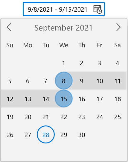
Limit the selection range
In the WinUI Calendar DateRange Picker, you can limit the date range selection using the MinDatesCountInRange and MaxDatesCountInRange properties. We can use this feature to restrict users from selecting the shortest delivery date range in an e-procurement app.
Refer to the following code example.
SfCalendarDateRangePicker dateRangePicker = new SfCalendarDateRangePicker();
dateRangePicker.HorizontalAlignment = HorizontalAlignment.Center;
dateRangePicker.VerticalAlignment = VerticalAlignment.Top;
dateRangePicker.MinDatesCountInRange = 5;
dateRangePicker.MaxDatesCountInRange = 7;
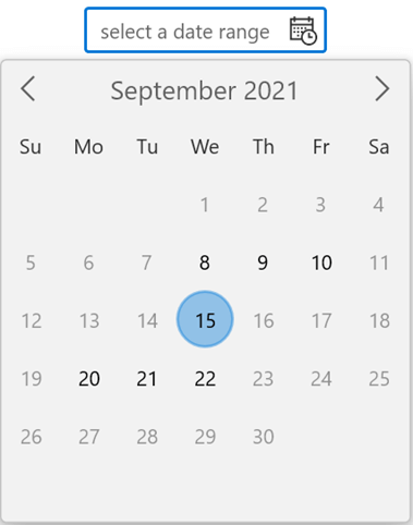
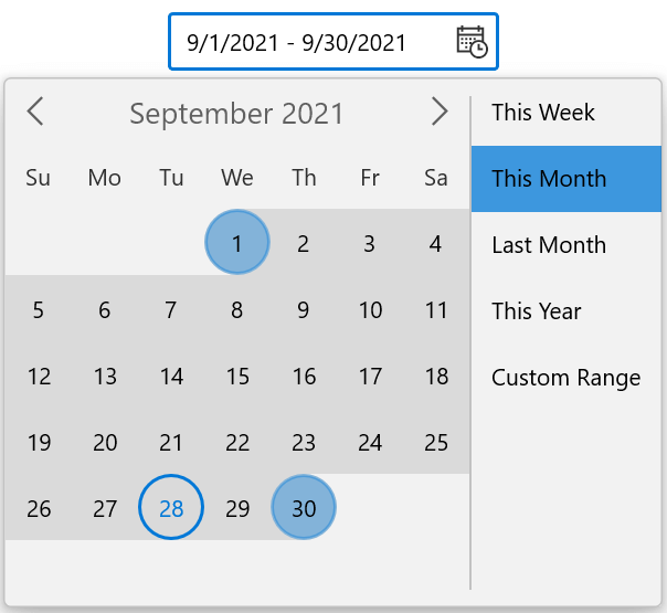
Show preset items
With the Preset and PresetTemplate properties, we can show a collection of preset items for choosing predefined date ranges within the dropdown calendar of the WinUI Calendar DateRange Picker.
Refer to the following code example.
//ViewModel class.
class ViewModel
    {
        public ObservableCollection<string> PresetCollection { get; set; }
        public ViewModel()
        {
            PresetCollection = new ObservableCollection<string>();
            PresetCollection.Add("This Week");
            PresetCollection.Add("This Month");
            PresetCollection.Add("Last Month");
            PresetCollection.Add("This Year");
            PresetCollection.Add("Custom Range");
        }
    }
<Grid>
<Grid.DataContext>
<local:ViewModel x:Name="viewModel" />
</Grid.DataContext>
<calendar:SfCalendarDateRangePicker x:Name="sfCalendar" Height="35" Width="200"
Preset="{x:Bind viewModel.PresetCollection, Mode=TwoWay}" >
<calendar:SfCalendarDateRangePicker.PresetTemplate>
<DataTemplate>
<ListBox ItemsSource="{Binding}" SelectionChanged="ListBox_SelectionChanged" />
</DataTemplate>
</calendar:SfCalendarDateRangePicker.PresetTemplate>
</calendar:SfCalendarDateRangePicker>
</Grid>privateprivate void ListBox_SelectionChanged(object sender, SelectionChangedEventArgs e)
{
ListBox listBox = sender as ListBox;
sfCalendarDateRangePicker.ShowCalendar = false;
DateTimeOffset todayDate = DateTimeOffset.Now;
if (listBox.SelectedItem.ToString() == "This Week")
{
DateTimeOffset startdate = todayDate.AddDays(-(todayDate.DayOfWeek - sfCalendarDateRangePicker.FirstDayOfWeek));
sfCalendarDateRangePicker.SelectedRange = new DateTimeOffsetRange(startdate, startdate.AddDays(6));
}
else if (listBox.SelectedItem.ToString() == "This Month")
{
…
}
else
{
sfCalendarDateRangePicker.SelectedRange = null;
sfCalendarDateRangePicker.ShowCalendar = true;
}
}
Other features
The WinUI DateRange Picker also supports impressive features like watermarks, localization and formatting, calendar UI customization, and more.
Note: For more details, refer to the WinUI Calendar DateRange Picker documentation and our GitHub demos.
Conclusion
Thanks for reading! With these splendid features, the WinUI Calendar Date Picker and Calendar DateRange Picker controls will meet and exceed your expectations and requirements for choosing a date and date range values. Try them out and leave your feedback in the comments section below!
Also, try out our WinUI control demos available in the Microsoft Store.
For existing customers, the newest version of Essential Studio® is available for download from the license and downloads page. If you are not yet a customer, you can try a 30-day free trial to check out these new features.
You can also contact us through our support forums, feedback portal, or support portal. We are always happy to assist you!
 No spam, just valuable updates.