
 Sheik Syed
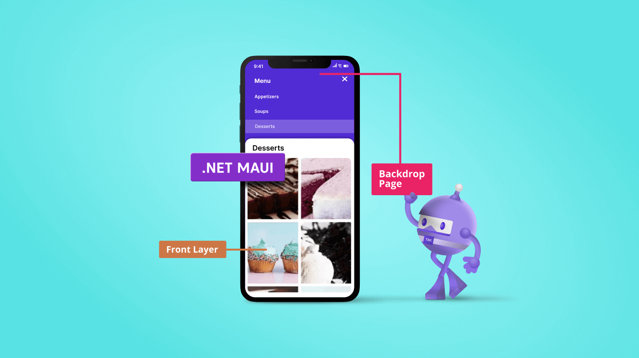
The .NET MAUI Backdrop included in our 2022 Volume 4 release is a specialized content page. It provides a full-screen interface for displaying and interacting with a single piece of content. This page comprises two surfaces, a back layer and a front layer, stacked one over the other. The back layer displays actions and context, while the rest of the page is covered by the front layer.
Integrating the Backdrop with built-in .NET MAUI pages such as NavigationPage and FlyoutPage allow you to utilize features such as title, icon, page navigation, and toolbar item customization.

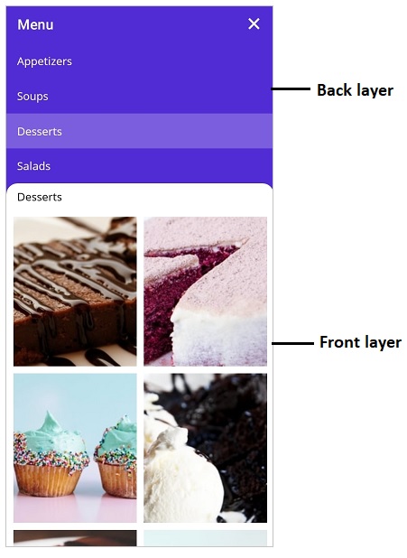
The back layer holds options such as navigation, filtration, and more, which updates the front layer content on performing specific actions. When concealed, the back layer can provide contextual information about the front layer. When revealed, the back layer displays contextual controls that relate to the front layer.
Front layer
The front layer is always visible in front of the back layer. It is displayed at full width and holds primary content.
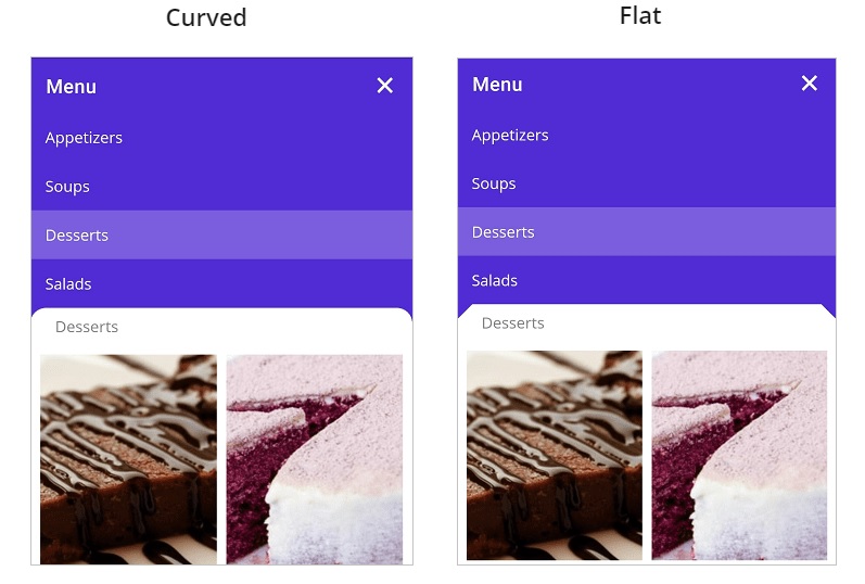
You can customize the corner of the front layer of the .NET MAUI Backdrop to be curve or flat. You can customize one or both corners of the front layer with these shapes. It is also possible to change the default radius of the custom shapes.
Back layer
The back layer appears at the lowest elevation in the app, filling the entire background. It holds actionable content that is relevant to the front layer.
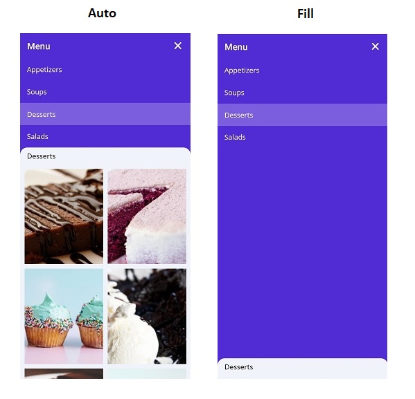
When the back layer is revealed, use the auto adjustment option to adjust its height based on its content, or expand it fully until only the front layer’s header is visible.
Reveal and conceal the back layer
The Backdrop provides options to reveal and conceal the back layer.
- Programmatically: Reveals the back layer by setting the IsBackLayerRevealed property to true. By default, it is set to false.
- Touch interaction: Reveals the back layer by tapping the toolbar icon at the top-right corner of the navigation bar header. The hamburger icon reveals the back layer, while the close icon conceals it. When adding the Backdrop as a child of the FlyoutPage, the hamburger, and close icons will be replaced by expand (or down arrow) and collapse (or up arrow) icons, respectively.
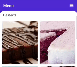
Touch Interaction in .NET MAUI Backdrop Interface
- Swipe or flick action: Reveals the back layer when swiping or flicking the front layer header. Swipe downward to reveal, and swipe upward to conceal the back layer. The swipe or flick action will be handled only on the top of the front layer (header).
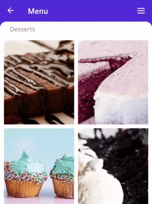
.NET MAUI Backdrop UI with Swipe Action
Add the .NET MAUI Backdrop to your application
We have seen the key features of the .NET MAUI Backdrop control. Let’s see how to create a simple .NET MAUI app with the Backdrop to demonstrate its primary usage.
Step 1: Create a .NET MAUI app.
First, create a new .NET MAUI app in Visual Studio.
Step 2: Install the NuGet packages.
Syncfusion .NET MAUI controls are available in the NuGet Gallery. To add the SfBackdropPage control to your project, open the NuGet package manager in Visual Studio, and search for Syncfusion.Maui.Backdrop, and then install it.
Step 3: Handler registration.
The Syncfusion.Maui.Core NuGet package is a dependent package for all Syncfusion .NET MAUI controls. In the MauiProgram.cs file, register the handler for the Syncfusion core package using the ConfigureSyncfusionCore() method.
Refer to the following code.
public static class MauiProgram
{
   public static MauiApp CreateMauiApp()
   {
      var builder = MauiApp.CreateBuilder();
      builder
	.UseMauiApp<App>()
	.ConfigureSyncfusionCore()
	.ConfigureFonts(fonts =>
	{
	   fonts.AddFont("OpenSans-Regular.ttf", "OpenSansRegular");
	   fonts.AddFont("OpenSans-Semibold.ttf", "OpenSansSemibold");
	});
      return builder.Build();
  }
}
Step 4: Initializing Backdrop
Create a page and import the SfBackdropPage XAML namespace. Refer to the following code.
<backdrop:SfBackdropPage xmlns="http://schemas.microsoft.com/dotnet/2021/maui"

  xmlns:x="http://schemas.microsoft.com/winfx/2009/xaml"
  x:Class= “BackdropGettingStarted.BackdropSamplePage”
  Title= “Menu”
  xmlns:backdrop= “clr-namespace:Syncfusion.Maui.Backdrop;assembly=Syncfusion.Maui.Backdrop”
  IsBackLayerRevealed= “True”>
Note: The Title and ToolBarItems properties of the Page can be used to customize the appearance of the navigation bar header.
Step 5: Configure the header
The page navigation bar header for the Backdrop appears only when adding Backdrop as a child of the NavigationPage. To learn more about it, refer to the header configuration.
Step 6: Add back layer content
The back layer holds actionable content (navigation or filtration) relevant to the front layer. The back layer will either fill the entire background or occupy the background based on the content height. Add a back layer using the BackLayer property as shown in the code below.
<backdrop:SfBackdropPage.BackLayer>
   <backdrop:BackdropBackLayer>
     <Grid>
       <Grid.RowDefinitions>
          <RowDefinition Height= “Auto”/>
       </Grid.RowDefinitions>
       <ListView>
         <ListView.ItemsSource>
           <x:Array Type="{x:Type x:String}">
              <x:String>Appetizers</x:String>
              <x:String>Soups</x:String>
              <x:String>Desserts</x:String>
              <x:String>Salads</x:String>
           </x:Array>
         </ListView.ItemsSource>
      </ListView>
    </Grid>
  </backdrop:BackdropBackLayer>
</backdrop:SfBackdropPage.BackLayer>
Step 7: Add front layer content
The front layer always appears in front of the back layer and holds primary content. Add the front layer using the FrontLayer property as shown in the code below.
<backdrop:SfBackdropPage.FrontLayer>
    <backdrop:BackdropFrontLayer>
        <Grid BackgroundColor= “WhiteSmoke”/>
    </backdrop:BackdropFrontLayer>
</backdrop:SfBackdropPage.FrontLayer>
GitHub reference
For more information, refer to the .NET MAUI Backdrop Control Getting Started demo on GitHub.
Conclusion
Thanks for reading! In this blog, we walked you through the new Syncfusion .NET MAUI Backdrop control and its features. For more information, refer to its user guide.
Leave your feedback in the comments section below.
Refer to our Release Notes and What’s New pages to check out the other updates in this release. Also, you can contact us through our support forums, support portal, or feedback portal. We are always happy to assist you!


 No spam, just valuable updates.