
 Kameshwaran R
An organizational chart (also known as “org chart”) is a graphic representation of the internal structure of an organization or any other data collection. Employees can utilize org charts to learn about their department’s structure, as well as the structure of other departments.
The Syncfusion Blazor Diagram component is a feature-rich component for creating or visualizing interactive diagrams. It allows users to create organizational charts using either C# code or a visual interface with seamless interaction and editing capabilities.
In this blog, we will learn how to create an interactive org chart to visualize your hierarchical data using the Blazor Diagram component.
Add the Blazor Diagram component to an application
Here, we are going to include the Blazor Diagram component in a Blazor WebAssembly application.
Note: Before proceeding, refer to the getting started with the Blazor Diagram component documentation.
- First, install the Syncfusion.Blazor.Diagram NuGet package in the app using the NuGet package manager.
- Now, add the style resources through CDN or from the NuGet package in the HEAD element of the ~/Pages/_Host.cshtml page.
<head> .... .... <link href="_content/Syncfusion.Blazor/styles/bootstrap4.css" rel="stylesheet" /> </head> - Then, open the ~/_Imports.Blazor file and import the Syncfusion.Blazor.Diagram package in it.
@using Syncfusion.Blazor.Diagram
- Open the Startup.cs file and add the services required for the Syncfusion components using the services.AddSyncfusionBlazor() method. Before that, add the services.AddSyncfusionBlazor() method in the ConfigureServices function, like in the following code example.
using Syncfusion.Blazor; namespace OrgChart { public class Startup { .... .... public void ConfigureServices(IServiceCollection services) { .... .... services.AddSyncfusionBlazor(); } } } - Next, add the Blazor Diagram Component to the Pages folder of your Razor file. Refer to the following code example.
<SfDiagramComponent Width="100%" Height="600px"/>
Note: For more details, refer to the documentation for creating Blazor diagram nodes and the documentation for creating Blazor diagram connectors with labels.
Creating an org chart
Let’s see how to create a simple org chart in your Blazor WebAssembly application.
#1: Define the data source
We need a data source or node collection to populate the organization chart on the diagram canvas.
First, let’s create a model class to construct the data source. Define the employee’s ID, role, and reporting person in your organization in the model class. You can add a color property to improve the UI’s design. Also, you can specify your custom properties if necessary.
Refer to the following code.
public class EmployeeData
{
   public string ID { get; set; }
   public string Role { get; set; }
   public string Manager { get; set; }
   public string ChartType { get; set; }
   public string Color { get; set; }
}
Now, create a data source for the org chart and populate the data source records as nodes. We should specify the parent and child relationships in the organization while giving the records. In the organizational layout, each record in the data source will be created as a separate node.
Refer to the following code.
public List<EmployeeData> DataSource = new List<EmployeeData>()
{
    new EmployeeData()   { ID= "parent", Role= "Board", Color= "#71AF17" },
    new EmployeeData()   { ID= "1", Role= "General Manager", Manager= "parent", ChartType= "right", Color= "#71AF17" },
    new EmployeeData()   { ID= "11", Role= "Assistant Manager", Manager= "1", Color= "#71AF17" },
    new EmployeeData()   { ID= "2", Role= "Human Resource Manager", Manager= "1", ChartType= "right", Color= "#1859B7" },
    new EmployeeData()   { ID= "3", Role= "Trainers", Manager= "2", Color= "#2E95D8" },
    new EmployeeData()   { ID= "4", Role= "Recruiting Team", Manager= "2", Color= "#2E95D8" },
    new EmployeeData()   { ID= "5", Role= "Finance Asst. Manager", Manager= "2", Color= "#2E95D8" },
    new EmployeeData()   { ID= "6", Role= "Design Manager", Manager= "1",ChartType= "right", Color= "#1859B7" },
    new EmployeeData()   { ID= "7", Role= "Design Supervisor", Manager= "6", Color= "#2E95D8" },
    new EmployeeData()   { ID= "8", Role= "Development Supervisor", Manager= "6", Color= "#2E95D8" },
    new EmployeeData()   { ID= "9", Role= "Drafting Supervisor", Manager= "6", Color= "#2E95D8" },
    new EmployeeData()   { ID= "10", Role= "Operation Manager", Manager= "1", ChartType= "right", Color= "#1859B7" },
    new EmployeeData()   { ID= "11", Role= "Statistic Department", Manager= "10", Color= "#2E95D8" },
    new EmployeeData()   { ID= "12", Role= "Logistic Department", Manager= "10", Color= "#2E95D8" },
    new EmployeeData()   { ID= "16", Role= "Marketing Manager", Manager= "1", ChartType= "right", Color= "#1859B7" },
    new EmployeeData()   { ID= "17", Role= "Oversea sales Manager", Manager= "16", Color= "#2E95D8" },
    new EmployeeData()   { ID= "18", Role= "Petroleum Manager", Manager= "16", Color= "#2E95D8" },
    new EmployeeData()   { ID= "20", Role= "Service Dept. Manager", Manager= "16", Color= "#2E95D8" },
    new EmployeeData()   { ID= "21", Role= "Quality Department", Manager= "16", Color= "#2E95D8" }
};
#2: Binding the data source to the layout
Now, bind the data source with the Blazor Diagram component, as seen in the following code.
<SfDiagramComponent>
  <DataSourceSettings DataSource="DataSource" ID="ID" ParentID="Manager" ></DataSourceSettings>
</SfDiagramComponent>
Once the data source is bound and the parent-child relationships are configured, define the automatic layout properties to create the organization chart.
<Layout Type="LayoutType.OrganizationalChart" Orientation="LayoutOrientation.TopToBottom" GetLayoutInfo="GetLayoutInfo">
</Layout>
#3: Customization
You can do the following customization in the org chart:
- The HorizontalSpacing and VerticalSpacing properties of the layout allow you to set the horizontal and vertical spacing between the nodes, respectively.
- The Layout’s Margin property allows you to set blank space. All these parameters are supported by two-way binding to modify the default or current values.
<Layout Type="LayoutType.OrganizationalChart" HorizontalSpacing="30" VerticalSpacing="30">
   <LayoutMargin Top="10" Bottom="10" Right="10" Left="10"></LayoutMargin>
</Layout>
Finally, the Razor file will look like the following.
@page "/"
@using Syncfusion.Blazor.Diagram
@using Syncfusion.Blazor.Diagram.Internal
<SfDiagramComponent @ref="@Diagram" Height="690px" InteractionController="@DiagramInteractions.ZoomPan" NodeCreating="@NodeCreating" ConnectorCreating="@ConnectorCreating">
<DataSourceSettings ID="ID" ParentID="Manager" DataSource="DataSource"></DataSourceSettings>
<Layout Type="LayoutType.OrganizationalChart" Orientation="LayoutOrientation.TopToBottom" GetLayoutInfo="GetLayoutInfo" HorizontalSpacing="30" VerticalSpacing="30">
<LayoutMargin Top="10" Bottom="10" Right="10" Left="10"></LayoutMargin>
</Layout>
<SnapSettings Constraints="SnapConstraints.None"></SnapSettings>
</SfDiagramComponent>
@code
{
SfDiagramComponent Diagram;
// Create a model class for the data source
public class EmployeeData
{
public string ID { get; set; }
public string Role { get; set; }
public string Color { get; set; }
public string Manager { get; set; }
}
//Defining the dataSource
public List<EmployeeData> DataSource = new List<EmployeeData>()
{
new EmployeeData(){ID= "parent", Role= "Board", Color = "#71AF17", Manager = "" },
new EmployeeData() { ID = "1",Role= "General manager", Color = "#71AF17", Manager = "parent" },
new EmployeeData() { ID = "2", Role= "Human resource manager", Color = "#1859B7", Manager = "1", },
new EmployeeData() { ID = "3", Role= "Trainers", Color = "#2E95D8", Manager = "2" },
new EmployeeData() { ID = "4", Role= "Recruiting team",Color = "#2E95D8", Manager = "2" },
new EmployeeData() { ID = "5", Role= "Finance asst. manager", Color = "#2E95D8", Manager = "2" },
new EmployeeData() { ID = "6", Role= "Design manager", Color = "#1859B7", Manager = "1" },
new EmployeeData() { ID = "7",Role= "Design supervisor",Color = "#2E95D8", Manager = "6" },
new EmployeeData() { ID = "8",Role= "Development supervisor",Color = "#2E95D8", Manager = "6" },
new EmployeeData() { ID = "9",Role= "Drafting supervisor", Color = "#2E95D8", Manager = "6" },
new EmployeeData() { ID = "10",Role= "Operations manager",Color = "#1859B7", Manager = "1" },
new EmployeeData() { ID = "11",Role= "Statistics department",Color = "#2E95D8", Manager = "10" },
new EmployeeData() { ID = "12",Role= "Logistics department",Color = "#2E95D8", Manager = "10" },
new EmployeeData() { ID = "16", Role= "Logistics department", Color = "#1859B7", Manager = "1" },
new EmployeeData() { ID = "17",Role= "Overseas sales manager",Color = "#2E95D8", Manager = "16" },
new EmployeeData() { ID = "18", Role= "Petroleum manager", Color = "#2E95D8", Manager = "16" },
new EmployeeData() { ID = "20",Role= "Service department manager",Color = "#2E95D8", Manager = "16" },
new EmployeeData() { ID = "21", Role= "Quality control department", Color = "#2E95D8", Manager = "16" },
};
private TreeInfo GetLayoutInfo(IDiagramObject obj, TreeInfo options)
{
if (!options.HasSubTree)
{
options.AlignmentType = SubTreeAlignmentType.Left;
options.Orientation = Orientation.Vertical;
}
return options;
}
private void NodeCreating(IDiagramObject obj)
{
Node node = obj as Node;
if (node.Data is System.Text.Json.JsonElement)
{
node.Data = System.Text.Json.JsonSerializer.Deserialize<EmployeeData>(node.Data.ToString());
}
EmployeeData organizationData = node.Data as EmployeeData;
node.Width = 120;
node.Height = 50;
node.Style.Fill = organizationData.Color;
ShapeAnnotation annotation = new ShapeAnnotation()
{
Content = organizationData.Role,
Offset = new DiagramPoint(0.5, 0.5),
Style = new TextStyle() { Color = "white" }
};
node.Annotations = new DiagramObjectCollection<ShapeAnnotation>() { annotation };
}
// Defines default values for Connector object
private void ConnectorCreating(IDiagramObject DiagramObject)
{
Connector connector = (DiagramObject as Connector);
connector.Type = ConnectorSegmentType.Orthogonal;
connector.TargetDecorator.Shape = DecoratorShape.None;
}
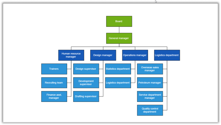
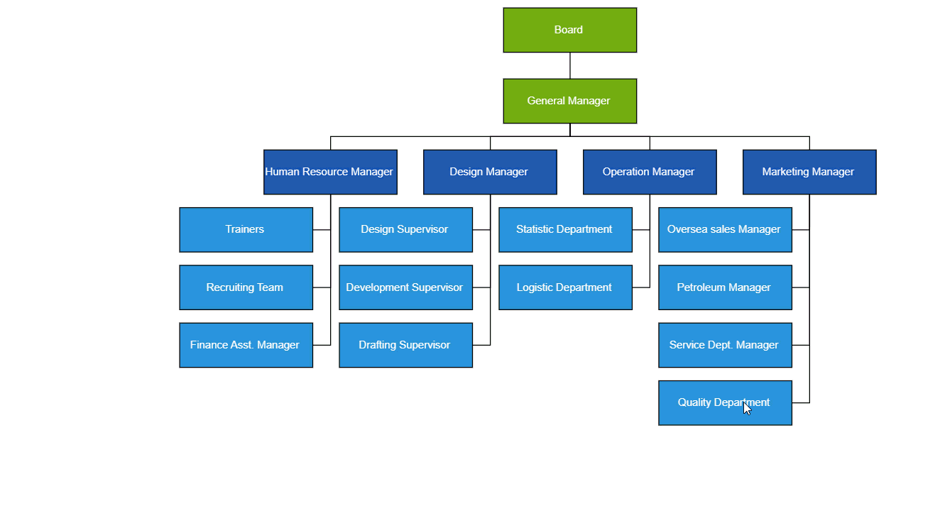
}After executing the previous code, you will get an org chart that looks like the following image.
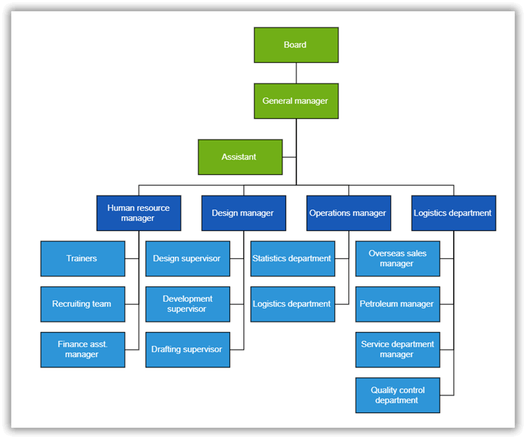
Features
Assistants
The Diagram control supports defining assistants in the org chart. Assistants are child items that have a different relationship with the parent node. They are laid out in a dedicated part of the tree.
The diagram’s GetLayoutInfo callback method will be triggered for each node during the layout process, and it takes node and tree information as the arguments.. This method helps us to provide instructions to the automatic-layout process regarding how to generate the org chart. In our Blazor Diagram Component, we can assign only one assistant in the entire org chart layout.
Refer to the following code.
private TreeInfo GetLayoutInfo(IDiagramObject obj, TreeInfo options  )
{
   Node node = obj as Node;
   //Add an assistant to "General manager" node
   if ((node.Data as EmployeeData).Role == "General manager")
   {
      options.Assistants.Add(options.Children[0]);
      options.Children.RemoveAt(0);
   }
   if (!options.HasSubTree)
   {
      options.AlignmentType = SubTreeAlignmentType.Left;
      options.Orientation = Orientation.Vertical;
   }
   return options;
}
Expand and Collapse
Use the expandIcon and collapseIcon properties of nodes to implement the expand and collapse features of the tree-shaped org chart. The following code example illustrates this.
private void NodeCreating(IDiagramObject obj)
{
   Node node = obj as Node;
   ………
   ………
   ………
   node.ExpandIcon = new DiagramExpandIcon()
   {
      Shape = DiagramExpandIcons.Minus,
      Height = 10,
      Width = 10,
   };
   node.CollapseIcon = new DiagramCollapseIcon()
   {
      Shape = DiagramCollapseIcons.Plus,
      Height = 10,
      Width = 10,
   };
}
Drag-and-Drop (Editing Org Chart interactively)
In an organization, employees’ designations and departments may change frequently. You can modify the org chart interactively by dragging and dropping child (employee) nodes or parent (department) nodes to desired locations. To enable editing of the org chart’s hierarchical structure, add the following code in the drop method of the Blazor Diagram component.
<SfDiagramComponent  DragDrop="Drop" >
    …………
    …………
</SfDiagramComponent>
@code {

    private async Task Drop(DropEventArgs args)
    {
        DiagramSelectionSettings selector = args.Element as DiagramSelectionSettings;
        if (selector.Nodes.Count > 0)
        {
            string id = selector.Nodes[0].InEdges[0];
            Connector conn = diagram.GetObject(id) as Connector;
            // Source connection has changed for dropped connector.
            conn.SourceID = (args.Target as Node).ID;
            await diagram.DoLayout();
        }
    }

}
The previous code snippet directly modifies the connectors’ source ID alone. But the data source will not be updated automatically. Refer to the following code to update the data source while dragging and dropping the nodes in the org chart.
<SfDiagramComponent  DragDrop="Drop" >
    …………
    …………
</SfDiagramComponent>
@code {

    private async Task Drop(DropEventArgs args)
    {

        DiagramSelectionSettings selector = args.Element as DiagramSelectionSettings;
        if (args.Target != null && args.Element != null && selector.Nodes.Count > 0)
        {
            // Refresh the data source when dragging and dropping the shape over another shape.
            Node targetNode = args.Target as Node;
            EmployeeData targetNodeData = DataSource.Find(data => data.ID == (targetNode.Data as EmployeeData).ID);
            EmployeeData drogNodeData = DataSource.Find(data => data.ID == (selector.Nodes[0].Data as EmployeeData).ID);
            drogNodeData.Manager = targetNodeData.ID;
            diagram.ClearSelection();
            await diagram.RefreshDataSource();
        }
    }

}
Refer to the following GIF image.
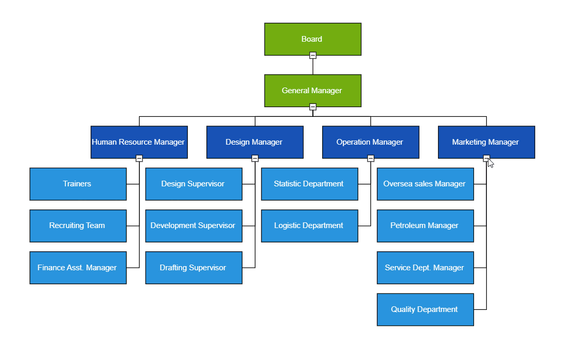
Org Chart Shape Customization
You can easily create different types of organizational chart templates and visualize them with a smooth UI design.
You can define custom node style using template in NodeTemplate at tag level. Please refer to the below code example for details.
<SfDiagramComponent>
 <DiagramTemplates>
  <NodeTemplate>
    @{
        Node node1 = (context as Node);
        string Name = (node1.Data as OrganizationalDetails).Name;
        string Role = (node1.Data as OrganizationalDetails).Role;
        string Imageurl = (node1.Data as OrganizationalDetails).Imageurl;
        <div class="e-orgchart-template-div-style">
          <div id="image" class="e-orgchart-template-image-style" style="background-image: url(@Imageurl);">
          </div>
          <div style="height:75%;float: right;margin-right: 20px">
           <p class="e-orgchart-template-name-style">@Name</p>
           <p class="e-orgchart-template-role-style">@Role</p>
          </div>
        </div>
     }
  </NodeTemplate>
 </DiagramTemplates>
</SfDiagramComponent>

Orientation
You can arrange the organizational chart with different orientations, such as top-to-bottom, left-to-right, right-to-left, and bottom-to-top as needed. Please refer to the following code example to set the orientation.
<SfDiagramComponent @ref="@Diagram" >
    …………
    …………
    …………
    <Layout Type="LayoutType.OrganizationalChart" Orientation="LayoutOrientation.BottomToTop" GetLayoutInfo="GetLayoutInfo">
    </Layout>
</SfDiagramComponent>
Alignment
Leaf-level nodes of the org chart can be aligned either horizontally or vertically. Nodes can be aligned to the left, right, or centre horizontally and to the top, bottom, or middle vertically. Please refer to the following code example to customize leaf-level node alignment.
private TreeInfo GetLayoutInfo(IDiagramObject obj, TreeInfo options)
{
   if (!options.HasSubTree)
   {
      options.Orientation = Orientation.Vertical;
      options.AlignmentType = SubTreeAlignmentType.Left;
   }
   return options;
}
Zoom and pan
It is difficult to visualize a huge organization chart on a small screen. In such a scenario, zooming and panning support helps provide a better view of chart data. Use the following code to enable zooming and panning support in the Blazor Diagram component.
<SfDiagramComponent @ref="@Diagram" InteractionController="@DiagramInteractions.ZoomPan">
    ………
    ………
</SfDiagramComponent>
Then, use the Ctrl + mouse wheel operation to zoom in and out on the org chart.
Note: For complete details, refer to the Create Org Chart using the Blazor Diagram Component documentation.
GitHub reference
Refer to the examples for creating an org chart using the Blazor Diagram Component in WebAssembly on GitHub and Syncfusion’s website.
Conclusion
Thanks for reading! In this blog, we have seen how to create an org chart using the Syncfusion Blazor Diagram component. Try out the steps given in this blog and elegantly visualize the hierarchical structure of any data!
If you would like to try Syncfusion components, you can download our free trial. Also, check out our other Blazor demos and documentation for detailed explanations and the facts you need to proceed further.
You can also contact us through our support forum, support portal, or feedback portal. We are always happy to assist you!


 No spam, just valuable updates.
Comments (2)
Hi Kameshwaran,
Can we also set height of the SfDiagramComponent dynamic like 100% or 50% or Organization – chart height something like this
Hi Srikar,
We can set the height of the SfDiagramComponent to a percentage. Please refer to our user guide documentation.
UG link: https://blazor.syncfusion.com/documentation/diagram/page-settings#responsive-with-parent-container