
 Sarathkumar V
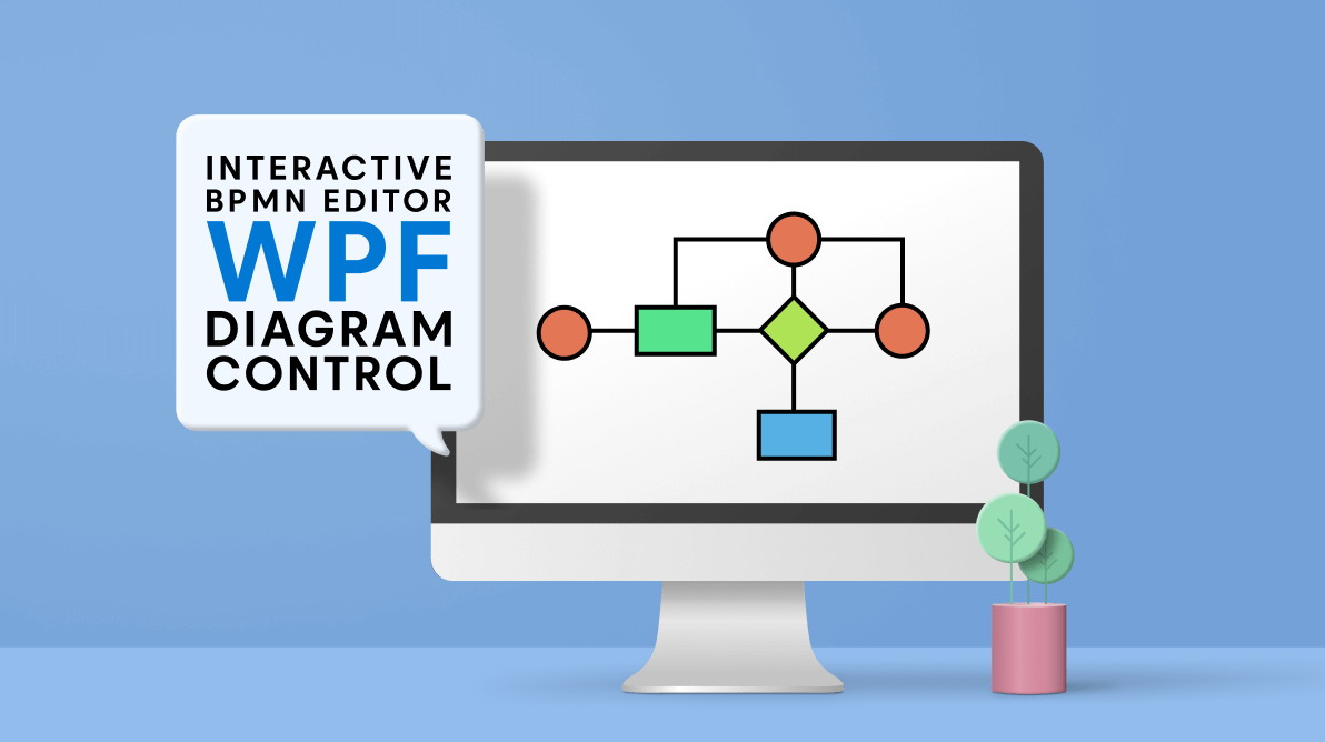
A business process can be confusing for anyone who is not directly involved with the process. A Business Process Model and Notation (BPMN) diagram creates a visual representation of a complex business process in a form similar to a flowchart. We can share such diagrams across organizations and industries to communicate the necessary information to complete a process.
In this blog, we will see how to easily create a BPMN editor with an interactive user interface using the Syncfusion WPF Diagram control. In the course of this explainer, we’ll also see how to use the rich set of features available in the WPF Diagram control to give your app a better user experience.
Let’s start!
BPMN shapes
The BPMN shapes help us to represent internal business processes in a graphical notation. They enable you to communicate procedures in a standard manner. These shapes are popular and intuitive graphics that can be easily understood by all business stakeholders, including business users, business analysts, software developers, and data architects.
The WPF Diagram control supports the following BPMN shapes:
| Shape | Symbol | Description |
| Event |  |
Represents something that happens during a business process. |
| Gateway |  |
Used to control the flow of a process. |
| Activity |  |
Describes the kind of work being done in a particular process instance. |
| Message | 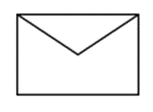 |
The content of a communication. |
| DataStore | 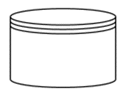 |
Store or access data associated with a business process. |
| DataObject | 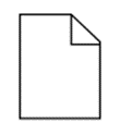 |
Represents information flowing with the process. Examples: data placed into a process, data resulting from a process, or data that needs to be collected or stored. |
| TextAnnotation | 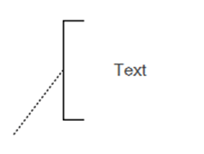 |
Points at or references another BPMN shape. |
| Group |  |
Organizes tasks or processes that are significant in the overall process. |
| ExpandedSubProcess |  |
The extended version of the Group symbol. |
| SequenceFlow | 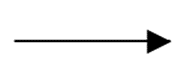 |
Represents the typical path between two flow objects. |
| DefaultSequenceFlow | 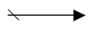 |
Represents the default sequence flow when other conditional flows are not valid. It is indicated by a backslash at the beginning of the sequence. |
| ConditionalSequenceflow | 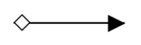 |
Controls the flow of a process based on certain conditions. |
| Association | 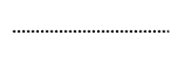 |
Represents a relationship between artifacts and flow objects. This is represented as a dotted line. |
| DirectionalAssociation | 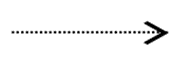 |
A directional association is used with data objects to show that they are either an input or output from an activity. This is represented as a dotted line with an arrow at one end. |
| BiDirectionalAssociation | 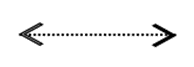 |
A bidirectional association is used with data objects to show that they are both input and output from an activity. This is represented as a dotted line with an arrow at both ends. |
| MessageFlow | 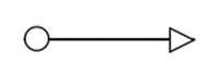 |
Shows the flow of messages between two participants. |
| InitiatingMessageflow | 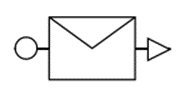 |
Represents an activity or event in one pool which can initiate a message to another pool. |
| NonInitiatingMessageflow | 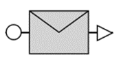 |
Represents an activity or event in one pool which can’t initiate a message to another pool. |
Create the WPF application
Refer to the documentation on creating your first WPF app to build a new WPF app using Visual Studio and run it.
Create the BPMN editor surface using WPF Diagram control
Add the WPF Diagram (SfDiagram) control to the app by dragging it from the Toolbox and dropping it in the Designer view. You can also manually add it using the XAML/C# code.
The following code example shows how to add the diagram canvas to your WPF application.
<syncfusion:SfDiagram Grid.Column="1">
    <syncfusion:SfDiagram.HorizontalRuler>
        <syncfusion:Ruler/>
    </syncfusion:SfDiagram.HorizontalRuler>
    <syncfusion:SfDiagram.SnapSettings>
        <syncfusion:SnapSettings SnapConstraints="ShowLines"/>
    </syncfusion:SfDiagram.SnapSettings>
    <syncfusion:SfDiagram.VerticalRuler>
        <syncfusion:Ruler Orientation="Vertical"/>
    </syncfusion:SfDiagram.VerticalRuler>
    <syncfusion:SfDiagram.Nodes>
        <syncfusion:NodeCollection/>
    </syncfusion:SfDiagram.Nodes>
    <syncfusion:SfDiagram.Connectors>
        <syncfusion:ConnectorCollection/>
    </syncfusion:SfDiagram.Connectors>
    <syncfusion:SfDiagram.Groups>
        <syncfusion:GroupCollection/>
    </syncfusion:SfDiagram.Groups>
</syncfusion:SfDiagram>
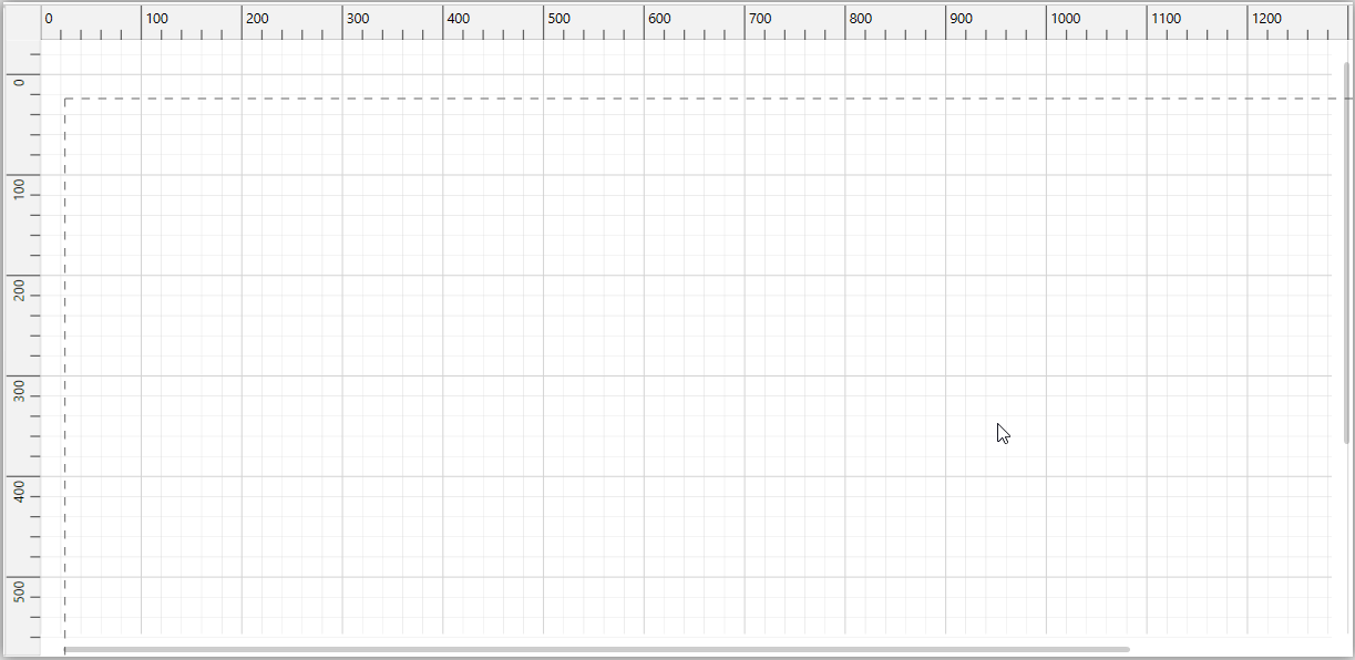
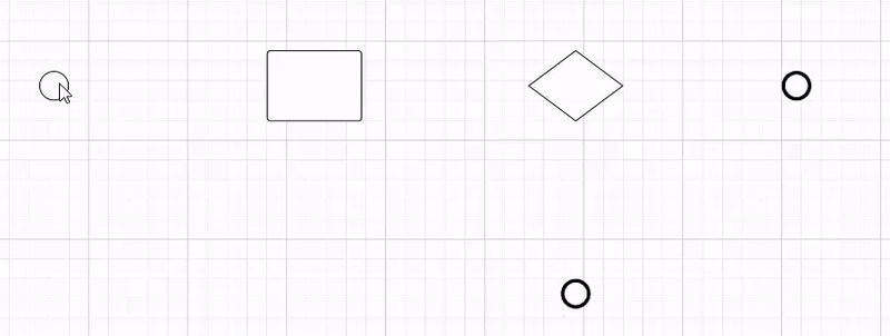
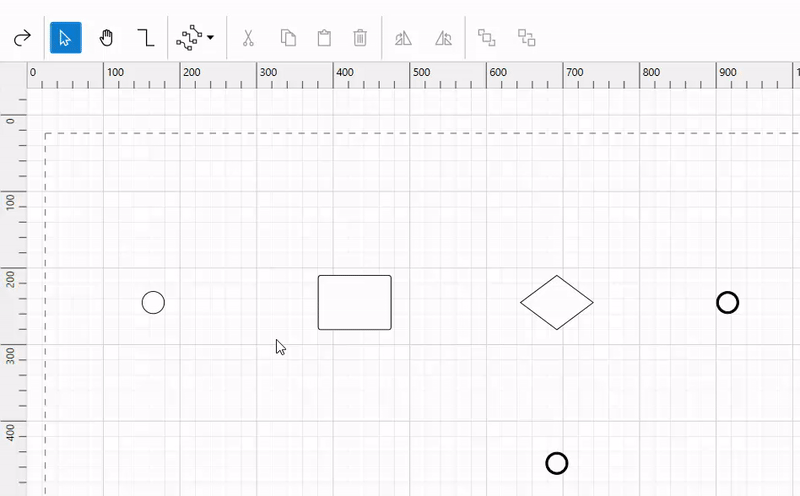
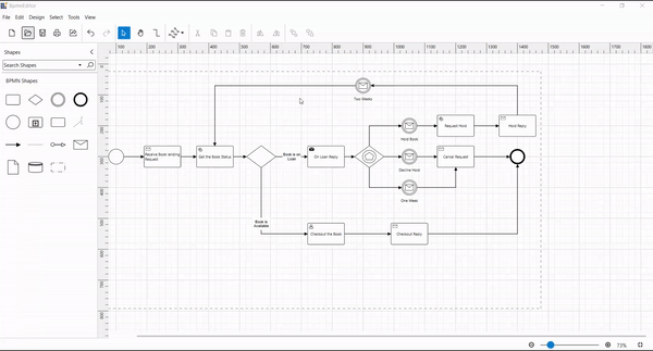
The following screenshot shows the created diagramming page.
Note: For more details, refer to the Getting Started with WPF Diagram documentation.
Create reusable BPMN symbols using WPF Diagram control
The WPF Diagram control provides a gallery of reusable symbols and diagram elements called stencil. We can drag and drop them onto the diagram canvas any number of times.
Let’s see how to create stencils using our built-in BPMN shapes. The WPF Diagram control provides a set of predefined categories of shapes. We can load the built-in shape categories into the stencils by specifying the Keys and Title properties of the StencilCategory class. The properties do the following:
- Keys: Specifies the static resource key name value of the category collection.
- Title: Specifies the title that should be displayed as a header of the category collection.
The following code explains how to create stencils with the BPMN shapes using the BPMNEditorShapes categories.
<syncfusion:Stencil x:Name="stencil" Grid.Column="0" BorderThickness="0,1,1,1" Title="Shapes">
    <syncfusion:Stencil.Categories>
        <syncfusion:StencilCategoryCollection>
            <!--Specify the basic shapes category with title and resource key-->
            <syncfusion:StencilCategory Title="BPMN Shapes" Keys="{StaticResource BPMNEditorShapes}"/>
        </syncfusion:StencilCategoryCollection>
    </syncfusion:Stencil.Categories>
    <syncfusion:Stencil.SymbolGroups>
        <syncfusion:SymbolGroups>
            <!--Separate groups based on the key-->
            <syncfusion:SymbolGroupProvider MappingName="Key"/>
        </syncfusion:SymbolGroups>
    </syncfusion:Stencil.SymbolGroups>
</syncfusion:Stencil>
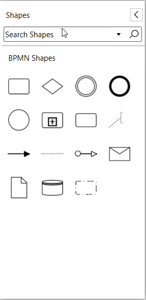
The following screenshot shows the collection of BPMN editor shapes as stencils.
Note: Refer to the Stencil in WPF Diagram documentation for more info on adding custom shapes, shape categories, and customizing the stencil appearances.
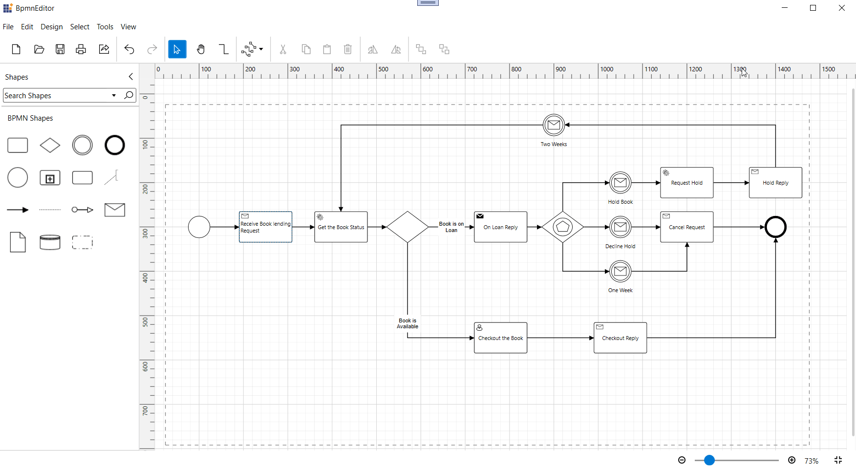
Create the BPMN diagram editor using WPF Diagram control
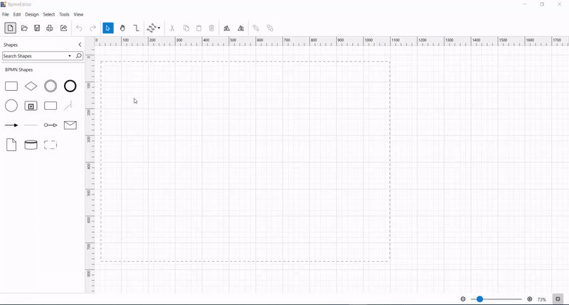
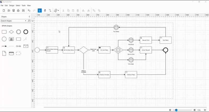
Now we can easily create the BPMN diagram editor using the WPF Diagram control by dragging and dropping the BPMN symbols from the stencils, and then arranging and connecting them.
Step #1: Add BPMN symbols to the editor
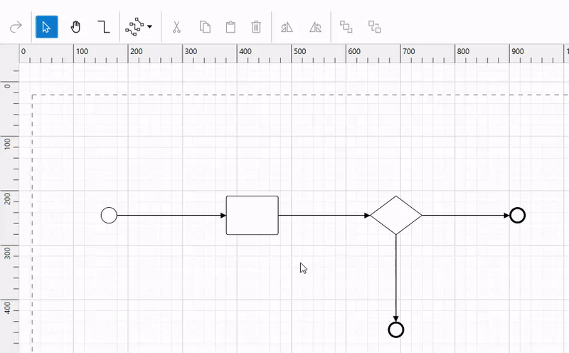
Start by dragging symbols onto the diagramming canvas from the BPMN Shapes stencils. Arrange them into an order that makes it clear where the business process start and endpoints are, and how the various nodes are linked. People who read the diagram should be able to see where to start and how to follow the connections.
Refer to the following GIF image.
Step #2: Connect BPMN symbols
Each diagram symbol has a Draw quick command  which is visible on selecting any diagram symbol. This quick command helps us to create a connection between symbols by clicking and dragging a connector and dropping it on another symbol.
Refer to the following GIF image.
Note: Refer to the Quick Command in WPF Diagram Control documentation to learn how to add or remove default/custom quick commands in your app and customize their appearance.
You can also create connectors by selecting the Connector tool  from the toolbar or using the Tools > Connector tool menu option. Click a symbol and drag a connector to another shape. When you are done, click the Pointer tool
  on the toolbar to select the symbols.
Note: For more details, refer to the Tools in WPF Diagram documentation.
Step #3: Add labels to symbols
To add text to any BPMN node, double-tap on the node or select the node and press F2. A text box will appear to type the required text. When you are done, press the Esc key or deselect the node.
Refer to the following GIF image.
Note: Refer to the Annotations in WPF Diagram documentation to see how to add labels in your diagram and customize its appearance.
Step #4: Load and save a diagram
The WPF Diagram control provides the flexibility to save your current work and resume it by loading the saved diagram back to the diagram canvas. Use the Save button  to save your current diagram to the local drive and use the Open button
  to load the existing diagram file from your local drive.
Refer to the following GIF image.
Note: Refer to the loading and saving diagrams in WPF Diagram documentation.
Step #5: Export the diagram
You can export the diagram to PDF format or an image format (JPEG, PNG, BMP, TIF, GIF, and more). To do so, click the Export button  or select the File > Export menu command.
Note: For more details, refer to the Exporting in WPF Diagram documentation.
Step #6: Print the diagram
Print a diagram by clicking the Print button  in the toolbar or selecting the File > Print menu command.
The following screenshot shows the Print Diagram dialog along with the custom print options.
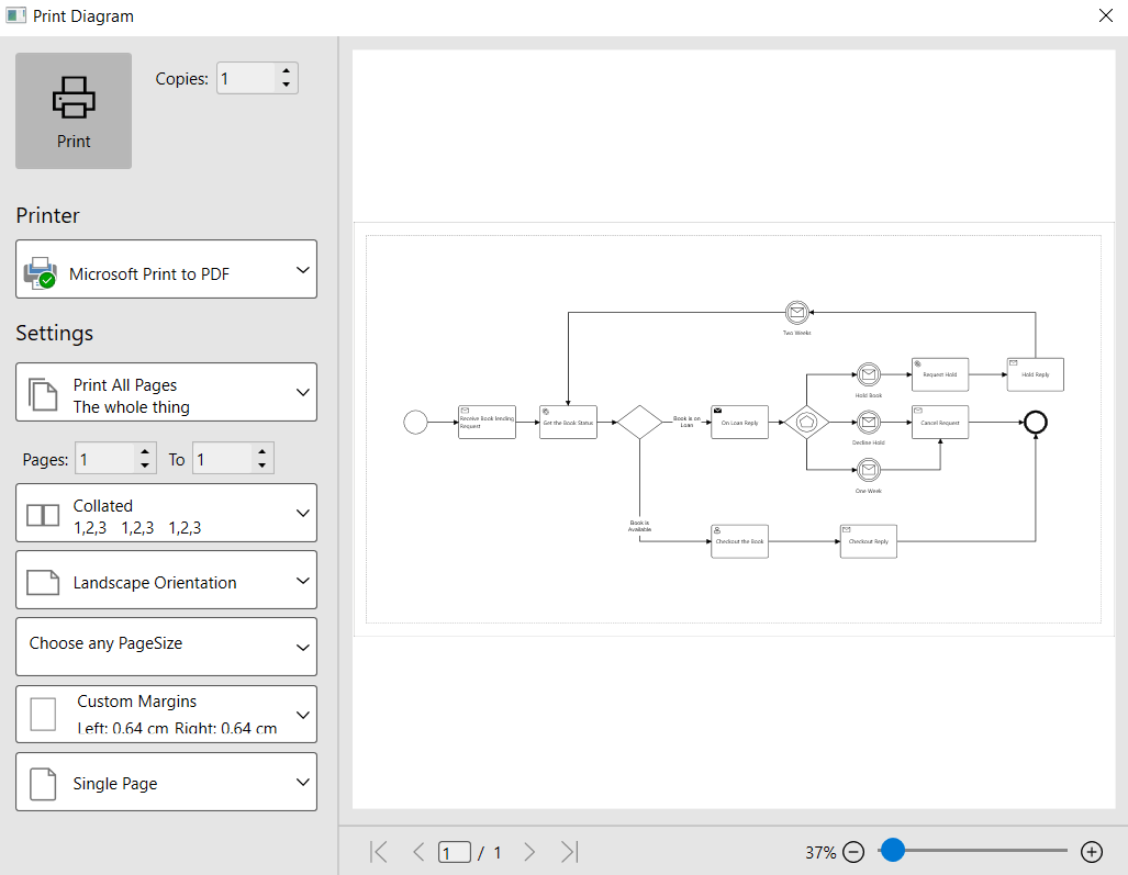
Note: For more details, refer to the Printing in WPF Diagram documentation.
Step 7: Pan and zoom
The WPF Diagram control provides support to pan and zoom the diagram in different ways.
Pan and zoom using the keyboard
- Press and hold the Ctrl and Shift keys. The pointer will turn into a magnifying glass.
- Do any of the following:
- Click the left mouse button to enlarge the view.
- Click the right mouse button to reduce the view.
- Click and drag the left mouse button over a region you want to zoom into.
- Right-click and drag to pan the diagram.
Pan and zoom using the scroll wheel
Do any of the following:
- To scroll up or down, rotate the scroll wheel forward or backward.
- To scroll left or right, hold down Shift as you rotate the scroll wheel forward or backward.
- To zoom in or out, hold down Ctrl as you rotate the scroll wheel forward or backward.
Zoom using the zoom controls
The zoom controls are in the Zoom ribbon bar of the View tab. Click the Zoom Out and Zoom In buttons to change the zoom level of the diagram. Also, you can make the entire diagram fit into the current view by clicking the Fit to Window button.
Pan using the pan tool
You can pan the diagram by selecting the Pan tool  from the Tools ribbon bar of the Home tab. Then, click and drag the mouse to pan the diagram.
GitHub reference
You can download an example of creating a BPMN editor using WPF Diagram control from GitHub.
Conclusion
Thanks for reading! In this blog, we have seen how to create an interactive BPMN editor using the versatile features of the Syncfusion WPF Diagram control. Now we can easily demonstrate business workflows! Try it out and leave feedback in the comments section below!
Similarly, you can use our Diagram control to build editors for organizational charts, flowcharts, network diagrams, or logic circuit diagrams.
If you’re already a Syncfusion user, you can download the product setup from our website. Otherwise, you can download a 30-day free trial.
You can contact us through our support forum, support portal, or feedback portal. We are always happy to assist you.


 No spam, just valuable updates.