
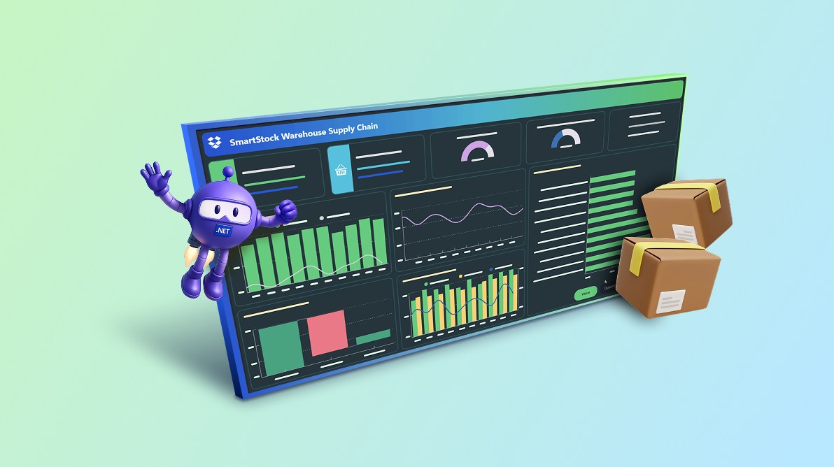
TL;DR: Need a faster way to visualize supply chain metrics? Learn how to create a .NET MAUI dashboard with Syncfusion charts and gauges to track inventory levels, delivery performance, and operational trends in real time. You’ll also see how MVVM, live‑updating data, and responsive layouts come together to build a clean, production-ready analytics UI.
Welcome to our Chart of the Week series!
In today’s fast‑paced supply chain environment, managers must track shipments, delivery timelines, and inventory levels to keep operations efficient and goals aligned. Every day brings new orders, shifting demand, and constant inventory changes. To keep operations running smoothly, managers need clear, real-time visibility; not spreadsheets buried in folders or static reports that age the moment you export them.
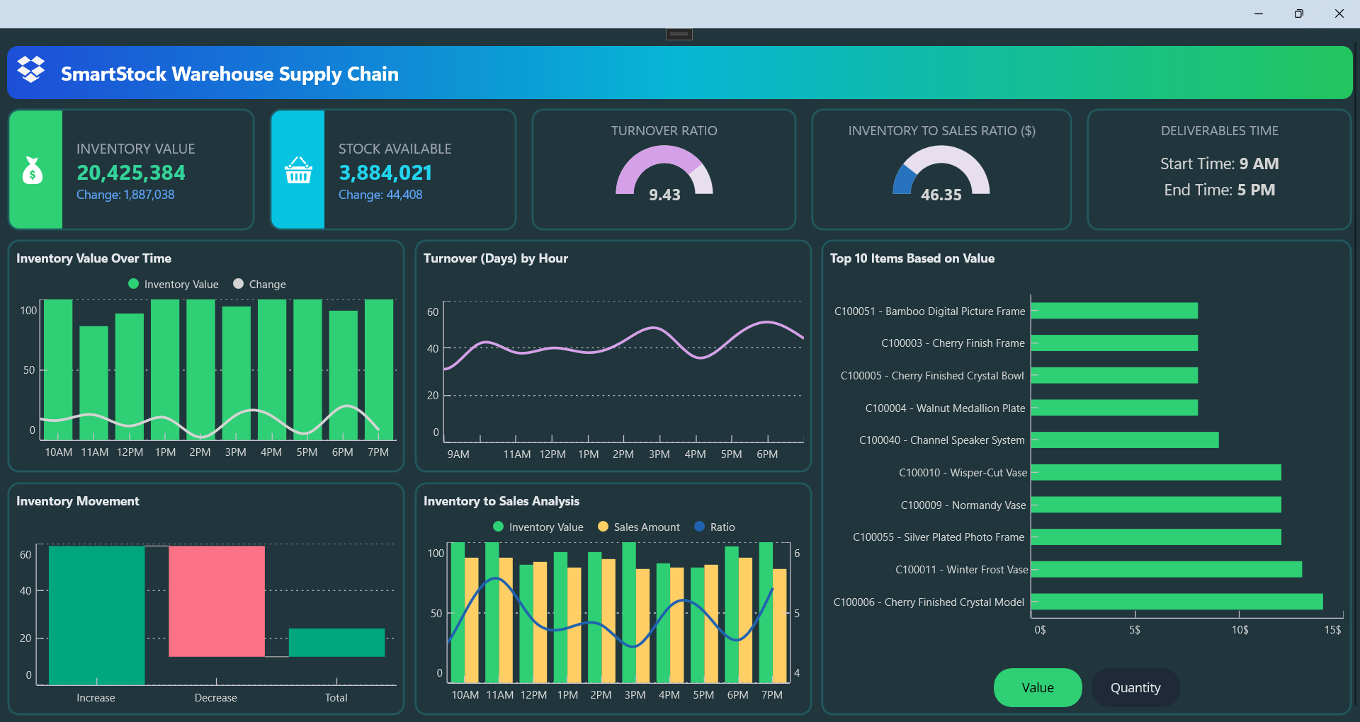
A Supply Chain Management Dashboard solves this problem by turning raw metrics into visual insights you can act on. Inventory value, stock availability, turnover ratios, and movement patterns all become easier to understand when presented through charts, gauges, and KPIs.
With Syncfusion® .NET MAUI Charts and Gauges, you can build an interactive, clean dashboard with minimal effort. In this hands-on guide, you’ll learn how to create a modern supply chain dashboard in .NET MAUI using the MVVM pattern, backed by realistic inventory data and developer-friendly architecture.
Designing the dashboard layout
The dashboard starts with a simple hierarchy:
- A gradient AppBar with a bold title.
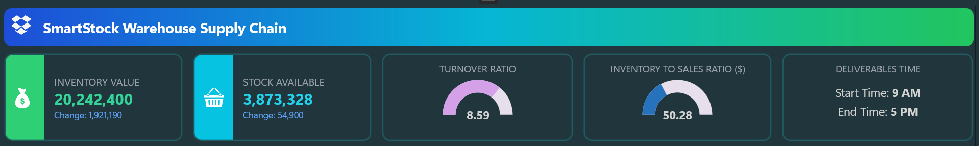
- A row of KPI cards for:
- Inventory value.
- Stock available.
- Turnover ratio.
- Inventory to sales ratio.
- Average inventory days of supply.
Each KPI card includes rounded corners and a small radial gauge to highlight its value at a glance.
Below the KPIs, a responsive grid arranges the charts. The layout adapts automatically, with two columns on larger screens and a vertical stack on mobile.
Here’s how each chart contributes to the dashboard:
- WaterfallSeries → Inventory value changes over time.
- SplineSeries → Turnover trends.
- ColumnSeries → Inventory movement.
- ColumnSeries + SplineSeries → Inventory vs. sales comparison.
- Horizontal Bar Chart → Top 10 items by inventory value.
This structure keeps every insight visually distinct while maintaining a clean, modular flow across devices.
Here’s how you can do it in code:
  <Grid RowDefinitions="Auto,Auto,Auto" ColumnDefinitions="*">

    <!-- AppBar with gradient banner and title -->
    <Border Grid.Row="0" Padding="10" StrokeThickness="0" />

    <!-- Grid with 5 KPI cards: Inventory, Stock, Turnover, Sales Ratio, Avg Days -->
    <Grid Grid.Row="1" ColumnDefinitions="Auto,Auto,Auto,Auto,Auto" />

    <!-- Grid with charts: Inventory Over Time, Turnover by Hour, Top 10 Items -->
    <Grid Grid.Row="2" ColumnDefinitions="1.5*,1.5*,2*" />

  </Grid>
Creating model classes for metrics and chart data
To support clean data binding and chart rendering, the dashboard defines lightweight model classes for each visualization.
Use the following model classes to structure the dashboard’s metrics and chart data:
public class KpiCards
    {
        // KPI card metrics -> drives KPI cards
    }

    public class InventoryValueOverTimePoint
    {
        // Inventory value trend -> drives Inventory Value Over Time chart
    }

    public class TurnoverByHourPoint
    {
        // Turnover trend -> drives Turnover (Days) by Hour chart
    }

    public class InventoryToSalesAnalysisPoint
    {
        // Inventory vs Sales -> drives combined Column + Line chart
    }

    public class InventoryMovement
    {
        // Inventory movement categories -> drives waterfall chart visualization
    }

    public class TopItem
    {
        // Top-selling items -> drives ranking lists and bar charts
    }
These models are seeded in the InventoryDashboardViewModel to simulate realistic supply chain metrics, keeping the ViewModel clean and the UI declarative.
Building the ViewModel for the dashboard
The InventoryDashboardViewModel connects data models to the UI. It exposes observable collections for KPIs, inventory movements, and top items, keeping everything reactive through INotifyPropertyChanged.
Here’s the ViewModel code example:
public partial class InventoryDashboardViewModel : INotifyPropertyChanged
{
        public InventoryDashboardViewModel()
        {
            // Set up collections, define the command for metric switching, and add a sample TopItems.
        }

        private bool UpdateVerticalData()
        {
            // Add new data points, update InventoryMovement and KPI cards, then increment count.
        }

        private void SeedInventoryMovement()
        {
            // Populate InventoryMovement with random Increase, Decrease, and Total values.
        }

        private void KPICards()
        {
            // Generate random KPI values for inventory, stock, turnover, ratio, and deliverables time.
        }

        public void StartTimer()
        {
            // Clear collections, seed initial data, set up KPI cards, and start 5-second update timer.
        }

        public void StopTimer()
        {
            // Stop the timer and reset the count.
        }
}
This structure keeps the ViewModel simple, predictable, and ready for real-time updates, perfect for dashboards where metrics change frequently.
Building the views with the Chart and Gauge controls
The dashboard UI is crafted using Syncfusion .NET MAUI Radial Gauge for KPI cards and .NET MAUI Cartesian Chart for visualizing supply chain trends. Each component is styled for clarity and responsiveness, ensuring the layout adapts smoothly across mobile and desktop screens.
The charts use a mix of ColumnSeries, SplineSeries, and WaterfallSeries to match the nature of each metric, while radial helps present ratio-based KPIs with strong visual context. Features like tooltips, legends, and crosshairs provide users with an interactive, insightful experience.
For example, a timer updates the data every 5 seconds, and each interval represents 1 hour on the chart axis. This creates a realistic progression model while keeping the visuals aligned with supply chain workflows. For more details on this timer-driven update logic, refer to the source implementation.
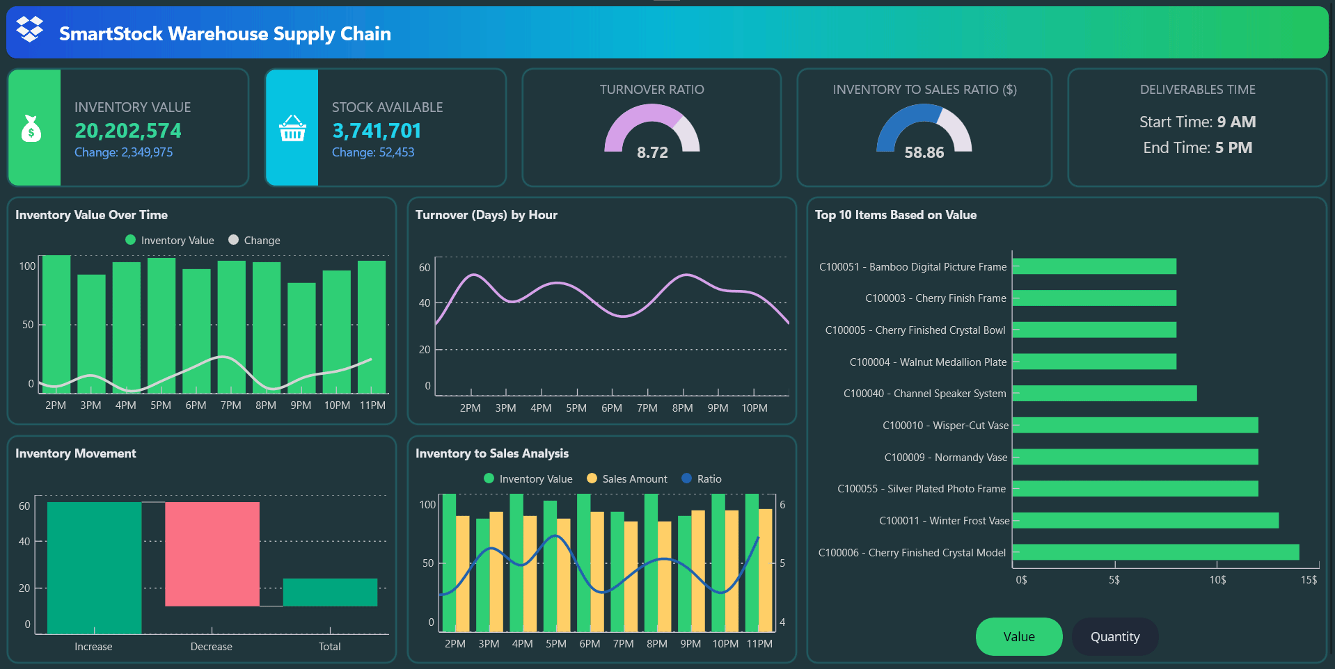
Displaying KPI cards using .NET MAUI Radial Gauge
Each top-level KPI is displayed using a combination of numeric text and delta indicators, styled for quick scanning. For ratio-based metrics such as turnover ratio, inventory-to-sales ratio, and deliverables time, the dashboard uses a .NET MAUI Radial Gauge with radial pointers to display thresholds and performance zones at a glance. This helps users interpret data quickly without scanning large tables.
The KPIS includes,
- Inventory value: Shows total stock value with a change indicator.
- Stock available: Displays current available units.
- Turnover ratio: Uses a radial gauge to show inventory replacement frequency.
- Inventory-to-sales ratio: Highlights the efficiency of stock usage.
- Deliverables time: Defines the scheduled time window during which inventory-related tasks or shipments are expected to be completed.
Here’s how you can do it in code:
<Border>
    <Label Text="INVENTORY VALUE"/>
    <Label Text="{Binding Kpis.InventoryValue, StringFormat='{}{0:N0}'}"/>
    <Label Text="{Binding Kpis.InventoryChange}"/>
</Border>

<Border Grid.Column="1">
    <Label Text="STOCK AVAILABLE"/>
    <Label Text="{Binding Kpis.StockAvailableValue, StringFormat='{}{0:N0}'}"/>
    <Label Text="{Binding Kpis.StockAvailableChange}"/>
</Border>

<gauge:SfRadialGauge>
    <gauge:RadialAxis>
        <gauge:GaugeAnnotation>
            <Label Text="{Binding Kpis.TurnoverRatio, StringFormat='{0:0.00}'}"/>
        </gauge:GaugeAnnotation>
    </gauge:RadialAxis>
</gauge:SfRadialGauge>

<gauge:SfRadialGauge>
    <gauge:RadialAxis>
        <gauge:GaugeAnnotation>
            <Label Text="{Binding Kpis.InventoryToSalesRatio, StringFormat='{0:0.00}'}"/>
        </gauge:GaugeAnnotation>
    </gauge:RadialAxis>
</gauge:SfRadialGauge>

<Border>
   <Label Text="DELIVERABLES TIME"/>
   <Label Text="Start Time: 9 AM"/>
   <Label Text="End Time: 5 PM"/>
</Border>
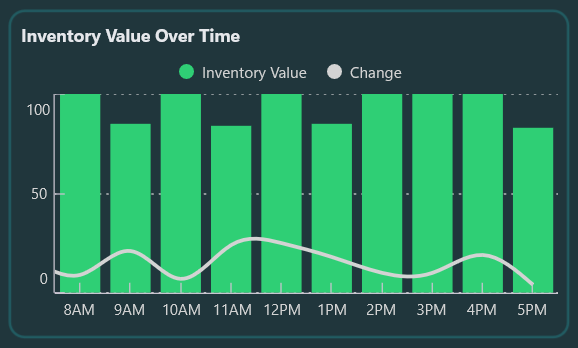
Visualizing inventory trends with Column and Spline series
This inventory trend chart illustrates inventory performance using Syncfusion .NET MAUI Cartesian Chart, combining bar and line visuals to convey both volume and variation. They include,
- ColumnSeries displays total inventory values at each time interval, offering a clear view of stock levels.
- SplineSeries overlays the inventory changes, highlighting subtle fluctuations and trends.
Tooltips help users inspect exact data points, and the legend allows toggling series visibility for focused viewing.
<chart:SfCartesianChart>
  <chart:SfCartesianChart.Series>
    <chart:ColumnSeries ItemsSource="{Binding InventoryValueOverTime}"
                        XBindingPath="Timestamp"
                        YBindingPath="InventoryOverTimeValue"
                        Label="Inventory Value"/>
    <chart:SplineSeries ItemsSource="{Binding InventoryValueOverTime}"
                        XBindingPath="Timestamp"
                        YBindingPath="InventoryValueOverTimeChange"
                        Label="Change"/>
  </chart:SfCartesianChart.Series>
</chart:SfCartesianChart>
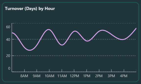
Smoothing inventory flow: Turnover trends by hour
This chart tracks hourly turnover behavior using a smooth SplineSeries with markers. The X‑axis represents hourly intervals throughout the day, while the Y‑axis shows turnover duration in days. You can inspect exact values using crosshair and tooltip interactions, making it easy to spot peaks, dips, and emerging demand patterns.
Try this in your code:
<chart:SfCartesianChart>
  <chart:SfCartesianChart.Series>
    <chart:SplineSeries ItemsSource="{Binding TurnoverByHour}"
                        XBindingPath="Timestamp"
                        YBindingPath="TurnoverHoursValue"
                        Label="Turnover"/>
  </chart:SfCartesianChart.Series>
</chart:SfCartesianChart>
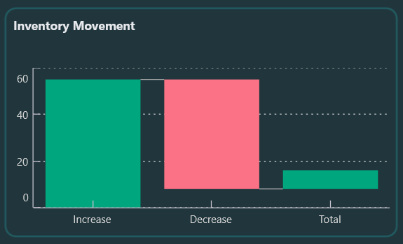
Tracking stock adjustments: Inventory flow
A WaterfallSeries visualizes sequential increases and decreases in inventory, showing how each adjustment contributes to the final total. Gains and losses are displayed in color-coded bars for quick interpretation, and the summary bar highlights the net result. This visualization is especially useful when teams need a clear view of item movements across operational steps. Tooltips provide quick breakdowns of each category.
Below is the code you need:
<chart:SfCartesianChart>
  <chart:SfCartesianChart.Series>
    <chart:WaterfallSeries ItemsSource="{Binding InventoryMovement}"
                           XBindingPath="MovementType"
                           YBindingPath="MovementValue"
                           SummaryBindingPath="IsSummary"
                           Label="Movement"/>
  </chart:SfCartesianChart.Series>
</chart:SfCartesianChart>
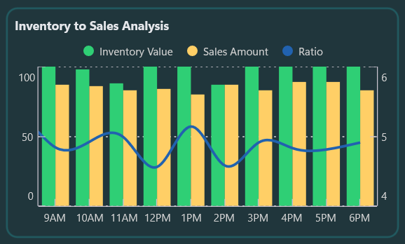
Balancing inventory and sales: Ratio insights
This chart combines two ColumnSeries and a SplineSeries to compare inventory values with sales figures and the resulting inventory-to-sales ratio. You can toggle the series visibility to focus on specific metrics. This side-by-side layout helps identify overstocking, understocking, and mismatched demand patterns throughout the day.
This chart includes,
- ColumnSeries (Inventory and sales): To display hourly values per day, shown side by side for direct comparison.
- SplineSeries (Inventory‑to‑sales ratio): To highlight trend fluctuations between inventory and sales throughout the day.
Add this to your project:
<chart:SfCartesianChart>
  <chart:SfCartesianChart.Series>
    <chart:ColumnSeries ItemsSource="{Binding InventoryToSalesAnalysis}"
                        XBindingPath="Timestamp"
                        YBindingPath=" InventoryOverTimeValue "
                        Label="Inventory"/>
    <chart:ColumnSeries ItemsSource="{Binding InventoryToSalesAnalysis}"
                        XBindingPath=" Timestamp"
                        YBindingPath=" SalesAmount"
                        Label="Sales"/>
    <chart:SplineSeries ItemsSource="{Binding InventoryToSalesAnalysis}"
                        XBindingPath=" Timestamp"
                        YBindingPath=" InventorySalesRatio"
                        YAxisName="RatioAxis"
                        Label="Ratio"/>
  </chart:SfCartesianChart.Series>
</chart:SfCartesianChart>
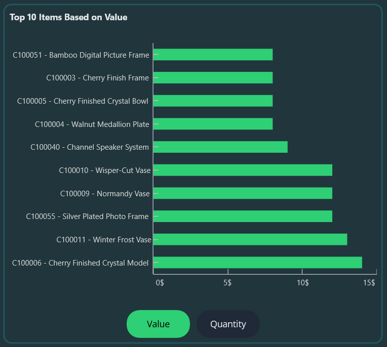
Identifying top contributors to inventory costs
A horizontal ColumnSeries ranks SKUs using the TopItems collection, sorted in descending order for quick identification of high‑impact items. By default, items are ranked by value, but the SetTopItemsMetricCommand allows switching to quantity for alternative analysis. It’s a powerful way to spotlight key contributors to inventory costs and movement.
Code example for quick integration:
<chart:SfCartesianChart IsTransposed="True">
  <chart:SfCartesianChart.Series>
    <chart:ColumnSeries ItemsSource="{Binding TopItems}"
                        XBindingPath="ItemName"
                        YBindingPath="{Binding TopItemsMetricPath}"
                        Label="Top Items"/>
  </chart:SfCartesianChart.Series>
</chart:SfCartesianChart>
By following these steps, you’ll build a complete Supply Chain and Logistics Dashboard in .NET MAUI, as shown below.
GitHub reference
You can find the complete example of the supply chain dashboard in .NET MAUI in this GitHub repository.
Frequently Asked Questions
The dashboard leverages .NET MAUI Radial Gauge for KPI cards and .NET MAUI Cartesian Chart (ColumnSeries, SplineSeries, WaterfallSeries) for data visualizations.What Syncfusion controls are used in this dashboard?
Data is refreshed every 5 seconds using a timer, which is mapped to 1 hour per axis interval for simulation purposes.How often does the data update in the charts?
Yes. For example, the top ten items chart supports switching between Value and Quantity using the SetTopItemsMetricCommand.Can I switch between different metrics in the charts?
WaterfallSeries is ideal for showing cumulative increases and decreases toward a total, while ColumnSeries is better for side‑by‑side category comparison.Why use Waterfall Series for visualizing inventory movement instead of Column Charts?

Conclusion
Thank you for reading! In this blog, we’ve seen how to build a supply chain and logistics dashboard using Syncfusion .NET MAUI controls. We explored KPI cards with radial gauges and a variety of charts, including ColumnSeries, SplineSeries, and WaterfallSeries, to track shipment status, delivery times, and inventory levels. We strongly encourage you to follow the steps outlined and share your feedback in the comments section below.
If you’re a Syncfusion user, you can download the setup from the license and downloads page. Otherwise, you can download a free 30-day trial.
You can also contact us through our support forum, support portal, or feedback portal for queries. We are always happy to assist you!


 No spam, just valuable updates.