
TL;DR: Bar charts and histograms look similar but reveal different data stories. Bar charts quickly compare categories, while histograms show patterns, shapes, and trends you might not see otherwise. Once you know when to use each, your visualizations become clearer and more impactful.
Same bars, different stories: Choosing the right chart for accurate analysis
Choosing between a bar chart and a histogram can dramatically influence how well your data speaks. Sure, both use bars, but that’s where the similarity ends. A bar chart compares categories with clear gaps between bars, while a histogram uncovers distributions of continuous numbers using connected bars.
To help you make confident decisions, we break down the 8 essential differences with practical examples. Whether you’re a developer, analyst, or student, these distinctions will guide you toward selecting the best chart for any analysis.
What is a bar chart
A bar chart, also commonly known as a column chart, is used to compare the frequency, count, total, or average of data across distinct categories. It displays information using vertical or horizontal bars, making it ideal for representing discrete categories side-by-side.
Each bar requires two values:
- X value: the category (string, number, or date-time).
- Y value: the numeric measure for that category.
The x-axis shows the categories being compared, while the y-axis shows their corresponding values. All bars have equal width, but their heights (or lengths) vary based on the numeric value they represent. Since each bar stands independently with clear gaps, bar charts make category‑to‑category comparisons easy and visually intuitive.
Key characteristics of a bar chart
- Designed for categories: Each bar corresponds to a separate, independent category, making bar charts ideal for comparing items such as countries, brands, products, or departments.
- Bars have visible gaps: The spacing between bars emphasizes that the data is not continuous, helping readers clearly distinguish one category from another.
- Bar height/length reflects the value: All bars have equal width, but their height (or length, in horizontal charts) varies according to the numeric value they represent. Higher or longer bars indicate larger values.
- Flexible ordering: Bars can be sorted alphabetically, numerically, or in any custom sequence without changing the meaning of the chart. This flexibility helps communicate insights more effectively.
When to use a bar chart
Bar charts are the go‑to choice when your data revolves around distinct groups rather than continuous values. They shine in situations where each category stands on its own, with the goal of highlighting how these groups compare. Because of their clarity, bar charts are widely used in presentations, reports, and dashboards where quick understanding is essential.
Use a bar chart:
- When data is naturally divided into separate categories with no numeric relationship.
- To show how groups differ in size, quantity, or performance.
- When the information represents labels or classes, not ranges or intervals.
- To clearly compare data by category instantly.
- While ranking or contrasting items, not analyzing a distribution.
Example for the bar chart
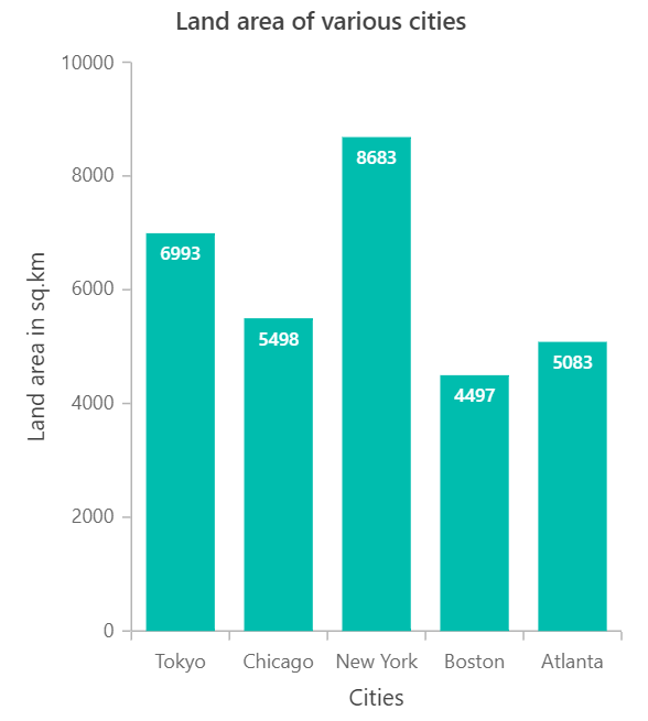
Imagine comparing the land area of major cities. The bar chart shows the land area for Tokyo, Chicago, New York, Boston, and Atlanta. New York has the largest land area, followed by Tokyo, while Boston has the smallest. The bar chart works well because it compares each city’s land area side by side.
Histogram chart
Although histogram chart looks similar to a bar chart, it serves a more statistical purpose. It groups continuous values into bins, showing the distribution, clusters, gaps, or outliers in a dataset. Only a list of numeric values is needed; the chart automatically organizes them into frequency ranges.
- X-axis: Represents the value ranges (bins).
- Y-axis: Represents the count or frequency of values within each range.
The x-axis shows the value ranges defined by the bin size, and the y-axis shows how many values are in each bin. Since bins are continuous, the bars touch.
Histograms are especially helpful when you want to understand the overall distribution of data, such as in exam scores, measurements, or time intervals, where observing how values are spread is crucial.
Key characteristics of a histogram chart
- Shows distribution of continuous data: A histogram groups continuous numeric values into intervals (bins), making it easy to analyze the shape, spread, and patterns within the data.
- Bars touch to indicate continuity: Unlike bar charts, histogram bars have no gaps, emphasizing that the data values fall along a continuous numeric range.
- Each bar represents a value range (bin): Instead of categories, each bar corresponds to a numerical interval, such as 0–10, 11–20, or 21–30, based on the chosen bin size.
- Requires only one numeric dataset: You don’t need categories, just a single list of numbers. The histogram automatically groups them into frequency ranges on the x-axis and counts occurrences on the y-axis.
When to use a histogram chart
A histogram is best when you need to understand how numeric data is distributed, not when comparing values. It groups values into bins and shows how often each occurs, making it easy to see patterns, skewness, clusters, gaps, or outliers.
Use a histogram:
- To analyze the distribution or spread of data.
- When the dataset contains continuous numerical values (e.g., duration, measurements, rates).
- To identify patterns such as symmetry, skewness, peaks, or gaps.
- To explore the shape of your data: Normal, uniform, bimodal, etc.
- While examining a large dataset where grouping values into ranges provides clearer insights.
Example of the histogram chart
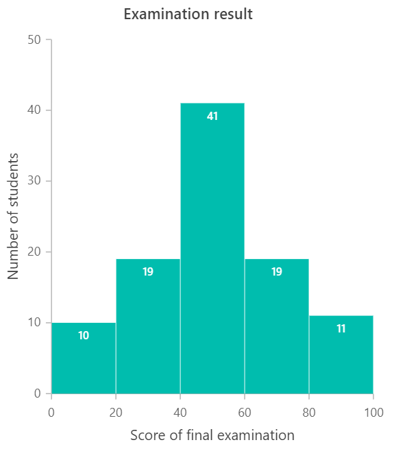
Imagine you are looking at students’ final exam scores. The following histogram groups scores into ranges such as 0–20, 20–40, 40–60, 60–80, and 80–100. Each bar shows how many students fall into each range. Most students scored between 40 and 60, while a few scored at the extremes. This is appropriate for a histogram, since the data are continuous and the goal is to see the score distribution.
Bar chart vs histogram chart: Quick comparison
| Comparison terms | Bar chart | Histogram chart |
| Usage | Compare values across different categories. | Show frequency distribution of continuous numerical data. |
| Indicates | Discrete, independent categories. | Continuous numeric ranges (intervals/bins). |
| Data type | Categorical data. | Quantitative (continuous) data. |
| Rendering method | Each category is shown as a separate bar. | Data is grouped into bins, and each bin is shown as a bar. |
| Space between bars | Bars typically have gaps between them. | Bars touch each other to represent continuity. |
| Reordering bars | Bars can be reordered freely (alphabetical, ascending, etc.) | Bars cannot be reordered because bin order is fixed by numeric ranges. |
| Axis label placement | Labels can be placed on or between ticks depending on category layout. | Labels are placed directly on ticks representing numeric intervals. |
| Required values | Requires x (category) + y (numeric value). | Requires only a numeric dataset to form bins (x) and frequencies (y). |

Choosing the right chart: A quick guide
Selecting the correct chart type is essential for presenting your data clearly and effectively. Here’s a simple guide to help you decide:
- Comparing values across categories? → Choose a bar chart
- Exploring numeric distribution? →Use a histogram
- Do your data contain continuous numbers (e.g., age, marks, temperature)? → Avoid bar charts
Bar charts are best for comparing categories side by side. Histograms show the shape of the dataset, such as peaks or clusters.
Choosing the right chart keeps your visuals precise, clean, and impactful.
Frequently Asked Questions
How to handle outliers in histograms?
We can cap or floor extreme values, put them in a separate outlier bin, or use a small zoomed in chart to show them clearly.
Can I overlay two histograms to compare groups?
Yes, use transparency or offset bins and consider density or normalized counts to compare shapes fairly.
Do bar charts support stacked or grouped layouts?
Absolutely. Use stacked bars for part to whole comparisons or grouped bars for side by side comparisons.
Which chart is easier for beginners to understand?
Bar charts are generally easier for new users. Histograms require more interpretation but offer deeper insights into data distribution.
Can histograms display negative values?
Yes, if the numeric data includes negative values, bins are created to accommodate them.
Conclusion
Thanks for reading! You now have a clear understanding of when to use a bar chart vs a histogram and how each one transforms your data storytelling.
If you’re ready to integrate these chart types into your applications, Syncfusion offers powerful, customizable chart components for every major platform:
ASP.NET Core | ASP.NET MVC | JavaScript |
React | Vue | .NET MAUI |
Flutter | Angular | Blazor |
WinForms | WinUI | WPF |
You can download Essential Studio from the license and downloads page if you’re already a customer. If you’re not a Syncfusion customer yet, you can start with a 30-day trial to evaluate the components.
Also, if you have any questions or need assistance, feel free to reach out through the support forum, support portal, or feedback portal. We’re always happy to help!
Happy charting!


 No spam, just valuable updates.
Comments (1)
Good one ☝️