
TL;DR: Learn how to build an AI-powered WinUI Line Chart to visualize billionaire wealth trends. This guide covers real-time data binding, anomaly detection, and interactive chart customization for financial dashboards.
Tracking and comparing billionaire wealth across different years isn’t just fascinating, it’s a powerful way to uncover global financial trends and understand how fortunes shift over time. In this tutorial, we’ll build an AI-powered WinUI application that uses Syncfusion WinUI Charts to visualize the net worth of the world’s top 10 billionaires with a sleek SfCartesianChart LineSeries.
What You’ll Build
In this project, we’ll combine AI-driven data generation with modern UI components to create an interactive dashboard that makes exploring trends in billionaire wealth effortless.
- Generate a structured dataset of the top 10 richest individuals using Azure OpenAI.
- Bind the data to a WinUI Line Chart for clear and dynamic visualization.
- Highlight key insights, such as the highest and lowest net worth.
- Apply structured axis styling and customized data labels for better readability.
- Implement a year selector and display rich details, such as age, nationality, and industry.
- Design a polished, responsive UI for an engaging user experience.
By the end of this tutorial, you’ll have a responsive, data-driven dashboard that dynamically updates as you explore billionaire wealth trends across different years.
Why this solution works
Here’s why this approach is effective and practical for building a modern, interactive financial dashboard:
- Dynamic updates: Refresh the chart instantly based on the selected year.
- Clear comparisons: A LineSeries with labeled points makes ranking and trend analysis easy.
- Modern WinUI styling: Leverage WinUI theming with a card-based layout and data labels.
- Extensible design: Add tooltips, legends, or anomaly highlighting as needed.
Uses and scenarios
This solution is versatile and can be applied in various real-world contexts, including:
- Executive dashboards tracking billionaire wealth by year.
- Educational demos for charting, data binding, and WinUI UI composition.
- Finance analytics prototypes that need fast, well-structured charting and list views.
Why use AI for billionaire wealth tracking?
Traditional billionaire lists rely on periodic updates from public filings and news, which can be inconsistent and lag behind real events. By combining Azure OpenAI with modern charting dashboards, you get:
- Faster aggregation: AI consolidates names, net worth, industries, and sources into a clean JSON schema.
- Normalized, comparable records: Automatically standardize currencies, units, and name variants for accurate comparisons.
- Data enrichment: Fill gaps with inferred details like age, nationality, and industry.
- Change detection: Highlight year-over-year shifts and probable drivers such as market moves, IPOs, and acquisitions.
- Trend insights: Generate natural-language highlights aligned with chart data.
- Forecast-ready structure: Enable projections and scenario testing.
- Rapid prototyping: Quickly create realistic datasets for development and demos.
- Extensible integrations: Combine AI-curated lists with market APIs for real-time updates.
Let’s walk through the steps for building an AI-powered WinUI dashboard that visualizes billionaire wealth by year.
Step 1: Supply the dataset via the AI service
Start by using Azure OpenAI to generate a year-specific dataset of the top 10 billionaires. Deserialize the response into strongly typed objects for charting and UI binding.
Define the data model
Creating a simple, chart-friendly model with the necessary fields for plotting:
namespace WorldRichestPeople
{
    public class RichestPeopleModel
    {
        public string? Name { get; set; }
        public double NetWorth { get; set; }
        public double Age { get; set; }
        public string? Nationality { get; set; }
        public string? PrimarySource { get; set; }
    }
}
Implement the AI-backed data provider
This service crafts a strict prompt, calls Azure OpenAI, extracts the raw JSON array, and converts it into a list of RichestPeopleModel entries. Configure these settings:
- Endpoint: HTTPS URL of your Azure OpenAI resource.
- DeploymentName: Model deployment name, such as gpt-4o or gpt-35-turbo.
- Key: Your secret API key for authentication; keep it private and rotate it if exposed.
Refer to the below code example:
public class RichestPeopleAIService
{
    internal const string Endpoint = "YOUR_END_POINT_NAME";
    internal const string DeploymentName = "DEPLOYMENT_NAME";
    internal const string Key = "API_KEY";
    internal bool IsValid { get; set; }
    internal IChatClient? Client { get; set; }

    public RichestPeopleAIService()
    {
        _ = ValidateCredential();
    }

    internal async Task ValidateCredential()
    {
        // Validate credentials and initialize the chat client
    }

    public async Task<List<RichestPeopleModel>> GetTopRichestByYear(int year)
    {
        // Get top 10 richest by year via AI (or fallback data if invalid)
    }

    private void GetAzureOpenAIClient()
    {
        // Create AzureOpenAI client with Endpoint/Key and bind to DeploymentName
    }

    private async Task<string> GetAnswerFromGPT(string prompt)
    {
        // Send prompt to Azure OpenAI and return raw response
    }

    private static string ExtractJsonArray(string response)
    {
        // Extract the first JSON array from the AI response
    }
}
Bind results to the ViewModel
Trigger the AI call for the selected year and expose the collection for chart and list binding.
public async Task RefreshForSelectedYearAsync()
{
    var list = await service.GetTopRichestByYear(SelectedYear) ?? new();
    Data = new ObservableCollection<RichestPeopleModel>(list);
    UpdateMinMaxValues();
}
Step 2: Add a dashboard header
Begin with a clear header to establish context. A simple StackPanel and TextBlock deliver a focused title and a consistent visual anchor for the page.
<StackPanel>
    <TextBlock Text="Top 10 Billionaires in the World by Net Worth"
               Foreground="{StaticResource HeaderTextBrush}"
               FontSize="22"
               FontWeight="SemiBold"/>
</StackPanel>
Step 3: Add a year selector
Introduce a compact SfComboBox bound to Years and SelectedYearString. When a new year is selected, the dashboard triggers a fresh AI fetch, updating the chart and list seamlessly:
<StackPanel>
<TextBlock Text="Select Year:"
VerticalAlignment="Center"
Foreground="{StaticResource TextPrimaryBrush}"/>
<editors:SfComboBox ItemsSource="{Binding Years}"
SelectedItem="{Binding SelectedYearString, Mode=TwoWay}"
Background="{StaticResource CardBackgroundShort}"
BorderBrush="{StaticResource CardBorderBrush}"
Foreground="{StaticResource TextPrimaryBrush}"/>
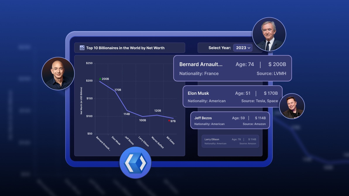
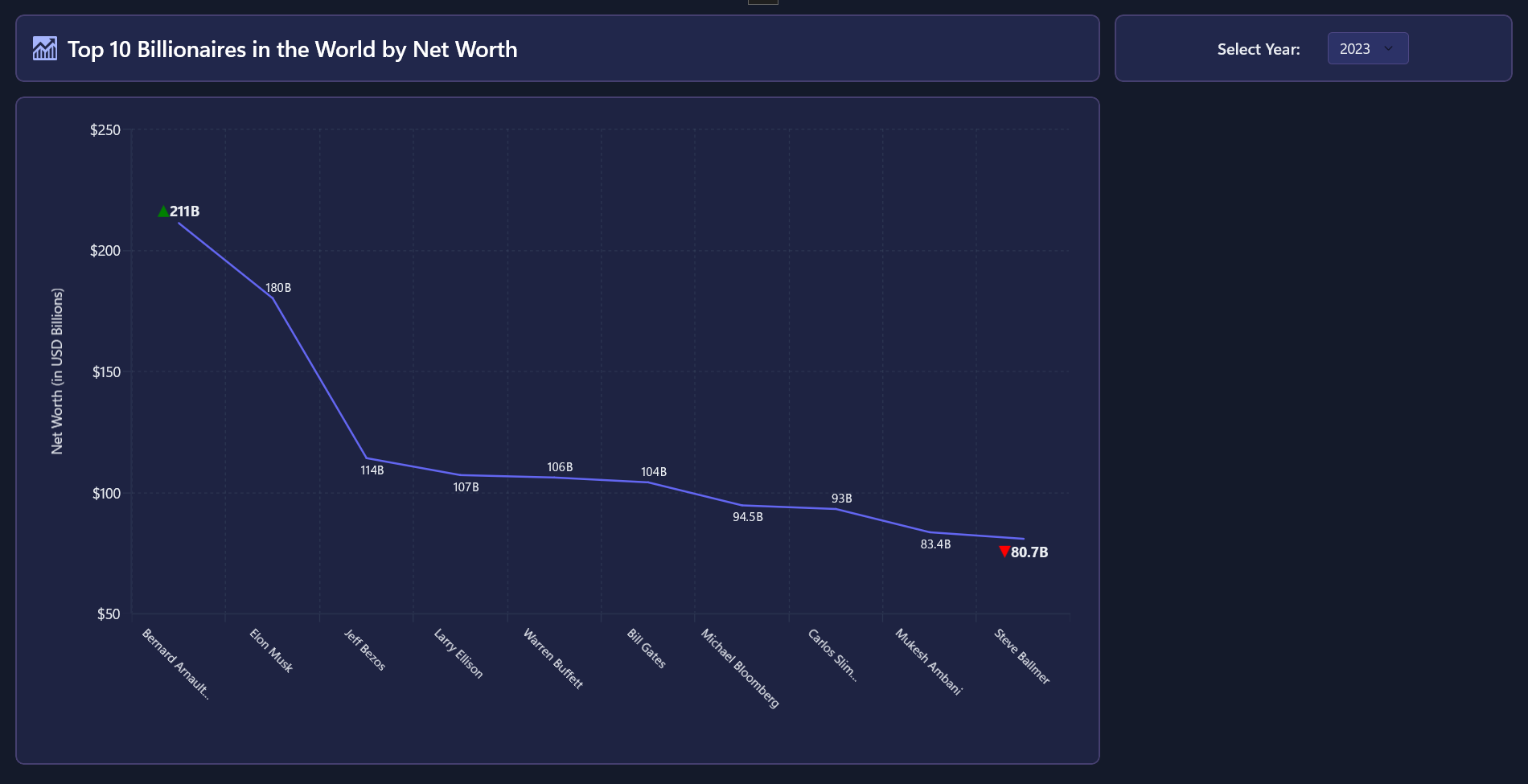
</StackPanel>Step 4: Plot a LineSeries
Bind a LineSeries to the data, setting XBindingPath to the Name field and YBindingPath to the NetWorth field. Configure axes and data labels for clarity:
- XAxis: CategoryAxis for names.
- YAxis: NumericalAxis for net worth.
DataLabelSettings: Show ▲ for max and ▼ for min values.- Use a converter to trim long names for readability.
Refer to the code example:
<chart:SfCartesianChart>
    <chart:SfCartesianChart.Resources>
        <local:DataLabelConverter x:Key="dataLabelConverter"/>
        <DataTemplate x:Key="dataLabelTemplate">
            <StackPanel Orientation="Horizontal">
                <Path Width="12"
                      Height="12"
                      Fill="{Binding Converter={StaticResource dataLabelConverter}, ConverterParameter=Fill}"
                      Data="{Binding Converter={StaticResource dataLabelConverter}}"/>
                <TextBlock Text="{Binding YData}"
                           Foreground="{StaticResource TextPrimaryBrush}"
                           FontWeight="{Binding Converter={StaticResource dataLabelConverter}, ConverterParameter=FontWeight}"
                           FontSize="{Binding Converter={StaticResource dataLabelConverter}, ConverterParameter=FontSize}"/>
                <TextBlock Text="B"
                           Foreground="{StaticResource TextPrimaryBrush}"
                           FontWeight="{Binding Converter={StaticResource dataLabelConverter}, ConverterParameter=FontWeight}"
                           FontSize="{Binding Converter={StaticResource dataLabelConverter}, ConverterParameter=FontSize}"/>
            </StackPanel>
        </DataTemplate>
    </chart:SfCartesianChart.Resources>
    <chart:SfCartesianChart.XAxes>
        <chart:CategoryAxis LabelPlacement="BetweenTicks"
                            LabelRotation="45"
                            AxisLineStyle="{StaticResource AxisLineStyle}"
                            MajorTickStyle="{StaticResource AxisLineStyle}"
                            MajorGridLineStyle="{StaticResource XAxisGridLineStyle}"
                            LabelTemplate="{StaticResource CategoryAxisLabelTemplate}">
            <chart:CategoryAxis.LabelStyle>
                <chart:LabelStyle Foreground="{StaticResource TextPrimaryBrush}"/>
            </chart:CategoryAxis.LabelStyle>
        </chart:CategoryAxis>
    </chart:SfCartesianChart.XAxes>

    <chart:SfCartesianChart.YAxes>
        <chart:NumericalAxis HeaderTemplate="{StaticResource headerTemplate}"
                             LabelExtent="50"
                             Interval="50"
                             AxisLineStyle="{StaticResource AxisLineStyle}"
                             MajorTickStyle="{StaticResource AxisLineStyle}"
                             MajorGridLineStyle="{StaticResource YAxisGridLineStyle}">
            <chart:NumericalAxis.LabelStyle>
                <chart:LabelStyle LabelFormat="$#0"
                                  Foreground="{StaticResource TextPrimaryBrush}" />
            </chart:NumericalAxis.LabelStyle>
        </chart:NumericalAxis>
    </chart:SfCartesianChart.YAxes>

    <chart:LineSeries ItemsSource="{Binding Data}"
                      XBindingPath="Name"
                      YBindingPath="NetWorth"
                      Fill="{StaticResource PrimaryIndigoBrush}"
                      ShowDataLabels="True">
        <chart:LineSeries.DataLabelSettings>
            <chart:CartesianDataLabelSettings UseSeriesPalette="False"
                                              Position="Outer"
                                              Format="$#0B"
                                              Context="DataLabelItem"
                                              ContentTemplate="{StaticResource dataLabelTemplate}"/>
        </chart:LineSeries.DataLabelSettings>
    </chart:LineSeries>
</chart:SfCartesianChart>
Take a look at the chart below:
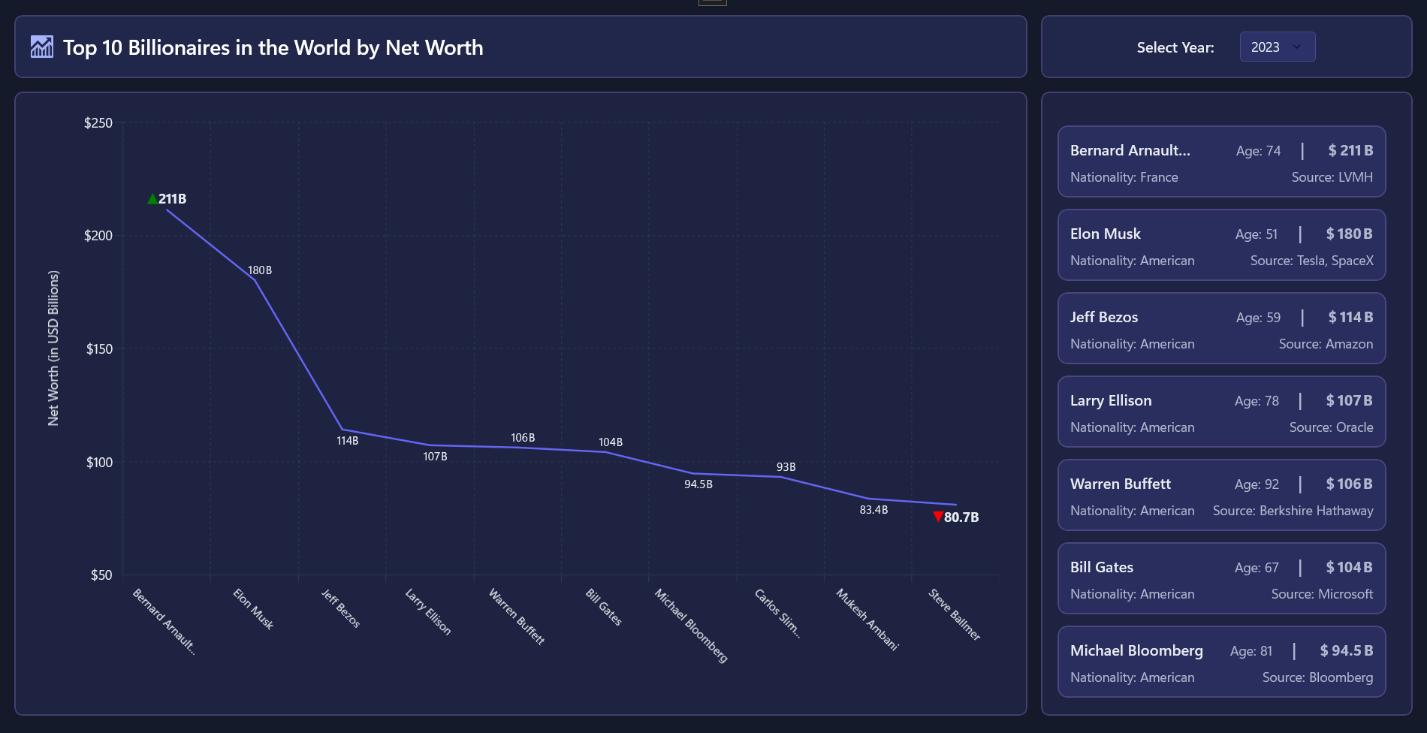
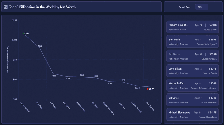
Step 5: Display a clean ListView with key attributes
To complement the chart, add a minimalist ListView that mirrors the dataset and highlights essential attributes. This list provides quick access to details that the chart alone cannot convey.
Start by trimming long names to the first two words and appending an ellipsis for readability. Display the age inline and format the net worth using a compact pattern such as $… B. Add a second row to show nationality and primary source for additional context.
Refer to the XAML for the ListView:
<ListView ItemsSource="{Binding Data}"
          SelectionMode="None"
          IsItemClickEnabled="False">
    <ListView.ItemTemplate>
        <DataTemplate>
            <Border Padding="12"
                    CornerRadius="10"
                    Background="{StaticResource CardBackgroundShort}"
                    BorderBrush="{StaticResource CardBorderBrush}"
                    BorderThickness="1.5">
                <Grid>
                    <Grid.RowDefinitions>
                        <RowDefinition Height="Auto"/>
                        <RowDefinition Height="Auto"/>
                    </Grid.RowDefinitions>

                    <Grid Grid.Row="0">
                        <Grid.ColumnDefinitions>
                            <ColumnDefinition Width="*"/>
                            <ColumnDefinition Width="Auto"/>
                            <ColumnDefinition Width="Auto"/>
                            <ColumnDefinition Width="Auto"/>
                        </Grid.ColumnDefinitions>

                        <TextBlock Grid.Column="0"
                                   Text="{Binding Name, Converter={StaticResource NameTrimConverter}}"
                                   FontSize="16"
                                   FontWeight="SemiBold"
                                   Foreground="{StaticResource TextPrimaryBrush}"
                                   TextTrimming="CharacterEllipsis"
                                   MaxLines="1"/>

                        <StackPanel Grid.Column="1"
                                    Orientation="Horizontal"
                                    Margin="10,0,20,0">
                            <TextBlock Text="Age:"
                                       Foreground="{StaticResource TextSecondaryBrush}"/>
                            <TextBlock Text="{Binding Age}"
                                       Foreground="{StaticResource TextSecondaryBrush}"
                                       Margin="4,0,0,0"/>
                        </StackPanel>

                        <TextBlock Grid.Column="2"
                                   Text="|"
                                   Foreground="{StaticResource TextSecondaryBrush}"
                                   FontSize="18"
                                   FontWeight="SemiBold"/>

                        <StackPanel Grid.Column="3"
                                    Orientation="Horizontal"
                                    Margin="25,0,0,0">
                            <TextBlock Text="$"
                                       FontSize="16"
                                       FontWeight="Bold"
                                       Foreground="{StaticResource TextSecondaryBrush}"/>
                            <TextBlock Text="{Binding NetWorth}"
                                       FontSize="16"
                                       FontWeight="Bold"
                                       Foreground="{StaticResource TextSecondaryBrush}"
                                       Margin="2,0,0,0"/>
                            <TextBlock Text="B"
                                       FontSize="16"
                                       FontWeight="Bold"
                                       Foreground="{StaticResource TextSecondaryBrush}"
                                       Margin="2,0,0,0"/>
                        </StackPanel>
                    </Grid>

                    <Grid Grid.Row="1"
                          Margin="0,6,0,0">
                        <Grid.ColumnDefinitions>
                            <ColumnDefinition Width="*"/>
                            <ColumnDefinition Width="Auto"/>
                        </Grid.ColumnDefinitions>

                        <StackPanel Grid.Column="0"
                                    Orientation="Horizontal"
                                    Margin="0,0,16,0">
                            <TextBlock Text="Nationality:"
                                       Foreground="{StaticResource TextSecondaryBrush}"/>
                            <TextBlock Text="{Binding Nationality}"
                                       Foreground="{StaticResource TextSecondaryBrush}"
                                       Margin="4,0,0,0"/>
                        </StackPanel>

                        <StackPanel Grid.Column="1"
                                    Orientation="Horizontal">
                            <TextBlock Text="Source:"
                                       Foreground="{StaticResource TextSecondaryBrush}"/>
                            <TextBlock Text="{Binding PrimarySource}"
                                       Foreground="{StaticResource TextSecondaryBrush}"
                                       Margin="4,0,0,0"/>
                        </StackPanel>
                    </Grid>
                </Grid>
            </Border>
        </DataTemplate>
    </ListView.ItemTemplate>
</ListView>
Refer to the following image:
Converters for Enhanced Readability
Use converters to shorten long names and highlight extremes in the dataset. For example, trim names longer than two words and apply color coding for the highest and lowest values:
public class NameTrimConverter : IValueConverter
{
    public object Convert(object value, Type targetType, object parameter, string language)
    {
        // Convert: trims full names longer than two parts to "First Last…"
    }
    public object ConvertBack(object value, Type targetType, object parameter, string language)
            => throw new NotImplementedException();
}

public class DataLabelConverter : IValueConverter
{
    public object Convert(object value, Type targetType, object parameter, string language)
    {
        // Convert: sets label font/size/shape/fill based on item rank and requested parameter
    }
    public object ConvertBack(object value, Type targetType, object parameter, string language)
            => throw new NotImplementedException();
}
By running the sample, you’ll get the completed AI-powered billionaire wealth dashboard that includes:
- A styled header and year selector
- A WinUI LineSeries chart with formatted data labels
- A responsive details list that updates automatically when the year changes
This layout delivers a clean, modern experience for financial visualization.
GitHub reference
For more details about the AI-Powered WinUI Line Chart to visualize the wealth of billionaires, refer to the GitHub demo.
Conclusion
Thanks for reading! This blog explored how to build an AI-Powered WinUI Line Chart to visualize the Wealth of Billionaires using the Syncfusion WinUI Line Chart. You learned how to generate structured data using Azure OpenAI, bind it to a WinUI chart and list, and apply polished UI styling for a modern dashboard experience. Try running the sample, experiment with additional features like tooltips or anomaly detection, and share your thoughts in the comments!
If you’re a Syncfusion user, you can download the setup from the license and downloads page. Otherwise, you can download a free 30-day trial.
You can also contact us through our support forum, support portal, or feedback portal for queries. We are always happy to assist you!


 No spam, just valuable updates.