
 Karthick Mani
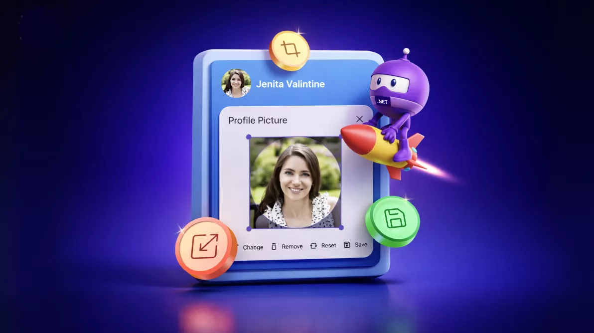
TL;DR: Looking to offer a clean, customizable profile image editing experience in your MAUI app? Create a cross-platform profile image editor in .NET MAUI with the Image Editor control, integrating a custom popup layout, chip toolbar commands, circular cropping, reset logic, and efficient state management.
Profile photos look simple until you build the editing flow: pick an image, enforce a circle crop, support reset/remove, and save reliably across Android, iOS, Windows, and macOS.
This tutorial shows how to build a beginner-friendly .NET MAUI profile image editor using the Syncfusion® .NET MAUI Image Editor control. You’ll create a circular avatar with an edit badge that opens a popup editor, then drive the experience with a small custom chip toolbar (Change/Remove/Reset/Save).
What you’ll build
- A circular avatar that displays the current profile image.
- An edit badge (pencil) overlay to launch editing.
- A popup editor with the image loaded and ready to crop.
- A minimal action bar: Change, Remove, Reset, Save.
- A saved result that updates the avatar after editing.
Why use Syncfusion Image Editor in .NET MAUI?
The Syncfusion Image Editor supports common editing actions you need for profile photos:
- Cropping, rotating, flipping, and resizing.
- Drawing and annotation tools.
- Text overlay and shape insertion.
- Undo/redo and zooming.
- Saving edited images in multiple formats.
Combined with .NET MAUI, you get a consistent cross-platform editing experience with one codebase.
Setting up the Syncfusion Image Editor in .NET MAUI
Let’s create a profile editor using the Syncfusion .NET MAUI ImageEditor control. This implementation intentionally avoids the Image Editor’s built-in toolbar and uses a custom chip toolbar instead.
Flow:
- Show the current profile image in an SfAvatarView.
- Tap the edit badge to open an SfPopup.
- Load the image into SfImageEditor with ShowToolbar=”False”.
- Use a chip group to trigger actions:
- Change: pick a new photo and load it into the editor.
- Remove: swap to a default avatar image and close the popup.
- Reset: cancel edits/reset and re-apply circle crop.
- Save: commit edits and save.
Prerequisites
- A .NET MAUI app (Android/iOS/Windows/Mac Catalyst).
- Syncfusion .NET MAUI controls installed and configured.
For setup, follow the Syncfusion .NET MAUI Image Editor getting started documentation.
Step 1: Create an Avatar View
Start by displaying the user’s profile photo with the Syncfusion .NET MAUI Avatar View, using platform-specific dimensions to maintain consistent sizing across Android, iOS, Windows, and Mac Catalyst. The avatar remains centered within the layout and uses a circular shape with a subtle stroke for a polished appearance.
Here’s how you can do it in code:
<Grid x:Name="grid"
      HorizontalOptions="Center"
      WidthRequest="{OnPlatform WinUI=200, Android=160, iOS=160, MacCatalyst=200}"
      HeightRequest="{OnPlatform WinUI=200, Android=160, iOS=160, MacCatalyst=200}">
    <core:SfAvatarView x:Name="avatar"
                       WidthRequest="{OnPlatform WinUI=200, Android=160, iOS=160, MacCatalyst=200}"
                       HeightRequest="{OnPlatform WinUI=200, Android=160, iOS=160, MacCatalyst=200}"
                       CornerRadius="{OnPlatform WinUI=100, Android=80, iOS=80, MacCatalyst=100}"
                       Stroke="{AppThemeBinding Light=#CAC4D0, Dark=#49454F}"
                       StrokeThickness="4"
                       ContentType="Custom"
                       VerticalOptions="Center"
                       HorizontalOptions="Center"
                       ImageSource="{converters:SfImageResource profileimage.png}">
    </core:SfAvatarView>
</Grid>
Step 2: Add an edit badge overlay (opens the editor)
A small circular Syncfusion .NET MAUI Chip control with a pencil icon is positioned at the bottom‑right corner of the avatar. This chip includes basic hover and press states and triggers a method that opens the profile image editor popup.
Try this in your code:
<core:SfChip x:Name="editButton"
WidthRequest="{OnPlatform WinUI=50, Android=40, iOS=40, MacCatalyst=50}"
HeightRequest="{OnPlatform WinUI=50, Android=40, iOS=40, MacCatalyst=50}"
CornerRadius="{OnPlatform WinUI=25, Android=20, iOS=20, MacCatalyst=25}"
Padding="0"
HorizontalOptions="End"
VerticalOptions="End"
Margin="{OnPlatform WinUI='0,0,8,8', Android='0,0,6,6', iOS='0,0,6,6', MacCatalyst='0,0,8,8'}"
ZIndex="1"
ShowIcon="true"
ImageSize="25"
ImageAlignment="{OnPlatform WinUI=End, MacCatalyst=End, Android=Start, iOS=Start}"
Clicked="OnEditBadgeClicked">
<core:SfChip.ImageSource>
<FontImageSource Glyph=""
FontFamily="MauiMaterialAssets"
Color="{AppThemeBinding Light=White, Dark=Black}"
Size="35" />
</core:SfChip.ImageSource>
<VisualStateManager.VisualStateGroups>
<VisualStateGroupList>
<VisualStateGroup x:Name="CommonStates">
<VisualState x:Name="Normal">
<VisualState.Setters>
<Setter Property="Background"
Value="{AppThemeBinding Light=#6750A4, Dark=#D0BCFF}" />
</VisualState.Setters>
</VisualState>
<VisualState x:Name="Hovered">
<VisualState.Setters>
<Setter Property="Background"
Value="{AppThemeBinding Light=#6750A4, Dark=#D0BCFF}" />
</VisualState.Setters>
</VisualState>
<VisualState x:Name="Pressed">
<VisualState.Setters>
<Setter Property="Background"
Value="{AppThemeBinding Light=#4F378B, Dark=#B69DF8}" />
</VisualState.Setters>
</VisualState>
</VisualStateGroup>
</VisualStateGroupList>
</VisualStateManager.VisualStateGroups>
</core:SfChip>Step 3: Place the image editor inside a popup
We use Syncfusion .NET MAUI Popup control to display the profile editor. The popup includes a header, the ImageEditor control as its main content, and a custom chip-based toolbar in the footer.
Below is the code you need:
<popup:SfPopup x:Name="popup"
               AutoSizeMode="Height"
               HeaderHeight="67"
               AutoSizeTarget="All"
               WidthRequest="380"
               ShowFooter="True"
               ShowCloseButton="True"
               Closed="OnCloseClicked"
               HeaderTitle="Profile Picture"
               Opening="OnPopupOpening"
               Closing="OnPopupClosing">
    <popup:SfPopup.ContentTemplate>
        <DataTemplate>
            <Grid HorizontalOptions="Center"
                  VerticalOptions="Center">
                <imageEditor:SfImageEditor x:Name="imageEditor"
                                           ShowToolbar="False"
                                           Background="{AppThemeBinding Light={StaticResource FlyoutBackgroundLight}, Dark={StaticResource FlyoutBackground}}"
                                           Source="{converters:SfImageResource profileimage.png}"
                                           MinimumWidthRequest="{OnPlatform WinUI=350, MacCatalyst=350}"
                                           HeightRequest="250"
                                           SelectionStroke="{AppThemeBinding Light=#6750A4, Dark=#D0BCFF}"
                                           ImageLoaded="OnImageEditorLoaded"
                                           ImageSaving="OnImageEditorSaving"
                                           SavePickerOpening="OnImageEditorSavePickerOpening">
                </imageEditor:SfImageEditor>
            </Grid>
        </DataTemplate>
    </popup:SfPopup.ContentTemplate>
</popup:SfPopup>
Step 4: Add a chip-based footer toolbar
Add an SfChipGroup to the popup footer with four actions such as Change, Remove, Reset, and Save. All actions are handled through one event method for a clean and maintainable workflow.
Code example for quick integration:
<core:SfChipGroup x:Name="chipGroup" ChipTextColor="{AppThemeBinding Light=#6750A4, Dark=#D0BCFF}"
Margin="{OnPlatform WinUI='18', MacCatalyst='18', Android='15', iOS='15'}"
HorizontalOptions="Center"
VerticalOptions="Center"
HeightRequest="40"
ChipClicked="OnChipClicked"
Loaded="OnChipGroupLoaded">
<core:SfChipGroup.Items>
<core:SfChip Text="Change"
WidthRequest=”90”
CornerRadius="20"
Stroke="Transparent"
ImageAlignment="Start"
ShowIcon="True">
<core:SfChip.ImageSource>
<FontImageSource Glyph=""
FontFamily="MauiMaterialAssets"
Color="{AppThemeBinding Light=Black, Dark=White}"
Size="18" />
</core:SfChip.ImageSource>
</core:SfChip>
<core:SfChip Text="Remove"
WidthRequest="{OnPlatform WinUI=90, MacCatalyst=95, Android=95, iOS=95}"
CornerRadius="20"
Stroke="Transparent"
ImageAlignment="Start"
ShowIcon="True">
<core:SfChip.ImageSource>
<FontImageSource Glyph=""
FontFamily="MauiMaterialAssets"
Color="{AppThemeBinding Light=Black, Dark=White}"
Size="18" />
</core:SfChip.ImageSource>
</core:SfChip>
<core:SfChip Text="Reset"
WidthRequest=”80"
CornerRadius="20"
Stroke="Transparent"
ImageAlignment="Start"
ShowIcon="True">
<core:SfChip.ImageSource>
<FontImageSource Glyph=""
FontFamily="MauiMaterialAssets"
Color="{AppThemeBinding Light=Black, Dark=White}"
Size="18" />
</core:SfChip.ImageSource>
</core:SfChip>
<core:SfChip Text="Save"
WidthRequest="{OnPlatform WinUI=80, MacCatalyst=75, Android=75, iOS=75}"
CornerRadius="20"
Stroke="Transparent"
ImageAlignment="Start"
ShowIcon="True">
<core:SfChip.ImageSource>
<FontImageSource Glyph=""
FontFamily="MauiMaterialAssets"
Color="{AppThemeBinding Light=Black, Dark=White}"
Size="18" />
</core:SfChip.ImageSource>
</core:SfChip>
</core:SfChipGroup.Items>
</core:SfChipGroup>Step 5: Manage editing state in C#
To maintain a smooth and predictable editing experience, the code‑behind uses a few simple state flags:
isImageRemoved: Determines whether the Remove and Reset actions should be enabled.shouldReloadOriginalImage: Ensures the editor resets to a clean state each time the popup opens.originalBytes: Stores the current avatar image as bytes for non‑destructive editing and quick reloading.
This avoids a “mystery state” when users open/close the popup multiple times.
Step 6: Implement toolbar actions
Each chip in the footer corresponds to a specific editing workflow:
- Change: Select and load a new image.
- Remove: Removes the current image.
- Reset: Restores the editor to the initial state.
- Save: Apply edits and update the avatar.
Add this code example to your project:
private void OnChipClicked(object? sender, EventArgs e)
{
    if (sender is not SfChip chip)
    {
        return;
    }

    if (chip.Text == "Change")
    {
        this.UpdateChangeAction();
    }
    else if (chip.Text == "Remove")
    {
        this.UpdateRemoveAction();
    }
    else if (chip.Text == "Reset")
    {
        this.UpdateResetAction();
    }
    else if (chip.Text == "Save")
    {
        this.UpdateSaveAction();
    }
}


private async void UpdateChangeAction()
{
    var results = await MediaPicker.PickPhotosAsync(new MediaPickerOptions
    {
        Title = "Please select an image",
    });

    var result = results?.FirstOrDefault();
    if (this.imageEditor == null || result == null || this.removeChip == null || this.resetChip == null)
    {
        return;
    }

    using (var stream = await result.OpenReadAsync())
    {
        originalBytes = await GetMemoryStreamBytes(stream);
    }

    this.imageEditor?.Source = ImageSource.FromStream(() => new MemoryStream(originalBytes, writable: false));
    this.isImageRemoved = false;
    this.removeChip.IsEnabled = true;
    this.resetChip.IsEnabled = true;
    this.shouldReloadOriginalImage = true;
}

private void UpdateRemoveAction()
{
    if (this.imageEditor == null)
    {
        return;
    }

    Assembly assembly = typeof(SfImageSourceConverter).GetTypeInfo().Assembly;
    var imagePath = "SampleBrowser.Maui.Base.Resources.Images.defaultprofileview.png";
    var imageSource = ImageSource.FromResource(imagePath, assembly);
    this.avatar.ImageSource = imageSource;
    this.imageEditor.Source = imageSource;
    this.isImageRemoved = true;
    this.shouldReloadOriginalImage = false;
    this.popup.IsOpen = false;
}

private void UpdateResetAction()
{
    if (this.imageEditor == null)
    {
        return;
    }

    if (this.imageEditor.HasUnsavedEdits)
    {
        this.imageEditor.CancelEdits();
    }
    else
    {
        this.imageEditor.Reset();
    }

    if (!this.isImageRemoved)
    {
        this.imageEditor.Crop(ImageCropType.Circle);
    }
}

private async void UpdateSaveAction()
{
    if (this.imageEditor == null)
    {
        return;
    }

    if (this.imageEditor.HasUnsavedEdits && !this.isImageRemoved)
    {
        this.imageEditor.SaveEdits();
        await Task.Delay(DeviceInfo.Platform == DevicePlatform.WinUI ? 500 : 200);
    }

    this.imageEditor.Save();
}
Step 7: Reload the original image safely
To ensure consistency across platforms:
- On first load, capture the avatar’s current image bytes.
- Before reopening the editor, reset the editor and reapply circular crop.
Code snippet to achieve this:
private async Task ReloadOriginalImageAsync()
{
    if (this.imageEditor == null)
    {
        return;
    }

    await MainThread.InvokeOnMainThreadAsync(async () =>
    {
        this.imageEditor.Reset();
        await Task.Delay(200);

        if(!this.isImageRemoved)
        {
            this.imageEditor.Crop(ImageCropType.Circle);
        }
    });
}
Step 8: Add utility helpers
Use helper methods like GetMemoryStreamBytes and GetStreamImageBytesAsync to handle stream‑to‑byte conversions cleanly. This avoids file locks and ensures images reload smoothly in the editor.
Implementation example:
private async Task<byte[]> GetMemoryStreamBytes(Stream stream, CancellationToken cancellationToken = default)
{
    using var memoryStream = new MemoryStream();
    await stream.CopyToAsync(memoryStream, cancellationToken);
    return memoryStream.ToArray();
}

private async Task<byte[]> GetStreamImageBytesAsync(ImageSource imageSource, CancellationToken cancellationToken = default)
{
    if (imageSource is StreamImageSource streamImageSource)
    {
        using var stream = await streamImageSource.Stream(cancellationToken);
        if (stream == null)
        {
            return Array.Empty<byte>();
        }

        return await GetMemoryStreamBytes(stream, cancellationToken);
    }

    return Array.Empty<byte>();
}
After executing all the above code examples, we’ll get the output that resembles the following image.

GitHub reference
For more details, refer to the .NET MAUI ImageEditor control demo on GitHub.

Conclusion
Thanks for reading! In this blog, we walked through how to build a profile editor app using the Syncfusion .NET MAUI ImageEditor control, a popup‑based editing experience, and a simple custom toolbar that focuses on the actions users actually need. Try out this user-friendly control and share your feedback in the comments section below.
If you’re a Syncfusion user, you can download the setup from the license and downloads page. Otherwise, you can download a free 30-day trial.
You can also contact us through our support forums, support portal, or feedback portal for queries. We are always happy to assist you!


 No spam, just valuable updates.