
React.js Succinctly®

CHAPTER 6
Reusability
Function components are the best components when it comes to reusability because they are pure function with no state. They are predictable—the same input will always give us the same output.
Stateful components can be reusable too, as long as the state being managed is completely private to every instance of the component. When we start depending on an external state, reusability becomes more challenging. There are a few things we can add to a React component to enhance its reusability score.
Input validation
If you are the only one using your component, you probably know exactly what that component needs in terms of input. What are the different props needed? What data type does it need for every prop?
When that component getis reused in multiple places, the manual validation of input becomes a problem. Sometimes you end up with a component that does not work, and but no errors are being reported.
Even if you are the only one using your component, and you use it only once, you may not have complete control over the input values. For example, you could be feeding the component something that getis read from an API, which makes the component dependent on what the API returns, (and that could change any time).
Let’s say you have a component that takes an array of unique numbers and displays each one of them in a div. The component also takes a number value, and it highlights that value in the array, if it exists.
Here’s a possible implementation with a pure stateless component:
Code Listing 37: NumberList
const NumbersList = props => ( <div> {props.list.map(number => <div key={number} className={`highlight-${number === props.x}`}> {number} </div> )} </div> ); |
props.list is the array of numbers, and props.x is the number to highlight if it exists in props.list.
To style highlighted elements differently, let's just give them a different color.:
.highlight-true { color: red; } |
Here’s how we can use this NumbersList component in the DOM:
Code Listing 38: Using NumberList
ReactDOM.render( <NumbersList list={[5, 42, 12]} x={42} />, document.getElementById("react") ); |
Now, go ahead and try to feed this component the string "“42"” instead of a number.:
Code Listing 39: Wrong pProp tType
ReactDOM.render( <NumbersList list={[5, 42, 12]} x="42" />, document.getElementById("react") ); |
Not only will things not work as expected, but we will also not get any errors or warnings about the problem.
It would be great if we could do perform input validation on this x prop (and all other props), effectively telling the component to expect only an integer value for x.
React has a way for us to do exactly that, through React.PropTypes.
We can set a propType property on every component. In that property, we can provide an object where the keys are the input props that need to be validated, and the values map to what data type React should use to validate. For example, our NumbersList component should have x validated as a number.
Here’s how we can do that:
Code Listing 40: React PropTypes
NumbersList.propTypes = { x: React.PropTypes.number }; |
If we now try to pass x as a string instead of a number, React will give us an explicit warning about it in the console.:

Figure 3: Invalid Prop Type Warning
If we pass a correct numeric value for x, we dwon’t get any warnings.
While these validation errors only show up in development (primarily for performance reasons), they are extremely helpful in making sure all developers use the components correctly. They also make debugging problems in components an easier task.
React.PropTypes has a range of validators we can use on any input. Here are some examples:
- JavaScript primitive validators:
- React.PropTypes.array
- React.PropTypes.bool
- React.PropTypes.number
- React.PropTypes.object
- React.PropTypes.string
- React.PropTypes.node: Aanything that can be rendered.
- React.PropTypes.element: aA React element.
- React.PropTypes.instanceOf(SomeClass): This uses the instanceof operator.
- React.PropTypes.oneOf(['Approved', 'Rejected']): For ENUMs.
- React.PropTypes.oneOfType([..., ...]): Either this or that.
- React.PropTypes.arrayOf(React.PropTypes.number): An array of a certain type.
- React.PropTypes.objectOf(React.PropTypes.number): An object with property values of a certain type.
- React.PropTypes.func: A function reference.
By default, all props we pass to components are optional. We can change that using React.PropTypes.isRequired, which can be chained to other validators.
For example, to make x required in our NumbersList example, we can do the following:
Code Listing 41: isRequired
NumbersList.propTypes = { x: React.PropTypes.number.isRequired }; |
And if we try to omit x from the props at this point, we’ll get the following:
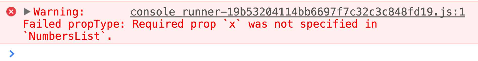
Figure 4: Required Prop Type Warning
In addition to the list of validators we can use with React.PropTypes, we can also use custom validators. These are just functions that we can use to do any custom checks on inputs. For example, to validate that the input value tweetText is not longer than 140 characters, we can do something like:
Code Listing 43: Custom PropTypes
Tweet.propTypes = { tweetText: (props, propName) => { if (props[propName] && props[propName].length > 140) { return new Error('Too long'); } } } |
For components created with React.createClass, propTypes is just a property on the input object. For the regular class syntax, we can use a static property (which is a proposed feature in JavaScript).
Examples:
Code Listing 44: propTypes Syntax
// With React.createClass syntax: let NumbersList = React.createClass({ propTypes: { x: React.PropTypes.number }, }); // For class syntax: class NumbersList extends React.Component { static propTypes = { x: React.PropTypes.number }; } // For functions syntax (and also works for class syntax): NumberList.propTypes = { x: React.PropTypes.number } |
Input default values
One other useful thing we can do on any input prop for a React component is to assign it a default value, in case we use the component without passing a value to that prop.
For example, here’s an alert box component that displays an error message in an alert div. If we don’t specify any message when we use it, it will default to “Something went wrong.”
Code Listing 45: React defaultProps
const AlertBox = props => ( <div className="alert alert-danger"> {props.message} </div> ); AlertBox.defaultProps = { message: "Something went wrong" }; ReactDOM.render( <AlertBox />, document.getElementById("react") ); |
The syntax to use defaultProps with React.Component is similar to propTypes. For React.createClass, we use the method getDefaultProps instead:
Code Listing 46: getDefaultProps()
const AlertBox = React.createClass({ getDefaultProps() { return { message: "Something went wrong" }; } }); |
Shared component behavior
Sometimes, reusing the whole component is not an option; we’ll have cases where some components share most of their functionalities but are different in a few areas.
If we need to have different components to share common behavior, we have two options:
- If we’re using the React.createClass syntax, we can use Mmixins.
- If we’re using the React.Component class syntax, we can create a new class and have all components extend it. We can also manually inject the external methods we'd like our classes to have in their constructor functions.
Mixins are objects that we can “mix” into any component defined with React.createClass.
For example, in one application, we have links and buttons with unique ids, and we would like to track all clicks that happen on them. Every time a user clicks a button or a link, we want to hit an API endpoint to log that event to our database.
We have two components in this app, Link and Button, and both have a click handler handleClick.
To log every click before handling it, we need something like this:
Code Listing 47: logClick Function
logClick() { console.log(`Element ${this.props.id} clicked`); $.post(`/clicks/${this.props.id}`); } |
We can add this method to both components, but instead of repeating it twice, we can put logClick() in a mMixin, and include the Mmixin in every component where we need to log the clicks.
Here’s how we put the logClick feature in a mMixin and use it in both Link and Button.:
Code Listing 48: logClickMixin
const logClicksMixin = { logClick() { console.log(`Element ${this.props.id} clicked`); $.post(`/clicks/${this.props.id}`); }, }; const Link = React.createClass({ mixins: [logClicksMixin], handleClick(e) { this.logClick(); e.preventDefault(); console.log("Handling a link click..."); }, render() { return ( <a href="#" onClick={this.handleClick}>Link</a> ); } }); const Button = React.createClass({ mixins: [logClicksMixin], handleClick(e) { this.logClick(); e.preventDefault(); console.log("Handling a button click..."); }, render() { return ( <button onClick={this.handleClick}>Button</button> ); } }); ReactDOM.render( <div> <Link id="link1" /> <br /><br /> <Button id="button1" /> </div>, document.getElementById("react") ); |
This is a better approach, since now the logClick implementation is abstracted in one place. If in the future we need to change that implementation, we only need to do it in that one place.
If we want to do the exact same thing with React.Component class syntax (which is vanilla JavaScript where we don’t have Mmixins), we have many options. Here’s one possible way: cCreate a new class Loggable, implement the logClick in there, and then make both Button and Link components extend Loggable.
Code Listing 49: The Loggable Class
class Loggable extends React.Component { logClick() { console.log(`Element ${this.props.id} clicked`); $.post(`/clicks/${this.props.id}`); } } class Link extends Loggable { handleClick(e) { this.logClick(); e.preventDefault(); console.log("Handling a link click..."); } render() { return ( <a href="#" onClick={this.handleClick.bind(this)}>Link</a> ); } } class Button extends Loggable { handleClick(e) { this.logClick(); e.preventDefault(); console.log("Handling a button click..."); } render() { return ( <button onClick={this.handleClick.bind(this)}>Button</button> ); } } ReactDOM.render( <div> <Link id="link1" /> <br /><br /> <Button id="button1" /> </div>, document.getElementById("react") ); |
- 80+ high-performance, modular, and responsive React UI components.
- Popular components like Data Grid, Charts, and Scheduler.
- Lightweight and user-friendly.
- Stunning built-in themes.