

High-performance React charting library
The Syncfusion React Charts component is a data visualization library for creating interactive charts, graphs, and dashboards. It includes 55+ chart types, from basic line and bar charts to advanced financial charts, helping developers visualize business, analytical, and real-time data.
Built for performance, React Charts can efficiently render and interact with 100K+ data points while maintaining smooth navigation. Features such as zooming, panning, tooltips, crosshairs, trackball, highlighting, and selection make exploring large datasets fast and intuitive.
See the chart types and features working together
The chart above focuses on handling large datasets. Try Live Demo opens a full sample showing multiple chart types with tooltips, axes, data labels, legends, zooming, and other interactive features working together.
Runs in-browser. No installation required.
Installation & Quick Start
Follow these two steps to integrate the Charts into your React application.
1
Install the Charts package
Install the Syncfusion React Charts package by using npm.
npm install @syncfusion/ej2-react-charts --save2
Initialize the Charts component
Configure and render the React Charts by using this code. Define the component in the src/App.tsx file and manage the data source in the chartdata.ts file. Explore the React Charts example to learn more.
import { ChartComponent, SeriesCollectionDirective, SeriesDirective, Inject, Category, ColumnSeries } from '@syncfusion/ej2-react-charts';
import { chartData } from './chart-data';

function App() {
    return (
        <ChartComponent primaryXAxis={{ valueType: 'Category', title: 'Month' }} title='Monthly Sales Analysis'>
            <Inject services={[ColumnSeries, Category]} />
            <SeriesCollectionDirective>
                <SeriesDirective dataSource={chartData} xName='month' yName='sales' type='Column'>
                </SeriesDirective>
            </SeriesCollectionDirective>
        </ChartComponent>
    );
};
export default App;
export const chartData: object[] = [
{ month: 'Jan', sales: 35 },
{ month: 'Feb', sales: 28 },
{ month: 'Mar', sales: 34 },
{ month: 'Apr', sales: 32 },
{ month: 'May', sales: 40 },
{ month: 'Jun', sales: 32 },
{ month: 'Jul', sales: 35 },
{ month: 'Aug', sales: 55 },
{ month: 'Sep', sales: 38 },
{ month: 'Oct', sales: 30 },
{ month: 'Nov', sales: 25 },
{ month: 'Dec', sales: 32 }
];No credit card required.
Why choose the Syncfusion React charts and graphs?
Performance
Build high-performance React charts and graphs for data-intensive applications. Render and interact with large datasets smoothly with fast loading, real-time updates, zooming, panning, and support for up to 100,000 data points in less than a second.
Seamless data binding
Bind the React Charts component to local or remote data sources, including JSON, REST APIs, OData, and custom services. Use the built-in DataManager to handle querying, data operations, and communication with remote endpoints for dynamic chart rendering.
AI-Assisted Development
Create chart layouts, series configurations, axis settings, and dashboard interfaces with the Agentic UI Builder and Syncfusion Agent Skills.
Customizable themes
Apply built-in Fluent, Tailwind CSS, Bootstrap, Material, and Fabric themes. Use the Theme Studio to adjust theme settings.
Easy export and printing
Export charts in various file formats, including PDF, SVG, PNG, and JPEG. You can also export chart data to Excel and CSV formats, and print the chart for easy sharing, analysis, and reporting.
Globalization and localization
Users from different locales can use the component by formatting dates, currency, and numbering to suit preferences.
55+ React Chart Types
Select from 55+ built-in chart types including line, bar, area, pie, financial, scatter, and radar charts to visualize trends, comparisons, proportions, distributions, relationships, financial data, and statistical insights. Create the most effective visualization for every dataset using a consistent charting experience.
React Chart Data Binding
Connect charts to local and remote data sources using DataManager and built-in adaptors. Bind data from JSON objects, REST APIs, OData services, GraphQL endpoints, and custom backends to create dynamic, data-driven visualizations.
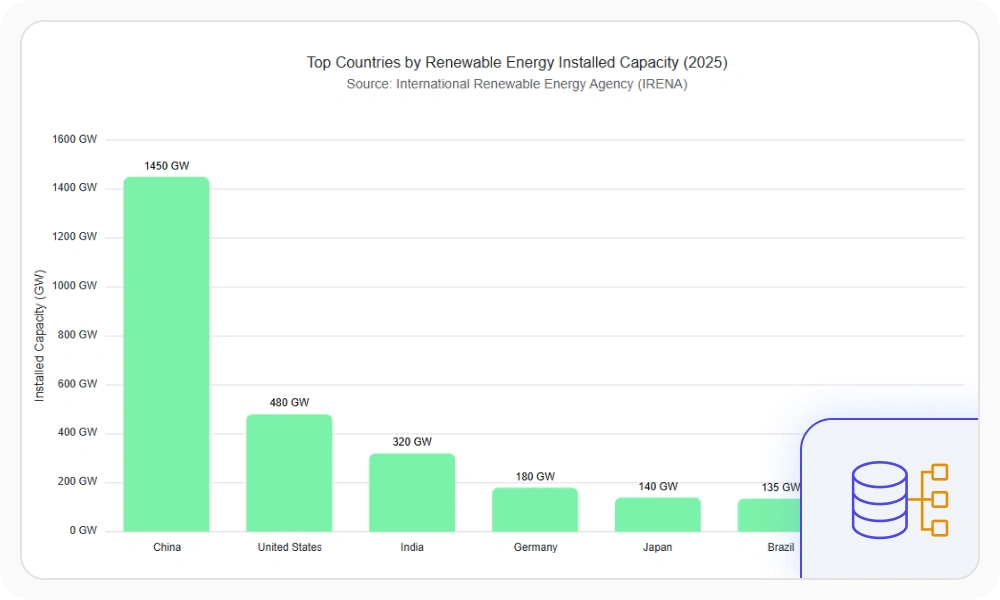
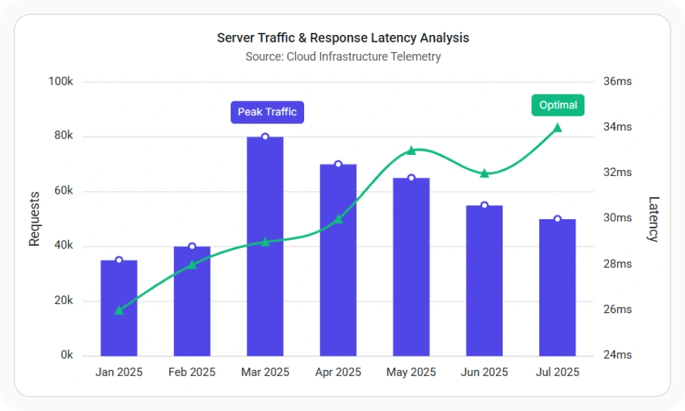
Chart Axis Types
Visualize categorical, numeric, date-time, date-time category, logarithmic, and multi-scale data using specialized axis types. Choose the right axis configuration to improve readability, represent data accurately, and support a wide range of analytical scenarios.
Chart Data Labels and Annotations
Display axis labels, data labels, series labels, last-value labels, legends, and annotations to add context and improve chart readability. Use flexible formatting, positioning, and templates to highlight important data and make insights easier to understand.
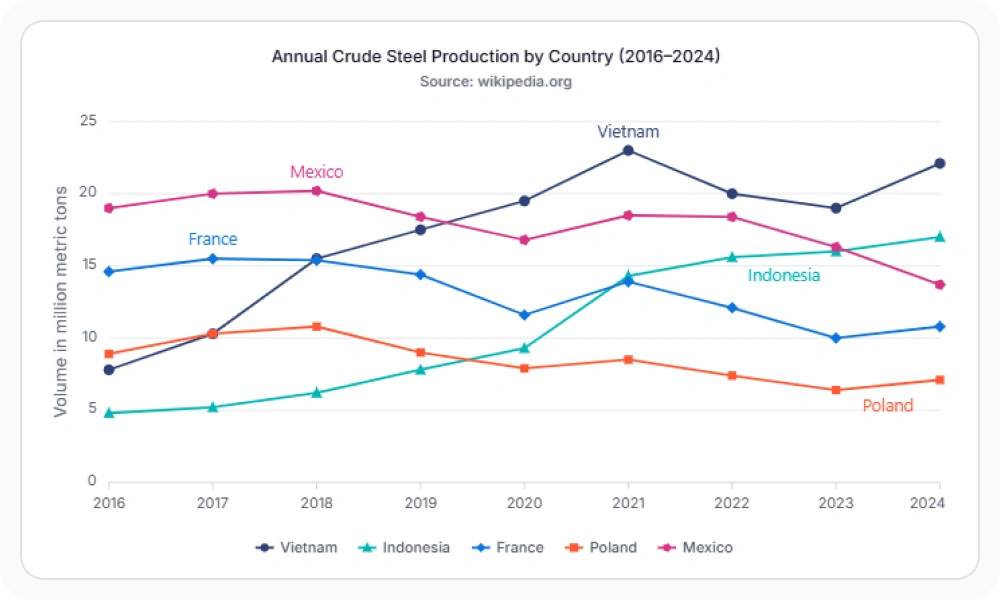
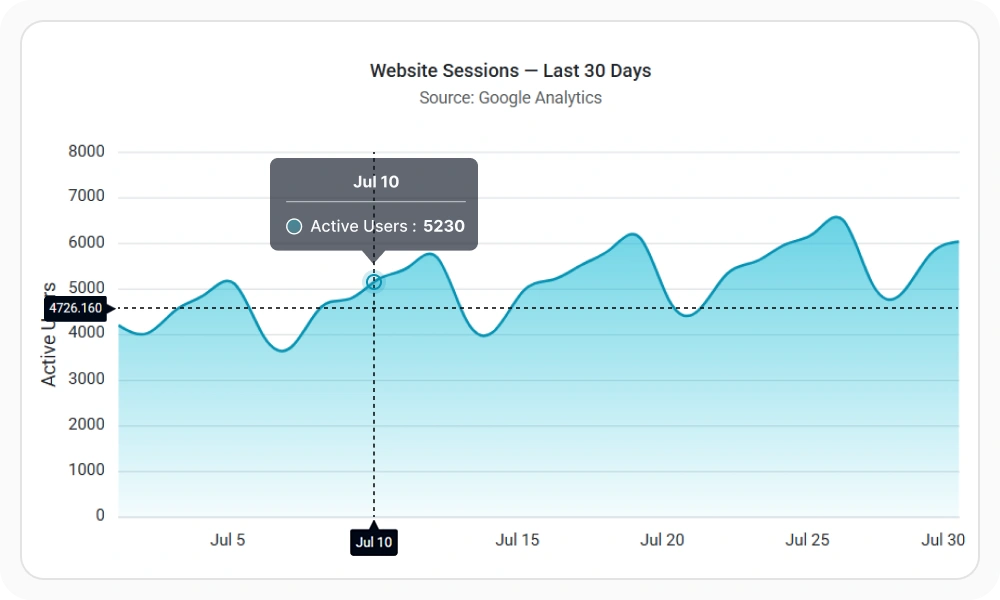
Interactive Chart Experiences
Enable zooming, panning, tooltips, crosshairs, trackball, selection, and drill-down interactions to help users explore data, compare values, and uncover insights through intuitive chart navigation.
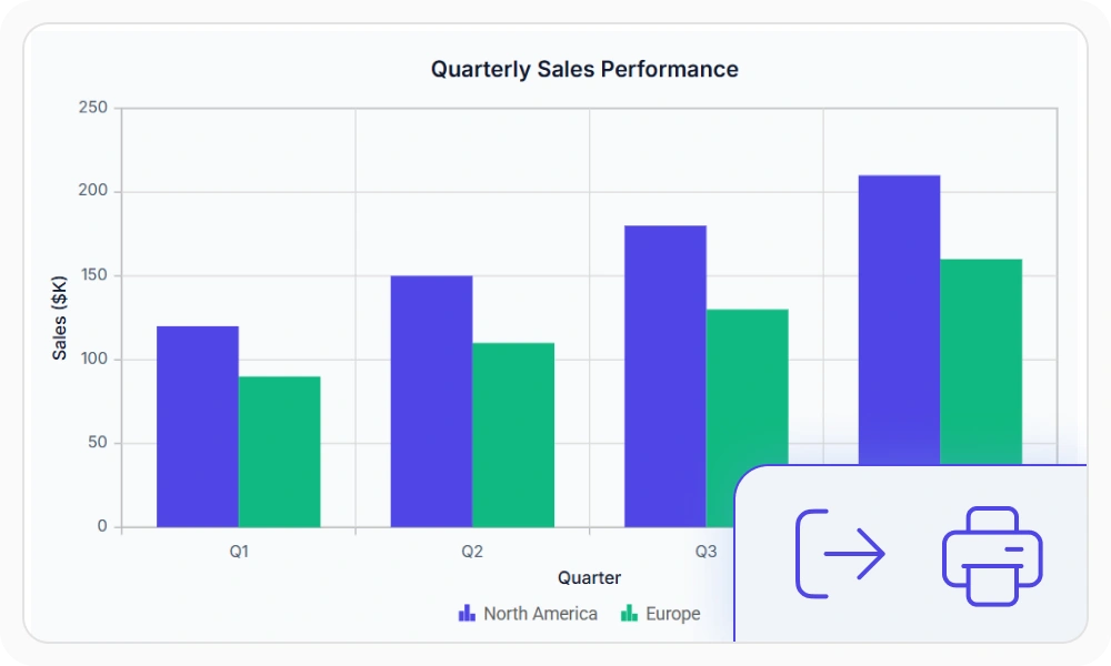
Export Charts to PDF, PNG, SVG and Excel
Export charts as PDF, SVG, PNG, and JPEG files, print directly from the browser, or download underlying data in Excel and CSV formats. Simplify reporting, collaboration, and data sharing across business workflows.
React Chart Dashboards
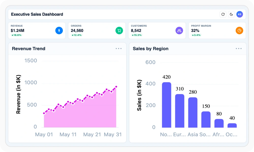
Combine multiple charts into a unified dashboard to monitor key metrics, compare trends, and explore data from different perspectives. Use synchronized interactions such as tooltips, selection, and zooming to create connected analytical experiences.
Real-Time Charts with Live Data
Build real-time React charts and graphs that update as data changes. Monitor live metrics, sensor readings, financial data, market activity, and time-sensitive business events with dynamic data updates.
Custom Chart Templates for Tooltips, Labels and Markers
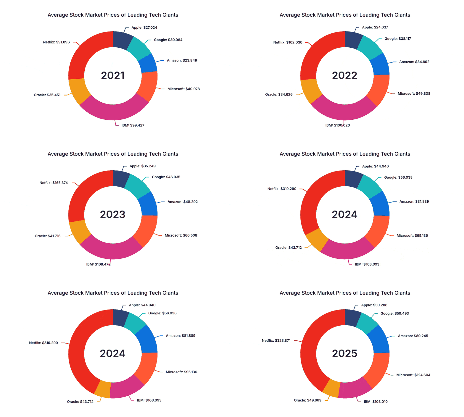
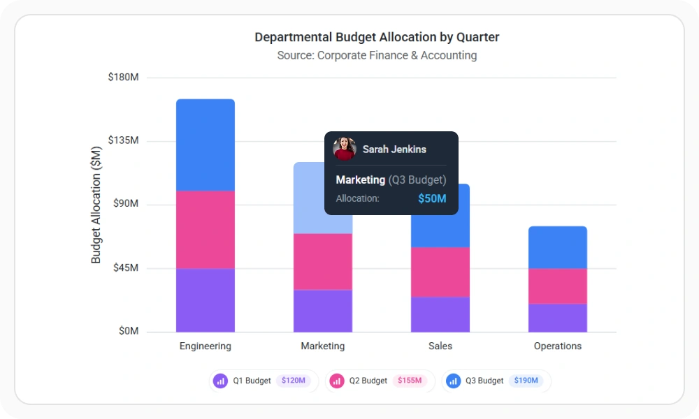
Customize data labels, tooltips, legends, and axis labels using flexible templates. Display formatted values, contextual information, custom icons, and branded content to create richer and more informative chart experiences.
Chart Themes and Custom Styling
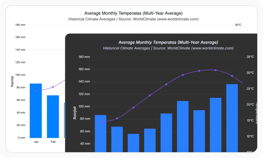
Apply built-in themes such as Material, Fluent, Tailwind, Bootstrap, and Fabric to create visually consistent chart experiences. Customize colors, themes, light and dark modes, and visual styles to match your application’s design system and branding.
Gradient Fills and Series Colors
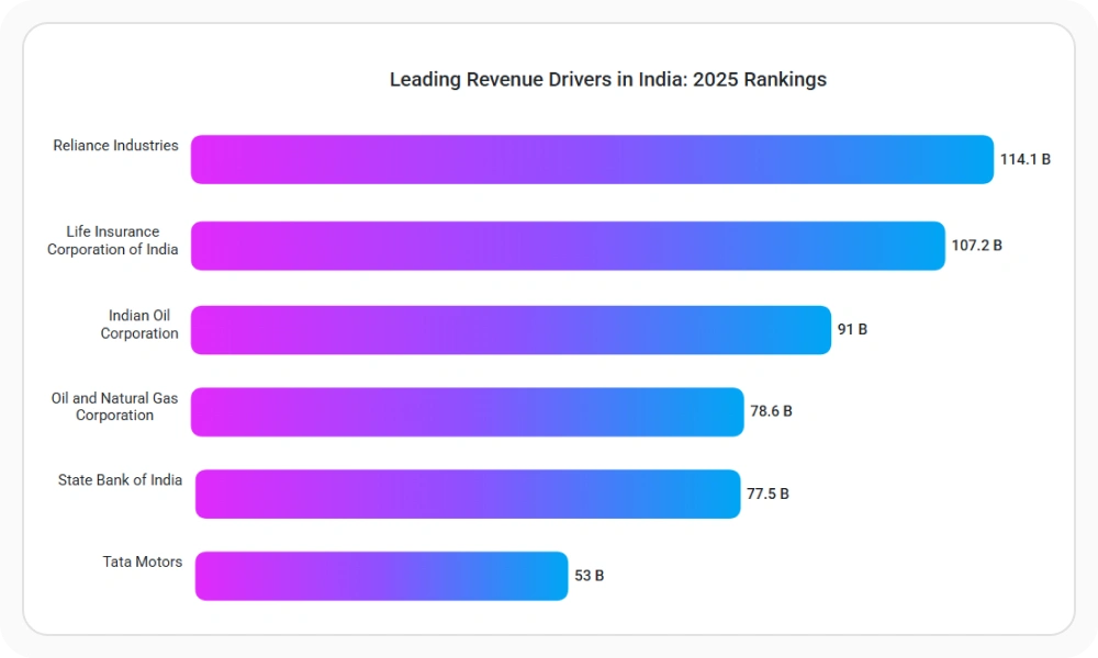
Apply linear and radial gradients to chart series, trendlines, and technical indicators. Create visually distinctive charts, emphasize important data, and maintain consistent styling across dashboards and reporting applications.
Financial Charts: Candlestick, OHLC and Stock
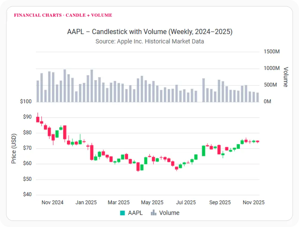
Visualize stock prices, market activity, and trading data using specialized financial chart types such as Candlestick, OHLC, HiLo, and HiLo Open Close charts. Analyze price movements, market trends, and trading patterns with purpose-built financial visualizations.
Technical Indicators for Financial Analysis
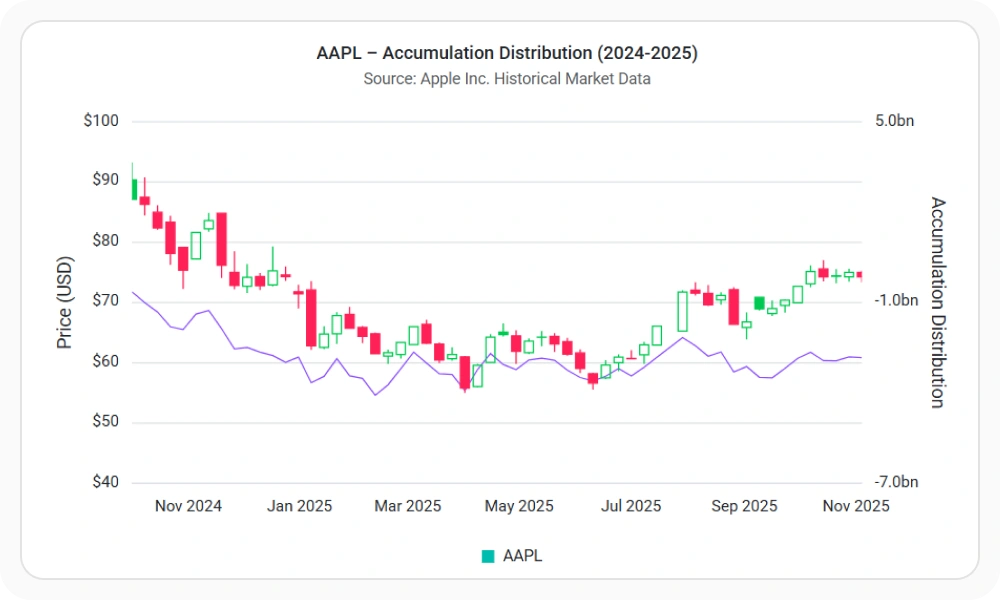
Measure momentum, volatility, trend strength, and market sentiment using built-in technical indicators. Visualize financial data with RSI, MACD, Bollinger Bands, ATR, Stochastic Oscillator, moving averages, and other indicators to support trading and investment analysis.
Trendlines and Forecasting
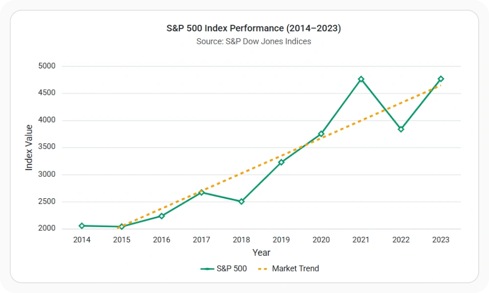
Identify patterns, growth rates, and trend direction using linear, exponential, logarithmic, polynomial, power, and moving average trendlines. Trendlines help users understand underlying data behavior and make trends easier to interpret across time-series and analytical datasets.
Accessibility and Global User Support
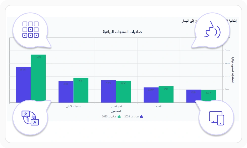
Create accessible and inclusive chart experiences with keyboard navigation, screen reader support, right-to-left layouts, localization, responsive design, and high-contrast themes. Help users interact with chart data effectively across devices, languages, and accessibility needs.
Responsive React Charts for Web and Mobile
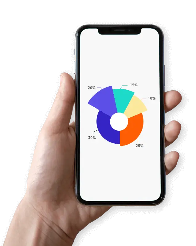
Develop React Charts with one code base for web, mobile, and tablet applications. Render responsive, interactive charts that adapt to each device size.
AI-assisted development
Build feature-rich React Charts experiences faster
Accelerate chart development with Syncfusion AI tools that turn requirements into fully configured data visualizations with minimal manual setup.
Agentic UI Builder
Turn prompts into ready-to-use UI screens, layouts, and workflows with Syncfusion React components.
Example Prompt Create a sales analytics dashboard with bar charts, trend analysis, and KPI cards.
Agent Skills
Accelerate development with Syncfusion AI Agent Skills for faster implementation and integration.
Example Prompt Generate a React chart with multiple series, zooming, legends, and export support.
MCP Server
Accelerate development with AI that generates, configures, and troubleshoots component code directly in your IDE.
Example Prompt Show how to bind remote data and enable zooming in Syncfusion React Charts.
Not sure how to create your first React Charts component? Our tutorial videos and documentation can help.
I’d love to watch it now I’d love to read it nowFrequently Asked Questions
What is a React Chart?
A React Chart is a UI component for creating interactive data visualizations in React applications, including line, bar, area, pie, and financial charts. Syncfusion React Charts offers 55+ chart types, built-in interactions, and high-performance rendering for visualizing small and large datasets efficiently.
What should I look for in a React Graph library?
A React Graph library should support multiple visualization types, responsive rendering, interactions, customization, and real-time data.
Can I bind REST APIs or external sources to the Syncfusion React Charts component?
Yes. The Syncfusion React Charts component can bind charts to local or remote data, including JSON, RESTful services, and OData, through Syncfusion’s DataManager.
How do I choose a chart type with the React Charts component for my dashboard?
Use the React Charts component for trends with line, spline, or area charts; rankings with bar or column charts; distribution with histograms or box plots; composition with pie, doughnut, or stacked charts; and relationships with scatter or bubble charts. Financial series include candlestick and OHLC charts.
Does Syncfusion React Charts support real-time data visualization?
Yes. Syncfusion React Charts supports real-time data updates, enabling live dashboards and monitoring applications to reflect sensor readings, market activity, and other time-sensitive events as they happen.
How do I enable interactions in the Syncfusion React Charts component?
Enable the React Charts component's interactions through props and module injection: zoomSettings for selection, mouse wheel, pinch, and toolbar actions; tooltip=; crosshair=; and trackball for nearby-point inspection.
How customizable is the Syncfusion React Charts component?
The Syncfusion React Charts component lets you style series, axes, palettes, markers, labels, and legends through props. Enable smart labels, animations, and built-in Material, Fluent, Tailwind, and Bootstrap themes.
Does the Syncfusion React Charts component support accessibility features?
Yes. The Syncfusion React Charts component supports WAI-ARIA roles and labels, keyboard navigation, and high-contrast visuals. It follows ADA, Section 508, and WCAG 2.2 guidance for accessible dashboards.
Is the Syncfusion React Charts free?
No, the React Charts component is a commercial product and requires a paid license. However, a free community license is available for companies and individuals with less than $1 million USD in annual gross revenue, five or fewer developers, and ten or fewer total employees.
What performance considerations exist for the Syncfusion React Charts component with large datasets?
The Syncfusion React Charts component can render up to 100k+ data points. It uses optimized SVG rendering and React-native architecture for smooth interaction, panning, zooming, and animations, including with large datasets.
How can I create my first React Charts component with JSX and TypeScript?
Create a React app, install @syncfusion/ej2-react-charts, and add the React Charts component with injected modules such as LineSeries, Legend, and Tooltip. The getting started guide includes TSX and JSX snippets, module injections, markers, legends, titles, and tooltips for Vite, CRA, and Next.js.
Is Syncfusion React Charts a high-performance chart library for large datasets?
Yes. Syncfusion React Charts can render up to 100,000 data points in less than a second, providing fast loading, smooth interactions, and responsive navigation for large-scale data visualization.
How can I integrate the React Charts component with REST APIs or backend data sources?
How can I export the React Charts component to PNG, JPEG, PDF, or Excel?
Call the React Charts component exportModule.export(...) method to output PNG, JPEG, SVG, or PDF, or export underlying data as XLSX or CSV. Printing uses print(), and exporting requires the ExportModule.
How do I build responsive React Charts component dashboards with touch interactions?
The React Charts component is mobile-friendly and responsive, with pinch-to-zoom, scrolling, and toolbar controls for small screens. Use layout-friendly containers and responsive legend and tooltip options for phones and tablets. The chart automatically adjusts axis labels, legends, and tooltips to the screen size.
How do I add a chart in React?
Install the package with npm install @syncfusion/ej2-react-charts, import ChartComponent along with the required series and axis directives, then bind your data to the chart.
Refer to the documentation to quickly add a chart to your React application.
Trusted by the world’s leading companies

Our Customers Love Us




Transform your applications today by downloading our free evaluation version
Syncfusion React Charts resources


 Figma download


Explore all Syncfusion React components
Explore over 140+ React UI components featuring established, and production-ready controls built for modern web app development.
-
SMART COMPONENTSGRIDSDATA VISUALIZATIONDROPDOWNSFILE VIEWERS & EDITORSBUTTONSINTERACTIVE CHATINPUTSNAVIGATIONNOTIFICATIONS
Standalone UI SDKs
Integrate the DataGrid, Chart, Scheduler, Gantt, Rich Text Editor, File Manager, and Diagram UI components into applications to enable rich interaction and visualization, delivering a seamless user experience.
Document Solutions
Integrate the PDF Viewer, DOCX Editor, Spreadsheet Editor, and document-processing libraries into the React applications to enable a smooth user experience.