- Home
- Forum
- React - EJ 2
- about chart list
about chart list
Is it possible circled charts of appendix work on pivot data?
Example: stock chart, gauge chart, map chart......
And I have another question.
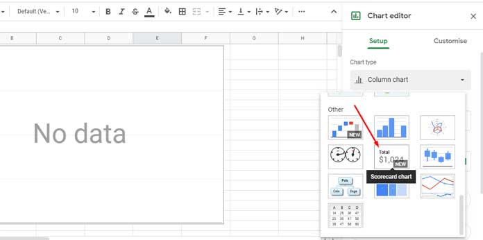
Do you have a scorecard chart and table with bars chart of datastudio.google.com
Thank you for your service.
Attachment: Syncfusion_chart_option2_8dd20ded.rar
SIGN IN To post a reply.
4 Replies
1 reply marked as answer
SS
Saranya Sivan
Syncfusion Team
March 24, 2021 04:40 PM UTC
Hi Sodbayar,
We are validating the reported requirement at our end. We will update further details within two business days.
Regards,
Saranya.
SS
Saranya Sivan
Syncfusion Team
March 26, 2021 01:12 PM UTC
Hi Sodbayar,
Thanks for the patience.
Please find the response below,
|
Query |
Response |
|
Is it possible circled charts of appendix work on pivot data?
Example: stock chart, gauge chart, map chart...... |
We have prepared sample to meet your requirement. Please check the below sample for your reference.
Note: This sample demonstrates rendering Heatmap control by providing desired data from a pivot table on selection. Not only Heatmap, but any other control can be used for this purpose.
|
|
Do you have a scorecard chart and table with bars chart of datastudio.google.com
|
This requirement can be achieved using chart and grid control. We have rendered chart and grid with X, Y values inside html table to display as per attached image in mentioned link. Please check with the below screenshot and sample.
Screenshot:
|
Please let us know if you have concerns.
Regards,
Saranya Sivan.
Marked as answer
SE
Sodbayar Erdenebaatar
March 27, 2021 02:51 AM UTC
Hello Saranya Sivan,
About srocecard chart.
See the picture below. Is it possible?

SS
Saranya Sivan
Syncfusion Team
March 29, 2021 02:31 PM UTC
Hi Sodbayar ,
Please find the response,
No, it isn’t possible. Because the card component is only to display the data, no further processing of the data can be done in the cards. Please check the below sample and the documentation for reference,
Regards,
Saranya.
SIGN IN To post a reply.
- 4 Replies
- 2 Participants
- Marked answer
-
SE Sodbayar Erdenebaatar
- Mar 23, 2021 07:21 AM UTC
- Mar 29, 2021 02:31 PM UTC
