
 Hari Venkatesh E
A progress bar is a graphical control that helps visualize the progress of work or an operation. In real-time scenarios, this control is mainly used for showing progress in software installation and loading, file transfer, download, data loading and recovery, and so on.
We are glad to include two patterns of progress bar controls in our 2019 Volume 3 beta release for the WPF platform:
- Linear Progress Bar
- Circular Progress Bar
Linear Progress Bar
A linear progress bar (a.k.a. rectangular) is a type of graphical control that helps to visualize the progress of any work or operation in a rectangular segment. The following are some of the standard features currently supported in the linear progress bar.
| Feature | Description |
| Determinate Mode | A determinate progress bar will show the amount of completed progress as well as the duration of the remaining progress. For example, we can use the determinate indicator to show a file’s downloading progress. The progress color and percentage are used to indicate the download completed and remaining percentages. |
| Indeterminate Mode | An indeterminate progress bar will show a continuous animation progress, letting the end-user see that the end of the task in progress cannot be determined. For example, we could use this progress type for something that is waiting for a response, like in a case of online data retrieval when the sizes of the data and internet bandwidth vary in different machine environments. |
| Buffer Mode | A buffer-type progress bar plays dual roles in which background progress indicates an activity or loading while foreground progress indicates current progress position. For example, while streaming videos, we can use this type of progress bar to show both the streaming progress (in the background) and current video play position. |
| Segment Mode | The segment progress bar can be used in places where the larger amount of progress can be split into different partitions. Both the segment’s color and count are customizable. For example, during online food delivery, placing an order may start the bar with a red color; and as the order progresses, it turns an orange color; upon completion, it turns yellow; and finally it turns green with a delivered status. |
| Range Color | The range colors inside a progress bar allows users to distinguish and improvise the look and feel for better communication. Again, the online food delivery is the best example, showing different stages meaningfully with customized colors. |
| Track Color | The track color (background color) is used to differentiate the progress indication from the track, making the UI more approachable. |
| Padding | End users can differentiate track and progress indicators by customizing the padding between them. |
| Corner Radius | The corner radius of the progress bar can be changed in order to view the control with a rounded corner or with sharp edges. |
Getting started with linear progress bars
Step 1: Create a WPF application and install Syncfusion.SfProgressBar.WPF NuGet package.
Step 2: Add the required XML NameSpace and the SfLinearProgressBar control in the MainWindow.xaml. The following code example illustrates this.
<Window x:Class="ProgressBar.MainWindow"
        xmlns="http://schemas.microsoft.com/winfx/2006/xaml/presentation"
        xmlns:x="http://schemas.microsoft.com/winfx/2006/xaml"
        xmlns:Syncfusion="http://schemas.syncfusion.com/wpf" >
    <Grid x:Name="Grid">
        <Syncfusion:SfLinearProgressBar x:Name="sfLinearProgressBar" IsIndeterminate="False" Progress="75" ProgressColor="Aquamarine" SecondaryProgress="85" SecondaryProgressColor="AntiqueWhite" SegmentCount="4" TrackColor="Beige" IndicatorCornerRadius="10" Height="20">
            <Syncfusion:SfLinearProgressBar.RangeColors>
                <Syncfusion:RangeColorCollection>
                    <Syncfusion:RangeColor Color="Red" Start="0" End="25" />
                    <Syncfusion:RangeColor Color="Orange" Start="25" End="50" />
                    <Syncfusion:RangeColor Color="Yellow" Start="50" End="75" />
                    <Syncfusion:RangeColor Color="Green" Start="75" End="100" />
                </Syncfusion:RangeColorCollection>
            </Syncfusion:SfLinearProgressBar.RangeColors>
        </Syncfusion:SfLinearProgressBar>
    </Grid>
</Window>
Step 3: In the code-behind CS file of the MainWindow, add the following code example and run the project to see the linear progress bar in action.
public partial class MainWindow : Window
{
    public MainWindow()
    {
        InitializeComponent();
        SfLinearProgressBar sfLinearProgressBar = new SfLinearProgressBar();
        sfLinearProgressBar.IsIndeterminate = false;
        sfLinearProgressBar.Progress = 75;
        sfLinearProgressBar.ProgressColor = new SolidColorBrush(Color.FromRgb(138, 43, 226));
        sfLinearProgressBar.SecondaryProgress = 85;
        sfLinearProgressBar.SecondaryProgressColor = new SolidColorBrush(Color.FromRgb(250, 235, 215));
        sfLinearProgressBar.TrackColor = new SolidColorBrush(Color.FromRgb(245, 245, 220));
        sfLinearProgressBar.SegmentCount = 4;
        sfLinearProgressBar.IndicatorCornerRadius = 10;
        sfLinearProgressBar.Height = 20;
        sfLinearProgressBar.RangeColors = new RangeColorCollection()
        {
            new RangeColor() { Color = Color.FromRgb(255, 0, 0), Start = 0, End = 25 },
            new RangeColor() { Color = Color.FromRgb(255, 165, 0), Start = 25, End = 50 },
            new RangeColor() { Color = Color.FromRgb(255, 255, 0), Start = 50, End = 75},
            new RangeColor() { Color = Color.FromRgb(0, 128, 0), Start = 75, End = 100}
        };
        Grid.Children.Add(sfLinearProgressBar);
    }
}
Sample link: You can check out the sample project from this GitHub location.
You can find more details about these controls in our UG documentation. The following is the screenshot of different modes in the linear progress bar, along with customization.

Circular progress bar
A circular progress bar is a round or semicircle-shaped graphical control that helps to visualize the progress of work.
The following features of the circular progress bar are similar to the linear progress bar:
- Determinate mode
- Indeterminate mode
- Range Color
- Segment mode
The other unique features are as follows.
| Feature | Description |
| Progress Value and Custom Content | The progress value helps show the amount of progress done. It provides more clarity to end users in showing both the completed and the remaining amounts of a task. The users can add their own content inside the progress bar and embed it in a label, text block, button, and so on. |
| Radius and Custom Angles | The radius of inner and outer indicators and the track can be customized. The start and end angle of the circular progress bar can be made adaptive to an application. |
Getting started with circular progress bar
To initialize and use a circular progress bar, please follow this code sample.
Step 1: Create a WPF application and install Syncfusion.SfProgressBar.WPF NuGet package.
Step 2: Add the required XML NameSpace and the SfCircularProgressBar control in the MainWindow.xaml. The following code example illustrates this.
<Window x:Class="ProgressBar.MainWindow"
        xmlns="http://schemas.microsoft.com/winfx/2006/xaml/presentation"
        xmlns:x="http://schemas.microsoft.com/winfx/2006/xaml"
        xmlns:Syncfusion="http://schemas.syncfusion.com/wpf" >
    <Grid x:Name="Grid">
        <Syncfusion:SfCircularProgressBar x:Name="sfCircularProgressBar" IsIndeterminate="False" ShowProgressValue="True" Progress="75" ProgressColor="BlueViolet" SegmentCount="4" IndicatorOuterRadius="0.75" IndicatorInnerRadius="0.6" TrackOuterRadius="0.6" TrackInnerRadius="0.75">
            <Syncfusion:SfCircularProgressBar.RangeColors>
                <Syncfusion:RangeColorCollection>
                    <Syncfusion:RangeColor Color="Red" Start="0" End="25" />
                    <Syncfusion:RangeColor Color="Orange" Start="25" End="50" />
                    <Syncfusion:RangeColor Color="Yellow" Start="50" End="75" />
                    <Syncfusion:RangeColor Color="Green" Start="75" End="100" />
                </Syncfusion:RangeColorCollection>
            </Syncfusion:SfCircularProgressBar.RangeColors>
        </Syncfusion:SfCircularProgressBar>
    </Grid>
</Window>
Step 3: In the code-behind CS file of the MainWindow, add the following code example and run the project to see the linear progress bar in action.
public partial class MainWindow : Window
{
    public MainWindow()
    {
        InitializeComponent();
        SfCircularProgressBar sfCircularProgressBar = new SfCircularProgressBar();
        sfCircularProgressBar.IsIndeterminate = false;
        sfCircularProgressBar.ShowProgressValue = true;
        sfCircularProgressBar.Progress = 75;
        sfCircularProgressBar.ProgressColor = new SolidColorBrush(Color.FromRgb(138, 43, 226));
        sfCircularProgressBar.SegmentCount = 4;
        sfCircularProgressBar.IndicatorOuterRadius = 0.75;
        sfCircularProgressBar.IndicatorInnerRadius = 0.6;
        sfCircularProgressBar.TrackOuterRadius = 0.6;
        sfCircularProgressBar.TrackInnerRadius = 0.75;
        sfCircularProgressBar.RangeColors = new RangeColorCollection()
        {
            new RangeColor() { Color = Color.FromRgb(255, 0, 0), Start = 0, End = 25 },
            new RangeColor() { Color = Color.FromRgb(255, 165, 0), Start = 25, End = 50 },
            new RangeColor() { Color = Color.FromRgb(255, 255, 0), Start = 50, End = 75},
            new RangeColor() { Color = Color.FromRgb(0, 128, 0), Start = 75, End = 100}
        };
        Grid.Children.Add(sfCircularProgressBar);
    }
}
Sample link: You can check out the sample project from this GitHub location.
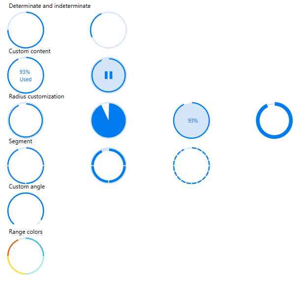
You can find more details about these controls in our UG documentation. The following is the screenshot of different modes in a circular progress bar, along with the customization options.
Conclusion
We hope you now have a clear idea of these features and how to get started with the linear and circular progress bar controls for WPF. You can download our 2019 Volume 3 beta release setup to check out these controls.
If you have any questions or require clarification for these controls, please let us know in the comments below. You can also contact us through our support forum, Direct-Trac, or Feedback Portal. We are happy to assist you!


 No spam, just valuable updates.
Comments (1)
[…] Introducing Linear and Circular Patterns in WPF Progress Bar (Hari Venkatesh E) […]