
 Paul Anderson
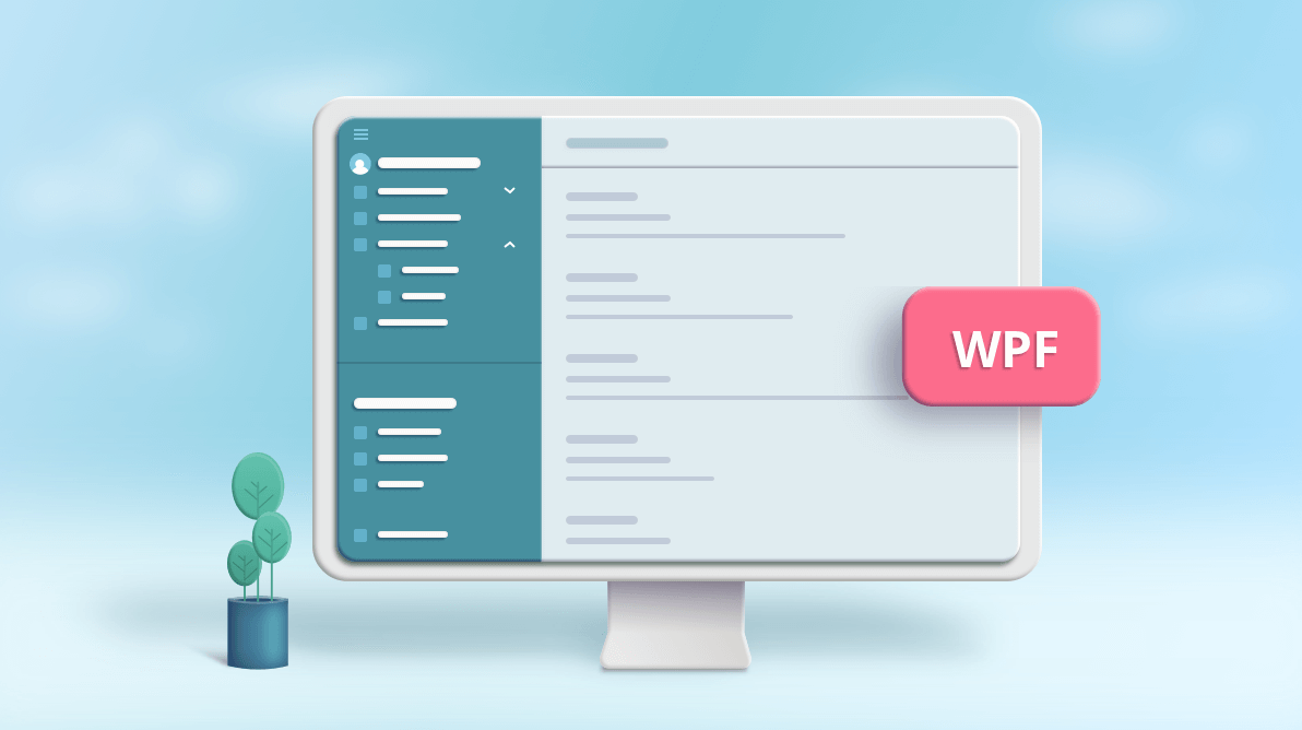
A good UI design for an application enhances the user experience by making the application easy to use. This, in turn, increases the number of users for the application. In this article, we will show you a modern method of navigating a WPF desktop application that provides a consistent experience. The modern navigation in the application is achieved using Syncfusion’s WPF Navigation Drawer.
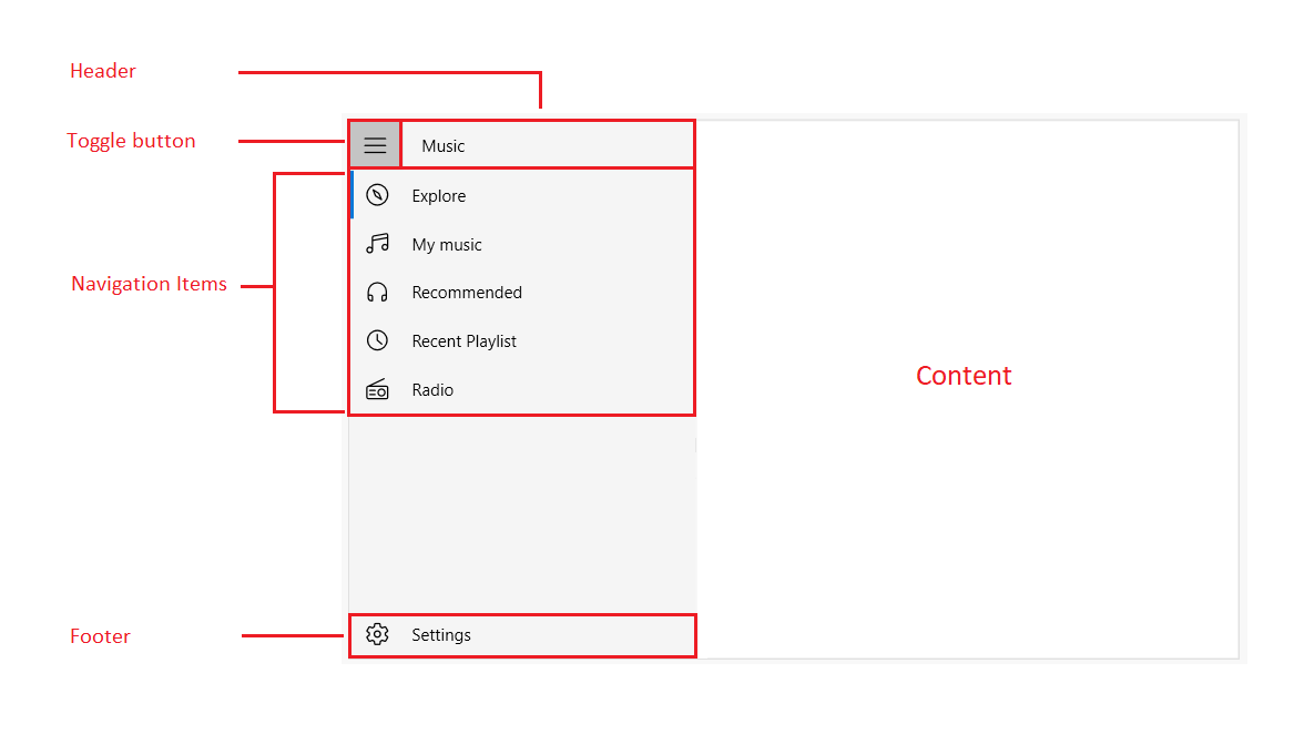
The Navigation Drawer is a sidebar view that is used to create a navigation menu. You can place the drawer on any side of the screen. It allows you to handle navigation between major modules of an application.
Navigation menu design
The WPF Navigation Drawer contains the following two panes:
- Sidebar pane: This pane can be loaded with navigation items such as tabs, headers, separators, and buttons. You can also include multiple levels by using the tab navigation item, which is useful when organizing and prioritizing a list.
- Main content pane: This pane displays the main content of the application. The contents can be organized as needed to provide a satisfying visual presentation.
Different display modes
The WPF Navigation Drawer provides default, compact and extended display modes to create a navigation UI menu that adapts to a variety of screen sizes. Refer to the following code example.
<syncfusion:SfNavigationDrawer DisplayMode="Expanded">
   <syncfusion:NavigationItem Header="Inbox">
      <syncfusion:NavigationItem.Icon>
         <Path Data="…" />
      </syncfusion:NavigationItem.Icon>
   </syncfusion:NavigationItem>
   <syncfusion:NavigationItem Header="Sent mail">
      <syncfusion:NavigationItem.Icon>
         <Path Data="…" />
      </syncfusion:NavigationItem.Icon>
   </syncfusion:NavigationItem>
</syncfusion:SfNavigationDrawer>
The compact mode provides a simple thin bar that is expanded and overlaid when the toggle button is tapped. The pane returns to its narrow bar state on tapping anywhere in the application.
The extended mode renders the drawer pane in a fully expanded view, pushing the main content to the right of the sidebar pane.
Note: For more information, refer to the navigation items in WPF Navigation Drawer demos.
Auto mode switching
You can switch between compact and extended display modes at runtime based on the available size to best fit the content. You can enable the auto sizing behavior using the AutoDisplayMode property.
Powerful data binding
Our WPF Navigation Drawer provides built-in support for populating items. You can bind the Navigation Drawer to different sources such as objects and collections, and the control supports DataTemplate. You can also apply different styles to the header, navigation items, and footer items.
Refer to the following code example.
<Window.DataContext>
  <local:ViewModel />
</Window.DataContext>
<Window.Resources>
  <Style x:Key="ItemStyle" TargetType="syncfusion:NavigationItem">
     <Setter Property="Icon" Value="{Binding Icon}" />
     <Setter Property="DisplayMemberPath" Value="Item" />
     <Setter Property="ItemsSource" Value="{Binding SubItems}" />
  </Style>
</Window.Resources>
<syncfusion:SfNavigationDrawer DisplayMemberPath="Item"
                               DisplayMode="Expanded"
                               ItemContainerStyle="{StaticResource ItemStyle}"
                               ItemsSource="{Binding Items}">
</syncfusion:SfNavigationDrawer>
Note: For more information, refer to the various items sources supported in WPF Navigation Drawer demos.
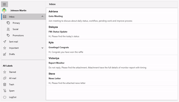
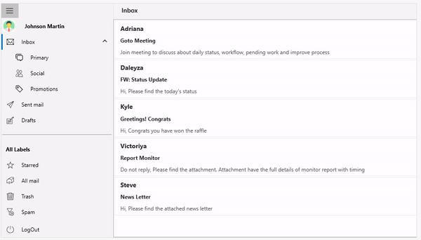
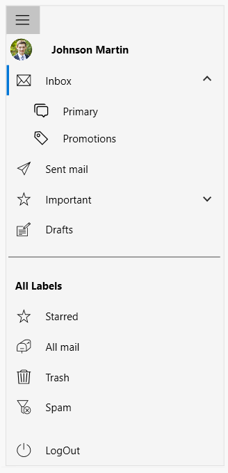
Item types
You can load the navigation menu with the navigation items. These items can be set based on the predefined item types such as tab, button, separator and header. The tab item type provides end users a child item upon clicking. This feature is incredibly useful when you are looking to organize and prioritize a list of items in a multilevel hierarchy.
Refer to the following example which shows an email application with sub folders.
<syncfusion:SfNavigationDrawer DisplayMode="Compact">
     <syncfusion:NavigationItem Header="Johnson Martin"
                                ItemType="Header">
          <syncfusion:NavigationItem.Icon>
                  …….
          </syncfusion:NavigationItem.Icon>
     </syncfusion:NavigationItem>
     <syncfusion:NavigationItem Header="Inbox"
                                ItemType="Tab"
                                IsExpanded="True">
          <syncfusion:NavigationItem.Icon>
                  …….
          </syncfusion:NavigationItem.Icon>
          <syncfusion:NavigationItem Header="Primary">
               <syncfusion:NavigationItem.Icon>
                  …….
               </syncfusion:NavigationItem.Icon>
          </syncfusion:NavigationItem>
          <syncfusion:NavigationItem Header="Social">
               <syncfusion:NavigationItem.Icon>
                 …….
                </syncfusion:NavigationItem.Icon>
           </syncfusion:NavigationItem>
           <syncfusion:NavigationItem Header="Promotions">
                    <syncfusion:NavigationItem.Icon>
                      ……….
                    </syncfusion:NavigationItem.Icon>
           </syncfusion:NavigationItem>
       </syncfusion:NavigationItem>
   </syncfusion:NavigationItem>
</syncfusion:SfNavigationDrawer>
Note: For more information, refer to the item types in WPF Navigation Drawer demos.
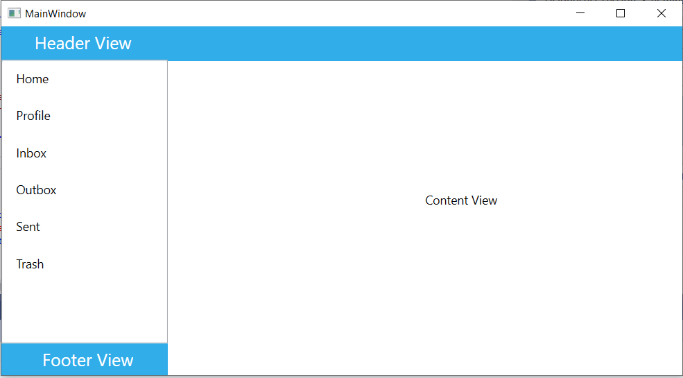
Custom views
You can populate the Navigation Drawer with custom views by setting the DisplayMode property as Default. In the Default mode, you can provide custom views to the DrawerHeaderView, DrawerContentView and DrawerFooterView properties.
Note: For more information, refer to the WPF Navigation Drawer custom view demos.
Conclusion
Thanks for reading! In this blog, we have learned about the Syncfusion WPF Navigation Drawer and its user-friendly features. You can refer to the WPF Navigation Drawer demos and documentation for a complete guide to all the available features in the control. Use these features to enable seamless navigation in your desktop app!
Also, browse through our WPF demos and documentation to learn more about all of our WPF controls. In addition, our demos are available in the Microsoft Store and we have .NET Core demos available in the App center.
If you aren’t a customer yet, you can try our 30-day free trial to check out these features.
If you wish to send us feedback or submit any questions, please feel free to post them in the comments section of this blog post. You can also contact us through our support forum, feedback portal, or Direct-Trac support system. We are always happy to assist you!
If you like this blog post, we think you’ll also like the following articles too:


 No spam, just valuable updates.