
 Rajasekar B
Syncfusion is happy to end 2018 with some interesting features that give the Xamarin community a strong reason to use our components. Let’s see the important highlights in Xamarin in this release.
New components
This release includes six new controls: backdrop page, border, button, chips, parallax view, and badge view.
Backdrop Page
The new backdrop is a modern page with two layers: the back layer and the front layer. The back layer can contain contextual items. It is hidden by default and can be revealed by clicking the hamburger menu to quickly access the contextual items. The front layer contains the primary content of the page. It works seamlessly as a sub-page of the master detail page and navigation page.
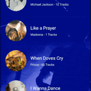
Border
The new Border control, a container control, applies borders over any content. Also, it can be used to show a circular image.

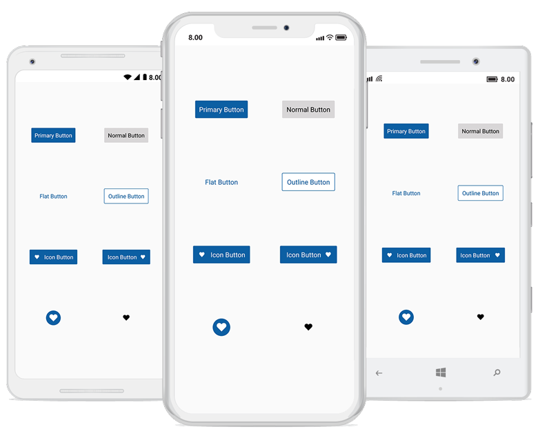
Button
The new Button control comes with some advanced features like support for hosting any custom content and a toggle button with checked and unchecked visual states. Using this button, you can also implement modern buttons like flat, outline, circle, and image buttons. All the visual states (checked, unchecked, disabled, pressed, and normal) are highly customizable using the visual state manager.
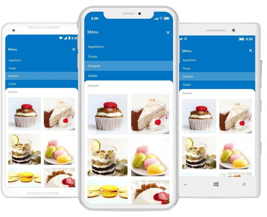
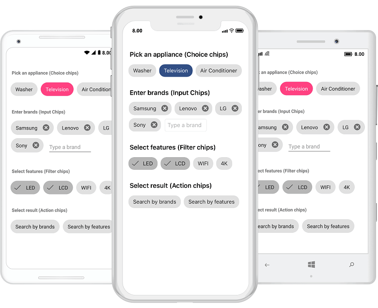
Chips
The new Chips control presents information in a compact layout. Arrange multiple chips in any layout (flex layout, stack layout, etc.) to create a chip group to use as action, filter, choice, or input chips.
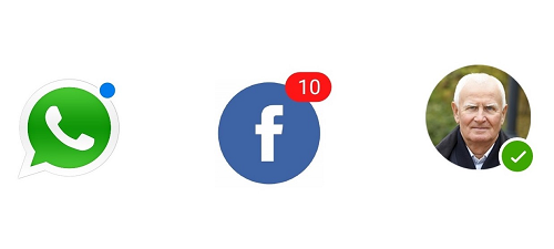
Badge view
The new Badge control shows notifications about new messages or the status of something. It has some predefined status icons like available, away, and busy.
Parallax View
The new Parallax View binds the scroll position of a foreground element (e.g., a list) to a background element and moves the background element at a different speed, to implement a parallax scrolling effect. It also supports vertical and horizontal parallax scrolling. Parallax View has built-in support to work seamlessly with ScrollView, SfListView, and SfRotator. However, any control that implements IParallaxView interface can also be used with ParallaxView.
Right-to-left layout
In this release, we provided right-to-left layout support for these controls: DataGrid, Kanban Board, ListView, Schedule, Text Input Layout, and TreeView controls.
Theme support
Now, you can easily theme our controls using predefined dynamic resource keys or just by applying the predefined light theme and changing the colors for specific elements. Also, DynamicResource binding will work for all the properties in all controls, now. More enhancements have been planned for our next release, including a dark theme. More details about our theming mechanism will be explained in another blog.
These are just the major highlights. Take a complete look at our 2018 Volume 4 What’s New and Release Notes to learn more about the changes made in other controls for this release.
We hope you will like these new controls and features in our 2018 Volume 4 release. You can download 2018 Volume 4 of Essential Studio® for Xamarin on our website and we look forward to you trying them out. Please feel free to leave your feedback in the comments section below. We are happy to offer any help we can.
If you enjoyed this post, we think you will also like:
- [Ebook] Visual Studio for Mac Succinctly
- [Ebook] Xamarin.Forms Succinctly
- [Ebook] Xamarin.Forms for macOS Succinctly
- [Blog Post] Seven Tips to Optimize Xamarin Charts Performance
- [Blog Post] What’s New in 2018 Volume 3: Xamarin.Forms Maps Updates
 No spam, just valuable updates.