
 Satheeskumar S
We are glad to announce that the Blazor Breadcrumb component is now production-ready with our latest release, 2021 Volume 4!
The Blazor Breadcrumb component is a graphical user interface that serves as a navigation header for a web application or site. It helps to identify or highlight the user’s current location within the hierarchical structure of a website. Now, it has been developed to meet industrial standards.
This blog will provide a walk-through of the Blazor Breadcrumb component, its UI design, available features in beta, and new updates in the production-ready phase.
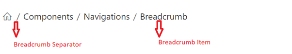
Breadcrumb UI design
The Breadcrumb component is flexible, responsive, and completely customizable. It provides support for web standard functionalities like accessibility, keyboard interactions, events, and a UI optimized for touch interactions.
Parts of the Breadcrumb component:
- Breadcrumb item: Represents the navigation item for a link.
- Breadcrumb separator: Separates the Breadcrumb items.
Refer to the following image.
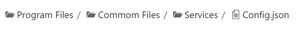
Use cases
You can use the Breadcrumb component as a navigation header for your web app or site. Also, you can use it as a secondary navigation tool to identify the current location without navigation.
The following are some of the use case scenarios for this component:
- eCommerce sites: Display the hierarchal categories of a product with its parent category.
- Search engines: Showcase the current location with its parent root in the search results.
- Support tickets: Display the current support ticket with its platforms and parent navigation.
What did we ship in the beta phase?
The following is the list of key features in the Breadcrumb component in its previous beta phase:
- BindToLocation or URL binding.
- Items with icons.
- UI customization with the custom item and separator templates.
- Breadcrumb with overflow mode.
- Keyboard accessibility.
BindToLocation or URL binding
We can automatically generate the Breadcrumb items based on the current location of the user within the website. Also, we can create the breadcrumb items by specifying the absolute or relative URL in the Url property.
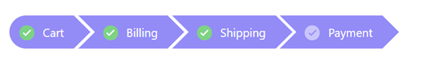
Items with icons
The built-in icons support provides a better visual representation of breadcrumb items. By default, the icons are aligned in the left position. If required, we can place them in the right position.
UI customization with the custom item and separator templates
Templates are used to create a custom user experience. The Breadcrumb component provides template support for each breadcrumb item and separators. With these features, we can customize or change the appearance of the entire Breadcrumb UI with HTML elements or any other components.
Note: Refer to the Example of Template and Customization in Blazor Breadcrumb component.
Breadcrumb with overflow mode
You can easily limit the number of breadcrumb items to be displayed in the view using an overflow mode.
These overflow modes were supported in Breadcrumb’s beta version:
- Default: Shows the maximum number of items that can accommodate in the container space and hides the remaining items. Navigating one item up in the hierarchy will make the last hidden item visible.
- Collapsed: Shows the first and last breadcrumb items alone and hides the remaining items with a collapsed icon. When we click the collapsed icon, all items become visible and navigable.
Keyboard accessibility
All our Syncfusion Blazor components follow keyboard interaction and web accessibility standards. So, users can easily interact with the Breadcrumb using a keyboard:
- Tab: Navigate to the next item.
- Shift + Tab: Navigate to the previous item.
- Enter: Select an item.
What’s new in the production-ready phase?
As you know, the Blazor Breadcrumb component is marked as production-ready in 2021 Volume 4. You can enjoy a new set of overflow modes and responsiveness support for a better UI experience in this release.
Breadcrumb with new overflow modes
Now, the Breadcrumb component supports the following new set of overflow modes:
- Hidden: The Default mode’s name has been changed to Hidden. It displays the maximum number of items that can fit in the available container space and hides the remaining items. Navigating one item up in the hierarchy will make the last hidden item visible.
- Menu: Shows the number of breadcrumb items that can accommodate within the container space and creates a submenu with the remaining items.
- Wrap: Wraps the items on multiple lines when the Breadcrumb’s width exceeds the container space.
- Scroll: Shows an HTML scroll bar when the Breadcrumb’s width exceeds the container space.
- None: Shows all the items on a single line.
Note: Refer to the Example of Overflow Modes in Blazor Breadcrumb Component.
Responsiveness
The Blazor Breadcrumb component provides responsiveness support by default. The Breadcrumb’s UI automatically changes to overflow mode when the screen size changes. So, it will adapt based on the device, providing optimal user experience on phones, tablets, and desktops applications.
Reference
For more details, refer to our Blazor Breadcrumb live demos and getting started documentation.
Conclusion
Thanks for reading! We hope you enjoyed this quick introduction to the design and available features of the Blazor Breadcrumb component. If you would like to give it a try, please download our latest version in the 2021 Volume 4 release and provide your valuable feedback. Also, check out our Release Notes and What’s New pages to see all the other updates in this release.
Also, you can contact us through our support forums, support portal, or feedback portal. We are always happy to assist you!


 No spam, just valuable updates.