
 Piruthiviraj Malaimelraj
TL;DR: Default summary rows in the WPF DataGrid often look generic and make key metrics easy to overlook. This guide shows how to transform table, group, and caption summary rows into visually distinct, readable, and consistent UI elements. You’ll learn when to use implicit versus explicit styles, how to highlight important aggregates, and how to create a maintainable styling strategy that scales across your application.
Effective data visualization is no longer optional, it’s foundational to modern application design. As datasets grow in size and complexity, users rely on visual cues to quickly interpret totals, averages, and grouped metrics. When these cues are missing, even accurate data can feel overwhelming or hard to trust.
The Syncfusion® WPF DataGrid offers a powerful data-handling foundation, but its default summary row styles are intentionally neutral. Without customization, critical insights, such as grand totals or group averages, can blend into the grid, reducing clarity and usability.
By thoughtfully styling summary rows, you can elevate the entire DataGrid experience. Well-designed summary rows guide the user’s eye, reinforce hierarchy, and make important numbers instantly recognizable. In this guide, you’ll learn how to use built-in styling properties, such as background color, typography, and spacing, to create a summary UI that looks intentional, professional, and easy to read.
We will walk through customization patterns for the following DataGrid elements:
- Table summary rows and cells.
- Group summary rows and cells.
- Caption summary rows and cells.
Best practice: Use implicit styles for consistent, app-wide design, and explicit styles when a specific DataGrid requires a unique appearance.
Customize table summary rows
Table summary rows appear at the top or bottom of the grid and display high-level metrics such as grand totals. Because these values often influence decisions, they should be visually distinguished from regular data rows.
Method 1: Style summary rows
Implicit style for app-wide consistency
By setting the Style.TargetType property to the TableSummaryRowControl class, you can define a default appearance for all table summary rows in your application. This allows you to align the grid’s look and feel with your overall design language.
For the best result, store this style in a shared ResourceDictionary. Doing so ensures consistent styling across the app and reduces repetition when multipe grids use summary rows.
This approach improves the user experience by making summary rows visually distinct, predictable, and polished.
Here’s how you can do it in code:
<Style TargetType="syncfusion:TableSummaryRowControl">
    <Setter Property="Background" Value="Bisque"/>
    <Setter Property="FontStyle" Value="Italic"/>
    <Setter Property="Foreground" Value="Red"/>
</Style>
Explicit styling for a single grid
When you want only a single DataGrid to use a custom table summary row style, define an explicit style and assign it using the TableSummaryRowStyle property.
This approach is ideal when a particular grid requires unique branding, visual emphasis, or layout differentiation without affecting other grids in the application.
For this, refer to this code:
<Style TargetType="syncfusion:TableSummaryRowControl"
x:Key="tableSummaryRowStyle">
<Setter Property="Background" Value="Bisque"/>
</Style>
<syncfusion:SfDataGrid x:Name="dataGrid"
ItemsSource="{Binding Orders}"
ShowGroupDropArea="True"
TableSummaryRowStyle="{StaticResource tableSummaryRowStyle}">
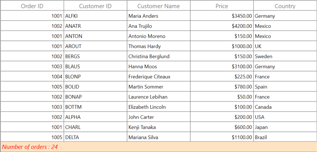
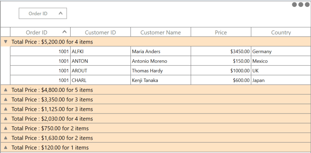
</syncfusion:SfDataGrid>Here’s what the summary row looks like:
Method 2: Style summary cells
Summary cells typically display key metrics such as totals, averages, or counts. Applying custom styles to these cells improves readability and helps users quickly identify important values.
Implicit styling
You can define implicit styles in XAML to ensure summary cells visually align with your application’s design language.
Common styling enhancements include:
- Set a background color to visually separate summary cells from regular data rows.
- Apply bold text to emphasize important figures.
- Use a custom font to reflect branding or improve aesthetics.
- Increase the font size to make key data easier to read.
- Change the text color to draw attention.
Below is the code you need:
<Style TargetType="syncfusion:GridTableSummaryCell">
    <Setter Property="Background" Value="Beige"/>
    <Setter Property="Foreground" Value="Red" />
    <Setter Property="FontSize" Value="16" />
    <Setter Property="FontFamily" Value="Congenial Black"/>
    <Setter Property="FontWeight" Value="Bold" />
</Style>
Explicit styling
To apply the style to a specific DataGrid only, define it with a key and assign it using the TableSummaryCellStyle property.
Add the following to your project:
<Style TargetType="syncfusion:GridTableSummaryCell"
       x:Key="tableSummaryCellStyle">
    <Setter Property="Background" Value="Beige"/>
    <Setter Property="Foreground" Value="Red" />
    <Setter Property="FontSize" Value="16" />
    <Setter Property="FontFamily" Value="Congenial Black"/>
    <Setter Property="FontWeight" Value="Bold" />
</Style>

<syncfusion:SfDataGrid x:Name="dataGrid"
                       ItemsSource="{Binding Orders}"
                       ShowGroupDropArea="True"
                       TableSummaryCellStyle="{StaticResource tableSummaryCellStyle}">
</syncfusion:SfDataGrid>
After running the code, you’ll see this:
Spend less time building grid features from scratch. Syncfusion WPF DataGrid includes ready-to-use support for data binding, paging, sorting, filtering, editing, and exporting.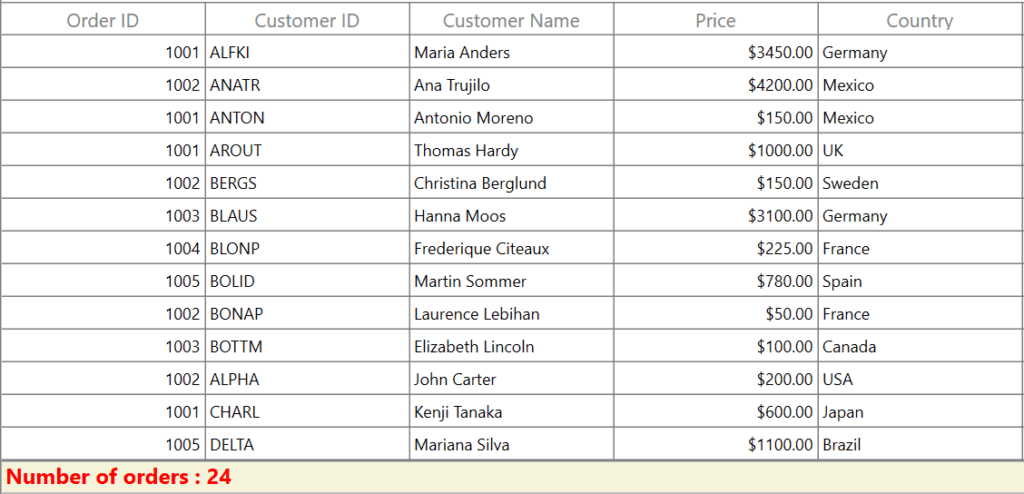
Customize group summary rows
Group summary rows display aggregated data, such as totals, counts, or averages, for each group of records within the DataGrid. Making these rows visually distinct helps users quickly recognize and interpret important group-level data.
Method 1: Style the group summary row
You can customize the appearance of group summary rows by applying a style to the GroupSummaryRowControl class, which is responsible for rendering group summary sections within the DataGrid.
By adjusting properties such as Background, you introduce a clear visual distinction between group summary rows and regular data rows. As a result, group‑level summaries become easier to identify and interpret at a glance.
The following example demonstrates how to apply this styling in XAML:
<Style TargetType="syncfusion:GroupSummaryRowControl">
    <Setter Property="Background" Value="Bisque"/>
</Style>
Explicit styling
If you want to customize the group summary row for a specific DataGrid only, define the style with an x:Key and apply it using the GroupSummaryRowStyle property of the DataGrid. This ensures that the customization affects only the intended grid and does not impact others in your application.
Try this in your code:
<Style TargetType="syncfusion:GroupSummaryRowControl"
x:Key="groupSummaryRowStyle">
<Setter Property="Background" Value="Bisque"/>
</Style>
<syncfusion:SfDataGrid x:Name="dataGrid"
ItemsSource="{Binding Orders}"
ShowGroupDropArea="True"
GroupSummaryRowStyle="{StaticResource groupSummaryRowStyle}">
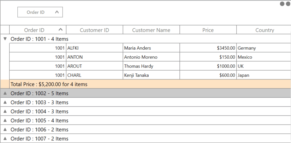
</syncfusion:SfDataGrid> After running the code, you’ll see this:
Method 2: Style group summary cells
While styling the group summary row improves visibility at a high level, styling the group summary cells allows you to further emphasize individual aggregate values, such as totals, counts, or averages.
Group summary cells are rendered by the GridGroupSummaryCell class. By customizing this class, you can enhance readability and ensure visual consistency with your application’s design language.
You can adjust the following properties:
- Background: Differentiates summary cells from standard data cells
- FontFamily: Maintains branding or typographic consistency
- FontSize: Improves text readability
- Foreground: Enhances contrast and visual clarity
- FontWeight / FontStyle: Adds emphasis to key metrics
Below is the code you need:
<Style TargetType="syncfusion:GridGroupSummaryCell">
    <Setter Property="Background" Value="Beige"/>
    <Setter Property="FontWeight" Value="SemiBold"/>
    <Setter Property="Foreground" Value="DarkBlue"/>
    <Setter Property="FontStyle" Value="Oblique"/>
    <Setter Property="FontFamily" Value="Congenial Black"/>
    <Setter Property="FontSize" Value="14"/>
</Style>
Explicit styling
To apply the group summary cell style to only one DataGrid, define the style with a key and assign it using the GroupSummaryCellStyle property.
<Style TargetType="syncfusion:GridGroupSummaryCell"
       x:Key="groupSummaryCellStyle">
    <Setter Property="Background" Value="Beige"/>
    <Setter Property="FontWeight" Value="SemiBold"/>
    <Setter Property="Foreground" Value="DarkBlue"/>
    <Setter Property="FontStyle" Value="Oblique"/>
    <Setter Property="FontFamily" Value="Congenial Black"/>
    <Setter Property="FontSize" Value="14"/>
</Style>

<syncfusion:SfDataGrid x:Name="dataGrid"
                       ItemsSource="{Binding Orders}"
                       ShowGroupDropArea="True"
                       GroupSummaryCellStyle="{StaticResource groupSummaryCellStyle}">
</syncfusion:SfDataGrid>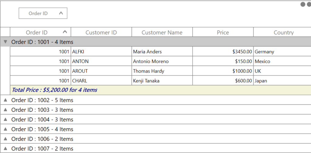
Caption summary row customization
In modern UI development, consistent and intentional styling plays a crucial role in delivering a polished user experience. Within a DataGrid, the caption summary row displays summary or group‑level information above grouped data, serving as an important visual anchor.
Method 1: Applying styles to the summary row
You can customize the appearance of caption summary rows by targeting the CaptionSummaryRowControl class.
TargetType: Specifies that the style should be applied to caption summary row views in the grid.Background property: Sets a custom background color for the row, which helps distinguish it from other data rows and improves overall readability.
<Style TargetType="syncfusion:CaptionSummaryRowControl">
    <Setter Property="Background" Value="Bisque"/>
</Style>
Explicit styling
To limit the caption summary row customization to a specific DataGrid, define the style with a key and assign it using the CaptionSummaryRowStyle property.
<Style TargetType="syncfusion:CaptionSummaryRowControl"
       x:Key="captionRowStyle">
    <Setter Property="Background" Value="Bisque"/>
</Style>

<syncfusion:SfDataGrid x:Name="dataGrid"
                       ItemsSource="{Binding Orders}"
                       ShowGroupDropArea="True"
                       CaptionSummaryRowStyle="{StaticResource captionRowStyle}">
</syncfusion:SfDataGrid>
Here’s the expected output:
Method 2: Style group summary cells
The GridGroupSummaryCell class controls how individual summary cells are rendered within grouped rows. You can easily customize their appearance, including background, font family, font size, and foreground color, by defining a style.
As shown in the code example below.
<Style TargetType="syncfusion:GridCaptionSummaryCell">
    <Setter Property="Background" Value="Beige"/>
    <Setter Property="FontWeight" Value="Bold"/>
    <Setter Property="Foreground" Value="DarkBlue"/>
    <Setter Property="FontStyle" Value="Italic"/>
    <Setter Property="FontFamily" Value="Congenial Black"/>
    <Setter Property="FontSize" Value="14"/>
</Style>
Explicit styling
To apply the style definition of the GridCaptionSummaryCell class to a particular DataGrid, you can achieve this by setting the CaptionSummaryCellStyle property of the DataGrid, as shown below.
<Style TargetType="syncfusion:GridCaptionSummaryCell"
       x:Key="captionSummaryCellStyle">
    <Setter Property="Background" Value="Beige"/>
    <Setter Property="FontWeight" Value="Bold"/>
    <Setter Property="Foreground" Value="DarkBlue"/>
    <Setter Property="FontStyle" Value="Italic"/>
    <Setter Property="FontFamily" Value="Congenial Black"/>
    <Setter Property="FontSize" Value="14"/>
</Style>

<syncfusion:SfDataGrid x:Name="dataGrid"
                       ItemsSource="{Binding Orders}"
                       ShowGroupDropArea="True"
                       CaptionSummaryCellStyle="{StaticResource captionSummaryCellStyle}">
</syncfusion:SfDataGrid>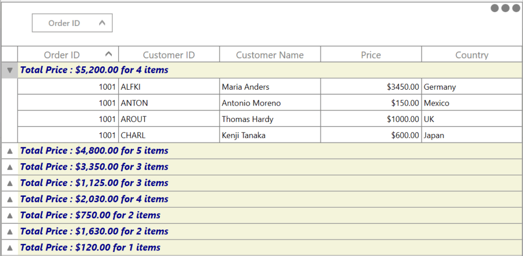
GitHub reference
You can explore the complete code example for styling summary rows on the GitHub repository.
Frequently Asked Questions
You can customize the appearance of summary rows by applying a Style with the appropriate target type. Using Style tags allows you to control colors, fonts, borders, and other visual properties of the summary rows.How can I customize the appearance of summary rows in a WPF DataGrid?
In a WPF DataGrid, you can customize summary rows and cells using several styling properties, including Background, which sets the background color of the row or cell; Foreground, which defines the color of the summary text; FontFamily, used to specify the font type, such as Congenial Black; FontSize, which controls the size of the summary text; FontWeight, enabling styles such as Bold, Light, Medium, or ExtraBold; and BorderBrush, which determines the border color of the summary rows and cells.What properties are available for customizing summary rows and cells in a WPF DataGrid?
To customize individual caption summary cells, define a Style that targets the GridCaptionSummaryCell element. This allows you to control the appearance of each cell in the caption summary row, including background color, font settings, and text color.How can I customize individual caption summary cells in a WPF DataGrid?
Conclusion
Thank you for reading! Customizing summary row styles in the Syncfusion WPF DataGrid is a simple yet impactful way to enhance clarity, highlight key insights, and elevate the overall user experience of your app. By moving from manual data analysis to quick summaries, you can gain faster insights and make better decisions with less effort.
With the styling techniques covered in this guide, you can present aggregate data in a way that’s both visually appealing and easy to interpret.
If you’re ready to take your WPF apps further, explore Syncfusion’s complete WPF UI suite, featuring rich controls, AI-powered components, and robust document processing capabilities to help you build professional, production-ready apps faster.
Start your free 30-day trial today and see the difference for yourself. Already a user? Download the latest version and begin enhancing your apps right away.
Have questions or need guidance? Connect with us through our support forum, support portal, or feedback portal. We’re here to help you succeed!


 No spam, just valuable updates.