
 Surya Elayaperumal
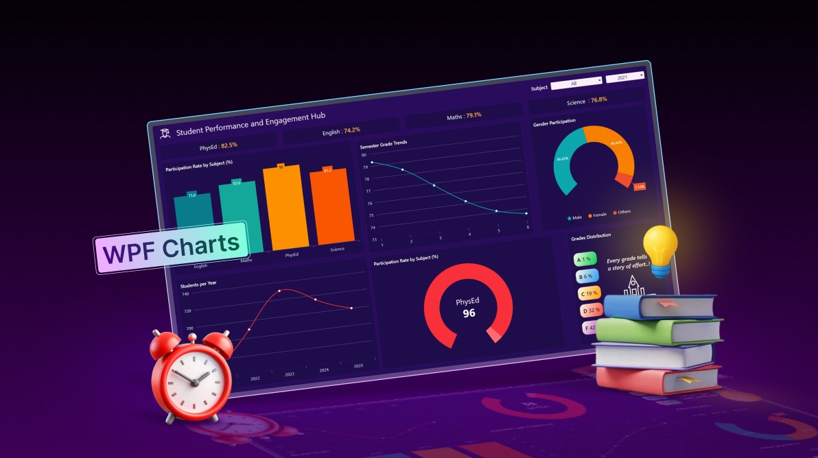
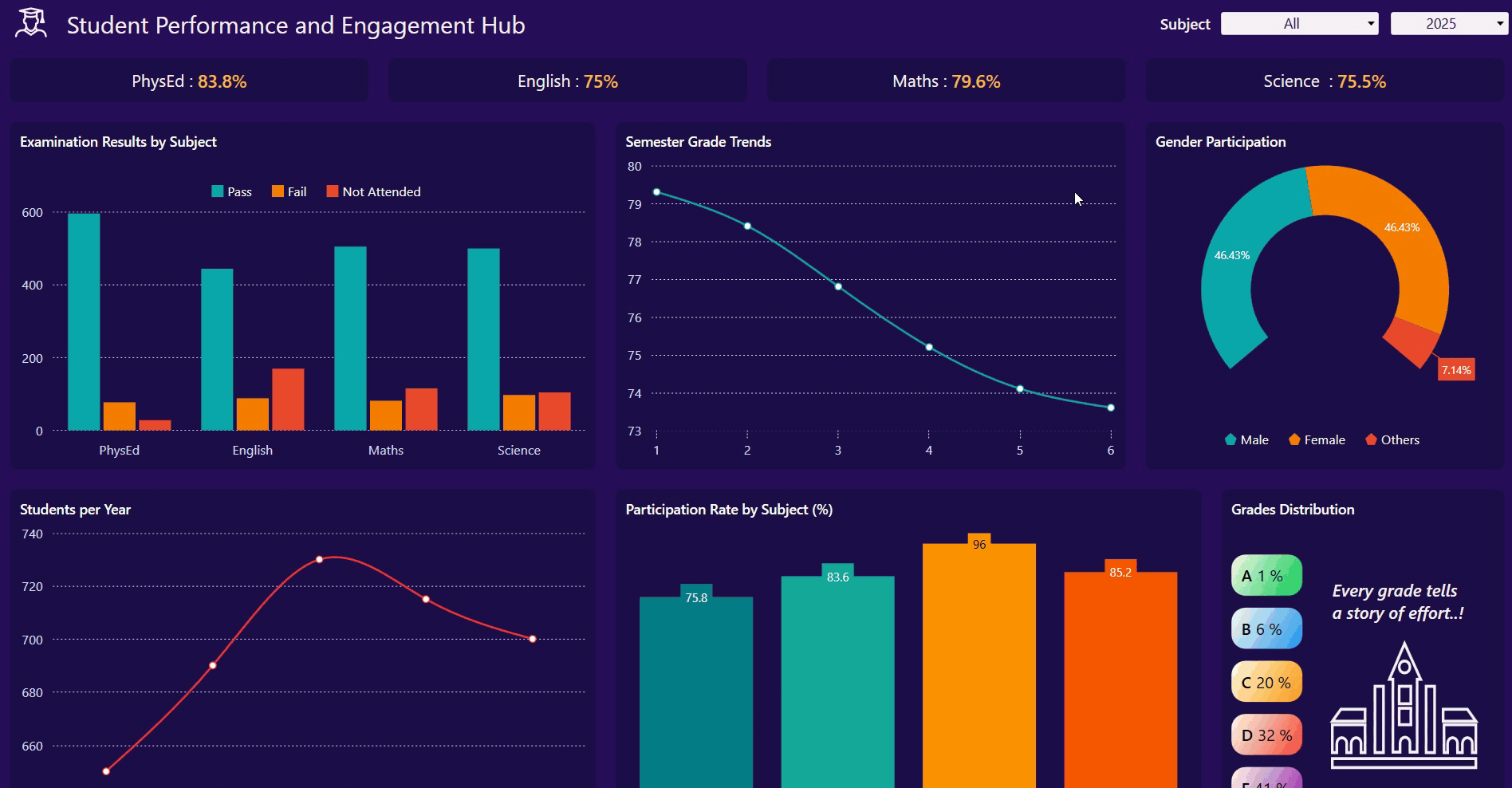
TL;DR: Build a MVVM-based student analytics dashboard in WPF that covers data models, ViewModel projections, and grid-driven UI composition. Academic datasets, such as scores, exam results, participation rates, grade distribution, and yearly trends, are transformed using bindings, converters, and filtered ViewModel collections to drive multiple chart series with dynamic updates by year and subject.
Welcome to our Chart of the Week series!
Educators make better decisions when data tells a clear story. Raw numbers alone don’t help, but structured, visual insights do. A well-built student performance dashboard turns academic data into something educators can explore, question, and act on.
In this post, we’ll walk through building a Student Performance and Engagement Hub using Syncfusion® WPF Chart controls. The focus stays on practical UI patterns and data visualization strategies that developers can reuse in real-world education platforms. You’ll see how to visualize subject scores, engagement levels, grade distributions, and long-term trends in a way that feels intuitive and responsive.
Rather than dumping charts onto a screen, this dashboard centralizes academic indicators into a single, decision-friendly view, helping schools spot patterns early and respond faster.
The dashboard highlights the academic signals that educators and administrators care about most:
- KPI scores: Overall subject scores.
- Examination results: Pass, Fail, and Not Attended counts by subjects.
- Participation rates: Engagement levels across subjects.
- Grade distribution: A – F breakdown across the student population.
- Semester grade trends: Performance changes over time.
- Students per year trend: Enrollment trends across academic years.
- Gender participation: Distribution of participation by gender.
These metrics enable educators to track trends over time, compare performance across subjects, and identify groups that may require additional support. Spend less time building data visualization features from scratch. Syncfusion WPF Charts includes ready-to-use support for multiple chart types, data binding, interactive tooltips, legends, zooming, selection, and responsive layouts.
UI architecture overview
The dashboard follows a clean MVVM structure: a well-defined model, a reactive ViewModel, and a layout that puts insights first.
Step 1: Define the Model
Begin by defining the data structures in the StudentPerformanceModels.cs file. Each class represents a specific part of student performance, such as subjects, scores, exam results, participation, or grade distribution.
Here’s how you can do it in code:
public class StudentsPerYear
{
    // Yearly total student count; drives year filter and overall enrollment visuals.
}

public class AverageSubjectScore
{
    // Yearly average scores across subjects; powers KPI tiles and score trends.
}

public class SubjectScores
{
    // Container for subject score fields (PhysEd, English, Maths, Science).
}

public class StudentsByGradeAndGender
{
    // Gender totals for the selected year; used by the gender participation pie.
}

public class StudentParticipationRateByBranch
{
    // Yearly participation percentages by subject; feeds subject participation visuals.
}

public class BranchRates
{
    // Holder for participation rates per subject (PhysEd/Arts/English/Maths/Science).
}

public class ExaminationResultsByBranch
{
    // Yearly exam outcomes by subject (Pass/Fail/NotAttended); used for exam result charts.
}

public class ExaminationResult
{
    // Aggregated counts for a subject: Pass, Fail, and Not Attended.
}

public class LabelValue
{
    // Generic label–value–percentage tuple for simple charts, legends, and summaries.
}

public class SubjectRate
{
    // Pairs a Subject with a participation rate; used in subject participation bars/gauges.
}

public class SubjectExamResult
{
    // Per-subject exam outcome counts for a given year; drives stacked bar/pie breakdowns.
}

public class SubjectScoreTile
{
    // Simple KPI tile model showing a subject name and its average score.
}

public class GradeDistribution
{
    // Grade bucket share (A–F) with color; used in the grade distribution visualization.
}

public class Subject
{
    // Subject identity used in filters and charts; optional IsSelected for UI state.
}
Step 2: Create the ViewModel
Next, we need to define the StudentPerformanceViewModel class. This class connects the data models to the UI, exposes data using ObservableCollection, and keeps the dashboard updated when data changes.
Here’s how that looks in code:
public partial class StudentPerformanceViewModel
{
    public StudentPerformanceViewModel()
    {
        SeedSampleData();
        InitializeSubjects();
        InitializeCollections();
        SelectedSubject = _subjectsByName["Maths"];
        UpdateFilteredData();
    }

    private void SeedSampleData()
    {
        // Seeds year-wise totals, average scores, participation rates, and computes exam results
    }

    private void InitializeSubjects()
    {
        // Creates subject cache and list used across UI (includes "All")
    }

    private void InitializeCollections()
    {
        // Populates Years list (latest first)
    }

    private void UpdateFilteredData()
    {
        // Rebuilds all projections when filters change (year/subject)
    }

    private void ComputeExamResultsFromRatesAndScores()
    {
        // Computes examination pass/fail/not-attended per year/subject from participation and average scores
    }

    private void BuildProjections()
    {
        // Builds runtime series for the selected year/subject (gender pie, participation by subject, exam results, trends)
    }

    private void BuildGradeDistribution(double average)
    {
        // Builds A/B/C/D/F distribution from an average score using a normal-model approximation
    }
}
Step 3: Structure the layout
A Grid layout organizes the dashboard into predictable zones: filters at the top, KPI tiles beneath them, and charts below.
Code snippet to achieve this:
<!--MainGrid-->
<Grid RowDefinitions="1*,1*,3.5*,4.5*">
     <!-- Header and Filters (Grid.Row="0") -->
     <Grid Grid.Row="0" Background="#140733" ColumnDefinitions="Auto,Auto,Auto,Auto,*" Height="70">
         <!-- ... TextBlock for title ... -->
         <!-- ... ComboBoxAdv for Subject ... -->
         <!-- ... ComboBoxAdv for Year ... -->
     </Grid>

     <!-- Score Tiles (Grid.Row="1") -->
     <Grid Grid.Row="1" ColumnDefinitions="*,*,*,*">
            . . .
     </Grid>

     <!-- Charts (Grid.Row="2") -->
         <Grid Grid.Row="2" ColumnDefinitions="4*,3.5*,2.5*" >
             . . .
             <!-- Chart 1: Exam Results by Subject (Grid.Column="0") -->
             <!-- Chart 2: Semester Grade Trend ( Grid.Column="1") -->
             <!-- Chart 3: Gender Participation ( Grid.Column="2") -->
         </Grid>
         <Grid Grid.Row="3" ColumnDefinitions="4*,4*,2*">
             <!-- Chart 1: Students per Year (Grid.Column="0") -->
             <!-- Chart 2: Participation Rate by Subject (Grid.Column="1") -->
             <!-- Chart 3: Grades Distribution (Grid.Column="2") -->
         </Grid>
     </Grid>
UI components and their roles
Top panel: Controls and dynamic filters
The dashboard’s top section includes the main title and interactive filtering elements:
Title
Add a TextBlock to display the title Student Performance and Engagement Hub, as shown in the code below:
<TextBlock
    Margin="20,0,0,0"
    Text="Student Performance and Engagement Hub"
    Foreground="#FAEFF6"
    FontSize="24"/>
Subject Dropdown
You define ComboBoxAdv so users can select a subject. Then bind it to the Subjects ViewModel and update the SelectedSubject property when a choice is made, triggering data recalculations.
Here’s the Subject Dropdown implementation:
<editors:ComboBoxAdv
    Grid.Column="2"
    Style="{StaticResource comboBoxStyle}"
    Width="160"
    DisplayMemberPath="Name"
    ItemsSource="{Binding Subjects}"
    SelectedItem="{Binding SelectedSubject, Mode=TwoWay}"
    VerticalAlignment="Center"/>
Year Dropdown
Add another ComboBoxAdv class to filter data by academic year. You need to bind it to the Years list and the SelectedYear property, updating the dashboard’s data accordingly.
Here’s the year Dropdown implementation:
<editors:ComboBoxAdv
    Grid.Column="3"
    Style="{StaticResource comboBoxStyle}"
    Margin="10,0,0,0"
    Width="120"
    ItemsSource="{Binding Years}"
    SelectedItem="{Binding SelectedYear, Mode=TwoWay}"
    VerticalAlignment="Center"/>
KPI cards: Performance at a glance
You can display each subject’s average score in a compact KPI tile. These cards make performance trends visible before users even look at charts.
Here’s the KPI tile implementation:
<!-- PhysEd Score Tile -->
<!-- Example for one subject, others would follow a similar pattern -->
<Border Grid.Column="0" Style="{StaticResource border}">
    <StackPanel Orientation="Horizontal"
                HorizontalAlignment="Center"
                VerticalAlignment="Center">
        <TextBlock Text="PhysEd : " Style="{StaticResource kpiCard1}"/>
        <TextBlock Text="{Binding PhysEdScore, StringFormat={}{0}%}"
                   Style="{StaticResource kpiCard2}"/>
         ….
    </StackPanel>
</Border>
Next, we will display the charts, which are explained in detail in the following section.
Implementing insightful charts
Syncfusion WPF Charts are used throughout the application to deliver clear, interactive, and visually compelling data insights. Below is an overview of the chart types implemented and their purposes.
1. Column Chart: Exam performance breakdown
The Column Chart visually compares examination outcomes, such as Pass, Fail, and Not Attended, across different subjects for a selected academic year. It helps educators quickly identify subjects where students may be excelling, struggling, or disengaging.
We use the SfChart control with multiple ColumnSeries classes, each representing a specific result category, as shown below.
<!-- Column Chart: Examination Results -->
<chart:SfChart Palette="Custom">
    <chart:SfChart.PrimaryAxis>
        <chart:CategoryAxis ... />
    </chart:SfChart.PrimaryAxis>

    <chart:SfChart.SecondaryAxis>
        <chart:NumericalAxis ... />
    </chart:SfChart.SecondaryAxis>

    <chart:SfChart.Legend>
        <chart:ChartLegend ... />
    </chart:SfChart.Legend>

    <chart:SfChart.ColorModel>
        <chart:ChartColorModel>
            <chart:ChartColorModel.CustomBrushes>
                <SolidColorBrush Color="#0BA7AC"/>
                <SolidColorBrush Color="#F77F00"/>
                <SolidColorBrush Color="#EC492D"/>
            </chart:ChartColorModel.CustomBrushes>
        </chart:ChartColorModel>
    </chart:SfChart.ColorModel>

    <!-- Series -->
    <chart:ColumnSeries ItemsSource="{Binding FilteredExamResults}" XBindingPath="Subject.Name"
                        YBindingPath="Pass" Label="Pass" ... />
    <chart:ColumnSeries ItemsSource="{Binding FilteredExamResults}" XBindingPath="Subject.Name"
                        YBindingPath="Fail" Label="Fail" ... />
    <chart:ColumnSeries ItemsSource="{Binding FilteredExamResults}" XBindingPath="Subject.Name"
                        YBindingPath="NotAttended" Label="Not Attended" ... />
</chart:SfChart>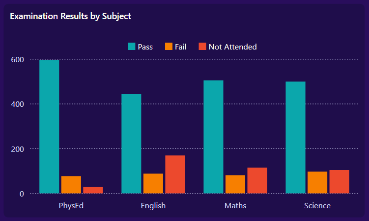
2. Spline Chart: Semester‑wise grade progression
You can use a Spline Chart to highlight grade progression across semesters, enabling educators to observe long-term performance patterns such as improvement or decline.
A SplineSeries in the SfChart is used to draw a smooth, continuous curve reflecting semester-wise grade changes.
Code example for quick integration:
<!-- Spline Chart: Semester Grade Trends -->
<chart:SfChart>
    <chart:SfChart.PrimaryAxis>
        <chart:CategoryAxis ... />
    </chart:SfChart.PrimaryAxis>

    <chart:SfChart.SecondaryAxis>
        <chart:NumericalAxis ... />
    </chart:SfChart.SecondaryAxis>

    <chart:SplineSeries ItemsSource="{Binding FilteredSemesterTrend}"
                        XBindingPath="Label" YBindingPath="Value"
                        EnableAnimation="True" Interior="#0BA7AC" ShowTooltip="True">
        <chart:SplineSeries.AdornmentsInfo>
            <chart:ChartAdornmentInfo ShowMarker="True" Symbol="Ellipse" ... />
        </chart:SplineSeries.AdornmentsInfo>
    </chart:SplineSeries>
</chart:SfChart>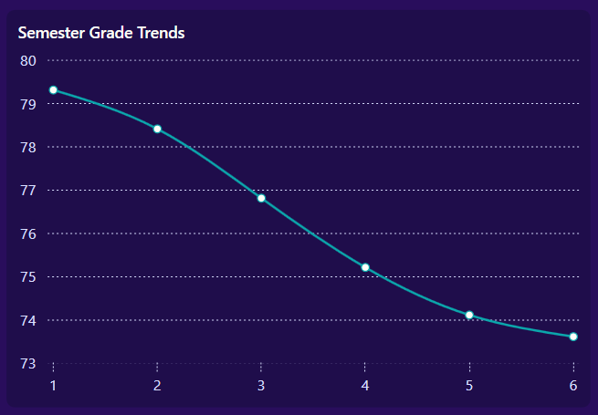
3. Doughnut Chart: Gender participation distribution
You can use a Doughnut Chart to display the proportional distribution of student participation by gender (Male, Female, and Others) based on the selected year and subject.
A DoughnutSeries, a variation of the PieSeries with a hollow center, provides a clear and modern representation of gender ratios.
Here’s the Doughnut Chart implementation:
<!-- Doughnut Chart: Gender Participation -->
<chart:SfChart>
    <chart:SfChart.Legend>
        <chart:ChartLegend DockPosition="Bottom" ... />
    </chart:SfChart.Legend>

    <chart:DoughnutSeries ItemsSource="{Binding GenderParticipationPie}"
                           XBindingPath="Label" YBindingPath="Value"
                           Palette="Custom" EnableAnimation="True" ... >
        <chart:DoughnutSeries.ColorModel>
            <chart:ChartColorModel>
                <chart:ChartColorModel.CustomBrushes>
                    <SolidColorBrush Color="#0BA7AC"/>
                    <SolidColorBrush Color="#F77F00"/>
                    <SolidColorBrush Color="#EC492D"/>
                </chart:ChartColorModel.CustomBrushes>
            </chart:ChartColorModel>
        </chart:DoughnutSeries.ColorModel>

        <chart:DoughnutSeries.AdornmentsInfo>
            <chart:ChartAdornmentInfo ShowLabel="True" SegmentLabelContent="Percentage" ... />
        </chart:DoughnutSeries.AdornmentsInfo>
    </chart:DoughnutSeries>
</chart:SfChart>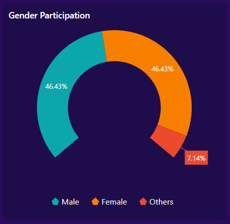
4. Spline Chart: Year‑over‑year student count trend
Again, use another Spline Chart to showcase student enrollment trends across academic years, allowing stakeholders to identify growth or decline patterns.
A smooth curve is achieved using a SplineSeries to visually represent year-over-year changes in student numbers.
<!-- Spline Chart: Students per Year Trend -->
<chart:SfChart>
    <chart:SfChart.PrimaryAxis>
        <chart:CategoryAxis ... />
    </chart:SfChart.PrimaryAxis>

    <chart:SfChart.SecondaryAxis>
        <chart:NumericalAxis ... />
    </chart:SfChart.SecondaryAxis>

    <chart:SplineSeries ItemsSource="{Binding StudentsPerYear}"
                        XBindingPath="Year" YBindingPath="Students"
                        EnableAnimation="True" Interior="#F73039" ShowTooltip="True">
        <chart:SplineSeries.AdornmentsInfo>
            <chart:ChartAdornmentInfo ShowMarker="True" Symbol="Ellipse" ... />
        </chart:SplineSeries.AdornmentsInfo>
    </chart:SplineSeries>
</chart:SfChart>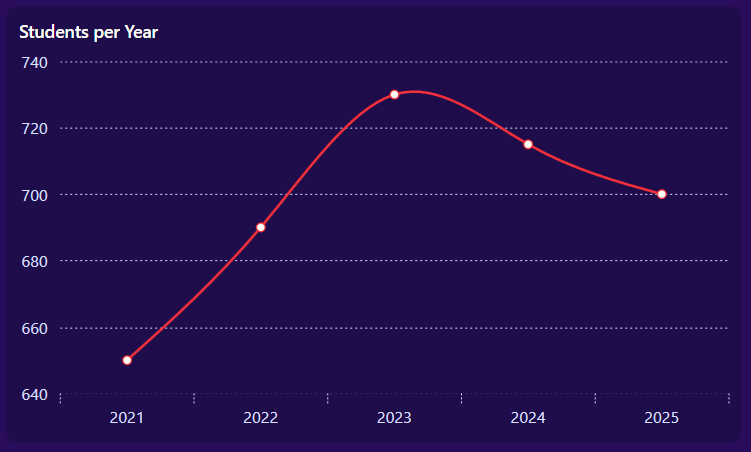
5. Column and Doughnut Charts: Subject‑level participation insights
This visualization dynamically adapts depending on the user’s selection:
- When “All” subjects are selected, a Column Chart is displayed to present a comparative view of participation rates across all subjects.
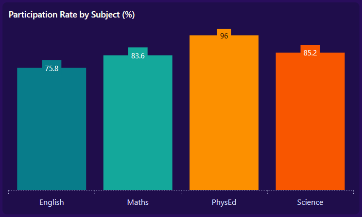
- When a single subject is selected, a Doughnut Chart is displayed to provide a focused breakdown of participation for that specific subject.
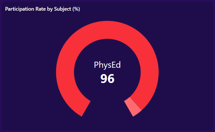
This dynamic switching between ColumnSeries and DoughnutSeries is handled by the custom converters OneItemVisibleConverter and MultipleItemsVisibleConverter, defined in Converters/Converter.cs, as shown below.
<!-- Participation by Subject: Multi vs Single -->
<Grid>
    <!-- Multi-subject view: Column Chart -->
    <chart:SfChart Visibility="{Binding FilteredParticipationRates.Count,
                                Converter={StaticResource MultipleItemsVisibleConverter}}">
        <chart:SfChart.PrimaryAxis>
            <chart:CategoryAxis ... />
        </chart:SfChart.PrimaryAxis>
        <chart:SfChart.SecondaryAxis>
            <chart:NumericalAxis Maximum="100" Visibility="Collapsed" ... />
        </chart:SfChart.SecondaryAxis>

        <chart:ColumnSeries ItemsSource="{Binding FilteredParticipationRates}"
                            XBindingPath="Subject.Name" YBindingPath="Rate"
                            Palette="Custom" EnableAnimation="True">
            <chart:ColumnSeries.ColorModel>
                <chart:ChartColorModel>
                    <chart:ChartColorModel.CustomBrushes>
                        <SolidColorBrush Color="#087C8A"/>
                        <SolidColorBrush Color="#14A89B"/>
                        <SolidColorBrush Color="#FC9000"/>
                        <SolidColorBrush Color="#F85600"/>
                    </chart:ChartColorModel.CustomBrushes>
                </chart:ChartColorModel>
            </chart:ColumnSeries.ColorModel>
            <chart:ColumnSeries.AdornmentsInfo>
                <chart:ChartAdornmentInfo ShowLabel="True"/>
            </chart:ColumnSeries.AdornmentsInfo>
        </chart:ColumnSeries>
    </chart:SfChart>

    <!-- Single-subject view: Doughnut with center label -->
    <chart:SfChart VerticalAlignment="Center" Margin="5"
                   Visibility="{Binding FilteredParticipationRates.Count,
                                Converter={StaticResource OneItemVisibleConverter}}">
        <chart:DoughnutSeries ItemsSource="{Binding FilteredParticipationRates}"
                              XBindingPath="Subject.Name" YBindingPath="Rate"
                              Palette="Custom" EnableAnimation="True"
                              DoughnutCoefficient="0.7" DoughnutSize="1"
                              StartAngle="120" EndAngle="420">
            <chart:DoughnutSeries.CenterView>
                <ContentControl>
                    <StackPanel HorizontalAlignment="Center" VerticalAlignment="Center">
                        <TextBlock Text="{Binding FilteredParticipationRates[0].Subject.Name}"
                                   FontSize="24" HorizontalAlignment="Center" Foreground="White"/>
                        <TextBlock Text="{Binding FilteredParticipationRates[0].Rate}"
                                   FontSize="34" FontWeight="Bold"
                                   HorizontalAlignment="Center" Foreground="White"/>
                    </StackPanel>
                </ContentControl>
            </chart:DoughnutSeries.CenterView>
            <chart:DoughnutSeries.ColorModel>
                <chart:ChartColorModel>
                    <chart:ChartColorModel.CustomBrushes>
                        <SolidColorBrush Color="#f73039"/>
                        <SolidColorBrush Color="#ff6a71"/>
                    </chart:ChartColorModel.CustomBrushes>
                </chart:ChartColorModel>
            </chart:DoughnutSeries.ColorModel>
        </chart:DoughnutSeries>
    </chart:SfChart>
</Grid>
6. Overview of grade performance spread
Finally, implement the grades distribution panel to show how students are spread across each grade category. It highlights toppers, average performers, and those needing extra support.
Try this in your code:
<Grid RowDefinitions="1.5*, 8.5*" ColumnDefinitions="Auto,Auto">
    <!-- Title -->
    <TextBlock Grid.Row="0" Grid.ColumnSpan="2" Text="Grades Distribution" Style="{StaticResource titleStyle}"/>

    <!-- Grade List -->
    <ItemsControl Grid.Row="1" Grid.Column="0" ItemsSource="{Binding GradeDistributions}">

        <ItemsControl.ItemContainerStyle>
            <Style TargetType="ContentPresenter">
                <Setter Property="Margin" Value="0,6,0,6"/>
            </Style>
        </ItemsControl.ItemContainerStyle>

        <ItemsControl.ItemsPanel>
            <ItemsPanelTemplate>
                <StackPanel Orientation="Vertical" HorizontalAlignment="Left"/>
            </ItemsPanelTemplate>
        </ItemsControl.ItemsPanel>
        <ItemsControl.ItemTemplate>

            <DataTemplate>
                <Border CornerRadius="14">
                    <Border.Background>
                        <LinearGradientBrush StartPoint="0,0" EndPoint="1,1">
                            <GradientStop Color="#FFFFFBEB" Offset="0"/>
                            <GradientStop Color="{Binding Color}" Offset="1"/>
                        </LinearGradientBrush>
                    </Border.Background>
                    <StackPanel Orientation="Horizontal" Margin="10">
                        <TextBlock Text="{Binding Grade}" FontWeight="SemiBold" FontSize="16"/>
                        <TextBlock VerticalAlignment="Center" FontSize="16" Margin="5,0,0,0">
                            <Run Text="{Binding Percentage}"/>
                            <Run Text="%"/>
                        </TextBlock>
                    </StackPanel>
                </Border>
            </DataTemplate>

        </ItemsControl.ItemTemplate>
    </ItemsControl>

    <!-- Motivation Section -->
    <StackPanel Orientation="Vertical" Grid.Row="1" Grid.Column="1" Margin="30,30,0,0">
        <TextBlock Text="Every grade tells" FontStyle="Italic" Foreground="#FAEFF6" FontWeight="SemiBold" FontSize="17"/>
        <TextBlock Text="a story of effort..!" FontStyle="Italic" Foreground="#FAEFF6" FontWeight="SemiBold" FontSize="17"/>
        <Path  Data="{StaticResource PathData2}" Stroke="#FAEFF6" StrokeThickness="0.6" Margin="0,20,0,0">
            <Path.RenderTransform>
                <ScaleTransform ScaleX="4.5" ScaleY="5"/>
            </Path.RenderTransform>
        </Path>
    </StackPanel>
</Grid>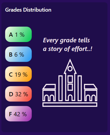
Here’s a quick demo of the dashboard in action.
GitHub reference
For more details, refer to the complete student performance dashboard using WPF Charts demo on GitHub.
Frequently Asked Questions
Which charts or libraries are used in this dashboard?
The dashboard uses WPF chart components (such as bar, line, pie/doughnut charts) to present student performance metrics. These can also be implemented using libraries like .NET MAUI Syncfusion Toolkit Charts or WinUI Syncfusion Charts.
Are the charts interactive (hover, click, filter)?
Yes, the charts can support interactions such as tooltips, click events, and dynamic filtering (e.g., selecting a subject or year), depending on the chosen chart library.
How customizable is the dashboard’s appearance?
The theme, colors, layout, and animations can be fully customized using XAML styling, ControlTemplates, and gradients.
What’s the difference between LineSeries, FastLineSeries, and FastLineBitmapSeries? When should I use each?
LineSeries: Best suited for smaller datasets. It offers complete customization options, including segment dragging and detailed stroke settings.
FastLineSeries: Renders data using a single polyline, making it ideal for large datasets (50,000+ points) with better performance than LineSeries.
FastLineBitmapSeries: Use bitmap rendering to deliver the highest throughput, making it suitable for huge datasets (hundreds of thousands to millions of points), though with fewer styling options
Conclusion
Thank you for reading! In this blog, we explored how to build a Student Performance Dashboard using Syncfusion WPF Charts. We implemented visual components to track subject-wise scores, participation trends, and overall grade distribution. Interactive chart types such as column, line, and pie charts help present academic progress, identify learning patterns, and highlight areas needing improvement.
These insights empower educators and institutions to monitor student performance more effectively, support personalized learning, and make data‑driven decisions that enhance academic outcomes.
We hope this blog post inspires you to leverage the power of WPF and Syncfusion controls to build impactful data visualization applications!
If you’re a Syncfusion user, you can download the setup from the license and downloads page. Otherwise, you can download a free 30-day trial.
You can also contact us through our support forum, support portal, or feedback portal for queries. We are always happy to assist you!


 No spam, just valuable updates.