
 Sivakumar R
Syncfusion is getting closer to another exciting release this year with some cool and useful new controls and features. The release of 2020 Volume 3 is expected in the last week of September or the first week of October 2020. In this blog, I am going to give you a quick overview of the new controls and features we’re planning for the WPF platform for this release.
Designer for .NET Core
Microsoft has announced the general availability of the new XAML Designer for WPF .NET Core applications. Syncfusion controls’ designer experience will have smart tags to provide quick suggestions.
New themes
WPF controls will support the following new themes:
- Office2019 dark gray
- Office2019 white
- Office2019 high contrast
 New Step ProgressBar (preview)
The new Step ProgressBar control will be useful to show the progress of a multistep process. Users can customize its step shape, progress bar color, step template, and content template. The following will be the key features of this new control.
Data binding
Bind any business object as the ItemsSource and control the last active item using SelectedIndex.
Step shape
Circles and squares will be the built-in shapes of the step marker. You can also choose a custom template as the step marker.
Status
Use active, inactive, and indeterminate statuses to show progress.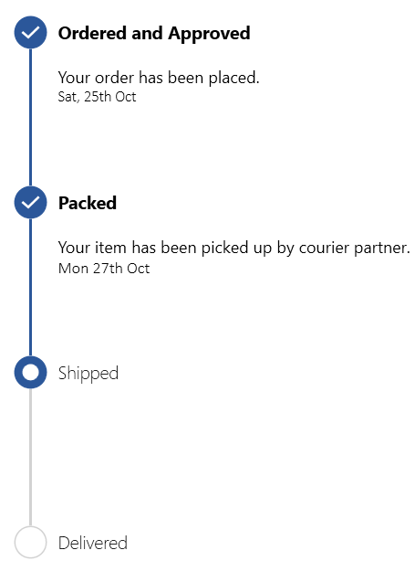
Orientation
Visualize the progress of a multistep process in either horizontal or vertical orientation.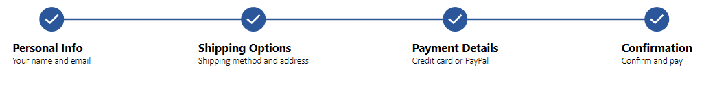
Customization
Customize the progress bar’s style, markers, and content using templates.
Scheduler (Preview)
The Scheduler control was released in 2020 Volume 2, and we’re adding the following new features in the 2020 Volume 3 release.
Resources
This feature will allow users to define resources and group appointments based on the resources associated with them in day, week, workweek, and timeline views. You can also customize the resource UI using a template and template selectors.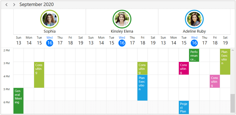
Disable date
This feature will disable dates that exceed the minimum or maximum of the Scheduler’s date range.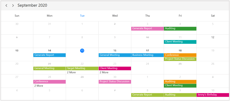
Context menu
The WPF Scheduler will have support to define a context menu for appointments, time slots, and month cells. It also will have built-in RoutedUICommands support for handling the context menu to add, edit, and delete appointments.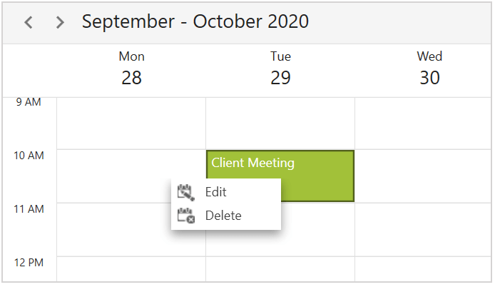
Drag-and-drop support in month view
You can drag appointments between different days or time slots in the month view when the display mode is set to appointment.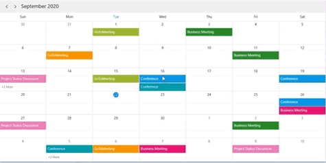
Theme support
Use Material and Office 2019 themes in the Scheduler control.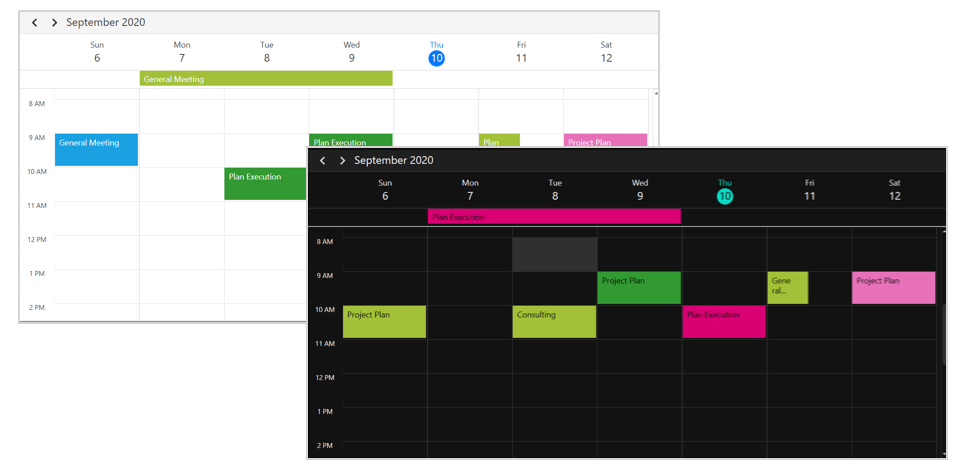
Tree View
TreeView will be marked as production-ready with the following additional features.
Editing
Users can edit the text displayed in tree nodes.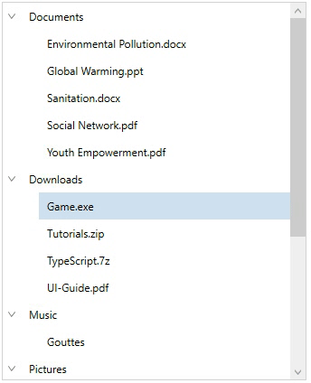
Theme support
The Material and Office 2019 themes will help adapt the TreeView’s appearance to the rest of a business application.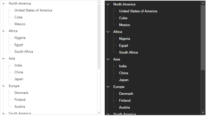
Horizontal scrolling
Users can now scroll the TreeView horizontally to read the content of nodes properly.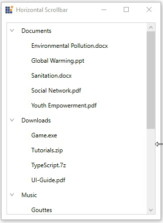
Skin Manager
Customize theme color and font
Modify the colors and fonts of built-in themes at the application level without needing to use Theme Studio.
Ribbon
The Ribbon control will have the following new features.
Icon template support for Ribbon items
Ribbon will have an option to add any kind of image, like path data, font icons, etc., as a template to Ribbon items such as a drop-down button, split button, gallery, ribbon bar, and backstage command button.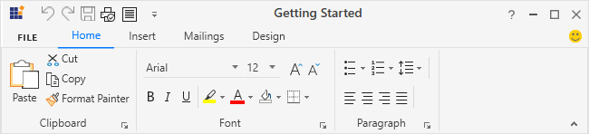
Header and footer support for backstage
Previously, backstage items could only be placed at the top of the backstage. From the 2020 Vol. 3 release, you can arrange the backstage items either at the top or bottom.
Diagram
Business process model and notation (BPMN)
This is a standard way to represent business processes graphically. You can create a BPMN diagram through code or using the visual interface with the built-in BPMN shapes described by the BPMN 2.0 specification.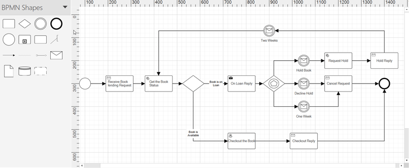
PropertyGrid
Configure properties manually
Stop the auto generation of properties and configure each property manually. Configure properties directly in XAML instead of attributes or events.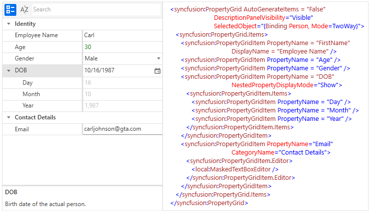
Property description height
The height of the property description panel can be programmatically set. Different values such as auto size, relative size, and absolute size will be supported.
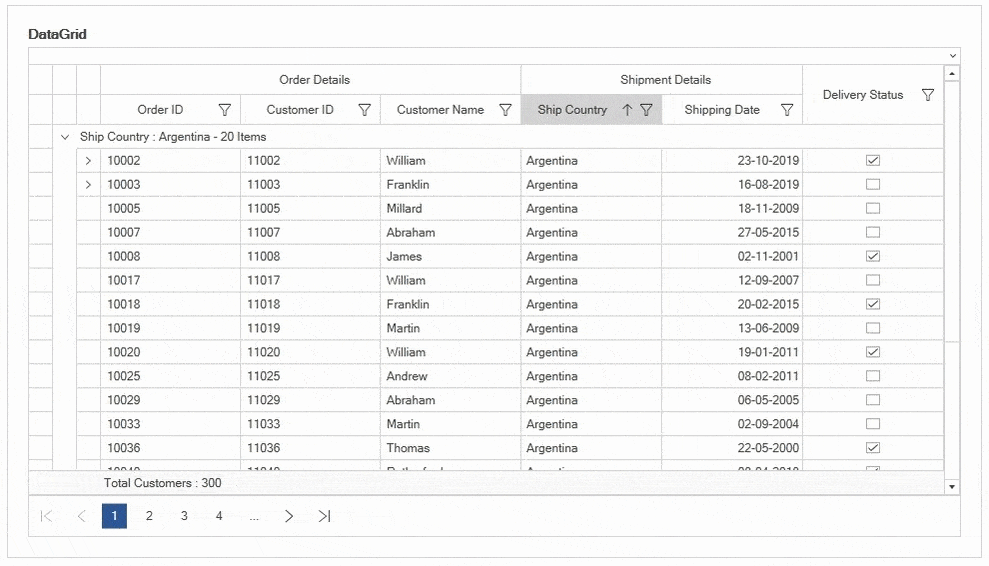
DataGrid
Text wrapping
Wrap the text in combo box columns.
Radial Gauge
Rotate labels
Rotate the scale labels based on the provided angle.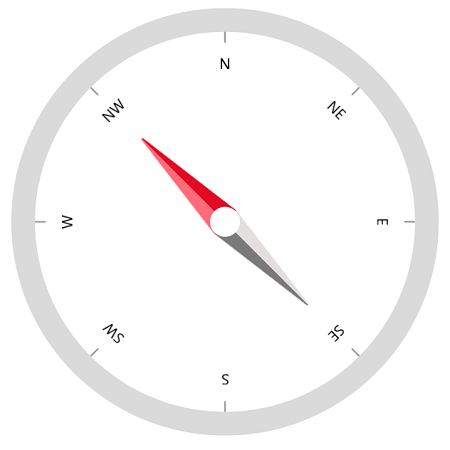
Dragging events
The following new events will be triggered when the user drags the pointer:
- ValueChangeStarted: Triggered when the user starts selecting a new value for the pointer by dragging.
- ValueChanging: Will be triggered multiple times between the start and end of the value change in the pointer.
- ValueChanged: Triggered when the user selects a new value for the pointer by dragging.
- ValueChangeCompleted: Triggered when the user is done selecting a new value for the pointer.
Range Slider
You can expect the following new features in the WPF Range Slider.
Major and minor tick support
Add major and minor ticks in the Range Slider.
Active and inactive range customizations
Customize active and inactive ranges.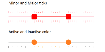
RichTextBox
Word template format
You will be able to open and save a document in Word template format (DOT and DOTX).
PDF Viewer
Annotation events
Events will be added to track the changes made in annotations, like add, move, resize, and delete.
Carousel
Scroll items using scroll bar
Scroll the items using horizontal or vertical scroll bars.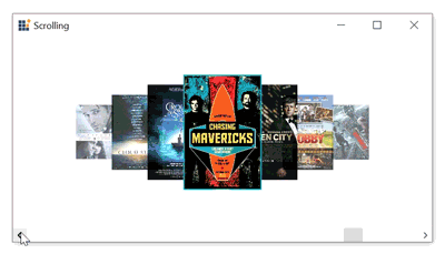
Chromeless Window
Hide the maximize and minimize buttons
Show or hide minimize and maximize buttons in the normal mode.
Color Picker Palette
No color button
Choose transparent color by clicking the No Color button.
Selected brush
We intend to add a select brush property so you can use SolidColorBrush directly instead of converting Color to SolidColorBrush. The SelectedBrushChanged event will send notification when a color is selected.
BreadCrumb
Filter support
When in edit mode, the BreadCrumb control will suggest matching nodes based on the path entered in the editor, like in the Windows Explorer.
Button controls
Icon template
Button controls (Button, Split Button, Dropdown Button) will let you customize icons using templates. This will enable you to use path data, font icons, images, or any UI as an icon.
Conclusion
I hope you are excited about the new features that will be a part of the WPF controls in the 2020 Volume 3 release. Along with these, some more interesting features will be included, too. You can check out all these features once the release is rolled out.
So, please stay tuned to our official Twitter, Facebook, and LinkedIn pages for the announcement of the release. We will also post a detailed blog right after the release to guide you through working with the new features.


 No spam, just valuable updates.
Comments (2)
Hello, short question: Does syncfusion wpf includes the icons (microsoft word like) which are shown in the “Icon template support for Ribbon items” section? Or are they third-party icons?
Yes, The icons used the demos are shipped along with demos. You can use the same in your application if it suits for your need. It was created by our UI designers.
https://github.com/syncfusion/wpf-demos/tree/master/ribbon/Views
Syncfusion also offers free Metro studio product which offers 7000+ icons.
https://www.syncfusion.com/downloads/metrostudio