
 Ramkumar Ravy
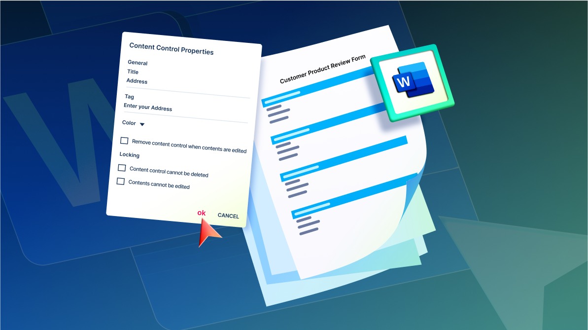
TL;DR: Reusable forms reduce manual effort and improve consistency in document workflows. This guide shows how to build them using Syncfusion’s React Document Editor with content controls and drag-and-drop features.
Tired of manually formatting Word forms for every new project or client? Whether you’re in HR, healthcare, or customer service, repetitive document creation can be time-consuming and error-prone. But what if you could build once and reuse forever?
In this guide, you’ll learn how to create dynamic, reusable forms in Word documents using Syncfusion’s React Document Editor. With support for content controls, drag-and-drop functionality, and centralized field management, you can streamline your workflow and deliver polished, fillable documents without the hassle.
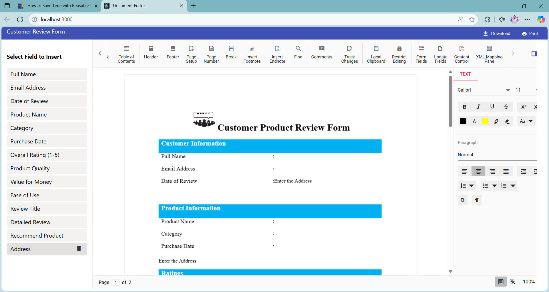
Users can insert reusable fields such as Rich Text, Plain Text, Combo Box, Dropdown List, Date Picker, and Checkbox directly into a document. While the editor doesn’t offer native drag-and-drop support, this can be implemented at the application level to enhance usability. With content controls, fields can be reused throughout the document, ensuring consistency and saving time.
In this blog, we’ll walk through the steps to create a reusable customer review form using Syncfusion® Document Editor, manage content controls via a custom sidebar, and export the final document in formats such as .docx, .sfdt, .txt, and .dotx.
Configuring the Syncfusion® Document Editor in React
To get started with integrating Syncfusion® Document Editor into your React application, follow the steps outlined in our official documentation documentation.
This guide walks you through:
- Setting up a new React project
- Installing the necessary Syncfusion® packages
- Configuring the DocumentEditorContainerComponent within your application
By the end of the setup, you’ll have a fully functional document editor embedded in your React app, ready for building dynamic, form-based documents.
Step 1: Create title bar
Begin by creating a file named titlebar.jsx to define a custom title bar for your document editor. This component enhances the user interface by providing quick access to essential document actions such as:
- Displaying the document name
- Printing the document
- Exporting the document in various formats
Below is the code to implement the title bar:
import { createElement } from '@syncfusion/ej2-base';
import { Button } from '@syncfusion/ej2-buttons';
import { DropDownButton } from '@syncfusion/ej2-splitbuttons';

// Represents the title bar of the document editor.
class TitleBar {
  constructor(element, docEditor, isShareNeeded, isRtl, dialogComponent) {

    // Initialize title bar elements
    this.tileBarDiv = element;
    this.documentEditor = docEditor;
    this.isRtl = isRtl;
    this.dialogComponent = dialogComponent;
    this.initializeTitleBar(isShareNeeded);
    this.wireEvents();

    // Append document title after initialization
    if (this.tileBarDiv && !this.tileBarDiv.contains(this.documentTitle)) {
      this.tileBarDiv.prepend(this.documentTitle);
    }
  }

  // Initializes the title bar, setting up text and tooltips.

  // @param {boolean} isShareNeeded - Flag to decide if sharing feature is needed.
  initializeTitleBar = (isShareNeeded) => {
    const downloadText = 'Download';
    const downloadToolTip = 'Download this document.';
    const printText = 'Print';
    const printToolTip = 'Print this document (Ctrl+P).';

    // Create the document title element
    this.documentTitle = createElement('label', {
      id: 'documenteditor_title_name',
      styles: 'font-weight:400;text-overflow:ellipsis;white-space:pre;overflow:hidden;user-select:none;cursor:text;font-size:16px',
    });
    this.documentTitle.innerHTML = this.documentEditor.documentName;

    const btnStyles = `
      float:right;
      background:transparent;
      box-shadow:none;
      font-family:inherit;
      border-color:transparent;
      border-radius:2px;
      color:inherit;
      font-size:12px;
      text-transform:capitalize;
      height:28px;
      font-weight:400;
      margin:4px;
    `.replace(/\s+/g, '');

    // Initialize print button
    this.print = this.addButton(
      'e-icons e-print e-de-padding-right',
      printText,
      btnStyles,
      'de-print',
      printToolTip,
      false
    );

    // Initialize download drop-down button
    const items = [
      { text: 'Syncfusion® Document Text (*.sfdt)', id: 'sfdt' },
      { text: 'Word Document (*.docx)', id: 'word' },
      { text: 'Word Template (*.dotx)', id: 'dotx' },
      { text: 'Plain Text (*.txt)', id: 'txt' },
    ];
    this.download = this.addButton(
      'e-icons e-download e-de-padding-right',
      downloadText,
      btnStyles,
      'documenteditor-share',
      downloadToolTip,
      true,
      items
    );

    // Hide download button if sharing is not needed
    if (!isShareNeeded) {
      this.download.element.style.display = 'none';
    }
  };

  // Wires events to the buttons.
  wireEvents = () => {
    this.print.element.addEventListener('click', this.onPrint);
  };

  // Updates the document title displayed in the title bar.
  updateDocumentTitle = () => {
    if (this.documentEditor.documentName === '') {
      this.documentEditor.documentName = 'Untitled';
    }
    this.documentTitle.textContent = this.documentEditor.documentName;
  };

  /** Adds a button to the title bar.

   @param {string} iconClass - Icon class for the button.

   @param {string} btnText - Button text.

   @param {string} styles - Button styles.

   @param {string} id - Button id.

   @param {string} tooltipText - Tooltip text for the button.

   @param {boolean} isDropDown - Whether the button is a dropdown.

   @param {Array} items - Items for dropdown, if applicable.**/

  // @returns {Button|DropDownButton} - The created button instance.
  addButton = (iconClass, btnText, styles, id, tooltipText, isDropDown, items) => {

    // Create button element
    const button = createElement('button', { id, styles });
    this.tileBarDiv.appendChild(button);
    button.setAttribute('title', tooltipText);

    // Return appropriate button based on the isDropDown flag
    if (isDropDown) {
      return new DropDownButton(
        {
          select: this.onDownloadClick,
          items,
          iconCss: iconClass,
          cssClass: 'e-caret-hide',
          content: btnText,
        },
        button
      );
    }
    return new Button({ iconCss: iconClass, content: btnText }, button);
  };

  // Handles print button click event.
  onPrint = () => {
    this.documentEditor.print();
  };

  // Handles download item selection.

 // @param {Object} args - Event arguments.
  onDownloadClick = (args) => {
    const formatMap = {
      word: 'Docx',
      sfdt: 'Sfdt',
      txt: 'Txt',
      dotx: 'Dotx',
    };
    this.save(formatMap[args.item.id]);
  };

  // Saves the document in the specified format.

 // @param {string} format - Format to save the document as.
  save = (format) => {
    this.documentEditor.save(this.documentEditor.documentName || 'sample', format);
  };
}
export default TitleBar;Step 2: Integrate Document Editor
We’ll set up the Syncfusion® Document Editor inside a React component and integrate both the custom title bar and a sidebar panel for inserting reusable content control fields.
Inject the toolbar
To enable toolbar support in the Syncfusion® Document Editor, you need to inject the Toolbar module before using the DocumentEditorContainerComponent:
DocumentEditorContainerComponent.Inject(Toolbar);Add title bar and sidebar
Here’s how to structure your component to include the title bar and a sidebar for inserting content controls:
<div id="mainContainer">
  <div id="documenteditor_titlebar" className="e-de-ctn-title"></div>

  <div className="control-pane">
    <div className="content-control-panel">
      <h4>Select Field to Insert</h4>

      {controlList.map((item, index) => (
        <div className="content-control-parent" key={`${item.tag}_${index}`}>
          <div
            className="content-control"
            data-type={item.type}
            draggable >
            <span>{item.label}</span>
            <button
              className="e-icons e-trash"
              title="Remove"
              onClick={() => handleRemove(item. Tag)} >
            </button>
          </div>
        </div>
      ))}

    </div>

    <div className="control-section">
      <DocumentEditorContainerComponent
        id="container"
        ref={containerRef}
        height={"700px"}
        serviceUrl="https://services.syncfusion.com/react/production/api/documenteditor/"
        enableToolbar={true}
      />
    </div>
  </div>
</div>
Initialize the editor and title bar
The initializeEditor() function sets up the document editor, attaches the title bar, loads a default .sfdt document, and ensures the title bar stays updated with document changes.
//Initializes the document editor and sets up the title bar.
function initializeEditor() {
  if (containerRef.current && !titleBarRef.current) {
    convertDocxToSfdt();

    titleBarRef.current = new TitleBar(
      document.getElementById("documenteditor_titlebar"),
      containerRef.current.documentEditor,
      true
    );

    // Update the content control list in local storage
    let contentControlElement = JSON.parse(localStorage.getItem("contentControlList"));
    if (!contentControlElement) {
      localStorage.setItem("contentControlList", JSON.stringify(contentControlList));
    }

    containerRef.current.documentEditor.documentName = "Customer Review Form";
    titleBarRef.current.updateDocumentTitle();

    containerRef.current.documentChange = () => {
      titleBarRef.current?.updateDocumentTitle();
      containerRef.current?.documentEditor.focusIn();
    };
  }
}

// Convert GitHub Raw document to SFDT and load in Editor.
const convertDocxToSfdt = async () => {
  try {
    const docxResponse = await fetch(
      'https://raw.githubusercontent.com/SyncfusionExamples/Create-Dynamic-Reusable-Forms-with-Ease-Using-Content-Controls-in-Word-Documents/master/public/docs/Customer_Review_Form.docx'
    );
    const docxBlob = await docxResponse.blob();

    const formData = new FormData();
    formData.append('files', docxBlob, 'Customer_Review_Form.docx');

    const importResponse = await fetch(
      'https://ej2services.syncfusion.com/production/web-services/api/documenteditor/Import',
      {
        method: 'POST',
        body: formData,
      }
    );

    if (importResponse.ok) {
      defaultDocument = await importResponse.text();
      containerRef.current.documentEditor.open(defaultDocument);
    }
    else {
      console.error(`Failed to import document: ${importResponse.statusText}`);
    }
  } catch (error) {
    console.error('Error converting document:', error);
  }
};
With this setup, your document editor is now fully functional and ready for use. The integration of a custom title bar and a dynamic sidebar allows users to interact with the document efficiently, whether it’s inserting reusable fields, printing, or exporting.
Step 3: Centralized content control setup
To simplify form creation and ensure consistency, the application uses a centralized configuration file named ContentControlElements.json. This file contains a predefined list of commonly used content controls frequently required in form-based documents.
When the application initializes, it loads this default list from the JSON file and stores it in local storage. This ensures the controls are readily available for reuse across sessions, even after a page reload. The sidebar panel reflects this list, allowing users to drag and drop these fields into the document as needed.
Step 4: Adding new content controls via the toolbar
To make the form more dynamic and adaptable, users can also add new content controls directly from the toolbar. When a new field is added, it is automatically included in the centralized list and stored in local storage, ensuring predefined and user-added fields are consistently available for reuse.
Steps to add a new content control to the sidebar:
1. Click the Content Control button in the toolbar at the top of the editor.
2. From the dropdown, select the type of content control you want to insert (e.g., Rich Text, Plain Text, Combo Box, Drop Down List, Date Picker, or Checkbox).
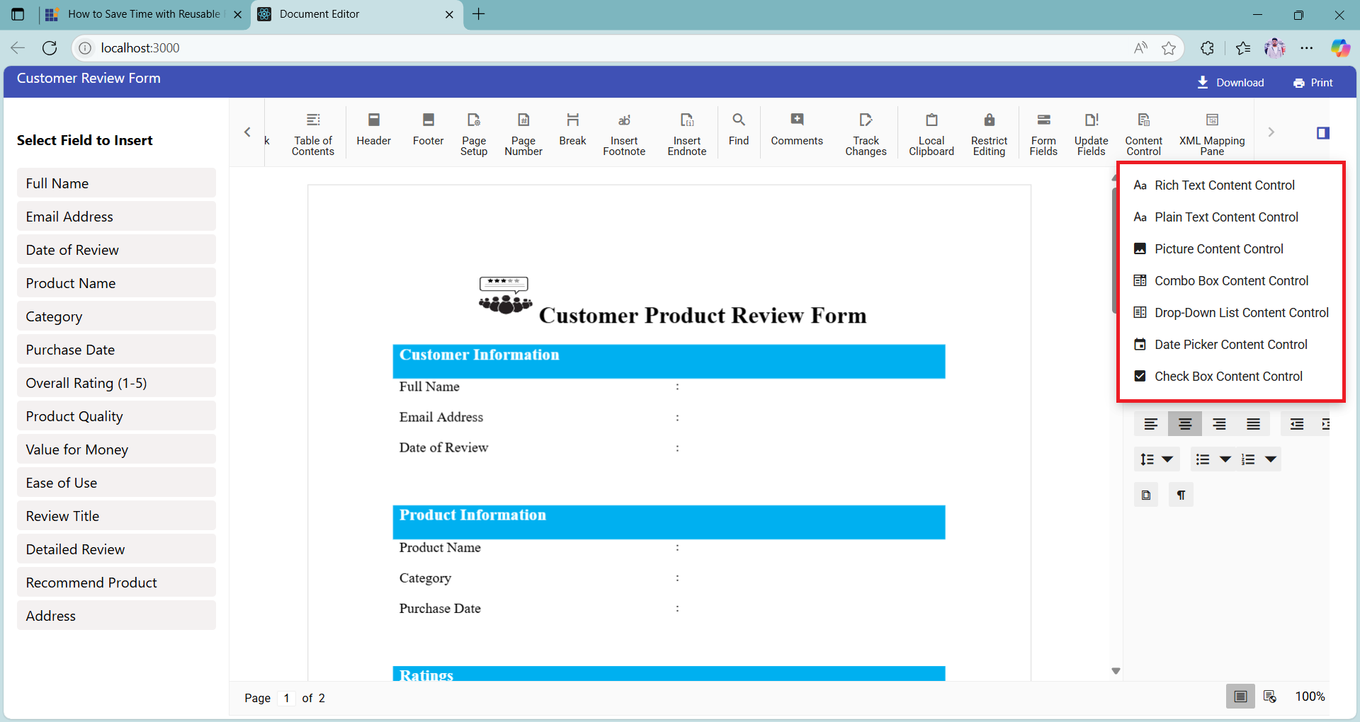
3. Once selected, a Content Control Properties dialog will automatically appear. This dialog allows you to configure properties such as:
- Title: Set the control label in the sidebar.
- Tag: Acts as a unique identifier and serves as the default value when inserted into the document.
- Locking behavior: Optional settings to restrict editing or deletion.
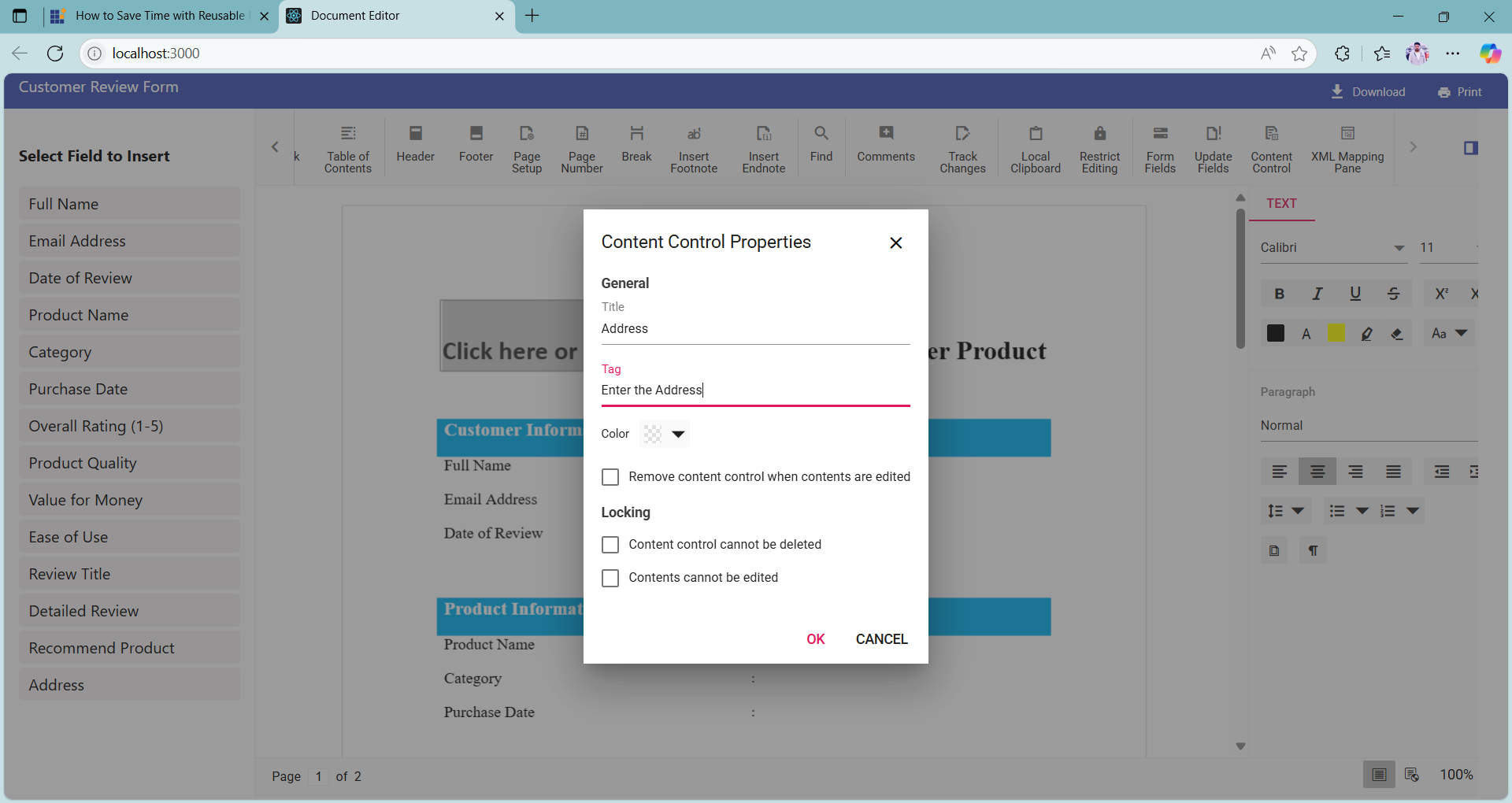
Note: Both the Title and Tag fields are required. If either is left empty, the content control will not be added to the sidebar and won’t be available for reuse.
4. After filling in the required fields, click the OK button. The configured content control will be:
- Inserted into the document
- Added to the sidebar for future reuse

5. Once added, you can drag and drop the content control anywhere within the document. This flexibility allows you to organize your layout efficiently and reuse controls as needed. The drag and drop setup is explained in detail in the next step.
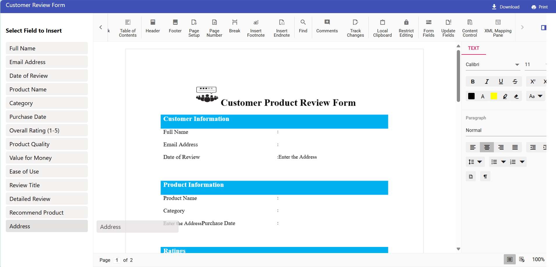
Step 4: Add drag-and-drop functionality for sidebar controls
To enhance the form-building experience, you can enable drag-and-drop support for the content controls listed in the sidebar. This allows users to simply drag a field from the sidebar and drop it into the document at the desired location, making the process more intuitive and efficient.
This functionality is implemented using two key functions:
- setupDragAndDrop(): Initializes the drag-and-drop behavior for sidebar elements.
- handleDrop(): Handles the logic for inserting the selected content control into the document at the drop location.
// Sets up drag-and-drop functionality for content control elements.
function setupDragAndDrop() {
    const container = document.getElementById("container");
    const deleteElement = document.querySelectorAll('.e-trash');

    document.querySelectorAll(".content-control").forEach(element => {
        if (!attachedDragElements.has(element)) {
            element.addEventListener("dragstart", (event) => {
                event.dataTransfer.setData("controlType", event.target.dataset.type);
                deleteElement.forEach(icon => icon.style.display = 'none');
                isDragElement = true;
            });
            attachedDragElements.add(element);
        }
    });

    container?.addEventListener("dragover", (event) => event.preventDefault());
    container?.addEventListener("drop", handleDrop);
}

// Handles the drop event when a content control is dragged into the editor.
function handleDrop(event) {
    event.preventDefault();

    const deleteElement = document.querySelectorAll('.e-trash');
    const type = event.dataTransfer.getData("controlType");

    deleteElement.forEach(icon => icon.style.display = 'block');

    containerRef.current.documentEditor.selection.select({
        x: event.offsetX,
        y: event.offsetY,
        extend: false,
    });

    if (!type || !containerRef.current || !isDragElement) return;

    const editor = containerRef.current.documentEditor.editor;
    const control = contentControlList[type];

    if (control) {
        editor.insertContentControl(control);
        let contentControlDetails = editor.selection.getContentControlInfo();

        if (contentControlDetails) {
            if (
                currentContentControl &&
                (contentControlDetails.type === "Text" || contentControlDetails.type === "RichText")
            ) {
                currentContentControl[0].contentControlProperties.hasPlaceHolderText = true;
            }
            else if (
                currentContentControl &&
                contentControlDetails.type === "CheckBox" &&
                !control.canEdit
            ) {
                currentContentControl[0].contentControlProperties.lockContents = false;
            }
        }
    }

    isDragElement = false;
}
With drag-and-drop enabled, you can quickly build forms by placing fields exactly where they want them in the document. This improves usability and makes the form creation process more visual, interactive, and efficient.
Step 5: Remove content control from the sidebar
To help users manage the list of reusable fields effectively, each content control listed in the sidebar includes a delete icon. When you hover over a content control, a small trash icon appears on the right side of the item. Clicking this icon removes the control from the sidebar, allowing users to keep the list clean and relevant.
Once a content control is deleted:
- The centralized list is immediately updated.
- The changes are reflected in local storage, ensuring that the removal is persistent across sessions.
- The sidebar remains in sync with the stored configuration, maintaining consistency throughout the application.
Refer to the code below to remove the content control from the sidebar:
// Removes a content control from the centralized list by its tag.
function removeContentControl(tag) {
    const tagValue = tag.trim().toLowerCase().replace(/\s+/g, '_');

    const keyToRemove = Object.keys(contentControlList).find(key => {
        const item = contentControlList[key];
        const formattedValue = item.tag.trim().toLowerCase().replace(/\s+/g, '_');
        return formattedValue === tagValue;
    });

    if (keyToRemove) {
        delete contentControlList[keyToRemove];
        setContentControlElementCount(prev => prev + 1);

        // Update the local storage with the updated list
        localStorage.setItem("contentControlList", JSON.stringify(contentControlList));
    }
}
Step 6: Export the final document
After completing your form using high-efficiency content controls and the intuitive drag-and-drop sidebar, you can export the document for distribution or customer use. This allows you to generate a ready-to-fill form that can be shared, archived, or integrated into various workflows.
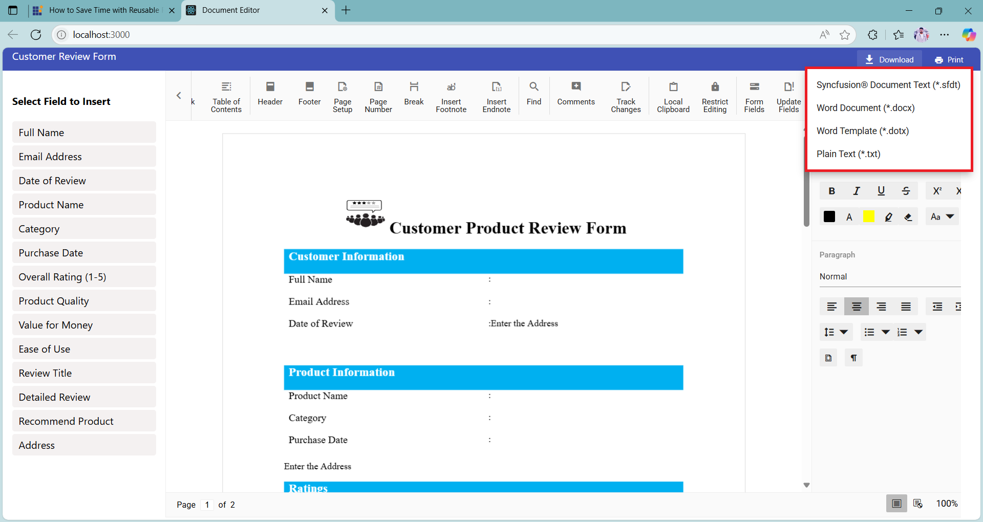
To export the document, simply click the Download dropdown in the title bar. From there, you can choose your preferred file format:
- .docx: Microsoft Word Document
- .sfdt: Syncfusion® Document Text (ideal for reloading into the editor)
- .txt: Plain Text
- .dotx: Word Template
This export feature ensures that your form is not only easy to build but also easy to share and reuse across different platforms and use cases.
Run the project
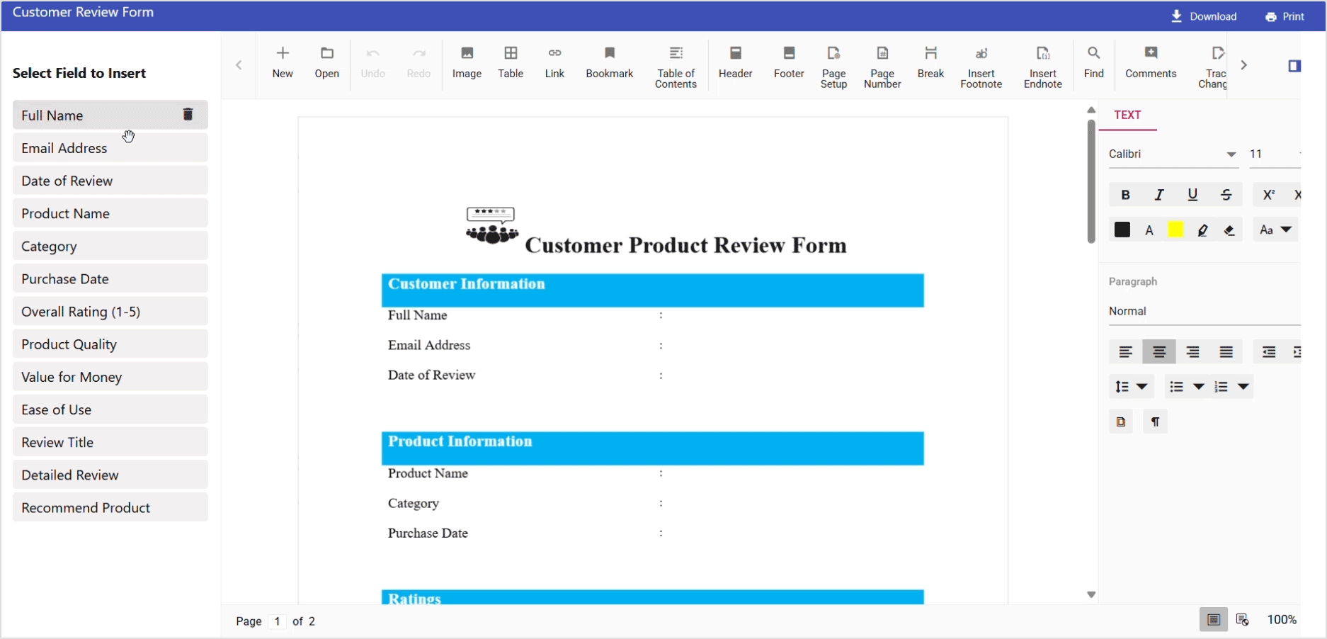
With all components in place, including the document editor, custom title bar, dynamic sidebar, and drag-and-drop functionality, you’re ready to run the application and test its full capabilities.
The results of the client-side operations will be displayed in real time, as demonstrated in the image below.
GitHub reference
For the complete working projects, refer to the GitHub demo.
Conclusion
Thanks for reading! In this blog, we explored how to build a dynamic and reusable form experience using Syncfusion® Document Editor in a React application. We walked through setting up the editor, defining reusable content controls, integrating a custom title bar, enabling drag-and-drop functionality, and exporting the final document in multiple formats.
Reusable forms are a game-changer for document automation. With Syncfusion’s React Document Editor, developers can build structured, fillable documents that streamline data collection and improve consistency. Whether you’re building internal tools or customer-facing forms, Syncfusion’s Document Editor offers a powerful and flexible solution for document automation.
The latest version is available for current customers to download from the license and downloads page. If you are not a Syncfusion® customer, you can try our 30-day free trial for our newest features.
You can also contact us through our support forums, support portal, or feedback portal. We are always happy to assist you!


 No spam, just valuable updates.