
 Leomaris Reyes
Howdy! In this blog post, we’ll be replicating a banking exploration UI in Xamarin.Forms obtained from this Dribble design site.
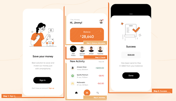
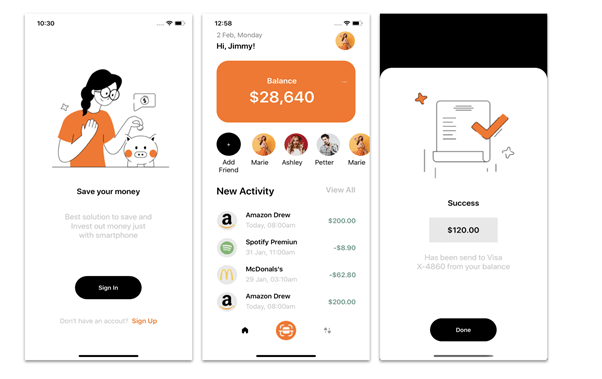
Our design contains the following three screens:
- SignInPage: Shows the Sign In and Sign Up options.
- AcitivityPage: Shows more details about the user.
- TransactionPage: Shows the transaction validation information (for example: Success).
 Let ‘s start!
Designing the sign-in page
As you may have expected, we’ll start with designing the first screen. Let’s name this page SignInPage. To create the Sign In button, I am going to use the Syncfusion Xamarin Button control. You can read about the control’s implementation logic in this getting started documentation.
Let ‘s code!
Main layout structure
It’s important to choose the right layout for our page. In this case, for the main layout structure, I am using the StackLayout.
<!-- Main structure-->
 <StackLayout Padding="{OnPlatform iOS='0,90', Android='0,35'}">
   <!-- You must write here what is explained from the step number 1 -->

 </StackLayout>
Step 1: Sign in
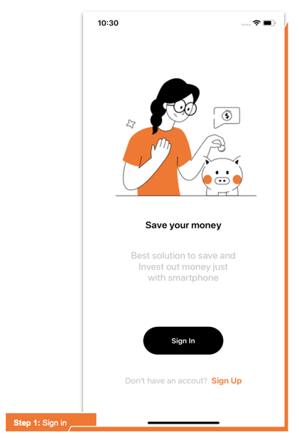
To start, let’s divide the screen into the following controls:
- An image.
- “Save your money” title.
- Description.
- Sign In button.
- Sign Up text.
Code implementation
<!-- Main image-->
   <Image Source="SaveYourMoney" Margin="50,40" />
   <!-- Main description-->
   <Label Text="Save your money" FontSize="20" FontAttributes="Bold" HorizontalTextAlignment="Center"/>
   <Label Text="Best solution to save and
Invest out money just
with smartphone" FontSize="20" HorizontalTextAlignment="Center" TextColor="Silver" Padding="0,35"/>
   <!-- Sign In & Sign Up-->
   <StackLayout VerticalOptions="EndAndExpand">
      <buttons:SfButton Text="Sign In" FontAttributes="Bold" WidthRequest="165" HeightRequest="60" HorizontalOptions="Center" CornerRadius="30" TextColor="White" BackgroundColor="Black"/>
      <Label HorizontalTextAlignment="Center" Padding="0,40,0,0" VerticalOptions="End">
         <Label.FormattedText>
           <FormattedString>
               <Span Text="Don't have an account? " TextColor="Silver"/>
               <Span Text=" Sign Up" TextColor="#ff7114" FontAttributes="Bold"/>
           </FormattedString>
         </Label.FormattedText>
      </Label>
  </StackLayout>
Designing the activity page
Step 2: Displaying balance information
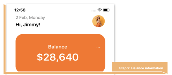
Now, we are going to design the second screen. Let’s name this page ActivityPage.
Here, we’ll use the Syncfusion Xamarin Avatar View control to display the user’s profile image in circular shape. You can check the control implementation logic in this getting started documentation.
To display the Friends and Activity lists, we’ll use the CollectionView. To learn more about it, refer to these CollectionView examples.
Let ‘s code!
Main layout structure
Here, we are using the Grid control as the main layout structure.
<!-- Main structure-->
<Grid Padding="35,45,35,45" RowDefinitions="Auto,Auto,Auto,Auto,Auto,*,Auto" ColumnDefinitions="*,Auto">
 <!-- You must write here what is explained from the steps number 2,3,4 -->
</Grid>
To learn more about using Grid for layouts, refer to our blog post 5 Tips to Easily Use the Grid for Layouts in Xamarin.Forms.
Display the balance information with the following code implementation,
<!-- Balance information-->
   <Label Grid.Row="0" Grid.Column="0" Text="2 Feb, Monday" TextColor="Gray"/>
   <Label Grid.Row="1" Grid.Column="0" Text="Hi, Jimmy!" FontSize="20" FontAttributes="Bold"/>
   <sfavatar:SfAvatarView Grid.Row="0" Grid.RowSpan="2" Grid.Column="1" HorizontalOptions="End" ContentType="Custom"
            ImageSource="Marie.png"
            VerticalOptions="Center"
            BorderColor="White"
            HeightRequest="50"
            CornerRadius="25"
            WidthRequest="50" />
      <Frame Margin="0,20" Grid.Row="2" Grid.Column="0" Grid.ColumnSpan="2" CornerRadius="30" BackgroundColor="#ff7114" HasShadow="False" HeightRequest="120">
         <Grid RowDefinitions="Auto,*" Padding="0,20" ColumnDefinitions="*,Auto">
            <Label Grid.Row="0" Grid.Column="1" Text="..." TextColor="White" />
            <Label Grid.Row="0" Grid.Column="0" Text="Balance" FontSize="20" TextColor="White" FontAttributes="Bold" HorizontalTextAlignment="Center"/>
            <Label Grid.Row="1" Grid.Column="0" Text="$28,640" FontSize="40" TextColor="White" FontAttributes="Bold" HorizontalTextAlignment="Center"/>
         </Grid>
      </Frame>

<!-- You must add here what is explained in the next step -->
Step 3: Displaying the friends list
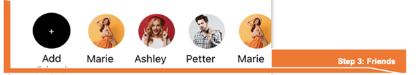
Here, we’ll use the CollectionView layout to display the friends list and use circular buttons to display the Add Friend action and the friends.
Code implementation
<!-- Friends-->
   <Grid Grid.Row="3" Grid.Column="0" Grid.ColumnSpan="2" RowDefinitions="Auto,Auto" ColumnDefinitions="Auto,*">
      <Button Grid.Row="0" Grid.Column="0" Text="+" TextColor="White" BackgroundColor="Black" CornerRadius="30" WidthRequest="60" HeightRequest="60"/>
      <Label Grid.Row="1" Grid.Column="0" Text="Add
Friend" HorizontalTextAlignment="Center"/>
      <CollectionView Grid.Row="0" Grid.RowSpan="2" Grid.Column="1" ItemsSource="{Binding FriendsCollection}"
             HeightRequest="110" Margin="0,0,-45,0"
             HorizontalScrollBarVisibility="Never"
             ItemsLayout="HorizontalList">
          <CollectionView.ItemTemplate>
              <DataTemplate>
                 <Grid RowDefinitions="Auto,Auto">
                    <sfavatar:SfAvatarView Grid.Row="0" HorizontalOptions="End" ContentType="Custom"
                         ImageSource="{Binding Image}"
                         VerticalOptions="Center"
                         BorderColor="White"
                         HeightRequest="60"
                         CornerRadius="30"
                         WidthRequest="60" />
                      <Label Grid.Row="1" WidthRequest="80" Text="{Binding Name}" HorizontalTextAlignment="Center"/>
                    </Grid>
                 </DataTemplate>
            </CollectionView.ItemTemplate>
         </CollectionView>
   </Grid>

<!-- You must add here what is explained in the next step -->
Step 4: Activities
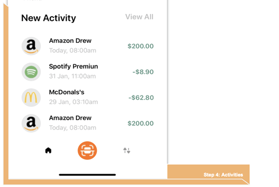
Now, let’s create an activity list with the following items for each activity:
- Image
- Title
- Date
- Price
Code implementation
<!-- Activities-->
  <Label Grid.Row="4" Grid.Column="0" Text="New Activity" FontAttributes="Bold" Padding="0,20" FontSize="25"/>
  <Label Grid.Row="4" Grid.Column="1" Text="View All" Padding="0,20" TextColor="Silver" FontAttributes="Bold" HorizontalTextAlignment="End" FontSize="20"/>

   <CollectionView Grid.Row="5" Grid.Column="0" Grid.ColumnSpan="2" ItemsSource="{Binding ActivitiesCollection}"
            VerticalScrollBarVisibility="Never">
          <CollectionView.ItemTemplate>
             <DataTemplate>
                <Grid RowDefinitions="Auto,Auto" ColumnDefinitions="Auto,*,Auto" Padding="0,10">
                    <Button Grid.Row="0" Grid.RowSpan="2" Grid.Column="0"  ImageSource="{Binding Image}" TextColor="White" BackgroundColor="#e8e8e8" CornerRadius="25" WidthRequest="50" HeightRequest="50"/>
                    <Label Grid.Row="0" Grid.Column="1" Text="{Binding Title}" Padding="15,0,0,0" FontAttributes="Bold" />
                    <Label Grid.Row="1" Grid.Column="1" Text="{Binding Date}" Padding="15,0,0,0" TextColor="Silver"/>
                    <Label Grid.Row="0" Grid.Column="2" Grid.RowSpan="2" Text="{Binding Price}" VerticalTextAlignment="Center" TextColor="#589280" FontAttributes="Bold" Padding="15,0,0,0"/>
                </Grid>
            </DataTemplate>
         </CollectionView.ItemTemplate>
    </CollectionView>
Finally, let’s add the bottom menu to display the option to navigate to the different pages in the UI.
<!--Bottom menu-->
<Grid Grid.Row="6" Grid.Column="0" Grid.ColumnSpan="2" RowDefinitions="Auto" ColumnDefinitions="*,Auto,*" VerticalOptions="EndAndExpand">
     <Image Grid.Row="0" Grid.Column="0" HeightRequest="50" Source="House" BackgroundColor="Transparent" />
     <Button Grid.Row="0" Grid.Column="1" ImageSource="Main" TextColor="Black" BackgroundColor="#ff7114" CornerRadius="25" WidthRequest="50" HeightRequest="50"/>
     <Image Grid.Row="0" Grid.Column="2" HeightRequest="50" Source="Arrows" BackgroundColor="Transparent"/>
 </Grid>
Designing the Transaction page
Step 5: Success
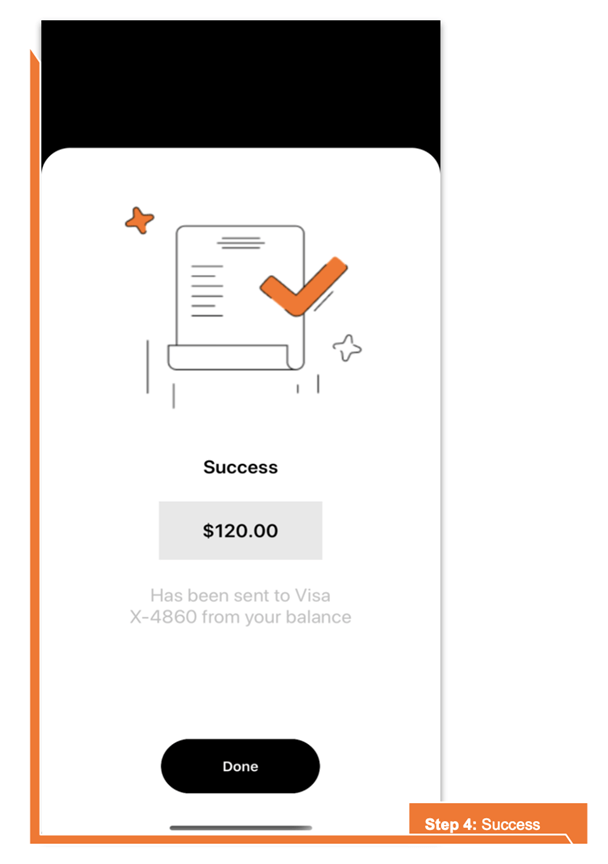
Let’s continue with the last screen of our UI! We’ll do the following:
- Name this page TransactionPage.
- Use Syncfusion Xamarin Button control to create a Done button.
- Use StackLayout as the main layout in this screen.
Code implementation
Here, we are going to add the following components:
- An image
- Success title
- Amount
- Description
- Done button
<StackLayout>
 <Frame Margin="{OnPlatform iOS='0,140,0,-22', Android='0,70,0,22'}" CornerRadius="30" VerticalOptions="FillAndExpand">
   <StackLayout>
       <Image Source="Success" Margin="50,30"/>
       <Label Text="Success" FontSize="20" HorizontalTextAlignment="Center" FontAttributes="Bold"/>
       <Label Text="$120.00" Margin="0,20" FontSize="20" BackgroundColor="#e8e8e8" Padding="45,20" HorizontalOptions="Center" HorizontalTextAlignment="Center" FontAttributes="Bold"/>
       <Label Text="Has been send to Visa
X-4860 from your balance" TextColor="Silver" FontSize="20" HorizontalTextAlignment="Center"/>
       <buttons:SfButton Text="Done" Margin="0,0,0,50" FontAttributes="Bold" WidthRequest="165" HeightRequest="60" HorizontalOptions="Center" VerticalOptions="EndAndExpand" CornerRadius="30" TextColor="White" BackgroundColor="Black"/>
    </StackLayout>
  </Frame>
</StackLayout>
</ContentPage.Content>
And our UI is done!
Reference
To see the complete code structure of this project, refer to our Replicating Banking Exploration UI in Xamarin.Forms demo on GitHub.
Conclusion
Thanks for reading! In this blog post, we have seen how to replicate a banking exploration UI in Xamarin.Forms. Let’s use these steps as a starting point to build our own UI!
Syncfusion’s Xamarin suite offers over 150 UI controls, from basic editors to powerful, advanced controls like DataGrid, Charts, ListView, and Rich Text Editor. Try them out and leave your comments below.
You can also contact us through our support forum, Direct-Trac, or feedback portal. We are always happy to assist you!
 No spam, just valuable updates.