
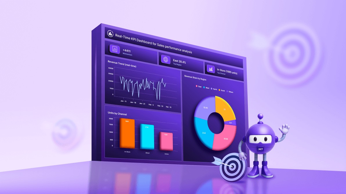
TL;DR: Create a real-time KPI dashboard in .NET MAUI with charts and MVVM architecture. This guide walks you through building a responsive XAML layout, binding dynamic data using observable collections, and implementing live updates for metrics such as revenue trends, leads by channel, and regional performance. Ideal for cross-platform apps that require fast, interactive data visualization.
In today’s fast-paced business world, decision-makers need instant access to accurate, actionable insights. Traditional static dashboards often fail to keep up, leaving teams with outdated information. The solution? A real-time KPI dashboard that continuously updates to reflect changes in revenue, sales leads, and regional performance in real-time, powered by dynamic data streaming and interactive visualizations.
Using Syncfusion® .NET MAUI Toolkit controls, you can build sleek, cross-platform applications that deliver this responsive experience. By leveraging charts and the MVVM architecture, developers can create dashboards that are not only visually appealing but also highly performant and scalable.
In this hands-on tutorial, we will build a sleek, real-time KPI dashboard in .NET MAUI Toolkit using Syncfusion Charts following the MVVM pattern. We will stream sales and marketing metrics and turn them into actionable visual insights.
Core features of the KPI dashboard
To provide a clear and actionable view of business performance, the dashboard includes several key components:
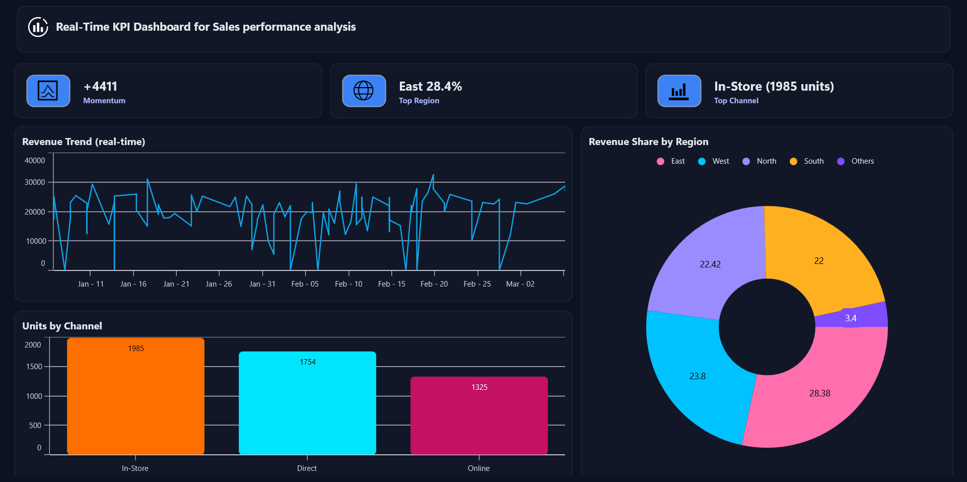
- Revenue trend: Line chart showing revenue over time.
- Units by channel: Column chart breaking down unit’s acquisition.
- Revenue by region: Doughnut chart illustrating regional contribution.
- Dynamic insights: Display quick metrics like momentum and top performers.
Step 1: Dashboard layout design
To begin, we’ll create a clean and responsive KPI workspace using a two-column, four-row grid in .NET MAUI. This structure organizes dashboard components logically while maintaining flexibility across devices.
Refer to the following code example.
<ContentPage …>

    <Grid RowDefinitions="Auto,Auto,Auto,Auto" ColumnDefinitions="3*,2*" RowSpacing="12" ColumnSpacing="12">
        <!-- Header -->
        <Border Grid.Row="0" Grid.ColumnSpan="2" Style="{StaticResource Card}">
            <Label Text="Real-Time KPI Dashboard" Style="{StaticResource CardTitle}"/>
        </Border>

        <!-- Insight cards (3 columns) -->
        <Grid Grid.Row="1" Grid.ColumnSpan="2" ColumnDefinitions="*,*,*">
            <!-- 3 compact Border cards bound to Insights[0..2] -->
        </Grid>

        <!-- Charts -->
        <Border Grid.Row="2" Grid.Column="0" Style="{StaticResource Card}">
            <!-- Revenue Trend: Line Series -->
        </Border>

        <Border Grid.Row="3" Grid.Column="0" Style="{StaticResource Card}">
            <!-- Leads by Channel: Column Series -->
        </Border>

        <Border Grid.Row="2" Grid.RowSpan="2" Grid.Column="1" Style="{StaticResource Card}">
            <!-- Revenue by Region: Doughnut Series -->
        </Border>
    </Grid>
</ContentPage>
Step 2: Creating model classes for charting and insights
Model classes define the structure of your data, including:
- Time points for revenue trends.
- Category totals for leads.
- Insight items for quick metrics.
- Raw sales records for aggregation.
Refer to the following code example.
// Time series point (Line Series)
public class TimePoint
{
    public DateTime Time { get; set; }
    public double Value { get; set; }
    ...
}

// Category point (Column/Doughnut)
public class CategoryPoint
{
    public string Category { get; set; } = "";
    public double Value { get; set; }
    ...
}

// Insight card item
public class InsightItem
{
    public string Name { get; set; } = "";
    public string Value { get; set; } = "";
    public string Severity { get; set; } = "Info";
    public string Icon { get; set; } = "";
    ...
}

// Raw CSV record (Kaggle: Ascension merch supply chain)
public class SalesRecord
{
    public DateTime Date { get; set; }
    public string Channel { get; set; } = "";
    public string Region { get; set; } = "";
    public double UnitsSold { get; set; }
    public double Revenue { get; set; }
}
Note: Check the Model classes on GitHub for more details.
Step 3: Configuring Firebase Realtime Database for live KPI updates
To make our KPI dashboard truly dynamic, we need a real-time data source. For this demo, we use Firebase Realtime Database (RTDB) because it offers instant data synchronization across devices.
Creating a Firebase project
- First, go to the Firebase console.
- Click Create a Project. Then, enter the project name and click continue.
- After creating the project, open the left navigation panel, expand Build, and select Realtime Database.
- In the Realtime Database section, click Create Database and choose a database location, and configure the initial security rules for access.
- Configure Click Next to configure the security rules for your database to secure your data.
- Then, select Start in test mode and click Enable at the bottom. The database will be created successfully.
Configure Database rules
- To configure database rules, go to the Realtime Database page in Firebase Console and click on the Rules tab at the top.
- For development, you can allow read/write access without authentication. Publish the rules. For production, apply stricter security with Firebase Authentication.
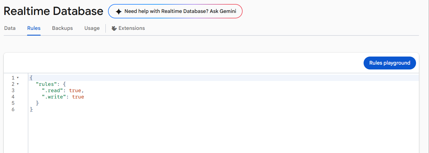
Configuring Realtime Database Rules
Note: For a more detailed guide on database creation in Firebase, please visit blog post.
How FirebaseService works in our demo
- Copy the RTDB URL from the Firebase console (e.g.,
https://your-project-id-default-rtdb.firebaseio.com). - Connect to Firebase Realtime Database using the project’s base URL.
- Create a unique session path so each app run has its own data stream.
- Push demo records to the database at a fixed interval (e.g., every 1 second).
- Listen in real time to the same session path for new/updated records.
- Convert incoming data into sales records and notify the charts to refresh.
Here’s how that looks in code:
public sealed class FirebaseService
{
    public async Task StartListeningAsync(CancellationToken ct)
    {
        // Build session path
        var baseUrl = (Environment.GetEnvironmentVariable("FIREBASE_BASE")
                       ?? "https://your-project-id-default-rtdb.firebaseio.com")
                      .TrimEnd('/');
        var sessionPathJson = $"/sessions/{_instanceId}/salesrecords.json";
        var fullJsonUrl     = baseUrl + sessionPathJson;

        // Start SSE listener
        _streamTask = StartSseStreamAsync(fullJsonUrl, ct);

        // Push simulated records periodically
        _simTask = Task.Run(async () =>
        {
            while (!ct.IsCancellationRequested)
            {
                await PushSimulatedRecordAsync(ct);
                await Task.Delay(1000, ct); // 1-second interval
            }
        }, ct);
    }
}
Note: This demo pushes simulated data from the app for real-time visualization. In production, connect Firebase to your backend. And also, each run uses a unique Session ID to keep updates isolated and consistent.
Register the service
Registering FirebaseService as a singleton and registering DashboardViewModel (which depends on that singleton) in MauiProgram.cs ensures a single streaming source for the entire app. With one FirebaseService instance injected everywhere, the DashboardViewModel receives real-time updates and refreshes the charts consistently.
// Register FirebaseService and ViewModel
builder.Services.AddSingleton<FirebaseService>();
builder.Services.AddSingleton<DashboardViewModel>(sp =>
{
    var db = sp.GetRequiredService<FirebaseService>();
    var logger = sp.GetService<ILogger<DashboardViewModel>>();
    return new DashboardViewModel(db, logger);
});
Step 4: Build the ViewModel for real-time updates
DashboardViewModel holds the observable collections bound to the charts (revenue trend, leads by channel, revenue by region, progress cards, insights). It listens to real‑time records coming from the FirebaseService, maintains rolling buffers (up to 60 points), and updates the UI on the main thread.
public class DashboardViewModel
{
    private async Task InitializeAsync()
    {
        // Subscribe to real-time stream (NewSalesRecord).
        // Ensure any seed/setup is done.
        // Start listening (SSE + demo simulator).
    }

    private void OnNewSalesRecord(SalesRecord rec)
    {
        // Update rolling buffers (cap at 60).
        // Precompute snapshots for charts.
        // Update UI-bound collections on the main thread.
    }

    private void UpdateInsightsValues()
    {
        // Compute Momentum from recent trend.
        // Set Top Region (% share).
        // Set Top Channel (units).
    }
}
Note: Check the DashboardViewModel class for more details on Github.
Step 5: Create modular views with user controls
With the dashboard structure in place, the next step is to add charts that make your KPIs clear and actionable.
Revenue trend
Start by introducing a Line Chart to illustrate revenue changes over time. This visualization provides a smooth, continuous view of performance trends, allowing users to identify patterns and anomalies quickly. To keep the interface clean, enable tooltips for instant value checks without cluttering the interface.
Below is the code you need:
<Chart:SfCartesianChart>
    <Chart:SfCartesianChart.XAxes>
        <Chart:DateTimeAxis />
    </Chart:SfCartesianChart.XAxes>

    <Chart:SfCartesianChart.YAxes>
        <Chart:NumericalAxis />
    </Chart:SfCartesianChart.YAxes>

    <Chart:LineSeries ItemsSource="{Binding RevenueTrend}"
                       XBindingPath="Time"
                       YBindingPath="Value"
                       StrokeWidth="2"
                       Fill="#0EA5E9"
                       ShowMarkers="False"
                       EnableTooltip="True" />
</Chart:SfCartesianChart>
Here’s a preview of the feature in action:

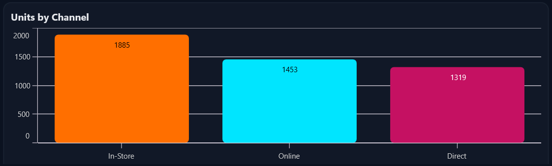
Leads by channel
To compare performance across different channels, incorporate a Column Chart. This chart emphasizes category-based metrics, making it easy to spot strong and weak performers. Use clear data labels and custom colors to enhance readability and visual appeal.
Code example for quick integration:
<Chart:SfCartesianChart>
    <Chart:SfCartesianChart.XAxes>
        <Chart:CategoryAxis />
    </Chart:SfCartesianChart.XAxes>

    <Chart:SfCartesianChart.YAxes>
        <Chart:NumericalAxis />
    </Chart:SfCartesianChart.YAxes>

    <Chart:ColumnSeries ItemsSource="{Binding LeadsByChannel}"
                         XBindingPath="Category"
                         YBindingPath="Value"
                         CornerRadius="6"
                         ShowDataLabels="True"
                         EnableTooltip="True"
                         PaletteBrushes="{Binding LeadsBrushes}" />
</Chart:SfCartesianChart>
Here’s what the output looks like:
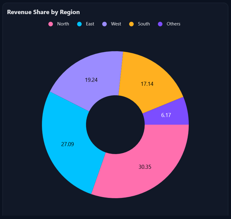
Revenue share by region
Next, visualize regional contributions with a Doughnut Chart. This chart highlights proportional data, making it ideal for understanding market distribution. Include data labels and a legend for clarity, and position labels outside the chart for a polished look.
RHere’s how that looks in code:
<Chart:SfCircularChart>
    <Chart:DoughnutSeries ItemsSource="{Binding RevenueByRegion}"
                           XBindingPath="Category"
                           YBindingPath="Value"
                           ShowDataLabels="True"
                           EnableTooltip="True"
                           PaletteBrushes="{Binding CustomBrushes}">
        <Chart:DoughnutSeries.DataLabelSettings>
            <Chart:CircularDataLabelSettings Position="Outside" />
        </Chart:DoughnutSeries.DataLabelSettings>
    </Chart:DoughnutSeries>

    <Chart:SfCircularChart.Legend>
        <Chart:ChartLegend />
    </Chart:SfCircularChart.Legend>
</Chart:SfCircularChart>
Here’s the feature demonstrated visually:
Insight cards
Finally, complement your charts with insight cards for quick-glance metrics. Momentum uses color to indicate success or warning, while Top Region shows percentage share and Top Channel highlights unit count.
Implementation code example:
<Border Style="{StaticResource InsightCard}">

  <Grid ColumnDefinitions="Auto,*" ColumnSpacing="16">
    <Path Data="M17…Z"
          Fill="Black"
          WidthRequest="40"
          HeightRequest="40" />
    <VerticalStackLayout>
      <Label Text="{Binding Insights[0].Value}"
             FontSize="20"
             FontAttributes="Bold" />
      <Label Text="{Binding Insights[0].Name}"
             FontSize="12"
             TextColor="#A5B4FC" />
    </VerticalStackLayout>
  </Grid>

</Border>
By following these steps, you’ll build the core of a dynamic, real-time KPI dashboard in .NET MAUI, using charts and MVVM architecture, delivering actionable insights across platforms.
See the implementation in action below:
Frequently Asked Questions
Why choose Syncfusion .NET MAUI Charts for KPI dashboards?
Syncfusion charts offer rich interactivity, real-time updates, multiple series types, and enterprise-grade performance for production dashboards.
Can Syncfusion charts handle real-time data updates?
Yes! When your series is bound to an ObservableCollection, new points render smoothly. To keep the latest values in view, set AutoScrollingDelta on the X-axis to define the visible span, and AutoScrollingMode as end, so that the chart will shift as new points arrive.
How do Syncfusion charts integrate with MVVM?
Charts bind seamlessly to ViewModel properties and update automatically when data changes, making them perfect for MVVM architecture. For more details explore getting started.
What interactivity features are available out of the box?
Can I combine multiple series or use secondary axes?
Yes! You can plot multiple series and assign secondary axes for different units like revenue vs units sold.
Can I replace Firebase with my backend?
Yes. Swap FirebaseService with any real-time source (WebSockets, SignalR, gRPC streams, MQTT). Keep the ViewModel contract (NewSalesRecord events/stream) intact.
Is test mode in Firebase safe for production?
No. Use test mode only for development. For production, enforce auth-based read/write rules in Firebase and restrict paths.
GitHub reference
For more details, refer to the building KPI dashboards using .NET MAUI Toolkit Charts GitHub demo.

Conclusion
Thanks for following this dashboard walkthrough! You’ve learned how to build a clean, real-time KPI dashboard using .NET MAUI Toolkit Charts and the MVVM pattern. This approach ensures synchronized updates, modular design, and maintainable architecture. Feel free to extend the ViewModel, customize the charts, and adjust the layout to suit your specific metrics and application requirements.
Ready to elevate your .NET MAUI apps? Try Syncfusion charting components today and start visualizing volatility like a pro. Try out the steps discussed in this blog and leave your feedback in the comments section below.
If you’re a Syncfusion user, you can download the setup from the license and downloads page. Otherwise, you can download a free 30-day trial.
You can also contact us through our support forum, support portal, or feedback portal for queries. We are always happy to assist you!


 No spam, just valuable updates.