
 Berkunath A
This blog post is an overview of the calendar control for Windows Forms and important features you should know.
The calendar control allows users to select a date interactively as well as programmatically. It has all the functionalities of the standard Syncfusion Windows Forms month calendar, plus advanced functionalities such as multiple selection, UI customization, and more.
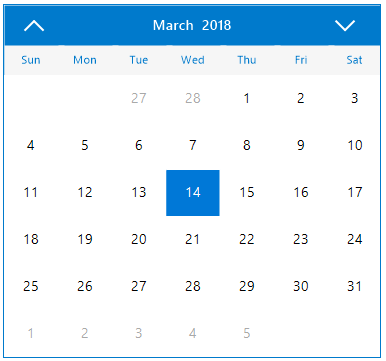
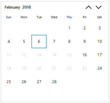
Calendar component
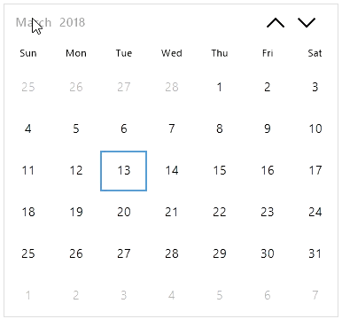
Month calendar versus calendar
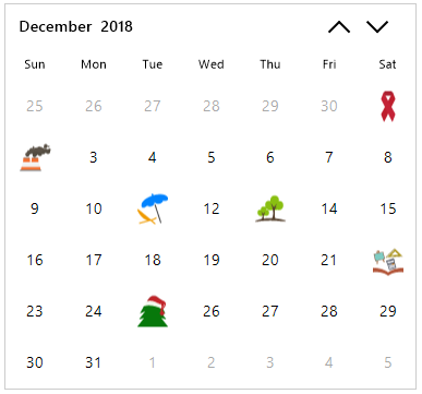
- Special dates
- Blackout dates
- Cell customization
- Appearance customization
- Developer-friendly API structure
Getting started with the new calendar control
- Add the following required assemblies in your project:
- Syncfusion.SfInput.WinForms
- Syncfusion.Core.WinForms
You can find the required assemblies in the following location:
$ Installed Location:\Syncfusion\Essential Studio®\$Version #\precompiledassemblies\$Version#\[TargetFramework]
E.g.: C:\Program Files (x86)\Syncfusion\Essential Studio®\16.1.0.24\precompiledassemblies\16.1.0.24\4.6
- Add the namespace Syncfusion.WinForms.Input.
using Syncfusion.WinForms.Input;
3. Add the SfCalendar component to your form:
SfCalendar calendar = new SfCalendar();
this.Controls.Add(calendar);
Now, a simple calendar control is ready to use. Let’s add more stuff to it.
Date Range
SfCalendar calendar = new SfCalendar();
calendar.MinDate = new DateTime(2018, 2, 27);
calendar.MaxDate = new DateTime(2018, 4, 05);
Date selection
calendar.AllowMultipleSelection = true;
The calendar allows selection by mouse, keyboard, and touch interactions to make applications available to a wide variety of users. Users may want to select multiple, separate dates, or sometimes multiple dates in a single range. The calendar component provides easy selection for both cases. To select separate dates, hold Ctrl while selecting the required dates with the mouse. To select a range, hold Shift and use the arrow keys, Home, or End.
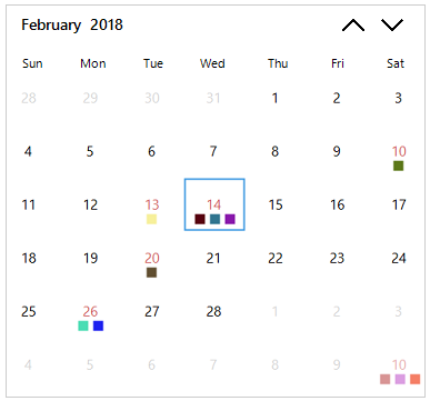
Special dates
ListSpecialDates = new List (); SpecialDate specialDate1 = new SpecialDate(); specialDate1.BackColor = System.Drawing.Color.White; specialDate1.ForeColor = System.Drawing.Color.Magenta; specialDate1.Image = Properties.Resources.Icon_Christmas_day; specialDate1.Description = "Christmas"; specialDate1.ImageAlign = System.Drawing.ContentAlignment.MiddleCenter; specialDate1.IsDateVisible = false; specialDate1.TextAlign = System.Drawing.ContentAlignment.MiddleCenter; specialDate1.TextImageRelation = System.Windows.Forms.TextImageRelation.TextBeforeImage; specialDate1.Value = new System.DateTime(2018, 12, 25, 0, 0, 0, 0); // Here we can add the collection of special dates with required settings SpecialDates.Add(specialDate1); calendar.SpecialDates = SpecialDates;
Blackout dates
ListblackoutDates = new List (); // Here we can add the collection of blackout dates blackoutDates.Add(new System.DateTime(2018, 2, 11, 0, 0, 0, 0)); blackoutDates.Add(new System.DateTime(2018, 2, 12, 0, 0, 0, 0)); blackoutDates.Add(new System.DateTime(2018, 2, 13, 0, 0, 0, 0)); calendar.BlackoutDates = blackoutDates;
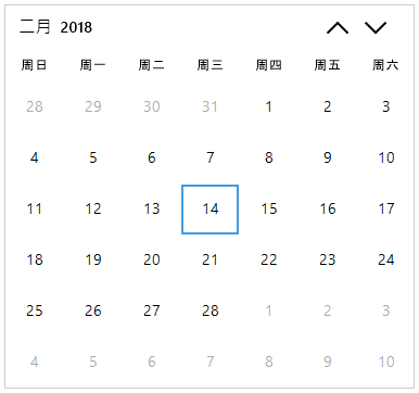
Globalization
calendar.Culture = new CultureInfo("zh-CN");
Cell customization
this.sfCalendar1.DrawCell += SfCalendar1_DrawCell;

void SfCalendar1_DrawCell(SfCalendar sender, Syncfusion.WinForms.Input.Events.DrawCellEventArgs args)
{

   if(args.IsTrailingDate)
   {
    // Customize the cell appearance using options from DrawCellEventArgs
    args.ForeColor = Color.DarkGray;
   }
   else if(args.Value.Value == (new System.DateTime(2018, 2, 10, 0, 0, 0, 0)))
   {
     args.Handled = true;
     // Customize the cell appearance by your own drawing using Graphics and Bounds of cell from DrawCellEventArgs
   }

}
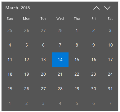
Appearance customization
SfCalendar calendar = new SfCalendar();

calendar.Style.BorderColor = ColorTranslator.FromHtml("#FFDFDFDF");
calendar.Style.Cell.CellBackColor = ColorTranslator.FromHtml("#FF555555");
calendar.Style.Cell.CellForeColor = ColorTranslator.FromHtml("#FFFFFFFF");
calendar.Style.Cell.SelectedCellBorderColor = ColorTranslator.FromHtml("#0078d7");
calendar.Style.Cell.SelectedCellBackColor = ColorTranslator.FromHtml("#FF0078D7");
calendar.Style.Cell.SelectedCellForeColor = ColorTranslator.FromHtml("#FFFFFFFF");
calendar.Style.Cell.TrailingCellBackColor = ColorTranslator.FromHtml("#FF555555");

calendar.Style.Header.BackColor = ColorTranslator.FromHtml("#FF555555");
calendar.Style.Header.ForeColor = ColorTranslator.FromHtml("#FFDFDFDF");
calendar.Style.Header.HoverForeColor = ColorTranslator.FromHtml("#FFFFFFFF");
calendar.Style.Header.DayNamesForeColor = ColorTranslator.FromHtml("#FFFFFFFF");
calendar.Style.Header.DayNamesBackColor = ColorTranslator.FromHtml("#FF555555");

calendar.Style.Header.NavigationButtonForeColor = ColorTranslator.FromHtml("#FFDFDFDF");
calendar.Style.Header.NavigationButtonHoverForeColor = ColorTranslator.FromHtml("#FFFFFFFF");
 No spam, just valuable updates.