
 Sheik Syed
Nowadays, applying gradients is more popular and trendier in mobile design. A gradient is a gradual blending of one color to another. It creates color combinations that feel different and modern, and they provide a completely unique feel to UI designs. In Xamarin.Forms applications, you may be asked to set a gradient background for a layout or view, but it might require additional effort to accommodate this request. Syncfusion’s aim is to make things easier and save developers time. Based on this, we have added the Gradient View to our Xamarin control collection to make stylish gradients in your applications. To add a gradient design, just include the Gradient View as a background view of your application.
The Gradient View control supports two types of gradients: linear and radial. Now, I will explain how to apply a gradient background to a Xamarin.Forms application.
Refer to this documentation to add the Gradient View reference in your application. The Gradient View contains the BackgroundBrush property, where you can specify either linear or radial gradients based on your requirements.
<gradient:SfGradientView>
        <gradient:SfGradientView.BackgroundBrush>
        </gradient:SfGradientView.BackgroundBrush>
</gradient:SfGradientView>
Apply linear gradient
A linear gradient paints a view with multiple colors that blend with each other. In general, there are three kinds of linear gradient based on its direction: horizontal, vertical, and diagonal. The default linear gradient direction is diagonal.
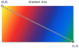
The StartPoint and EndPoint properties of SfLinearGradientBrush represent the start and end points of the gradient value. The default value of StartPoint is (0,0), which is the upper-left corner, and the default EndPoint is (1,1), which is the lower-right corner. To change the gradient effect direction from left to right, change StartPoint to (0,0.5) and EndPoint to (1,0.5). Similarly, to change the direction to vertical, set StartPoint to (0.5,0) and EndPoint to (0.5,1). The following MSDN image shows the linear gradient axis direction.
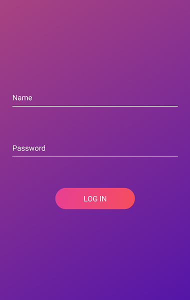
Linear Gradient in Diagonal Direction
SfGradientStop is a color block of the gradient brush and it specifies a color at an offset along the gradient axis. The Color property specifies the color of the gradient stop and the Offset property specifies the position of gradient stop’s color on the gradient axis. Gradients aren’t limited to two color shades. If you are in a colorful mood, you can add any number of color shades by adding SfGradientStop to the GradientStops collection.
<gradient:SfGradientView>
      <gradient:SfGradientView.BackgroundBrush>
            <gradient:SfLinearGradientBrush StartPoint="0,0" EndPoint="1,1">
                  <gradient:SfLinearGradientBrush.GradientStops>
                        <gradient:SfGradientStop Color="#ff05cd" Offset="0.0" />
                        <gradient:SfGradientStop Color="#313196" Offset="1.0" />
                  </gradient:SfLinearGradientBrush.GradientStops>
            </gradient:SfLinearGradientBrush>
      </gradient:SfGradientView.BackgroundBrush>
</gradient:SfGradientView>
Now, you can apply this gradient view as a background view to your application to create the gradient style.
<Grid>
     <gradient:SfGradientView/>
     <!--Your application view-->
</Grid>
Diagonal Linear Gradient
Apply radial gradient
A radial gradient paints a view with multiple colors that blend together and create a circular color effect. A radial gradient axis is defined by a circle and its color radius starts from its origin. You can set the color radius and origin by using the Radius and Center properties of SfRadialGradientBrush. Refer to this documentation to learn more about radius and center customization.
<gradient:SfGradientView>
      <gradient:SfGradientView.BackgroundBrush>
            <gradient:SfRadialGradientBrush x:Name="linear" Radius="1" Center="0.5,0.5">
                  <gradient:SfRadialGradientBrush.GradientStops>
                        <gradient:SfGradientStop Color="#ff05cd" Offset="0.0" />
                        <gradient:SfGradientStop Color="#313196" Offset="1.0" />
                  </gradient:SfRadialGradientBrush.GradientStops>
             </gradient:SfRadialGradientBrush>
      </gradient:SfGradientView.BackgroundBrush>
</gradient:SfGradientView>
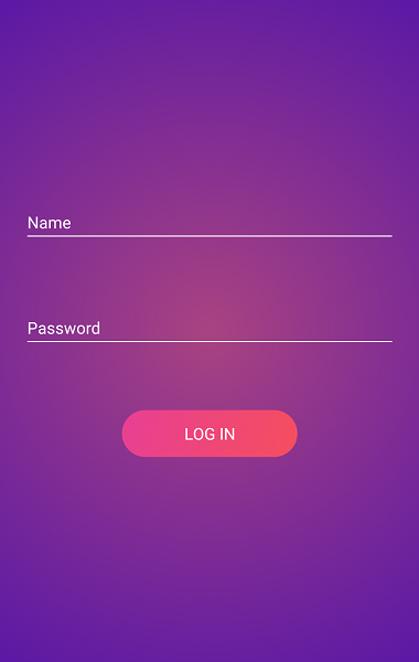
Circular Gradient
Gradient support for Button and Switch controls
In our 2019 Volume 2 release, we have provided gradient support for the Syncfusion Button and Switch controls to make it easy to apply gradient effects to them.
Button
You can set the gradient background for the Button control using the BackgroundGradient property as shown in the following code.
        <!--Linear gradient background-->
        <buttons:SfButton HeightRequest="40" WidthRequest="150" CornerRadius="20" Text="Linear">
            <buttons:SfButton.BackgroundGradient>
                <gradient:SfLinearGradientBrush>
                    <gradient:SfLinearGradientBrush.GradientStops>
                        <gradient:SfGradientStop Color="#51F1F2" Offset="0"/>
                        <gradient:SfGradientStop Color="#2F9BDF" Offset="1"/>
                    </gradient:SfLinearGradientBrush.GradientStops>
                </gradient:SfLinearGradientBrush>
            </buttons:SfButton.BackgroundGradient>
        </buttons:SfButton>

        <!--Radial gradient background-->
        <buttons:SfButton HeightRequest="40" WidthRequest="150" CornerRadius="20" Text="Radial">
            <buttons:SfButton.BackgroundGradient>
                <gradient:SfRadialGradientBrush Radius="1">
                    <gradient:SfRadialGradientBrush.GradientStops>
                        <gradient:SfGradientStop Color="#FFB57B" Offset="0"/>
                        <gradient:SfGradientStop Color="#FF5361" Offset="1"/>
                    </gradient:SfRadialGradientBrush.GradientStops>
                </gradient:SfRadialGradientBrush>
            </buttons:SfButton.BackgroundGradient>
        </buttons:SfButton>
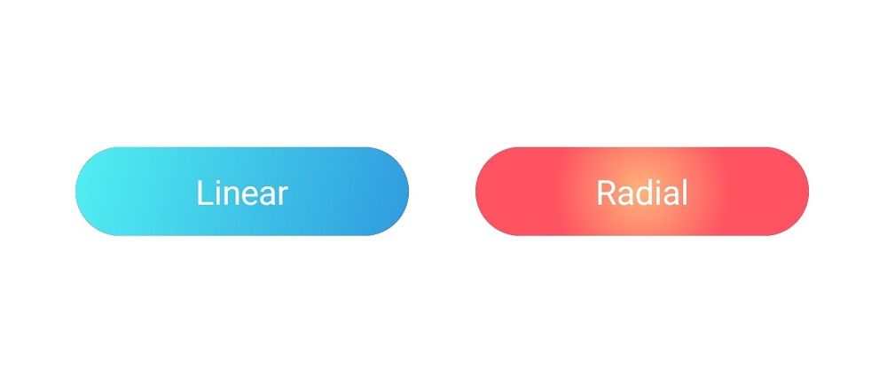
Linear (Left) and Radial (Right) Gradients in the Button Control
Switch
You can apply the gradient effect in both the track and thumb of the Switch control by using the TrackGradient and ThumbGradient properties.
<buttons:SfSwitch VisualType="Custom">
    <buttons:SfSwitch.SwitchSettings>
          <syncfusion:MaterialSwitchSettings>
                <syncfusion:MaterialSwitchSettings.ThumbGradient>
                    <gradient:SfLinearGradientBrush StartPoint="0.5, 0" EndPoint="0.5, 1">
                          <gradient:SfLinearGradientBrush.GradientStops>
                                <gradient:SfGradientStop Color="#FFFF0199" Offset="0.0" />
                                <gradient:SfGradientStop Color="#FFFFFFFF" Offset="1.0" />
                          </gradient:SfLinearGradientBrush.GradientStops>
                    </gradient:SfLinearGradientBrush>
                </syncfusion:MaterialSwitchSettings.ThumbGradient>
                <syncfusion:MaterialSwitchSettings.TrackGradient>
                    <gradient:SfLinearGradientBrush>
                          <gradient:SfLinearGradientBrush.GradientStops>
                                <gradient:SfGradientStop Color="#55FF0199" Offset="0.0" />
                                <gradient:SfGradientStop Color="#FFFFFFFF" Offset="1.0" />
                          </gradient:SfLinearGradientBrush.GradientStops>
                    </gradient:SfLinearGradientBrush>
                </syncfusion:MaterialSwitchSettings.TrackGradient>
          </syncfusion:MaterialSwitchSettings>
    </buttons:SfSwitch.SwitchSettings>
</buttons:SfSwitch>

Switch Control with Linear Gradient
Summary
In app UI design, color is one of the most powerful design factors and it’s an important part of the latest design trends. As a result, gradients are very hot in the current design moment and can give your app a unique style. In this blog post, we walked through the simple way to apply gradients using the Syncfusion Gradient View control and its extended support in the Button and Switch views. In our upcoming releases, we will include this support for other possible Syncfusion controls to provide built-in gradient background support. I hope you will create or modify your app’s UI design with our Gradient View.
I have added the complete sample code in this GitHub repo. You can always download our free evaluation to see all our components in action. Also, explore our samples available in this GitHub repository. You can even evaluate samples we have available on Google Play and Microsoft Store.
If you have any questions or require clarifications, please let us know in the comments section below. You can also contact us through our support forum, Direct-Trac, or our feedback portal. As always, we are happy to assist you!
 No spam, just valuable updates.
Comments (5)
[…] How to Make Stylish Gradient Backgrounds in Xamarin.Forms (Sheik Syed) […]
thanks
but this SfGradien is trail
how to get the license for it
You can contact the Deputy Director (Ryan Madison) He will provide you a license quote $995
[email protected]
Hey, when using this piece of code in my studio I am experiencing an error:”Error XFC0009: No property, BindableProperty, or event found for “BackgroundGradient”, or mismatching type between value and property.”:
Hi Mohammed,
Can you please share more details, such as a code example, replication steps to reproduce the issue? Also, you can create a support incident with details using the below link.
https://www.syncfusion.com/support/directtrac/incidents/newincident