
 Rajendran R
Our Blazor kanban board is a task scheduling component that provides a clear user interface for managing tasks with multiple stages.
Kanban boards are widely used in various real-time applications such as task scheduling, project management, software development, manufacturing processes, personal task management, and many more. The Syncfusion Kanban component supports both Blazor Server and Blazor WebAssembly (WASM) applications. This blog post showcases the following features of our Blazor kanban board:
- Data Binding
- Swimlanes
- Work-in-Progress Validation
- Toggling Columns
- Sorting Cards
- Templates
- Stacked Headers
- Performing CRUD Operations
Let’s get a bird’s-eye view of them!
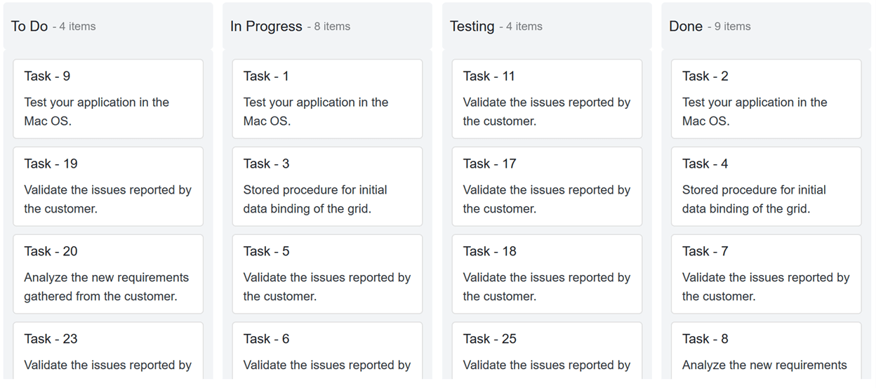
Data binding
Let’s look at the different ways to bind data sources to the Blazor kanban board. The component provides two methods:
Local data binding
In local data binding, we need to create required model classes and data. Then, we have to bind the data to the DataSource property of the SfKanban tag.
Add the following code in your Razor file to bind the local data to the kanban board.
@page "/"

<h3>Local Data Binding</h3>

<SfKanban KeyField="Status" DataSource="Source">
    <KanbanColumns>
         @foreach (ColumnModel item in columnData)
            {
                 <KanbanColumn HeaderText="@item.HeaderText" KeyField="@item.KeyField"></KanbanColumn>
            }
    </KanbanColumns>
    <KanbanCardSettings HeaderField="Title" ContentField="Summary"></KanbanCardSettings>
</SfKanban>

@code {
    private List<KanbanModel> Source = new KanbanModel().GetTaskDetails();
    private List<ColumnModel> columnData = new List<ColumnModel>() {
        new ColumnModel(){ HeaderText= "To Do", KeyField= new List<string>() { "Open" } },
        new ColumnModel(){ HeaderText= "In Progress", KeyField= new List<string>() { "InProgress" } },
        new ColumnModel(){ HeaderText= "Testing", KeyField= new List<string>() { "Testing" } },
        new ColumnModel(){ HeaderText= "Done", KeyField= new List<string>() { "Close" } }
    };
}
Remote data binding
In remote data binding, use the Syncfusion Data Manager to retrieve tasks from a remote data source. Then, define the key fields, columns, and card settings to bind the data to the Kanban component.
Refer to the following code example.
<SfKanban TValue="KanbanModel" KeyField="Status" AllowDragAndDrop="false">
   <SfDataManager Url="https://js.syncfusion.com/ejServices/wcf/Northwind.svc/Tasks" CrossDomain="true"></SfDataManager>
    <KanbanColumns>
        @foreach (ColumnModel item in columnData)
        {
            <KanbanColumn HeaderText="@item.HeaderText" KeyField="@item.KeyField"></KanbanColumn>
        }
    </KanbanColumns>
    <KanbanCardSettings HeaderField="Id" ContentField="Summary"></KanbanCardSettings>
</SfKanban>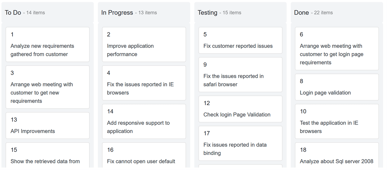
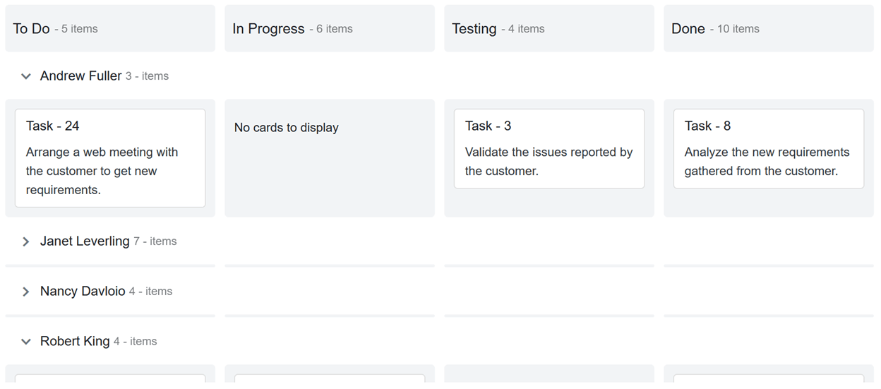
Swimlanes
With the swimlane row feature, you can split the Kanban component horizontally based on fields such as assignee, priority, and more. Its rows can be expanded and collapsed. Also, you can show or hide empty rows and the task count in each row, and also sort swimlane rows.
For example, when we group the board with the assignee field as a swimlane, the board will show a clear picture of each assignee’s tasks with their progress.
Refer to the following code example.
<SfKanban TValue="KanbanModel" KeyField="Status">
…
 <KanbanSwimlaneSettings KeyField="Assignee" TextField="Assignee" AllowDragAndDrop=false ShowItemCount=true SortDirection=SortDirection.Ascending ShowEmptyRow=true>
 </KanbanSwimlaneSettings>

</SfKanban>
The following image shows the swimlane in use.
Note: To learn about template support in the swimlane header, you can refer to this section of the blog.
Work-in-progress validation
You can limit the minimum and maximum card count per column or swimlane. This will help you monitor the capacity of the team that owns the kanban board.
For example, if you limit the maximum card count to two in the progress column, when a user moves more than two cards into it, the column will be highlighted to denote the validation failure.
The validation fails when the card count is less than the MinCount or more than the MaxCount. Custom appearances can be used to denote the individual validation failures for the min count and max count.
You can configure the work-in-progress limitation as demonstrated in the following code example.
<SfKanban TValue="KanbanModel" KeyField="Status" ConstraintType=ConstraintType.Column>
…
    <KanbanColumns>
    @foreach (ColumnModel item in columnData)
    {
        <KanbanColumn HeaderText="@item.HeaderText" KeyField="@item.KeyField" MinCount='@item.MinCount' MaxCount='@item.MaxCount'></KanbanColumn>
    }
    </KanbanColumns>
…
</SfKanban>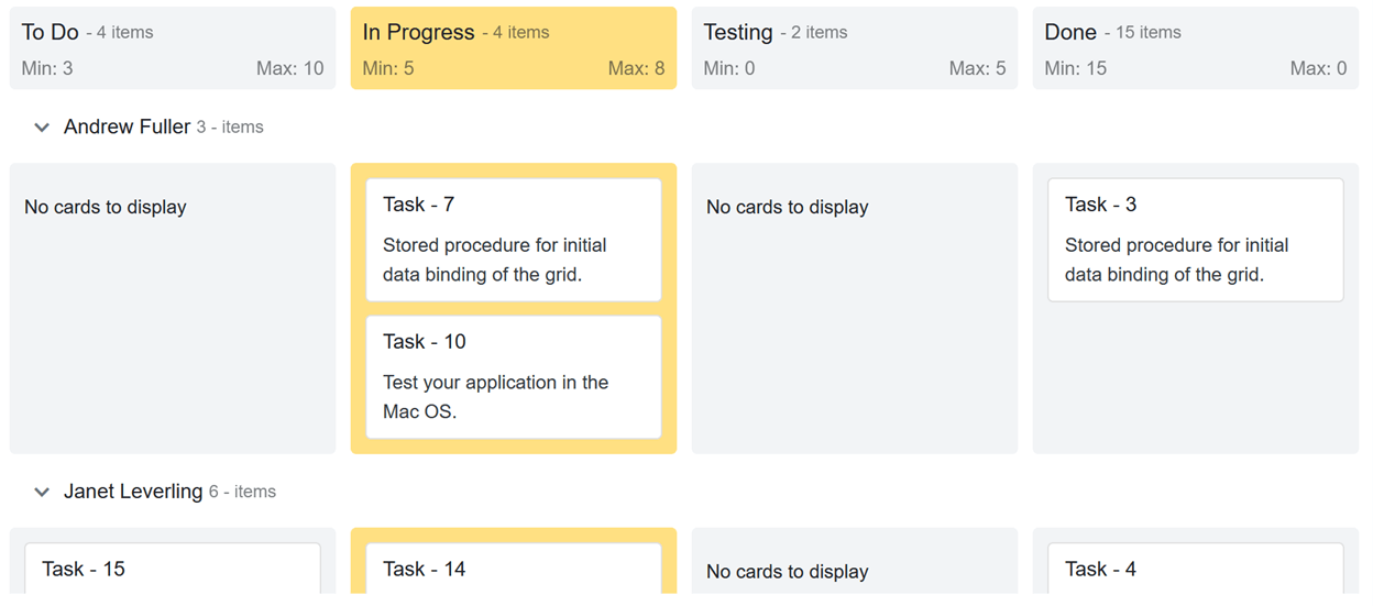
Toggling columns
The Kanban board column headers can be expanded or collapsed. If you want to hide a few columns or empty columns, use the toggling columns feature. Toggling columns provides a broader view for visualizing the remaining visible columns.
If toggling is enabled, then an expand/collapse icon will be rendered on the right corner of the column. Simply click on the icon to collapse or expand the column.
Note: If you want to collapse a column on initial load, you have to set the IsExpanded property to false.
You can configure the KanbanColumns tag as shown in the following code example to utilize the toggle column feature.
<SfKanban TValue="KanbanModel" KeyField="Status">
…
    <KanbanColumns>
    @foreach (ColumnModel item in columnData)
    {
        <KanbanColumn HeaderText="@item.HeaderText" KeyField="@item.KeyField" AllowToggle="@item.AllowToggle" IsExpanded="@item.IsExpanded" ></KanbanColumn>
    }
    </KanbanColumns>
…
</SfKanban>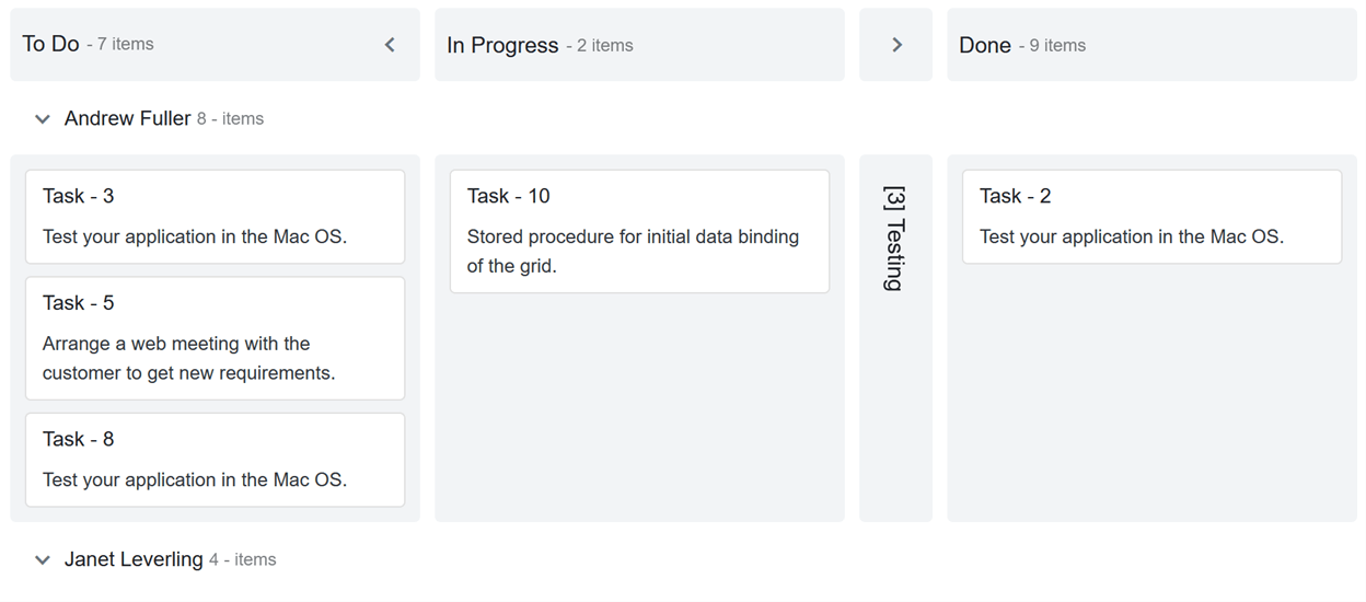
Sorting cards
By default, the Kanban component displays its cards based on the order in which they are placed in the data source. If you want to sort the cards using a specific field value, you can easily do this through the built-in sorting options to organize the cards based on specific fields such as field, rank, assignee, etc.
When adding cards dynamically, sorting will be applied to the corresponding column once the cards are added in the board.
Refer to the following code example.
<SfKanban TValue="KanbanModel" KeyField="Status">
…
    <KanbanSortSettings SortBy=SortOrderBy.Custom Direction=SortDirection.Descending Field="Priority"></KanbanSortSettings>
</SfKanban>
Templates
Templates allow you to easily add any HTML content or any Blazor UI components inside the kanban board. You can apply templates to the following kanban board elements:
The Template tag provides the context object to access its corresponding attributes. For example, the KanbanColumn’s context property provides all the information about a column such as key field, header text, toggle, expand/collapse state, and more.
Column header templates
To design a column header with template content, place the HTML content or Blazor UI component inside the Template tag under the KanbanColumn tag.
Access the column properties through the context property of the KanbanColumn and add the template content as explained in the following code example.
<SfKanban TValue="KanbanModel" KeyField="Status">
…
    <KanbanColumns>
    @foreach (ColumnModel item in columnData)
    {
        <KanbanColumn HeaderText="@item.HeaderText" KeyField="@item.KeyField">
            <Template>
            @{
                KanbanColumn column = (context as KanbanColumn);
                <div class="header-template-wrap">
                    <div class="header-icon e-icons @column.KeyField[0]"></div>
                    <div class="header-text">@column.HeaderText</div>
                </div>
            }
            </Template>
        </KanbanColumn>
    }
    </KanbanColumns>
 …
</SfKanban>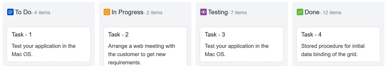
Swimlane header templates
The Template tag is available inside the KanbanSwimlaneSettings tag. It is used to customize swimlane headers with icons or any other HTML content or Blazor component.
You can access the swimlane settings through the context property of the SwimlaneSettingsModel class and customize it as shown in the following code example.
<SfKanban TValue="KanbanModel" KeyField="Status">
…
    <KanbanSwimlaneSettings KeyField="Assignee">
    <Template>
        @{
            SwimlaneSettingsModel swimlane = (SwimlaneSettingsModel)context;
            <div class="swimlane-template e-swimlane-template-table">
                <div class="e-swimlane-row-text">
                    <img src="./images/@(swimlane.KeyField).png" alt="@swimlane.TextField" />
                    <span>@swimlane.TextField</span>
                </div>
            </div>

        }
    </Template>
    </KanbanSwimlaneSettings>
    …
</SfKanban>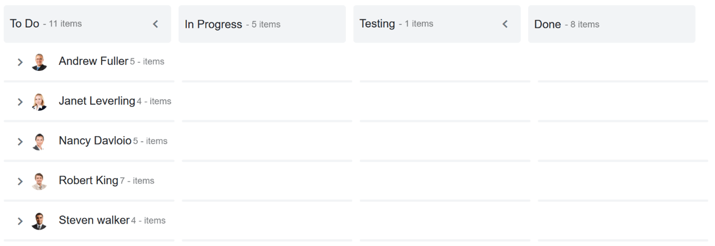
Card templates
We can customize each of the cards in the kanban board using the Template tag inside the KanbanCardSettings tag. To do so, place the required HTML or Blazor component within the Template tag to display it in the cards.
In the following code example, you can see how to configure templates for the cards in a kanban board.
<SfKanban TValue="KanbanModel" KeyField="Status">
…
    <KanbanCardSettings>
        <Template>
            @{
                KanbanModel card = (KanbanModel)context;
                <div class="e-card-header-title">@card.Title</div>
                <div class="e-card-content">
                    <span>@card.Summary</span><br>
                    <span>Priority: @card.Priority</span><br>
                    <span>Type: @card.Type</span>
                </div>
            }
        </Template>
    </KanbanCardSettings>
…
</SfKanban>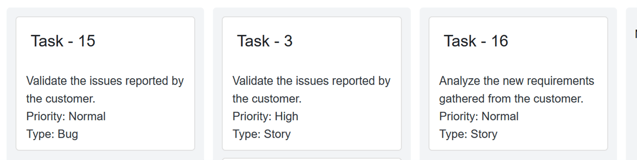
Tooltip templates
We have also added tooltip template support to the Kanban component in the 2020 Volume 4 release.
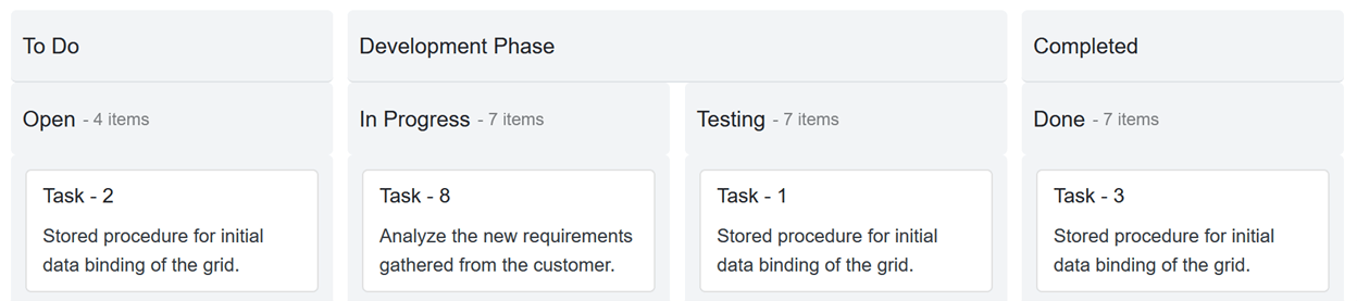
Stacked headers
Stacked headers are an additional header feature that helps you group kanban columns based on specific categories. To stack columns, you have to define the KanbanStackedHeader property with key fields inside the KanbanStackedHeaders tag. Map the key fields to render the header in a stacked manner.
For example, the task statuses in progress, code review, and testing can be grouped under the development phase by using the stacked header feature.
Refer to the following code example.
<SfKanban TValue="KanbanModel" KeyField="Status">
    <SfDataManager Json="Tasks"></SfDataManager>
    <KanbanColumns>
         @foreach (ColumnModel item in columnData)
            {
                 <KanbanColumn HeaderText="@item.HeaderText" KeyField="@item.KeyField"></KanbanColumn>
            }
    </KanbanColumns>
    <KanbanStackedHeaders>
            @foreach (StackedHeaderModel item in stackedHeaderData)
            {
                <KanbanStackedHeader Text="@item.Text" KeyFields="@item.KeyFields"></KanbanStackedHeader>
            }
        </KanbanStackedHeaders>
    <KanbanCardSettings HeaderField="Title" ContentField="Summary"></KanbanCardSettings>
</SfKanban>

@code {
    List<KanbanModel> Tasks = new KanbanModel().GetTaskDetails();
    private List<ColumnModel> columnData = new List<ColumnModel>() {
        new ColumnModel(){ HeaderText= "Open", KeyField= new List<string>() { "Open" } },
        new ColumnModel(){ HeaderText= "In Progress", KeyField= new List<string>() { "InProgress" } },
        new ColumnModel(){ HeaderText= "Testing", KeyField= new List<string>() { "Testing" } },
        new ColumnModel(){ HeaderText= "Done", KeyField= new List<string>() { "Close" } }
    };
     private List<StackedHeaderModel> stackedHeaderData = new List<StackedHeaderModel>() {
        new StackedHeaderModel(){ Text= "To Do", KeyFields= new List<string>() { "Open" } },
        new StackedHeaderModel(){ Text= "Development Phase", KeyFields= new List<string>() { "InProgress", "Testing" } },
        new StackedHeaderModel(){ Text= "Completed", KeyFields= new List<string>() { "Close" } }
    };
}
Performing CRUD operations
Use the Syncfusion Data Manager in the Kanban component to perform CRUD (create, read, update, and delete) operations. We can perform CRUD actions in the following ways:
Before defining a kanban board, you have to implement the data access layer to pass the data and handle the added, modified, and deleted cards.
Configure the adapter to the Data Manager to handle CRUD actions.
| Custom Adapter | <SfKanban ID="Kanban" TValue="Order" KeyField="ShipCity"> <SfDataManager AdaptorInstance="@typeof(CustomAdaptor)" Adaptor="Adaptors.CustomAdaptor"></SfDataManager> … </SfKanban> |
| URL adapter | <SfKanban ID="Kanban" TValue="Order" KeyField="ShipCity"> <SfDataManager Url="/api/Default" CrudUrl="/api/Default/Batch" Adaptor="Adaptors.UrlAdaptor"></SfDataManager> … </SfKanban> |
The added, changed, and deleted card details will get the corresponding argument of the Data Manager’s adapter. You can perform further processing based on it.
For example:
| CustomAdapter | public override object BatchUpdate(DataManager dm, object Changed, object Added, object Deleted, string KeyField, string Key, int? dropIndex)
{
if (Changed != null)
{
foreach (var rec in (IEnumerable<Order>)Changed)
{
db.UpdateOrder(rec);
}
}
if (Added != null)
{
foreach (var rec in (IEnumerable<Order>)Added)
{
db.AddOrder((Order)rec);
}
}
if (Deleted != null)
{
foreach (var rec in (IEnumerable<Order>)Deleted)
{
db.DeleteOrder((Order)rec);
}
}
return new { };
} |
| URL adapter | [HttpPost]
[Route("api/Default/Batch")]
public void Batch([FromBody]CRUDModel<Order> value)
{
if (value.Changed.Count > 0)
{
foreach (Order rec in value.Changed)
{
db.UpdateOrder(rec);
}
}
if (value.Added.Count > 0)
{
foreach (Order rec in value.Added)
{
db.AddOrder(rec);
}
}
if (value.Deleted.Count > 0)
{
foreach (Order rec in value.Deleted)
{
db.DeleteOrder(rec);
}
}
} |
Using built-in dialogs
There are no additional settings needed to edit a card using the built-in dialog. However, if you want to show the Add card button in each column, use the AllowAdding property.
The default built-in dialog will open with the mapped details while adding or editing a card.
The default dialog contains the following three fields:
- Card Header
- Kanban Key
- Card Content
Refer to the following code example.
<SfKanban ID="Kanban" TValue="Order" KeyField="ShipCity">
…
    <KanbanColumns>
        <KanbanColumn HeaderText="Brazil" KeyField=@(new List<string>{"Brazil"}) AllowAdding=true></KanbanColumn>
…
    </KanbanColumns>
…
</SfKanban>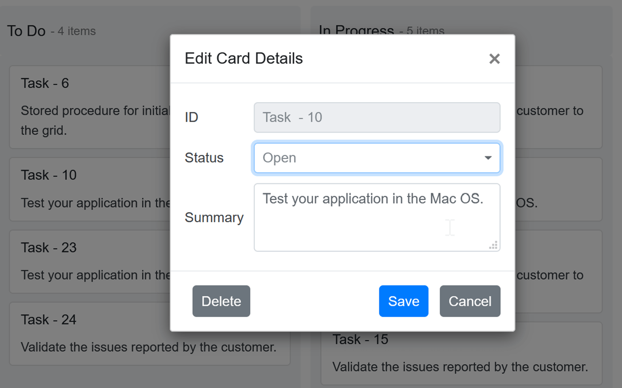
Dialog with custom fields
You can also include custom dialog fields in the editing dialog by including their rendering component type and text using the DialogSettingsFields tag. The following component types are available to configure:
- Text Box
- Drop-Down
- Numeric
- Text Area
Refer to the following code example.
<SfKanban ID="Kanban" TValue="Order" KeyField="ShipCity">
…
    <KanbanDialogSettings>
        <KanbanDialogSettingsFields>
            <KanbanDialogSettingsField Text="Ship City" Key="ShipCity" Type=DialogFieldType.DropDown></KanbanDialogSettingsField>
            <KanbanDialogSettingsField Text="Ship Name" Key="ShipName" Type=DialogFieldType.TextBox></KanbanDialogSettingsField>
            <KanbanDialogSettingsField Text="Employee ID" Key="EmployeeID" Type=DialogFieldType.TextBox></KanbanDialogSettingsField>
        </KanbanDialogSettingsFields>
    </KanbanDialogSettings>
…
</SfKanban>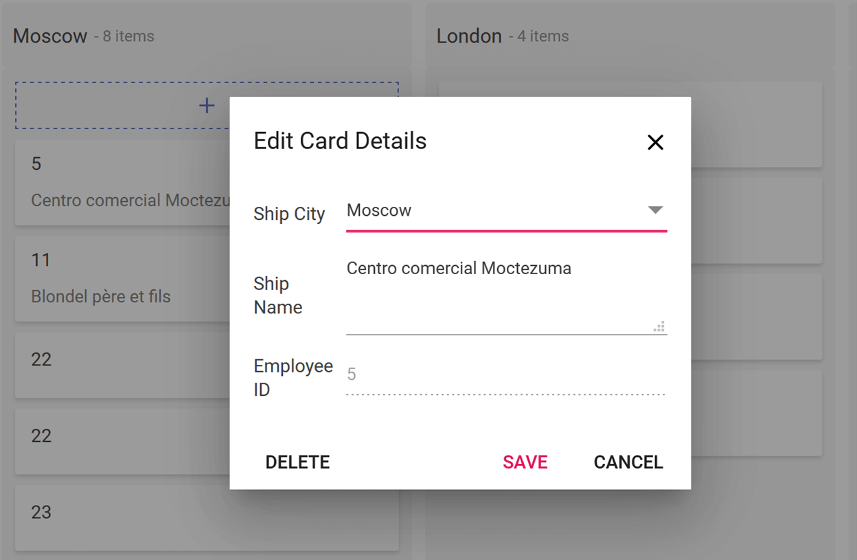
Dialog template
You can design your own form to create or edit a card within the Template tag of the KanbanDialogSettings tag. You can also render HTML content or any other Blazor UI component inside the template.
Refer to the following code example.
<SfKanban ID="Kanban" TValue="Order" KeyField="ShipCity">
…
    <KanbanDialogSettings>
        <Template>
            @{

            }
        </Template>
    </KanbanDialogSettings>
…
</SfKanban>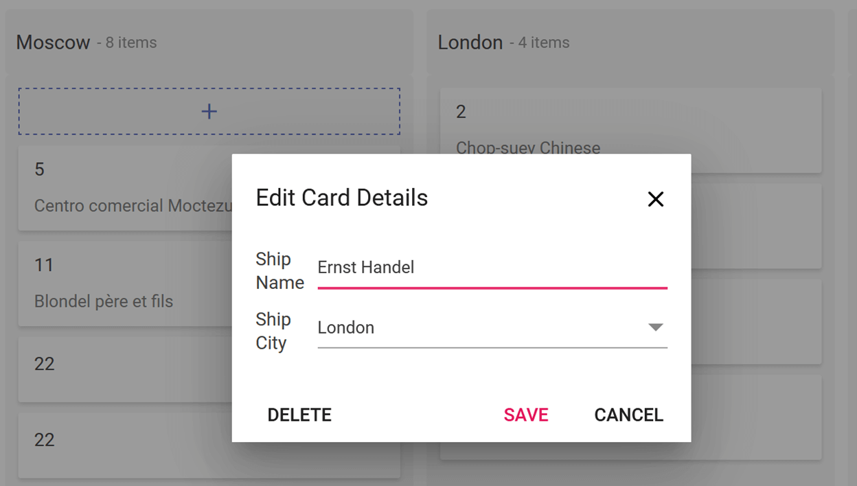
GitHub reference
You can find working samples of the CRUD operations in the Kanban component at the following GitHub locations:
- URL adapter: https://github.com/SyncfusionExamples/blazor-kanban-crud-url-adaptor.git
- Custom adapter: https://github.com/SyncfusionExamples/blazor-kanban-crud-custom-adaptor.git
Also, you can download the complete source code of our Blazor Kanban features from the following GitHub link: https://github.com/SyncfusionExamples/blazor-kanban-board-features.git.
Other features
There are many other helpful features in our Blazor Kanban component, including:
- Themes: Material, Fabric, Bootstrap, Bootstrap 4, and high contrast.
- Mobile support: Adaptive for all mobile devices.
- Keyboard access: Access to all kanban board functionalities through the keyboard.
- Web accessibility: ARIA (accessible rich internet applications) support to meet accessibility standards.
- Localization: Localize all of the component’s static texts based on culture.
- Right-to-left (RTL) direction: Display the layout in a right-to-left direction.
- Tooltip: Display more useful information about a card.
- Drag-and-drop support: Drag and drop a card between swimlane rows.
- Selection: Select single or multiple cards.
Conclusion
We have included in the Syncfusion Blazor Kanban component support for most common requirements and have implemented them with modular architectures. In addition, we have included the following features in the recent 2020 Volume 4 release:
- Workflow Restrictions
- Tooltip Templates
We will be publishing detailed blogs regarding the new features soon. We look forward to you trying out the Kanban component and providing your feedback.
If you don’t have a license yet, you can try out the Kanban component’s features by downloading our free trial. You can also explore our online demos and documentation pages to learn more about our other Blazor controls.
You can contact us with questions or comments through our support forums, Direct-Trac, or feedback portal. We are always happy to assist you!


 No spam, just valuable updates.
Comments (6)
Have you ever tested it with 18.4..x and not 18.3.42 like in your samples? Such an unbelievable bugy piece of code. No chanche to get an index after drop or add Kanbanevents without errors when working with adapters and not datasource. AllowDraganddrop doesnt work with Column AllowDrag/Drop, and so on. BatchUpdate doesnt work with 18.4.. No focus on Ranks/order in a column, which is a major reason working with Kanban to prioritize tasks (not just assignees), and so on.. just Unbelievable and very disappointing. You just destroyed 5 of my working days on kanban with this version.
Hi Gregor Schlinger,
We are very sorry for the frustrating experience with Kanban.
We ensured the same code blog with the 2020 Volume 4 release version. Please find the details for your comments.
Query #1: Have you ever tested it with 18.4..x and not 18.3.42 like in your samples?
We will upgrade these GitHub samples to the 18.4 version shortly.
Query #2: No chance to get an index after a drop or add
So far, we didn’t provide an index in the argument of Kanban Events on drop the card. We will include it with ‘DragStop’ event arguments when using `SortBy` as `Index` property. The changes will include with the upcoming NuGet release.
Query #3: Kanbanevents without errors when working with adapters and not data sources.
We ensured the Kanban with both Adaptors and DataSource. We didn’t face any issues with these configurations. If you face any issues, kindly share the details. We will validate and provide the solution ASAP.
Query #4: AllowDraganddrop doesn’t work with Column AllowDrag/Drop, and so on.
The individual AllowDrop/AllowDrag option introduced for workflow restriction with the 2020 Volume 4 release. The property completely depends on the “AllowDragAndDrop” property. We hope you try to access individual column property by disabling the main AllowDragAndDrop property.
Query #5: BatchUpdate doesn’t work with 18.4. No focus on Ranks/order in a column, which is a major reason working with Kanban to prioritize tasks (not just assignees), and so on.
Previously, we have considered batch update for single/multiple cards changes. After the 18.3.42 version, we have modified the batch update concept for multiple card changes alone. So, you face the console error when drag and drop the cards and `sortBy` as `Index` with adaptors. We will fix this issue with priority and include it with the upcoming patch release.
Regards,
Rajendran R
Hi, thanks for the update. In meantime i got it to work like before by using just OnActionComplete and implementing all the Controller stuff (CRUD) manually. OnActionComplete was the only chance to get (with SortBy=SortOrderBy.Index Field=”Seq”) any index (here Seq) out of the changed or dropped items. If you have eyes for the programmer using your Kanban, he wants to know all(!) changed items with Sequence/Rank/Index property to save it on backend all at once. Not just for a single item (DragStop) which is meaningless updating a sequence.
So please keep this OnActionComplete which is a great and powerfull event, having all changed, added and deleted items with index info in one event args. You really shold focus your descriptions more to this event which took me hours to find this possibility by try and error.
The biggest Problem now is the behaviour of dragdrop inside of one(!) column. Especially drag top->down. It acts just wrong. Drag bottom->up works like expected.
Hi Gregor Schlinger,
Thanks for your suggestion.
We are happy to hear that you achieved your requirement using action events and your own controller codes. We will consider your suggestion about action events to improve its descriptions. The suggestion helps to get the best out of our Kanban. We streamlined the CRUD operation for single and multiple cards updates. So, you will try built-in CRUD actions in future requirements.
We resolved the wrong behavior with drag-and-drop already and will reflect with the upcoming patch release.
Regards,
Rajendran R.
Hi Rajendran,
i will spend a minute to give you an idea how you can make a huge benefit to programmers handling sequences/ranks and more. After working with your SfKanban and now with SfMultiselect (may others i didnt test yet) both have same disadvantages and can be solved by the following simple approach. This appraoch you can see on many other solution like jQurey sortable or select2 and other components in the world. Bottom line the solution handles sequences/relations to child objects in a single comma separated string. “id1,id3,id100,id2” those ids show all relations and its sequence in the given order. Why? Very often you do not have/need a mapping table to map i.e. tags or team-members or minor relations, so you save/persist it in a single string against the data base. UI-components like sortable from jQuery can handle such strings in methods with get and set. If i want to save the current sequence/rank/order i just call get() and save one(!) string value without any need to convert it between UIDatabase. If I want to go back to the “normal” order I just set() this string, This also makes the function SortBy (SfKanban) independent from any database field – right now it is dependent which is by design a bad idea. In SfMultiselect you always have to convert the @bind-Value=”” from or into an array, why? it just needs ugly code on the backend/code behind to convert it from UIdatabase for each SfMultiselect .
Advantages:
SfKanban:
1. Makes SortBy (a typical temporarely user interaction) not necessarerly related to data base field /changedRecords.
2. Assuming a a flat parent/child table as kanban datasource (parent is kanban column) you can easely change the order by changeing one string at parent. No need to change the sequence of each changedRecord. All parents are columns, no need to have a seperate list of predefined columns.
3. Avoids the very complex calculation about who are the changed records after a DragDrop) and recalculate its sequence number
..
SFMultiselect:
1. No ugly TValue converts into and from string[] or List
2. May a future possiblity to sort Box-objects inside the SfMultiSelcet by just changing one string
3. just One string field (1:1 from and into data base) and all is done
This one string philosophy (“id1, id3, id100, id4”) is a good friend to programmers and compatible with all kinds of database schemes (flat parent child , mappings, …). It also allows easy testing and demos.
From your side, if any object for a given id is not present in the data source, just ignore it. Thats the behaviour of all components i know and works perfectly especially for deleted records.
Just a suggestion,
Gregor
Hi Gregor,
We appreciate your effort that you have taken the time to communicate with us.
For Multiselect:
We have considered your requirement for “single comma-separated string like “id1,id3,id100,id2” in Value and Text properties” of the Multiselect component on our end. We will implement and include it with our upcoming 2021 Volume 1 main release.
For Kanban,
We couldn’t get the column list as a string collection for Kanban. Since, we need to configure individual column properties such as Toggle, Min, Max, Expand, display text, and more. For the client framework, your suggestion is valid, and agree to consider it. We are not sure how much this approach helps Blazor framework-related customers. Most of the customers don’t want to reconfigure the DB values again in the string field. If you have any help article related to Blazor and string manipulation approach, kindly share it with us to validate further.
Thanks again.
Regards,
Rajendran R