Syncfusion is excited to announce that the theme studio for Essential JS 2 components is available now!
Previously, you may have experienced some difficulty changing a specific theme-based color after integrating Essential JS 2 components in an application. Now, you no longer need additional custom CSS style integrations to customize the theme color. We have built a new tool that can customize the Essential JS 2 component styles and generate them as a CSS file for your application. You can just download the styles and use them directly in your application to apply custom themes.
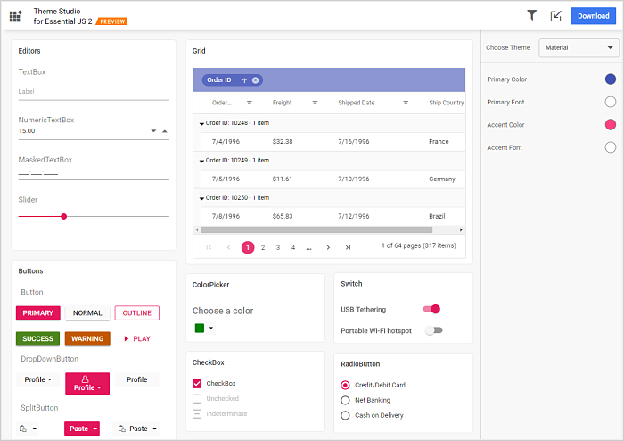
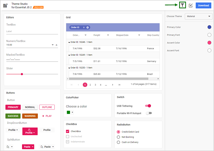
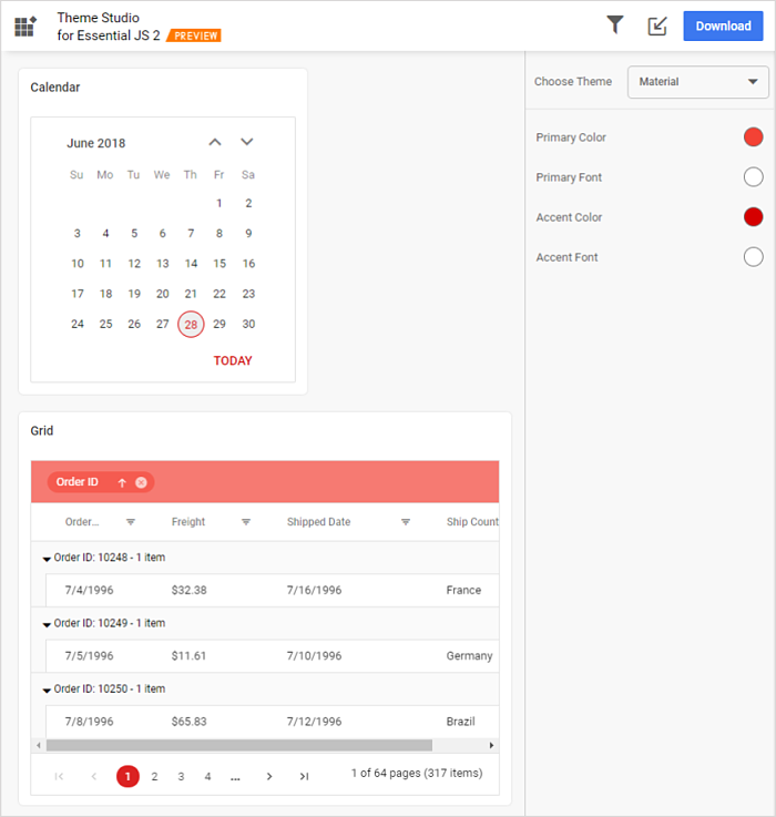
Figure 1: ThemeStudio preview
Features and functionalities
Let’s take a deeper look into the theme studio functionalities and what they can really do with Essential JS 2 components. We’ll look at the following topics:
- Customizing theme colors from the theme studio.
- Filtering a specific list of components to style.
- Download a customized theme.
- Import previously changed settings into the theme studio.
Customizing theme color from theme studio
The Essential JS 2 style themes are developed under the SCSS environment. Each theme has a unique common variable list. When you change the common variable color code value, it will reflect in all the Essential JS 2 components. All the Essential JS 2 component styles are derived from these theme-based common variables.
This common variable list is handled inside the theme studio application for customizing theme-based colors. We have greatly simplified theming in Essential JS 2 by allowing only essential colors to be changed; for example, only accent and primary variables are integrated in the theme studio.
Let’s see the process of customizing a theme in the theme studio.
- Navigate to the theme studio application at https://ej2.syncfusion.com/themestudio/
- The theme studio application page can be divided into two sections: the components preview section on the left, and the theme customization section on the right.
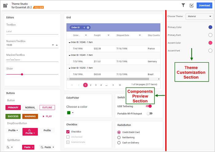
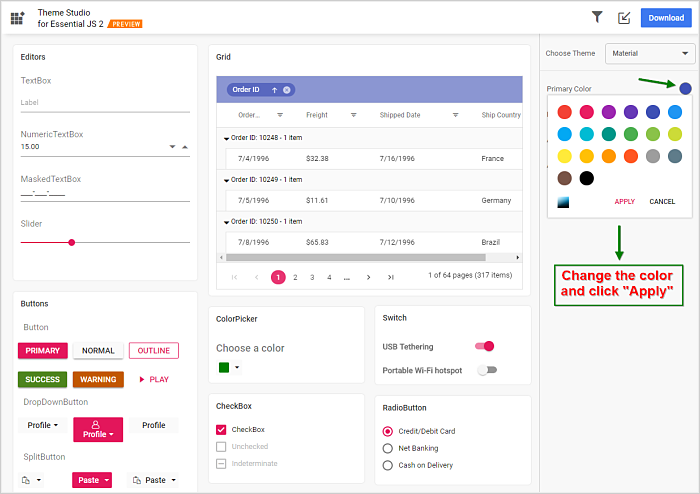
- Click the color pickers in the theme customization section to select your desired colors.
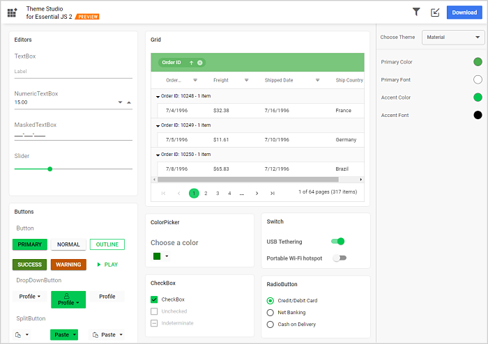
- After selecting colors with the color pickers, the Essential JS 2 components will have the newly selected colors applied to them in the components preview section.
Filtering a specific list of components
Using the theme studio, you can apply custom themes to a list of specific components. This option is useful when you have integrated a selective list of Essential JS 2 components in your application. The theme studio will filter the selected components and customize the final output for those components’ styles alone, reducing the final output file size. Let’s look at the filtering process in the theme studio.
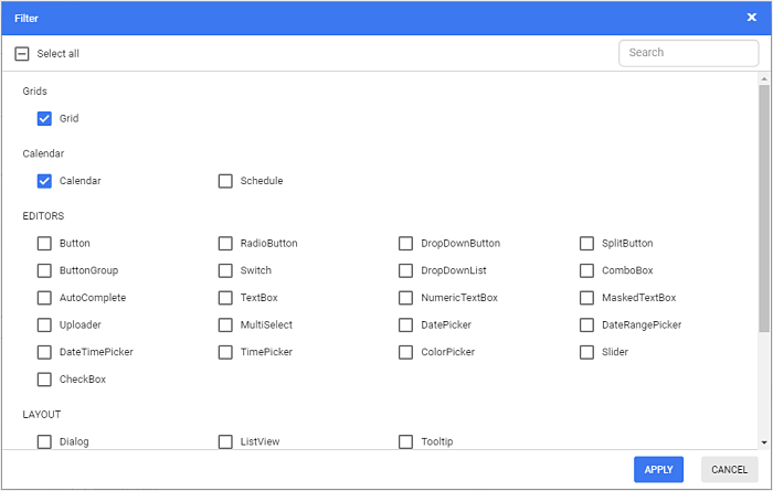
- Click the Filter icon in the top right corner and select the components whose theme you want to customize.
- Click the Apply button in the Filter dialog. Now, only the selected components will be rendered in the components preview section.
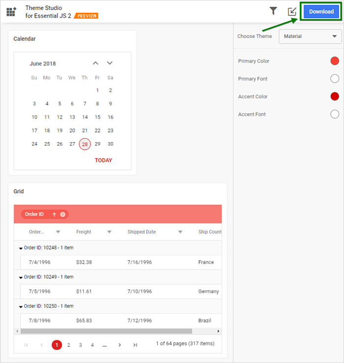
- Now you can customize the colors in the theme customization section for the components you selected.

Download the customized theme
You can download the custom styles after customizing the theme colors. Let’s look at the process of downloading styles in the theme studio.
- Click the Download button in the top right corner. The Download dialog will open.
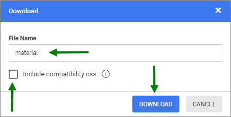
- Assign a theme name in the File Name field and click the Download button. If your application uses both Essential JS 1 and Essential JS 2 components, then select the Include compatibility CSS check box before downloading the theme. This option will generate the custom theme for Essential JS 2 compatibility styles, which are compatible as Essential JS 1 styles.
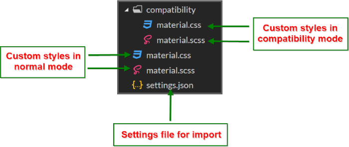
- The downloaded styles will come as a zip file that contains SCSS and CSS files for the selected Essential JS 2 components. The current settings are stored in the settings.json file.
Import previously changed settings into the theme studio
When you want to change your application theme and UI design in the future, you won’t need to customize the Essential JS 2 components from scratch in the theme studio. Just import the old settings.json file to review and update your stored settings in the theme studio application.
Let’s check out the process of importing themes in the theme studio.
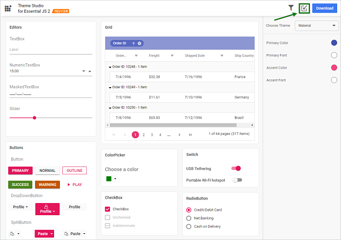
- Click the Import icon in the top right corner.
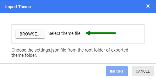
- The Import Theme dialog will open. Click the Browse button and select a settings.json file you exported previously.
- Click the Import button.
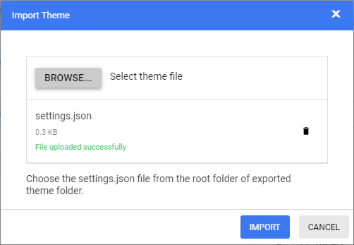
- The stored data will be reflected in the theme studio application. Now you can change the theme colors based on your latest design and export the theme again.
- The exported file will contain your latest changes. You can just replace the older custom style with the newer one to refresh your application.
Summary
In this blog, we have learned how to customize the Essential JS 2 theme styles in the theme studio application and how to use its main functionalities. Feel free to use the theme studio application any time, and refer to the theming and themestudio documentation for more details about Essential JS 2 theming and its customization.
If you have any questions or require clarifications, please let us know in the comments section below. You can also contact us through our support forum or Direct-Trac. We are happy to assist you!
If you like this blog post, we think you’ll also like the following free e-books:
Comments (2)
Where do you put the generated file in an Angular project? And how do you apply it?
Hi Gez,
Thanks for your interest in Syncfusion products.
You can copy/paste the generated CSS file in your Angular project and add its relative path reference to the “styles” option in angular.json file to apply it. Please refer the below Angular CLI getting started documentation for further details.
https://ej2.syncfusion.com/angular/documentation/getting-started/angular-cli.html#adding-css-reference
Regards,
Ajith R