
 Jegan R
The CheckedListBox control is a list box containing items that can be checked and unchecked individually. Creating your own CheckedListBox based on MS ListBox seems to be easy in the WPF platform. However, Syncfusion’s CheckedListBox comes with additional functionalities like grouping, virtualization, binding checked items to a collection or a property, checking a group of items, and theming.
Let’s get started with CheckedListBox.
Add items
First, we need to add items to the CheckedListBox control. You can add any number of items, just like with a normal ItemsControl.
Here, we’re going to add employees’ details as the items in the CheckedListBox control.
- Create a model.
//Model.cs public class Employee { public string Name { get; set; } public int Age { get; set; } public DateTime DOB { get; set; } } //EmployeesCollection.cs public class EmployeesCollection : ObservableCollection<Employee> { } - Create a view model.
//ViewModel.cs public class ViewModel : NotificationObject { private EmployeesCollection employeesCollection; public EmployeesCollection EmployeesCollection { get { return employeesCollection; } set { employeesCollection = value; RaisePropertyChanged("EmployeesCollection"); } } } - Populate employee collection.
public ViewModel() { EmployeesCollection = GetEmployeeData(); GroupDescriptions = new ObservableCollection<GroupDescription>(); } private EmployeesCollection GetEmployeeData() { return new EmployeesCollection() { new Employee { Name="Daniel", DOB = new DateTime(1983,2,15), Age=37 }, new Employee { Name="James", DOB = new DateTime(1988,6,29), Age=32}, new Employee { Name="Michael", DOB = new DateTime(1987,6,10), Age=33}, new Employee { Name="Daniel", DOB = new DateTime(1980,8,23), Age=40 }, new Employee { Name="John", DOB = new DateTime(1990,12,22), Age=30 }, new Employee { Name="Paul", DOB = new DateTime(1997,4,8), Age=23 }, new Employee { Name="Mark", DOB = new DateTime(1994,8,5), Age=26 }, new Employee { Name="George", DOB = new DateTime(1998,10,1), Age=22 }, new Employee { Name="Daniel", DOB = new DateTime(1998,10,1), Age=24 }, new Employee { Name="Thomes", DOB = new DateTime(1995,10,8), Age=25 }, new Employee { Name="Steven", DOB = new DateTime(1982,12,15), Age=38 } }; } - Create an instance of CheckedListBox and bind the data to the ItemSource property. Use the DisplayMemberPath property to show the value of the Name property in the CheckListBoxItem.
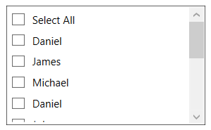
<Window x:Class="Custom_Grouping.MainWindow" xmlns="http://schemas.microsoft.com/winfx/2006/xaml/presentation" xmlns:x="http://schemas.microsoft.com/winfx/2006/xaml" xmlns:local="clr-namespace:Custom_Grouping" xmlns:syncfusion="http://schemas.syncfusion.com/wpf" Title="CheckListBox - Custom Grouping" Height="650" Width="400"> <Window.Resources> <!-- Define view model with group description --> <local:ViewModel x:Key="viewModel"/> </Window.Resources> <Grid> <syncfusion:CheckListBox ItemsSource="{Binding EmployeesCollection}" DataContext="{StaticResource viewModel}" DisplayMemberPath="Name" Name="checkListBox" Margin="20"/> </Grid> </Window> - When you run the application, you will see that all the items have a check box. You can check or uncheck these items. A Select All option is also available to select or clear all the items at once.
The following screenshot shows the output of the previous code example.
Access checked items
Next, let’s see how to access the checked items. We can expand the same example from before. In CheckedListBox, the checked items are maintained in the SelectedItems property, so we can bind it to a collection in the ViewModel:
- Create a collection to hold SelectedItems in the ViewModel.
private ObservableCollection<object> selectedEmployees; public ObservableCollection<object> SelectedEmployees { get { return selectedEmployees; } set { selectedEmployees = value; RaisePropertyChanged(nameof(SelectedEmployees)); } } - Bind SelectedItems property of the CheckedListBox with SelectedEmployees.
<syncfusion:CheckListBox DataContext="{StaticResource viewModel}" ItemsSource="{Binding EmployeesCollection}" SelectedItems="{Binding SelectedEmployees}" DisplayMemberPath="Name" Name="checkListBox" Margin="20"/> - To check an item in the code-behind, add it to the SelectedItems property, so it will be updated in the UI.
public ViewModel()
    {
        EmployeesCollection = GetEmployeeData();
        SelectedEmployees = new ObservableCollection<object>();
        selectedEmployees.Add(employeesCollection[1]);
    }
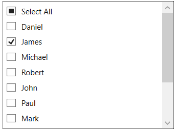
The following screenshot shows the selected item in the list of available items.
Sorting items
We can sort items based on any specific property in ascending or descending order using the SortDescriptions property:
- Add a property in the view model to control sort descriptions.
private SortDescriptionCollection sortDescriptions; public SortDescriptionCollection SortDescriptions { get { return sortDescriptions; } set { sortDescriptions = value; RaisePropertyChanged(nameof(SortDescriptions)); } } - Initialize sort descriptions.
public ViewModel() { SortDescriptions = new SortDescriptionCollection { new SortDescription("Name", ListSortDirection.Ascending) }; } - Bind the SortDescriptions property in the ViewModel to the SortDescriptions property in CheckedListBox.
<syncfusion:CheckListBox
                                DataContext="{StaticResource viewModel}"
                                ItemsSource="{Binding EmployeesCollection}"
                                SelectedItems="{Binding SelectedEmployees}"
                                SortDescriptions="{Binding SortDescriptions}"
                                DisplayMemberPath="Name"
                                Name="checkListBox"
                                Margin="20"/>
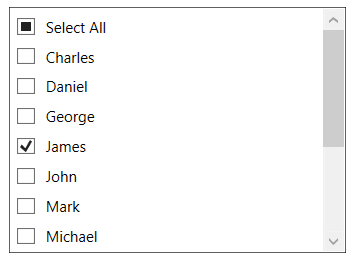
The following screenshot shows the employees’ names sorted in ascending order.
Grouping items
You can group items like in any other ItemsControl using the CollectionViewSource property. You can also do nested grouping and customize the value of grouping based on your desired converter.
Let’s try to group an object based on date, like we’ve seen in MS Excel filtering. Check boxes are also available for the groups, so you can check or uncheck all the items in the group:
- Add a property in the view model to control grouping, so that it can bound to the GroupDescriptions.
// ViewModel.cs public class ViewModel : NotificationObject { private ObservableCollection<GroupDescription> groupDescriptions; public ObservableCollection<GroupDescription> GroupDescriptions { get { return groupDescriptions; } set { groupDescriptions = value; RaisePropertyChanged(nameof(GroupDescriptions)); } } public ViewModel() { GroupDescriptions = new ObservableCollection<GroupDescription>() { new PropertyGroupDescription { PropertyName="DOB", Converter = new DateConverter{ Category = "Year" } }, new PropertyGroupDescription { PropertyName="DOB", Converter = new DateConverter{ Category = "Month" } } }; } } - Create a converter that can group dates based on the year and four quarters.
//Converter for custom grouping.
    public class DateConverter : IValueConverter
    {
        public string Category { get; set; }

        public object Convert(object value, Type targetType,
            object parameter, CultureInfo culture)
        {
            DateTime dob;
            DateTime.TryParse(value.ToString(), out dob);

            // Group based on decade
            if (Category == "Year")
            {
                var year = dob.Year / 10 * 10;
                return string.Format("Birth Year({0} - {1})", year, year + 9);
            }

            // Group base on Quarter
            else if (Category == "Month")
            {
                return "Quarter-" + ((dob.Month / 4) + 1);
            }
            return "Others";
        }

        public object ConvertBack(object value, Type targetType,
            object parameter, CultureInfo culture)
        {
            throw new NotImplementedException();
        }
    }
    <syncfusion:CheckListBox DataContext="{StaticResource viewModel}"
                                ItemsSource="{Binding EmployeesCollection}"
                                SelectedItems="{Binding SelectedEmployees}"
                                SortDescriptions="{Binding SortDescriptions}"
                                GroupDescriptions="{Binding GroupDescriptions}"
                                DisplayMemberPath="Name"
                                Name="checkListBox"
                                Margin="20"/>
All these functionalities are wrapped in a single example. You can download the sample from this GitHub repository.
Virtualization
The CheckedListBox by default supports virtualization. Virtualization is also supported when items are grouped or sorted in the CheckedListBox control, unlike the ListBox control. The CheckListBox class internally flattens groups into a single collection, which allows virtualization along with grouping options.
We’re going to create a new example and try the virtualization support now. We can add several items and see if some items are loaded faster. The CheckedListBox is virtualized by default, so no need to explicitly enable it.
    //Model.cs
    public class GroupItem
    {
            public string Name { get; set; }
            public string GroupName { get; set; }
    }

    //ViewModel.cs
    public class ViewModel : NotificationObject
    {
        private ObservableCollection<GroupDescription> groupDescriptions;
        private ObservableCollection<GroupItem> virtualCollection = new
                     ObservableCollection<GroupItem>();

        public ObservableCollection<GroupItem> VirtualCollection
        {
            get { return virtualCollection; }
            set
            {
                virtualCollection = value;
                RaisePropertyChanged("VirtualCollection");
            }
        }

        public ObservableCollection<GroupDescription> GroupDescriptions
        {
            get { return groupDescriptions; }
            set
            {
                groupDescriptions = value;
                RaisePropertyChanged("GroupDescriptions");
            }
        }

        public ViewModel()
        {
            GroupDescriptions = new ObservableCollection<GroupDescription>();

            //Define virtualisation items
            VirtualCollection = new ObservableCollection<GroupItem>();
            for (int i = 0; i < 1000; i++)
            {
                for (int j = 0; j < 10; j++)
                {
                    VirtualCollection.Add(
                        new GroupItem ()
                        {
                            Name = "Module " + i.ToString(),
                            GroupName = "Group" + j.ToString()
                        });
                }
            }
        }
    }
<Window x:Class="CheckListBox_Virtualization.MainWindow"
        xmlns="http://schemas.microsoft.com/winfx/2006/xaml/presentation"
        xmlns:x="http://schemas.microsoft.com/winfx/2006/xaml"
        xmlns:local="clr-namespace:CheckListBox_Virtualization"
        xmlns:syncfusion="http://schemas.syncfusion.com/wpf"
        Width="400" Height="600" Title="CheckListBox - Virtualisation" >
    <Window.Resources>

         <!-- Define view model with group description -->
        <local:ViewModel x:Key="viewModel">
            <local:ViewModel.GroupDescriptions>

                <!-- Define group details -->
                <PropertyGroupDescription PropertyName="GroupName" />
            </local:ViewModel.GroupDescriptions>
        </local:ViewModel>
    </Window.Resources>
    <Grid>
        <syncfusion:CheckListBox ItemsSource="{Binding VirtualCollection}"
                                 GroupDescriptions="{Binding GroupDescriptions}"
                                 DataContext="{StaticResource viewModel}"
                                 DisplayMemberPath="Name"
                                 Name="checkListBox"
                                 Margin="20">
        </syncfusion:CheckListBox>
    </Grid>
</Window>
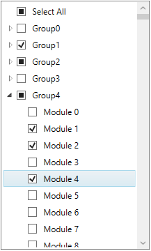
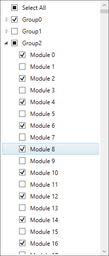
After adding ten thousand items with grouping, the items are loaded normally without any delay. This is because we are loading only the items in the view.
The following screenshot shows the output with grouping and virtualization support in it.
You can download this project from this GitHub repository.
Check or uncheck using a property in model
Earlier, we saw how to maintain checked items using a collection. Now, let’s see how to bind individual items with a Boolean property in a model to check them.
There is one limitation when using this approach. During virtualization, views will not be loaded, so it does not know the state of the ViewModel. Hence, CheckedListBox.SelectedItems will not be synchronized.
However, you can turnoff virtualization if you want the selected items to be in sync with the Boolean property in the ViewModel. For this, follow these steps:
- Add a Boolean property in the Model to bind the checked state.
//Model.cs public class GroupItem { public string Name { get; set; } public string GroupName { get; set; } public bool IsChecked { get; set; } } - Set the checked status of items when the instance of CheckedListBox is created.
//ViewModel.cs public class ViewModel : NotificationObject { public ViewModel() { GroupDescriptions = new ObservableCollection<GroupDescription>(); VirtualCollection = new ObservableCollection<GroupItem>(); for (int i = 0; i < 1000; i++) { for (int j = 0; j < 10; j++) { GroupItem myitem = new GroupItem() { Name = "Module " + i.ToString(), GroupName = "Group" + j.ToString() }; if (i % 2 == 0) { //Define a checked state for items myitem.IsChecked = true; } VirtualCollection.Add(myitem); } } } } - Bind the IsChecked state and disable the virtualization by changing it to the items panel property.
<syncfusion:CheckListBox ItemsSource="{Binding VirtualCollection}" GroupDescriptions="{Binding GroupDescriptions}" DataContext="{StaticResource viewModel}" DisplayMemberPath="Name" Name="checkListBox" Margin="20"> <!--Binding the IsChecked property from ViewModel--> <syncfusion:CheckListBox.ItemContainerStyle> <Style TargetType="syncfusion:CheckListBoxItem"> <Setter Property="IsChecked" Value="{Binding Mode=TwoWay, Path=IsChecked}"/> </Style> </syncfusion:CheckListBox.ItemContainerStyle> <!--Disable the Virtualization to update the checked item--> <syncfusion:CheckListBox.ItemsPanel> <ItemsPanelTemplate> <StackPanel/> </ItemsPanelTemplate> </syncfusion:CheckListBox.ItemsPanel> </syncfusion:CheckListBox> - We can see items that are loaded based on their checked status in the ViewModel in the following screenshot.
You can download this sample from this GitHub repository.
Other ways to check items
There are several ways to check items. Let me summarize the ways you can do it:
- Using your mouse
- Click on item to toggle checked state.
- You can also check a group or select all to check or uncheck a group of items.
- Using your keyboard
- When an item is selected, hit the Spacebar key to toggle checked state.
- Using API
- Add or remove items from the SelectedItems collection to check or uncheck items.
- Set the IsChecked property to true or false to check or uncheck items.
Conclusion
I hope you have a clear idea of our CheckedListBox control for WPF platform. Learn more from the feature tour and user guide pages. You can also download and try our examples for the CheckedListBox from this GitHub repository.
Try out our 90+ essential WPF controls like DataGrid, Chart, Diagram, and PDF Viewer to build powerful line-of-business Windows applications faster!
If you aren’t a Syncfusion customer yet, you can try our 30-day free trial to check out our features.
If you wish to send us feedback, please use the comments section below. If you would like to submit any questions, please feel free to contact us through our support forum, Direct-Trac, or feedback portal. We are always happy to assist you!


 No spam, just valuable updates.
Comments (4)
Can we search in CheckedListBox
Hi Manshi,
CheckedListBox does not have built-in search functionality. However, you can filter the items using CollectionViewSource, like what we do with any ItemsControl.
https://docs.microsoft.com/en-us/dotnet/framework/wpf/data/how-to-filter-data-in-a-view
https://docs.microsoft.com/en-us/dotnet/api/system.windows.data.collectionviewsource.filter?view=netcore-3.1
Binding the IsChecked property from ViewModel
You should add TwoWay.
This make things work
Hi Lech,
Thanks for notifying us. We will correct it.