
 Jayaleshwari N
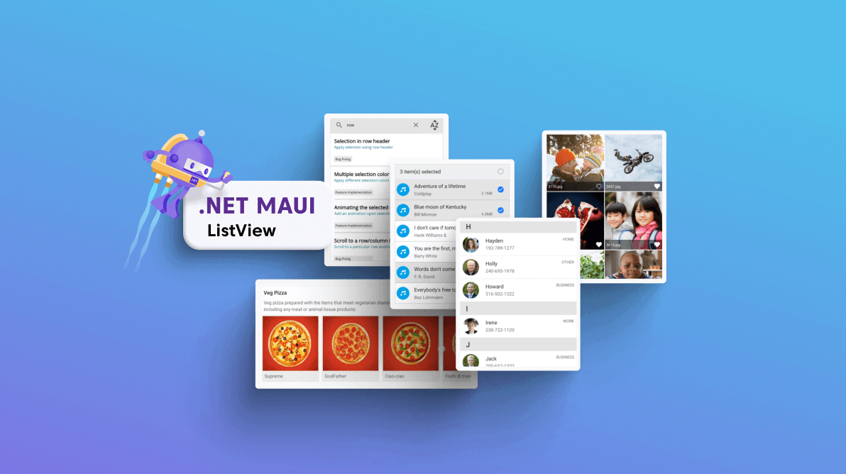
The Syncfusion .NET MAUI ListView component (SfListView) is used to display a list of data in a predefined or customized view. Data can be grouped, sorted, and filtered with ease. Key features include different layouts, item templating, horizontal orientation, sticky headers and footers, and selection with different modes and gestures.
This blog explains how to add the .NET MAUI ListView to your application and use its marvelous features with code examples.
Creating an application using the .NET MAUI ListView
Let’s create a simple .NET MAUI app with the ListView control.
Step 1: Create the ListView control.
First, create a new .NET MAUI application in Visual Studio.
Syncfusion .NET MAUI components are available on NuGet Gallery. To add the SfListView to your project, open the NuGet package manager in Visual Studio, and search for Syncfusion.MAUI.ListView, and then install it.
Then, import the control namespace Syncfusion.Maui.ListView in your XAML or C# code. Finally, initialize the .NET MAUI ListView.
Refer to the following code example.
<ContentPage . . .
 xmlns:syncfusion="clr-namespace:Syncfusion.Maui.ListView;assembly=Syncfusion.Maui.ListView">
  <syncfusion:SfListView/>
</ContentPage>
Step 2: Register the handler.
To use the .NET MAUI ListView control inside our app, we have to initialize the SfListView handler.
Refer to the following code.
using Microsoft.Maui.Hosting;
using Microsoft.Maui.Controls.Hosting;
using Syncfusion.Maui.ListView.Hosting;

namespace ListViewMaui
{
  public static class MauiProgram
  {
    public static MauiApp CreateMauiApp()
    {
      var builder = MauiApp.CreateBuilder();
      builder
       .UseMauiApp<App>()
       .ConfigureFonts(fonts =>
       {
         fonts.AddFont("OpenSans-Regular.ttf", "OpenSansRegular");
       });

      builder.ConfigureSyncfusionListView();
      return builder.Build();
    }
  }
}
Step 3: Bind data.
The .NET MAUI ListView is a data-bound control. Therefore, we have to create a data model to bind to it.
In our example, a simple shopping category has been modeled, which generates a list of shopping categories, each with its description and image. In a real-world scenario, you can bind data from services and databases to render in the ListView control.
Creating the data model
We are going to create a simple data source in a new class file and save it as CategoryInfo.cs. Refer to the following code.
public class CategoryInfo : INotifyPropertyChanged
{
  #region Fields
  private string name;
  private string desc;
  private ImageSource image;

  #endregion
  #region Constructor
  public CategoryInfo()
  {
  }

  #endregion
  #region Properties
  public string Name
  {
    get { return name; }
    set
    {
      name = value;
      OnPropertyChanged("Name");
    }
  }

  public string Description
  {
    get { return desc; }
    set
    {
      desc = value;
      OnPropertyChanged("Description");
    }
  }

  public ImageSource Image
  {
    get
    {
      return image;
    }

    set
    {
      image = value;
      OnPropertyChanged("Image");
    }
  }

  #endregion
  #region Interface Member
  public event PropertyChangedEventHandler PropertyChanged;
  public void OnPropertyChanged(string name)
  {
    if (this.PropertyChanged != null)
    this.PropertyChanged(this, new PropertyChangedEventArgs(name));
  }

  #endregion
}
ViewModel
Then, populate the model collection like in the following code example.
public class CategoryInfoRepository
{
  #region Constructor
  public CategoryInfoRepository()
  {
  }

  #endregion
  #region Properties
  internal ObservableCollection<CategoryInfo> GetCategoryInfo()
  {
    var categoryInfo = new ObservableCollection<CategoryInfo>();
    for (int i = 0; i < Names.Count(); i++)
    {
      var info = new CategoryInfo()
      {
        Name = Names[i],
        Description = Descriptions[i],
        Image = Images[i]
      };
      categoryInfo.Add(info);
    }
    return categoryInfo;
  }

  #endregion
  #region CategoryInfo
  string[] Names = new string[]
  {
    "Fashion",
    "Electronics",
    "Home & Kitchen",
    "Sports",
    "Kids",
    "Books",
    "Footware",
    "Mobile Phones & Accessories",
    "FlowerGiftCakes",
    "Watches",
    "Jewelry",
    "Food",
    "Perfumes",
    "Movies & Music",
    "Cameras & Accessories"
  };

  string[] Images = new string[]
  {
     "shopping.jpg",
     "electronics.jpg",
     "diningtable.jpg",
     "sports_health.jpg",
     "naughtyboy.jpg",
     "novels.jpg",
     "graycanvas.jpg",
     "mobile.jpg",
     "flowergiftcakes.jpg",
     "watches.jpg",
     "jewellery.jpg",
     "food.jpg",
     "perfumes.jpg",
     "brownguitar.jpg",
     "cameras.png"
  };

  string[] Descriptions = new string[]
  {
    "Latest fashion trends in online shopping for branded shoes, clothing, dresses, handbags, watches
     and more for men and women.",
    "Shop from a wide range of electronics like mobiles, laptops, tablets, cameras, TVs, LEDs, music
     systems, and much more.",
    "Purchase home and kitchen accessories like cookware, home cleaning, furniture, dining, etc.",
    "Buy sports equipment and accessories for badminton, cricket, football, swimming, tennis, gym,
     volleyball, hockey, etc. at the lowest price.",
    "Shop for kid's clothes, footwear, books, accessories, computer games, and toys for boys, girls,
     and infants.",
    "Purchase books online from millions of book titles across various categories at low prices. Read
     books online and download them as PDF.",
    "Buy footwear for men, women, and kids from a collection of formal shoes, slippers, casual shoes,
     sandals, and more at the best price.",
    "Buy branded mobile phones, SmartPhones, tablets, and mobile accessories like bluetooth,
     headsets, memory cards, charger, covers, etc.",
    "Buy different flowers, gifts, and cakes online for birthdays, anniversaries, Mother’s Day, et
     c.",
    "Latest range of trendy branded Digital & Analog watch, Digital Steel Watches, Digital LED
     Watches for men and women.",
    "Buy jewelry for men, women, and children from brands like Gitanjali, Tara, Orra, Sia Art
     Jewelry, Addons, Ayesha, Peora, etc.",
    "Shop from a wide range of best quality fruits, vegetables, health food, grocery, dry and frozen
     foods, etc.",
    "Choose the best perfumes from brands like Azzaro, Davidoff, CK, Axes, Good Morning, Hugo Boss,
     Jaguar, Calvin Klein, Antonio, etc.",
    "Buy a wide variety of movies in different languages and music in different formats like audio CD,
     DVD, MP3, etc.",
    "Buy cameras and accessories at the best prices. Choose cameras from popular brands like Nikon,
     Sony, Canon, and more accessories."
  };

  #endregion
}
Now, configure the populated data or data from services or databases to a ViewModel collection. The collection can be any widely used data source. Generally, we expect the ListView control to be responsive.
I prefer ObservableCollection for its internal INotifyCollectionChanged implementation. If the collection changes aren’t an issue, a generic List <T> object type can be used to hold the data, which is faster than an ObservableCollection.
Refer to the following code example.
public class ViewModel
{
  #region Fields
  private ObservableCollection<CategoryInfo> categoryList;

  #endregion
  #region Constructor
  public ViewModel()
  {
    GenerateSource();
  }

  #endregion
  #region Properties
  public ObservableCollection<CategoryInfo> CategoryList
  {
     get { return categoryList; }
     set { this.categoryList = value; }
  }

  #endregion
  #region Generate Source
  private void GenerateSource()
  {
    CategoryInfoRepository categoryinfo = new CategoryInfoRepository();
    categoryList = categoryinfo.GetCategoryInfo();
  }

  #endregion
}
Now, we can bind the ViewModel’s CategoryList collection to the .NET MAUI ListView control on the XAML page.
<ContentPage xmlns="http://schemas.microsoft.com/dotnet/2021/maui"
             xmlns:x="http://schemas.microsoft.com/winfx/2009/xaml"
             x:Class="ListViewMaui.MainPage"
             xmlns:syncfusion="clr-
             namespace:Syncfusion.Maui.ListView;assembly=Syncfusion.Maui.ListView"
             xmlns:local="clr-namespace:ListViewMaui"
             BackgroundColor="White">
 <ContentPage.BindingContext>
  <local:ListViewMauiViewModel/>
 </ContentPage.BindingContext>
 <syncfusion:SfListView x:Name="listView"
                          ItemsSource="{Binding CategoryList}"
 </syncfusion:SfListView>
</ContentPage>
Defining ItemTemplate
Once the ItemsSource is bound, the ListView control will display only the business object (like CategoryInfo) as the content of the ListView items. We can update them by defining the ItemTemplate.
By defining the ItemTemplate, you can easily set custom views to display the data items.
<syncfusion:SfListView x:Name="listView"
                         ItemsSource="{Binding CategoryList}"
                         Padding="0,5,0,5"
                         SelectionMode="None"
                         Background="#f2f2f1"
                         ItemSpacing="5,3,5,3"
                         ItemSize="{OnPlatform Android=105, Default=100}">
 <syncfusion:SfListView.ItemTemplate>
  <DataTemplate>
   <Grid  BackgroundColor="White" Padding="1">
    <Grid.RowDefinitions>
     <RowDefinition Height="{OnPlatform Android=105, Default=100}"/>
    </Grid.RowDefinitions>
    <Grid.ColumnDefinitions>
     <ColumnDefinition Width="{OnPlatform Android=105, Default=100}" />
     <ColumnDefinition Width="Auto" />
    </Grid.ColumnDefinitions>

    <Image Grid.Column="0" Grid.Row="0" Source="{Binding Image}" HorizontalOptions="FillAndExpand" VerticalOptions="FillAndExpand" HeightRequest="{OnPlatform Android=105, Default=100}" WidthRequest="{OnPlatform Android=105, Default=100}" Aspect="Fill"/>

    <Grid Grid.Row="0" Grid.Column="1" Padding="10,0,0,0">
     <Grid.RowDefinitions>
      <RowDefinition Height="Auto"/>
      <RowDefinition Height="Auto"/>
     </Grid.RowDefinitions>
     <Label Grid.Row="0" Text="{Binding Name}" Margin='{OnPlatform Default="0,5,0,0", Android="0"}' LineBreakMode="WordWrap" TextColor="#DE000000" FontFamily="Roboto-Medium" FontSize="{OnPlatform Android={OnIdiom Phone=15, Tablet=22}, iOS=16, UWP=16}" />
     <Label Grid.Row="1" LineBreakMode="WordWrap" Margin='{OnPlatform Android="0,5,5,0", Default="0,5,0,0"}' TextColor="#99000000" LineHeight="1.2" Text="{Binding Description}" FontFamily="Roboto-Regular" FontSize="{OnPlatform Android={OnIdiom Phone=13, Tablet=13}, iOS=14, UWP=14}" />
    </Grid>
   </Grid>
  </DataTemplate>
 </syncfusion:SfListView.ItemTemplate>
</syncfusion:SfListView>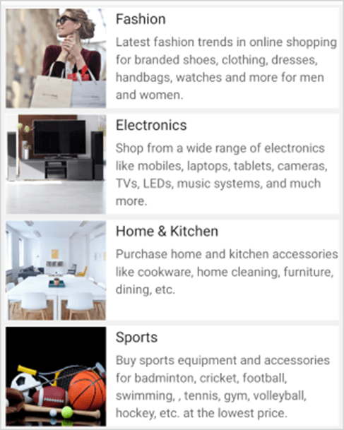
We have seen how to get started. Now, let’s see the marvelous features of the .NET MAUI ListView control.
Different layouts
The ListView control supports different layouts, such as linear and grid. The linear layout arranges items in a single column. The grid layout arranges items in a predefined number of columns defined by the SpanCount property of the GridLayout.
The SfListView.ItemsLayout property is used to define the layout of the ListView control. The LinearLayout is the default layout.
Refer to the following code example.
<ContentPage xmlns="http://schemas.microsoft.com/dotnet/2021/maui"
             xmlns:syncfusion="clr-namespace:Syncfusion.Maui.ListView;assembly=Syncfusion.Maui.ListView"
             xmlns:local="clr-namespace:ListViewMaui">
 <ContentPage.BindingContext>
  <local:ListViewMauiViewModel/>
 </ContentPage.BindingContext>

 <syncfusion:SfListView x:Name="listView"
                          ItemsSource="{Binding CategoryList}"
                          Padding="0,5,0,5"
                          AutoFitMode="Height"
                          SelectionMode="None"
                          Background="#f2f2f1"
                          ItemSpacing="5,3,5,3" >
  <syncfusion:SfListView.ItemsLayout>
   <syncfusion:GridLayout SpanCount="2">
   </syncfusion:GridLayout>
  </syncfusion:SfListView.ItemsLayout>

  <syncfusion:SfListView.ItemTemplate>
   <DataTemplate>
    <Grid Padding="10,0,0,0">
     <Grid.RowDefinitions>
      <RowDefinition Height="Auto"/>
      <RowDefinition Height="Auto"/>
     </Grid.RowDefinitions>
     <Label Grid.Row="0" Text="{Binding Name}" Margin='{OnPlatform Default="0,5,0,0", Android="0"}' LineBreakMode="WordWrap" TextColor="#DE000000" FontFamily="Roboto-Medium" FontSize="{OnPlatform Android={OnIdiom Phone=15, Tablet=22}, iOS=16, UWP=16}" />
     <Label Grid.Row="1" LineBreakMode="WordWrap" Margin='{OnPlatform Android="0,5,5,0", Default="0,5,0,0"}' TextColor="#99000000" LineHeight="1.2" Text="{Binding Description}" FontFamily="Roboto-Regular" FontSize="{OnPlatform Android={OnIdiom Phone=13, Tablet=13}, iOS=14, UWP=14}" />
    </Grid>
   </DataTemplate>
  </syncfusion:SfListView.ItemTemplate>
 </syncfusion:SfListView>
</ContentPage>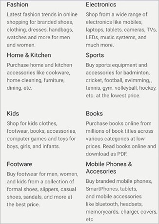
Sorting
You can display the list items in either ascending or descending order. You can also sort the items with custom logic using the SfListView.DataSource.SortDescriptors property.
Refer to the following code example.
<ContentPage xmlns=”http://schemas.microsoft.com/dotnet/2021/maui”
             xmlns:x=”http://schemas.microsoft.com/winfx/2009/xaml”
             x:Class=”ListViewMaui.MainPage”
             xmlns:syncfusion=”clr-namespace:Syncfusion.Maui.ListView;assembly=Syncfusion.Maui.ListView”
             xmlns:data=”clr-namespace:Syncfusion.Maui.DataSource;assembly=Syncfusion.Maui.DataSource”
             xmlns:local=”clr-namespace:ListViewMaui”>

 <syncfusion:SfListView x:Name=”listView”
                          ItemsSource=”{Binding CategoryList}”
                          Padding=”0,5,0,5”
                          AutoFitMode=”Height”
                          SelectionMode=”None”
                          Background=”#f2f2f1”
                          ItemSpacing=”5,3,5,3” >
  <syncfusion:SfListView.DataSource>
   <data:DataSource>
    <data:DataSource.SortDescriptors>
     <data:SortDescriptor PropertyName=”Name” Direction=”Ascending”/>
    </data:DataSource.SortDescriptors>
   </data:DataSource>
  </syncfusion:SfListView.DataSource>
 </syncfusion:SfListView>
</ContentPage>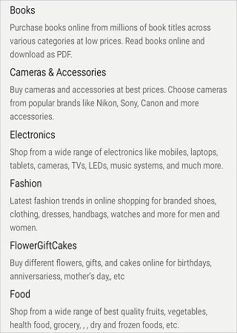
Filtering
Filter the list items and display only the required items by setting the predicate to the SfListView.DataSource.Filter property. Call the DataSource.RefreshFilter method after assigning the Filter property to refresh the view. Also, the ListView control supports dynamic filtering.
Refer to the following code example.
Public partial class MainPage : ContentPage
{
  private void OnFilterTextChanged(object sender, TextChangedEventArgs e)
  {
    searchBar = (sender as SearchBar);
    if (listView.DataSource != null)
    {
       this.listView.DataSource.Filter = FilterContacts;
       this.listView.DataSource.RefreshFilter();
    }
  }
  private bool FilterContacts(object obj)
  {
    if (searchBar == null || searchBar.Text == null)
      return true;

    var  categoryInfo = obj as CategoryInfo;
    if ( categoryInfo.Name.ToLower().Contains(searchBar.Text.ToLower())
          ||  categoryInfo.Description.ToLower().Contains(searchBar.Text.ToLower()))
      return true;
    else
      return false;
  }
}
Grouping
Group the list items by setting the GroupDescriptor property in one line of code using the SfListView.DataSource.GroupDescriptors property. You don’t have to make any changes to your ViewModel.
Refer to the following code example.
<ContentPage xmlns=”http://schemas.microsoft.com/dotnet/2021/maui”
             xmlns:x=”http://schemas.microsoft.com/winfx/2009/xaml”
             x:Class=”ListViewMaui.MainPage”
             xmlns:syncfusion=”clr-namespace:Syncfusion.Maui.ListView;assembly=Syncfusion.Maui.ListView”
             xmlns:data=”clr-namespace:Syncfusion.Maui.DataSource;assembly=Syncfusion.Maui.DataSource”
             xmlns:local=”clr-namespace:ListViewMaui”>

  <syncfusion:SfListView x:Name=”listView”
                           ItemsSource=”{Binding CategoryList}”
                           Padding=”0,5,0,5”
                           AutoFitMode=”Height”
                           SelectionMode=”None”
                           Background=”#f2f2f1”
                           ItemSpacing=”5,3,5,3” >
   <syncfusion:SfListView.DataSource>
    <data:DataSource>
     <data:DataSource.GroupDescriptors>
      <data:GroupDescriptor PropertyName=”Name” />
     </data:DataSource.GroupDescriptors>
    </data:DataSource>
   </syncfusion:SfListView.DataSource>
 </syncfusion:SfListView>
</ContentPage>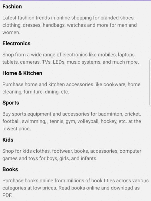
Selection
The .NET MAUI ListView control supports multiple selections. You can select more than one item in the list at a time. Enjoy different selection modes (none, single, single deselect, and multiple) and selection gestures (tap, double-tap, and hold).
Easily customize the appearance of selected items using the SfListView.SelectedItemTemplate property.
Refer to the following code example.
<syncfusion:SfListView x:Name=”listView”
                         ItemsSource=”{Binding CategoryList}”
                         SelectionMode=”Single”
                         SelectionGesture=”Tap”/>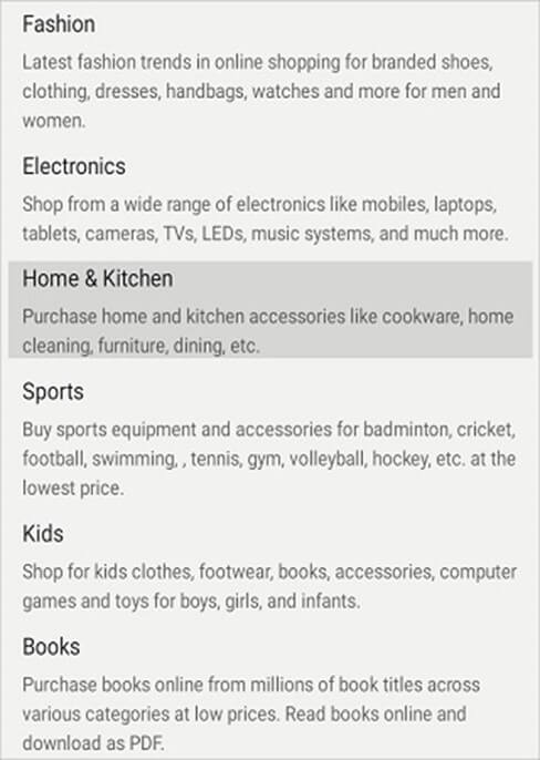
References
For more details, check out the .NET MAUI ListView documentation and demo on GitHub.
Summary
Thanks for reading! In this post, we have explored some of the features of Syncfusion’s .NET MAUI ListView control. It also supports LoadMore, header and footer, item size customization, and more features. Try out this user-friendly control and leave your feedback in the comments section below!
If you have questions, you can contact us through our support forums, support portal, or feedback portal. We are always happy to assist you!


 No spam, just valuable updates.
Comments (1)
hai madam i have error in our code this listview not event woking why ?
<!–
–>
<!—->