

Frequency distribution categorizes and positions input data in appropriate groups. This occurs in ranges for better statistical analysis. A pivot table is a type of component that allows users to categorize and view input data like in a frequency distribution table. You can group date, number, and text fields in a pivot table into ranges.
For example:
- We can group the birth rate around the world over the last three years, quarter by quarter (date type), into 2019 (Q1, Q2, Q3, Q4), 2020 (Q1, Q2, Q3, Q4), and 2021 (Q1, Q2, Q3, Q4).
- We can divide the world population into age groups (number type) such as 0-20, 21-40, 41-60, 60-and-above.
- We can also group populations of countries (string type) into the continents of North America, South America, Europe, Asia, Africa, and Australia.
In this blog, we will walk through how to group data into ranges with a real-time scenario.
Group data using date and time
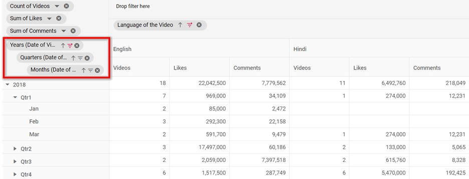
To begin with, we will group data based on date and time ranges. In this illustration, we will see YouTube videos published by a channel in English and Hindi and the number of likes and comments for them during specific time periods.
First, insert the Years field into the pivot table’s row axis, the Language of the Video field into the column axis, and Video URL (to get the number of videos), Likes, and Comments into the value axis.
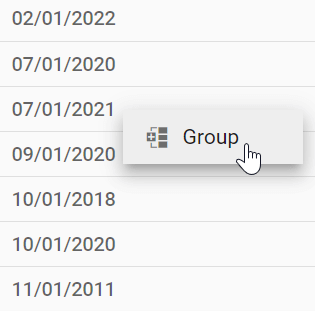
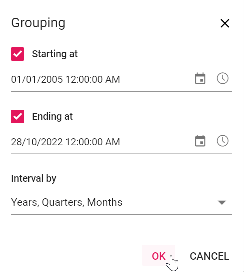
When you right-click on the Years field, a context menu with the option Group appears. When you select Group, a dialog appears in which you can enter the start and end dates, as well as the interval type. Since we are grouping by date type, the Interval dropdown will display the following options: years, quarters, months, days, hours, minutes, and seconds. As a result, we will get the following output.
Note: By default, the dates excluded from the date range will be grouped under the Out of Range category. We can also customize the name Out of Range.
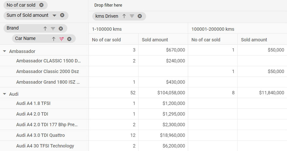
Group data using number type
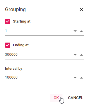
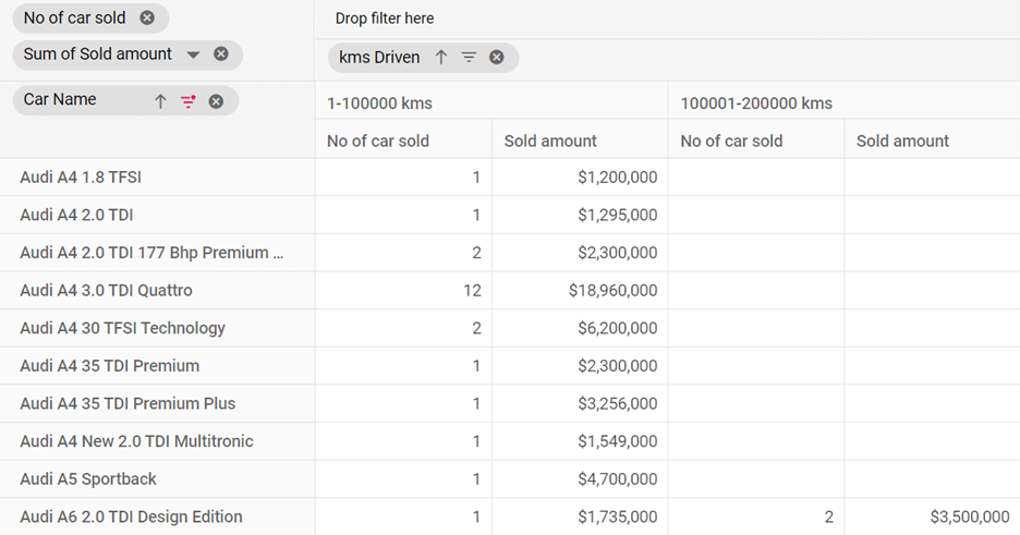
Following the date and time is the number type. In this illustration, we will see used car sales divided into ranges of kilometers driven for various car brands. To make the classification, the number of cars in these ranges are tabulated along with sales amount details: 0–100,000 kms, 100,001–200,000 kms, 200,001–300,000 kms, and greater than 300,000 kms.
To do this, insert the kms Driven field in the pivot table’s column axis, Car Name in the row axis, and No. of cars sold and Sold amount in the value axis.
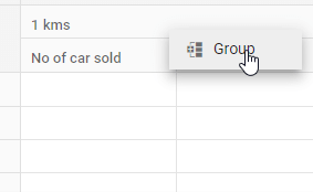
When you right-click the kms Driven field, a context menu with the Group option will appear. When you select Group, a dialog appears in which you can enter the start and end numbers, as well as the interval count. Refer to the following output images.
Note: By default, the numbers excluded will be grouped under the Out of Range category. The name Out of Range can be customized.
Group data by string type
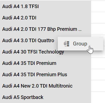
Finally, we’ll use the custom format to format the string data type. To illustrate this, we will return to the previous example of used car sales, where car names of string data type are grouped based on their brand name.
Insert the kms Driven field in the pivot table’s column axis, Car Name in the row axis, No. of cars sold and Sold amount in the value axis.
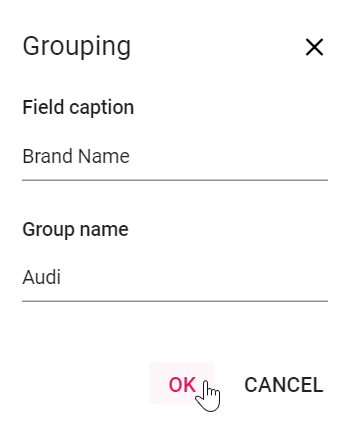
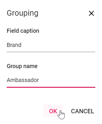
To group the custom format field members, select the appropriate header(s) by holding down the Ctrl or Shift key and right-clicking; a context menu with the option Group appears. When you select Group, a dialog box appears in which you can enter the field caption and group name. In our illustration, we enter Brand in the field caption and Audi in the group name, resulting in the creation of a new field, Brand, in the row axis on top of the Car Name field. And the selected header(s) are added to the group created under the group name Audi. We get the following output.

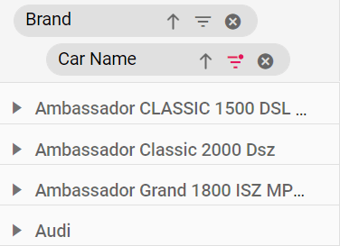
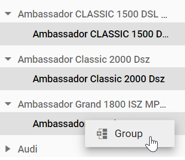
Audi car names are now grouped under one name, Audi, while other car names are listed under their names, such as Ambassador CLASSIC 1500 DSL AC, on top of Audi. You can group Ambassador cars under their brand. To do so, expand the appropriate headers and select the car names. As usual, right-click and select Group. Retype Brand in the field caption and Ambassador in the group name.
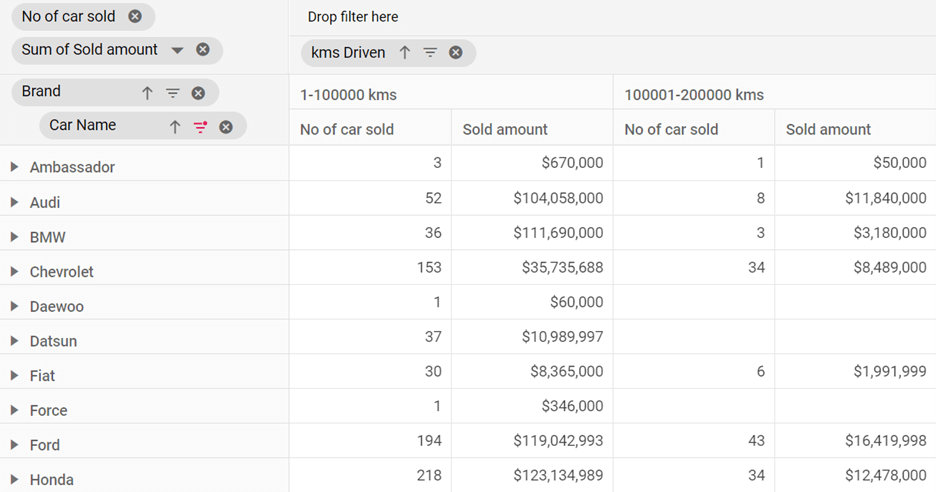
You can do the same for all other car names, and the end result is shown in the following images.
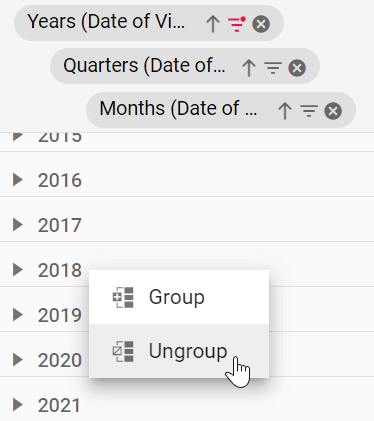
Ungrouping
You can ungroup applied date, number, and string grouping by right-clicking the appropriate header and selecting Ungroup from the context menu in the Pivot Table.
Editing groups
You can edit the date- and number-based grouping by right-clicking and selecting Group from the context menu. The existing grouping information is preserved (state persisted) and we can modify that at any time.
In the case of a custom format, such as string, we have to remove the newly created field, and restart grouping from the beginning. There is no direct edit or modify option for the custom format.
Documentation references
- TypeScript: Grouping in JavaScript Pivot Table control
- JavaScript: Grouping in JavaScript Pivot Table control
- Angular: Grouping in Angular Pivot Table component
- React: Grouping in React Pivot Table component
- Vue: Grouping in Vue Pivot Table component
- ASP.NET Core: Grouping in ASP.NET Core Pivot Table control
- ASP.NET MVC: Grouping in ASP.NET MVC Pivot Table component

Conclusion
We hope this article gave you a better understanding of grouping data into ranges in the Pivot Table. Try it out and leave your feedback in the comments section.
Thanks for reading!
Our Pivot Table is available in our Blazor, ASP.NET (Core, MVC, Web Forms), JavaScript, Angular, React, and Vue component suites. Use it to organize and summarize business data elegantly in any application!
For existing customers, the newest version of Essential Studio® is available for download from the License and Downloads page. If you are not yet a Syncfusion customer, you can try our 30-day free trial to check out the available features.
For questions, you can contact us through our support forum, support portal, or feedback portal. We are always happy to assist you!
 No spam, just valuable updates.