
 Selva Ganapathy Kathiresan
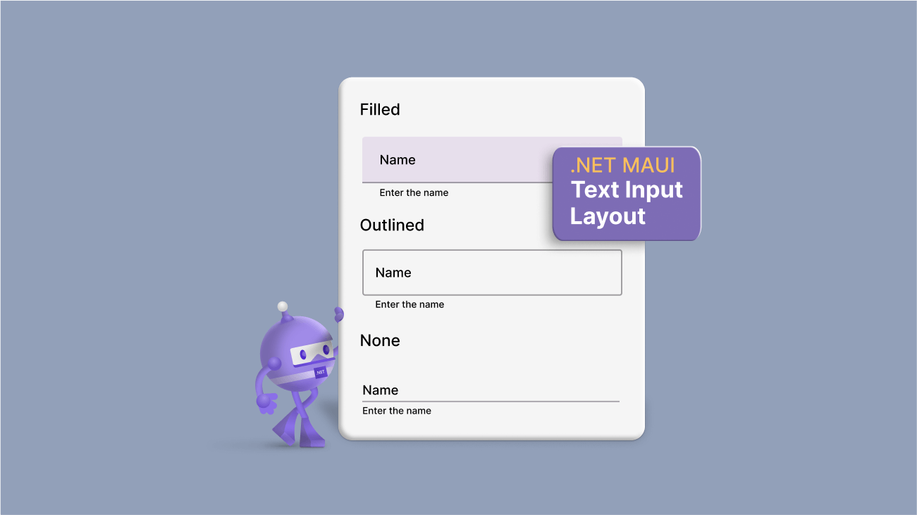
A text input layout control was one of the most-requested controls by our mobile app developers. We understand the requirement for this essential control and have now delivered the .NET MAUI Text Input Layout control in our 2022 Volume 4 release.
This control can be used to build UIs that require user input. It allows users to add floating labels, password toggle icons, leading and trailing icons, and assistive labels such as error messages and help text on top of the input controls. These features help improve the interface’s usability and make it easier for users to enter and submit information.
In this article, we will see the key features of the new .NET MAUI Text Input Layout and the steps to get started with it.
Key features
The .NET MAUI Text Input Layout supports numerous user-friendly features. Some of them are listed here.
- Supported input controls
- Container types
- Supported states
- Toggling password visibility
- Floating labels and hints
- Helper text
- Error text
- Leading and trailing icons
Supported input controls
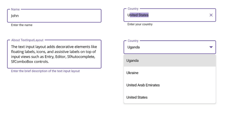
The .NET MAUI Text Input Layout control can enhance the appearance and functionality of the Syncfusion Autocomplete or ComboBox controls, and the Microsoft Entry and Editor controls in the .NET MAUI framework.
By wrapping these input views with the Text Input Layout, you can easily add assistive labels and icons to improve your app’s usability and visual appeal.
Container types
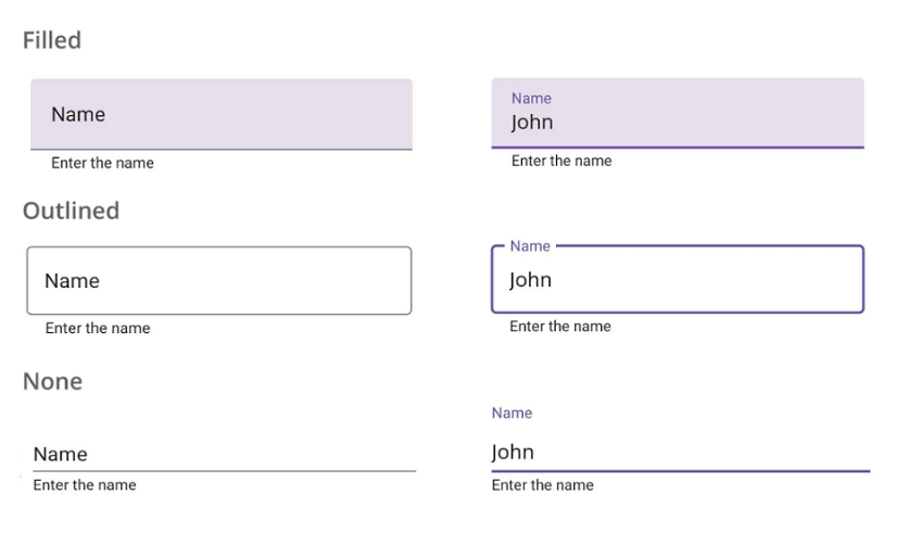
The .NET MAUI Text Input Layout supports the following container types:
- Filled: The background of the input view will fill with the container color, and the baseline stroke and thickness will change based on the state of the input view.
- Outlined: The container will be framed with a rounded border.
- None: The container will have an empty background and space around it.
Supported states
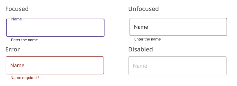
The .NET MAUI Text Input Layout supports the focused, unfocused, error, and disabled visual states.
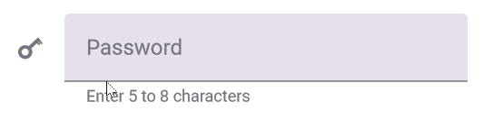
Toggling password visibility
You can enable the password toggle icon to show or hide a password interactively.
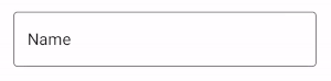
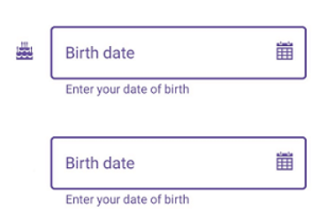
Floating labels and hints
Use the hint text feature to add placeholder text to the input view. This hint text will be displayed in the middle of the input view and will move to the top to become a floating label when the input field becomes active. This can help save space and avoid the need for additional titles.
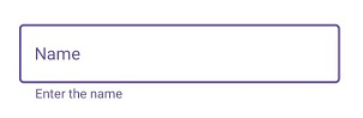
Helper text
In addition to the hint text, the Text Input Layout control also provides a helper text feature. It allows you to display additional information about the text that is expected to be entered. This can be useful for giving instructions or examples to help users understand how to correctly enter details in the input field.
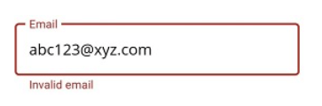
Error text
Use the error text feature to display error messages that assist users in solving validation errors. This can improve the usability of your app by providing clear feedback to users when there are problems with their input.
Leading and trailing icons
You can use leading icons to indicate the expected input type, such as a birth date, phone number, or password. These can help users understand the purpose of the input field and easily enter the appropriate information.
Trailing icons, on the other hand, can be used for various purposes, such as adding a clear button, error icon, voice input icon, or drop-down icon. These can improve the functionality of the input view and make it easier for users to interact with it.
Note: For more details, refer to the .NET MAUI Text Input Layout documentation.
Getting started with the .NET MAUI Text Input Layout control
We have seen the key features of the .NET MAUI Text Input Layout (SfTextInputLayout). Let’s see how to configure it with a floating label.
Step 1: First, create a .NET MAUI application.
Step 2: The Syncfusion .NET MAUI controls are available on NuGet Gallery. To add the .NET MAUI Text Input Layout control to your project, open the NuGet package manager in Visual Studio. Search for Syncfusion.Maui.Core and then install it.
Step 3: Now, register the handler for the Syncfusion core in the MauiProgram.cs file.
using Microsoft.Maui;
using Microsoft.Maui.Hosting;
using Microsoft.Maui.Controls.Compatibility;
using Microsoft.Maui.Controls.Hosting;
using Microsoft.Maui.Controls.Xaml;
using Syncfusion.Maui.Core.Hosting;
namespace TextInputLayoutSample
{
  public static class MauiProgram
  {
	public static MauiApp CreateMauiApp()
	{
		var builder = MauiApp.CreateBuilder();
		builder
		.UseMauiApp<App>()
		.ConfigureSyncfusionCore()
		.ConfigureFonts(fonts =>
		{
	           fonts.AddFont("OpenSans-Regular.ttf", "OpenSansRegular");
		});
		return builder.Build();
	 }
  }
}
Step 3: Add Syncfusion.Maui.Core namespace in your XAML page.
xmlns:inputLayout="clr-namespace:Syncfusion.Maui.Core;assembly=Syncfusion.Maui.Core"
Step 4:Then, add any input view control such as Entry, Editor, Autocomplete, or ComboBox to the Text Input Layout.
<inputLayout:SfTextInputLayout>
   <Entry />
</inputLayout:SfTextInputLayout>
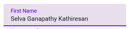
Step 5: Now, we can add the floating label for the Text Input Layout by setting the Hint property with the text you want to display as the label. You can also control the visibility of the hint by setting the ShowHint property as true or false. By default, it’s set to true to display the floating label.
Refer to the following code example.
<inputLayout:SfTextInputLayout Hint= "First Name">
   <Entry Text = "Selva Ganapathy Kathiresan"/>
</inputLayout:SfTextInputLayout>
Conclusion
Thanks for reading! In this blog, we’ve seen the features of the new .NET MAUI Text Input Layout control rolled out in the 2022 Volume 4 release. Information about our other new controls and features is available in our Release Notes and What’s New pages. Try them out and leave your feedback in the comments section below!
Download Essential Studio® for .NET MAUI to start evaluating them immediately.
If you have any questions or need further assistance, please don’t hesitate to contact us through our support forum, support portal, or feedback portal. We are always happy to help you!


 No spam, just valuable updates.