
 Sasi Kumar Arumugam
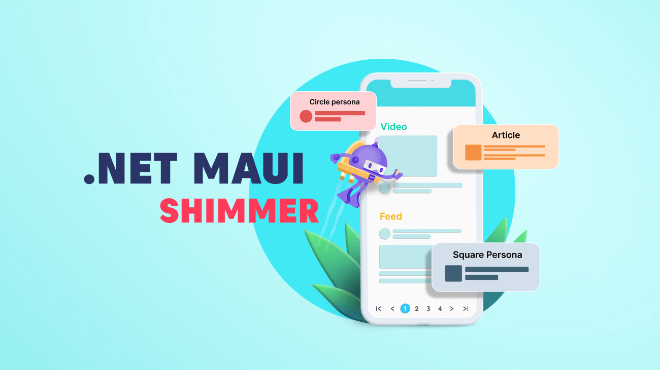
The user experience of an application begins from the moment it is launched until the user exits, and it plays a vital role in engaging the user. Therefore, ensuring an exemplary user interface is essential for any app.
Showing an empty screen while loading data in the background can mess up the user experience. Loading indicators help us make the app look responsive instead. In the Essential Studio® 2023 Volume 1 release, Syncfusion introduced a new loading indicator control in the .NET MAUI platform, the Shimmer control.
The new .NET MAUI Shimmer control provides a seamless user experience while the app fetches data from either local or remote sources. It works by showing a preview of the actual view displayed on the app rather than a loading animation. This helps us easily understand the loaded content while providing a more visually appealing user experience.
In this blog, we’ll see the key features of the .NET MAUI Shimmer control and the steps to get started with it.
Built-in shimmer effect views
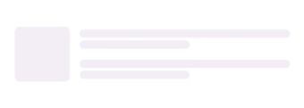
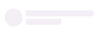
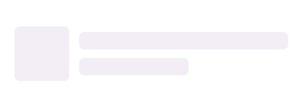
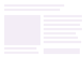
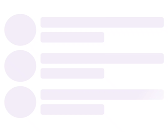
The .NET MAUI Shimmer control supports seven built-in shimmer effect views that can be assigned using the Type property. These shimmer types are: circle, square, profile, article, video, feed, and shopping. By default, the circle persona view is assigned to the control.
Each view has its unique shimmer effect, allowing developers to choose the one that best fits their app’s UI design. The flexibility of customizing the shimmer view according to specific requirements can help developers enhance their app’s overall user experience.
 |  |

 |  |
 |  |
Custom shimmer effect view
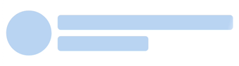
You can also easily create and integrate a custom shimmer effect view. To do so, set the CustomView property to the desired view, and then the shimmer effect will be applied. This will provide a more personalized and engaging user experience.
To customize the shape of the custom view, you can use the ShimmerView class with different ShapeTypes. It supports three shapes: rectangle, circle, and rounded rectangle. By default, the shape type is set to rectangle.
Customizing the shimmer view and its effects
Customizing the .NET MAUI Shimmer control is easy. You can adjust the color, wave color, wave width, repeat count, animation duration, and wave direction properties to create a shimmer effect that matches your app’s design.
For instance, you can set the repeat count to determine how often the shimmer effect should be rendered or change the wave direction to make the shimmer move horizontally or vertically. By experimenting with different combinations of properties, you can achieve a unique and eye-catching shimmer effect.
 |  |
 |  |
 |  |
Integrating .NET MAUI Shimmer control into your app
Note: Before proceeding, please refer to the .NET MAUI Shimmer control getting started documentation.
The .NET MAUI Shimmer is a content view that accepts any layout and shows it with a shimmer effect. The shimmer animation effect will be displayed if the IsActive property value is set to true, and either built-in or custom views can be used to define the shimmer animation view.
Refer to the following code example. In it, we have used the Article shimmer effect type.
<ContentPage
    . . .
 xmlns:shimmer="clr-namespace:Syncfusion.Maui.Shimmer;assembly=Syncfusion.Maui.Core">

 <shimmer:SfShimmer x:Name="Shimmer" Type="Article">
  <Grid>
    …
  </Grid>
 </shimmer:SfShimmer>

</ContentPage>

Conclusion
Thanks for reading! The Syncfusion .NET MAUI Shimmer is a powerful tool for enhancing your app’s user experience. By using its built-in views or creating custom views, you can add a shimmer effect to any view and make it more visually appealing. With its various customization options, you can tailor the shimmer effect to fit your specific design needs.
This control is available in our 2023 Volume 1 release. Check out our Release Notes and What’s New pages to see the other new updates in this release.
Also, try our .NET MAUI control demos on GitHub and share your feedback or ask questions in the comments section below. If you are not a Syncfusion customer, try our 30-day free trial to see how our components can enhance your projects.


 No spam, just valuable updates.