

Welcome to our Chart of the Week blog series!
Today, we’ll create a customized column chart to visualize the top insurance companies in the USA using the Syncfusion .NET MAUI Column Chart. This control is supported on desktop (Windows and Mac) and mobile platforms (Android and iOS).
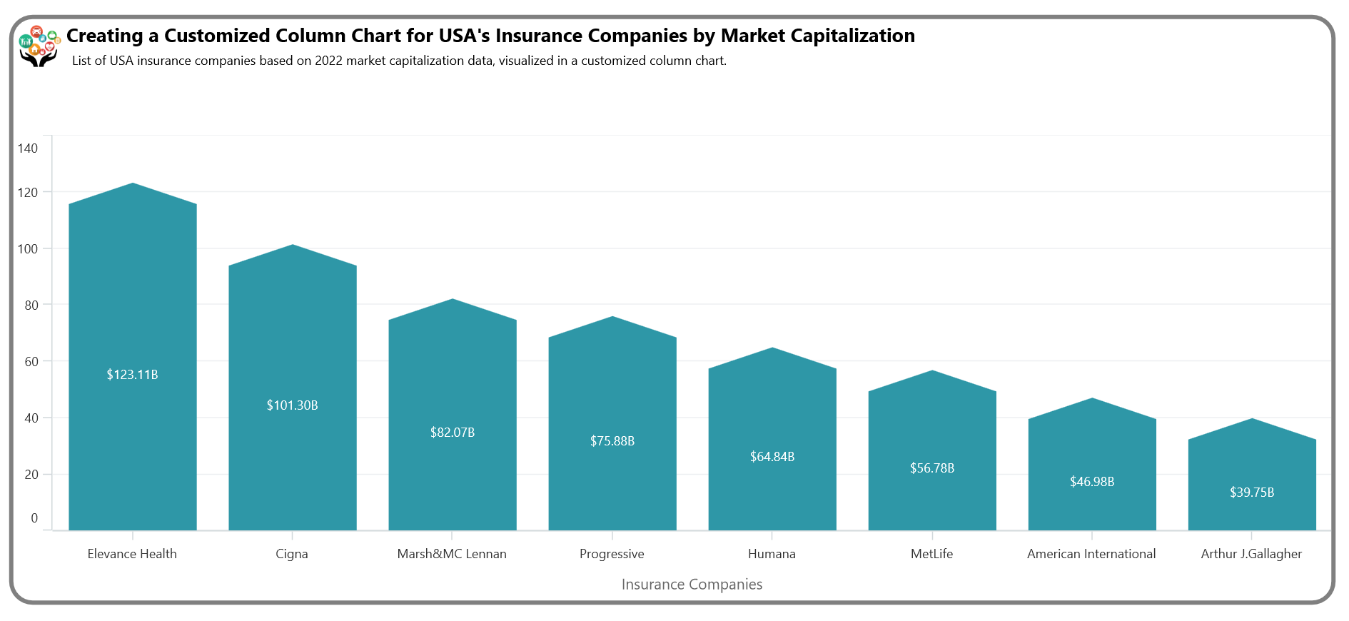
A column chart is a data visualization tool where categories are represented in the form of vertical columns. In this case, the column chart has been customized to represent the top insurance companies in the USA based on their 2022 market capitalization.
 Let’s get started!
Step 1: Collect data on top insurance companies
First, let’s gather data on the names of the leading insurance companies in the USA and their corresponding market capitalizations for the year 2022 from the CompaniesMarketCap website. Click on each company’s name to retrieve the yearly market capitalization data and collect the values for the year 2022.
Step 2: Prepare data for the chart
Create an InsuranceCompany model class that includes properties for storing information about companies and their market capitalization in the USA.
Refer to the following code example.
public class InsuranceCompany
{
    public string CompaniesName { get; set; }
    public double MarketCapitalization { get; set; }

    public InsuranceCompany(string name, double capitalization)
    {
        CompaniesName = name;
        MarketCapitalization = capitalization;
    }
}
Next, configure the ViewModel class to create a collection of insurance companies along with their market capitalizations and store it in an observable collection using the InsuranceCompaniesList property.
Refer to the following code example.
public class InsuranceCompaniesViewModel
{
    public ObservableCollection<InsuranceCompany> InsuranceCompaniesList { get; set; }

    public InsuranceCompaniesViewModel()
    {
        InsuranceCompaniesList = new ObservableCollection<InsuranceCompany>
        {
             new InsuranceCompany("Elevance Health",123.11),
             new InsuranceCompany("Cigna",101.30),
             new InsuranceCompany("Marsh&MC Lennan",82.07),
             new InsuranceCompany("Progressive",75.88),
             new InsuranceCompany("Humana",64.84),
             new InsuranceCompany("MetLife",56.78),
             new InsuranceCompany("American International",46.98),
             new InsuranceCompany("Arthur J.Gallagher",39.75),
         };
    }
}
Step 3: Define layout
Define the layout using a Border element. Inside the border, utilize a Grid to place the chart elements.
Refer to the following code example.
<Border StrokeShape="RoundRectangle 20"
                StrokeThickness="4"
                Stroke="Gray"
                Margin="20">

<Grid RowDefinitions="2*,8*">

<!--Align Header-->
<Grid Grid.Row="0"
         ColumnDefinitions="50,*" RowDefinitions="50,*">
</Grid>

</Grid>
</Border>
Step 4: Configuring the Syncfusion .NET MAUI Charts
Let’s configure the Syncfusion .NET MAUI Cartesian Charts control using this documentation.
Refer to the following code example.
<chart:SfCartesianChart Grid.Row="1">

 <chart:SfCartesianChart.XAxes>
    <chart:CategoryAxis />
 </chart:SfCartesianChart.XAxes>

 <chart:SfCartesianChart.YAxes>
    <chart:NumericalAxis />
 </chart:SfCartesianChart.YAxes>
</chart:SfCartesianChart>
Step 5: Bind data to the chart
Use Syncfusion’s ColumnSeries instance to visualize the list of top insurance companies. In this case, we want a customized column chart. Therefore, in the code behind, initialize the column chart and segment accordingly.
Refer to the following code example.
public class ColumnSeriesExt : ColumnSeries
{

}
public class ColumnSegmentExt : ColumnSegment
{

}
Utilize a customized column instance to bind the data to the chart. Bind the InsuranceCompaniesList collection to the ItemSource property. The XBindingPath and YBindingPath properties should be associated with the CompaniesName and MarketCapitalization properties, respectively. These bindings indicate the data points to be used for the x-axis and y-axis values.
<chart:SfCartesianChart  Grid.Row="1">
 <model:ColumnSeriesExt ItemsSource="{Binding InsuranceCompaniesList}"
                        XBindingPath="CompaniesName"
                        YBindingPath="MarketCapitalization">
 </model:ColumnSeriesExt>
</chart:SfCartesianChart>
Step 6: Customize the column chart
Refer to the following code example. In it, the ColumnSeriesExt class extends the standard ColumnSeries and overrides the CreateSegment method. This method is crucial as it dictates the creation of a custom ColumnSegmentExt instance, enabling the chart to display specialized segments.
The ColumnSegmentExt class, which inherits from ColumnSegment, holds the drawing logic for the custom column shape. The Draw method within this class utilizes PathF to define shapes: a rectangle with a triangle top.
public class ColumnSeriesExt : ColumnSeries
{
    protected override ChartSegment CreateSegment()
    {
        return new ColumnSegmentExt();
    }
}

public class ColumnSegmentExt : ColumnSegment
{
    protected override void Draw(ICanvas canvas)
    {
          // Create a path rectangle with a triangle top.
          var path = new PathF();
          path.MoveTo(Left, Bottom);
          path.LineTo(Right, Bottom);
          path.LineTo(Right, Top + 20);
          path.LineTo((Left + Right) / 2, Top);
          path.LineTo(Left, Top + 20);
          path.Close();

          var color = (Fill is SolidColorBrush brush) ? brush.Color : Colors.Transparent;
          canvas.FillColor = color;
          canvas.FillPath(path);

     }
}
Step 7: Customize the chart appearance
Let’s enhance the visual appeal of the chart and its elements for better readability.
Customizing the title
Refer to the following example to customize the chart title.
<!--Align Header-->
 <Grid Grid.Row="0" ColumnDefinitions="50,*" RowDefinitions="50,*">
     <Image Grid.RowSpan="1" Grid.Column="0" Source="insurancelogo.png"
                 HeightRequest="40"
                 WidthRequest="40"
                 Margin="8"/>
     <VerticalStackLayout Grid.Row="0" Grid.Column="1">
       <Label Text="Creating a Customized Column Chart for USA's Insurance Companies by Market Capitalization"
            TextColor="Black"
            FontSize="18"
            FontFamily="TimeSpan"
            FontAttributes="Bold"
            Margin="0,5,0,0"/>

       <Label Text="List of USA insurance companies based on 2022 market capitalization data, visualized in a customized column chart."
            TextColor="Black"
            FontSize="12"
            FontFamily="TimeSpan"
            Margin="5"/>
     </VerticalStackLayout>
 </Grid>
Customizing the axes
Customize the x- and y-axes using the properties MajorGrideLines, Title, Text, and Interval.
Refer to the following code example.
<chart:SfCartesianChart.XAxes>
   <chart:CategoryAxis ShowMajorGridLines="False">
     <chart:CategoryAxis.Title>
        <chart:ChartAxisTitle Text="Insurance Companies"/>
     </chart:CategoryAxis.Title>
   </chart:CategoryAxis>
</chart:SfCartesianChart.XAxes>

<chart:SfCartesianChart.YAxes>
   <chart:NumericalAxis Interval="20" IsVisible="True" />
</chart:SfCartesianChart.YAxes>
Customizing the series appearance
Customize the column series using the Fill property.
<model:ColumnSeriesExt Fill="#2E97A7">
</model:ColumnSeriesExt>
Customizing the series data labels
Add the chart’s data labels and customize the labels as shown in the following code example.
<model:ColumnSeriesExt ItemsSource="{Binding InsuranceCompaniesList}"
                       XBindingPath="CompaniesName"
                       YBindingPath="MarketCapitalization"
                       ShowDataLabels="True"
                       Fill="#2E97A7">
  <chart:ColumnSeries.DataLabelSettings>
    <chart:CartesianDataLabelSettings LabelPlacement="Inner" BarAlignment="Middle"                                                                        UseSeriesPalette="False">
      <chart:CartesianDataLabelSettings.LabelStyle>
        <chart:ChartDataLabelStyle LabelFormat="$0.00'B" TextColor="White"/>
      </chart:CartesianDataLabelSettings.LabelStyle>
    </chart:CartesianDataLabelSettings>
  </chart:ColumnSeries.DataLabelSettings>
</model:ColumnSeriesExt>
After executing the previous code examples, our output will look like the following image.
GitHub reference
For more information, refer to the project on Github.

Conclusion
Thanks for reading! We’ve seen how to compare the top insurance companies in the USA based on 2022 market capitalization using the Syncfusion .NET MAUI Column Chart control. We encourage you to follow these steps and share your thoughts on the experience in the comment section below.
If you require assistance, please don’t hesitate to contact us via our support forum, support portal, or feedback portal. We are always happy to help you!
Related blogs
- Announcing .NET 8 Support for Syncfusion .NET MAUI Controls!
- Effortless Google Calendar Events Synchronization in .NET MAUI Scheduler
- Revolutionize Your User Experience with a Custom Dropdown Calendar in .NET MAUI
- Chart of the Week: Creating a .NET MAUI Bubble Chart to Visualize Healthcare Spending and Life Expectancy Data
 No spam, just valuable updates.