
 Dashboard Team
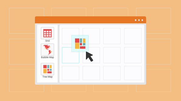
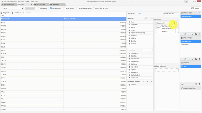
The grid widget in the Syncfusion Dashboard Platform is an efficient way to showcase data in a table. It is available under the Relationship category in the Dashboard Designer’s toolbox. We’ll use the Northwind Order Details [LINK] as our data for this example.
There are different functionalities and formatting options available in the grid widget for effectively displaying data.
But first, you need to set up the grid.
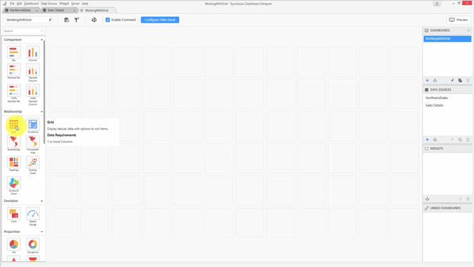
Add a grid widget to the dashboard.
Open the widget configuration.
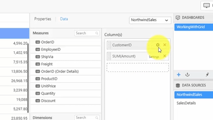
Add data to the grid by dragging and dropping the fields to the columns area.
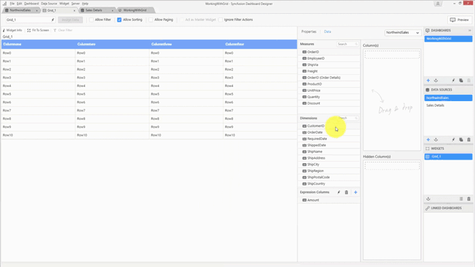
The widget is now configured, but there is one more configurable area: Hidden Columns. Hidden columns are useful when you do not want to show data in your grid, but you do want to use the underlying data for filtering. For example, if you have two tables, one containing student details such as student ID, student name, and department, and the other table containing the student’s scores in academics and sports. Both these tables have the student ID column in common. If these tables are present in different data sources, you can still filter using the grid widget.
To demonstrate, student details and scores data was added as a data source to the Dashboard Designer. In the design canvas, there are two widgets: the grid and the proportion chart.
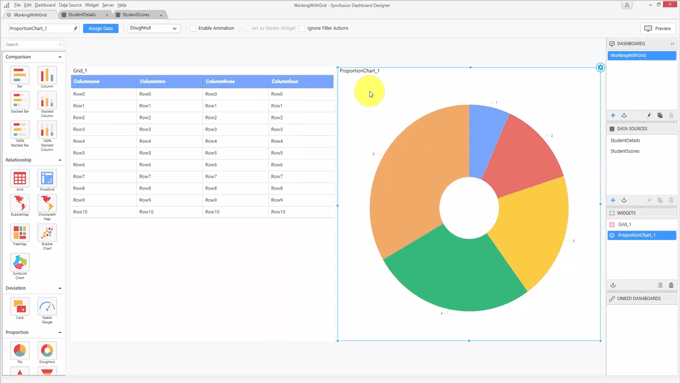
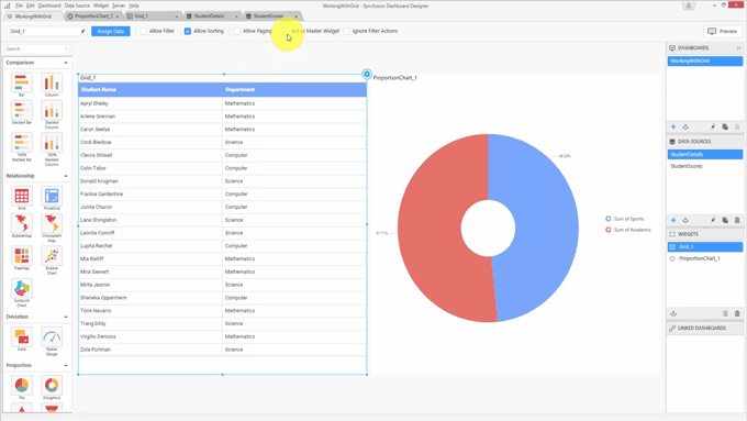
The student details will be shown in this grid, and whenever you select a student, the proportion chart will display the corresponding student’s scores in different areas. First, let’s configure these widgets.
You want to choose the student details, but you don’t want to show the student ID since it is not readable. Instead, add the student name and department.
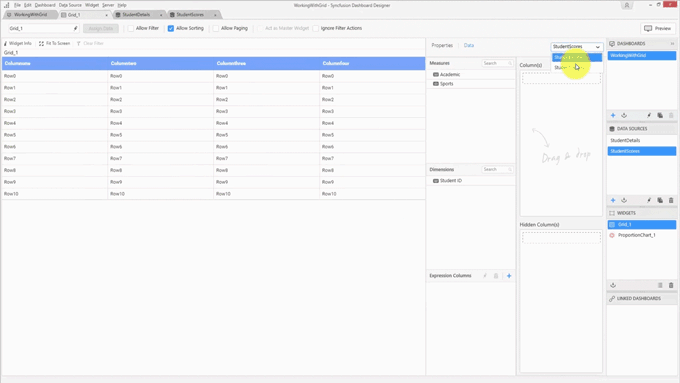
Student ID is the column we have in common with the other database, so add it to the hidden column.
The student ID isn’t displayed in the grid, but still, it is there so that you can make use of it for filtering. For the proportion chart, add the scores to the values and enable the legend.

You want to make this grid as a master widget to perform the filtering, so select this grid and enable the Act as Master Widget option.
You are almost done, but one thing you still have to do is define the relationship between these two widgets. Use the filter configuration manager that is available in the toolbar.
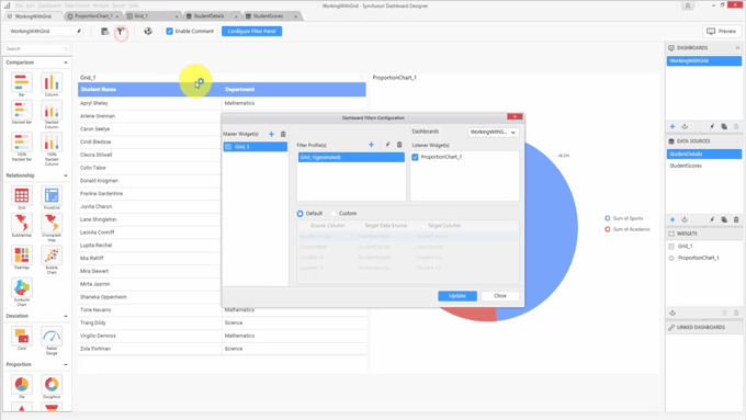
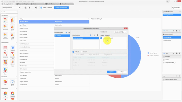
You can see, the grid is listed as the Master Widget and the proportioned chart is the Listener Widget. You now need to define the relationship between these two widgets.
Choose the Custom option
Add a relationship by clicking the add button (+).
Under Source Column, where all the bound columns are shown—including the hidden column—select Student ID to perform the filtering.
Under Target Data Source, select StudentScores.
Under Target Column, select Student ID again.
Click Update to complete the configuration.
Now that you have successfully configured the widgets, click Preview to see how they are displayed in the viewer.
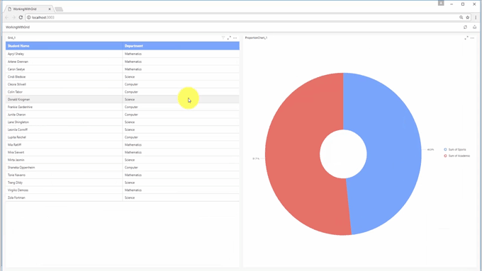
Whenever you select a student, the corresponding student’s mark will be shown in proportions of the chart. This is one of the uses of the hidden columns. Back in the original dashboard, you can see the various customization options available with respect to the data.

You can customize or format the data using the settings button available in the field.
These customizations are available based upon the field type. For example, the Customer ID is a string type, so you have options to sort the data and filter it by including or excluding items, and you can add filters based on condition or rank.
For numeric data, you can change the aggregation, filter based on a condition, and you can change the format. For example, you would do the following to change the format for currencies.
Set the Type field to Currency.
Set the Representation field to Thousands.
Click OK.
Similarly, you have customization options for different data types that allow you to change the aggregation from year to month and add filters.
Now, let’s look at the various formatting options available with respect to the grid.
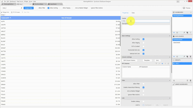
Open the Properties panel.
Change the header and add a description.
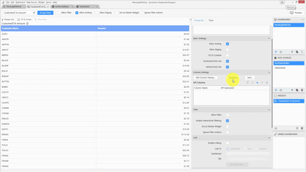
Under Basic Settings, you’ll find the following options:
Allow Sorting enables interactive sorting.
Allow Paging showcases a large amount of data via paging.
Fit to Content provides automatic width resizing based upon the length of the data.
Horizontal Grid Line and Vertical Grid Line control the visibility of the grid lines.
Under the Filter settings, you’ll find the following options:
Allow Filter allows you to perform filter operations interactively.
Enable Hierarchical Filtering is selected by default. When selected, it allows you to filter based on a hierarchy you set. If you wish to perform flat filtering, disable this setting.
Act as Master Widget allows you to make the grid a master widget; thereby, whenever you select a record, the other widgets in the dashboard will show only the filtered data.
Ignore Filter Actions allows you to ignore the filter actions from other widgets in the dashboard.
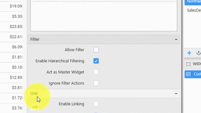
Under the Link settings, you can add links to your grid and target other dashboards that are published in the dashboard’s server.
Below the Link setting, you’ll find Container Appearance, which formats the appearance of the widget. You can change the title alignment, title color, the border settings, and if you wish to add a rounded-cornered widget, you can modify the corner radius.
Under Container Appearance, there are settings related to the dashboard server.
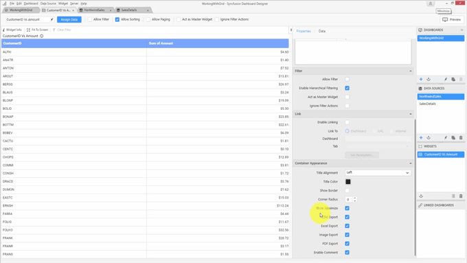
You can select options to maximize the widget, and you can provide options to export the widget and enable comments.
Under Column Settings you’ll find several options:
The Edit Column option allows you to edit column names.
The Template option allows you to format the row and column based upon data.
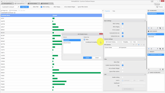
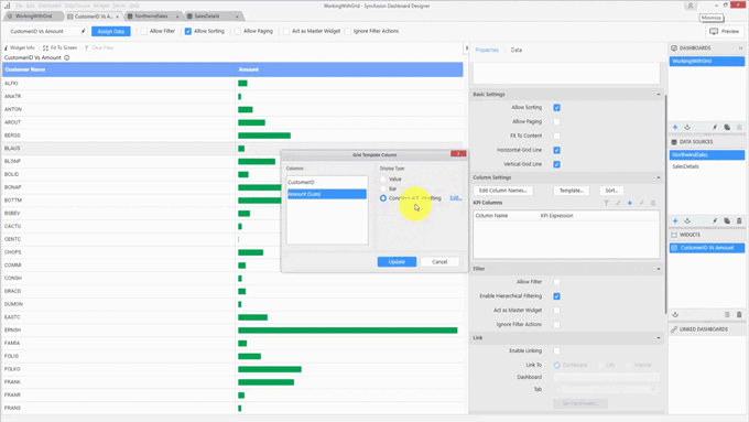
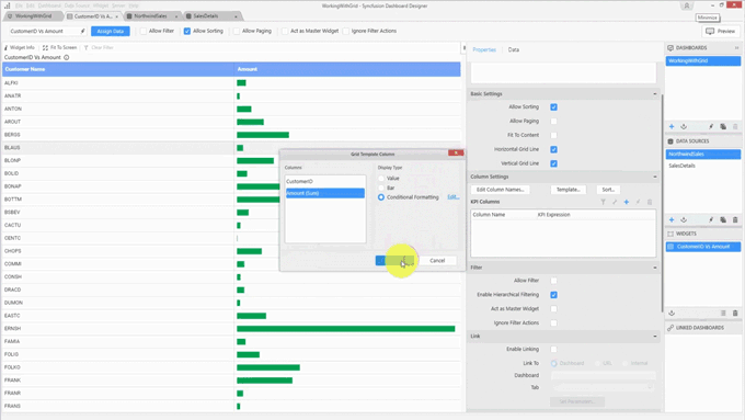
In this grid widget, we have two columns. One is the customer ID, which is a string field, and another is the amount, which is a numeric field. You can modify or format the column or row to display the value. The default display type is Value, you can also add conditional formatting for those. And similarly, for numeric fields, you can display the column as a value or as a bar, and you can enable conditional formatting.
You can see the information is now displayed as bars with the actual values presented in tooltips.
Let’s look at Conditional Formatting. Conditional formatting helps you format rows or columns based upon values.
Select Conditional Formatting from the Grid Template Column dialog.
Click Edit to display the Grid Conditional Formatting dialog.
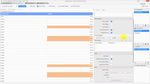
Click the add sign (+) to add a condition based upon an amount.
You can choose to use either a single color or a gradient color. Whenever a gradient color is chosen, the widget will apply background color based upon the values. Once the column has been formatted, you’ll see the gradients are applied based upon the values. Larger values receive a darker tone.
With conditional formatting, you can modify font color, font style, as well as background color.
The column settings also provide an option to sort data. You can choose the default sort order or you can make it either in ascending order or descending order. This sorting operation can only be executed based upon a single numeric field.
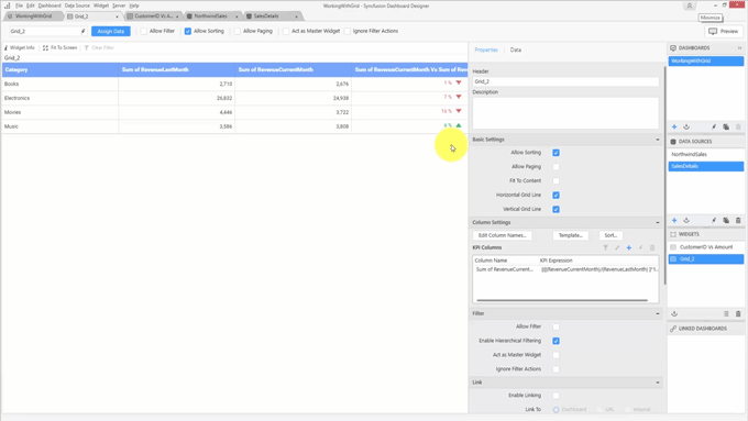
Syncfusion dashboards also support adding key performance indicators to the grid. You can add a key performance indicator as a separate column using the KPI Column settings.
To demonstrate this, add another grid widget to the dashboard. To add a KPI, do the following:
In the KPI Columns settings, click the add button (+) to add a KPI column.
Set the values for Actual Value and Target Value.
You can set Value Type to Actual variation, Actual value, Percentage of variation, Percentage of target, or Value and Percentage.
Set Result to indicate whether a greater value is good or a lesser value is good.
Click OK to implement the KPI.
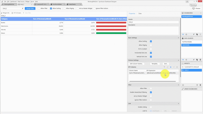
In the following example percentage of variation is shown with the indicator.
By clicking on Template, you can also show actual variation as bars.
The customization, formatting, and “key performance indicator” options available in the Dashboard Platform’s grid widget allow you to set up, customize, and deliver dashboards to your uses in a few easy steps.
The next blog post in this series will cover link configuring, types, and filtering in the grid widget. Explore even more features on our Dashboard Platform homepage, or review the grid widget documentation for further details.
If you liked this post, we think you’ll love these free e-books:
BI Solutions Using SSAS Tabular Model Succinctly
MongoDB 3 Succinctly
Hadoop Succinctly
Power BI Succinctly
R Programming Succinctly
 No spam, just valuable updates.