
 Jegan R
Overview
The PropertyGrid control provides an interface to view and edit the properties of any .NET object with support for built-in editors. To handle different types of properties, create your own editor using a custom editor. Use a category editor to edit a set of properties. Organize the properties using sorting, grouping, searching, and filtering.
Adding PropertyGrid to a WPF application
- In Visual Studio, create a new WPF project.
- Add the following NuGet package to the project:
PropertyGrid.Wpf. - Add the Syncfusion WPF schema. Here, we used syncfusion as a prefix for the namespace.
<Window xmlns="http://schemas.microsoft.com/winfx/2006/xaml/presentation" xmlns:x="http://schemas.microsoft.com/winfx/2006/xaml" xmlns:d="http://schemas.microsoft.com/expression/blend/2008" xmlns:mc="http://schemas.openxmlformats.org/markup-compatibility/2006" xmlns:syncfusion="http://schemas.syncfusion.com/wpf" </Window> - Add the PropertyGrid control to the MainWindow.
<syncfusion:PropertyGrid Name="propertyGrid1" Height="300" Width="300" />
Inspect properties of a .NET object
CLR object
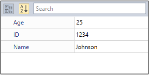
You can view the properties of any .NET object in the PropertyGrid control using its SelectedObject property. Let us define a class and assign an instance of it to PropertyGrid in order to inspect it.
- Create a class named Employee to be inspected in a property grid.
public class Employee { public string Name { get; set; } public string ID { get; set; } public int Age { get; set; } } - Create a ViewModel class with the property SelectedEmployee to be bound with PropertyGrid.SelectedObject.
public class ViewModel { public object SelectedEmployee { get; set; } public ViewModel() { SelectedEmployee = new Employee() { Name = "Johnson", Age = 25, ID = "1234" }; } } - Set ViewModel to DataContext for the MainWindow
<Window.DataContext> <local:ViewModel></local:ViewModel> </Window.DataContext> - Bind the SelectedObject property of PropertyGrid with the SelectedEmployee property in the ViewModel.
<syncfusion:PropertyGrid Name="propertyGrid1" SelectedObject="{Binding SelectedEmployee}" Height="200" Width="300" /> - Run the application
Nested properties
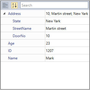
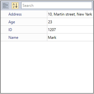
PropertyGrid allows you to view and edit n levels of complex properties of a selected object by displaying them in a tree-like structure. To enable this feature, set the PropertyExpandMode property to NestedMode. By default, the complex properties are not shown.
You can also explore the complex properties of a selected object by expanding it. To enable this feature, set the PropertyExpandMode property to NestedMode. By default, the sub-properties are not shown.
In the following code example, Address is a class-type property in the Employee class. It includes the City, StreetName, and DoorNo properties. If you want to show all the properties in the Address class property, set the PropertyExpandMode to NestedMode.
public class Address
{
    public string State { get; set;}
    public string StreetName { get; set; }
    public string DoorNo { get; set; }

    public override string ToString()
    {
        return DoorNo + ", " + StreetName + ", " + State;
    }
}

public class Employee
{
    public string Name { get; set; }
    public string ID { get; set; }
    public int Age { get; set; }
    public Address Address { get; set; }
}

public class ViewModel
{
    public object SelectedEmployee { get; set; }
    public ViewModel()
    {
        SelectedEmployee = new Employee() {Address= new Address() { State="New Yark", DoorNo="10", StreetName= "Martin street" }, Age = 23,  ID = "1207", Name = "Mark" };
    }
}
<syncfusion:PropertyGrid Name="propertyGrid1" SelectedObject="{Binding SelectedEmployee }" Height="300" Width="300" PropertyExpandMode="NestedMode" />
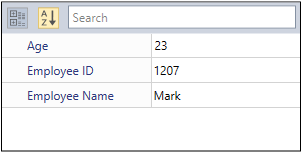
Change display name of properties
In the output of the previous section, it will be good to display ‘Employee ID’ instead of ‘ID’ as the property name. You can change the display name of the properties by using the DisplayName attribute or Name field of the Display attribute.
public class Employee
{
    [DisplayName("Employee Name")]
    public string Name { get; set; }
    [Display(Name = "Employee ID")]
    public string ID { get; set; }
    public int Age { get; set; }
}
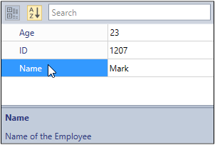
Description
You can give meaningful descriptions to the properties using the Description attribute or Description field of the Display attribute. They can display in the Description panel. By default, the Description panel is collapsed. To show it, set the DescriptionPanelVisibility to Visible.
- Adding descriptions for the Name and Age properties
public class Employee { [Description("Name of the Employee")] public string Name { get; set; } public string ID { get; set; } [Display(Description = "Age of the Employee")] public int Age { get; set; } } - Enable the Description panel.
<syncfusion:PropertyGrid Name="propertyGrid1" SelectedObject="{Binding SelectedEmployee }" Height="150" Width="300" DescriptionPanelVisibility="Visible" DescriptionPanelHeight="50"/>
 If you want to adjust the height of the Description panel, use the DescriptionPanelHeight property.
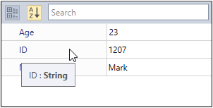
Tooltip
A tooltip is used show information about a property name and its type when hovering the mouse over the property and its value field. Tooltip is enabled by default. You can disable it by setting EnableToolTip to false.
<syncfusion:PropertyGrid Name="propertyGrid1" SelectedObject="{Binding SelectedEmployee }" Height="150" Width="300" EnableToolTip="False"/>
Edit values of properties
Built-in editors
You don’t need to assign editors for editing the property values. The PropertyGrid will automatically create a value editor. If you add the Name and ID properties as strings, a text box will be generated as a value editor. If you add the Gender property as an enum type, then it will create a combo box as a value editor.
public class Employee
{
    public DateTime DOB { get; set; }
    public Gender Gender { get; set; }
    public string Name { get; set; }
    public string ID { get; set; }
    public int Age { get; set; }
}

public enum Gender
{
    Male,
    Female
}

Custom editors
If you want to make a custom value editor for properties, then create it with the Editor attribute or CustomEditorCollection. To create a custom editor, you need to implement the ITypeEditor interface. Here, the EmailID is a string property, and a text box is assigned as a default editor. We have changed the value editor for the EmailID property from a text box to the MaskedEdit text box that accepts only inputs that are in the Email ID format.
- Implement the MaskedEdit control as a custom value editor for the EmailID property with ITypeEditor interface.
public class EmailEditor : ITypeEditor { SfMaskedEdit maskededit; public void Attach(PropertyViewItem property, PropertyItem info) { if (info.CanWrite) { var binding = new Binding("Value") { Mode = BindingMode.TwoWay, Source = info, ValidatesOnExceptions = true, ValidatesOnDataErrors = true }; BindingOperations.SetBinding(maskededit, SfMaskedEdit.ValueProperty, binding); } else { maskededit.IsEnabled = false; var binding = new Binding("Value") { Source = info, ValidatesOnExceptions = true, ValidatesOnDataErrors = true }; BindingOperations.SetBinding(maskededit, SfMaskedEdit.ValueProperty, binding); } } public object Create(PropertyInfo propertyInfo) { maskededit = new SfMaskedEdit(); maskededit.MaskType = MaskType.RegEx; maskededit.Mask = "[A-Za-z0-9._%-]+@[A-Za-z0-9]+.[A-Za-z]{2,3}"; return maskededit; } public void Detach(PropertyViewItem property) { } } - Set the custom editor for the EmailID property.
    [Editor("EmailID", typeof(EmailEditor))]
    public class Employee
    {
        public int Age { get; set; }
        public string EmailID { get; set; }
        public string Name { get; set; }
        public string ID { get; set; }
        public int Experience { get; set; }
    }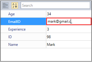
Single editor for multiple properties
Using the CategoryEditor, you can to relate multiple properties and edit them with a single editor. To display the CategoryEditor, you need to set the EnableGrouping property to true.
Here, the Background, Foreground, and BorderBrush are brush-type properties. So, they are categorized under the A-Brushes category with the ColorEdit control as value editor. By default, the properties are arranged like the key-value pairs.
The CategoryEditor can be customized to use values from a single ColorEdit control as values for the Background, Foreground, and BorderBrush properties. The property and its value editor can be placed as you wish.
- Create a visibility converter to show the ColorEdit for the Background, Foreground and BorderBrush properties.
public class SelectedIndexToVisibility : IValueConverter { public object Convert(object value, Type targetType, object parameter, System.Globalization.CultureInfo culture) { int index = (int)value; Visibility vis; if (index == 0 && parameter.ToString() == "Foreground") { vis = Visibility.Visible; } else if (index == 1 && parameter.ToString() == "Background") { vis = Visibility.Visible; } else if (index == 2 && parameter.ToString() == "BorderBrush") { vis = Visibility.Visible; } else { vis = Visibility.Collapsed; } return vis; } public object ConvertBack(object value, Type targetType, object parameter, System.Globalization.CultureInfo culture) { return null; } } - Create the CategoryEditor for the properties.
    <Window.Resources>
        <local:SelectedIndexToVisibility x:Key="VisConv"/>
    </Window.Resources>
    <Grid>
        <Grid.ColumnDefinitions>
            <ColumnDefinition></ColumnDefinition>
            <ColumnDefinition Width="300"></ColumnDefinition>
        </Grid.ColumnDefinitions>
        <syncfusion:PropertyGrid Margin="20" Grid.Column="0" Name="propertyGrid1" SelectedObject="{Binding ElementName=button}" EnableGrouping="True" >
            <syncfusion:PropertyGrid.CategoryEditors>
                <syncfusion:CategoryEditor Category="A-Brushes">
                    <syncfusion:CategoryEditor.Properties>
                        <syncfusion:CategoryEditorProperty Name="Background"/>
                        <syncfusion:CategoryEditorProperty Name="Foreground"/>
                        <syncfusion:CategoryEditorProperty Name="BorderBrush"/>
                    </syncfusion:CategoryEditor.Properties>
                    <syncfusion:CategoryEditor.EditorTemplate>
                        <DataTemplate>
                            <Grid>
                                <Grid.RowDefinitions>
                                    <RowDefinition />
                                    <RowDefinition />
                                </Grid.RowDefinitions>
                                <ListBox BorderBrush="Transparent" x:Name="list" SelectedIndex="0">
                                    <StackPanel HorizontalAlignment="Center" Orientation="Horizontal">
                                        <TextBlock Text="Foreground" Margin="5" Width="80"/>
                                        <Rectangle Stroke="Black" Fill="{Binding Path=CategoryValueProperties[Foreground].Value, Mode=TwoWay}" Height="15" Width="25" Margin="5"/>
                                    </StackPanel>
                                    <StackPanel HorizontalAlignment="Center" Orientation="Horizontal">
                                        <TextBlock Text="Background" Margin="5" Width="80"/>
                                        <Rectangle Stroke="Black" x:Name="background" Fill="{Binding Path=CategoryValueProperties[Background].Value, Mode=TwoWay}" Height="15" Width="25" Margin="5" />
                                    </StackPanel>
                                    <StackPanel HorizontalAlignment="Center" Orientation="Horizontal">
                                        <TextBlock Text="BorderBrush" Margin="5" Width="80"/>
                                        <Rectangle Stroke="Black" Fill="{Binding Path=CategoryValueProperties[BorderBrush].Value, Mode=TwoWay}" Height="15" Width="25" Margin="5"/>
                                    </StackPanel>
                                </ListBox>

                                <syncfusion:ColorEdit Grid.Row="1" IsGradientPropertyEnabled="False" Visibility="{Binding ElementName=list, Path=SelectedIndex, Converter={StaticResource VisConv}, ConverterParameter=Foreground}"
                                                      Brush="{Binding Path=CategoryValueProperties[Foreground].Value, Mode=TwoWay}" EnableToolTip="False"/>
                                <syncfusion:ColorEdit Grid.Row="1" IsGradientPropertyEnabled="False" Visibility="{Binding ElementName=list, Path=SelectedIndex, Converter={StaticResource VisConv}, ConverterParameter=Background}"
                                                      Brush="{Binding Path=CategoryValueProperties[Background].Value, Mode=TwoWay}" EnableToolTip="False"/>
                                <syncfusion:ColorEdit Grid.Row="1" IsGradientPropertyEnabled="False" Visibility="{Binding ElementName=list, Path=SelectedIndex, Converter={StaticResource VisConv}, ConverterParameter=BorderBrush}"
                                                      Brush="{Binding Path=CategoryValueProperties[BorderBrush].Value, Mode=TwoWay}" EnableToolTip="False"/>
                            </Grid>
                        </DataTemplate>
                    </syncfusion:CategoryEditor.EditorTemplate>
                </syncfusion:CategoryEditor>
            </syncfusion:PropertyGrid.CategoryEditors>
        </syncfusion:PropertyGrid>
        <StackPanel Grid.Column="1" VerticalAlignment="Center" HorizontalAlignment="Center" >
            <TextBlock Grid.Column="1" Margin="10" HorizontalAlignment="Center"  TextWrapping="Wrap" VerticalAlignment="Center" Width="168"><Run Text="Selected Object: "/><Run FontWeight="Bold" Text="Button"/></TextBlock>
            <Button Name="button" Width="200" Height="50" VerticalAlignment="Center" HorizontalAlignment="Center" Content="Click me"/>
        </StackPanel>
    </Grid>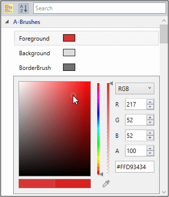
With CategoryEditor 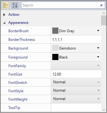
Without CategoryEditor
Click here to download the sample with previous code snippet.
Validate
You don’t need to do any validation yourself—PropertyGrid contains built-in validation for the value editors. Based on the property type, PropertyGrid will accept values only of that type.
For example, if the data type of the Age property is integer, then it will accept only integer values. Here, no external validation is required.
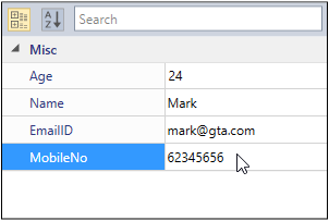
ReadOnly properties
If you want to make some properties non-editable, you can use the ReadOnly or Editable attributes. Set any of these properties’ values to false to make them non-editable. Here, MobileNo and Age properties are made non-editable by the ReadOnly and Editable attributes’ values being set to false.
    public class Employee
    {
        [Editable(false)]
        public int Age { get; set; }
        public string Name { get; set; }
        public string EmailID { get; set; }
        [ReadOnly(true)]
        public string MobileNo { get; set; }
    }
Sorting
If the PropertyGrid.SelectedObject contains a large number of properties, it will be difficult to find a specific property through scrolling. To ease this, you can arrange the properties in ascending or descending alphabetical order using the SortDirection property. You can click on the Sort button in the top-left corner of the PropertyGrid to achieve this. By default, the properties are in ascending alphabetical order. If the properties are in the grouped state, then the groups are sorted based on group name.
    public class Employee
    {
        [Category("Contact Details")]
        public string MobileNo { get; set; }
        [Category("Basic Info")]
        public string Name { get; set; }
        [Display(GroupName = "Contact Details")]
        public string EmailID { get; set; }
        [Display(GroupName = "Basic Info")]
        public int Age { get; set; }
    }
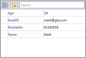
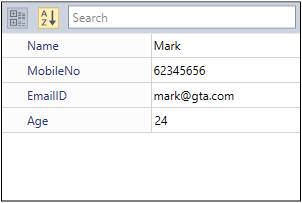
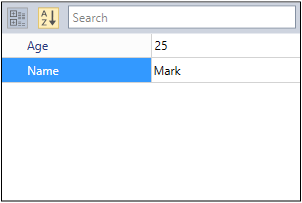
SortDirection = Ascending
Here, the properties are sorted in ascending order based on the property name. So, the Age property is displayed first and Name property displayed last.
<syncfusion:PropertyGrid Name="propertyGrid1" SelectedObject="{Binding SelectedEmployee }" Height="150" Width="300" SortDirection="Ascending" />
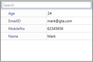
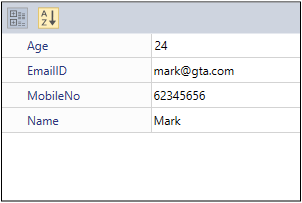
SortDirection = Descending
Here, the properties are sorted in descending order based on the property name. So, the Name property is displayed first and Age property displayed last.
<syncfusion:PropertyGrid Name="propertyGrid1" SelectedObject="{Binding SelectedEmployee }" Height="150" Width="300" SortDirection="Descending" />
By default, both the SortButton and CategoryButton will be displayed. Use the ButtonPanelVisibility property to hide these buttons.
<syncfusion:PropertyGrid Name="propertyGrid1" SelectedObject="{Binding SelectedEmployee }" Height="150" Width="300" ButtonPanelVisibility ="Collapsed" />
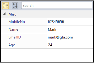
Ordering
To display the properties based on the order they were added to the class, set the SortDirection property to null.
In the following code example, the SortDirection property is set to null and the properties are arranged by the order they were added to the Employee class.
    public class Employee
    {
        public string MobileNo { get; set; }
        public string Name { get; set; }
        public string EmailID { get; set; }
        public int Age { get; set; }
    }
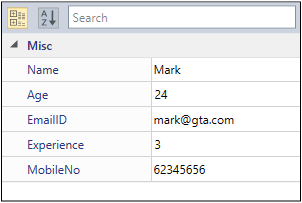
Custom ordering
To customize the display order of the properties, set the SortDirection property to null. Then provide the sorting order to each property starting from 0.
The following code example illustrates this.
    public class Employee
    {
        public int Experience { get; set; }
        [Display(Order = 1)]
        public int Age { get; set; }
        [Display(Order = 0)]
        public string Name { get; set; }
        public string MobileNo { get; set; }
        [Display(Order = 2)]
        public string EmailID { get; set; }
    }
<syncfusion:PropertyGrid Name="propertyGrid1" SelectedObject="{Binding SelectedEmployee }" Height="200" Width="300" SortDirection="{x:Null}" />
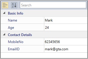
Grouping
To group some specific properties, use CategoryAttribute or the GroupName field of the Display attribute. If you want to display the properties in group mode, you must set the EnableGrouping property to true or click the Category button, which is in the top-left corner of the PropertyGrid.
Here, Name and Age properties are grouped under the Basic Info category and Email and MobileNo properties are grouped under the Contact Details category.
    public class Employee
    {
        [Category("Contact Details")]
        public string MobileNo { get; set; }
        [Category("Basic Info")]
        public string Name { get; set; }
        [Display(GroupName = "Contact Details")]
        public string EmailID { get; set; }
        [Display(GroupName = "Basic Info")]
        public int Age { get; set; }
    }
<syncfusion:PropertyGrid Name="propertyGrid1" SelectedObject="{Binding SelectedEmployee }" Height="200" Width="300" EnableGrouping="True"/>
Filtering the properties
If you want to hide some properties in the PropertyGrid, set either the Browsable or Bindable attribute value as false. Here, the EmailID and MobileNo properties are hidden in the PropertyGrid by setting the Browsable and Bindable attributes values as false.
    public class Employee
    {
        public int Age { get; set; }
        public string Name { get; set; }
        [Browsable(false)]
        public string EmailID { get; set; }
        [Bindable(false)]
        public string MobileNo { get; set; }
    }
Search properties
If the PropertyGrid.SelectedObject contains a large number of properties, it will be difficult to find a specific property. In this case, you can easily access the required property by searching for the property name in the SearchBox.
SearchBox will filter and display the properties that contain the desired text. SearchBox is shown by default, and you can hide it by setting SearchBoxVisibility to collapsed.
SearchBoxVisibility = Visible
Here, the Age property is being searched for in the SearchBox.
<syncfusion:PropertyGrid Name="propertyGrid1" SelectedObject="{Binding SelectedEmployee }" Height="200" Width="300" SearchBoxVisibility="Visible">

SearchBoxVisibility = Collapsed
Here, the SearchBox is hidden in the PropertyGrid.
<syncfusion:PropertyGrid Name="propertyGrid1" SelectedObject="{Binding SelectedEmployee }" Height="200" Width="300" SearchBoxVisibility="Collapsed">
Update property grid configuration at runtime
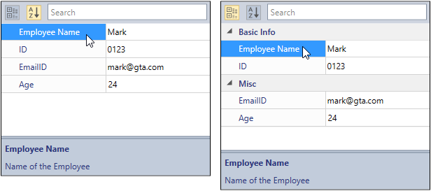
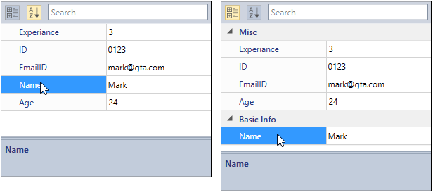
You can assign the DisplayName, Category, Description, Ordering; make a property read-only; or hide properties using the attributes at compile time. After that, you cannot change their values using the attributes. If you want to change them at runtime, handle the AutoGeneratingPropertyGridItem event.
In the Name property, the display name is changed from Name to Employee Name using the DisplayName property; Order is changed from 3 to 0 by the Order property; Description is set as Name of the Employee by the Description property; and property state is changed from editable to read-only by setting the ReadOnly property to true. The Experience property is hidden from the PropertyGrid by setting the Cancel property to true. The category of the ID property is changed from Misc to Basic Info category by the Category property.
<syncfusion:PropertyGrid Name="propertyGrid1" SelectedObject="{Binding SelectedEmployee }" SortDirection="{x:Null}" DescriptionPanelVisibility="Visible" Height="250" Width="300" AutoGeneratingPropertyGridItem="PropertyGrid1_AutoGeneratingPropertyGridItem">
        private void PropertyGrid1_AutoGeneratingPropertyGridItem(object sender, AutoGeneratingPropertyGridItemEventArgs e)
        {
            if (e.DisplayName == "Name")
            {
                e.Order = 0;
                e.ReadOnly = true;
                e.DisplayName = "Employee Name";
                e.Description = "Name of the Employee";

            }
            else if(e.DisplayName== "Experience")
            {
                e.Cancel = true;
            }
            else if(e.DisplayName=="ID")
            {
                e.Category = "Basic Info";
            }
        }
Click here to download the PropertyGrid sample.
Conclusion
I hope you now have a clear idea of the Syncfusion PropertyGrid control for WPF and all its customization features. Syncfusion also has over 90 essential WPF controls like a DataGrid, Charts, Diagram, and PDF Viewer. Try these controls for yourself by downloading the setup from our latest release.
For existing customers, the newest version is available for download from the license and downloads page. If you are not yet a customer, you can try our 30-day free trial to check out these new features.
Also, if you wish to send us feedback or would like to submit any questions, please feel free to post them in the comments section of this blog post. You can also contact us through our support forum, feedback portal, or Direct-Trac support system.


 No spam, just valuable updates.
Comments (2)
it’s great to know about these kind of functionality got available in WPF data grid by syncfusion, otherwise it take a great toll on developer to create a such kind of custom data grid. Didn’t tried the above code practically bu hope so it stands out in terms of performance.
Hi Suraj,
There are few examples already in our github repositories, listed in this article. You can directly pull or download and try it.
You can also try all property grid examples from : https://github.com/SyncfusionExamples/wpf-property-grid-examples.
You can also get completed documentation from : https://help.syncfusion.com/wpf/propertygrid
Please note that PropertyGrid is a separate control, which does not have dependency with DataGrid. This blog gives an outlook of PropertyGrid features and how to get started with it. PropertyGrid loading and editing performance will be good. As items are loaded asynchronously, UI thread will not be affected while loading large sets of properties.