
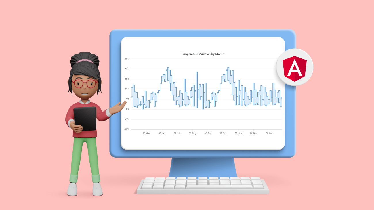
Syncfusion Angular Charts is a well-crafted charting component for data visualization. It contains a rich UI gallery of 50+ charts and graphs, ranging from line to financial, that cater to all charting scenarios.
In our 2023 Volume 1 release, we added one more chart to our collection: the range step area chart. In this blog, we’ll explore its stunning, user-friendly features and the steps to integrate it into your application.
Overview
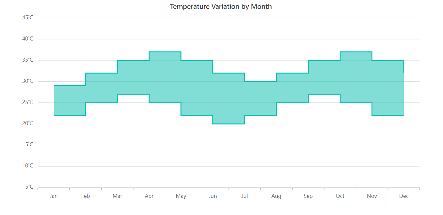
The new Angular range step area chart is designed to display continuous data points as steps that fluctuate between high and low values over time intervals and across different categories.
Unlike the traditional area charts, the areas between the high and low values in the range step area chart are filled with color, and a step line connects the data points.
Why use a range step area chart?
The Angular range step area chart is particularly useful when you need to showcase the variation between minimum and maximum values in a data set, such as temperature and price fluctuations. You can use it to plot data, emphasizing steps and gradual changes.
To utilize the range step area chart effectively, you need to provide the following values as input.
| Value | Type | Description |
| X | Int/ Double/ String/ DateTime | X-axis value of the data point. |
| High | Int/ Double | Denotes the high value in the data series. |
| Low | Int/ Double | Denotes the low value in the data series. |
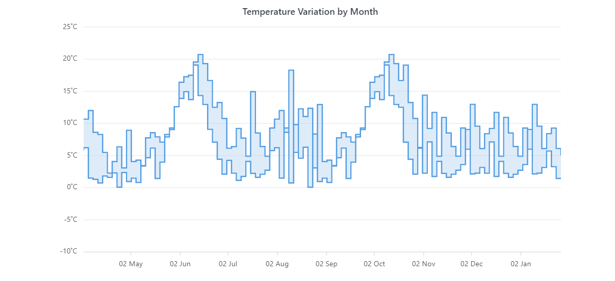
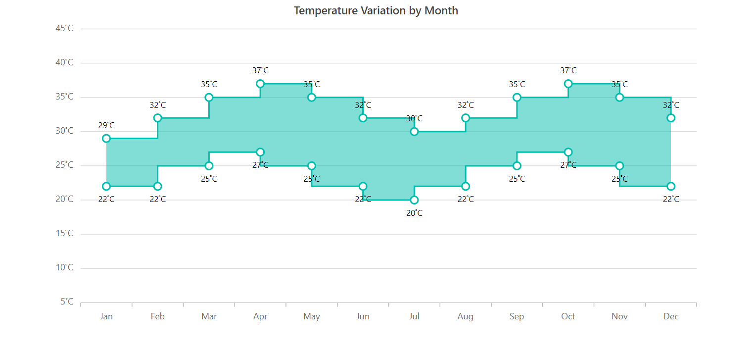
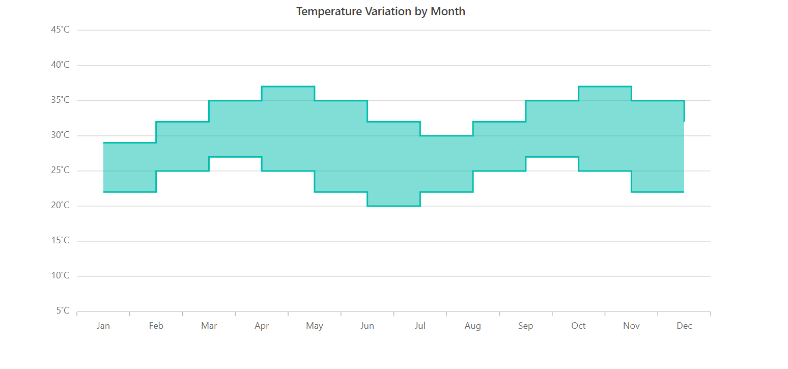
Refer to the following code example. In it, we have used the Angular range step area chart to visualize the temperature variation in a year.
<e-series-collection>
  <e-series [dataSource]='data'
            [border]='border'
            [marker]='marker'
            [opacity]='opacity'
            type='RangeStepArea'
            xName='x'
            high='high'
            low='low'>
 </e-series>
</e-series-collection>

export class AppComponent {

  public data: Object[] = [
    { x: 'Jan', high: 29, low: 22 },
    { x: 'Feb', high: 32, low: 22 },
    { x: 'Mar', high: 35, low: 25 },
    { x: 'Apr', high: 37, low: 27 },
    { x: 'May', high: 35, low: 25 },
    { x: 'Jun', high: 32, low: 22 },
    { x: 'Jul', high: 30, low: 20 },
    { x: 'Aug', high: 32, low: 22 },
    { x: 'Sep', high: 35, low: 25 },
    { x: 'Oct', high: 37, low: 27 },
    { x: 'Nov', high: 35, low: 25 },
    { x: 'Dec', high: 32, low: 22 }
  ];
}
Key features
The Angular range step area chart supports the following key features.
Markers and data labels
You can mark the data points in the chart with various built-in shapes: circles, rectangles, ellipses, vertical lines, horizontal lines, diamonds, triangles, and pentagons. You can also use images to make the data points more visually appealing.
Refer to the following code example to enable markers for a data series.
<e-series-collection>
   <e-series
       [dataSource]='data'
       [border]='border'
       [marker]='marker'
       [opacity]='opacity'
       type='RangeStepArea'
       xName='x'
       high='high'
       low='low'>
  </e-series>
</e-series-collection>

export class AppComponent {

 public marker: Object = {
    visible: true,
    height: 10,
    width: 10
 }
}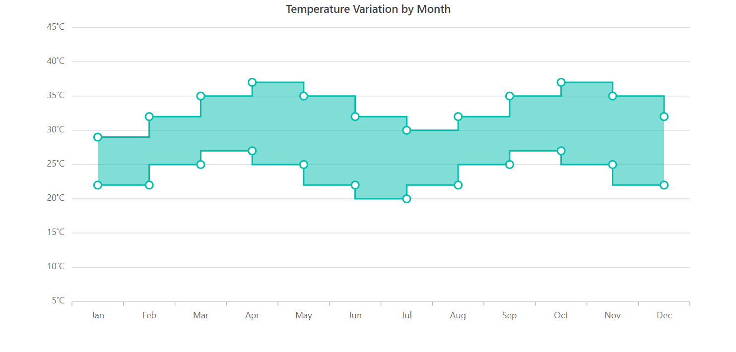
Data labels help us to display information about the data points within a chart. You can also add a template to display data labels with HTML elements such as images, divs, and spans. Additionally, the data labels can be rotated to any desired angle.
Refer to the following code example to enable data labels in the chart.
<e-series-collection>
   <e-series
       [dataSource]='data'
       [border]='border'
       [marker]='marker'
       [opacity]='opacity'
       type='RangeStepArea'
       xName='x'
       high='high'
       low='low'>
   </e-series>
</e-series-collection>

export class AppComponent {

 public marker: Object = {
    visible: true,
    dataLabel: {
      visible: true
    }
 }
}
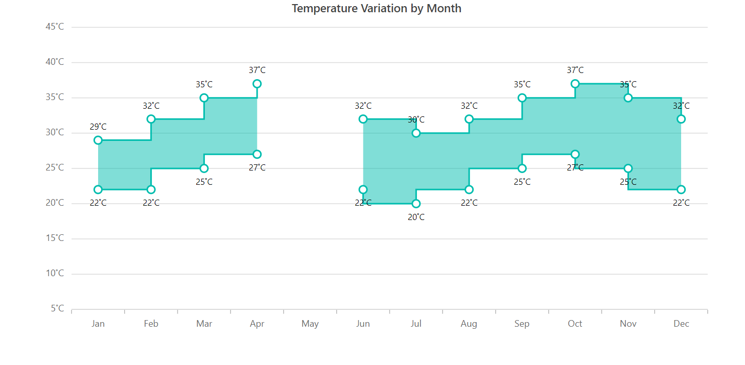
Empty points
When no data is available for a specific date or category, you can elegantly handle that in the chart using an empty data point.
Refer to the following code example.
<e-series-collection>
    <e-series
          [dataSource]='data'
          [emptyPointSettings]="emptyPointSettings"
          [border]='border'
          [marker]='marker'
          [opacity]='opacity'
          type='RangeStepArea'
          xName='x'
          high='high'
          low='low'>
    </e-series>
</e-series-collection>

export class AppComponent {

 public data: Object[] = [
    { x: 'Jan', high: 29, low: 22 },
    { x: 'Feb', high: 32, low: 22 },
    { x: 'Mar', high: 35, low: 25 },
    { x: 'Apr', high: 37, low: 27 },
    { x: 'May', high: null, low: null },
    { x: 'Jun', high: 32, low: 22 },
    { x: 'Jul', high: 30, low: 20 },
    { x: 'Aug', high: 32, low: 22 },
    { x: 'Sep', high: 35, low: 25 },
    { x: 'Oct', high: 37, low: 27 },
    { x: 'Nov', high: 35, low: 25 },
    { x: 'Dec', high: 32, low: 22 }
 ];
}
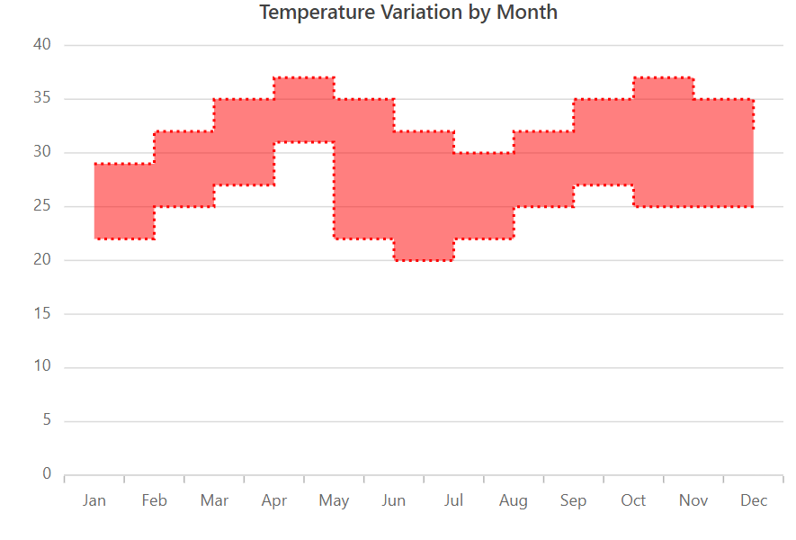
Customization
You can easily customize the appearance of the range step area chart using the following built-in APIs:
- Fill—To change the color of the data series.
- Opacity—To control the transparency of the fill color.
- DashArray—To alter the pattern of dashes in the data series.
- Border—To modify the color and width of the chart series border.
Refer to the following code example.
<e-series-collection>
     <e-series
           [dataSource]='data'
           dashArray="2,3" [border]='border'
           [marker]='marker'
          [opacity]='opacity'
          type='RangeStepArea'
          xName='x'
          high='high'
          low='low'>
    </e-series>
</e-series-collection>

export class AppComponent {

 public border: Object = { width: 2 };

}
Other supported features
The range step area chart also supports other data visualization capabilities, including animation, multiple series, tooltips, legends, zooming, and panning.
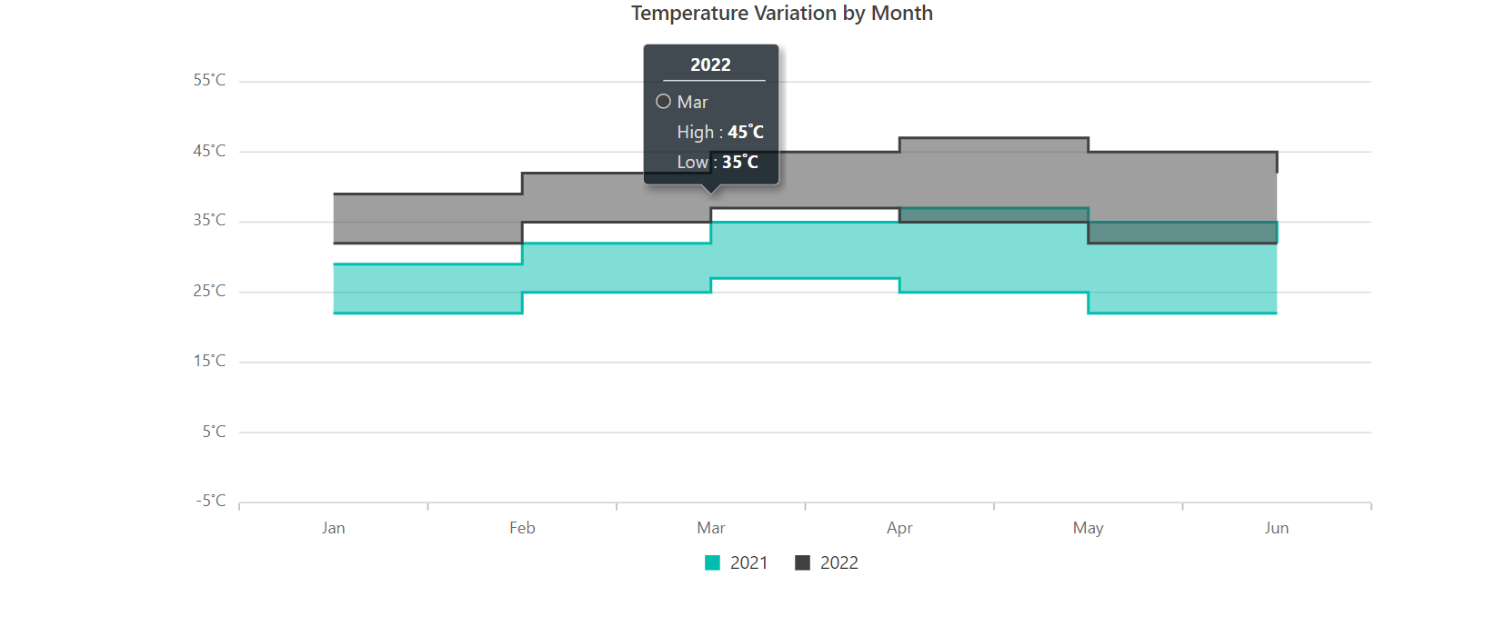
Getting started with the Angular range step area chart
We have explored the remarkable features of the Angular range step area chart. Let’s see the steps to integrate it into your Angular application:
- First, create a new Angular application.
- Then, install the ej2-angular-charts NPM package in your application.
- Initialize the Angular range step area chart like in the following code example.
<ejs-chart id='range_container' [width]='width' [title]='title' [primaryXAxis]='primaryXAxis' [primaryYAxis] = 'primaryYAxis' [tooltip] = 'tooltip' [legendSettings]='legend'>
  <e-series-collection>
     <e-series [dataSource]='data' name="2021" [border]='border' type='RangeStepArea' xName='x' high='high' low='low'>
     </e-series>
  </e-series-collection>
</ejs-chart>

export class AppComponent {
  public primaryXAxis: Object = {
    valueType: 'Category',
  };
  public primaryYAxis: Object = {
    labelFormat: '{value}˚C',
  };
  public marker: Object = {
    visible: true,
  }
  public legend: Object = {
    visible: true,
  }
  public title: string = 'Temperature Variation by Month';
  public tooltip: Object = {
    enable: true,
    format:'Temperature : <b>${point.low} - ${point.high}</b>',
    header: '<b>${point.x}</b>',
  };
  public data: Object[] = [
    { x: 'Jan', high: 29, low: 22 },
    { x: 'Feb', high: 32, low: 22 },
    { x: 'Mar', high: 35, low: 25 },
    { x: 'Apr', high: 37, low: 27 },
    { x: 'May', high: 35, low: 25 },
    { x: 'Jun', high: 32, low: 22 },
    { x: 'Jul', high: 30, low: 20 },
    { x: 'Aug', high: 32, low: 22 },
    { x: 'Sep', high: 35, low: 25 },
    { x: 'Oct', high: 37, low: 27 },
    { x: 'Nov', high: 35, low: 25 },
    { x: 'Dec', high: 32, low: 22 }
  ];
  constructor() {
    //code
  };
}
In the this code example, we have bound the data for monthly temperature variation to the chart and mapped the high and low values to the High and Low properties.
Refer to the following output image.
References
For more details, refer to the Angular Range Step Area Chart documentation, live demos, and API documentation.
Conclusion
Thanks for reading! In this blog, we have seen the features of the new Angular range step area chart rolled out in the 2023 Volume 1 release. Other features from this release are detailed in our Release Notes and What’s New pages. Try them out to elegantly visualize your data and leave your feedback in the comments below!
If you are already our customer, you can access the latest version of Essential Studio® on the license and downloads page. If you are not a customer, you can try our Syncfusion Angular components by downloading our 30-day free trial.
For questions, you can contact us through our support forum, support portal, or feedback portal. We are always happy to assist you!
 No spam, just valuable updates.