
 Hariram Subramanian
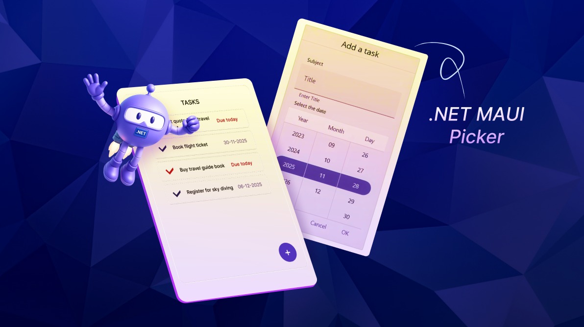
TL;DR: Choosing between DatePicker, TimePicker, DateTimePicker, and Picker in .NET MAUI can be confusing. This guide maps common workflows to the right control, with MVVM-friendly bindings and cascading lists.
Capturing accurate user input across mobile and desktop apps can be challenging. Developers often face these pain points:
- Inconsistent UX across platforms like iOS, Android, Windows, and macOS.
- Limited customization for styling and behavior.
- Complex data binding that breaks MVVM patterns.
- Fragmented controls for handling dates, times, and custom lists.
Syncfusion® .NET MAUI Picker solve these challenges with a unified, developer-friendly approach, offering:
- Four versatile controls:
- Date Picker for calendar input
- Date Time Picker for precise timestamps
- Time Picker for time-only fields
- Picker for custom list selection
- MVVM-ready architecture for clean data binding and separation of concerns.
- Customizable styling to match your app’s design language.
- Cross-platform consistency for a seamless user experience.
- Enhanced usability features like looping, auto-close, and gesture-driven dialogs.
Key features of .NET MAUI Pickers
The Syncfusion .NET MAUI Picker make input handling easy and consistent across scheduling, filtering, and form scenarios. Here’s what they offer:
- Flexible input modes: Choose from dropdown lists, calendar views, and segmented date-time inputs to match your app’s UX needs.
- MVVM-friendly binding: Support clean data binding for seamless integration with ViewModels.
- Customization options: Apply style using templates, set ranges, and add icons or indicators.
- Cross-platform consistency: Uniform look and behavior across iOS, Android, Windows, and macOS.
- Enhanced usability: Features like looping, auto-close, and intuitive touch interactions improve end-user engagement.
Choosing the right pickers for your workflow
Each picker is designed for a specific input type but adapts well to real-world scenarios like scheduling, filtering, and forms. This section maps every picker to these three common use cases, helping developers quickly decide which control best matches their application needs.
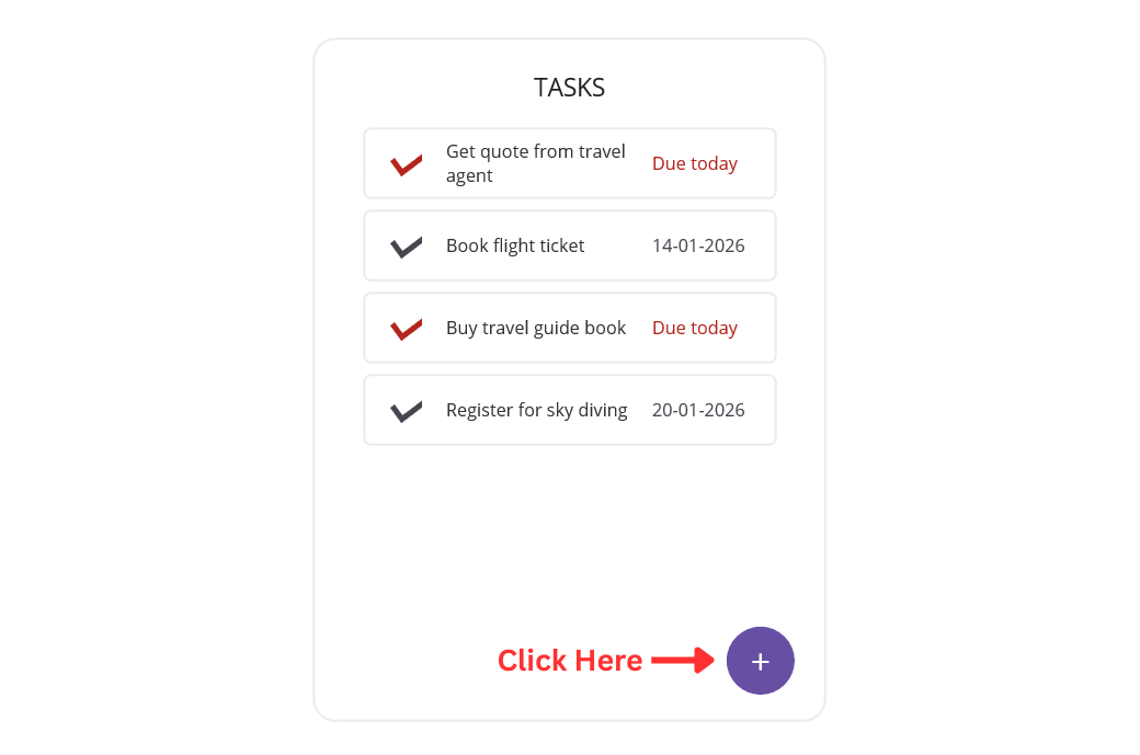
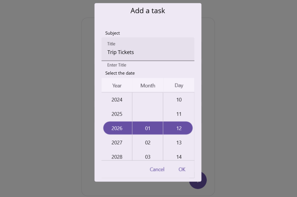
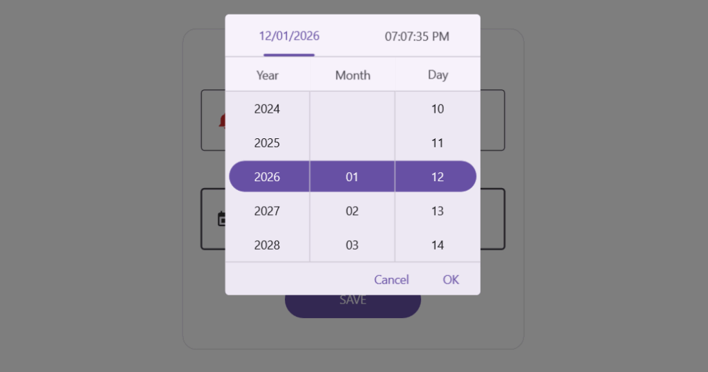
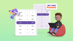
.NET MAUI Date Picker
The .NET MAUI Date Picker provides a simple calendar UI for selecting dates.
- Scheduling: Perfect for assigning due dates or task deadlines.
- Filtering: Allows users to refine records by date, such as transactions or logs.
- Forms: Commonly used for fields like date of birth or booking dates.
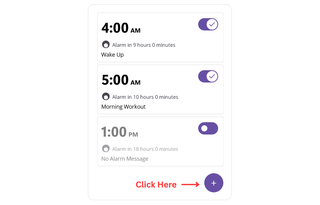
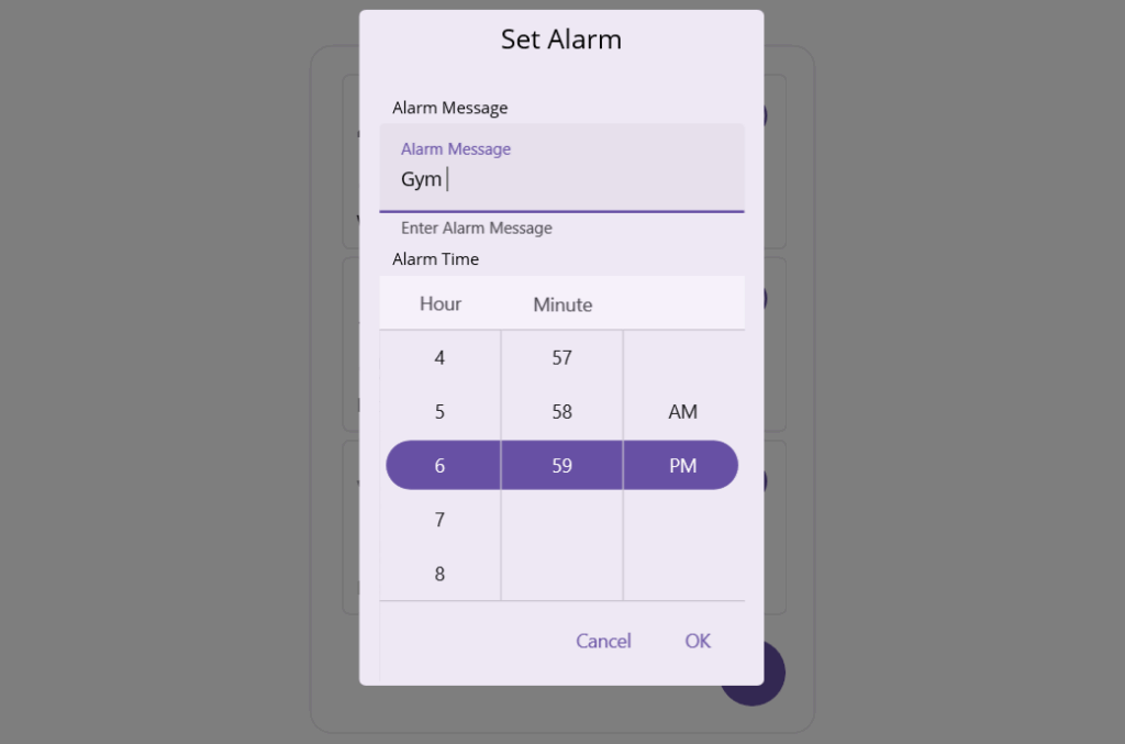
.NET MAUI Time Picker
The .NET MAUI Time Picker focuses on time-only input in 12-hour or 24-hour formats.
- Scheduling: Recurring reminders or alarms.
- Filtering: Time-based logs like shift records.
- Forms: Capture alarm times or shift start times.
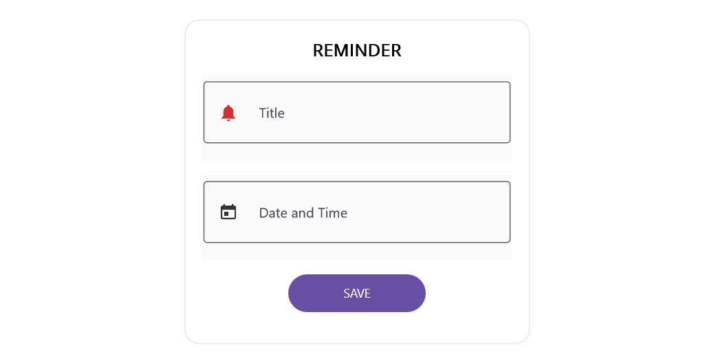
.NET MAUI Date Time Picker
The .NET MAUI Date Time Picker combines both date and time selection in a single control.
- Scheduling: Meetings or appointments with precise timestamps.
- Filtering: Refine datasets with exact datetime values.
- Forms: Event scheduling or reservation systems.
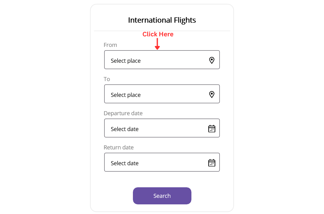
.NET MAUI Picker
The .NET MAUI Picker is a versatile control for selecting values from custom lists.
- Scheduling: Assign categories or labels to tasks.
- Filtering: Narrow datasets by category or status.
- Forms: Dropdowns, product variants, or multi-column selections.
Quick decision checklist: Selecting .NET MAUI Pickers
- Identify input type: Date, Time, DateTime, or List.
- Use DateTimePicker for single timestamp; use separate DatePicker and TimePicker otherwise.
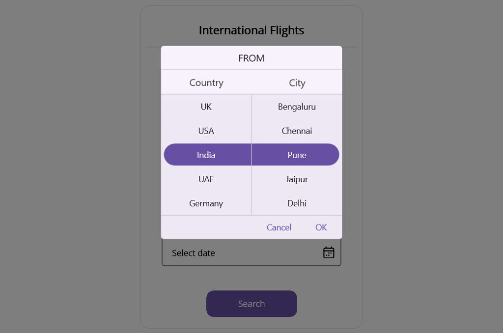
- Apply cascading Picker for dependent selections (e.g., Country → City).
- Choose presentation mode: Dialog for compact UI, Inline for always-visible selection.
- Enable auto-close and looping for faster user interaction.
- Define time format and step: 12/24-hour mode, minute interval (e.g., 5, 15, 30).
- Provide sensible defaults and meaningful placeholders.
- Bind values using MVVM: Date, Time, DateTime, SelectedItem with two-way binding.
- Wire commands/events for Confirm, Open, and Close actions.
- Configure localization: culture formats, first day of week, time zone awareness.
- Ensure accessibility: label association, keyboard navigation, 44x44dp touch targets.
- Optimize for data size: use a simple Picker for small lists, search/filter for large lists.
- Apply consistent styling: templates, icons, headers, and footers.
- Handle special cases: round-trip dates, multi-select via custom controls.
- Test performance across platforms: iOS, Android, Windows, macOS.
Frequently Asked Questions
Which picker should I use for scheduling a meeting with both date and time?
Use Date Time Picker. It captures a complete timestamp in one flow, reduces user effort, and avoids synchronization issues between separate date and time fields.
When is the Time Picker better than the Date Time Picker?
Choose Time Picker when the date is either fixed or irrelevant. Common cases include setting daily alarms, using snooze settings, scheduling recurring reminders, or selecting a shift start time for an already known date. Time Picker keeps the interaction focused and fast.
What is the best picker for collecting a user’s date of birth in a form?
Use Date Picker. Configure a sensible minimum and maximum date range, such as limiting future dates and allowing historical dates. Optionally enable dialog mode to keep the form compact on mobile devices. This keeps the experience simple and prevents invalid input from occurring.
How do the pickers behave consistently across iOS, Android, Windows, and macOS?
They follow platform guidelines while keeping a consistent programming model. You bind values and handle events the same way across platforms. Use dialog or inline modes as needed and apply shared styles and templates for a uniform look while respecting native behavior.
GitHub reference
You can explore the complete sample on GitHub to see demonstrations of all four implementations in action.

Conclusion
Thank you for reading! In this blog, we explored how to master all types of .NET MAUI Pickers, including Picker, Date Picker, Time Picker, and Date Time Picker and apply them to real-world scenarios like forms, data filtering, and scheduling tasks.
If you’re a Syncfusion user, you can download the setup from the license and downloads page. Otherwise, you can download a free 30-day trial.
You can also contact us through our support forum, support portal, or feedback portal for queries. We are always happy to assist you!


 No spam, just valuable updates.