
TL;DR: Struggling to interpret complex airline delay patterns? A simple bar chart won’t cut it. This guide shows how to build a .NET MAUI Violin Chart for deep statistical insights, complete with data binding and advanced customization techniques.
Welcome to our Chart of the Week blog series!
Comparing flight delays across multiple airlines can feel overwhelming, especially when you’re dealing with thousands of data points. Traditional charts often fail to reveal the full picture. That’s where a Violin Chart in .NET MAUI comes in.
In this guide, you’ll learn how to build a Syncfusion® .NET MAUI Violin Charts to visualize airline arrival delay distributions. We’ll walk through transforming raw operational data into an interactive chart that highlights delay patterns, uncovers performance bottlenecks, and detects outliers, all using advanced data visualization techniques.
What is a Violin Chart?
A violin chart combines the power of box-and-whisker plot functionality with kernel density estimation to show the complete distribution of data. Unlike traditional bar charts or simple box plots, violin charts reveal the density and shape of data across the entire range. Wider sections indicate higher concentrations of observations, while narrower sections show lower frequencies.
This makes violin charts ideal for:
- Displaying multimodal distributions
- Identifying skewness
- Comparing distribution shapes across categories
Here are some practical use cases:
- Airline operations analysis: Visualize delay patterns across carriers and routes.
- Performance benchmarking: Compare operational metrics between airlines.
- Statistical analysis: Present experimental results or continuous variable distributions.
- Operational excellence: Spot process variations and consistent performers.
- Quality assurance: Monitor reliability and detect systemic issues.
Creating a Violin Chart using .NET MAUI Charts
To build a violin chart for airline delay analysis in .NET MAUI, we will use the SfCartesianChart with a customized BoxAndWhiskerSeries with custom rendering capabilities and advanced segment customization. This approach allows you to render violin-shaped segments and apply advanced customization for statistical visualization.
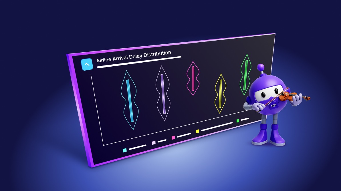
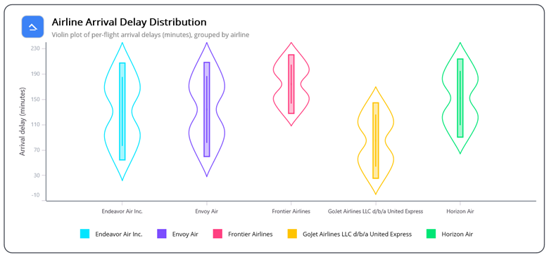
Here’s an example of how the chart displays airline delay distributions for easy comparison and performance analysis:

Let’s break down the steps to create a violin chart distribution using the Syncfusion .NET MAUI Cartesian Chart for analyzing the airline delay pattern.
Step 1: Collecting airline data
Start by loading historical airline delay data from a CSV file. For this example, we’re using 2023 flight performance data from transtats.bts.gov. Group the data by airline to prepare for distribution analysis.
Step 2: Preparing data for visualization
Before rendering the Violin Chart, the data must be structured using the MVVM pattern to ensure proper separation of concerns and maintainability. This process involves defining two classes: AirlineViolinModel and ViolinViewModel.
The AirlineViolinModel class represents airline delay details. It includes properties for the airline name, which will be used as chart labels, a collection of arrival delay values for statistical analysis, and a legend color for easy visual comparison. Below is the implementation:
public class AirlineViolinModel
{
    public AirlineViolinModel()
    {
    }

    public AirlineViolinModel(string airline, List<double> arrivalDelayMinutes)
    {
        Airline = airline;
        ArrivalDelayMinutes = arrivalDelayMinutes;
    }

    public string Airline { get; set; }
    public Color LegendColor { get; set; }
    public List<double> ArrivalDelayMinutes { get; set; }
}
The ViolinViewModel class is responsible for loading, grouping, and processing the data for the chart.
public class ViolinViewModel
{
    public ObservableCollection<AirlineViolinModel> AirlineData { get; set; }
    public ObservableCollection<Brush> PaletteBrushesDark { get; set; }
    public ViolinViewModel()
    {
        AirlineData = new ObservableCollection<AirlineViolinModel>();
        LoadAllAirlineData();
        int count = 0;
        foreach (AirlineViolinModel airline in AirlineData)
        {
            if (PaletteBrushesDark[count++] is SolidColorBrush color)
                airline.LegendColor = color.Color;
            }
        }

    private void LoadAllAirlineData()
    {
        var flightPoints = ReadCSV("Airline_Delay_Cause.csv");
        var groups = new Dictionary<string, List<double>>();
        foreach (var flightPoint in flightPoints)
        {
            if (flightPoint.Cancelled || flightPoint.Diverted)
                continue;
            double delay = flightPoint.ArrivalDelayMinutes;
            if (_clampEarlyToZero && delay < 0)
                delay = 0;
            if (_capMinutes.HasValue && delay > _capMinutes.Value)
                delay = _capMinutes.Value;

            if (!groups.TryGetValue(flightPoint.Airline, out var list))
            {
                list = new List<double>();
                groups[flightPoint.Airline] = list;
            }
            list.Add(delay);
        }
        var items = groups
            .Where(kvp => kvp.Value.Count >= _minSamples)
            .Select(kvp => new AirlineViolinModel(kvp.Key, kvp.Value))
            .OrderBy(m => m.Airline)
            .ToList();

        AirlineData.Clear();
        foreach (var item in items.Skip(4).Take(5))
        {
            AirlineData.Add(item);
        }
    }
Step 3: Configure the Syncfusion .NET MAUI Charts
Let’s configure the Syncfusion .NET MAUI Charts control for professional statistical data visualization using the official documentation. Use a CategoryAxis on the XAxis to display airline names, and a NumericalAxis on the YAxis to display arrival delay values in minutes.
Code example for Quick Integration:
<chart:SfCartesianChart>
    <chart:SfCartesianChart.XAxes>
        <chart:CategoryAxis/>
    </chart:SfCartesianChart.XAxes>

    <chart:SfCartesianChart.YAxes>
        <chart:NumericalAxis/>
    </chart:SfCartesianChart.YAxes>
</chart:SfCartesianChart>
Step 4: Customizing the Violin series
Syncfusion .NET MAUI Charts offers advanced customization options for violin chart customization. Using custom series renderers with BoxAndWhiskerSeriesViolin and BoxAndWhiskerSegmentViolin classes.
We create the BoxAndWhiskerSeriesViolin class that inherits from BoxAndWhiskerSeries. This class manages the overall series configuration and customization properties for professional distribution visualization:
public class BoxAndWhiskerSeriesViolin : BoxAndWhiskerSeries
{
    public float ViolinStrokeThickness { get; set; } = 2f;
    public float MaxHalfWidthFraction { get; set; } = 0.7f;
    public float PinchAmount { get; set; } = 0.6f;
    public float PinchSigma { get; set; } = 0.09f;
    public float WhiskerThickness { get; set; } = 2.2f;
    public float IqrBarWidthFraction { get; set; } = 0.08f;
    public float IqrBarHeightFraction { get; set; } = 0.70f;
    public float IqrBarMinHeightPixels { get; set; } = 8f;
    public float IqrFillOpacity { get; set; } = 0.35f;
    public float TipGapPixels { get; set; } = 7f;
    public float WhiskerShortenPixels { get; set; } = 6f;
    public float WhiskerLengthFraction { get; set; } = 0.55f;
    public float MinWhiskerPixels { get; set; } = 7f;
    protected override ChartSegment CreateSegment()
    {
        return new BoxAndWhiskerSegmentViolin(this);
    }
}
Then create the BoxAndWhiskerSegmentViolin class that inherits from BoxAndWhiskerSegment. Override the Draw method to render the distinctive arc-shaped violin body along with whiskers and statistical indicators for comprehensive airline delay analysis.
public class BoxAndWhiskerSegmentViolin : BoxAndWhiskerSegment
{
    private readonly BoxAndWhiskerSeriesViolin _owner;
    private float _left, _right, _top, _bottom;
    private float _centerX, _halfWidth;
    private float _yQ1, _yQ3, _yMedian;
    public BoxAndWhiskerSegmentViolin(BoxAndWhiskerSeriesViolin owner)
    {
        _owner = owner;
    }
    protected override void OnLayout()
    {
        base.OnLayout();
        _left = Left;
        _right = Right;
        _top = Top;
        _bottom = Bottom;
        if (float.IsNaN(_left) || float.IsNaN(_right) || float.IsNaN(_top) || float.IsNaN(_bottom))
            return;

        _centerX = (_left + _right) * 0.5f;
        _halfWidth = MathF.Max(1f, (_right - _left) * 0.5f);
        _yQ1 = _top;
        _yQ3 = _bottom;
        _yMedian = (_yQ1 + _yQ3) * 0.5f;
    }
    protected override void Draw(ICanvas canvas)
    {
        if (float.IsNaN(_left) || float.IsNaN(_right) || float.IsNaN(_top) || float.IsNaN(_bottom))
            return;

        DrawViolin(canvas);
        DrawVerticals(canvas);
    }
}
Step 5: Design the Violin Chart layout
To design the violin chart, add multiple instances of the BoxAndWhiskerSeriesViolin class. Configure each series with the appropriate ItemsSource, XBindingPath, and YBindingPath properties. Ensure that the ViolinViewModel is set as the chart’s BindingContext for seamless data visualization.
Here’s how you can do it in code.
<ContentPage xmlns="http://schemas.microsoft.com/dotnet/2021/maui"
             xmlns:x="http://schemas.microsoft.com/winfx/2009/xaml"
             xmlns:chart="clr-namespace:Syncfusion.Maui.Charts;assembly=Syncfusion.Maui.Charts"
             xmlns:local="clr-namespace:ViolinChart"
             x:Class="ViolinChart.MainPage">
    <chart:SfCartesianChart>
        <local:BoxAndWhiskerSeriesViolin ItemsSource="{Binding AirlineData}"
                                                                      XBindingPath="Airline"
                                                                      YBindingPath="ArrivalDelayMinutes"/>
    </chart:SfCartesianChart>

</ContentPage>
Step 6: Customize the Chart
Now, let’s make the chart visually engaging and easy to interpret. You’ll customize the title, axes, legend, and series styling to create a polished, developer-friendly visualization.
Chart title
Set a descriptive title that clearly communicates the purpose of the chart. A well-defined title helps users quickly understand the airline delay distribution being analyzed.
<StackLayout Grid.Row="0" Grid.Column="1"
                     Spacing="3"
                     VerticalOptions="Center"
                     Margin="15,0,10,0">
    <Label Text="Airline Arrival Delay Distribution Analysis"
                   FontSize="{OnPlatform Android=16, Default=20, iOS=16}"
                   FontAttributes="Bold"
                   TextColor="#1A1A1A"
                   LineBreakMode="WordWrap"/>
    <Label Text="Comprehensive Distribution Comparison of Arrival Delays Across Major Airlines"
                   FontSize="{OnPlatform Android=11, Default=13, iOS=11}"
                   TextColor="#64748B"
                   FontAttributes="None"
                   LineBreakMode="WordWrap"/>
</StackLayout>
Chart axes
Fine-tune the X-axis and Y-axis for clarity:
- Use meaningful titles and label styles.
- Define ranges for better precision.
- Control visibility with the IsVisible property. These adjustments ensure the chart delivers accurate and readable statistical insights.
Here’s how you can do it in code.
<!-- X-Axis Configuration -->
<chart:SfCartesianChart.XAxes>
    <chart:CategoryAxis ShowMajorGridLines="False"
                        EdgeLabelsDrawingMode="Shift"
                        AxisLineStyle="{chart:ChartLineStyle Stroke=#233042, StrokeWidth=1}">
        <chart:CategoryAxis.LabelStyle>
            <chart:ChartAxisLabelStyle FontSize="{OnPlatform Default=11, Android=10}"/>
        </chart:CategoryAxis.LabelStyle>
    </chart:CategoryAxis>
</chart:SfCartesianChart.XAxes>

<!-- Y-Axis Configuration -->
<chart:SfCartesianChart.YAxes>
    <chart:NumericalAxis Interval="40" Minimum="-10" ShowMajorGridLines="False">
        <chart:NumericalAxis.Title>
            <chart:ChartAxisTitle Text="Arrival Delay (Minutes)"/>
        </chart:NumericalAxis.Title>
        <chart:NumericalAxis.AxisLineStyle>
            <chart:ChartLineStyle Stroke="#233042" StrokeWidth="1"/>
        </chart:NumericalAxis.AxisLineStyle>
        <chart:NumericalAxis.LabelStyle>
            <chart:ChartAxisLabelStyle TextColor="#9CA3AF" FontSize="{OnPlatform Default=11, Android=10}"/>
        </chart:NumericalAxis.LabelStyle>
    </chart:NumericalAxis>
</chart:SfCartesianChart.YAxes>
Violin series styling
Enhance the violin series by customizing colors, opacity, stroke widths, and statistical indicators. Proper styling enhances the chart’s visual appeal and facilitates a more effective multi-carrier comparison.
<chart:SfCartesianChart>
    <local:BoxAndWhiskerSeriesViolin ItemsSource="{Binding AirlineData}"
                                     XBindingPath="Airline"
                                     YBindingPath="ArrivalDelayMinutes"
                                     PaletteBrushes="{Binding PaletteBrushesDark}"
                                     ShowOutlier="True"
                                     ShowMedian="True"
                                     StrokeWidth="1.6"
                                     Opacity="0.92"/>
</chart:SfCartesianChart>
Legend
Add a legend with color-coded indicators, enhancing the multi-carrier comparison capabilities of the distribution visualization, as shown below:
 <Grid Grid.Row="1" Padding="{OnPlatform Default='4,8,4,2', Android='2,6,2,2', iOS='2,6,2,2'}">
    <CollectionView ItemsSource="{Binding AirlineData}"
                    HorizontalScrollBarVisibility="Never"
                    HorizontalOptions="CenterAndExpand"
                    VerticalScrollBarVisibility="Never">
        <CollectionView.ItemsLayout>
            <LinearItemsLayout Orientation="Horizontal" ItemSpacing="10"/>
        </CollectionView.ItemsLayout>
        <CollectionView.ItemTemplate>
            <DataTemplate>
                <Grid ColumnDefinitions="Auto, *" Padding="0" Margin="0,0,6,8">
                    <!-- Color Swatch -->
                    <RoundRectangle Grid.Column="0"
                                   WidthRequest="{OnPlatform Android=10, Default=20, iOS=10}"
                                   HeightRequest="{OnPlatform Android=10, Default=20, iOS=10}"
                                   BackgroundColor="{Binding LegendColor}"
                                   Margin="8, 0,5,0"/>
                    <!-- Airline Label -->
                    <Label Grid.Column="1"
                           Text="{Binding Airline}"
                           Margin="6,0,0,0"
                           VerticalOptions="Center"
                           FontSize="{OnPlatform Default=12, Android=11, iOS=12}"/>
                </Grid>
            </DataTemplate>
        </CollectionView.ItemTemplate>
    </CollectionView>
</Grid>
Once you run the code, the chart renders a clear and visually compelling view of airline delay distributions, making it easy to compare performance across carriers.
GitHub reference
For more details and complete source code for this .NET MAUI Violin Chart implementation, refer to the GitHub demo.

FAQs
Q1: What is a Violin Chart, and why use it?
The Violin Chart shows the full shape of your data (where values are common or rare). It’s great for comparing distributions between groups, finding skewness, and spotting outliers.
Q2: How does it help with airline delay analysis?
It shows how delays are spread for each airline, so you can quickly see typical delay ranges, long tails, and unusual patterns.
Q3: What are the mode types in a box plot chart?
Box plot supports three quartile calculation modes: Normal, Inclusive, and Exclusive.
Q4: How to customize OutlierShapeType?
Choose the outlier symbol on the series. Available shapes: Circle (default), Cross, Diamond, Triangle, InvertedTriangle, Rectangle, Pentagon, Hexagon, and Plus.
Conclusion
Thank you for reading! In this guide, we’ve explored how to create a professional .NET MAUI custom Violin Chart to visualize airline arrival delay distribution patterns and statistical analysis across major airlines using Syncfusion .NET MAUI Charts. This advanced data visualization approach provides aviation professionals with powerful tools for distribution analysis, performance benchmarking, and operational excellence.
If you’re a Syncfusion user, you can download the setup from the license and downloads page. Otherwise, you can download a free a 30-day free trial.
You can also contact us through our support forum, support portal, or feedback portal for queries. We are always happy to assist you!


 No spam, just valuable updates.