
 Saiyath Ali Fathima M
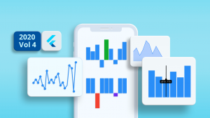
TL;DR: A newly introduced Spark Chart control for .NET MAUI Toolkit enables developers to embed compact, responsive visualizations, like Line, Column, Area, and WinLoss charts, directly into mobile and dashboard UIs. This guide walks through its setup, customization, and practical use cases for modern app development.
Struggling to fit clear data visuals into your app’s tight UI? The new Spark Chart control in the .NET MAUI Toolkit solves this with sleek, high-performance micro charts. Perfect for developers building modern apps, it delivers instant trend insights without cluttering your interface.
Why choose Spark Charts for your .NET MAUI app?
Spark Charts empower developers to visualize data efficiently in space-constrained UIs. Use them to:
- Track trends in tight spaces: Display time-series data in small widgets, like stock tickers or sensor readouts.
- Enhance grids and lists: Embed charts in tables or cards for at-a-glance insights, ideal for dashboards.
- Simplify complex data: Convey patterns without bulky, full-sized charts, keeping your app clean and fast. Available in Line, Column, Area, and WinLoss formats, Spark Charts are optimized for performance and flexibility, making them go-to for modern mobile and desktop interfaces.
Let’s configure the Spark Chart control in a .NET MAUI application.
Set up the Spark Chart [Micro Chart]
Start by following these steps:
Step 1: Install the NuGet package Syncfusion.Maui.Toolkit.
Step 2: Register the Syncfusion Toolkit handler in MauiProgram.cs:
using Syncfusion.Maui.Toolkit.Hosting;

namespace ChartGettingStarted
{
    public static class MauiProgram
    {
        public static MauiApp CreateMauiApp()
        {
            var builder = MauiApp.CreateBuilder();

            builder
                .UseMauiApp<App>()
                .ConfigureSyncfusionToolkit()

            return builder.Build();
        }
    }
}
Step 3: Add the namespace Syncfusion.Maui.Toolkit.SparkCharts in your XAML page, as shown below.
xmlns:chart="clr-namespace:Syncfusion.Maui.Toolkit.SparkCharts;assembly=Syncfusion.Maui.Toolkit"
Step 4: Initialize View Model
To begin, define a simple data model representing each data point in the chart.
public class SparkDataModel
{
    public double Value { get; set; }
}
Next, create a view model class that holds a list of these data points:
public class SparkChartViewModel
{
     public List Data { get; set; }
     public SparkChartViewModel()
    {
         Data = new List()
         {
              new SparkDataModel(){ Value = 5000},
              new SparkDataModel(){ Value = 9000},
              new SparkDataModel(){ Value = 5000},
              new SparkDataModel(){ Value = 0},
              new SparkDataModel(){ Value = 3000},
              new SparkDataModel(){ Value = -4000},
              new SparkDataModel(){ Value = 5000},
              new SparkDataModel(){ Value = 0},
              new SparkDataModel(){ Value = 9000},
              new SparkDataModel(){ Value = -9000},
         };
    }
}
Step 5: Bind ViewModel
To connect the chart to your data, assign the BindingContext to an instance of SparkChartViewModel as shown below:
<ContentPage
     xmlns="http://schemas.microsoft.com/dotnet/2021/maui"
     xmlns:x="http://schemas.microsoft.com/winfx/2009/xaml"
     xmlns:sparkchart="clr-namespace:Syncfusion.Maui.Toolkit.SparkCharts;assembly=Syncfusion.Maui.Toolkit"
     xmlns:model="clr-namespace:GettingStarted"
     x:Class="GettingStarted.MainPage">

     <ContentPage.BindingContext>
          <model:SparkChartViewModel/>
     </ContentPage.BindingContext>
</ContentPage>
Now you’re all set to integrate Spark Chart into your application. Before integrating, let’s see the different types of charts available.
- Line Chart: Displays data as a continuous line, great for showing trends.
- Column Chart: Uses vertical bars to represent values, ideal for comparisons.
- Area Chart: Similar to line charts but with filled areas, adds visual emphasis.
- WinLoss Chart: Highlights positive vs. negative values, useful for binary outcomes.
Each chart type in the Spark Chart control serves a unique purpose and can be selected based on the nature of your data and layout needs. Now that your .NET MAUI app is all set with the basic configurations, let’s explore each chart type by integrating them into the app.
Spark Column Chart
The Spark Column Chart is an excellent choice for visualizing discrete data points such as performance metrics, monthly sales figures, or sensor readings. It’s particularly effective in compact layouts like dashboard cards or list items, where space is limited but trend visibility is crucial.
You can integrate the Spark Column Chart in your .NET MAUI app with this code snippet,
<sparkchart:SfSparkColumnChart ItemsSource="{Binding Data}" YBindingPath="Value"/>Note: In the above code, the Data property is bound to ItemsSource, and the Value property is bound to YBindingPath. For detailed setup instructions, refer to the official documentation.
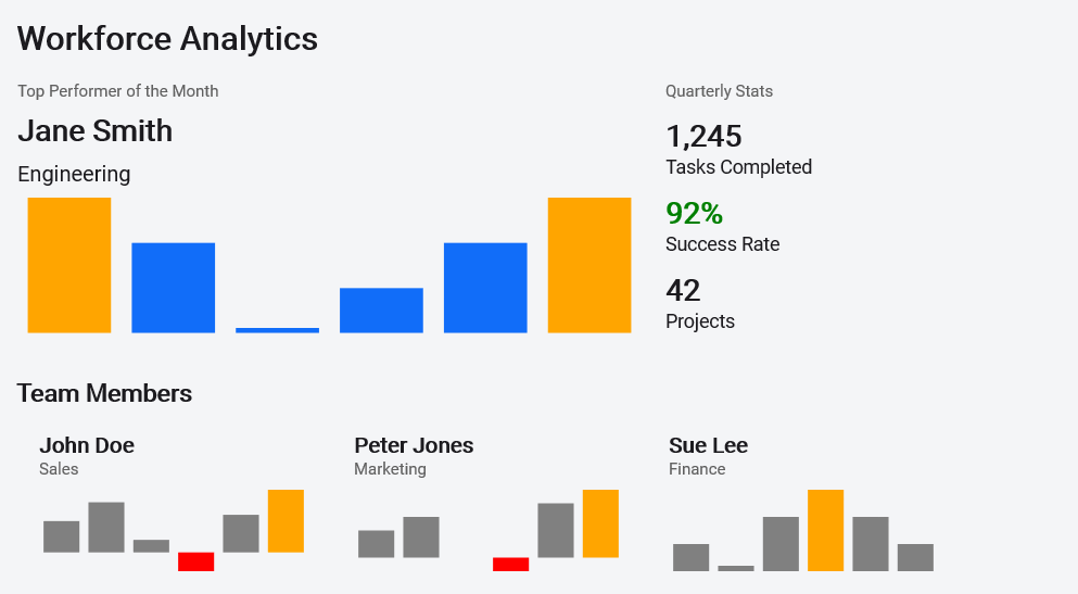
Example: In a workforce analytics dashboard, each employee card can feature a Spark Column Chart to represent daily productivity scores. This visual element helps highlight key data points using customizable properties:
- FirstPointFill and LastPointFill: Mark the beginning and end of the data series.
- HighPointFill and LowPointFill: Emphasize peaks and dips in performance.
- NegativePointsFill: Distinguish underperformance or negative values.
This approach allows managers to quickly assess performance trends at a glance, without needing to dive into detailed reports.
Spark Line Chart
The Spark Line Chart is ideal for visualizing continuous data trends such as stock prices, temperature changes, or heart rate fluctuations. It offers a clean and minimal way to visualize movement over time.
If you want to integrate the Spark Line Chart in your app, use this code snippet
<sparkchart:SfSparkLineChart ItemsSource="{Binding Data}"
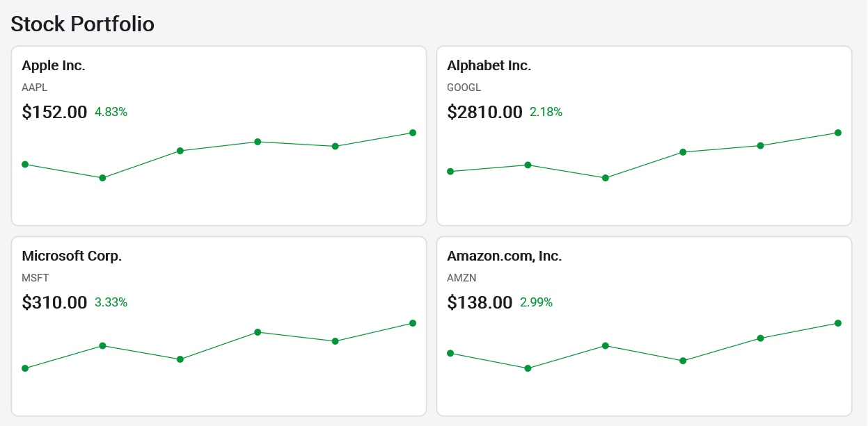
YBindingPath="Value"/>Example: In a financial app, each stock card can feature a Spark Line Chart showing price movement over the past 10 days. By enabling ShowMarkers, users can easily spot turning points, peaks, and dips.
Developers can customize the chart using the MarkerSettings property to adjust marker shape, size, and color, perfect for aligning with app branding or highlighting specific data points.
Spark Area Chart
The Spark Area Chart builds upon the line chart by adding a filled region beneath it, making it ideal for visualizing cumulative data or emphasizing volume.
Integrate the Spark Area Chart with the below code snippet.
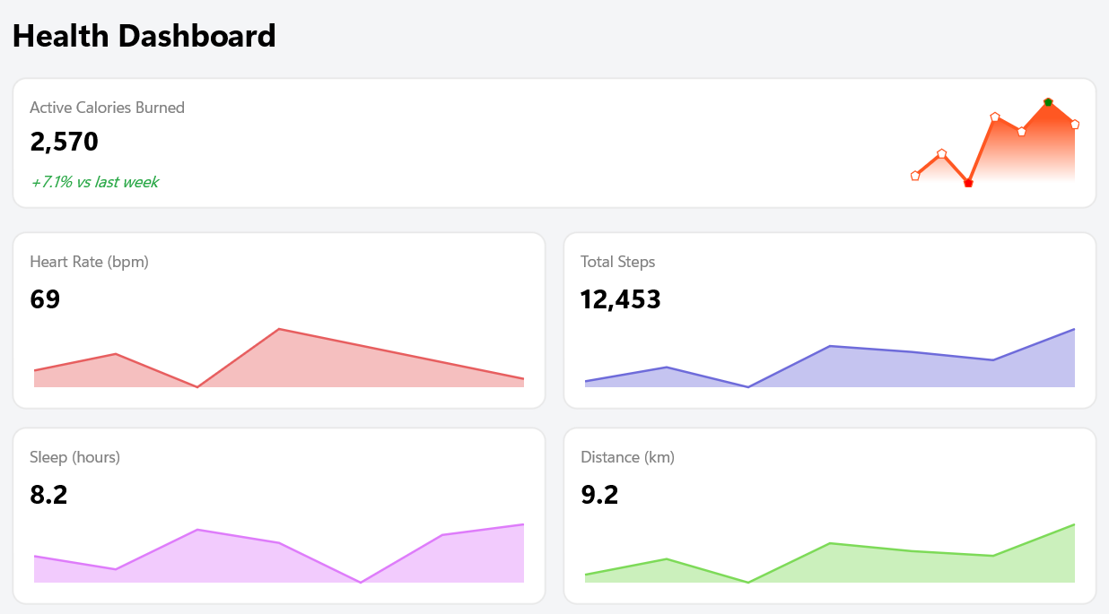
<sparkchart:SfSparkAreaChart ItemsSource="{Binding Data}" YBindingPath="Value"/>Example: The fitness tracking app might show a Spark Area Chart showing daily calorie burn. The filled area helps convey intensity and consistency at a glance. With marker support enabled, individual data points can be highlighted for clarity and insight.
Spark Win/Loss Chart
The Spark Win/Loss Chart is designed for binary outcomes like pass/fail, profit/loss, or yes/no. It’s a great fit for scenarios where you want to show success/failure patterns in a compact format.
Use this code snippet to integrate the Spark Win/Loss Chart.
<chart:SfSparkWinLossChart ItemsSource="{Binding Data}"  // refer demo for view model
                           YBindingPath="Value"
                           PositivePointsFill="Green"
                           NegativePointsFill="Red"
                           NeutralPointFill="Gray" />
The chart supports:
PositivePointsFillfor successful outcomesNegativePointsFillfor failuresNeutralPointFillfor skipped or undefined results
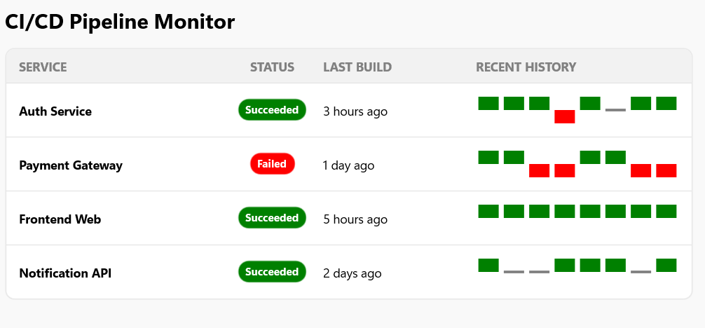
For example, in a CI/CD pipeline dashboard, each build card can include a Spark Win/Loss Chart summarizing test results. Passed tests appear in green, failed in red, and skipped or neutral tests in gray. This makes it easy for developers and QA teams to spot issues at a glance.
Performance tips
- Keep datasets small to maintain fast rendering
- Pre-shape data to avoid blocking the UI thread
- Limit the use of markers when rendering multiple charts simultaneously
What’s coming next?
Syncfusion continues to evolve the Spark Chart control to meet modern data visualization needs. Upcoming features include:
- Trackball support: Users tap or hover over data points to view exact values with contextual tooltips.
- Axis types: Add support for multiple axis formats, including:
- Numeric: For continuous data like performance metrics.
- Category: For grouped data like months or product names.
- DateTime: For time-series data such as trends over days or weeks.
- PlotBand enhancements: Introduce visual range indicators using:
- RangeBandStart and RangeBandEnd will define the band limits.
- RangeBandColor to highlight specific value ranges (e.g., thresholds or targets).
These features will make Spark Charts even more powerful and flexible.
GitHub reference
For more details, refer to the Toolkit Spark Char control demo on GitHub.

Conclusion
Thanks for reading! The Spark Chart control is a smart, lightweight addition to the Syncfusion .NET MAUI Toolkit that empowers developers to deliver instant trend insights in a compact format.
Whether you’re building dashboards, trackers, or data-driven reports, Spark Charts help users visualize patterns at a glance, without cluttering the UI or compromising performance. For more details, check our release notes.
With flexible chart types, rich customization options, and seamless integration, Spark Charts make it easy to turn raw data into meaningful visuals that feel native across platforms.
If you’re a Syncfusion user, you can download the setup from the license and downloads page. Otherwise, you can download a free 30-day trial.
You can also contact us through our support forum, support portal, or feedback portal for queries. We are always happy to assist you!


 No spam, just valuable updates.