
Xamarin.Forms Succinctly®

CHAPTER 5
Xamarin.Forms Common Controls
Xamarin.Forms ships with a rich set of common controls that you can use to build cross-platform user interfaces easily, and without the need for the complexity of platform-specific features. As you can imagine, the benefit of these common controls is that they run on Android, iOS, and Windows from the same codebase. In this chapter, you’ll learn about common controls, their properties, and their events. Other controls will be introduced in Chapter 7, especially controls whose purpose is displaying lists of data.
Note: In order to follow the examples in this chapter, either create a brand new Xamarin.Forms solution (the name is up to you) or open the solution in the Chapter5 folder of the companion code repository. If you go for the first option, every time a new control is discussed, just clean the content of the root ContentPage object in the XAML file and remove any C# code specific to a single control or add a new file of type ContentPage to the project.
Understanding the concept of view
In Xamarin.Forms, a view is the building block of any mobile application. Put succinctly, a view is a control, and it represents what you would call a widget in Android, a view in iOS, and a control in Windows. Views derive from the Xamarin.Forms.View class. Actually, from a technical perspective, layouts are views themselves and derive from Layout, an intermediate object in the hierarchy that derives from View and includes a Children property, allowing you to add multiple visual elements to the layout itself.
The concept of view is also important from the terminology perspective. In fact, in Xamarin.Forms and its documentation, you will more often find the word view than control. From now on, I will be using both view and control interchangeably, but remember that documentation and tutorials often refer to views.
Views’ common properties
Views share a number of properties that are important for you to know in advance. These are summarized in Table 4.
Table 4: Views’ common properties
Property | Description |
|---|---|
HorizontalOptions | Same as Table 2. |
VerticalOptions | Same as Table 2. |
HeightRequest | Of type double, gets or sets the height of a view. |
WidthRequest | Of type double, gets or sets the width of a view. |
IsVisible | Of type bool, determines whether a control is visible on the user interface. |
IsEnabled | Of type bool, allows enabling or disabling a control, keeping it visible on the UI. |
GestureRecognizers | A collection of GestureRecognizer objects that enable touch gestures on controls that do not directly support touch. These will be discussed later in this chapter. |
Tip: Controls also expose the Margin property described in Table 3.
If you wish to change the width or height of a view, remember that you need the WidthRequest and HeightRequest properties, instead of Height and Width, which are read-only and return the current height and width.
Introducing common views
This section provides a high-level overview of common views in Xamarin.Forms, and their most utilized properties. Remember to add the official documentation about the user interface to your bookmarks for a more detailed reference.
User input with the Button
The Button control is certainly one of the most-used controls in every user interface. You already saw a couple examples of the Button previously, but here is a quick summary. This control exposes the properties summarized in Table 5, and you declare it like this:
<Button x:Name="Button1" Text="Tap here" TextColor="Orange" BorderColor="Red"
BorderWidth="2" CornerRadius="2" Clicked="Button1_Clicked"/>
Table 5: Button properties
Property | Description |
|---|---|
Text | The text in the button. |
TextColor | The color of the text in the button. |
BorderColor | Draws a colored border around the button. |
BorderWidth | The width of the border around the button. |
CornerRadius | The radius of the edges around the button. |
Image | An optional image to be set near the text. |
Notice how you can specify a name with x:Name so that you can interact with the button in C#, which is the case when you set the Clicked event with a handler. This control also exposes the Font, FontFamily, and FontAttributes properties, whose behavior is discussed in the next section about text.
Working with text: Label, Entry, and Editor
Displaying text and requesting input from the user in the form of text is extremely common in every mobile app. Xamarin.Forms offers the Label control to display read-only text, and the Entry and Editor controls to receive text. The Label control has some useful properties, as shown in the following XAML:
<Label Text="Displaying some text" LineBreakMode="WordWrap"
TextColor="Blue" XAlign="Center" YAlign="Center"/>
LineBreakMode allows you to truncate or wrap a long string and can be assigned a value from the LineBreakMode enumeration. For example, WordWrap splits a long string into multiple lines proportionate to the available space. If not specified, NoWrap is the default. XAlign and YAlign specify the horizontal and vertical alignment for the text. The Entry control instead allows you to enter a single line of text, and you declare it as follows:
<Entry x:Name="Entry1" Placeholder="Enter some text..."
TextColor="Green" Keyboard="Chat" Completed="Entry1_Completed"/>
The Placeholder property lets you display specific text in the entry until the user types something. It is useful for explaining the purpose of the text box. When the user taps the Entry, the on-screen keyboard is displayed. The appearance of the keyboard can be controlled via the Keyboard property, which allows you to display the most appropriate keys, depending on the Entry’s purpose. Supported values are Chat, Email, Numeric, Telephone, and Number. If Keyboard is not assigned, Default is assumed.
Additionally, Entry exposes the MaxLength property, which allows you to set the max length of the text the user can enter. This control also exposes two events: Completed, which is fired when the users finalize the text by tapping the Return key, and TextChanged, which is fired at every keystroke.
You provide event handlers the usual way, as follows:
private void Entry1_Completed(object sender, EventArgs e)
{
// Entry1.Text contains the full text
}
Entry also provides the IsPassword property to mask the Entry’s content, which you use when the user must enter a password. Another very useful property is ReturnType, whose value is of type ReturnType, which allows you to specify the text to be displayed in the Enter key of the keyboard. Possible values are Done, Go, Next, Search, Send, and Default (which sets the default text for each platform). The combination of the Label and Entry controls is visible in Figure 32.
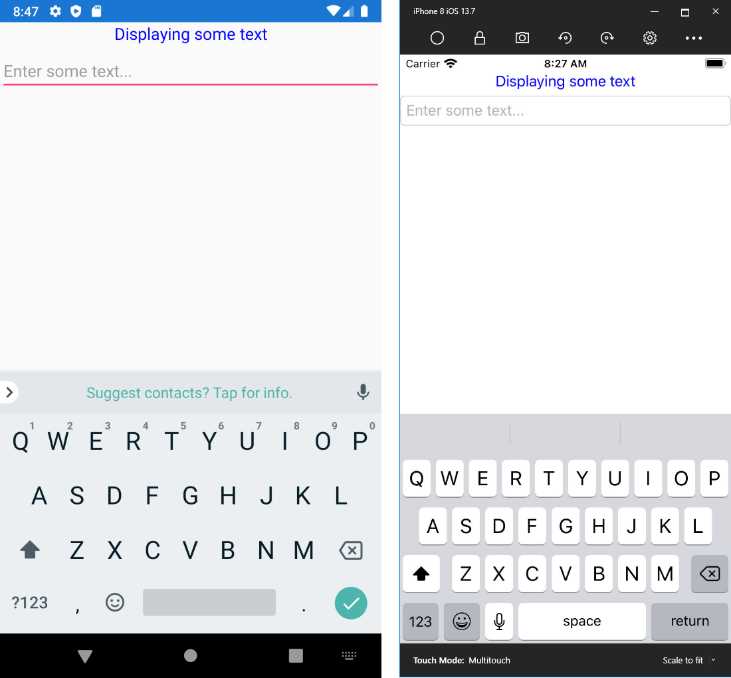
Figure 32: Label and Entry controls
The Editor control is very similar to Entry in terms of behavior, events, and properties, but it allows for entering multiple lines of text. For example, if you place the editor inside a layout, you can set its HorizontalOptions and VerticalOptions properties with Fill so that it will take all the available space in the parent. Both the Entry and Editor views expose the IsSpellChedkedEnabled property that, as the name implies, enables spell check over the entered text.
Formatted strings and bindable spans
The Label control exposes the FormattedText property, which can be used to implement more sophisticated string formatting. This property is of type FormattedString, an object that is populated with a collection of Span objects, each representing a part of the formatted string. The following snippet provides an example:
<Label
HorizontalOptions="Center"
VerticalOptions="CenterAndExpand">
<Label.FormattedText>
<FormattedString>
<FormattedString.Spans>
<Span FontSize="Large" FontAttributes="Bold"
ForegroundColor="Red"
Text="Xamarin.Forms Succinctly" />
<Span FontSize="Medium" FontAttributes="Italic"
ForegroundColor="Black" Text="3rd edition" />
<Span FontSize="Small" FontAttributes="Bold"
ForegroundColor="Blue"
Text="by Alessandro Del Sole" />
</FormattedString.Spans>
</FormattedString>
</Label.FormattedText>
</Label>
You can basically use Span objects to format specific paragraphs or sentences by setting most of the properties already exposed by the Label control, such as Text, Font, FontFamily, FontSize, FontAttributes, ForegroundColor, and BackgroundColor.
Managing fonts
Controls that display some text (including the Button) or that wait for user input through the keyboard also expose some properties related to fonts, such as FontFamily, FontAttributes, and FontSize. FontFamily specifies the name of the font you want to use. FontAttributes displays text as Italic or Bold and, if not specified, None is assumed.
With FontSize, you can specify the font size with either a numeric value or with a so-called named size, based on the Micro, Small, Medium, and Large values from the NamedSize enumeration. With this enumeration, Xamarin.Forms chooses the appropriate size for the current platform. For instance, the following two options are allowed to set the font size:
<Label Text="Some text" FontSize="72"/>
<Label Text="Some text" FontSize="Large"/>
Unless you are writing an app for a single platform, I recommend you avoid using numeric values—use the named size instead. You can also manage the spacing between individual characters in a string by setting the CharacterSpacing property, of type double, whose default value is zero.
Another useful property is TextTransform, which you can use to automatically convert a string into uppercase or lowercase. Allowed values are Uppercase, Lowercase, Default, and None. By default, strings are not transformed. It is also possible to apply underline and strikethrough decorations to a string by assigning the TextDecorations property with Underline and Strikethrough (the default is None).
Using custom fonts
A common requirement with modern apps is to use custom fonts. These can be available through official design channels, such as Google Material, or produced by professional designers. Xamarin.Forms supports both .ttf and .otf file formats. In order to use custom fonts, follow these steps:
- Add the .ttf or .otf files into each platform project’s resource folder: Assets for Android and UWP, Resources for iOS.
- Set the Build Action property of each file to: AndroidResource for Android, BundleResource for iOS, and EmbeddedResource for UWP.
- Assign the FontFamily property of your view with the name of the font.
For iOS and UWP, FontFamily just takes the font name, as follows:
<Label Text="Some text" FontFamily="MyFont.ttf"/>
For Android, you also need to specify the font name without the extension, as follows:
<Label Text="Some text" FontFamily="MyFont.ttf#MyFont"/>
In Chapter 9 you will learn how to assign the same property with different values depending on the operating system.
Working with dates and time: DatePicker and TimePicker
Another common requirement in mobile apps is working with dates and time: Xamarin.Forms provides the DatePicker and TimePicker views for that. On each platform, these are rendered with the corresponding date and time selectors. DatePicker exposes the Date, MinimumDate, and MaximumDate properties that represent the selected/current date, the minimum date, and the maximum date, respectively, all of type DateTime. It exposes an event called DateSelected, which is raised when the user selects a date. You can handle this to retrieve the value of the Date property. The view can be declared as follows:
<DatePicker x:Name="DatePicker1" MinimumDate="07/17/2021"
MaximumDate="12/31/2021"
DateSelected="DatePicker1_DateSelected"/>
And then in the code-behind, you can retrieve the selected date, like this:
private void DatePicker1_DateSelected(object sender, DateChangedEventArgs e)
{
DateTime selectedDate = e.NewDate;
}
The DateChangedEventArgs object stores the selected date in the NewDate property and the previous date in the OldDate property. Figure 33 shows the DatePicker on Android and iOS simulators.
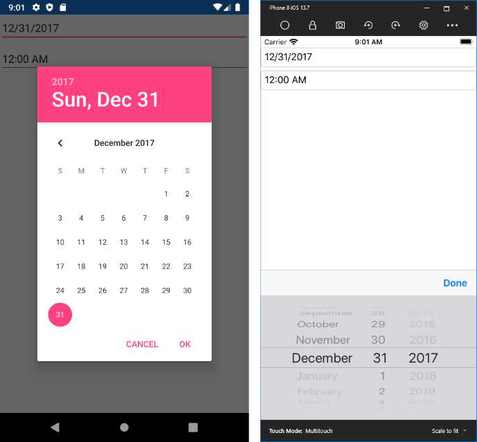
Figure 33: The DatePicker in action
The TimePicker exposes a property called Time, of type TimeSpan, but it does not expose a specific event for time selection, so you need to use the PropertyChanged event. In terms of XAML, you declare a TimePicker like this:
<TimePicker x:Name="TimePicker1"
PropertyChanged="TimePicker1_PropertyChanged"/>
Then, in the code-behind, you need to detect changes on the Time property as follows:
private void TimePicker1_PropertyChanged(object sender,
System.ComponentModel.PropertyChangedEventArgs e)
{
if(e.PropertyName == TimePicker.TimeProperty.PropertyName)
{
TimeSpan selectedTime = TimePicker1.Time;
}
}
TimeProperty is a dependency property, a concept that will be discussed in Chapter 7. Figure 34 shows the TimePicker in action.
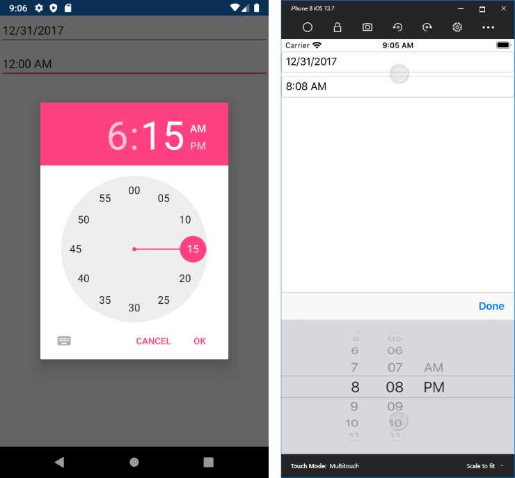
Figure 34: The TimePicker in action
Tip: You can also assign a date or time to pickers in the C# code-behind, for example, in the constructor of the page that declares them.
Displaying HTML contents with WebView
The WebView control allows for displaying HTML contents, including webpages and static HTML markup. This control exposes the Navigating and Navigated events that are raised when navigation starts and completes, respectively. The real power is in its Source property, of type WebViewSource, which can be assigned with a variety of content, such as URIs or strings containing HTML markup. For example, the following XAML opens the specified website:
<WebView x:Name="WebView1" Source="https://www.xamarin.com"/>
The following example shows instead how you can assign the Source property with a string:
WebView1.Source = "<div><h1>Header</h1></div>";
For dynamic sizing, a better option is enclosing the WebView inside a Grid layout. If you instead use the StackLayout, you need to supply height and width explicitly. When you browse contents on the internet, you need to enable the internet permission in the Android manifest, and the internet (client) permission in the UWP manifest. Figure 35 shows how the WebView appears.

Figure 35: Displaying HTML contents with WebView
If the webpage you display allows you to browse other pages, you can leverage the built-in GoBack and GoForward methods, together with the CanGoBack and CanGoForward Boolean properties to programmatically control navigation between webpages.
Tip: If you need to implement navigation to URLs, it might be worth considering the deep linking feature.
App Transport Security in iOS
Starting with iOS 9, Apple introduced some restrictions in accessing networked resources, including websites, enabling navigation only through the HTTPS protocol by default. This feature is known as App Transport Security (ATS). ATS can be controlled in the iOS project properties, and it allows for introducing some exceptions, because you might need to browse HTTP contents despite the restrictions. More details about ATS and exceptions are available in the documentation; however, remember that if the WebView shows no content on iOS, the reason might be ATS.
Implementing value selection: Switch, Slider, Stepper
Xamarin.Forms offers a number of controls for user input based on selecting values. The first of them is the Switch, which provides a toggled value and is useful for selecting values such as true or false, on or off, and enabled or disabled. It exposes the IsToggled property, which turns the switch on when true, and the Toggled event, which is raised when the user changes the switch position. This control has no built-in label, so you need to use it in conjunction with a Label, as follows:
<StackLayout Orientation="Horizontal">
<Label Text="Enable data plan"/>
<Switch x:Name="Switch1" IsToggled="True" Toggled="Switch1_Toggled"
Margin="5,0,0,0"/>
</StackLayout>
The Toggled event stores the new value in the ToggledEventArgs object that you use as follows:
private void Switch1_Toggled(object sender, ToggledEventArgs e)
{
bool isToggled = e.Value;
}
You can also change the color for the selector when it’s turned on, assigning the OnColor property with the color of your choice. Before Xamarin.Forms 3.1, you had to create a custom renderer to achieve this, so it is a very useful addition. The Slider allows the input of a linear value. It exposes the Value, Minimum, and Maximum properties, all of type double, which represent the current value, minimum value, and maximum value. Like the Switch, it does not have a built-in label, so you can use it together with a Label as follows:
<StackLayout Orientation="Horizontal">
<Label Text="Select your age: "/>
<Slider x:Name="Slider1" Maximum="85" Minimum="13" Value="30"
ValueChanged="Slider1_ValueChanged"/>
</StackLayout>
Tip: Surprisingly, if you write the Minimum before the Maximum, a runtime error will occur. So, for both the Slider and the Stepper, the order matters.
The ValueChanged event is raised when the user moves the selector on the Slider, and the new value is sent to the NewValue property of the ValueChangedEventArgs object you get in the event handler.
The last control is the Stepper, which allows the supplying of discrete values with a specified increment. It also allows the specifying of minimum and maximum values. You use the Value, Increment, Minimum, and Maximum properties of type double as follows:
<StackLayout Orientation="Horizontal">
<Label Text="Select your age: "/>
<Stepper x:Name="Stepper1" Increment="1" Maximum="85" Minimum="13"
Value="30" ValueChanged="Stepper1_ValueChanged"/>
<Label x:Name="StepperValue"/>
</StackLayout>
Notice that both the Stepper and Slider only provide a way to increment and decrement a value, so it is your responsibility to display the current value, for example, with a Label that you can handle through the ValueChanged event. The following code demonstrates how to accomplish this with the Stepper:
private void Stepper1_ValueChanged(object sender, ValueChangedEventArgs e)
{
StepperValue.Text = e.NewValue.ToString();
}
Figure 36 shows a summary of all the aforementioned views.

Figure 36: A summary view of the Switch, Slider, and Stepper controls
Introducing the SearchBar
One of the nicest views in Xamarin.Forms, the SearchBar shows a native search box with a search icon that users can tap. This view exposes the SearchButtonPressed event. You can handle this event to retrieve the text the user typed in the box and then perform your search logic, for example, by executing a LINQ query against an in-memory collection or filtering data from the table of a local database.
It also exposes the TextChanged event, which is raised at every keystroke, and the Placeholder property, which allows you to specify a placeholder text like the same-named property of the Entry control. You declare it as follows:
<SearchBar x:Name="SearchBar1" Placeholder="Enter your search key..."
SearchButtonPressed="SearchBar1_SearchButtonPressed"/>
Figure 37 shows an example.
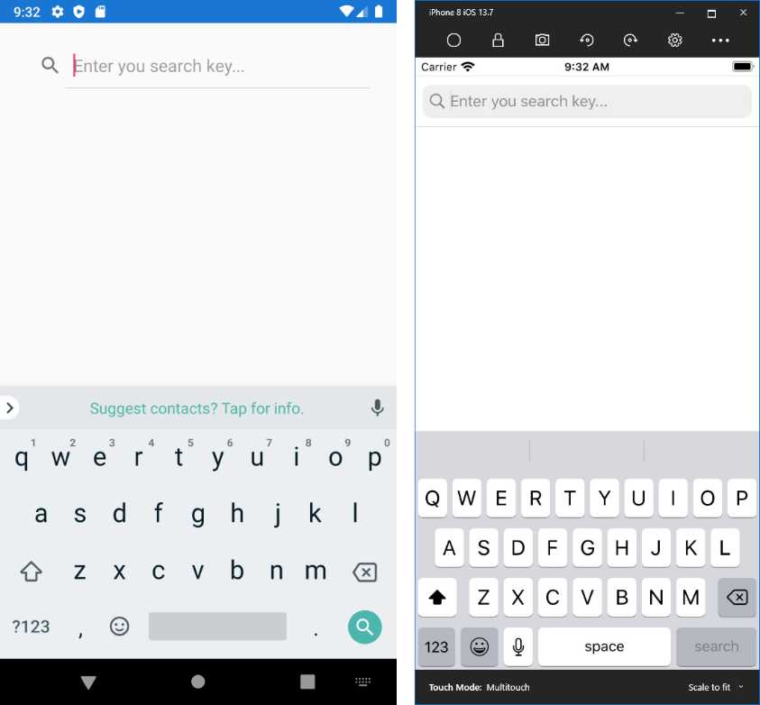
Figure 37: The SearchBar view
In Chapter 7, you will learn how to display lists of items through the ListView control. The SearchBar can be a good companion in that you can use it to filter a list of items based on the search key the user entered.
Long-running operations: ActivityIndicator and ProgressBar
In some situations, your app might need to perform potentially long-running operations, such as downloading content from the internet or loading data from a local database. In such situations, it is a best practice to inform the user that an operation is in progress. This can be accomplished with two views, the ActivityIndicator or the ProgressBar. The latter exposes a property called Progress, of type double and a ProgressColor property, of type Color, that allows you to change the color of the progress indicator. This control is not used very often, because it implies you are able to calculate the amount of time or data needed to complete an operation.
The ActivityIndicator instead shows a simple, animated indicator that is displayed while an operation is running, without the need to calculate its progress. It is enabled by setting its IsRunning property to true; you might also want to make it visible only when running, done by assigning IsVisible with true. You typically declare it in XAML as follows:
<ActivityIndicator x:Name="ActivityIndicator1" />
Then, in the code-behind, you can control it as follows:
// Starting the operation...
ActivityIndicator1.IsVisible = true;
ActivityIndicator1.IsRunning = true;
// Executing the operation...
// Operation completed
ActivityIndicator1.IsRunning = false;
ActivityIndicator1.IsVisible = false;
As a personal suggestion, I recommend you always set both IsVisible and IsRunning. This will help you keep consistent behavior across platforms. Figure 38 shows an example.

Figure 38: The ActivityIndicator shows that an operation is in progress
Tip: Page objects, such as the ContentPage, expose a property called IsBusy that enables an activity indicator when assigned with true. Depending on your scenario, you might also consider this option.
Working with images
Using images is crucial in mobile apps since they both enrich the look and feel of the user interface and enable apps to support multimedia content. Xamarin.Forms provides an Image control you can use to display images from the internet, local files, and embedded resources. Displaying images is really simple, while understanding how you load and size images is more complex, especially if you have no previous experience with XAML and dynamic user interfaces. You declare an Image as follows:
<Image Source="https://cdn.syncfusion.com/content/images/downloads/ebook/ebook-cover/2018-bronze-xamarin-forms-succinctly.png" Aspect="AspectFit"/>
As you can see, you assign the Source property with the image path, which can be a URL or the name of a local file or resource. Source can be assigned either in XAML or in code-behind. You will assign this property in C# code when you need to assign the property at runtime. This property is of type ImageSource and, while XAML has a type converter for it, in C# you need to use specific methods, depending on the image source: FromFile requires a file path that can be resolved on each platform, FromUri requires a System.Uri object, and FromResource allows you to specify an image in the embedded app resources.
Note: Each platform has its own way of working with local images and embedded resources, which requires further explanation. Because this goes beyond the scope of this ebook, I strongly recommend you read the official documentation, which also explains how to manage images for different purposes on iOS, Android, and Windows.
The Aspect property determines how to size and stretch an image within the bounds it is being displayed in. It requires a value from the Aspect enumeration:
- Fill: Stretches the image to fill the display area completely and exactly. This may result in the image being distorted.
- AspectFill: Clips the image so that it fills the display area while preserving the aspect.
- AspectFit: Letterboxes the image (if required) so that the entire image fits into the display area, with blank space added to the top, bottom, or sides, depending on whether the image is wide or tall.
You can also set the WidthRequest and HeightRequest properties to adjust the size of the Image control. Figure 39 shows an example.

Figure 39: Displaying images with the Image view
Supported image formats are .jpg, .png, .gif, .bmp, and .tif. Working with images also involves icons and splash screens, which are totally platform-dependent, and therefore require you to read the official documentation. Also, for enhanced 2D graphics, you might want to consider taking a look at the SkiaSharp library, a portable library that works great with Xamarin.Forms and is powered by Google’s Skia library.
Playing audio and videos
Xamarin.Forms provides a view called MediaElement, which allows for playing audio and videos in your applications. This is a recent addition, but the demand for a native media player has always been very high. Actually, during its development, the MediaElement control was included in the Xamarin.Forms code base, but now it has been moved to the Xamarin Community Toolkit library, so you will need to install the Xamarin.CommunityToolkit NuGet package into your project. The MediaElement can play media contents from a remote URI, from the local library, from media files embedded inside the app resources, and from local folders.
For the sake of simplicity, the next examples will be based on a free, public Microsoft video about Xamarin that can be streamed online. The reason is that working with local videos requires knowledge of features like resources and native API access, which will be discussed later in the book. Additionally, only the most important properties, methods, and events will be discussed.
In its simplest form, you declare a MediaElement as follows:
<MediaElement ShowsPlaybackControls="True"
Source="https://sec.ch9.ms/ch9/5d93/a1eab4bf-3288-4faf-81c4-294402a85d93/XamarinShow_mid.mp4"/>
The Source property contains the URI of the media file. As you can learn through the official documentation, local files are also represented by URIs that start with the ms-appx:/// or ms-appdata:/// prefixes. The ShowsPlaybackControls property allows you to avoid the need to create playback controls manually and will make the MediaElement use the playback control of each native platform.
You certainly have the option to create your custom controls and use data binding to provide a different look and feel to your player, but this is out of the scope of this chapter. You can make media start automatically by setting the AutoPlay property with true, and you can control the media volume using the Volume property, of type double. Its value must be between 0 and 1.
Like for the Image view, the MediaElement also exposes the Aspect property, which controls the stretching of the video with exactly the same values (Fill, AspectFill, AspectFit). The Duration property, of type TimeSpan?, returns the duration of the currently opened media, while the Position property, of type TimeSpan, returns the current progress over the duration. Figure 40 shows the MediaElement in action as declared above.
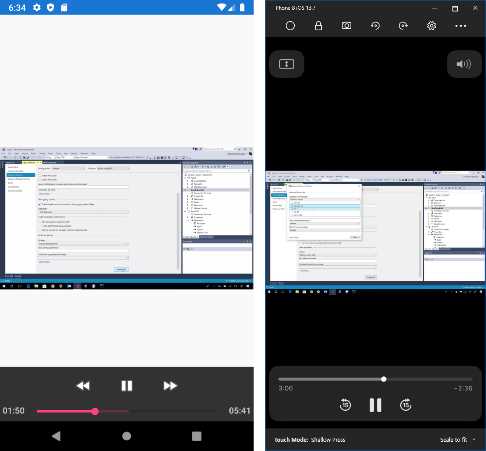
Figure 40: Playing videos with the MediaElement
The MediaElement view also exposes self-explanatory methods such as Play, Stop, and Pause that you can invoke in your C# code to manually control the media file. Additionally, and among the others, this view exposes events like:
- MediaOpened: Raised when the media stream has been validated and is ready for playing.
- MediaEnded: Raised when the media stream reaches its end.
- MediaFailed: Raised when an error occurs on the media source.
The MediaElement is at the same time a very versatile view in its simplest form, and a completely customizable view for high-quality media playing designs—but to get the most out of customizations, you need to first learn what comes in the next chapters.
Tip: When you learn about data binding in Chapter 7, you will gain the necessary knowledge to build a great custom media player, with your own controls and features. For example, you could bind a Slider view to the Volume property, and another Slider to the Position property.
Introducing gesture recognizers
Views such as Image and Label do not include support for touch gestures natively, but sometimes you might want to allow users to tap a picture or text to perform an action such as navigating to a page or website. The Xamarin.Forms.Gestures namespace has classes that allow you to leverage gesture recognizers to add touch support to views that do not include it out of the box. Views expose a collection called GestureRecognizers, of type IList<GestureRecognizer>. Supported gesture recognizers are:
- TapGestureRecognizer: Allows recognition of taps.
- PinchGestureRecognizers: Allows recognition of the pinch-to-zoom gesture.
- PanGestureRecognizers: Enables the dragging of objects with the pan gesture.
For example, the following XAML demonstrates how to add a TapGestureRecognizer to an Image control:
<Image Source="https://www.xamarin.com/content/images/pages/branding/assets/xamarin-logo.png" Aspect="AspectFit">
<Image.GestureRecognizers>
<TapGestureRecognizer x:Name="ImageTap"
NumberOfTapsRequired="1" Tapped="ImageTap_Tapped"/>
</Image.GestureRecognizers>
</Image>
You can assign the NumberOfTapsRequired property and the Tapped event with a handler that will be invoked when the user taps the image. It will look like this:
private void ImageTap_Tapped(object sender, EventArgs e)
{
// Do your stuff here...
}
Gesture recognizers give you great flexibility and allow you to improve the user experience in your mobile apps by adding touch support where required.
Displaying alerts
All platforms can show pop-up alerts with informative messages or receive user input with common choices such as OK or Cancel. Pages in Xamarin.Forms provide an asynchronous method called DisplayAlert, which is very easy to use. For example, suppose you want to display a message when the user taps a button. The following code demonstrates how to accomplish this:
private async void Button1_Clicked(object sender, EventArgs e)
{
await DisplayAlert("Title", "This is an informational pop-up", "OK");
}
As an asynchronous method, you call DisplayAlert with the await operator, marking the containing method as async. The first argument is the pop-up title, the second argument is the text message, and the third argument is the text you want to display in the only button that appears. DisplayAlert has an overload that can wait for the user input and return true or false depending on whether the user selected the OK option or the Cancel option:
bool result =
await DisplayAlert("Title", "Do you wish to continue?", "OK", "Cancel");
You are free to write whatever text you like for the OK and Cancel options, and IntelliSense helps you understand the order of these options in the parameter list. If the user selects OK, DisplayAlert returns true. Figure 41 shows an example of the alert.
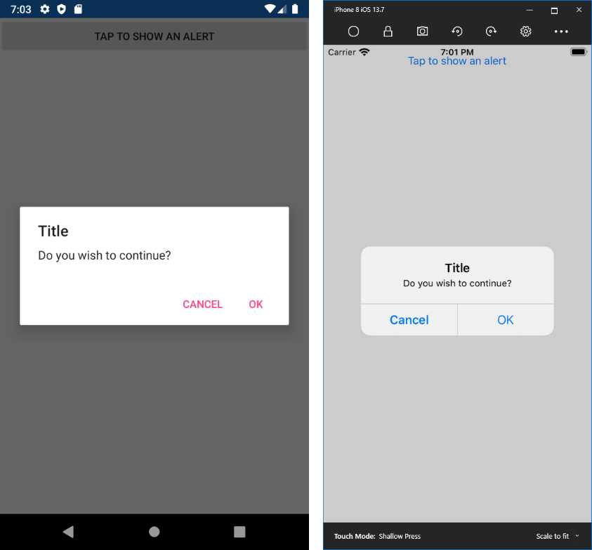
Figure 41: Displaying alerts
Introducing the Visual State Manager
With the Visual State Manager, you can make changes to the user interface based on a view’s state, such as Normal, Focused, and Disabled, all with declarative code. For example, you can use the Visual State Manager to change the color of a view depending on its state. The following code snippet demonstrates how you can change the background color of an Entry view based on its state:
<Entry>
<VisualStateManager.VisualStateGroups>
<VisualStateGroup x:Name="CommonStates">
<VisualState x:Name="Normal">
<VisualState.Setters>
<Setter Property="BackgroundColor" Value="White" />
</VisualState.Setters>
</VisualState>
<VisualState x:Name="Focused">
<VisualState.Setters>
<Setter Property="BackgroundColor"
Value="LightGray" />
</VisualState.Setters>
</VisualState>
<VisualState x:Name="Disabled">
<VisualState.Setters>
<Setter Property="BackgroundColor" Value="Gray" />
</VisualState.Setters>
</VisualState>
</VisualStateGroup>
</VisualStateManager.VisualStateGroups>
</Entry>
With this markup code, the Entry will automatically change its background color when its state changes. In this case, you will need to set the Entry’s IsEnabled property to False in order to disable the view and trigger the Disabled state.
States must be grouped into objects called VisualStateGroup. Each state is represented by the VisualState object, where you add Setter specifications as you would do with styles, therefore providing the name of the property you want to change, and its value. Of course, you can specify multiple property setters.
Xamarin.Forms defines a set of states called common states, such as Normal, Focused, and Disabled (see the VisualStateGroup with the CommonState name in the preceeding code); these states are common to each view. Other states might be available only to specific views, and not to other views. The Visual State Manager provides an elegant and clean way to control the user interface behavior, all in your XAML code.
Chapter summary
This chapter introduced the concepts of view and common views in Xamarin.Forms, the building blocks for any user interface in your mobile apps. You have seen how to obtain user input with the Button, Entry, Editor, and SearchBar controls; you have seen how to display information with the Label and how to use it in conjunction with other input views such as Slider, Stepper, and Switch. You have seen how the DatePicker and TimePicker views allow you to work with dates and time.
You have seen how to display images with the Image view and videos with the MediaElement; you have used the WebView to show HTML content; and you have seen how to inform the user of the progress of long-running operations with ActivityIndicator and ProgressBar. You have seen how to add gesture support to views that do not include it out of the box, how to display alerts for informational purposes, and how to allow user choices. Finally, you have seen how the Visual State Manager allows changing the user interface behavior based on a view’s state, all with declarative code.
Now you have all you need to build high-quality user interfaces with layouts and views, and you have seen how to use all these building blocks in a single page. However, most mobile apps are made of multiple pages. The next chapter explains all the available page types in Xamarin.Forms and the navigation infrastructure.
- 155+ high-performance Xamarin controls, including DataGrid, Charts, and ListView.
- Elegant XAML layouts for common scenarios.
- Layouts optimized for mobile and desktop.