
Xamarin.Forms Succinctly®

CHAPTER 6
Pages and Navigation
In the previous chapters, we went over the basics of layouts and views, which are the fundamental building blocks of the user interface in mobile applications. However, I demonstrated how to use layouts and views within a single page, while real-world mobile apps are made of multiple pages. Android, iOS, and Windows provide a number of different pages that allow you to display content in several ways and to provide the best user experience possible based on the content you need to present.
Xamarin.Forms provides unified page models you can use from your single, shared C# codebase that work cross-platform. It also provides an easy-to-use navigation framework, which is the infrastructure you use to move between pages. In addition, Xamarin.Forms 4.0 has also introduced a simplified architecture in one place with the Shell. Pages, navigation, and the Shell are the last pieces of the user interface framework you need to know to build beautiful, native apps with Xamarin.Forms.
Note: In order to follow the examples in the first part of this chapter, create a new Xamarin.Forms solution. The name is up to you. Every time a new page is discussed, just clean the content of the MainPage.xaml and MainPage.xaml.cs files (except for the constructor) and write the new code. When I cover the Shell, I will demonstrate a specific project template instead.
Introducing and creating pages
Xamarin.Forms provides many page objects that you can use to set up the user interfaces of your applications. Pages are root elements in the visual hierarchy, and each page allows you to add only one visual element, typically a root layout with other layouts and visual elements nested inside the root.
From a technical point of view, all the page objects in Xamarin.Forms derive from the abstract Page class, which provides the basic infrastructure of each page, including common properties such as Content. This is definitely the most important property that you assign with the root visual element. Table 6 describes available pages in Xamarin.Forms.
Table 6: Pages in Xamarin.Forms
Page Type | Description |
|---|---|
ContentPage | Displays a single view object. |
TabbedPage | Facilitates navigating among child pages using tabs. |
CarouselPage | Facilitates using the swipe gesture among child pages. |
FlyoutPage | Manages two separate panes, and includes a flyout control. |
NavigationPage | Provides the infrastructure for navigating among pages. |
The next sections describe the available pages in more detail. Remember that Visual Studio provides item templates for different page types, so you can right-click the .NET Standard project in Solution Explorer, select Add New Item, and in the Add New Item dialog box, you will see templates for each page described in Table 6.
Note: If you read previous editions of this book, or if you have worked with Xamarin.Forms in the past, you will notice that in Table 6 I omitted mentioning the MasterDetailPage object. The reason is that it is now deprecated; you will want to use the FlyoutPage instead, or the Shell. Of course, for existing code, the MasterDetailPage is still certainly supported.
Single views with the ContentPage
The ContentPage object is the simplest page possible and allows for displaying a single visual element. You already looked at some examples of the ContentPage previously, but it is worth mentioning its Title property. This property is particularly useful when the ContentPage is used in pages with built-in navigation, such as TabbedPage and CarouselPage, because it helps identify the active page.
The core of the ContentPage is the Content property, which you assign with the visual element you want to display. The visual element can be either a single control or a layout; the latter allows you to create complex visual hierarchies and real-world user interfaces. In XAML, the tag for the Content property can be omitted, which is also common practice (also notice Title):
<?xml version="1.0" encoding="utf-8" ?>
<ContentPage xmlns="http://xamarin.com/schemas/2014/forms"
xmlns:x="http://schemas.microsoft.com/winfx/2009/xaml"
xmlns:local="clr-namespace:App1"
Title="Main page"
x:Class="App1.MainPage">
<Label Text="A content page"/>
</ContentPage>
The ContentPage can be used individually, or as the content of other pages discussed in the next sections.
Splitting contents with the FlyoutPage
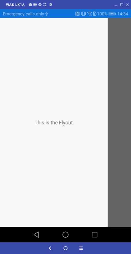
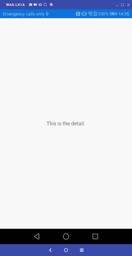
The FlyoutPage is a very important page, since it allows you to split contents into two separate categories: generic and detailed. The user interface provided by the FlyoutPage is very common in Android and iOS apps. It offers a flyout on the left (the flyout part) that you can swipe to show and hide it, and a second area on the right that displays more detailed content (the detail part).
For example, a very common scenario for this kind of page is displaying a list of topics or settings in the flyout and the content for the selected topic or setting in the detail. Both the flyout and the detail parts are represented by ContentPage objects. A typical declaration for a FlyoutPage looks like Code Listing 12.
Code Listing 12
As you can see, you populate the Flyout and Detail properties with the appropriate ContentPage objects. In real-world apps, you might have a list of topics in the Flyout, and then you might show details for a topic in the Detail when the user taps one in the Flyout’s content. Remember that assigning the Title property on the ContentPage that acts as the master is mandatory—otherwise, the runtime will throw an exception.
Note: Every time you change the root page from ContentPage to another kind of page, such as FlyoutPage, you also need to change the inheritance in the code-behind. For example, if you open the C# MainPage.xaml.cs file, you will see that MainPage inherits from ContentPage, but in XAML you replaced this object with FlyoutPage. So, you also need to make MainPage inherit from FlyoutPage. If you forget this, the compiler will report an error. This note is valid for the pages discussed in the next sections as well.
Figures 42 and 43 show the flyout and detail parts, respectively. You can simply swipe from the left to enable the master flyout, and then swipe back to hide it. You can also control the flyout appearance programmatically by assigning the FlyoutLayoutBehavior with one of the following values:
- Default: The pages are displayed using each platform’s default layout.
- Popover: The detail page covers the flyout page.
- Split: This equally splits the flyout page and the detail. The flyout is displayed on the left and the detail on the right.
- SplitOnLandscape: Similar to Split, but only applies when the device is in landscape orientation, otherwise Default is assumed.
- SplitOnPortrait: Similar to Split, but only applies when the device is in portrait orientation, otherwise Default is assumed.
|
|
Figure 42: FlyoutPage: The flyout | Figure 43: FlyoutPage: The detail |
Another interesting property is called IsPresented, which you assign with true (visible) or false (hidden), and that is useful when the app is in landscape mode, because the flyout is automatically opened by default. When not specified, IsPresented is false.
Displaying content within tabs with the TabbedPage
Sometimes you might need to categorize multiple pages by topic, or by activity type. When you have a small amount of content, you can take advantage of the TabbedPage, which can group multiple ContentPage objects into tabs for easy navigation. The TabbedPage can be declared as shown in Code Listing 13.
Code Listing 13
<?xml version="1.0" encoding="utf-8" ?> <TabbedPage xmlns="http://xamarin.com/schemas/2014/forms" xmlns:x="http://schemas.microsoft.com/winfx/2009/xaml" xmlns:local="clr-namespace:App1" Title="Main page" x:Class="App1.MainPage">
<TabbedPage.Children> <ContentPage Title="First"> <Label Text="This is the first page" HorizontalOptions="Center" VerticalOptions="Center"/> </ContentPage> <ContentPage Title="Second"> <Label Text="This is the second page" HorizontalOptions="Center" VerticalOptions="Center"/> </ContentPage> <ContentPage Title="Third"> <Label Text="This is the third page" HorizontalOptions="Center" VerticalOptions="Center"/> </ContentPage> </TabbedPage.Children> </TabbedPage> |
As you can see, you populate the Children collection with multiple ContentPage objects. Providing a Title to each ContentPage is of primary importance, since the title’s text is displayed in each tab, as demonstrated in Figure 44.
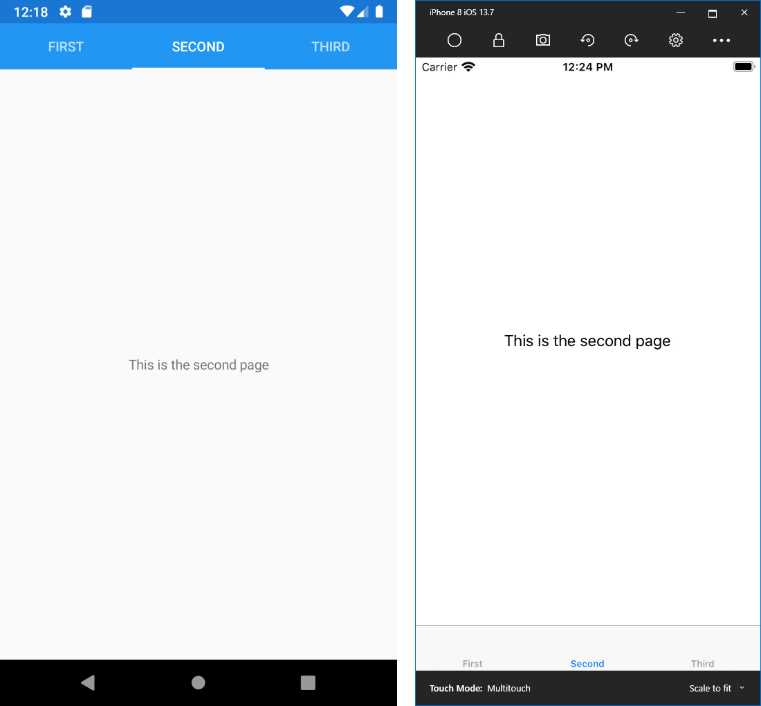
Figure 44: Displaying grouped contents with the TabbedPage
Of course, the TabbedPage works well with a small number of child pages, typically between three and four pages.
Swiping pages with the CarouselPage
The CarouselPage is similar to the TabbedPage, but instead of having tabs, you can use the swipe gesture to switch among child pages. For example, the CarouselPage could be perfect to display a gallery of pictures. Code Listing 14 shows how to declare a CarouselPage.
Code Listing 14
<?xml version="1.0" encoding="utf-8" ?> <CarouselPage xmlns="http://xamarin.com/schemas/2014/forms" xmlns:x="http://schemas.microsoft.com/winfx/2009/xaml" xmlns:local="clr-namespace:App1" Title="Main page" x:Class="App1.MainPage">
<CarouselPage.Children> <ContentPage Title="First"> <Label Text="This is the first page" HorizontalOptions="Center" VerticalOptions="Center"/> </ContentPage> <ContentPage Title="Second"> <Label Text="This is the second page" HorizontalOptions="Center" VerticalOptions="Center"/> </ContentPage> <ContentPage Title="Third"> <Label Text="This is the third page" HorizontalOptions="Center" VerticalOptions="Center"/> </ContentPage> </CarouselPage.Children> </CarouselPage> |
Figure 45 shows how the CarouselPage appears.
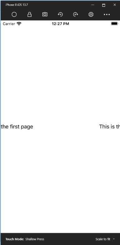
Figure 45: Swiping contents with the CarouselPage
Navigating among pages
Note: In the spirit of the Succinctly series, this section explains the most important concepts and topics of page navigation. However, there are tips and considerations that are specific to each platform that you have to know when dealing with navigation in Xamarin.Forms. To learn more about them, see the official documentation.
Most mobile apps offer their content through multiple pages. In Xamarin.Forms, navigating among pages is very simple because of a built-in navigation framework. First of all, in Xamarin.Forms you leverage navigation features through the NavigationPage object. This kind of page must be instantiated, passing an instance of the first page in the stack of navigation to its constructor. This is typically done in the App.xaml.cs file, where you replace the assignment of the MainPage property with the following code:
public App()
{
InitializeComponent();
MainPage = new NavigationPage(new MainPage());
}
Wrapping a root page into a NavigationPage will not only enable the navigation stack, but will also enable the navigation bar on Android, iOS, and Windows desktop (but not on Windows 10 Mobile, which relies on the hardware Back button), whose text will be the value of the Title property of the current page object, represented by the CurrentPage read-only property. Now suppose you added another page of type ContentPage to the .NET Standard project, called SecondaryPage.xaml. The content of this page is not important at this point; just set its Title property with some text. If you want to navigate from the first page to the second page, use the PushAsync method as follows:
await Navigation.PushAsync(new SecondaryPage());
The Navigation property, exposed by each Page object, represents the navigation stack at the application level and provides methods for navigating between pages in a LIFO (last-in, first-out) approach. PushAsync navigates to the specified page instance; PopAsync, invoked from the current page, removes the current page from the stack and goes back to the previous page. Similarly, PushModalAsync and PopModalAsync allow you to navigate between pages modally. The following lines of code demonstrate this:
// removes SecondaryPage from the stack and goes back to the previous page
await Navigation.PopAsync();
// displays the specified page as a modal page
await Navigation.PushModalAsync(new SecondaryPage());
await Navigation.PopModalAsync();
Figure 46 shows how the navigation bar appears on Android and iOS when navigating to another page.
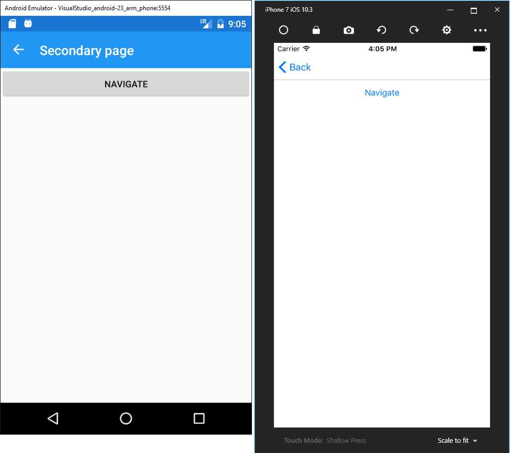
Figure 46: The navigation bar offered by the NavigationPage object
Users can simply tap the Back button on the navigation bar to go back to the previous page. However, when you implement modal navigation, you cannot take advantage of the built-in navigation mechanism offered by the navigation bar, so it is your responsibility to implement code that allows the user to go back to the previous page.
Modal navigation can be useful if you must be able to intercept a tap on the Back button on each platform. In fact, Android and Windows devices have a built-in hardware Back button that you can manage with events, but iOS does not. In iOS, you only have the Back button provided by the navigation bar, but this cannot be accessed by any events. So, in this case, modal navigation can be a good option to intercept user actions.
Passing objects between pages
The need to exchange data between pages is not uncommon. You can change or overload a Page’s constructor and require a parameter of the desired type. Then, when you call PushAsync and pass the instance of the new page, you will be able to supply the argument that is necessary to the new page’s constructor.
Animating transitions between pages
By default, the navigation includes an animation that makes the transition from one page to another nicer. However, you can disable animations by simply passing false as the argument of PushAsync and PushModalAsync.
Managing the page lifecycle
Every Page object exposes the OnAppearing and OnDisappearing events, raised right before the page is rendered, and right before the page is removed from the stack, respectively. Their code looks like the following:
protected override void OnAppearing()
{
// Replace with your code…
base.OnAppearing();
}
protected override void OnDisappearing()
{
// Replace with your code…
base.OnDisappearing();
}
Actually, these events are not strictly related to navigation, since they are available to any page, including individual pages. However, it is with navigation that they become very important, especially when you need to execute some code at specific moments in the page lifecycle.
For a better understanding of the flow, think of the page constructor: this is invoked the very first time a page is created. Then, OnAppearing is raised right before the page is rendered on screen. When the app navigates to another page, OnDisappearing is invoked, but this does not destroy the current page instance (and this makes perfect sense). When the app navigates back from the second page to the first page, this is not created again because it is still in the navigation stack, so its constructor will not be invoked, while OnAppearing will. So, within the OnAppearing method body, you can write code that will be executed every time the page is shown, while in the constructor, you can write code that will be executed only once.
Handling the hardware Back button
Android devices and Windows phones have a built-in hardware Back button that users can use instead of the Back button in the navigation bar. You can detect if the user presses the hardware Back button by handling the OnBackButtonPressed event as follows:
protected override bool OnBackButtonPressed()
{
return base.OnBackButtonPressed(); // replace with your logic here
}
Simply put your logic in the method body. The default behavior is to suspend the app, so you might want to override this with PopAsync to return to the previous page. This event does not intercept pressing the Back button in the navigation bar, which implies it has no effect on iOS devices.
Simplified app architecture: the Shell
More often than not, mobile apps share a number of features like a navigation bar, a search bar, and a flyout menu that users can open by sliding from the left side of the screen. Implementing these features by yourself is not complex at all, but it requires a certain amount of time. Moreover, it could be a repetitive task over multiple projects.
Starting with Xamarin.Forms 4.0, developers can leverage a new root layout called Shell. With the Shell, you can define the whole app architecture and hierarchy in one place, also providing a built-in navigation mechanism, search bar, and flyout menu.
In this chapter, you will learn the most common features of the Shell. However, this is a very sophisticated layout, so I suggest you bookmark the link to the official documentation page to keep as a reference for further studies.
Note: At the time of this writing, the Shell is only available to Android and iOS apps. Support for UWP is currently under development. In fact, you will see that UWP as a target is disabled when creating Shell-based projects.
Visual Studio 2019 offers a specific project template that implements the Shell, called Flyout (see Figure 4). Because the code generated by this project template is a bit complex if you are new to the Shell, I will not use such a project template. I will, instead, show how to create an app with basic functionalities based on the sample project called ShellDemo, located in the Chapter6 folder of the companion repository. As you will see, the Shell definition resides in the AppShell.xaml file, which is the place where all the code discussed shortly needs to be placed.
Tip: Once you get started with the Shell, you might want to have a look at an open-source example provided Microsoft, called Xaminals. This is a more advanced project that demonstrates how to implement more complex navigation, tabbed pages, and much more.
Structure of the Shell
At its core, the Shell is a container of the following visual elements:
- Flyout menu: This is a side menu that can be shown or hidden with a swipe gesture, and that can contain other visual elements or shortcuts to other pages. This is what Android users call the “hamburger” menu.
- Tab bar: This is usually placed at the bottom of the Shell and includes buttons with icons and text that users can tap to navigate to different pages.
- Search bar: This is used to search items in a list, typically by filtering a data-bound collection.
Visual elements in the Shell, such as flyout items and bar buttons, can be styled through resources. The flyout menu, tab bar, and search bar are independent from one another, and you can implement just one of them. In order to implement a flyout, you just need to add as many FlyoutItem objects to the Shell as you want.
If you only want a tab bar instead of the flyout menu, you can add a TabBar object to the Shell. Then to the TabBar you will add as many Tab objects, as many buttons, as you want to implement for navigation. Then, you will assign the FlyoutBehavior property of the Shell with Disabled. Both FlyoutItem and Tab need to be populated with an object of type ShellContent that points to the page you want to open.
If you want to have both the flyout and the tab bar, you will nest a Tab object into a FlyoutItem object. If this all seems confusing, do not worry; you will get proper examples in the next paragraphs.
Implementing the flyout menu
Suppose you want to create a flyout menu with three items, each pointing to a specific page. The code looks like the following:
<Shell … >
<FlyoutItem Title="Home" Icon="home.png">
<ShellContent ContentTemplate="{DataTemplate pages:HomePage}"/>
</FlyoutItem>
<FlyoutItem Title="About" Icon="about.png">
<ShellContent ContentTemplate="{DataTemplate pages:AboutPage}"/>
</FlyoutItem>
<FlyoutItem Title="Contact" Icon="contact.png">
<ShellContent ContentTemplate="{DataTemplate pages:ContactPage}"/>
</FlyoutItem>
</Shell>
For each FlyoutItem, you can specify the Title, which is the text you see in the menu, and an icon (icon files must follow the rules of each operating system). The ShellContent object represents the target page of the navigation.
The syntax based on the ContentTemplate, which receives a DataTemplate and the name of the target page as an argument, makes sure the instance of the target page is created only when required. You could also use the Content property instead of ContentTemplate, passing the name of the page directly, but in this case each page would be instantiated directly with potential performance overhead, so this is not recommended.
Data templates will be discussed in more details in the next chapter as part of the data-binding topic. The result of this code is shown in Figure 47.
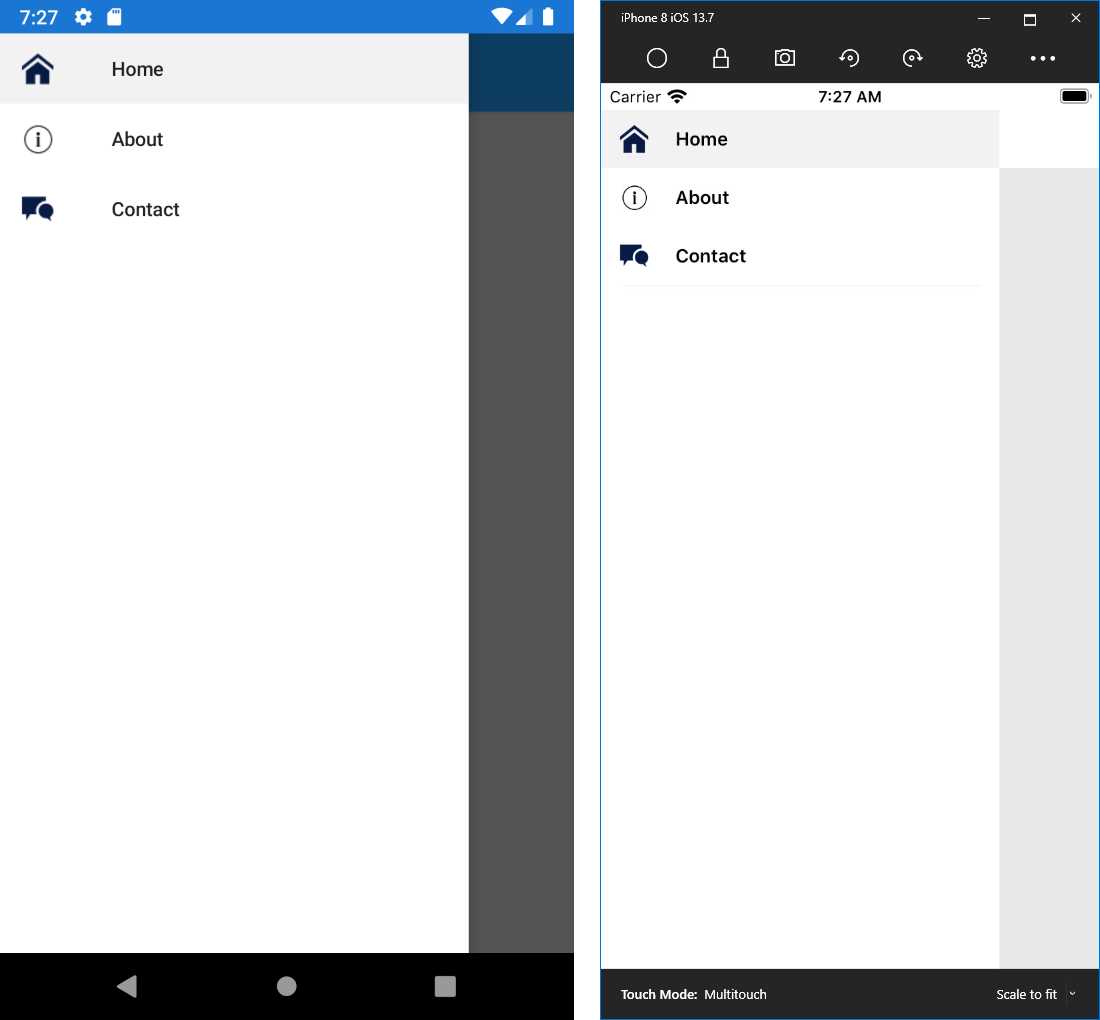
Figure 47: Flyout menu with the Shell
The flyout menu can be further customized via the following properties:
- FlyoutIcon: Sets the icon for the flyout.
- FlyoutHeader: Assigned with a view that appears at the top of the flyout. You can alternatively use the FlyoutHeaderTemplate property, which is populated with a DataTemplate.
- FlyoutBackgroundImage: Sets a background image for the flyout.
- FlyoutBackgroundImageAspect: Sets the aspect for the background image with the same values used for regular images (Fill, AspectFill, AspectFit).
- FlyoutIsPresented: Gets or sets the appearance status of the flyout. It can be also used in C# code to programmatically control the flyout appearance.
For a full list and description of the flyout properties, refer to the documentation page.
Implementing the tab bar
Implementing the tab bar is accomplished by adding a TabBar object to the Shell, and then adding as many Tab items for as many navigation buttons you want. Continuing the previous example of three items, the code would look like this:
<Shell … >
<TabBar>
<Tab Title="Home" Icon="home.png">
<ShellContent ContentTemplate="{DataTemplate pages:HomePage}"/>
</Tab>
<Tab Title="About" Icon="about.png">
<ShellContent ContentTemplate="{DataTemplate pages:AboutPage}"/>
</Tab>
<Tab Title="Contact" Icon="contact.png">
<ShellContent
ContentTemplate="{DataTemplate pages:ContactPage}"/>
</Tab>
</TabBar>
</Shell>
As you can see, each Tab has a title and an icon like the FlyoutItem. Navigation is again performed via the ShellContent object. Notice how you do not need to handle any events to perform navigation—everything is handled by the Shell. Figure 48 shows how the tab bar looks.
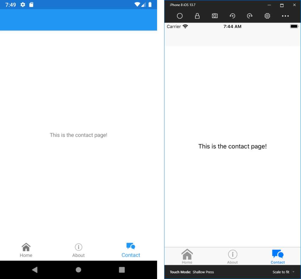
Figure 48: Tab bar with the Shell
Note: The Shell takes care of navigation between pages with its built-in mechanism, but you have deep control of it, and you can even manage navigation at runtime. This is known as routing, and I recommend you have a look at the documentation for more information.
Implementing the flyout with tab bar
If you want to have the same elements in both the flyout and the tab bar, you can declare one FlyoutItem and add Tab objects inside it, like in the following code:
<Shell … >
<FlyoutItem FlyoutDisplayOptions="AsMultipleItems">
<Tab Title="Home" Icon="home.png">
<ShellContent ContentTemplate="{DataTemplate pages:HomePage}"/>
</Tab>
<Tab Title="About" Icon="library.png">
<ShellContent ContentTemplate="{DataTemplate pages:AboutPage}"/>
</Tab>
<Tab Title="Contact" Icon="contact.png">
<ShellContent
ContentTemplate="{DataTemplate pages:ContactPage}"/>
</Tab>
</FlyoutItem>
</Shell>
In this case, you set the FlyoutDisplayOptions property with AsMultipleItems, which allows for displaying several elements in a single flyout item. You can run the code and see how the app will show both the flyout with its items and the navigation bar.
Adding the search bar
Another piece of the Shell is the integrated search tool. The search tool is made of a class that derives from SearchHandler. Code Listing 15 shows the structure of this class.
Code Listing 15
public class ItemsSearchHandler : SearchHandler { protected override void OnQueryChanged(string oldValue, string newValue) { base.OnQueryChanged(oldValue, newValue); if (string.IsNullOrWhiteSpace(newValue)) { ItemsSource = null; } else { ItemsSource = YourCollection .Where(p => p.YourProperty.ToLower().Contains(newValue.ToLower())) .ToList(); } } protected override async void OnItemSelected(object item) { base.OnItemSelected(item); await (App.Current.MainPage as Shell). GoToAsync($"ObjectDetails?name={((YourObject)item). YourProperty}"); } } |
In the OnQueryChanged event handler, which is invoked when the user types in the search box, you will filter the collection bound to your page. In Code Listing 15, YourCollection is a collection that implements the IEnumerable<T> interface, and that can be assigned to the ItemsSource property as the data source for the search tool, whereas YourProperty is a property on which the filter is based.
The oldValue and newValue string arguments of OnQueryChanged allow you to get the value in the search box before and after typing into it. The OnItemSelected event is raised when the user selects one of the items displayed in the search tool. It allows for navigating to a specific page. The example assumes there is a page called ObjectDetails to which the instance of the selected object is passed via query string as an argument, after conversion.
From the XAML point of view, you would add the following code inside the Shell definition:
<Shell.SearchHandler>
<local:ItemsSearchHandler Placeholder="Enter search term"
ShowsResults="true"
DisplayMemberName="YourProperty" />
</Shell.SearchHandler>
The SearchHandler property is assigned with the SearchHandler implementation. It allows for specifying a placeholder text if the search box must show a preview of the results, and the name of the property from the bound collection that will be displayed (DisplayMemberName). Figure 49 shows an example based on the Xaminals sample project from Microsoft.
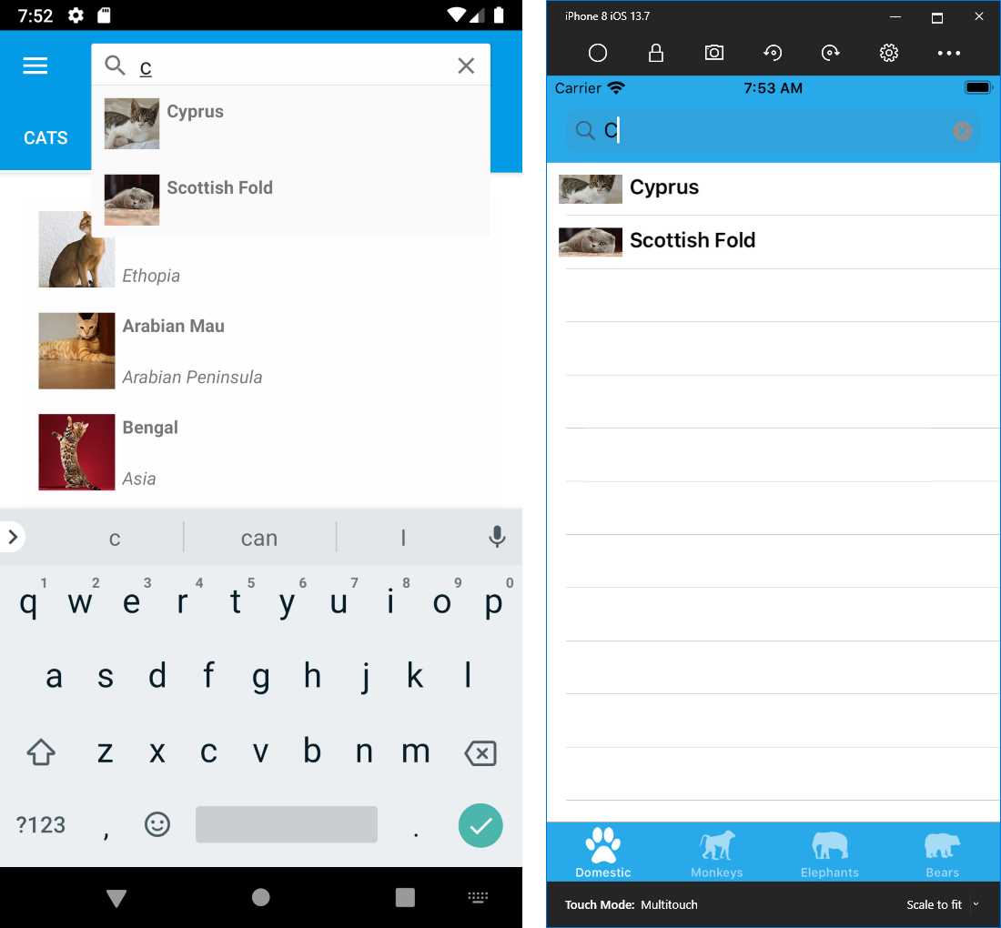
Figure 49: The search tool within the Shell
Styling the Shell
Elements in the Shell, such as the flyout and tab bar, can be customized with different colors and fonts. This is accomplished by defining specific resources. Actually, resources in Xamarin.Forms are discussed in the next chapter, so here you get a preview. For example, you could apply custom colors to the Shell and to tab bar elements with the following code:
<Shell.Resources>
<ResourceDictionary>
<Style x:Key="BaseStyle" TargetType="Element">
<Setter Property="Shell.BackgroundColor" Value="LightGreen" />
<Setter Property="Shell.ForegroundColor" Value="White" />
<Setter Property="Shell.TitleColor" Value="White" />
<Setter Property="Shell.DisabledColor" Value="#B4FFFFFF" />
<Setter Property="Shell.UnselectedColor" Value="#95FFFFFF" />
<Setter Property="Shell.TabBarBackgroundColor"
Value="LightBlue"/>
<Setter Property="Shell.TabBarForegroundColor" Value="White"/>
<Setter Property="Shell.TabBarUnselectedColor"
Value="#95FFFFFF"/>
<Setter Property="Shell.TabBarTitleColor" Value="White"/>
</Style>
</ResourceDictionary>
</Shell.Resources>
Names for properties that accept styling are really self-explanatory. You can also customize the appearance of the flyout and its elements. There are several additional ways to customize and configure the Shell. I recommend that you read the documentation for further studies.
Note: There is much more to say about the Shell, which is a very sophisticated tool. This book could not cover topics such as custom navigation settings, custom renderers, and programmatic access to the Shell. If you consider implementing the Shell in your apps, I strongly recommend you bookmark the root of the official documentation, which contains everything you need to create full Shell experiences.
Chapter summary
This chapter introduced the available pages in Xamarin.Forms, explaining how you can display single-view content with the ContentPage object, group content into tabs with the TabbedPage, swipe content with the CarouselPage, and group contents into two categories with the MasterDetail page object.
You also looked at how the NavigationPage object provides a built-in navigation framework that not only displays a navigation bar, but also allows for navigating between pages programmatically.
Finally, you got an introduction to the Shell, an object that simplifies the app infrastructure by including a flyout menu, a tab bar, and a search box in one place.
In the next chapter, you will look at information about two important and powerful features in Xamarin.Forms: resources and data binding.
- 155+ high-performance Xamarin controls, including DataGrid, Charts, and ListView.
- Elegant XAML layouts for common scenarios.
- Layouts optimized for mobile and desktop.