
Xamarin.Forms Succinctly®

CHAPTER 4
Organizing the UI with Layouts
Mobile devices such as phones, tablets, and laptops have different screen sizes and form factors. They also support both landscape and portrait orientations. Therefore, the user interface in mobile apps must dynamically adapt to the system, screen, and device so that visual elements can be automatically resized or rearranged based on the form factor and device orientation. In Xamarin.Forms, this is accomplished with layouts, which is the topic of this chapter.
Understanding the concept of layout
Tip: If you have previous experience with WPF or UWP, the concept of layout is the same as the concept of panels such as the Grid and the StackPanel.
One of the goals of Xamarin.Forms is to provide the ability to create dynamic interfaces that can be rearranged according to the user’s preferences or to the device and screen size. Because of this, controls in mobile apps you build with Xamarin should not have a fixed size or position on the UI, except in a very limited number of scenarios. To make this possible, Xamarin.Forms controls are arranged within special containers, known as layouts. Layouts are classes that allow for arranging visual elements in the UI, and Xamarin.Forms provides many of them.
In this chapter, you’ll learn about available layouts and how to use them to arrange controls. The most important thing to keep in mind is that controls in Xamarin.Forms have a hierarchical logic; therefore, you can nest multiple panels to create complex user experiences. Table 1 summarizes the available layouts. You’ll learn about them in more detail in the sections that follow.
Table 1: Layouts in Xamarin.Forms
Layout | Description |
|---|---|
StackLayout | Allows you to place visual elements near each other horizontally or vertically. |
FlexLayout | Allows you to place visual elements near each other horizontally or vertically. Wraps visual elements to the next row or column if not enough space is available. |
Grid | Allows you to organize visual elements within rows and columns. |
AbsoluteLayout | A layout placed at a specified, fixed position. |
RelativeLayout | A layout whose position depends on relative constraints. |
ScrollView | Allows you to scroll the visual elements it contains. |
Frame | Draws a border and adds space around the visual element it contains. |
ContentView | A special layout that can contain hierarchies of visual elements and can be used to create custom controls in XAML. |
ControlTemplate | A group of styles and effects for controls, which is also the base for built-in views and custom views. |
TemplatedView | The base class for ContentView objects that displays content within a control template. |
ContentPresenter | Specifies where content appears inside a control template. |
Remember that only one root layout is assigned to the Content property of a page, and that layout can then contain nested visual elements and layouts. ControlTemplate, TemplatedView, and ContentPresenter are actually of more interest when you create your own custom views and will not be covered in this chapter. More information can be found in the documentation page.
Alignment and spacing options
As a general rule, both layouts and controls can be aligned by assigning the HorizontalOptions and VerticalOptions properties with one of the property values from the LayoutOptions structure, summarized in Table 2. Providing an alignment option is very common. For instance, if you only have the root layout in a page, you will want to assign VerticalOptions with StartAndExpand so that the layout gets all the available space in the page. (Remember this consideration when you experiment with layouts and views in this chapter and the next one.)
Table 2: Alignment options in Xamarin.Forms
Alignment | Description |
|---|---|
Center | Aligns the visual element at the center. |
CenterAndExpand | Aligns the visual element at the center and expands its bounds to fill the available space. |
Start | Aligns the visual element at the left. |
StartAndExpand | Aligns the visual element at the left and expands its bounds to fill the available space. |
End | Aligns the visual element at the right. |
EndAndExpand | Aligns the visual element at the right and expands its bounds to fill the available space. |
Fill | Makes the visual element have no padding around itself and it does not expand. |
FillAndExpand | Makes the visual element have no padding around itself and it expands to fill the available space. |
You can also control the space between visual elements with three properties: Padding, Spacing, and Margin, summarized in Table 3.
Table 3: Spacing options in Xamarin.Forms
Spacing | Description |
|---|---|
Margin | Represents the distance between the current visual element and its adjacent elements with either a fixed value for all four sides, or with comma-separated values for the left, top, right, and bottom. It is of type Thickness, and XAML has built in a type converter for it. |
Padding | Represents the distance between a visual element and its child elements. It can be set with either a fixed value for all four sides, or with comma-separated values for the left, top, right, and bottom. It is of type Thickness, and XAML has built in a type converter for it. |
Spacing | Available only in the StackLayout container, it allows you to set the amount of space between each child element, with a default of 6.0. |
I recommend you spend some time experimenting with how alignment and spacing options work in order to understand how to get the desired result in your user interfaces.
The StackLayout
The StackLayout container allows the placing of controls near each other, as in a stack that can be arranged both horizontally and vertically. As with other containers, the StackLayout can contain nested panels. The following code shows how you can arrange controls horizontally and vertically. Code Listing 5 shows an example with a root StackLayout and two nested layouts.
Code Listing 5
<?xml version="1.0" encoding="utf-8" ?> <ContentPage xmlns="http://xamarin.com/schemas/2014/forms" xmlns:x="http://schemas.microsoft.com/winfx/2009/xaml" xmlns:local="clr-namespace:App1" x:Class="App1.MainPage">
<StackLayout Orientation="Vertical"> <StackLayout Orientation="Horizontal" Margin="5"> <Label Text="Sample controls" Margin="5"/> <Button Text="Test button" Margin="5"/> </StackLayout> <StackLayout Orientation="Vertical" Margin="5"> <Label Text="Sample controls" Margin="5"/> <Button Text="Test button" Margin="5"/> </StackLayout> </StackLayout> </ContentPage> |
The result of the XAML in Code Listing 5 is shown in Figure 25.
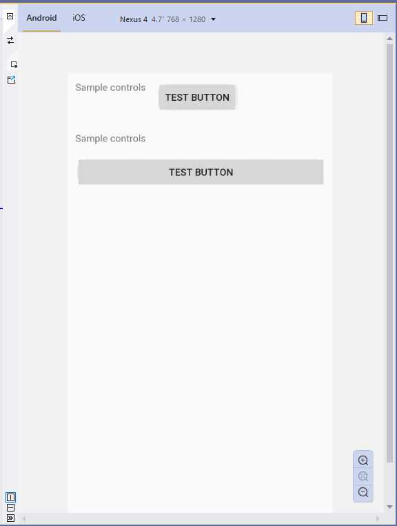
Figure 25: Arranging visual elements with the StackLayout
The Orientation property can be set as Horizontal or Vertical, and this influences the final layout. If not specified, Vertical is the default. One of the main benefits of XAML code is that element names and properties are self-explanatory, and this is the case in StackLayout’s properties, too.
Remember that controls within a StackLayout are automatically resized according to the orientation. If you do not like this behavior, you need to specify WidthRequest and HeightRequest properties on each control, which represent the width and height, respectively. Spacing is a property that you can use to adjust the amount of space between child elements; this is preferred to adjusting the space on the individual controls with the Margin property.
The FlexLayout
The FlexLayout works like a StackLayout, since it arranges child visual elements vertically or horizontally, but the difference is that it is also able to wrap the child visual elements if there is not enough space in a single row or column. Code Listing 6 provides an example and shows how easy it is to work with this layout.
Code Listing 6
<?xml version="1.0" encoding="utf-8" ?> <ContentPage xmlns="http://xamarin.com/schemas/2014/forms" xmlns:x="http://schemas.microsoft.com/winfx/2009/xaml" xmlns:local="clr-namespace:App1" x:Class="App1.MainPage">
<FlexLayout Wrap="Wrap" JustifyContent="SpaceAround" Direction="Row"> <Label Text="This is a sample label in a page" FlexLayout.AlignSelf="Center"/> <Button Text="Tap here to get things done" FlexLayout.AlignSelf="Center" x:Name="Button1"/> </FlexLayout> </ContentPage> |
The FlexLayout exposes several properties, most of them common to other layouts, but the following are exclusive to FlexLayout, and certainly the most important to use to adjust its behavior:
- Wrap: A value from the FlexWrap enumeration that specifies if the FlexLayout content should be wrapped to the next row if there is not enough space in the first one. Possible values are Wrap (wraps to the next row), NoWrap (keeps the view content on one row), and Reverse (wraps to the next row in the opposite direction).
- Direction: A value from the FlexDirection enumeration that determines if the children of the FlexLayout should be arranged in a single row or column. The default value is Row. Other possible values are Column, RowReverse, and ColumnReverse (where Reverse means that child views will be laid out in the reverse order).
- JustifyContent: A value from the FlexJustify enumeration that specifies how child views should be arranged when there is extra space around them. There are self-explanatory values such as Start, Center, and End, as well other options such as SpaceAround, where elements are spaced with one unit of space at the beginning and end, and two units of space between them, so the elements and the space fill the line; and SpaceBetween, where child elements are spaced with equal space between units and no space at either end of the line, again so the elements and the space fill the line. The SpaceEvenly value causes child elements to be spaced so the same amount of space is set between each element as there is from the edges of the parent to the beginning and end elements.
You can specify the alignment of child views in the FlexLayout by assigning the FlexLayout.AlignSelf attached property with self-explanatory values such as Start, Center, End, and Stretch. For a quick understanding, you can take a look at Figure 26, which demonstrates how child views have been wrapped.

Figure 26: Arranging visual elements with the FlexLayout
If you change the Wrap property value to NoWrap, child views will be aligned on the same row, overlapping each other. The FlexLayout is therefore particularly useful for creating dynamic hierarchies of visual elements, especially when you do not know in advance the size of child elements.
The Grid
The Grid is one of the easiest layouts to understand, and probably the most versatile. It allows you to create tables with rows and columns. In this way, you can define cells, and each cell can contain a control or another layout storing nested controls. The Grid is versatile in that you can just divide it into rows or columns, or both.
The following code defines a Grid that is divided into two rows and two columns:
<Grid>
<Grid.RowDefinitions>
<RowDefinition />
<RowDefinition />
</Grid.RowDefinitions>
<Grid.ColumnDefinitions>
<ColumnDefinition />
<ColumnDefinition />
</Grid.ColumnDefinitions>
</Grid>
RowDefinitions is a collection of RowDefinition objects, and the same is true for ColumnDefinitions and ColumnDefinition. Each item represents a row or a column within the Grid, respectively. You can also specify a Width or a Height property to delimit row and column dimensions; if you do not specify anything, both rows and columns are dimensioned at the maximum size available. When resizing the parent container, rows and columns are automatically rearranged.
The preceding code creates a table with four cells. To place controls in the Grid, you specify the row and column position via the Grid.Row and Grid.Column properties, known as attached properties, on the control. Attached properties allow for assigning properties of the parent container from the current visual element. The index of both is zero-based, meaning that 0 represents the first column from the left and the first row from the top. You can place nested layouts within a cell or a single row or column.
The code in Code Listing 7 shows how to nest a grid into a root grid with children controls.
Tip: Grid.Row="0" and Grid.Column="0" can be omitted.
Code Listing 7
<?xml version="1.0" encoding="utf-8" ?> <ContentPage xmlns="http://xamarin.com/schemas/2014/forms" xmlns:x="http://schemas.microsoft.com/winfx/2009/xaml" x:Class="Layouts.GridSample"> <ContentPage.Content> <Grid> <Grid.RowDefinitions> <RowDefinition /> <RowDefinition /> </Grid.RowDefinitions> <Grid.ColumnDefinitions> <ColumnDefinition /> <ColumnDefinition /> </Grid.ColumnDefinitions> <Button Text="First Button" /> <Button Grid.Column="1" Text="Second Button"/> <Grid Grid.Row="1"> <Grid.RowDefinitions> <RowDefinition /> <RowDefinition /> </Grid.RowDefinitions> <Grid.ColumnDefinitions> <ColumnDefinition /> <ColumnDefinition /> </Grid.ColumnDefinitions> <Button Text="Button 3" /> <Button Text="Button 4" Grid.Column="1" /> </Grid> </Grid> </ContentPage.Content> </ContentPage> |
Figure 27 shows the result of this code.
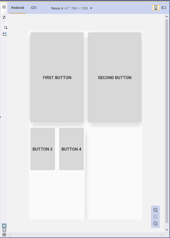
Figure 27: Arranging visual elements with the Grid
The Grid layout is very versatile and is also a good choice (when possible) in terms of performance.
Spacing and proportions for rows and columns
You have fine-grained control over the size, space, and proportions of rows and columns. The Height and Width properties of the RowDefinition and ColumnDefinition objects can be set with values from the GridUnitType enumeration as follows:
- Auto: Automatically sizes to fit content in the row or column.
- Star: Sizes columns and rows as a proportion of the remaining space.
- Absolute: Sizes columns and rows with specific, fixed height and width values.
XAML has type converters for the GridUnitType values, so you simply pass no value for Auto, a * for Star, and the fixed numeric value for Absolute, such as:
<Grid.ColumnDefinitions>
<ColumnDefinition />
<ColumnDefinition Width="*"/>
<ColumnDefinition Width="20"/>
</Grid.ColumnDefinitions>
Introducing spans
In some situations, you might have elements that should occupy more than one row or column. In these cases, you can assign the Grid.RowSpan and Grid.ColumnSpan attached properties with the number of rows and columns a visual element should occupy.
The AbsoluteLayout
The AbsoluteLayout container allows you to specify where exactly on the screen you want the child elements to appear, as well as their size and bounds. There are a few different ways to set the bounds of the child elements based on the AbsoluteLayoutFlags enumeration used during this process.
The AbsoluteLayoutFlags enumeration contains the following values:
- All: All dimensions are proportional.
- HeightProportional: Height is proportional to the layout.
- None: No interpretation is done.
- PositionProportional: Combines XProportional and YProportional.
- SizeProportional: Combines WidthProportional and HeightProportional.
- WidthProportional: Width is proportional to the layout.
- XProportional: X property is proportional to the layout.
- YProportional: Y property is proportional to the layout.
Once you have created your child elements, to set them at an absolute position within the container, you will need to assign the AbsoluteLayout.LayoutFlags attached property. You will also want to assign the AbsoluteLayout.LayoutBounds attached property to give the elements their bounds. Since Xamarin.Forms is an abstraction layer between Xamarin and the device-specific implementations, the positional values can be independent of the device pixels. This is where the LayoutFlags mentioned previously come into play. Code Listing 8 provides an example based on proportional dimensions and absolute position for child controls.
Code Listing 8
<?xml version="1.0" encoding="utf-8" ?> <ContentPage xmlns="http://xamarin.com/schemas/2014/forms" xmlns:x="http://schemas.microsoft.com/winfx/2009/xaml" xmlns:local="clr-namespace:App1" x:Class="App1.MainPage">
<AbsoluteLayout> <Label Text="First Label" AbsoluteLayout.LayoutBounds="0, 0, 0.25, 0.25" AbsoluteLayout.LayoutFlags="All" TextColor="Red"/> <Label Text="Second Label" AbsoluteLayout.LayoutBounds="0.20, 0.20, 0.25, 0.25" AbsoluteLayout.LayoutFlags="All" TextColor="Orange"/> <Label Text="Third Label" AbsoluteLayout.LayoutBounds="0.40, 0.40, 0.25, 0.25" AbsoluteLayout.LayoutFlags="All" TextColor="Violet"/> <Label Text="Fourth Label" AbsoluteLayout.LayoutBounds="0.60, 0.60, 0.25, 0.25" AbsoluteLayout.LayoutFlags="All" TextColor="Yellow"/> </AbsoluteLayout> </ContentPage> |
Figure 28 shows the result of the AbsoluteLayout example.
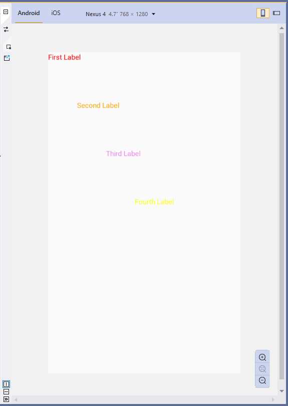
Figure 28: Absolute positioning with AbsoluteLayout
The RelativeLayout
The RelativeLayout container provides a way to specify the location of child elements relative either to each other or to the parent control. Relative locations are resolved through a series of Constraint objects that define each particular child element’s relative position to another. In XAML, Constraint objects are expressed through the ConstraintExpression markup extension, which is used to specify the location or size of a child view as a constant, or relative to a parent or other named view. Markup extensions are very common in XAML, and you will see many of them in Chapter 7 related to data binding, but discussing them in detail is beyond the scope here. The official documentation has a very detailed page on their syntax and implementation that I encourage you to read.
In the RelativeLayout class, there are properties named XConstraint and YConstraint. In the next example, you will see how to assign a value to these properties from within another XAML element, through attached properties. This is demonstrated in Code Listing 9, where you meet the BoxView, a visual element that allows you to draw a colored box. In this case, it’s useful for giving you an immediate perception of how the layout is organized.
Code Listing 9
<?xml version="1.0" encoding="utf-8" ?> <ContentPage xmlns="http://xamarin.com/schemas/2014/forms" xmlns:x="http://schemas.microsoft.com/winfx/2009/xaml" xmlns:local="clr-namespace:App1" x:Class="App1.MainPage">
<RelativeLayout> <BoxView Color="Red" x:Name="redBox" RelativeLayout.YConstraint="{ConstraintExpression Type=RelativeToParent, Property=Height,Factor=.15,Constant=0}" RelativeLayout.WidthConstraint="{ConstraintExpression Type=RelativeToParent,Property=Width,Factor=1,Constant=0}" RelativeLayout.HeightConstraint="{ConstraintExpression Type=RelativeToParent,Property=Height,Factor=.8,Constant=0}" /> <BoxView Color="Blue" RelativeLayout.YConstraint="{ConstraintExpression Type=RelativeToView, ElementName=redBox,Property=Y,Factor=1,Constant=20}" RelativeLayout.XConstraint="{ConstraintExpression Type=RelativeToView, ElementName=redBox,Property=X,Factor=1,Constant=20}" RelativeLayout.WidthConstraint="{ConstraintExpression Type=RelativeToParent,Property=Width,Factor=.5,Constant=0}" RelativeLayout.HeightConstraint="{ConstraintExpression Type=RelativeToParent,Property=Height,Factor=.5,Constant=0}" /> </RelativeLayout> </ContentPage> |
The result of Code Listing 9 is shown in Figure 29.
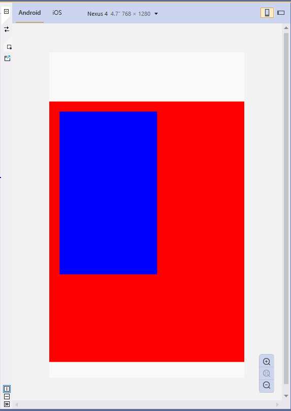
Figure 29: Arranging visual elements with the RelativeLayout
Tip: The RelativeLayout container has relatively poor rendering performance, and the documentation recommends that you avoid this layout whenever possible, or at least avoid more than one RelativeLayout per page.
The ScrollView
The special layout ScrollView allows you to present content that cannot fit on one screen, and therefore should be scrolled. Its usage is very simple:
<ScrollView x:Name="Scroll1">
<StackLayout>
<Label Text="My favorite color:" x:Name="Label1"/>
<BoxView BackgroundColor="Green" HeightRequest="600" />
</StackLayout>
</ScrollView>
You basically add a layout or visual elements inside the ScrollView and, at runtime, the content will be scrollable if its area is bigger than the screen size. You can also decide whether to display the scroll bars through the HorizontalScrollbarVisibility and VerticalScrollbarVisibility properties that can be assigned with self-explanatory values such as Always, Never, and Default.
Additionally, you can specify the Orientation property (with values Horizontal or Vertical) to set the ScrollView to scroll only horizontally or only vertically. The reason the layout has a name in the sample usage is that you can interact with the ScrollView programmatically, invoking its ScrollToAsync method to move its position based on two different options.
Consider the following lines:
Scroll1.ScrollToAsync(0, 100, true);
Scroll1.ScrollToAsync(Label1, ScrollToPosition.Start, true);
In the first case, the content at 100 px from the top is visible. In the second case, the ScrollView moves the specified control at the top of the view and sets the current position at the control’s position. Possible values for the ScrollToPosition enumeration are:
- Center: Scrolls the element to the center of the visible portion of the view.
- End: Scrolls the element to the end of the visible portion of the view.
- MakeVisible: Makes the element visible within the view.
- Start: Scrolls the element to the start of the visible portion of the view.
Note that you should never nest ScrollView layouts, and you should never include the ListView and WebView controls inside a ScrollView because they both already implement scrolling.
The Frame
The Frame is a very special layout in Xamarin.Forms because it provides an option to draw a colored border around the visual element it contains, and optionally add extra space between the Frame’s bounds and the visual element. Code Listing 10 provides an example.
Code Listing 10
<?xml version="1.0" encoding="utf-8" ?> <ContentPage xmlns="http://xamarin.com/schemas/2014/forms" xmlns:x="http://schemas.microsoft.com/winfx/2009/xaml" xmlns:local="clr-namespace:App1" x:Class="App1.MainPage">
<Frame OutlineColor="Red" CornerRadius="3" HasShadow="True" Margin="20"> <Label Text="Label in a frame" HorizontalOptions="Center" VerticalOptions="Center"/> </Frame> </ContentPage> |
The OutlineColor property is assigned with the color for the border, the CornerRadius property is assigned with a value that allows you to draw circular corners, and the HasShadow property allows you to display a shadow. Figure 30 provides an example.
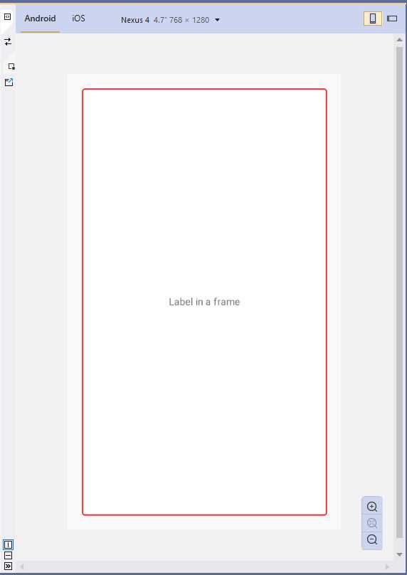
Figure 30: Drawing a Frame
The Frame will be resized proportionally based on the parent container’s size.
Tip: In Visual Studio 2019, for properties of type Color, the XAML code editor shows a small inline box with a preview of the color itself.
The ContentView
The special container ContentView allows for aggregating multiple views into a single view and is useful for creating reusable, custom controls. Because the ContentView represents a stand-alone visual element, Visual Studio makes it easier to create an instance of this container with a specific item template.
In Solution Explorer, you can right-click the .NET Standard project name and then select Add New Item. In the Add New Item dialog box, select the Xamarin.Forms node, then the Content View item, as shown in Figure 31. Make sure you do not select the item called Content View (C#); otherwise, you will get a new class file that you will need to populate in C# code rather than XAML.
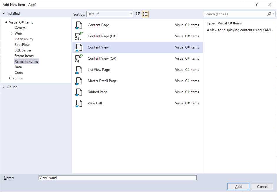
Figure 31: Adding a ContentView
When the new file is added to the project, the XAML editor shows basic content made of the ContentView root element and a Label. You can add multiple visual elements, as shown in Code Listing 11, and then you can use the ContentView as you would with an individual control or layout.
Code Listing 11
<?xml version="1.0" encoding="UTF-8"?> <ContentView xmlns="http://xamarin.com/schemas/2014/forms" xmlns:x="http://schemas.microsoft.com/winfx/2009/xaml" x:Class="App1.View1"> <ContentView.Content> <StackLayout> <Label Text="Enter your email address:" /> <Entry x:Name="EmailEntry" /> </StackLayout> </ContentView.Content> </ContentView> |
It is worth mentioning that visual elements inside a ContentView can raise and manage events and support data binding, which makes the ContentView very versatile and perfect for building reusable views.
Styling the user interface with CSS
Xamarin.Forms allows you to style the user interface with cascading style sheets (CSS). If you have experience with creating content with HTML, you might find this feature very interesting.
Note: CSS styles must be compliant with Xamarin.Forms in order to be consumed in mobile apps, since it does not support all CSS elements. For this reason, this feature should be considered a complement to XAML, not a replacement. Before you decide to make serious styling with CSS in your mobile apps, make sure you read the documentation for further information about what is available and supported.
There are three options to consume CSS styles in a Xamarin.Forms project: two in XAML, and one in C# code.
Defining CSS styles as a XAML resource
Note: Examples in this section are based on the ContentPage object since you have not read about other pages yet, but the concepts apply to all pages deriving from Page. Chapter 6 will describe in detail all the available pages in Xamarin.Forms.
The first way you can use CSS styles in Xamarin.Forms is by defining a StyleSheet object within the resources of a page, like in the following code snippet:
<?xml version="1.0" encoding="utf-8" ?>
<ContentPage xmlns="http://xamarin.com/schemas/2014/forms"
xmlns:x="http://schemas.microsoft.com/winfx/2009/xaml"
x:Class="Layouts.CSSsample">
<ContentPage.Resources>
<ResourceDictionary>
<StyleSheet>
<![CDATA[
^contentpage {
background-color: lightgray; }
stacklayout {
margin: 20; }
]]>
</StyleSheet>
</ResourceDictionary>
</ContentPage.Resources>
</ContentPage>
In this scenario, the CSS content is enclosed within a CDATA section.
Note: Names of visual elements inside a CSS style must be lowercase.
For each visual element, you supply property values in the form of key/value pairs. The syntax requires the visual element name and, enclosed within brackets, the property name followed by a colon, and the value followed by a semicolon, such as stacklayout { margin: 20; }. Notice how the root element, contentpage in this case, must be preceded by the ^ symbol. You do not need to do anything else, as the style will be applied to all the visual elements specified in the CSS.
Consuming CSS files in XAML
The second available option to consume a CSS style in XAML is from an existing .css file. First, you need to add your .css file to the Xamarin.Forms project (either .NET Standard or shared project) and set its BuildAction property as EmbeddedResource. The next step is to add a StyleSheet object to a ContentPage’s resources and assign its Source property with the .css file name, as follows:
<ContentPage.Resources>
<ResourceDictionary>
<StyleSheet Source="/mystyle.css"/>
</ResourceDictionary>
</ContentPage.Resources>
Obviously, you can organize your .css files into subfolders; for example, the value for the Source property could be /Assets/mystyle.css.
Consuming CSS styles in C# code
The last option you have to consume CSS styles in Xamarin.Forms is using C# code. You can create a CSS style from a string (through a StringReader object), or you can load an existing style from a .css file, but in both cases, the key point is that you still need to add the style to a page’s resources. The following code snippet demonstrates the first scenario, where a CSS style is created from a string and added to the page’s resources:
using (var reader =
new StringReader
("^contentpage { background-color: lightgray; }
stacklayout { margin: 20; }"))
{
// "this" represents a page
// StyleSheet requires a using Xamarin.Forms.StyleSheets directive
this.Resources.Add(StyleSheet.FromReader(reader));
}
For the second scenario, loading the content of a CSS style from an existing file, an example is provided by the following code snippet:
var styleSheet = StyleSheet.FromAssemblyResource(IntrospectionExtensions.
GetTypeInfo(typeof(Page1)).Assembly,
"Project1.Assets.mystyle.css");
this.Resources.Add(styleSheet);
The second snippet is a bit more complex, since the file is loaded via reflection (and in fact, it requires a using System.Reflection directive in order to import the IntrospectionExtensions object). Notice how you provide the file name including the project name (Project1) and the subfolder (if any) name that contains the .css file.
Chapter summary
Mobile apps require dynamic user interfaces that can automatically adapt to the screen size of different device form factors. In Xamarin.Forms, creating dynamic user interfaces is possible through a number of so-called layouts.
The StackLayout allows you to arrange controls near one another both horizontally and vertically. The FlexLayout does the same, but it is also capable of wrapping visual elements. The Grid allows you to arrange controls within rows and columns; the AbsoluteLayout allows you to give controls an absolute position; the RelativeLayout allows you to arrange controls based on the size and position of other controls or containers; the ScrollView layout allows you to scroll the content of visual elements that do not fit in a single page; the Frame layout allows you to draw a border around a visual element; and the ContentView allows you to create reusable views.
In the last part of the chapter, you saw how you can style visual elements using CSS stylesheets, in both XAML and imperative code, but these must be compliant to Xamarin.Forms and should only be considered as a complement to XAML, and not a replacement.
Now that you have a basic knowledge of layouts, it’s time to discuss common controls in Xamarin.Forms that allow you to build the functionalities of the user interface, arranged within the layouts you learned in this chapter.
- 155+ high-performance Xamarin controls, including DataGrid, Charts, and ListView.
- Elegant XAML layouts for common scenarios.
- Layouts optimized for mobile and desktop.