
Xamarin.Forms Succinctly®

CHAPTER 3
Building the User Interface with XAML
Xamarin.Forms is, at its core, a library that allows you to create native user interfaces from a single C# codebase by sharing code. This chapter provides the foundations for building the user interface in a Xamarin.Forms solution. Then, in the next three chapters, you will learn in more detail about layouts, controls, pages, and navigation.
The structure of the user interface in Xamarin.Forms
The biggest benefit of Xamarin.Forms is that you can define the entire user interface of your application inside the .NET Standard project that you selected for sharing code. Native apps for iOS, Android, and Windows that you get when you build a solution will render the user interface with the proper native layouts and controls on each platform. This is possible because Xamarin.Forms maps native controls into C# classes that are then responsible for rendering the appropriate visual element, depending on the platform the app is running on. These classes actually represent visual elements such as pages, layouts, and controls.
Because the .NET Standard library can only contain code that will certainly run on all platforms, Xamarin.Forms maps only those visual elements common to all platforms. For instance, iOS, Android, and Windows all provide text boxes and labels; thus Xamarin.Forms can provide the Entry and Label controls that represent text boxes and labels, respectively. However, each platform renders and manages visual elements differently from one another, with different properties and behavior. This implies that controls in Xamarin.Forms expose only properties and events that are common to every platform, such as the font size and the text color.
In Chapter 9, you will learn how to use native controls directly, but for now let’s focus on how Xamarin.Forms allows the creation of user interfaces with visual elements provided out of the box. The user interface in iOS, Android, and Windows has a hierarchical structure made of pages that contain layouts that contain controls. Layouts can be considered as containers of controls that allow for dynamically arranging the user interface in different ways. Based on this consideration, Xamarin.Forms provides a number of page types, layouts, and controls that can be rendered on each platform.
When you create a Xamarin.Forms solution, the .NET Standard shared project will contain a root page that you can populate with visual elements. Then you can design a more complex user interface by adding other pages and visual elements. To accomplish this, you can use both C# and the Extensible Application Markup Language (XAML). Let’s discuss both methods. Furthermore, C# Markup, which is a new feature currently in preview, allows you to define the user interface in C# using new fluent APIs discussed in the last section of this chapter.
Coding the user interface in C#
In Xamarin.Forms, you can create the user interface of an application in C# code. For instance, Code Listing 2 demonstrates how to create a page with a layout that arranges controls in a stack containing a label and a button. For now, do not focus on element names and their properties (they will be explained in the next chapter). Rather, focus on the hierarchy of visual elements that the code introduces.
var newPage = new ContentPage(); newPage.Title = "New page";
var newLayout = new StackLayout(); newLayout.Orientation = StackOrientation.Vertical; newLayout.Padding = new Thickness(10);
var newLabel = new Label(); newLabel.Text = "Welcome to Xamarin.Forms!";
var newButton = new Button(); newButton.Text = "Tap here"; newButton.Margin = new Thickness(0, 10, 0, 0);
newLayout.Children.Add(newLabel); newLayout.Children.Add(newButton);
newPage.Content = newLayout; |
Here you have full IntelliSense support. However, as you can imagine, creating a complex user interface entirely in C# can be challenging for at least the following reasons:
- Representing a visual hierarchy made of tons of elements in C# code is extremely difficult.
- You must write the code in a way that allows you to distinguish between user interface definition and other imperative code.
- As a consequence, your C# becomes much more complex and difficult to maintain.
In the early days of Xamarin.Forms, defining the user interface could only be done in C# code. Fortunately, you now have a much more versatile way of designing the user interface with XAML, as you’ll learn in the next section. Obviously, there are still situations in which you might need to create visual elements in C#, for example, if you need to add new controls at runtime, although this is the only scenario for which I suggest you code visual elements in C#.
The modern way: Designing the user interface with XAML
XAML is the acronym for eXtensible Application Markup Language. As its name implies, XAML is a markup language that you can use to write the user interface definition in a declarative fashion. XAML is not new in Xamarin.Forms, since it was first introduced more than 10 years ago with Windows Presentation Foundation, and it has always been available in platforms such as Silverlight, Windows Phone, and the Universal Windows Platform.
XAML derives from XML and, among others, it offers the following benefits:
- XAML makes it easy to represent structures of elements in a hierarchical way, where pages, layouts, and controls are represented with XML elements and properties with XML attributes.
- It provides clean separation between the user interface definition and the C# logic.
- Being a declarative language separated from the logic, it allows professional designers to work on the user interface without interfering with the imperative code.
The way you define the user interface with XAML is unified across platforms, meaning that you design the user interface once and it will run on iOS, Android, and Windows.
Note: XAML in Xamarin.Forms adheres to Microsoft’s XAML 2009 specifications, but its vocabulary is different from XAML in other platforms, such as WPF or UWP. So, if you have experience with these platforms, you will notice many differences in how visual elements and their properties are named. Microsoft is working on unifying all .NET development platforms into a new framework called .NET MAUI, whose release is expected for November 2021, and it is reasonable to think that XAML vocabularies will also be unified. Also, remember that XAML is case sensitive for object names and their properties and members.
For example, when you create a Xamarin.Forms solution, you can find a file in the .NET Standard project called MainPage.xaml, whose markup is represented in Code Listing 3.
Code Listing 3
<?xml version="1.0" encoding="utf-8" ?> <ContentPage xmlns="http://xamarin.com/schemas/2014/forms" xmlns:x="http://schemas.microsoft.com/winfx/2009/xaml" x:Class="App1.MainPage"> <StackLayout> <Frame BackgroundColor="#2196F3" Padding="24" CornerRadius="0"> <Label Text="Welcome to Xamarin.Forms!" HorizontalTextAlignment="Center" TextColor="White" FontSize="36"/> </Frame> <Label Text="Start developing now" FontSize="Title" Padding="30,10,30,10"/> <Label Text="Make changes to your XAML file and save to see your UI update in the running app with XAML Hot Reload. Give it a try!" FontSize="16" Padding="30,0,30,0"/> <Label FontSize="16" Padding="30,24,30,0"> <Label.FormattedText> <FormattedString> <FormattedString.Spans> <Span Text="Learn more at "/> <Span Text="https://aka.ms/xamarin-quickstart" FontAttributes="Bold"/> </FormattedString.Spans> </FormattedString> </Label.FormattedText> </Label> </StackLayout> </ContentPage> |
A XAML file in Xamarin.Forms normally contains a page or a custom view. The root element is a ContentPage object, which represents its C# class counterpart, and is rendered as an individual page. In XAML, the Content property of a page is implicit, meaning you do not need to write a ContentPage.Content element. The compiler assumes that the visual elements you enclose between the ContentPage tags are assigned to the ContentPage.Content property. The StackLayout is a container of views. The Frame view draws a border around a view with properties to control the distance (Padding) and the corner appearance (CornerRadius).
The Label element represents the Label class in C#. Properties of this class are assigned with XML attributes, such as Text, VerticalOptions, and HorizontalOptions. Properties can be assigned with complex types, and this must be done in a hierarchical way, not inline. An example in Code Listing 3 is in the assignment of the Label.FormattedText property, whose value is of type FormattedString, and whose attributes are part of the Spans object.
You probably already have the immediate perception of better organization and visual representation of the structure of the user interface. If you look at the root element, you can see a number of attributes whose definitions start with xmlns. These are referred to as XML namespaces and are important because they make it possible to declare visual elements defined inside specific namespaces or XML schemas. For example, xmlns points to the root XAML namespace defined inside a specific XML schema and allows for adding to the UI definition all the visual elements defined by Xamarin.Forms; xmlns:x points to an XML schema that exposes built-in types; and xmlns:local points to the app’s assembly, making it possible to use objects defined in your project.
Each page or layout can only contain one visual element. In the case of the autogenerated MainPage.xaml page, you cannot add other visual elements to the page unless you organize them into a layout. This is the reason why in Code Listing 3 you see several visual elements inside a StackLayout.
Let’s simplify the auto-generated code to have some text and a button. This requires us to have a Button below a Label, and both must be wrapped inside a container such as the StackLayout, as demonstrated in Code Listing 4.
Tip: IntelliSense will help you add visual elements faster by showing element names and properties as you type. You can then simply press Tab or double-click to quickly insert an element.
Code Listing 4
<?xml version="1.0" encoding="utf-8" ?> <ContentPage xmlns="http://xamarin.com/schemas/2014/forms" xmlns:x="http://schemas.microsoft.com/winfx/2009/xaml" xmlns:local="clr-namespace:App1" x:Class="App1.MainPage">
<StackLayout Orientation="Vertical" Padding="10"> <Label Text="Welcome to Xamarin Forms!" VerticalOptions="Center" HorizontalOptions="Center" />
<Button x:Name="Button1" Text="Tap here!" Margin="0,10,0,0"/> </StackLayout>
</ContentPage> |
If you did not include both controls inside the layout, Visual Studio will raise an error. You can nest other layouts inside a parent layout and create complex hierarchies of visual elements. Notice the x:Name assignment for the Button. Generally speaking, with x:Name you can assign an identifier to any visual element so that you can interact with it in C# code, for example, if you need to retrieve a property value.
If you have never seen XAML before, you might wonder how you can interact with visual elements in C# at this point. In Solution Explorer, if you expand the MainPage.xaml file, you will see a nested file called MainPage.xaml.cs. This is the code-behind file, and it contains all the imperative code for the current page. In this case, the simplest form of a code-behind file, the code contains the definition of the MainPage class, which inherits from ContentPage, and the page constructor, which makes an invocation to the InitializeComponent method of the base class and initializes the page.
You will access the code-behind file often from Solution Explorer, but Visual Studio 2019 offers another easy way that is related to a very common requirement: responding to events raised by the user interface.
Productivity features for XAML IntelliSense
The XAML code editor in Visual Studio 2019 is powered by the same engine that is behind Windows Presentation Foundation (WPF) and Universal Windows Platform (UWP). This is extremely important for several reasons:
- Full, rich IntelliSense support: Earlier versions of IntelliSense could make writing XAML markup painful to do. The new version adds linting and fuzzy matching, described in more detail shortly.
- Quick actions and refactorings: Light bulb suggestions are now available to XAML in Xamarin.Forms, just as they have been for WPF and UWP, making it easy to resolve XML namespaces, remove unused namespaces, and organize code with contextualized suggestions.
- Go To Definition and Peek Definition: These popular features, previously available only to the C# code editor, are also now available to Xamarin.Forms XAML.
- Enhanced support for binding expressions: IntelliSense now lists available objects for bindings based on the {Binding} markup extension, and also lists available resources when using the {StaticResource} markup extension. Hints about this feature will be provided in Chapter 7, Resources and Data Binding.
I will now describe these productivity features in more detail.
Fuzzy matching and linting
Fuzzy matching is a feature that helps you find appropriate completions based on what you type. For example, if you type Stk and then press the Tab key, IntelliSense will add a StackLayout tag. This feature is also capable of providing a list of possible completions as you type in a control name. For example, if you type Layout, IntelliSense will offer StackLayout, FlexLayout, AbsoluteLayout, and RelativeLayout as possible completions, as well as closing tags based on the same typing.
Another interesting feature of fuzzy matching is CamelCase matching, which provides shortcuts based on CamelCase types. For instance, if you type RL and then press Tab, the editor inserts a RelativeLayout tag. With linting, the code editor underlines code issues as you type with red squiggles (critical errors) or green squiggles (warnings).
Light bulb: Quick actions and refactorings
The light bulb icon was first introduced to IntelliSense in Visual Studio 2015 for the C# and Visual Basic languages, and it was later added to XAML IntelliSense in WPF and UWP. Now this useful feature is also available to XAML in Xamarin.Forms. With this tool, when a code issue is detected, you can click the light bulb icon (or press Ctrl + .), and IntelliSense will show potential fixes for that code issue. In Xamarin.Forms XAML, the light bulb can suggest code fixes to import missing XML namespaces, sort XML namespaces, and remove unused XML namespaces.
Tip: Unused XML namespaces have a lighter color in the code editor, so they are more easily recognizable. When you hover over unused XML namespaces, the light bulb will be available, and a quick action will suggest to remove all unused namespaces as a potential fix.
Figure 20 provides an example based on a declared but never used XML namespace.

Figure 20: Quickly removing an unused XML namespace
Go To Definition and Peek Definition
Go To Definition and Peek Definition are popular, extremely useful features in the code editor, and they are also available in the XAML IntelliSense in Xamarin.Forms. Both are available through the context menu when you right-click an object name in the code editor.
With Go To Definition, Visual Studio will open the definition of the selected object and, if it is defined in a different file, such a file will be opened in a separate tab. The cursor will be moved to the object definition. In XAML, this is particularly useful when you need to go to the definition of objects such as styles, templates, and other resources that might be defined in a different file.
Peek Definition opens an interactive pop-up window in the active editor, allowing you to see the definition of an object or to make edits without leaving the active window. Additionally, you are not limited to viewing or editing objects defined in a XAML file, as you can also peek at the definition of an object defined in the C# code-behind file.
Figure 21 shows an example of Peek Definition where a C# event handler for the Clicked event of a Button is displayed within a XAML editor window.

Figure 21: Making edits in the active editor with Peek Definition
Responding to events
Events are fundamental for the interaction between the user and the application, and controls in Xamarin.Forms raise events as normally happens in any platform. Events are handled in the C# code-behind file. Visual Studio 2019 makes it simple to create event handlers with an evolved IntelliSense experience. For instance, suppose you want to perform an action when the user taps the button defined in the previous code. The Button control exposes an event called Clicked that you assign the name of an event handler as follows.
<Button x:Name="Button1" Text="Tap here!" Margin="0,10,0,0"
Clicked="Button1_Clicked"/>
However, when you type Clicked=", Visual Studio offers a shortcut that allows the generation of an event handler in C# based on the control’s name, as shown in Figure 22.

Figure 22: Generating an event handler
If you press Tab, Visual Studio will insert the name of the new event handler and generate the C# event handler in the code-behind. You can quickly go to the event handler by right-clicking its name and then selecting Go To Definition. You will be redirected to the event handler definition in the C# code-behind, as shown in Figure 23.

Figure 23: The event handler definition in C#
At this point, you will be able to write the code that performs the action you want to execute, exactly as it happens with other .NET platforms such as WPF or UWP. Generally speaking, event handlers’ signatures require two parameters: one of type object representing the control that raised the event, and one object of type EventArgs containing information about the event.
In many cases, event handlers work with derived versions of EventArgs, but these will be highlighted when appropriate. As you can imagine, Xamarin.Forms exposes events that are commonly available on all the supported platforms.
Understanding type converters
If you look at Code Listing 2, you will see that the Orientation property of the StackLayout is of type StackOrientation, the Padding property is of type Thickness, and the Margin property assigned to the Button is also of type Thickness. However, as you can see in Code Listing 4, the same properties are assigned with values passed in the form of strings in XAML.
Xamarin.Forms (and all the other XAML-based platforms) implement the so-called type converters, which automatically convert a string into the appropriate value for a number of known types. Summarizing all the available type converters and known target types is neither possible nor necessary at this point; you simply need to remember that, in most cases, strings you assign as property values are automatically converted into the appropriate type on your behalf.
Xamarin.Forms Previewer
Xamarin.Forms doesn’t have a designer that allows you to draw the user interface visually with the mouse, the toolbox, and interactive windows as you are used to doing with platforms such as WPF, Windows Forms, and UWP. Though you can drag visual elements from the toolbox onto a XAML file, you still need to write all your XAML manually. However, Visual Studio 2019 offers the Xamarin.Forms Previewer, which shows a preview of the user interface in real time, as you edit your XAML.
Figure 24 shows the Xamarin.Forms Previewer in action. You enable the Xamarin.Forms Previewer by clicking either the Vertical Split or Horizontal Split buttons, which are located at the bottom-right corner of the code editor.
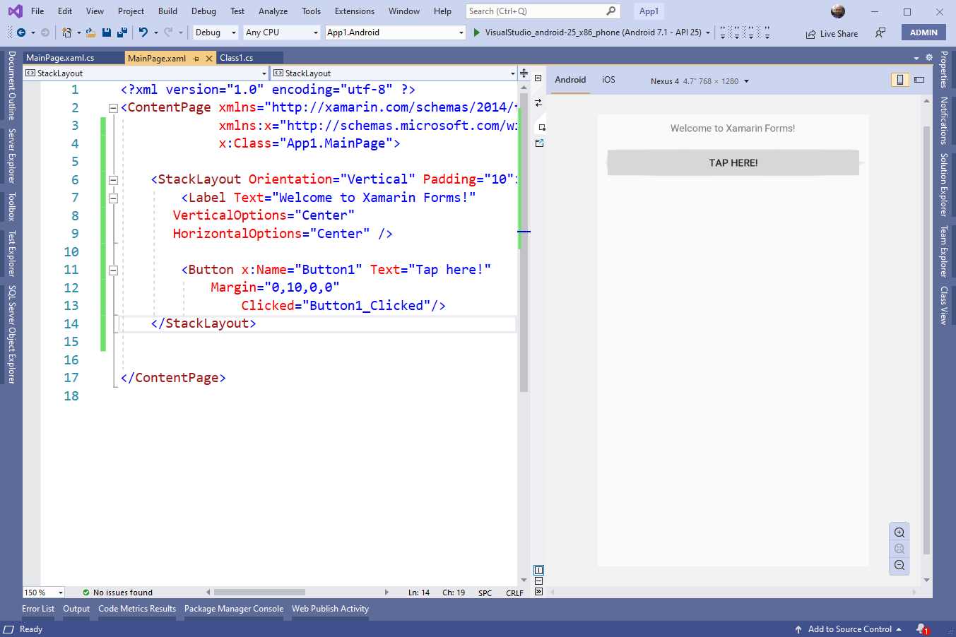
Figure 24: The Xamarin.Forms Previewer
Tip: Remember to rebuild your solution before opening the Xamarin.Forms Previewer for the first time.
At the bottom-right corner, the Previewer provides zoom controls. At the top, you can select the device factor (phone or tablet), the platform used to render the preview (Android or iOS), and the orientation (vertical or horizontal). If you wish to render the preview based on iOS, remember that you need Visual Studio to be connected to a Mac. If there are any errors in your XAML or if, for any reason, the Previewer is unable to render the preview, it will show a detailed error message.
The Xamarin.Forms Previewer is an important tool, because it prevents the need to run the application every time you make significant edits to the UI, as was required in the past. In the next chapters, I will often use the Previewer to demonstrate how the UI looks instead of running the emulators.
Xamarin.Forms Hot Reload
In the past, if you needed to make one or more changes to the XAML code, you had to stop debugging, make your changes, and then restart the application. This was one of the biggest limitations in the Xamarin.Forms development experience. In Visual Studio 2019, this problem has been solved by a feature called Hot Reload.
The way it works is very simple: with the application running in debugging mode, you can make changes to your XAML, then you save your changes, and the application will redraw the user interface based on your changes. Hot Reload is available to all the supported development platforms. Hot Reload is enabled by default, but you can disable this feature by accessing Tools > Options > Xamarin > Hot Reload and disabling the Enable XAML Hot Reload for Xamarin.Forms option.
In the same dialog, you will find additional settings called Reload Options. Here you can change the way the user interface is redrawn when you make real-time changes to your XAML. In fact, by default, Hot Reload redraws the whole page, even if you change only one control property. It is possible to change this setting and make Hot Reload redraw only the view that was changed; however, this feature is still in preview. Hot Reload requires you to set the linker option for all the project to Don’t Link or Link None. For iOS, you also need to enable the Mono interpreter in the project options.
Among the known limitations, Hot Reload might not work well when making changes to the visual hierarchy of the Shell (discussed in Chapter 6), and with views that are referenced by other views via the x:Name tag. Without a doubt, Hot Reload is a feature that will save you a lot of time, making it simple to understand the result of your changes at debugging time.
Introducing C# Markup
XAML is the most efficient way to organize the user interface in Xamarin.Forms, but this is a declarative mode. Sometimes you might need to create views at runtime and add them to the visual tree when the application is running. Of course, this can be done in C#, following what you have learned previously in this chapter. However, the C# approach makes it more difficult to set some views’ properties, such as data-binding assignments and the position inside the visual tree.
Starting with Xamarin.Forms 4.6, Microsoft introduced C# Markup, a new feature that allows for simplyfing the way the user interface can be defined in C# with fluent APIs. At the time of this writing, C# Markup is in preview and requires the following line of code inside the App constructor of the App.xaml.cs file, after the invocation to the InitializeComponent method:
Device.SetFlags(new string[]{ "Markup_Experimental" });
An example will help you better understand how this works. Some of the views used in this example will be discussed in more detail in Chapters 4 and 5, but the focus now is on the new Fluent APIs. Let’s consider the following XAML code snippet that defines a Grid layout with a Label and an Entry inside. The Grid, discussed in the next chapter, is a layout that allows for organizing visual elements into rows and columns:
<ContentPage>
<Grid>
<Grid.RowDefinitions>
<RowDefinition /> <RowDefinition />
</Grid.RowDefinitions>
<Label Text="Phone number:"/>
<Entry Keyboard="Telephone" Text="{Binding PhoneNumber}"
Placeholder="Enter phone number" Grid.Row="1"/>
</Grid>
</ContentPage>
This Grid has two rows: in the first row there is a Label that shows some text, and the second row includes an Entry, the equivalent of a text box, which allows entering a phone number, and therefore shows the appropriate keyboard and a placeholder text. The Entry is in the second row of the Grid (index start at 0), and its value is data-bound to a property PhoneNumber of a class that represents the data model. The data variable represents an instance of a data model. In C#, you would rewrite this UI as follows:
var grid1 = new Grid();
grid1.RowDefinitions.Add(new RowDefinition());
grid1.RowDefinitions.Add(new RowDefinition());
var phoneLabel = new Label { Text = "Phone number:", Margin = 5 };
var phoneEntry = new Entry { Keyboard = Keyboard.Telephone,
Placeholder = "Enter phone number", Margin = 5 };
phoneEntry.SetBinding(Entry.TextProperty,
new Binding(nameof(data.PhoneNumber)));
grid1.Children.Add(phoneLabel, 0, 0);
grid1.Children.Add(phoneEntry, 0, 1);
Content = grid1;
Since this piece of user interface is very simple, the code is also not complex, but you can see how you need to invoke several methods to add data binding and to place the controls inside the appropriate place. With C# Markup, you could rewrite this UI as follows:
Content = new Grid
{
RowDefinitions =
{
new RowDefinition(),
new RowDefinition()
},
Children =
{
new Label { Text = "Phone number:" }.Row(0),
new Entry { Keyboard=Keyboard.Telephone,
Placeholder="Enter phone number"}.
Row(1).Bind(nameof(data.PhoneNumber))
}
};
As you can see, not only is the visual representation of the code clearer, but here the Row extension method allows for quickly placing views inside the appropriate grid rows, and the Bind method sets data binding directly inline. If you consider that the number of available extension methods is huge, and that these target several Xamarin.Forms types, including styles, converters, gesture recognizers, and layouts, it is easy to understand how this will simplify the addition of visual elements at runtime. Because this feature is still in preview, I recommend you have a look at the official documentation for information about the release date and about additional scenarios that might change over time.
Chapter summary
Sharing the user interface across platforms is the main goal of Xamarin.Forms, and this chapter provided a high-level overview of how you define the user interface with XAML, based on a hierarchy of visual elements.
You have seen how to add visual elements and how to assign their properties; how type converters allow for passing string values in XAML, and how the compiler converts them into the appropriate types. You had a first look at the Xamarin.Forms Previewer to get a real-time, integrated representation of the user interface as you edit your XAML.
Finally, you had a quick look at an upcoming feature, C# Markup, which allows coding the user interface in managed code with Fluent APIs. Following this overview of how the user interface is defined in Xamarin.Forms, we will discuss important UI concepts in more detail, and we will start by organizing the user interface with layouts.
- 155+ high-performance Xamarin controls, including DataGrid, Charts, and ListView.
- Elegant XAML layouts for common scenarios.
- Layouts optimized for mobile and desktop.