
Xamarin Community Toolkit Succinctly®

CHAPTER 4
Saving Time with Reusable Converters
In Xamarin.Forms, and more generally, in platforms based on XAML, data-binding happens between a source property and a target property. If both are of the same type, data-binding is quick. If properties are of different types, for example when you need to bind an Image.Source property to an image that is represented by a Base64 string, data-binding requires an appropriate value converter that converts the Base64 string into an ImageSource type. This is accomplished via value converters, which are objects that implement the IValueConverter interface.
As for the other chapters, the assumption here is that you already know how value converters work. If not, I recommend that you read the official documentation before you continue. The Xamarin Community Toolkit provides a collection of reusable value converters that are extremely common in a lot of applications, so that you do not need to reinvent the wheel every time, getting rid of many source code files.
This chapter describes the available value converters in the library, and it will walk through the examples available with the official sample project. All the converters are located under the Converters folder of the Xamarin.CommunityToolkit project.
Note: For consistency with a book of the Succinctly series, it is not possible to show and discuss the class definition of each converter. For this reason, you will learn how to use each converter and which parameters they need, without going into the details of the architecture. Converter classes are very easy to understand, so you can always look at their definition analyzing the .shared.cs files located under the Converters folder of the Xamarin.CommunityToolkit project. In addition, notice that the ItemTappedEventArgsConverter and ItemSelectedEventArgsConverter will be discussed in Chapter 5, because they work in combination with the EventToCommandBehavior class, discussed with behaviors.
Converting from bool to Object
Sometimes you might need to convert objects from type bool to a different type. An example is a user choice made through views like the Switch or the CheckBox, whose true or false value will change the value or status of a completely different view or class instance.
For such situations, the Xamarin Community Toolkit exposes the BoolToObjectConverter class, which is demonstrated in the Pages\Converters\BoolToObjectConverter.xaml file of the sample project. For a better understanding, consider Figure 32, where you can see that the color of a BoxView changes depending on the true or false value of the Switch.

Figure 32: Binding and converting a value of type bool to Color
In this example, the bool value coming from the Switch view is converted into a Color. However, the conversion is possible to any other type for maximum flexibility. Now, let’s see how this works in code. The BoxView that displays the color is declared as follows.
<BoxView
BindingContext="{x:Reference Name=ColorToggle}"
HeightRequest="200"
WidthRequest="200"
Color="{Binding Path=IsToggled,
Converter={StaticResource BoolToObjectConverter}}" />
Notice how the Color property is bound to the IsToggled property of the Switch, and how the BoolToObject converter has been specified to convert from one type to another. The converter declaration in the page resources looks like the following.
<ResourceDictionary>
<converters:BoolToObjectConverter x:Key="BoolToObjectConverter"
FalseObject="#0000FF" TrueObject="#FF0000" />
</ResourceDictionary>
The FalseObject and TrueObject properties specify which values must be returned when the source property is false or true, respectively. Both properties are of type object, so you can return anything that derives from object itself (which means any .NET type).
Converting from byte arrays to images
In the real world, images are often stored inside databases or retrieved via API calls, and the way they are stored in a data source is typically a Base64 string or a byte array, in case the image is retrieved by a Stream object.
The Image view in Xamarin.Forms cannot display a byte array as an image directly, so a converter is required, and this is something developers do in almost every project. The Xamarin Community Toolkit simplifies your code base by offering the ByteArrayToImageSourceConverter, which is demonstrated in the Pages\Converters\ByteArrayToImageSourceConverterPage.xaml.
In this page, you can see that the converter is declared in the simplest way possible.
<ResourceDictionary>
<xct:ByteArrayToImageSourceConverter
x:Key="ByteArrayToImageSourceConverter" />
</ResourceDictionary>
It can be used when binding a property of type ImageSource, for example the Source property of the Image view or of the AvatarView, like in the current example.
<xct:AvatarView Size="300"
Source="{Binding Avatar,
Converter={StaticResource ByteArrayToImageSourceConverter}}"
HorizontalOptions="Center" VerticalOptions="Center" />
In the sample project, the ByteArrayToImageSourceViewModel class (which is the data source of the page) exposes a property called Avatar, of type byte?[]. This property will contain the profile picture of a person, which is retrieved from the GitHub contributors to the library. The ViewModel contains all the code that downloads the image and assigns it to the property, but the relevant part is the following.
using var client = new HttpClient();
using var response = await client.GetAsync(avatarUrl);
if (!response.IsSuccessStatusCode)
return;
var imageBytes =
await response.Content.ReadAsByteArrayAsync().ConfigureAwait(false);
Avatar = imageBytes;
The Avatar property is therefore assigned with a byte array; at the XAML level, when the assignment happens, the data-binding engine will invoke the converter that will return an ImageSource object, which is accepted by the Source property of the AvatarView. If you run the app, you will see how the image will appear after a few seconds required to download it from GitHub.
Note: The reason I’m not providing a screenshot from the sample app here is that the image retrieved by the code represents a real person. Though the image is hosted on GitHub and possibly is public domain, I consider it more appropriate not to show it here without explicit permission.
Converting dates to coordinated universal time
When you have to work with different markets in different time zones, you likely need to represent dates in a way that is the same across countries. This is accomplished by converting dates to the coordinated universal time (UTC).
In C# and .NET, this can be done using the DateTimeOffset structure. However, most of the views that allow working with dates (such as the DatePicker) natively support objects of type DateTime. For this reason, the Xamarin Community Toolkit provides the DateTimeOffsetConverter, which makes it easy to bind an object of type DateTimeOffset by converting an object of type DateTime into its DateTimeOffset counterpart (and vice versa).
If you look into the XAML of the Pages\Converters\DateTimeOffsetConverterPage.xaml file, you will see that the converter is declared as follows.
<ResourceDictionary>
<xct:DateTimeOffsetConverter x:Key="DateTimeOffsetConverter" />
</ResourceDictionary>
The usage is then very simple, as you can bind a property of type DateTimeOffset passing the converter, as demonstrated in the following declaration of the DatePicker view.
<DatePicker Date="{Binding TheDate,
Converter={StaticResource DateTimeOffsetConverter}}"
Margin="16" HorizontalOptions="Center" />
The TheDate property is declared in the DateTimeOffsetConverterViewModel class, whose simple definition is the following.
public class DateTimeOffsetConverterViewModel : BaseViewModel
{
DateTimeOffset theDate = DateTimeOffset.Now;
public DateTimeOffset TheDate
{
get => theDate;
set => SetProperty(ref theDate, value);
}
}
If you run the sample project, you will see the converter in action in the appropriate page, shown in Figure 33.

Figure 33: Converting a date to UTC
This converter is very useful, because it simplifies the way you address date problems with different time zones.
Converting decimal numbers to integers
If you need to convert decimal numbers of type double into integers of type int, you can leverage the DoubleToIntConverter class without implementing a conversion logic on your own. It is demonstrated in the Pages\Converters\DoubleToIntConverterPage.xaml file.
For an understanding of the result, look at Figure 34, where you can see an input decimal number converted into an integer.
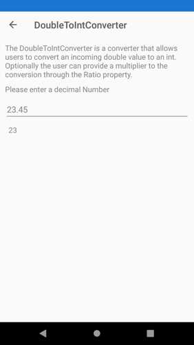
Figure 34: Converting decimal numbers into integers
The declaration of the converter in XAML is simple, as usual.
<ResourceDictionary>
<xct:DoubleToIntConverter x:Key="DoubleToIntConverter" />
</ResourceDictionary>
The relevant part of the code is in the declaration of the Label, which is bound to a property called Input, of type double, and shows the result of the conversion to int.
<Label
Padding="7,0,0,0"
Text="{Binding Path=Input,
Converter={StaticResource DoubleToIntConverter},
ConverterParameter=1}"
TextColor="{StaticResource NormalLabelTextColor}" />
Notice how a ConverterParameter is passed to the converter. This value is the ratio for the conversion, which represents the division of the multiplier by the denominator, and that equals 1 by default. This division is used to determine how many decimal numbers the input double should be rounded by. This can be better understood by looking at the Convert method of the converter.
public object Convert(object? value, Type? targetType,
object? parameter, CultureInfo? culture)
=> value is double result
? (int)Math.Round(result * GetParameter(parameter))
: throw new ArgumentException("Value is not a valid double",
nameof(value));
The parameter argument matches the ConverterParameter passed in XAML. The GetParameter method returns the supplied ratio, if available and if a valid number; otherwise, it returns the value of a property called Ratio, declared in the converter and assigned with 1.
double GetParameter(object? parameter)
=> parameter == null
? Ratio
: parameter switch
{
double d => d,
int i => i,
string s => double.TryParse(s, out var result)
? result
: throw new ArgumentException(
"Cannot parse number from the string",
nameof(parameter)),
_ => 1,
};
This ratio is then multiplied by the input double number. This allows you to have control of how the conversion is done.
Converting enumerations into Boolean values
If you need to convert values from an enum into a bool, you can leverage the EnumToBoolConverter class. This converter is demonstrated in the Pages\Converters\EnumToBoolConverterPage.xaml file, and it allows you to specify which values from the enumeration must be treated as true; then you can use the resulting bool as you like.
The sample page allows for selecting a state for a hypothetical issue on GitHub, and it looks like the one shown in Figure 35.
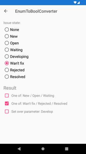
Figure 35: Converting enumeration values into Boolean values
States are represented by the IssueState enumeration, defined in the EnumToBoolConverterViewModel class as follows.
public enum IssueState
{
None = 0,
New = 1,
Open = 2,
Waiting = 3,
Developing = 4,
WantFix = 5,
Rejected = 6,
Resolved = 7
}
The ViewModel also defines a property called SelectedState of type IssueState, used to bind the current state to the user interface. Converter instances are declared in the page as follows.
<xct:EnumToBoolConverter x:Key="OpenConverter">
<xct:EnumToBoolConverter.TrueValues>
<vm:IssueState>New</vm:IssueState>
<vm:IssueState>Open</vm:IssueState>
<vm:IssueState>Waiting</vm:IssueState>
</xct:EnumToBoolConverter.TrueValues>
</xct:EnumToBoolConverter>
<xct:EnumToBoolConverter x:Key="ClosedConverter">
<xct:EnumToBoolConverter.TrueValues>
<vm:IssueState>WantFix</vm:IssueState>
<vm:IssueState>Rejected</vm:IssueState>
<vm:IssueState>Resolved</vm:IssueState>
</xct:EnumToBoolConverter.TrueValues>
</xct:EnumToBoolConverter>
<xct:EnumToBoolConverter x:Key="ManualConverter" />
The first two instances specify the values that should be considered true directly in the definition, whereas the third one does not specify any value. This is intentional; you will shortly see how to assign a value at a later stage.
There are multiple instances of the converter because the user interface contains three check boxes at the bottom, each representing one of the possible states, and each bound to an instance of the converter.
In the XAML, you will see a number of RadioButton views, each bound to a value of the IssueState enumeration, but more specifically, you will see how three CheckBox views are bound to the SelectedState property, so they also need to point to the appropriate converter to convert this type into bool.
<Label Grid.Row="2" Grid.ColumnSpan="2" FontSize="Large"
Margin="0,16,16,0">Result</Label>
<CheckBox Grid.Row="3" IsEnabled="False"
IsChecked="{Binding SelectedState,
Converter={StaticResource OpenConverter}, Mode=OneWay}" />
<Label Grid.Row="3" Grid.Column="1" Text="One of: New / Open / Waiting" />
<CheckBox Grid.Row="4" IsEnabled="False"
IsChecked="{Binding SelectedState,
Converter={StaticResource ClosedConverter}, Mode=OneWay}" />
<Label Grid.Row="4" Grid.Column="1" Text="One of: Wan't fix / Rejected / Resolved" />
<CheckBox Grid.Row="5" IsEnabled="False"
IsChecked="{Binding SelectedState,
Converter={StaticResource ManualConverter},
ConverterParameter={x:Static vm:IssueState.Developing}, Mode=OneWay}" />
<Label Grid.Row="5" Grid.Column="1" Text="Set over parameter: Develop" />
Notice how the last CheckBox is passing a value from the IssueState enumeration to the bound converter, and this demonstrates how you can pass a value to be evaluated as true at data-binding time; you are not limited to declaring true values in advance.
Converting objects into Boolean values and comparing for equality
The Xamarin Community Toolkit exposes the EqualConverter, which allows developers to convert any value binding to a bool, depending on whether or not it is equal to a specific value. The initial binding contains the object that will be compared, and the ConverterParameter contains the object to which to compare it.
In the sample project, this is demonstrated in the Pages\Converters\EqualConverterPage.xaml. More specifically, it demonstrates how to return true or false if the input value equals 100, which is the value specified in the ConverterParameter. Figure 36 shows what the example looks like.
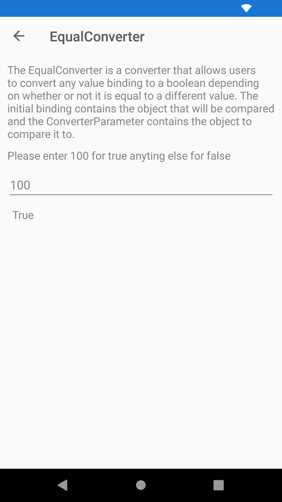
Figure 36: Converting objects into Boolean values for equality comparison
The converter is simply declared as follows.
<ResourceDictionary>
<xct:EqualConverter x:Key="EqualConverter" />
</ResourceDictionary>
The last Label from the top shows how the converter is actually used.
<Label
Padding="7,0,0,0"
BindingContext="{x:Reference Name=ExampleText}"
Text="{Binding Path=Text, Converter={StaticResource EqualConverter},
ConverterParameter=100}" TextColor="{StaticResource
NormalLabelTextColor}" />
The EqualConverter class checks if an object, the user input in this case, equals the value specified in the ConverterParameter and returns true or false, depending on the result of the comparison for equality.
As an opposite tool, the NotEqualConverter works exactly like EqualConverter, except for the fact that it returns true if two objects are not equal and false if they are equal.
Displaying images from resources
As you might know, it is possible to store images locally in the app resources. To accomplish this, you add the desired image files to the shared project. Then, for each image, in the Properties tool window, you set the Build Action property as EmbeddedResource, whereas the Copy To Output Directory property is set as Do not copy.
Retrieving and displaying an image from the app resources is very easy to do; if you had an Image view called Image1, you would write the following line of code.
Image1.Source = ImageSource.FromResource(imageId,
Application.Current.GetType().GetTypeInfo().Assembly);
The imageId object is the image identifier, and has the following form: AssemblyName.Folder.Filename. If you had an image called myimage.jpg inside a folder called Resources in a project whose resulting assembly name is MyProject, the image ID would be MyProject.Resources.myimage.jpg.
Tip: The image ID is case-sensitive, so it must exactly match the casing of assembly names, folder names, and image file names.
This approach works if you can directly access your views in C# code, but it does not work if you have Image views that are data-bound to properties in a ViewModel, because data-binding lives in XAML. You need a converter, and the Xamarin Community Toolkit offers one ready to use, called ImageResourceConverter. What it does is basically implement code similar to the line you saw previously but building the image ID is still your responsibility.
In the sample project, it is demonstrated in the Pages\Converters\ImageResourceConverterPage.xaml file and, if you run the example in the app and tap the button to change the image, the result of the conversion is represented in Figure 37.

Figure 37: Displaying images from app resources
The sample project uses two local images under the Images folder, called button.png and logo.png. Code Listing 7 shows instead the code for the ViewModel, located at ViewModels\ImageResourceConverterViewModel.cs, where there is code that builds the image ID the proper way.
Code Listing 7
using System.Windows.Input; using Xamarin.Forms; namespace Xamarin.CommunityToolkit.Sample.ViewModels.Converters { public class ImageResourceConverterViewModel : BaseViewModel { const string img1 = "button.png"; const string img2 = "logo.png"; const string imagesPath = "Images";
string defaultNamespace; string? imageName; public string? ImageName { get => imageName; set => SetProperty(ref imageName, value); } ICommand? changeImageCommand; public ICommand ChangeImageCommand => changeImageCommand ??= new Command(() => { ImageName = (ImageName?.Equals( BuildEmbededImagePath(img1)) ?? false) ? BuildEmbededImagePath(img2) : BuildEmbededImagePath(img1); }); public ImageResourceConverterViewModel() { defaultNamespace = System.Reflection.Assembly. GetExecutingAssembly().GetName().Name; ImageName = BuildEmbededImagePath(img1); } string BuildEmbededImagePath(string imgName) => $"{defaultNamespace}.{imagesPath}.{imgName}"; } } |
As you can see, the constructor retrieves the assembly name with the first line of code. This is required to build the image ID, which is actually performed by the BuildEmbeddedImagePath method that takes the image file name as an argument. The resulting image ID is assigned to the ImageName property, and the image name varies depending on the user tapping a button on the user interface, an action handled via the ChangeImageCommand. In the XAML, the converter is declared the usual way.
<pages:BasePage.Resources>
<xct:ImageResourceConverter x:Key="ImageResourceConverter"/>
</pages:BasePage.Resources>
The Image view is bound to the ImageName property of the ViewModel, and invokes the ImageResourceConverter as follows.
<Image WidthRequest="150"
HeightRequest="150"
Source="{Binding ImageName,
Converter={StaticResource ImageResourceConverter}}"/>
In this way, you can quickly display an image from the app resources, taking advantage of the data-binding automation—and without the need to write C# code and handle the views’ properties manually.
Converting an index into an array item
Sometimes, you might need to bind an item inside an array to the user interface, but you only have the index of the item itself. Simplifying this process is possible with the IndexToArrayItemConverter class, which is demonstrated in the Pages\Converters\IndexToArrayItemConverter.xaml page. The way it works is quite simple. If you look at the sample code, you will see the following array definition, along with the declaration of the converter.
<ResourceDictionary>
<xct:IndexToArrayItemConverter x:Key="IndexToArrayItemConverter" />
<x:Array x:Key="ValuesArray" Type="{x:Type x:String}">
<x:String>Value1</x:String>
<x:String>Value2</x:String>
<x:String>Value3</x:String>
<x:String>Value4</x:String>
<x:String>Value5</x:String>
</x:Array>
</ResourceDictionary>
The declared array contains a series of string values, and the converter is declared the usual way. The sample app allows entering an index of the array from an Entry, whose Text property is bound to another property in the ViewModel called Index. Index’s sole purpose is connecting the Entry with the Label, which displays the correspondent item of the array. It is declared as follows.
<Label
Padding="7,0,0,0"
Text="{Binding Path=Index, Converter={StaticResource
IndexToArrayItemConverter},
ConverterParameter={StaticResource ValuesArray}}"
TextColor="{StaticResource NormalLabelTextColor}" />
The Index property is an int that represents the index of the desired item in the array. The Converter property of the binding points to the converter, whereas the ConverterParameter property allows for specifying the array in which the converter must search the item that matches the supplied index. Behind the scenes, the IndexToArrayItemConverter returns the result of the invocation to the Array.GetValue method, which returns the item corresponding to the supplied index in the form of an object instance.
Converting from integer to Boolean
If you need to bind integer values to false and true Boolean values, the Xamarin Community Toolkit provides an easy solution: the IntToBoolConverter class, demonstrated in the Pages\Converters\IntToBoolConverter.xaml page. If the integer is 0, the converter returns false. Any other integer values will be converted to true. Declaring the converter is simple.
<ResourceDictionary>
<xct:IntToBoolConverter x:Key="IntToBoolConverter" />
</ResourceDictionary>
The sample code that demonstrates the conversion is the following, where Number is an integer property defined in the backing ViewModel, and just stores the input value.
<Entry
x:Name="ExampleText"
Placeholder="0 for false other for true"
Text="{Binding Number}"
TextColor="{StaticResource NormalLabelTextColor}" />
<Label
Padding="7,0,0,0"
Text="{Binding Path=Number,
Converter={StaticResource IntToBoolConverter}}"
TextColor="{StaticResource NormalLabelTextColor}" />
The converter implementation is very easy, since it just returns the result of the != operator compared to 0, but it is still very useful and of quick reuse.
Inverting Boolean bindings
When you data-bind properties of type bool, the binding happens when the source property is true. However, there are situations where you need to make the binding happen when the source property is false, such as displaying an error state view when the result of an API call is not successful.
To accomplish this, the Xamarin Community Toolkit provides the InvertedBoolConverter class, demonstrated in the Pages\Converters\InvertedBoolConverter.xaml file. The converter is declared as follows.
<ResourceDictionary>
<xct:InvertedBoolConverter x:Key="InvertedBoolConverter" />
</ResourceDictionary>
In the sample code, a Label displays a string that represents the opposite state of the Switch view, as follows.
<Label
BindingContext="{x:Reference Name=ColorToggle}"
Text="{Binding Path=IsToggled,
Converter={StaticResource InvertedBoolConverter}}" />
ColorToggle is the source view of the binding and is defined as follows:
<Switch x:Name="ColorToggle" IsToggled="False" />
In the sample app, the result of the code is shown in Figure 38.
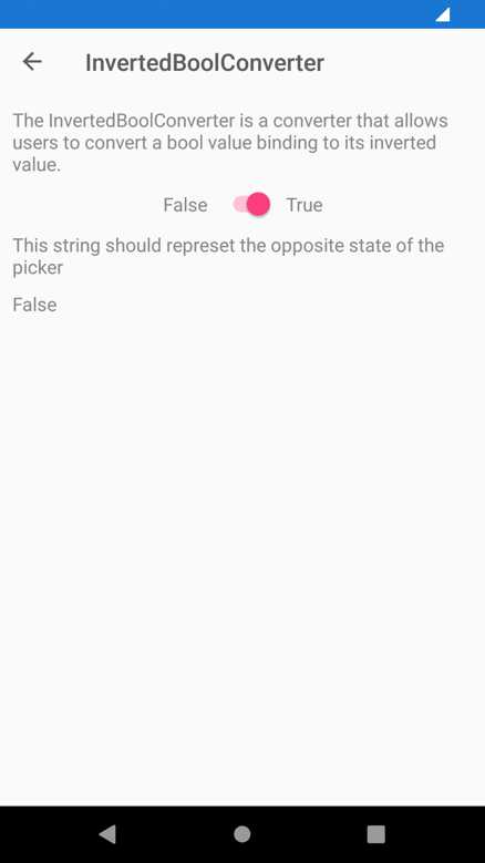
Figure 38: Inverting the binding of a bool value
Tip: In my real-world experience, I have implemented and used a similar converter to control the visibility of views based on the status of the data context.
Detecting null string values
The Xamarin Community Toolkit provides two converters that allow for detecting if a string is null, and that return a bool value if this is the case. The IsNullOrEmptyConverter returns false if a string is null or if it only contains white spaces, whereas the IsNotNullOrEmptyConverter returns true if a string is not null or if it does not contain only white spaces.
In the sample project, they are demonstrated in the Pages\Converters\IsNullOrEmptyConverterPage.xaml and Pages\Converters\IsNotNullOrEmptyConverterPage.xaml files, respectively. They both display a list of strings, and they are bound to an individual string via the properties defined in the IsNullOrEmptyConverterViewModel class, as follows.
public ObservableCollection<string> DummyItemSource { get; } =
new ObservableCollection<string>
{
"Dummy Item 0",
"Dummy Item 1",
"Dummy Item 2",
"Dummy Item 3",
"Dummy Item 4",
"Dummy Item 5",
};
public string? SelectedItem
{
get => selectedItem;
set => SetProperty(ref selectedItem, value);
}
The result of the binding is then different depending on the converter. Figure 39 demonstrates this, where on the left you can see the result of the IsNullOrEmptyConverter class, and on the right the result of the IsNotNullOrEmptyConverter one.
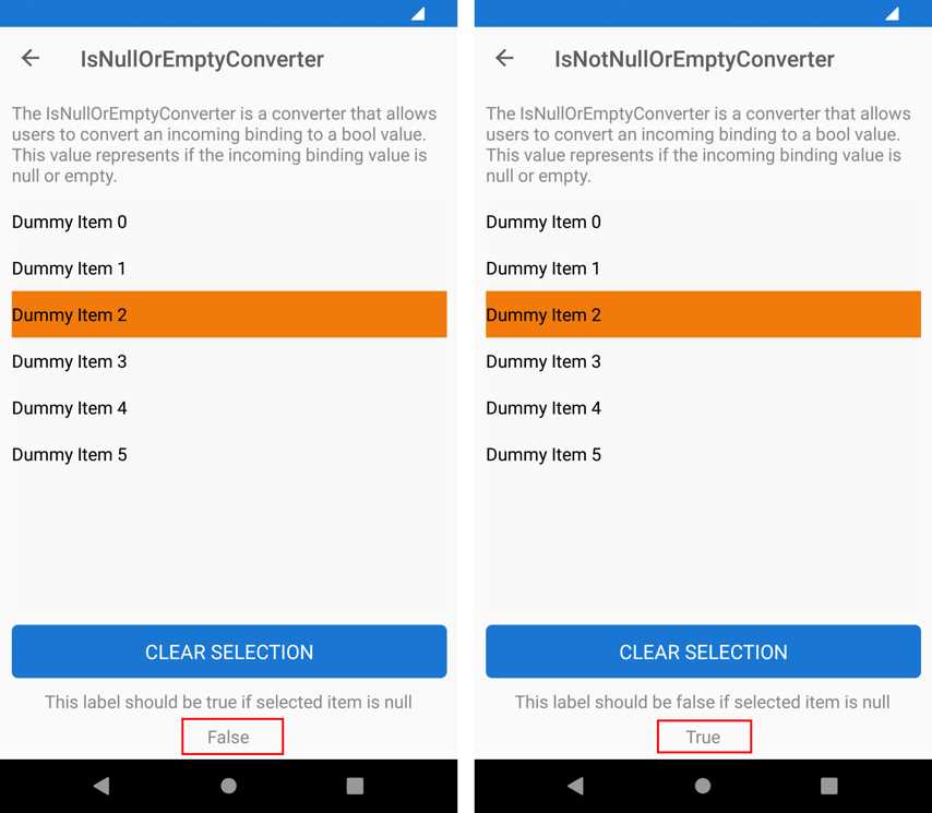
Figure 39: Checking for null values
The declaration of the converters is very simple, as usual. The following is how you declare the IsNullOrEmptyConverter.
<ResourceDictionary>
<xct1:IsNullOrEmptyConverter x:Key="IsNullOrEmptyConverter" />
</ResourceDictionary>
Following is instead how you declare the IsNotNullOrEmptyConverter.
<ResourceDictionary>
<xct:IsNotNullOrEmptyConverter x:Key="IsNotNullOrEmptyConverter" />
</ResourceDictionary>
In both examples, there is a CollectionView that displays the list of strings with the following data template.
<CollectionView VerticalOptions="StartAndExpand"
HorizontalOptions="Center" SelectionMode="Single"
ItemsSource="{Binding DummyItemSource}"
SelectedItem="{Binding SelectedItem}">
<CollectionView.ItemTemplate>
<DataTemplate>
<Label Text="{Binding .}" Margin="10" TextColor="Black" />
</DataTemplate>
</CollectionView.ItemTemplate>
</CollectionView>
Converters are then used in the last Label that displays the result of the converters themselves. More specifically, for the IsNullOrEmptyConverter, the declaration is the following.
<Label VerticalOptions="CenterAndExpand" HorizontalOptions="CenterAndExpand"
Text="{Binding Path=SelectedItem,
Converter={StaticResource IsNullOrEmptyConverter}}" />
For the IsNotNullOrEmptyConverter, the declaration is the following.
<Label VerticalOptions="CenterAndExpand" HorizontalOptions="CenterAndExpand"
Text="{Binding Path=SelectedItem,
Converter={StaticResource IsNotNullOrEmptyConverter }}" />
They are both used against the same string: only the result changes.
Checking data collections for null values
If your app displays data collections with a CollectionView control, you know that you can quickly implement empty states or error states via the EmptyView and EmptyViewTemplate properties, which allow for displaying a different view if the bound collection is null or empty. This is possible because the CollectionView checks the bound collection automatically. However, if your app has existed for years, it is very likely using ListView controls to display data collections, and implementing empty and error states is your own responsibility.
In order to simplify this, the Xamarin Community Toolkit exposes the ListIsNotNullOrEmptyConverter and the ListIsNullOrEmptyConverter classes, which respectively return true if a collection is not null or if it is null. They are demonstrated in the ListIsNotNullOrEmptyConverterPage.xaml and ListIsNullOrEmptyConverterPage.xaml files, both located under Page\Converters. Both sample pages work similarly, so I’m taking into consideration the ListIsNullOrEmptyConverterPage.xaml.
If you run the sample app and open this sample page, you will see that it’s first a display about the fact that the data collection is empty. Then, if you click Add, an item will be added to the list so that the empty state will disappear in favor of the collection. Figure 40 demonstrates this.
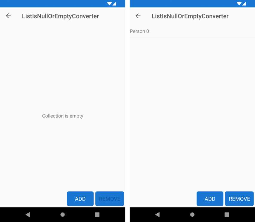
Figure 40: Displaying and hiding data lists
The bound data collection is called Items. It is exposed from the ListIsNullOrEmptyConverterViewModel class, and it’s empty at startup. The way the ListView is displayed or hidden relies on both converters, assigned to the binding of the ListView and the Label for the empty state as follows (only the relevant lines are shown here).
<ListView ItemsSource="{Binding Items}"IsVisible="{Binding Items,
Converter={xct:ListIsNotNullOrEmptyConverter}}">
…
<Label Text="Collection is empty" IsVisible="{Binding Items,
Converter={xct:ListIsNullOrEmptyConverter}}"
The IsVisible property of the ListView will be true if this is the value returned by the ListIsNotNullOrEmptyConverter, which means that the data collection is not empty. Instead, the IsVisible property of the Label will be true if this is the value returned by the other converter, ListIsNullOrEmptyConverter.
With these simple converters, you can quickly implement empty states and error states against ListView controls, without the need to implement custom logic.
Converting a list of strings into one string
If you need to bind and convert an IEnumerable<string> object (and obviously derived collections such as ObservableCollection<string>) into one single string, you can leverage the ListToStringConverter class, which is demonstrated in the Pages\Converters\ListToStringConverterPage.xaml file. The ViewModel defines the following collection of string objects.
public ObservableCollection<string> DummmyItemSource { get; } =
new ObservableCollection<string>
{
"Dummy Item 0",
"Dummy Item 1",
"Dummy Item 2",
"Dummy Item 3",
"Dummy Item 4",
"Dummy Item 5",
};
The converter is declared as follows.
<ResourceDictionary>
<xct:ListToStringConverter x:Key="ListToStringConverter" Separator="/" />
</ResourceDictionary>
Notice how you can specify a separator for each string. The sample code converts this collection into one string with the following XAML.
<Label Text="{Binding DummyItemSource,
Converter={StaticResource ListToStringConverter}}"
TextColor="Black"/>
The resulting string will be the following.
Dummy Item 1/ Dummy Item 2/ Dummy Item 3/ Dummy Item 4/ Dummy Item 5
Changing string casing
Changing the casing of an incoming string in a data-binding is extremely common. For this reason, the Xamarin Community Toolkit provides the TextCaseConverter, which is demonstrated in the Pages\Converters\TextCaseConverterPage.xaml file. The converter is declared as follows.
<ResourceDictionary>
<xct:TextCaseConverter x:Key="TextCaseConverter" Type="Upper" />
</ResourceDictionary>
The Type property allows you to specify the target casing. Possible options are Upper, Lower, FirstUpperRestLower, and None. In the XAML file, a Label displays the result of the conversion of some input text entered via the Entry view.
<Entry
x:Name="ExampleText"
Placeholder="Enter text here"
Text="{Binding Input}"
TextColor="{StaticResource NormalLabelTextColor}" />
<Label
Padding="7,0,0,0"
BindingContext="{x:Reference Name=ExampleText}"
Text="{Binding Path=Text, Converter={StaticResource TextCaseConverter}}"
TextColor="{StaticResource NormalLabelTextColor}" />
If you run the sample code, you will see the string converted to uppercase.
Tip: Keep in mind that the FirstUpperRestLower option capitalizes only the first character of the string. If you want to capitalize the first letter of each word in a string, you need to implement your own converter that returns the result of the invocation to the System.Globalization.CultureInfo.CurrentCulture.TextInfo.ToTitleCase method.
Using multiple converters together
The Xamarin Community Toolkit provides an easy way to use multiple converters at the same time, which might be very useful if you consider the number of converters in the toolkit, in the Xamarin.Forms code base, and possibly in your code base. To accomplish this, you can use the MultiConverter class, which is demonstrated in the Pages\Converters\MultiConverter.xaml page.
For a better understanding of how it works and of how powerful it is, let’s consider the code of the sample page. The purpose of the sample page is converting to uppercase an input string and, by default, checking if it is different from the ANDREI string shown in Code Listing 1. This is possible by combining the TextCaseConverter class with the NotEqualConverter class, which you saw previously.
The MultiConverter class can contain multiple converters, as follows.
<xct:MultiConverter x:Key="myMultiConverter">
<xct:TextCaseConverter />
<xct:NotEqualConverter />
</xct:MultiConverter>
Basically, you just need to declare the converter and assign a key as the identifier, and then you nest all the converters you want to be used simultaneously. However, this is not enough, because converters might need parameters. These are supplied in the form of an Array of MultiConverterParameter objects, as follows.
<x:Array
x:Key="multiParams"
Type="{x:Type xct:MultiConverterParameter}">
<xct:MultiConverterParameter
ConverterType="{x:Type xct:TextCaseConverter}"
Value="{x:Static xct:TextCaseType.Upper}" />
<xct:MultiConverterParameter
ConverterType="{x:Type xct:NotEqualConverter}"
Value="ANDREI" />
</x:Array>
For each MultiConverterParameter, you need to assign the ConverterType property with the converter you want to use via the x:Type reference and the value. This must be of the type that is accepted by the converter as a parameter; otherwise, an exception will be thrown.
The last step is assigning the MultiConverter to the binding, and this is done exactly as you would do with an individual converter. In the sample code, this can be seen in the last Label definition.
<Label
Text="{Binding EnteredName, Converter={StaticResource myMultiConverter},
ConverterParameter={StaticResource multiParams}}"
HorizontalOptions="CenterAndExpand" />
As you can see, you pass the identifier of the MultiConverter to the Converter property of the binding, and the identifier of the array of parameters to the ConverterParameter property of the binding. Running the sample app will demonstrate in practice how it works, but the biggest benefit to remember is that you can use multiple converters simultaneously, including converters defined outside of the Xamarin Community Toolkit.
Converting multiple Boolean values into a single one
The Xamarin Community Toolkit provides the VariableMultiValueConverter class, which allows for converting multiple bool values into a single one, based on the specified conditions. This converter is demonstrated in the Pages\Converters\VariableMultiValueConverterPage.xaml file. For a better understanding, consider Figure 41, which shows the converter in action.
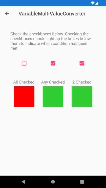
Figure 41: Converting multiple Booleans into a single one
If you play with the various check boxes, you will see the colored boxes change their color from red to green when the corresponding check boxes are flagged, and vice versa, depending on which conditions have been met.
Conditions can be better understood with some code. First, you declare as many VariableMultiValueConverter instances and as many conditions as you need, in this case three.
<pages:BasePage.Resources>
<xct:VariableMultiValueConverter
x:Key="AllTrueConverter" ConditionType="All" />
<xct:VariableMultiValueConverter
x:Key="AnyTrueConverter" ConditionType="Any" />
<xct:VariableMultiValueConverter x:Key="TwoTrueConverter"
ConditionType="Exact" Count="2" />
</pages:BasePage.Resources>
The ConditionType is an object of type MultiBindingCondition, an enumeration that exposes the following options: None, All, Any, Exact, GreaterThan, and LessThan. You will also need to supply a value for the Count property when you use the Exact, GreaterThan, and LessThan options.
Each of the declared converters must be assigned to the DataTrigger of the view to which it is applied, more specifically to the MultiBinding collection. The following code demonstrates this for the first BoxView, and the same thing is replicated on the other BoxView objects but changing the converter to which they refer.
<BoxView Grid.Row="2" Grid.Column="0" BackgroundColor="Red"
VerticalOptions="Center" HorizontalOptions="Center"
HeightRequest="80" WidthRequest="80">
<BoxView.Triggers>
<DataTrigger TargetType="BoxView" Value="true">
<DataTrigger.Binding>
<MultiBinding Converter="{StaticResource AllTrueConverter}">
<Binding Path="CheckBoxValue1" />
<Binding Path="CheckBoxValue2" />
<Binding Path="CheckBoxValue3" />
</MultiBinding>
</DataTrigger.Binding>
<Setter Property="BackgroundColor" Value="LimeGreen" />
</DataTrigger>
</BoxView.Triggers>
</BoxView>
With this approach, multiple bool values can talk to each other, and their combination can be converted into one single bool.
Chapter summary
Data-binding is one of the most powerful features in development platforms based on XAML. In many situations, you will need to bind views that support specific data types to objects of different types, and this is where value converters come in. The Xamarin Community Toolkit provides a lot of converters of common usage, so that you do not need to reinvent the wheel every time, which simplifies your code base. Value converters have then to do with data, and so do the validation behaviors described in the next chapters.
- 155+ high-performance Xamarin controls, including DataGrid, Charts, and ListView.
- Elegant XAML layouts for common scenarios.
- Layouts optimized for mobile and desktop.