
Xamarin Community Toolkit Succinctly®

CHAPTER 3
Improved UI Management with Effects
In Xamarin.Forms, Effects allows you to customize views with small styling changes, without the need to implement more complex, custom renderers. The Xamarin Community Toolkit offers seven effects that address very common needs. This chapter walks through all of them, making the necessary considerations from the technical point of view.
As usual, the sample app from the official repository will be used for quicker reference. If you want to use the code in a different page, remember to import the following XML namespace in the XAML declaration of the page.
xmlns:xct="http://xamarin.com/schemas/2020/toolkit"
Setting icons’ tint color with IconTintColorEffect
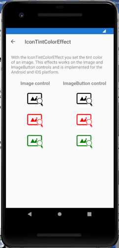
The IconTintColorEffect is demonstrated in the Effects\IconTintColorEffectPage.xaml file, and it allows you to change the tint color of the icons you use quickly with Image and ImageButton views. This effect actually works with monochrome icons. To understand how it works, look at Figure 25.
Figure 25: Changing an icon’s tint color
On the left side, you can see three Image views with their Source property assigned with a monochrome icon (the one in the example is available here), and on the right side you can see three ImageButton views with their Source property assigned with the same icon.
The first icon, the black one, is the original one for both views. For image views, the tint color has been quickly changed with the following code.
<Image Source="https://image.flaticon.com/icons/png/512/48/48639.png"
xct:IconTintColorEffect.TintColor="Red" Grid.Row="2" />
<Image Source="https://image.flaticon.com/icons/png/512/48/48639.png"
xct:IconTintColorEffect.TintColor="Green" Grid.Row="3" />
As you can see, you simply need to assign the TintColor property of the effect with an object of type Color. The way it works for ImageButton views is exactly the same, as you can see in the following code snippet.
<ImageButton
Source="https://image.flaticon.com/icons/png/512/48/48639.png"
xct:IconTintColorEffect.TintColor="Red"
Grid.Row="2" Grid.Column="1" />
<ImageButton
Source="https://image.flaticon.com/icons/png/512/48/48639.png"
xct:IconTintColorEffect.TintColor="Green"
Grid.Row="3" Grid.Column="1" />
This effect can be very useful when you use icons to present the state of an item in your user interface, and you want to change the icon color to represent a state change.
Managing views’ lifecycles with LifecycleEffect
The LifecycleEffect is demonstrated in the Effects\LifecycleEffectPage.xaml file, and it allows you to understand when an object deriving from VisualElement is loaded into or unloaded from the visual tree of the page.
The effect exposes two events, Loaded and Unloaded, which can be really useful to take actions only when a view is loaded or unloaded. If you look at Code Listing 5, you can see how the effect is applied to both layouts and individual views.
<?xml version="1.0" encoding="utf-8" ?> <pages:BasePage x:Class="Xamarin.CommunityToolkit.Sample.Pages.Effects.LifeCycleEffectPage" xmlns="http://xamarin.com/schemas/2014/forms" xmlns:x="http://schemas.microsoft.com/winfx/2009/xaml" xmlns:pages="clr-namespace:Xamarin.CommunityToolkit.Sample.Pages" xmlns:xct="http://xamarin.com/schemas/2020/toolkit"> <ContentPage.Content> <StackLayout x:Name="stack"> <StackLayout.Effects> <xct:LifecycleEffect Loaded="LifeCycleEffect_Loaded" Unloaded="LifeCycleEffect_Unloaded" /> </StackLayout.Effects> <Label HorizontalOptions="CenterAndExpand" Text="When you press the button, the Image will appear and after 3 seconds will be removed!" VerticalOptions="CenterAndExpand"> <Label.Effects> <xct:LifecycleEffect Loaded="LifeCycleEffect_Loaded" Unloaded="LifeCycleEffect_Unloaded" /> </Label.Effects> </Label> <Image x:Name="img" IsVisible="false" Source="https://raw.githubusercontent.com/xamarin/XamarinCommunityToolkit/main/assets/XamarinCommunityToolkit_128x128.png"> <Image.Effects> <xct:LifecycleEffect Loaded="LifeCycleEffect_Loaded" Unloaded="LifeCycleEffect_Unloaded" /> </Image.Effects> </Image> <Button Clicked="Button_Clicked" Text="Present Image and Remove it"> <Button.Effects> <xct:LifecycleEffect Loaded="LifeCycleEffect_Loaded" Unloaded="LifeCycleEffect_Unloaded" /> </Button.Effects> </Button> <Label Text="Log:" /> <Label x:Name="lbl" TextColor="Red" /> </StackLayout> </ContentPage.Content> </pages:BasePage> |
The sample application only displays a text message when the Loaded or Unloaded events are raised, but these are the places where you would take your own custom actions. As demonstrated in the code-behind file, you can use the same event handler for multiple views. Code Listing 6 demonstrates this.
Code Listing 6
void LifeCycleEffect_Loaded(object? sender, EventArgs e) { if (sender is Button) lbl.Text += "Button loaded \n"; if (sender is Image) lbl.Text += "Image loaded \n"; if (sender is Label) lbl.Text += "Label loaded \n"; if (sender is StackLayout) lbl.Text += "StackLayout loaded \n"; } void LifeCycleEffect_Unloaded(object? sender, EventArgs e) { if (sender is Button) lbl.Text += "Button unloaded \n"; if (sender is Image) lbl.Text += "Image unloaded \n"; if (sender is Label) lbl.Text += "Label unloaded \n"; if (sender is StackLayout) lbl.Text += "StackLayout unloaded \n"; } |
With the is operator, you can quickly check the type of the object that has raised the events and make the appropriate decisions.
Managing an entry border with EntryBorderEffect
Like most views, the Entry view has a default behavior on iOS and Android. More specifically, on iOS the Entry is surrounded by a border, while on Android it displays an underline. However, especially if you build cross-platform apps with the same design, a graphic designer might ask you to make the look and feel consistent between platforms by removing both the border on iOS and the underline on Android.
Before the Xamarin Community Toolkit was available, you had to create your own custom view and implement a custom renderer or effect. Now you can get this done by simply applying the EntryBorderEffect to the Entry views you want to make consistent.
In the sample app, this is demonstrated in the Effects\EntryBorderEffectsPage.xaml file. You just need to add the following simple lines to the Entry definition.
<Entry.Effects>
<xct:RemoveBorderEffect/>
</Entry.Effects>
Figure 26 shows how the Entry views appear without and with the effect applied, on both iOS and Android.
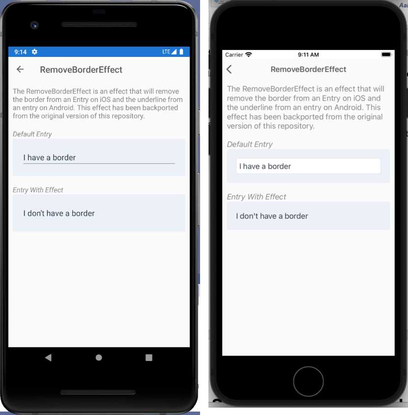
Figure 26: Applying the RemoveBorderEffect
This is a really cool effect that will save a lot of time with cross-platform design systems.
iOS: Managing the safe area with SafeAreaEffect
Note: The SafeAreaEffect does not apply to Android and is simply ignored at runtime.
The most recent iPhones have larger screens, and consequently, a larger area that app developers can leverage to build even more beautiful user interfaces. The Apple layout guidelines divide the screen area on the new iPhones into two parts. The first part is the full screen area as a whole. The second part is called the safe area, and it is made of a rectangle that represents the same screen area available on older iPhones.
Figure 27, which is credited to Apple and taken from the Adaptivity and Layout documentation page, provides a clean representation of how the screen area is organized.
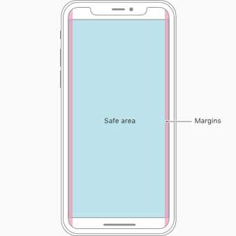
Figure 27: The safe area on iPhone devices (source: Apple, Inc.)
When you work with Xamarin.iOS and Xamarin.Forms, your app will automatically fill the entire screen area. However, there might be exceptions and reasons to avoid filling the entire screen and use only the safe area, such as:
- You want to really make sure your app looks and runs properly on older iPhones.
- You build for both Android and iOS, and you don’t want to write additional, platform-specific code for your UI.
- Your app adheres to a design that is thought to be cross-platform, or that is built upon older iPhone devices and that cannot be changed.
Because by default your app will fill the entire screen when running on iOS, if you want it to run only inside the safe area, you have to take the responsibility for handling this scenario in code. Luckily, with Xamarin Community Toolkit, it’s very quick and simple to make your apps use the safe area only via the SafeAreaEffect.
This is demonstrated in the Effects\SafeAreaEffectPage.xaml file and can be applied in both XAML and C#. Actually, the official sample app provides an example based on C# only, but I will show both ways starting from XAML. You apply the SafeAreaEffect to the desired view as follows.
<StackLayout SafeAreaEffect.SafeArea="true">
</StackLayout>
So, you simply need to assign the SafeArea property of the effect with true.
Tip: This example is applied to a StackLayout for consistency with the example offered by the sample app. However, in the real world, you might need to apply the effect at the page level for a more consistent layout of the user interface, especially with different OSes.
As an alternative, you can apply the effect in code-behind with the following code (which requires a using Xamarin.CommunityToolkit.Effects; directive).
SafeAreaEffect.SetSafeArea(view, value);
view is the view to which the effect is applied, and the value is true (safe area is on) or false (safe area is off). Actually, the second argument of SetSafeArea is not a bool object; it is a structure of type SafeArea from the Helpers class. With this structure, you can decide which sides of the safe area can be enabled with the following constructor overloads.
// Uniform Safe Area.
var safeArea = new Helpers.SafeArea(true);
// Horizontal and vertical Safe Area.
var safeArea = new Helpers.SafeArea(true, true);
// Left, top, right, bottom.
var safeArea = new Helpers.SafeArea(true, true, true, true);
You can replace the true arguments with false where you do not want the safe area to be enabled, and then you can pass the safeArea structure instance to the SetSafeArea method as follows.
SafeAreaEffect.SetSafeArea(view, safeArea);
In the official code example, the safe area is enabled programmatically with a Switch view, which raises a Toggled event when the state changes, and that is handled as follows.
void ActivationToggle_Toggled(object? sender, Forms.ToggledEventArgs e) =>
SafeAreaEffect.SetSafeArea(stack, e.Value);
Figure 28 shows how the safe area looks with the official sample, on an iPhone 12 simulator.
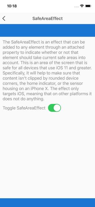
Figure 28: The safe area handled on an iPhone 12 simulator
The blue area is the part of the screen that is available to this specific kind of device, whereas the content is located inside the safe area.
Preselecting text with SelectAllTextEffect
Sometimes, you might want to allow preselection of all the text inside an Entry or Editor view. There are several reasons for doing this, such as making it easier to copy the text to the clipboard or deleting the content of a prefilled form.
This is another problem that the Xamarin Community Toolkit solves in a clever way, since you previously had to create a custom renderer or your own effect. Automatic text preselection happens by simply applying the SelectAllTextEffect to an Entry or Editor, and this is demonstrated in the Effects\SelectAllTextEffectsPage.xaml file of the sample project.
In XAML, the sample code looks like this:
<Entry Text="https://github.com/xamarin/XamarinCommunityToolkit"
TextColor="{StaticResource DarkLabelTextColor}"
PlaceholderColor="{StaticResource DarkLabelPlaceholderColor}">
<Entry.Effects>
<xct:SelectAllTextEffect/>
</Entry.Effects>
</Entry>
As you can see, it’s very quick and easy. Similarly, the effect can be applied to an Editor view as follows.
<Editor TextColor="{StaticResource DarkLabelTextColor}"
PlaceholderColor="{StaticResource DarkLabelPlaceholderColor}">
<Editor.Effects>
<xct:SelectAllTextEffect/>
</Editor.Effects>
</Editor>
If you run the sample code, you will see that the page displays an Entry and an Editor without the effect, plus an Entry and an Editor with the effect applied. Figure 29 shows how all the text in the Entry is automatically selected when focused on.
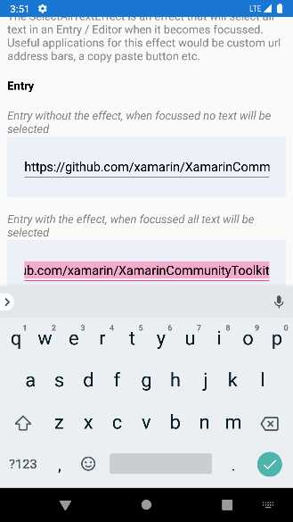
Figure 29: Automatic text preselection with the SelectAllTextEffect effect
You will get the same result with the Editor at the bottom of the page.
Adding shadows with ShadowEffect
Adding some shadow to views is not just something nice from an aesthetic point of view—it can really improve the experience of the user who needs to interact with visual elements on the page.
In Xamarin.Forms, only a very few visual elements support shadowing, and with limited customization options, so in most cases you have to create your own custom renderers. The ShadowEffect offered by the Xamarin Community Toolkit allows you to apply shadows to basically any view, and in the sample project it is demonstrated in the Effects\ShadowEffectPage.xaml file.
For a better understanding, let’s start by looking at the page resulting from the sample code, shown in Figure 30.
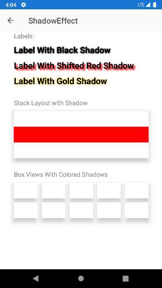
Figure 30: Examples of shadows
With this reference in mind, let’s now discuss the usage of the ShadowEffect. In its simplest form, you apply it to a view by specifying the shadow color as follows.
<Label Text="Label With Black Shadow" Style="{StaticResource ShadowLabel}"
xct:ShadowEffect.Color="Black"/>
The biggest benefit of this effect is that it allows you to specify the position of the shadow, with the OffsetX and OffsetY properties, both of type double, as follows.
<Label Text="Label With Shifted Red Shadow"
Style="{StaticResource ShadowLabel}" xct:ShadowEffect.Color="Red"
xct:ShadowEffect.OffsetX="10" xct:ShadowEffect.OffsetY="10" />
More specifically, OffsetX specifies the horizontal distance of the shadow from the view, and negative values place shadows to the left of the view. OffsetY specifies the vertical distance from the view, and negative values place the shadow at the top of the element. Another property of the effect is Radius, which you set like in the following example.
<Label Text="Label With Gold Shadow" Style="{StaticResource ShadowLabel}"
xct:ShadowEffect.Color="Gold" xct:ShadowEffect.Radius="20"/>
This property, of type double, allows you to set how large the shadow is: the higher the value, the greater the blur of the shadow. The ShadowEffect object also exposes the Opacity property, which allows, as the name implies, specifying the opacity of the shadow with a value from 0 to 1.
Improving interaction with TouchEffect
The TouchEffect allows changing the appearance of a view depending on its state, such as normal, pressed, and hovered by, also providing the option to include animations. In the sample project, it is demonstrated with the Effects\TouchEffectPage.xaml file.
The TouchEffect is certainly the most complex effect in the library, so it’s a good idea to discuss its capabilities in separate paragraphs. Before going into the details, you can keep Figure 31 as a reference for the discussion. It is based on the official sample project, and I will recall views displayed in the sample page for a better understanding.
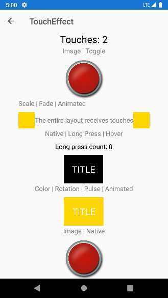
Figure 31: Examples of TouchEffect applied to different views
At the end of this section, all the pieces will be put together for a comprehensive understanding of the effect.
Note: The sample project extends the effect with commanding capabilities. This is not actually part of the TouchEffect; rather, it is part of the Model-View-ViewModel support offered by the Toolkit, discussed in Chapter 6.
Changing a view’s appearance
The TouchEffect supports three different states of a view: normal, pressed, and hovered. For each state, it is possible to change the background color or image. It is also possible to implement an animation when a state changes, which is discussed in the next paragraph.
Table 3 describes the most important properties of the TouchEffect that allow for managing the three states.
Table 3: Representative TouchEffect properties to manage view states
The following XAML code, taken from the sample project, demonstrates how to set up the normal and pressed states for the first image you see at the top in Figure 31.
<Image xct:TouchEffect.NormalBackgroundImageSource="{xct:ImageResource Id=Xamarin.CommunityToolkit.Sample.Images.button.png}"
xct:TouchEffect.PressedBackgroundImageSource="{xct:ImageResource Id=Xamarin.CommunityToolkit.Sample.Images.button_pressed.png}"
xct:TouchEffect.IsToggled="False"
xct:TouchEffect.Command="{Binding Command, Source={x:Reference Page}}"/>
You can additionally control the appearance of the view with the IsToggled property. When true, the view keeps the pressed state. When false, the view returns to the normal state after it has been pressed.
Animating a state change
The TouchEffect provides support for animating the view it is applied to and for animating the transition between one state and another. For animations, the TouchEffect provides the properties summarized in Table 4 for animating state changes.
Table 4: Animating state changes
The XAML syntax for assigning a specific animation type to the properties that support the Easing class is the following.
xct:TouchEffect.AnimationEasing="{x:Static Easing.CubicInOut}"
The following XAML code demonstrates how the sample project animates the TITLE label, the one with the dark yellow background you can see in Figure 31.
<StackLayout Style="{StaticResource GridRowContentStyle}">
<Label Text="Color | Rotation | Pulse | Animated" />
<StackLayout Orientation="Horizontal"
HorizontalOptions="CenterAndExpand"
Padding="20"
xct:TouchEffect.AnimationDuration="500"
xct:TouchEffect.PulseCount="2"
xct:TouchEffect.NormalBackgroundColor="Gold"
xct:TouchEffect.PressedBackgroundColor="Orange"
xct:TouchEffect.PressedRotation="15"
xct:TouchEffect.Command="{Binding Command,
Source={x:Reference Page}}">
<Label Text="TITLE"
TextColor="White"
FontSize="Large"/>
</StackLayout>
</StackLayout>
There is actually more, because a view can be rotated and translated during an animation. Table 5 describes the properties that allow you to accomplish this.
Table 5: Animating state changes
The sample project does not contain an example of these properties, but you can try yourself by modifying the previous snippet as follows.
<StackLayout Orientation="Horizontal"
HorizontalOptions="CenterAndExpand"
Padding="20"
xct:TouchEffect.AnimationDuration="500"
xct:TouchEffect.PulseCount="2"
xct:TouchEffect.NormalBackgroundColor="Gold"
xct:TouchEffect.PressedBackgroundColor="Orange"
xct:TouchEffect.PressedRotation="15"
xct:TouchEffect.PressedTranslationX="50"
xct:TouchEffect.PressedTranslationY="100"
xct:TouchEffect.PressedAnimationDuration="500"
xct:TouchEffect.Command="{Binding Command,
Source={x:Reference Page}}">
<Label Text="TITLE"
TextColor="White"
FontSize="Large"/>
</StackLayout>
If you now run this code, you will see the view translating on the x and y axes when it is pressed.
Chapter summary
The effects provided by the Xamarin Community Toolkit make it very quick and easy to implement functionalities of extremely common requirements, and it will save a lot of time during development. This includes (but it is not limited to) removing borders to Entry views, managing the safe area on modern iPhones, preselecting text inside Entry and Editor views, or adding interaction capabilities to any view.
Because saving development time is at the core of this library, in the next chapter you will learn how to save more with reusable converters.
- 155+ high-performance Xamarin controls, including DataGrid, Charts, and ListView.
- Elegant XAML layouts for common scenarios.
- Layouts optimized for mobile and desktop.